10,000 search results
(0.059 seconds)
- Salim by Omotu,
$18.00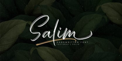 Salim is a handwritten brush font with 2 styles, regular (brush texture) and solid. Salim is perfect for branding, logotype, apparel, T-shirt, Hoodie, product packaging, quotes, flyer, poster. Comes with Uppercase and lowercase characters, Supports international languages, Numerals, punctuations, ligatures, stylistic alternates, and stylistic sets. Accessible in the Adobe Illustrator Glyphs panel, or under Stylistic Alternates in the Adobe Photoshop OpenType menu, Adobe InDesign, Corel Draw, even work on Microsoft Word. Thanks for looking, and I hope you enjoy it! Please don't hesitate to drop me a message if you have any issues or queries.
 - Sattinda by MC Creative,
$10.00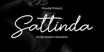 Sattinda is a thin and elegant handwritten font. It features a cute and joyful style that will take your designs to the next level! perfect for branding projects, logo, wedding designs, social media posts, advertisements, product packaging, product designs, label, photography, watermark, invitation, stationery and any projects that need handwriting taste. What’s Included : Standard Glyphs Ligature Works on PC & Mac Simple installations Accessible in the Adobe Illustrator, Adobe Photoshop, Adobe InDesign, even work on Microsoft Word. PUA Encoded Characters – Fully accessible without additional design software. Fonts include multilingual support for; ä ö ü Ä Ö Ü ß ¿ ¡
 - Alles Kaputt by Kitchen Table Type Foundry,
$16.00 Alles Kaputt means ‘everything’s broken’ in German. I always wonder why my stuff breaks so easily, especially my mobile phones (I have had 7 in the last two years). Maybe I am careless, but I believe that there is a more or less scientific explanation that chaos and destruction are far easier than harmony and creation. I am no scientist, so don’t take my word for it! Alles Kaputt is a nice script font. I made it with a felt tip pen I borrowed from the kids. Use it for texts on product packaging, book covers and websites. Or, whatever you fancy!
 - Magical Brush by Hanoded,
$15.00 Personally I think a brush font should have the word ‘Brush’ in its name. It’s not that easy finding a name - you need some magic to come up with a good one! Magical Brush is a completely handmade font. I used a small brush (a number 3 to be precise) and Chinese Ink. I wanted just a little ‘erosion’, so I used copier paper rather than my expensive French water color paper (which is quite rough). Magical Brush comes in the normal variant and a chickenpox one. Use it for your posters, your book covers and your Christmas invitations!
 - Receding Hairline NF by Nick's Fonts,
$10.00 Based on L&C Hairline, this family of faces is weighted to achieve stroke consistency in a variety of sizes. Both versions of this font support the Latin 1262, Central European 1250, Turkish 1254 and Baltic 1257 codepages.
 - Brush Hand Marker by TypoGraphicDesign,
$19.00 The typeface Brush Hand Marker is designed from 2020 for the font foundry Typo Graphic Design by Manuel Viergutz. The rough sans-serif display typeface with 4 font styles (Italic, Invert, Shadow, 3d) is inspired by handwriting. 348 glyphs incl. 100+ decorative extras like icons, arrows, dingbats, emojis, symbols, geometric shapes, catchwords, decorative ligatures (type the word #LOVE for ❤ or #SMILE for ☺ as OpenType-Feature dlig) and stylistic alternates (2 stylistic sets). For use in logos, magazines, posters, advertisement plus as webfont for decorative headlines. The font works best for display size. Have fun with this font & use the DEMO-Font (with reduced glyph-set) for FREE! Font Specifications ■ Font Name: Brush Hand Marker ■ Font Weights: Italic, Invert, Shadow, 3d + DEMO (with reduced glyph-set) ■ Font Category: Display for headline size ■ Font Format:.otf (Mac + Win, for Print) + .woff (for Web) ■ Glyph Set: 348 glyphs ■ Specials: Alternative letters, stylistic sets, automatic contextual alternates via OpenType Feature. Dingbats & Symbols, arrows, hearts, emojis/smileys, stars, further numbers, lines & geometric shapes ■ Design Date: 2020 ■ Type Designer: Manuel Viergutz
 - Delthami Script by Bexxtype,
$15.00 Delthami Script a new fresh & modern script with a handmade calligraphy style, decorative characters and a dancing baseline. So beautiful on invitation like greeting cards, branding materials, business cards, quotes, posters, and more. Delthami Script come with 704 glyphs. The alternative characters were divided into several OpenType features such as Swash, Stylistic Sets, Stylistic Alternates, Contextual Alternates. The OpenType features can be accessed by using OpenType savvy programs such as Adobe Illustrator, Adobe InDesign, Adobe Photoshop Corel Draw X version, And Microsoft Word. And this Font has given PUA unicode (specially coded fonts). so that all the alternate characters can easily be accessed in full by a craftsman or designer. If you don't have a program that supports OpenType features such as Adobe Illustrator and CorelDraw X Versions, you can access all the alternate glyphs using Font Book (Mac) or Character Map Windows). If you have any question, don't hesitate to contact me by email bexxtype@gmail.com Thanks and happy designing :-) Thank You for purchase!
 - Roberto by Letterara,
$12.00 Roberto is a charming and magical hand-lettered script font. The playful rounded characters make it the perfect font for creating stunning calligraphy results. Roberto comes packed with beautiful swashes, that will allow you to add a decorative touch within seconds. Get inspired by its authentic feel and use it to create greeting cards, branding materials, business cards, quotes, posters, and more! What’s included: • Works both on Mac & PC • Simple installations • Alternate, Swash & Ligature • Accessible in the Adobe Illustrator, Adobe Photoshop, Adobe InDesign, CorelDraw, even works on Microsoft Word. • Multi-lingual Support: ä ö ü Ä Ö Ü ß ¿ ¡ • To access the alternate glyphs, you need a program that supports OpenType features such as Adobe Illustrator CS, Adobe Photoshop CC, Adobe Indesign, and CorelDraw. More information about how to access alternate glyphs, check out this link (http://goo.gl/ZT7PqK) To stay up to date for my latest job, follow me and let’s be friends because there will be many promos.
 - Coumins by ryan creative,
$10.00 Coumins has soft, elegant brushstrokes, with typography that looks like handwriting. The brushstrokes appear to be produced by fluid, skillful hand movements, giving the font an artistic and handcrafted feel. Medium to large typography sizes will display brush stroke details clearly. This lettering font is perfect for designs that require a personal and organic touch. Coumins is supported with additional characters that have Alternate forms and swashes that will help you achieve beautiful styles with your own creations. FEATURES; -Uppercase, Lowercase, Foreign Support, Numbers and Punctuation -Alternative, Swash -Works on PC -Simple installation -Accessible in Adobe Illustrator, Adobe Photoshop. Adobe InDesign, even works in Microsoft Word - Fully accessible without additional design software. Coumins is encoded with Unicode PUA, which allows full access to all additional characters without having to design special software. Mac users can use the Font book, and Windows users can use the Character map to view and copy any extra characters to paste into your favorite text editor/app. Thank you for visiting:)
 - Schoolroom JNL by Jeff Levine,
$29.00 Based on the type style used for the Superior Sign and Chart Printer No. 929, this simple and clean sans serif font was perfectly suited for use by teachers in the classroom and for businesses and organizations that needed to make signs, price cards, charts and notices. Digitally redrawn as Schoolroom JNL, it is available in both regular and oblique versions. The Superior Marking Equipment Company [formerly of Chicago] was not only a major supplier of materials for the rubber stamp industry, but for most of its existence manufactured date and numbering stamps, sign and chart printers (such as the one used for this font), and a line of children’s printing toys (amongst other items).
 - Bradley Texting by Monotype,
$57.99Bradley Texting: a clear, friendly and easily legible calligraphy font, also suited to electronic devices With Bradley Texting, Richard Bradley has published another calligraphic typeface that recalls the style of Bradley Hand and Bradley Type. In this case, however, Bradley has advanced the style with clearer forms for display on electronic instruments and on other formats. Two other font families paved the way to the newly introduced Bradley Texting. In the mid-1990s, Bradley published Bradley Hand, with its rough contours. Since these coarse forms do not cut a good figure in the larger font sizes, Bradley Type followed, with smooth letters. During the development of Bradley Type, the idea for a further font came about ? one in the style of the two other calligraphic typefaces, but with simpler, easily legible forms and suited to electronic devices like mobile phones or tablets. The letters for Bradley Texting began with a marker on paper. Looking back, Bradley describes one of the biggest challenges as having the calm required to draw the relaxed-looking letters repeatedly while still making them fit the general style.The somewhat narrow and dynamically designed letters have round line ends, like those left by a felt-tipped pen. As a hand-written print font, the individual letters are not connected to one another. Nonetheless, they demonstrate the influence of a written font, such as the extended ends and the flowing transitions. Clear forms with open counters and a large x-height guarantee Bradley Texting good legibility in the smaller font sizes. Bradley Texting is also effective under more challenging conditions, such as on mobile phones, e-book readers or tablets; the fonts friendly and lively character comes through. With Regular, Semibold and Bold, Bradley Texting is adequately equipped for use as a headline or text font in various sizes. The selection of characters covers the Western European languages and German typographers will be happy to note the presence of the upper-case ß. Use the dynamic and clear forms of Bradley Texting anywhere you need a friendly character with a personal accent. Bradley Texting is persuasive in the print realm, in advertisements or on posters, as well as on electronic devices. - Henrician by Greater Albion Typefounders,
$16.50 Henrician can claim two sources of inspiration. One of these was a set of beautiful capital letterforms seen on the cover of a 19th century album of engravings. The engravings contained therein depicted lovely examples of half-timbered Tudor architecture and there was a clear 'Tudor' intent behind the letterforms. The second source of inspiration is more conceptual-the title lettering of period films from the 30's to the 60's…think if the opening text when Errol Flynn plays Robin Hood, or think of Richard the Lionheart, or even that great comedy Classic 'Carry on Henry', and it's discussion of Sir Thomas de Cobbler….but we digress! Henrician is a set of eight display and text (but perhaps not Body Text) faces in a 'Tudor Revival' spirit. Like any good revival design they are somehow at home with a wide range period themed design work, covering the medieval until, perhaps, the 18th century, just so long as we're more concerned with fun and appearance than strict historical accuracy. The family will be at home in the realms of advertising, posters, cover design and web design. Try Henrician out today!
 - Ambroise Std by Typofonderie,
$59.00 An exquisite Didot font in 18 series Ambroise is a contemporary interpretation of various typefaces belonging to Didot’s late style, conceived circa 1830, including the original forms of g, y, &; and to a lesser extent, k. These unique glyphs are found in Gras Vibert, cut by Michel Vibert. Vibert was the appointed punchcutter of the Didot family during this period. It is the Heavy, whom sources were surest that Jean François Porchez has been used as the basis for the design of the typeface family. In the second half of the 19th century, it was usual to find fat Didots in several widths in the catalogs of French type foundries. These same typefaces continued to be offered until the demise of the big French foundries in the 1960s. Ambroise attempts to reproduce more of what we see printed on paper in the 19th century; a more accurate representation of Didot punches. So, the unbracketed serifs are not truly square straight-line forms but use tiny transitional curves instead. The result on the page appears softer and less straight, particularly in larger sizes. The illustrious Didot family of type founders and printers Every variation of the typeface carries a name in homage to a member of the illustrious Didot family of type founders and printers. The condensed variant is called Ambroise Firmin. The extra-condensed is called Ambroise François. Ambroise Pro brought back to life: fifteen years in the making! Club des directeurs artistiques, 48e palmarès Bukva:raz 2001
 - Thicker by Zetafonts,
$39.00 Thicker is a type-family designed for Zetafonts by Francesco Canovaro with Andrea Tartarelli. A geometric sans typeface on steroids, it was first designed in the muscular Extrablack weight with the aesthetics of high-power dynamic typefaces used in sports communication, and then developed in the lighter weights where the shapes show some vintage-inspired proportions and the slightly squared look that nods to Novarese famous Eurostile, eponymous with retro-futurism. With these diverse influences the typeface allows for both impressive display use and effective logo design as well as more fine-tuned editorial use in body text - with a natural inclination for effective and powerful advertising. Sports typography usually uses italics to add dynamism and impact, and Thicker complies with this by offering a choice of three alternate italic forms with different slant, made even more customizable by the inclusion of variable font technology that allows fine tuning of the weight range as well as precise choice of typeface slant. In each of the 44 weights of the typeface family (as well as in the all-in-one variable type solution) Thicker offers a extended charset of over 900 latin, Cyrillic and Greek glyphs, covering over two hundred languages and including useful Open Type features (Alternate forms, Positional Numerals, Small Caps and Case Sensitive Forms) for flawless typesetting.
 - Funny Nature by URW Type Foundry,
$39.99 Funny Nature is not a typeface but a collection of small, comic-like symbols. Lüdicke used to work often for a supplier of gardening equipment etc. He had to come up with new, original and vivid ideas for the design of catalogues and ads. He designed Funny Nature, a wonderful collection of illustrations. Can you hear the humming and buzzuing, can you smell the flowers?
 - Ratilla Script by Krafted,
$10.00 Be yourself; everyone else is already taken -- Oscar Wilde Being a human being often means fulfilling who you really are. It’s about fulfilling your potential and living to the best of your abilities. And the Ratilla Script will help you show the world who you are! The Ratilla Script paves the way for you to write the information you need to send out to your audience. Make your projects to works of art, conveying your intentions clearly with the font! Maximize your designs with this urban and wavy font. It surely fits anywhere you want them to, giving them a place perfectly tucked in between your designs. Connect with your audience and stand out in the crowd as these fonts will show you that you and your works deserve their attention. Show your boldness as you make the world see of the elegant details put together in your projects! The Ratilla Script will be the perfect addition to aid you in your journey to be who you really are. Let the world see your beauty, bring it out through your handiwork and give your viewers a new perspective!
 - Hellbound - Unknown license

- WTF Cannibold by Wasabib Type Foundry,
$17.00 Cannibold is a Bold, modern, and square font is a typographic style that exudes confidence and contemporary flair. With its clean lines and strong presence, this font captivates the eye and demands attention. Each letter is meticulously crafted to create a striking visual impact, making it perfect for a wide range of design applications. The bold weight of this font adds a sense of strength and power to every character. It conveys a sense of assertiveness and stands out, even from a distance. The thickness of the strokes gives each letter a solid and substantial feel, making it an excellent choice for headlines, logos, and attention-grabbing text.
 - Brush Type Italic by Brush Art Design Office,
$52.00My name is Teruyoshi Matsui. I am a Brush Artist living in Japan. I artistically write the letters of the alphabet with a Japanese brush. I believe I am the only one in the world as a brush artist. I once declared on my blog that I would be a world artist. This is my ultimate goal once my name is recognized. I have created the font “ BrushType Italic”. It is an artistic product of mine. I consider this my best font. I am sure you can agree that it is “cool and beautiful”. I know you will be very proud if you use my font of BrushType Italic. Everyone will be envious of your works. I truly believe this. Thank you. - HS Alkitab by Hiba Studio,
$59.00 Hs Alkitab is an Arabic display typeface, under “titles” category. It is useful for book titles, creative designs and modern logos. Also, it is used when a contemporary and simple look is desired that can fit with the characteristics of Latin fonts where horizontal parts are thinner than vertical ones. The font is based on some modern lines of Kufi calligraphy along with some derived ideas of Latin fonts, maintaining the beauty of the Arabic font and its fixed rates. Undoubtedly, the insertion of curved ornament in the vertical parts adds more beauty and fascinating diversity in the flow line between sharp, soft and curved parts. This font supports Arabic, Persian, Urdu and Kurdish, consisting of two weights (regular and bold) which can add to the library of Arabic fonts contemporary models that meet with the purposes of various designs for all tastes.
 - Camila by Latinotype,
$39.00 Camila is a delicate and smooth Didone typeface designed by Paula Nazal. The family is inspired by concepts such as elegance, simplicity, femininity, and primarily based on Coco Chanel. A remarkable feature of this font is that it lacks teardrop terminals, characteristic of Didone typefaces. This font of thin serifs and soft finishes also includes italics, strengthening the concept of its design. A great variety of shapes makes Camila an ideal font for both display and small sizes. Camila is the perfect choice for branding and publishing projects.. This font family comes in 7 weights, ranging from Thin to Black, each with matching italics and includes a set of 426 characters that support 206 different languages.
 - Heraldica Script by Sudtipos,
$79.00 Ornamented scripts are a Koziupa/Paul specialty, and Heraldica is one of their most expressive. It attains the very definition of deluxe by conjoining the classic thin-and-thick script treatment with thin-only counterpart strokes, then it goes the extra mile with a varied complement of overlaid flourishes. The usual assortment of multiple alternates and ending forms pushes it even further in class and versatility. Monograms, logos, jewelry packaging and book covers are only a few of the possibilities with such a high-end script. Crafted Koziupa and digitized by Ale Paul.
 - Grodsky by Vintage Voyage Design Supply,
$15.00 Grodsky is a modern high contrast Antiqua with well-defined, recognizable features. Based on the architecture of classic Antiqua fonts, Grodsky is typical of the typefaces from the first half of the 20th century: pronounced serifs, contrasting geometry, and an interplay of right angles and flowing lines. Grodsky has a lot of stylistic alternates and ligatures and true small caps. They give you more authentically typographic style. Grodsky comes with oldstyle and modern, fraction and tabular figures. The font is well suited for both headlines and body text.
 - Terrified AOE by Astigmatic,
$19.00 Terrified AOE was inspired by vintage horror movie poster titling from the 1960's. It is a Capitals and smallcaps typeface, that really feels like a mix of three typefaces in one. While the Capitals and Smallcaps typesetting works to the effect of the original inspirations, each case also works well amongst itself independently, and having very different vibes. I've always been a huge fan of horror movies, and some of the lettering from vintage horror movie posters are so cool and alive, I only wish there were more of them recreated as display fonts.
 - Baskerville Display PT by ParaType,
$30.00 Baskerville Display PT is a type family intended for large and extra large point sizes. It was inspired by the faces of John Baskerville and designed for expressive display typography. Two weights of Baskerville Display with matching italics are much lighter than the existing text versions of Baskerville. Each of them is an ideal partner for ITC New Baskerville. A good addition to the family is Baskerville Poster which will look great in very large sizes. The font was designed by Arina Alaferdova under the supervision of Dmitry Kirsanov and released by ParaType in 2016.
 - ITC Mister Chuckles by ITC,
$29.99Round, firm, and bursting at the seams with good humor, ITC Mister Chuckles is based on the premise that barrel shapes have pleasant associations. Think: beer-barrel polkas, a barrel of fun, or a barrel of laughs, and you'll get the idea. Designer Nick Curtis has combined sans serif sturdiness, a hint of 1930s deco and a handful of giggles in this remarkably versatile all-cap face. If the typographic occasion calls for mirth and merriment, invite Mister Chuckles to the party. You'll have more fun than a barrel of monkeys! - Arabico by Nathatype,
$29.00 Unveiling Arabico, a captivating typeface that bridges cultures and aesthetics with its exquisite design. Arabico is a tribute to the elegance and fluidity of Arabic script. Its letterforms are carefully crafted to echo the aesthetic beauty and expressive nature of Arabic writing. Every stroke and curve of its letters pays homage to the graceful artistry of the flow of Arabic calligraphy. Arabico fits in headlines, logos, posters, flyers, branding materials, print media, editorial layouts, and many more designs. Find out more ways to use this font by taking a look at the font preview.
 - Foundry Wilson by The Foundry,
$90.00 Foundry Wilson is a lovingly drawn revival of a 1760 font from Scottish type founder Alexander Wilson, a learned and cultured man who crafted his types with care and skill. Many of Wilson’s fonts were produced exclusively for the Foulis brothers' classics published by Glasgow University Press. This creative relationship produced typography that earned the praise of their peers. A fresh alternative to the contemporary Baskerville, with a taste of the incised letterforms of its time, Foundry Wilson is a robust and lively type design that displays a beautiful colour and texture on the page.
 - CCS Monterio by Creative Corner Studio,
$29.00 CCS Monterio sans is a all-caps sans serif contemporary Art Deco typographic style , If you're into classic/vintage letter designs, then this typeface suits best for you. Packed with 300+ glyphs (alternate and multilingual characters included), now it’s your time to go crazy and explore the uniqueness of this typeface!
 - Nocturne by Scholtz Fonts,
$19.95 The font is based on an alphabet from a mid1920s art deco book. The original seemed to have tapering strokes but it was too small to be sure; I made all strokes parallel & orthogonal and slightly modified the original in a number of other ways to bring it into the 21st Century. The designers of the original were Paul Carlyle and Guy Oring. Nocturne has all the elegance of the Deco fonts of the 1930s. It recalls the romantic, sophisticated Zeitgeist of the early 20th century, that nostalgic time "between the wars". Nocturne comes in two styles: Nocturne Regular, which uses the Art Deco convention of small x height, and long ascenders. This style is perfect for headers, posters, labels etc. Nocturne Book, which, with its higher x height and slightly wider characters, is extremely legible and suitable for small size text.
 - Bentley Floyd by Differentialtype,
$10.00 Bentley Floyd is a display font family designed to enhance the appearance of any document or presentation you create. This font can also be used for logo fonts, brochures, pamphlets, billboards, book covers, magazine covers, or product promotions. This font will support the appearance of every product promotion that you make. This font consists of 18 styles from thin to black, which will add more options to your mix.
 - Utshani by Scholtz Fonts,
$21.00 Utshani means "grass" in the African language: Zulu. Grass has softness but it also has great strength and many African craft implements are made from it. When we describe someone as being "like the grass", it is meant as a compliment for it means that they can be tender and strong. The fluid African font, Utshani, was designed to suggest the flexibility and strength of grass. In this way it contrasts with the majority of other "African-inspired" fonts, which tend to be heavy and hard-edged. It can be used in a wide variety of situations, in adverts and on posters and invitations. The font includes all upper and lower case letters, all numerals and punctuation as well as all special and accented characters. The font has been professionally letterspaced and kerned, and the inter-line gap has been carefully checked.
 - Supra Demiserif by Wiescher Design,
$29.00 »Supra Demiserif« is the demi serif addition to the Supra family. I am no fan of slab serif fonts, so I designed this one with half serifs, that makes the serifs less important. Then I found, that the italic does not look nice with slab serifs, so I did only one italic cut for the normal weight. The light and normal weights and the dominant x-height with its high ascenders make for easy reading of long copy. The heavy and x-light weights are great for elegant headlines. Supra is an OpenType family for professional typography with an extended character set of over 700 glyphs. It supports more than 40 Central- and Eastern-European as well as many Western languages. Ligatures, different figures, fractions, currency symbols and smallcaps can be found in all cuts. with each other.
 - Zierde Grotesk by Lewis McGuffie Type,
$35.00 Zierde is a take on early advertising, small-copy grotesks of the late 19th/early 20th century, and is largely inspired by Miller & Richard’s own range of Grotesques. More importantly, Zierde is accompanied by a large set of ornaments (+200) which hark back to the look-and-feel of the early-modernist arts and crafts movement. The ornaments in, and presentation of, Zierde owe much credit to J.G Schelter & Giesecke’s 1913 type specimen book ‘Die Zierde’. The strong functional uppercase sans-serifs alongside luscious, beautiful patterns in ‘Die Zierde’ make for beautiful combinations. This early-modernist use of grotesk alongside ornament looks bizarre in the eyes of us used to seeing sans-serifs in more formal, sterile settings. The face itself retains some historical flourishes such as the eccentric leaning angle of the italics, the long cross-bar on the ‘G’, the gammy-leg of the ‘R’, a strange ampersand and some irregular terminals across the weights. Zierde is display face meant for headlines, titles, short-copy, labels and logos. It comes in caps and small caps, Latin and Cyrillic.
 - Obschepit by Zaporozhan Dmitriy,
$15.00 When did it start. One day I was designing some stuff for a fast food café. By style the Café was made as an old Soviet canteen. So I had to do a special accent on this in menu, advertising posters and other print products. I decided to do this by interesting old school font. There are many cool retro fonts on the Internet, but not one of them satisfied me on 100%. The next step was to look at the old posters and find some inspiration. So I found some cool pictures with exact letters that I needed, but there were no typefaces to buy so that I can print some text with this exact letters. That's why I decided to do such typeface for my own. You can use this typeface in the field of nutrition, and it also will suit for cinema posters.
 - Hortensia by Canada Type,
$24.95 Hortensia, designed around 1900 by Emil Gursch for his own Berlin foundry, is a typeface most expressive of the post-Victorian aesthetic that was all the rage in both Europe and America during the second half of the 19th century and up until the Great War. It is a reduced aesthetic of sharp points and natural curves that almost want to apologize for their own elegance, but clearly embody the simple excitement about the blossoming of industry and crafts during the period. This deco script trend would get a re-run for about a decade on either side of the second World War — especially in the entertainment and financial industries — before giving way to art nouveau and big brush faces. Hortensia was Gursch's most popular typeface, used extensively and prominently in many beautiful type catalogs, and a commonly seen design element in Germany for quite a while after its release. This digital version brings plenty of fixes and additions to the original metal Hortensia design, including many alternates sprinkled throughout the character set, and support for a wide range of Latin-based languages (including Central European, Baltic, Turkish and Welsh).
 - Friendly by Positype,
$29.00 Friendly is an homage to Morris Fuller Benton's adorable Announcement typeface. It is not a strict interpretation, digital revival or reverent reproduction of the original letterforms… but I would be remiss and shady to not acknowledge the letterforms that inspired this typeface. If you are looking for a more accurate 'scanned revival' I would recommend searching "Announcement" on MyFonts. As stated earlier, it is an homage to the original letterforms of the typeface but takes a great bit of freedom tightening the construction up in order to loosen up the movement of the variant letterforms to allow a great deal of usable personality. I enjoy stating this dichotomy… "loosen up to tighten up the forms" and vice versa. It seems counterintuitive or silly but by allowing the letterforms to normalize, I felt more comfortable going back and adding rather indulgent personality. Infused with stylistic alternates, swashes, titling, many many contextual alternates, 9 stylistic sets and 2 stylistic sets with wordmarks, the typeface became far more 'friendly' for me… how could it not? With so many loops, swashes and typographic indulgences, it was bound to be fun. The more elaborate and 'overdone' Friendly got, the more I wanted to slant it. Here's where my thinking differs from MFB's original. I like slanted romans… especially ones with long ascenders, but I do not like much of a slant. It has to be the lettering person in me. It's hard for me to do a completely upright serif and not pair it with an angle, but I did not feel Announcement's 'Italic' offered much and the actual slant needed to be far less. If it's not an italic, I prefer the letters to slant with an angle equivalent to the thickness of the vertical stroke. The Slanted version of Friendly is set at 3.6 degrees, is quite subtle, and very fitting for me. You will find that most characters have a contextual, stylistic, swash and titling alternate assigned to them and some have an echoed alternate to the swash and titling options if the stylistic alt has been selected in tandem. Additionally, all of these are accessible in the glyph palette directly from the base glyph typed or through selecting options through the Stylistic Sets 1–9. Stylistic Sets 10 & 11 are a little different. They are actually configured as complex majuscule ligatures… a result of me getting carried away. Other features like a default old style numeral set and coordinating glyphs have been produced along with case support, ordinals, and more have been added to make it more relevant for contemporary use.
 - EraMax 123 by Our House Graphics,
$15.00 EraMax 123 is a multi-layered display geometric sans serif, meant to be set BIG, for large, colourful statements. It's the perfect face for packaging, posters & branding, where a strong, colourful voice is needed... Did I mention posters? The "Max" in EraMax comes from the ultra bold weight, but also, and mainly as a tip of the hat to Peter Max, the designer and artist, known for creating so many images which have come to be emblematic of the sixties and seventies. The bold gradient effects in some of his posters were the inspiration behind the dotted and striped layers. This font's vintage flavour truly stand out in a retro setting, but also has a modern flavour that lends it the flexibility to work well in a more contemporary context. This is the second of what is to be an extended family of typefaces based on the original hand painted signage found in the T. H. & B Railway station in Hamilton Ontario, a classic Art Moderne building, designed by the New York architectural firm of Fellheimer and Wagner for the Toronto Hamilton and Buffalo Railway line and completed in 1933.
 - Archive Garamond by Archive Type,
$59.99Archive Garamond is a typeface roughly based on the designs of Claude Garamond (ca. 1480 – 1561), a French publisher and a leading typeface designer of that period. Garamond’s influence on type design is reflected in many typefaces that are today known under different commercial names. While the majority of contemporary digital interpretations of the “Garamond types” are cleaner and more polished versions of that genre, Archive Garamond tries to keep the rough nature which was typical in the early days of printing. Archive Garamond has a rather unique, distinctive temperament which is even more emphasised with the preserved non-uniformity, such as irregular glyph shapes or a variable baseline. Although Archive Garamond was clearly made to be used for display sizes it works surprisingly well in text. Archive Garamond is availale in three versions, each containing approximately 600 glyphs (in Pro versions). Archive Garamond Pro A Professional version of the typeface contains all glyphs, including the advanced typographic forms, such as different sets of figures, small caps, swashes, historical forms, etc. The font also enables full use of the OpenType features. It fully supports the languages listed in the language list. Archive Garamond Std A Standard version of the typeface is meant to be used for the basic typographic work. It typically contains the most common glyphs. The standard figures are proportional lining. Besides kerning this version does not contain any advanced OpenType features. A Standard file type fully supports the languages listed in the Language list. Archive Garamond Exp An Expert version contains glyphs that are supposed to be used in advanced typographic works. This type of file contains uppercase and small cap glyphs with the proportional oldstyle figures as the default set. Besides kerning this version does not contain any advanced OpenType features (all OTF features have to be replaced manually). An Expert file type fully supports the languages listed in the Language list. - Eclectic Medley by Altered Ego,
$65.00STF Eclectic Medley is the budget-concious answer to your dingbat blues! This "best of" collection from the Eclectic One, Two and Three fonts is the ultimate grab-bag dingbat resource. Every slot in the font is filled (over 200 characters!), and includes the form-making glyphs from Eclectic Three. The Eclectic family is legendary, with a cult-like following among the inititated. You'll find yourself using Eclectic Medley almost daily to add spice to your otherwise san-serif typographic existence. This font is essentially a soap opera of typographic image elements, created for projects when I couldn't find the "thingbat" I needed. Almost more of a collection of illustrations, there are many characters which connect to form patterns, and of course it's like a "small neutral European country" army knife for the creative community. Available in Mac and PC formats. License it today!
