10,000 search results
(0.055 seconds)
- RMU Bowery by RMU,
$30.00 In the last decade of the 19th century, Bruce Type Founders, New York - among others - released this shaded typeface which they named Bowery. Carefully redrawn and digitized, RMU Bowery breathes fresh life into this great design.
 - Vallassina by Wilton Foundry,
$29.00 Vallassina is named after Vallassina, a village in the valley of the upper tract of the river Lambro in northern Italy. The most important settlement in the area is the town of Asso, from which the valley takes its name. Spasell is a slang of Insubric language, spoken until 19th century by inhabitants of Vallassina, when they used to go out from the valley for business and they didn't want to be understood by the people. What makes this valley unique is that the locals use a unique whistle language to communicate to each other. Vallasina is confidently irreverent yet curiously attractive. How many ways can you use Vallassina to whistle to your neighbors? Vallasina is available in OpenType format.
 - Neuzeit Office Soft Rounded by Linotype,
$29.99 Every year, more and more text is read directly on a computer screen in office applications, or from freshly printed sheets from a copier or laser printer. Clear, legible text faces are more imperative to office communication than ever before. Yet every worker desires a small bit of personality in the corporate world. Most office environments are only equipped with a few basic fonts that are truly optimized for use in text, with laser printers, and on screen. The Linotype Office Alliance fonts guarantee data clarity. All of the font weights within the individual family have the same character measurements; individual letters or words may have their styles changed without line wrap being affected! All numbers, mathematical signs, and currency symbols are tabular; they share the same set character width, ensuring that nothing stands in the way of clear graph, chart, and table design. In addition to being extremely open and legible, the characters in this collection's fonts also share the same capital letter height and the same x-height. The production and reading of financial reports is duly streamlined with the Linotype Office Alliance fonts. The Neuzeit Office family is designed after the model of the original sans serif family Neuzeit S, which was produced by D. Stempel AG and the Linotype Design Studio in 1966. Neuzeit S itself was a redesign of D. Stempel AG's DIN Neuzeit, created by Wilhelm Pischner between 1928 and 1939. Intended to represent its own time, DIN Neuzeit must have struck a harmonious chord. DIN Neuzeit is a constructed, geometric sans serif. It was born during the 1920s, a time of design experimentation and standardization, whose ethos has been made famous by the Bauhaus and De Stijl movements in art, architecture, and design. Upon its redesign as Neuzeit S in the 1960s, other developments in sans serif letter design were taken into account. Neuzeit S looks less geometric, and more gothic, or industrial. Separating it from typefaces like Futura, it has a double-storey a, instead of a less legible, single-storey variant. Unlike more popular grotesque sans serifs like Helvetica, Neuzeit S and especially the redesigned Neuzeit Office contain more open, legible letterforms. Neuzeit Office preserves the characteristic number forms that have been associated with its design for years. After four decades, Neuzeit has been retooled once again, and it is more a child of its age than ever before. Akira Kobayashi, Linotype's Type Director, created the revised and updated Neuzeit Office in 2006. His greatest change was to retool the design to make its performance in text far more optimal. Additionally, he created companion oblique to help emphasize text. The other three families in the Office Alliance system include Metro Office, Times Europa Office and Trump Mediaeval Office.Some weights of the Neuzeit Office are availabla as soft rounded versions. "
 - Big Fish by Fenotype,
$30.00 Big Fish is a low contrast Script and Slanted Casuals with bold characters. Big Fish has three weights of Script and a set of Extras that can be used as themselves or combined with script charters for custom swashes. Big Fish is packed with OpenType features: Keep on Contextual Alternates and Standard Ligatures for better flow and try Swashes to spice up your words. Big Fish Casuals is a sturdy casual lettering font with same stroke shapes as the script. Casuals works great with the script but is also a strong font by itself. All Big Fish fonts have wide language support and cover even Cyrillic alphabets. Big Fish is a tremendous pack for any display use from branding to packaging and online to print.
 - Kavitta by Pixesia Studio,
$23.00 Introducing Kavitta - Modern Clean Serif Kavitta is a modern and classic serif typeface that exudes nostalgia and elegance in equal measure. With its clean lines and bold strokes, Kavitta offers a touch of luxury and sophistication to any design project. Its fancy and retro look make it the perfect choice for creating eye-catching headlines, logos, and branding materials. Whether you're designing for print or digital media, Kavitta is the ideal choice for any project that requires a touch of vintage charm and modern aesthetics. FEATURES - Stylistic Alternates - Ligatures - PUA Encode - Uppercase and Lowercase letters - Numbering and Punctuations - Multilingual Support - Works on PC or Mac - Simple Installation - Support Adobe Illustrator, Adobe Photoshop, Adobe InDesign, also works on Microsoft Word Hope you Like it. Thanks.
 - Rosalen by Pista Mova,
$12.00 Rosalen Script is an amazing typeface handmade script font that we created in freestyle for those of you doing work and crafts. It's perfect for all kinds of work you do for multiple purposes like logos, wedding invitations, titles, t-shirts, letterheads, signage, labels, news, posters, badges, etc. Files include: OpenType features with alternate styles, binders, swipes, and multiple language support. To enable the OpenType Stylistic alternative, you need a program that supports OpenType features such as Adobe Illustrator CS, Adobe Indesign & CorelDraw X6-X7, Microsoft Word 2010 or later. How to access all alternative characters, using the Windows Character Map with Photoshop: https://www.youtube.com/watch?v=Go9vacoYmBw How to access all alternative characters using Adobe Illustrator: http://youtu.be/iptSFA7feQ0 Thank you!
 - Egoism by WTFont,
$10.00 Presenting a proud and tall font! The ability to express emotion through typography is one that is very much needed. Thus, the idea of emotional typography to communicate feelings was born. The emotion of Egoism is primarily one that is self serving and personal. While appearing to be deceptively simple, it is designed to have a handmade effect. The center point of the letters has been raised, giving the letters and glyphs a taller appearance. This reflects the feeling of having an inflated Ego. The handmade aspect of this font is what makes it great for giving any design a personal touch. Pair it with a bold Sans Serif font which also has a hand made appearance. Create designs with this Egoism font that enhances your hand made looking pieces!
 - One United Font by TypoGraphicDesign,
$9.00 The typeface One United Font is designed from 2020 for the font foundry Typo Graphic Design by mäd • madeleine maros × Manuel Viergutz as a political statement #leavenoonebehind The display font is inspired in the past and present. 3 font-styles (Bubble, Bubble Behind, Outline) + 1 icon-style with 390 glyphs (Adobe Latin 1) incl. 100+ decorative extras like icons, arrows, dingbats, emojis, symbols, geometric shapes (type the word #LOVE for ❤ or #SMILE for ☺ as OpenType-Feature dlig) and stylistic alternates (3 stylistic sets). For use in logos, magazines, posters, advertisement plus as webfont for decorative headlines. The font works best for display size. Have fun with this font & use the DEMO-FONT (with reduced glyph-set) FOR FREE!
 - Melinda Script by Gatype,
$12.00 The Melinda is a smooth, elegant and flowing handwritten font. It has a beautifully balanced character, it fits into many designs. Melinda features a varied baseline, smooth lines, gorgeous glyphs, and stunning alternatives. Hand-drawn design elements allow you to create many beautiful typographic designs in an instant like branding, web design and editorial, prints, crafts, quotes, It's great for logotypes, wedding invitations, romantic cards, labels, packaging, spelling of names and others. Add to your most creative ideas and watch how they bring them to life! Melinda includes OpenType stylistic alternates, ligatures and International support for most Western Languages.To enable the OpenType Stylistic alternates, you need a program that supports as Adobe Illustrator CS, Adobe Indesign & CorelDraw X6-X7, Microsoft Word 2010 or later versions. How to access all alternative characters using Adobe Illustrator: https://www.youtube.com/watch?v=XzwjMkbB-wQ Melinda is coded with PUA Unicode, which allows full access to all the extra characters without having special designing software. Mac users can use Font Book , and Windows users can use Character Map to view and copy any of the extra characters to paste into your favorite text editor/app. How to access all alternative characters, using Windows Character Map with Photoshop: https://www.youtube.com/watch?v=Go9vacoYmBw
 - SubiktoTwo by Subtitude,
$25.00 The first flower that was created was for a the cover of a cultural magazine in Montréal (Québec). Then we couldn't stop and we've created a whole font with interesting forms of flowers. Please note that this font is unusually detailed and its complexity may exceed the memory limitations of drawing programs such as Adobe Illustrator or Corel Draw.
 - Hellschreiber by Jörg Schmitt,
$35.00 The birth of the monospaced types dates back to the past. There was a need for the creation of typesets for typewriters. The difficulty was to align the different glyphs in the same width. This led to particular problems with letters like “M” and “l”; the former seemed to be squeezed into the same width of all letters and the second one appeared way too streched. Despite – or perhaps because of – the impression of the typewriter is still popular with Graphic Designers. Nowadays there are even monospaced versions of primarily proportional types; for example the the Sans Mono designed by Lucas de Groot or the DIN Mono. Then again, why not the other way round?! In the first half of the Nineties, Erik Spiekermann developed a proportional type named ITC Officina based on the Letter Gothic. According to a survey on the 100 best fonts of all time conducted by FontShop, ITC Officina is in an eighth place, far ahead of its forerunner. This was the reason for me to create a wider design with a Serif and a Sans Serif based on the queen of all monospaced types – the Courier.
 - Tabac Big Sans by Suitcase Type Foundry,
$39.00 Those who have grown tired of text typefaces insensitively blown up to the size of a poster or a building facade should from time to time try out extreme display styles, which are designed precisely for this purpose. They look best in dimensions from around 32 point out to infinity, and they rise to the occasion when a strong impression is necessary. This is especially true for the extreme weights Hair and Black, which don’t allow for any compromise. The sharp hairline and brutal contrast of the strokes test the most extreme possibilities, without having readability suffer in continuous text, as is characteristic for all the typefaces of the Tabac superfamily. Tabac Big Sans has the distinction of having most of its styles hold up not only in giant sizes, but also in smaller texts, where it’s an obedient little doggie. It actually works like a narrowed linear grotesk with an increased x-height. There’s no limit to fantasy.
 - Molde by Letritas,
$25.00 Molde is a super sans serif font family, belonging to the neo-grotesque style. Formally, Molde was inspired by the extreme sobriety of famous post-Bauhaus Swiss Movement of the mid-twentieth Century. The masters of this style are famous for eliminating all the ornaments, as a brilliant mind said “Ornament und Verbrechen”(Ornament and Crime) as a creation law: ending up with only the essential. Thanks to the purity of its shapes, Molde spreads the message as clear as possible and this quality makes it much more versatile than any other typography. Molde can be therefore used in all types of designs, If we consider its personality and its amount of weights and widths. Molde is composed of 6 widths ranging from the tablet to the expanded and in the set of characters includes a Unicase version and a small caps version. The family is composed of 3 parts: the regular version, the italic version and the reverse version. Each one of them has 9 weights. Each weight has 649 characters and it has been thought for 219 latin languages.
 - Mene One Mexicali by Handselecta,
$38.00This style mimics the flare or upward fade that comes with the use of a spray paint can, as the tops of the letters flare, and become wider. An original font style, named after the border town of Mexicali, this font style falls under the larger umbrella of what is called Cholo-graffiti style. Originally from New Jersey, MENE has made his home in, New York City. He had a brief albeit satisfying career of street bombing in the late 90s that saw its end with a brief encounter with the Vandal Squad. Now a family man, Mene has dedicated himself to the preservation and education of style in its many forms. - Milli by Hydric Design,
$30.00 Milli Typeface is a stylish luxury serif. It's clean and have the smooth, also playful and versatile serif family with 40+ ligatures and 100+ alternates that you can combine to get curves and beautiful shapes just in seconds. type the words, This font is suitable for use in many design forms, for example magazines, postcards, logos, DIY Projects, invitation card, quotes, vintage look design, old classic ,60s, 70s, 80s era, wedding projects and much more. We recommend using Adobe Illustrator or Photoshop. INCLUDED : The perfect font choice for - book, Brand , label & Logo project watermarks, craft product, logos, business cards, quotes, or gift card. Milli is a PUA encoded font (Private Use Areas - font specific code)- so that all the alternative characters, can be easily accessed in full through any program by using your Operating System’s utilities (CharacterMap for Windows and Font Book for Mac.), as well as Illustrator, Photoshop CC 2017, Cricut Design Space and SilhouetteStudio and several other applications. Multilingual Support : To access all OpenType Stylistic alternates, you need a program that supports OpenType features such as Adobe Illustrator, Adobe Photoshop. Corel draw & ms word Thank You, and have a nice day!
 - Grogie by Luhop Creative,
$16.00 Grogie font family consists of 06 families,is a high-contrast typography inspired by transitional and contemporary typography. Fonts extend their use by giving weights ranging from thin to black. The natural curve, a swollen and sloping stem, grows in character as the font gains weight. While the thinner weight has lowered contrast and optical correction to create a warm and soft look. Featuring beautiful, excellent weight and extensive language support. The elegant modern font creates a unique design and is sure to steal the eye of the design target audience. Besides being unique, the Grogie font also has a luxury simple character that makes the design charming and luxurious. Grogie excels in display settings such as headlines, titles, branding projects, Logo design, packaging, magazine headings, advertising, short or long text. Grogie Features: Multilanguange PUA Encoded Alternates Ligatures. Open Type LatPro To be able to access alternative fonts, make sure the software you use can support opentype features such as Microsoft Word, Paint, Adobe, Corel draw, Cricut and other applications. If you need help, please contact me :)
 - Bumpo by Graphite,
$24.00 Bumpo is a chunky and a fun display typeface. With an extra heavy but friendly personality, Bumpo works well for posters, food packaging, children’s products and books, or any communications which needs to be friendly, fun, casual or loud. There is also a version of Bumpo with softer edges – Bumpo Soft
 - Black Rider by Hanzel Space,
$25.00 Black Rider is a supercharged street brush font full of energy. With extra attention to quick strokes and sharp detail, Black Rider is guaranteed to deliver a very loud & fast message; ideal for logos, clothing, quotes, product packaging, movie titles, book covers or anything else that needs a typography turbo-boost.
 - Walonka by TripleHely,
$18.00 Hello! Let me introduce Walonka – a modern calligraphy font. With its natural, elegant shapes Walonka is the perfect choice for logos, branding, web, blog headlines, invitations, magazine and book design, product packaging – or for any text on postcards and on your favorite photos. Walonka includes: a standard set of characters with wide multilingual support: Western-, Central- and Eastern-European, Baltic, Turkish, Latin-type Africans, and Asian (94 languages in total) two additional character sets: lowercase letters with alternates shapes and lowercase letters without a connection stroke - for the position at the end of a word another two additional lowercase character sets – initial and final swashed forms 75 ligatures for double letters and frequent combinations Walonka has a large number of embedded context-dependent auto-replacement features that give the text a natural, handwritten look and correct inharmonious combinations of letters. These features work well in many apps (even simple ones like Notepad/TextEdit), and if you need to customize their application – you could use programs that support OpenType features (for example, Adobe apps or CorelDraw). All these additional glyphs are PUA-encoded, so if your software does not support OpenType — you could access them through Character Map (Windows) or Font Book (Mac). I hope you will like Walonka and create great designs with it!
 - Katarine by Suitcase Type Foundry,
$75.00From today's point of view Katarine has a rather unusual origin. Initially an all-caps display face, what was to become the Medium weight of the family was augmented with a lower case, then the character set was completed by adding all the missing glyphs. The next step was the creation of the Light and the Bold weights with matching Italics. This working method compromised the relationships between the characters across the different weights After some consideration the decision was made to start over and draw the complete family from scratch. This time the "conventional" process was followed — first the Light and Bold weights were designed. Those extremes were used to interpolate the Regular, Medium and Semibold weights. When compared to the original, the glyphs of the new fonts are slightly wider. The construction of the letters is sturdy, with an x-height that varies from the heaviest to the lightest weights. The relationship of the stem weight between the horizontal and vertical strokes is carefully balanced. Characters are open and firm; the italics have room to breathe. The original fonts included two sets of small caps — Small Caps and Petite Caps. However neither set were suited for emphasis, with the Small Caps being too tall and the Petite Caps too short. We decided to replace them both with one set of traditional small caps, slightly taller than the x-height, perfectly suited for emphasis in text usage. The original version of Katarine was partly incorporated into the new OpenType versions. Thus most of the original arrows, frames and boxes can be found in the new Katarine. Each individual weight now contains 830 glyphs, nine sets of numerals, small caps, numerous ligatures and fractions. An additional font named Numbers contains numerals in circles and squares, and is now augmented with accented caps and a number of terminal alternatives, which can easily be accessed through stylistic sets. We also added two extra variants, Experts Regular and Experts Black (in inverted form). Katarine Std preserves the solid construction and excellent legibility of the original family, but has now become a fully featured OpenType typeface. Katarine is suited for a broad range of applications, from simple layouts to intricate corporate systems. It is the typeface of choice where the cold, austere character of modern sans serifs are inappropriate, yet simple shapes and good legibility are required. - Seinna Grace by Tegaki,
$15.00 Hi all, This beautiful modern lettering named Seinna Grace, its created with lovely and stylistic characters. This Elegant font was PUA encoded. Seinna Grace is a modern lettering typeface that comes with Extended Latin Characters. This fonts works properly and perfectly for logos, wedding invitation card, stationary, packaging, clothing, flyer, apparel, magazines, brochures, headings, signature, lable, news, posters, badges, etc. Seinna Grace features 327 glyphs and 82 alternate characters contain with opentype features. Seinna Grace has many stylistic alternate characters that allowing you to make each word look completely clean and elegant. The Standard Ligatures are also included to bring up your creativity. You can access all those alternate characters by using OpenType savvy programs such as Adobe Illustrator, Adobe InDesign and CorelDraw X6-X7, Microsoft Word 2010 or later versions. There are additional ways to access alternates/swashes, using Character Map (Windows), Nexus Font (Windows), Font Book (Mac) or a software program such as PopChar (for Windows and Mac). For other programs that doesn't support OpenType features or Glyphs Panel such as Photoshop, you can use Character Map in Windows to access the alternate characters.
 - Levato by Linotype,
$29.99 Levato, the first font designed by Felix Bonge, is an Antiqua that is full of character and is refined but by no means sterile. This typeface provides for a wide range of options for creating individual designs. It was not really Felix Bonge's intention to create a whole font family when, as a second year student, he began several exercises in contrast and proportion as part of the typeface design course of Professor Veljovi? at Hamburg University of Applied Sciences. However, these initial studies developed into a project that Bonge persisted with over the following years while working towards his degree. He continually had new insights and ideas that he was able to exploit for his font. Of particular importance, he claims, was a calligraphy seminar, which prompted him to completely rework his concept. It took him several years before his extensive font Levato™ was ready. Although the forms of Levato are ultimately derived from Renaissance Antiqua, Bonge has slightly increased the relative contrast in his version. This gives the font a graceful appearance that is further emphasized by the reduced x-height and the associated prominence of the ascenders. And, in addition, the relatively fine serifs, which are almost linear at their ends, infuse Levato with a hint of classical Antiqua á la Bodoni. At the same time, Bonge cleverly compensates for the sterilising tendency of this font form. Soft and rounded serif attachments and rounded line apexes offset the severe nature of the font and provide it with an aura of vivacity. This effect is promoted by the calligraphic-like foot of the lowercase h, n and m and the not quite horizontal bars of the uppercase E and F. Overall, Bonge has succeeded in creating a refined and yet very dynamic typeface. Levato is available in five weights; Light, Regular, Medium, Bold and Black, in each case with the corresponding italic versions. Bonge treats Levato Italic as a genuine cursive typeface. Its letters are thus slightly narrower than the analogous upright letters and their forms are considerably more curvilinear. All the versions of Levato boast an enormous range of characters to meet all possible requirements. In addition to four sets of minuscule and majuscule numerals for tabular and proportional typesetting, there are also small caps, numerous ligatures, ornamental characters and even swash variants of letters. With their generous, sweeping curves, the swash variants (available as OpenType versions) can be used for striking titling effects or as initials.
 - Teimer Std by Suitcase Type Foundry,
$75.00Typographer and graphic designer Pavel Teimer (1935-1970) designed a modern serif roman with italics in 1967. For the drawing of Teimer he found inspiration in the types of Walbaum and Didot, rather than Bodoni. He re-evaluated these archetypes in an individual way, adjusting both height and width proportions and modifying details in the strokes, thus effectively breaking away from the historical models he used as a starting point. Teimer's antiqua has less contrast; the overall construction of the characters is softer and more lively. The proportions of the italics are rather wide, making them stand out by their calm and measured rhythm. This was defined by the purpose of the typeface, as it was to be utilised for two-character matrices. The long serifs are a typical feature noticeable throughout the complete family of fonts. In 1967, a full set of basic glyphs, numerals and diacritics of Teimer's antiqua was submitted to the Czechoslovak Grafotechna type foundry. However, the face was never cast. At the beginning of 2005 we decided to rehabilitate this hidden gem of Czech typography. We used the booklet "Teimer's antiqua - a design of modern type roman and italics", written by Jan Solpera and Kl‡ra Kv’zov‡ in 1992, as a template for digitisation. The specimen contains an elementary set of roman and italics, including numerals and ampersands. After studying the specimen, we decided to make certain adjustments to the construction of the character shapes. We slightly corrected the proportions of the typeface, cut and broadened the serifs, and slightly strengthened the hair strokes. In the upper case we made some significant changes in the end serifs of round strokes in C, G and S, and the J was redrawn from the scratch. The top diagonal arm of the K was made to connect with the vertical stem, while the tail of Q has received a more expressive tail. The stronger hairlines are yet more apparent in the lower case, which is why we needed to further intervene in the construction of the actual character shapes. The drawing of the f is new, with more tension at the top of the character, and the overall shape of the g is better balanced. We also added an ear to the j, and curves in the r have become more fluent. To emphasise the compact character of the family, the lining numerals were thoroughly redrawn, with the finials being replaced by vertical serifs. The original character of the numerals was preserved in the new set of old-style figures. To make the uppercase italics as compact as possible, they were based on the roman cut rather than on the original design. The slope of lowercase italics needed to be harmonised. The actual letter forms are still broader than the characters in the original design, and the changes in construction are more noticeable. The lower case b gained a bottom serif, the f has a more traditional shape as it is no longer constricted by the demands of two-matrice casting, the g was redrawn and is a single storey design now. The serifs on one side of the descenders of the p and q were removed, the r is broader and more open. The construction of s, v, w, x, y, and z is now more compact and better balanced. Because Teimer was designed to make optimal use of the OpenType format, it was deemed necessary to add a significant amount of new glyphs. The present character set of one font comprisess over 780 glyphs, including accented characters for typesetting of common Latin script languages, small caps and a set of ligatures, tabular, proportional, old style and lining, superscript and fraction numerals. It also contains a number of special characters, such as arrows, circles, squares, boxed numerals, and ornaments. Because of its fine and light construction, the original digitised design remained the lightest of the family. Several heavier weights were added, with the family now comprising Light, Light Italic, Medium, Medium Italic, Semibold, Semibold Italic, Bold, and Bold Italic. - Blue Goblet Christmas Ornaments by insigne,
$32.00 insigne is pleased to present new Christmas ornaments as the latest in the Blue Goblet series, a series of fonts and ornaments by artist Cory Godbey. This best-selling series has now been extended to include a new Christmas-themed member. Hand drawn by the artist, the Blue Goblet additions are a fun and lively take on Christmas ornaments. Expressive and spontaneous, these ornaments seem to dance their way across the page. They can be used in conjunction with the original Blue Goblet Ornaments and the Blue Goblet fonts, which include both a sans serif and serif member. Combine them to form interesting compositions, or insert them directly into your layout as chapter headings or illustrations. There are over 60 of the Christmas-themed ornaments, including Christmas trees, bows, ivy and more. Check out the .pdf or the promotional graphics to see all of these great options.
 - ITC Hedera by ITC,
$29.99ITC Hedera's roots can be traced to a suite of initials intended for book design. Olivera Stojadinovic, the face's designer, made the first sketches for the initials with a handmade tool consisting of two flexible metal strips tied to a wooden handle. This makeshift pen created the distinctive uneven double strokes of the letterforms. Stojadinovic says that she tried to keep the original flavor of the sketches in the finished font. Stroke roughness has been preserved in final execution, though the characters had some cleaning and polishing," she notes. Based on Renaissance letterforms, ITC Hedera has a classical quality that complements its calligraphic exuberance. The name Hedera? According to Stojadinovic, "It's the name of a common ivy. I chose it because of the organic image of the character strokes, which, to me, resemble shapes from nature's leaves or stems of plants." Rough-hewn yet elegant, ITC Hedera is an exceptional display design." - F2F Whale Tree by Linotype,
$29.99Heavy techno music, a personal computer, a font creation program and some inspiration had been the sources to the Face 2 Face font series. Thomas Nagel and his friends had the demand to create new unusual faces that should be used in the leading german techno magazine Frontpage" Even typeset in 6 point to nearly unreadability it was a pleasure for the kids to read and decrypt the messages. WhaleTree is a hommage to Walbaum. The word is a gemanized translation where Wal means Whale and Baum means Tree. :-)" - NorB Marker by NorFonts,
$28.00 NorB Marker is a handwritten text font emulating a marker pen. The fonts set can be used with any word processing program for text and display use, print and web projects, apps and ePub, comic books, graphic identities, branding, editorial, advertising, scrapbooking, cards and invitations and any casual lettering purpose… or even just for fun! The fonts set features 4 weights: Regular Italic Bold Bold Italic
 - Catastrophist by Allouse Studio,
$16.00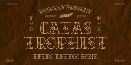 Catastrophist a Retro Tattoo Font that carefully crafted and will bring an cool impression to your project. Catastrophist is perfect for any titles, logo, product packaging, branding project, megazine, social media, wedding, or just used to express words above the background. Catastrophist also come with Multi-Lingual Support. Enjoy the font, feel free to comment or feedback, send me PM or email. Thank You!
 - Hogback by Allouse Studio,
$16.00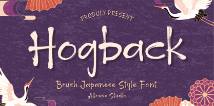 Proudly Presenting, Hogback a Brush Japanese Style Font that will bring an natural imression Asian Style for your need. Hogback is perfect for any tittles, logo, product packaging, branding project, megazine, social media, wedding, or just used to express words above the background. Hogback also come with Multi-Lingual Support. Enjoy the font, feel free to comment or feedback, send me PM or email. Thank You!
 - Moon Charming by Allouse Studio,
$16.00 Proudly Presenting, Moon Charming a Quirky Slab Typeface. Moon Charming is perfect for any titles product packaging, branding project, megazine, social media, wedding, or just used to express words above the background. Moon Charming come with two styles, regular and slab. Each style come with Multi-Lingual Support. Enjoy the font, feel free to comment or feedback, send me PM or email. Thank You!
 - Neug Asia by Allouse Studio,
$16.00 Proudly Presenting, Neug Asia. A font duo that will give you an a classy impression! Neug Asia can be display for any titles, logo, product packaging, branding project, megazine, social media, wedding, or just used to express words above the background. Neug Asia come with Multi-Lingual Support. Enjoy the font, feel free to comment or feedback, send me PM or email. Thank You!
 - Soul Doubt by Allouse Studio,
$16.00 Proudly Presenting, Soul Doubt a Graffiti Font with Two Syles. Soul Doubt is perfect for any tittles, logo, product packaging, branding project, megazine, social media, wedding, or just used to express words above the background. Both font come with underline styles and extras, also come with Multi-Lingual Support. Enjoy the font, feel free to comment or feedback, send me PM or email. Thank You!
 - Star Whisper by Allouse Studio,
$16.00 Star Whisper a Fun Handwritten Easter Font that will bring joy to your Easter Season. Star Whisper is perfect for any tittles, logo, product packaging, branding project, megazine, social media, wedding, or just used to express words above the background. Star Whisper also come with Multi-Lingual Support. Enjoy the font, feel free to comment or feedback, send me PM or email. Thank You!
 - Twist Jelly by Allouse Studio,
$16.00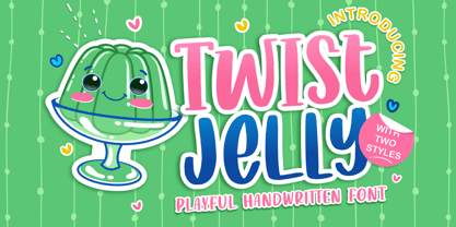 Proudly Presenting, Twist Jelly a Playful Handwritten Font with two styles, Basic and Slab Serif. Twist Jelly is perfect for any tittles, logo, product packaging, branding project, megazine, social media, wedding, or just used to express words above the background. Twist Jelly come with Multi-Lingual Support for each style. Enjoy the font, feel free to comment or feedback, send me PM or email. Thank You!
 - HGB Info SC by HGB fonts,
$10.00 It's nice when a font provides old style figures, small caps and alternate letters. But what if my typesetting program doesn't support Open Type features? The solution may be old-fashioned, but it's effective: the variants are placed in separate font families: Standard, Old Style Figures (OSF), and Small Caps (SC). Any word processor can handle it. HGB Info SC adds real Small Caps to HGB Info.
 - La Maison Brush by Allouse Studio,
$16.00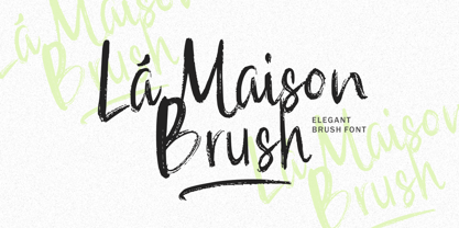 La Maison Brush a Elegant Brush Font with many options underline styles for your need! La Maison Brush is perfect for any tittle, logo, product packaging, branding project, megazine, social media, wedding, or just used to express words above the background. La Maison Brush also come with Multi-Lingual Support. Enjoy the font, feel free to comment or feedback, send me PM or email. Thank You!
 - Starella Tattoo by Mans Greback,
$59.00 Starella Tattoo is a professional typeface with flowing letter forms representing the merge between beauty and attitude. The font is provided as a regular version, as well as a version decorated with diamonds in each letter. Use symbols _ [ ] at any place in a word to create swashes. Example: S[tarellaTatt]oo It supports all Latin-based European languages, contains numbers and all symbols you'll ever need.
 - Mandalaz Sensei by Allouse Studio,
$14.00 Mandalaz Sensei is a Brush Font Family. These font come with Multi-Lingual Support and swash separated to make it easier to play with. Mandalaz Sensei is perfect for any tittles, logo, product packaging, branding project, megazine, social media, wedding, or just used to express words above the background. Enjoy the font, feel free to comment or feedback, send me PM or email. Thank You!
 - Zooja by Aerotype,
$48.00 Zooja™ and Zooja Light have alternates for every capital and lowercase letter, consecutive characters are controlled with the OpenType Ligature feature. Zooja Elements & Borders has 90+ fun decorative doodads, borders and corners that play well with the fonts. Zooja Catchwords has 60+ hand drawn word glyphs and Zooja Banners & Patterns has 17 repeatable patterns and 50+ banner and frame elements to help pull it all together.
 - Adelaide & Georgie by Allouse Studio,
$16.00 Adelaide & Georgie a Friendly Handwritten Typeface that will give you an fun, playful and friendy impression. Adelaide & Georgie is perfect for any tittles, logo, product packaging, branding project, megazine, social media, wedding, or just used to express words above the background. Adelaide & Georgie also come with Multi-Lingual Support. Enjoy the font, feel free to comment or feedback, send me PM or email. Thank You!