10,000 search results
(0.049 seconds)
- Bleakfall by Allouse Studio,
$16.00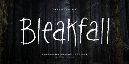 Proudly Present, Bleakfall a Handdrawn Horror Typeface. Bleakfall is perfect for any titles, logo, product packaging, branding project, megazine, social media, wedding, or just used to express words above the background. Bleakfall also come with Multi-Lingual Support. Enjoy the font, feel free to comment or feedback, send me PM or email. Thank You!
 - History Valentine by Skinny Type,
$15.00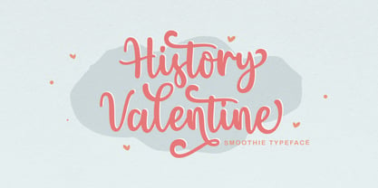 Proudly Present, History Valentine Font. History Valentine is a Modern Handwritten Font. History Valentine is perfect for product packaging, branding project, megaazine, social media, wedding, or just used to express words above the background. History Valentine also multilingual support. Enjoy the font, feel free to comment or feedback, send me PM or email. Thank you!
 - Sheilablue by Allouse Studio,
$16.00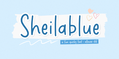 Proudly Presenting, Sheilablue A Fun Quirky Font Sheilablue is perfect for any titles, logo, product packaging, branding project, megazine, social media, wedding, or just used to express words above the background. Sheilablue also come with Multi-Lingual Support. Enjoy the font, feel free to comment or feedback, send me PM or email. Thank You!
 - Glathope by Allouse Studio,
$16.00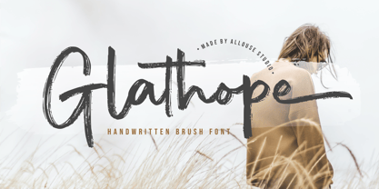 Proudly Presenting, Glathope is A Handwritten Brush Font Glathope is perfect for any titles, logo, product packaging, branding project, megazine, social media, wedding, or just used to express words above the background. Glathope also come with Multi-Lingual Support. Enjoy the font, feel free to comment or feedback, send me PM or email. Thank You!
 - Sahhira Wishess by Rotterlab Studio,
$12.00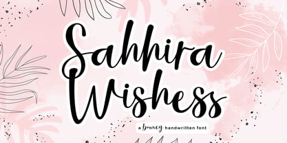 Proudly Present, Sahhira Wishess Font. Sahhira Wishess is a Modern Handwritten Font. Sahhira Wishess is perfect for product packaging, branding project, megaazine, social media, wedding, or just used to express words above the background. Sahhira Wishess also multilingual support. Enjoy the font, feel free to comment or feedback, send me PM or email. Thank you!
 - Highfilm by Allouse Studio,
$16.00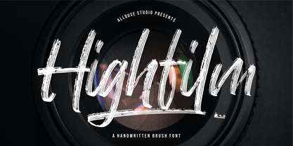 Proudly Present, Highfilm a Handwritten Brush Font Highfilm is perfect for any titles, logo, product packaging, branding project, megazine, social media, wedding, or just used to express words above the background. Highfilm also come with Multi-Lingual Support. Enjoy the font, feel free to comment or feedback, send me PM or email. Thank You!
 - Rhapsoline by Allouse Studio,
$16.00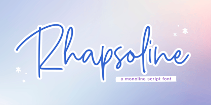 Proudly Presenting, Rhapsoline A Monoline Script Font. Rhapsoline is perfect for any titles, logo, product packaging, branding project, megazine, social media, wedding, or just used to express words above the background. Rhapsoline also come with Multi-Lingual Support. Enjoy the font, feel free to comment or feedback, send me PM or email. Thank you!
 - Adelliatte by Allouse Studio,
$16.00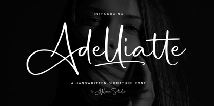 Proudly Presenting, Adelliatte A Handwritten Signature Font. Adelliatte is perfect for any titles, logo, product packaging, branding project, megazine, social media, wedding, or just used to express words above the background. Adelliatte also come with Multi-Lingual Support. Enjoy the font, feel free to comment or feedback, send me PM or email. Thank You!
 - Talklessy by Allouse Studio,
$16.00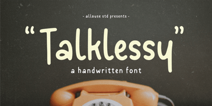 Proudly Presenting, Talklessy A Quirky Handwritten Font. Talklessy is perfect for any titles, logo, product packaging, branding project, megazine, social media, wedding, or just used to express words above the background. Talklessy also come with Multi-Lingual Support. Enjoy the font, feel free to comment or feedback, send me PM or email. Thank You!
 - Brother Siam by Arttype7,
$13.00 Brother Siam font, is a handwritten font with a professional signature style. equipped with 30 ligatures to add a natural impression. It is perfect for business cards, wedding invitations, fashion magazines, photography watermarks, logos, product packaging, branding projects, megazines, social media, weddings, or just to use to express the words over the background. regards
 - Chocobelly by Allouse Studio,
$16.00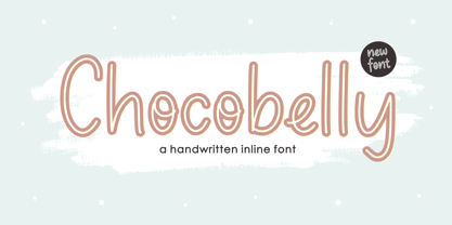 Proudly Presenting, Chocobelly A Handwritten Inline Font. Chocobelly is perfect for any titles, logo, product packaging, branding project, megazine, social media, wedding, or just used to express words above the background. Chocobelly also come with Multi-Lingual Support. Enjoy the font, feel free to comment or feedback, send me PM or email. Thank You!
 - Baltiholm by Allouse Studio,
$16.00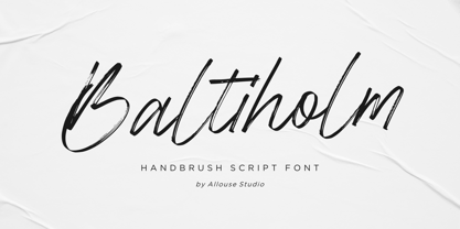 Proudly Presenting, Baltiholm A Handbrush Script Font. Baltiholm is perfect for any titles, logo, product packaging, branding project, megazine, social media, wedding, or just used to express words above the background. Baltiholm also come with Multi-Lingual Support. Enjoy the font, feel free to comment or feedback, send me PM or email. Thank You!
 - Jolystmas by Allouse Studio,
$16.00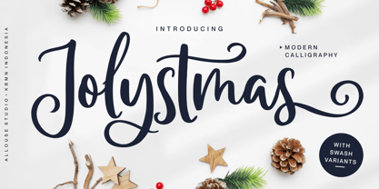 Proudly Presenting, Jolystmas a Modern Calligraphy Font. Jolystmas is perfect for any titles, logo, product packaging, branding project, megazine, social media, wedding, or just used to express words above the background. Jolystmas also come with Multi-Lingual Support. Enjoy the font, feel free to comment or feedback, send me PM or email. Thank You!
 - Boomsplash by Allouse Studio,
$16.00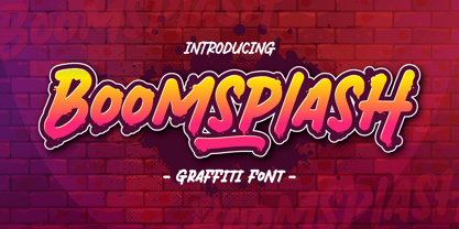 Proudly Presenting, Boomsplash a Tagging Graffiti Font. Boomsplash is perfect for any titles, logo, product packaging, branding project, megazine, social media, wedding, or just used to express words above the background. Boomsplash also come with Multi-Lingual Support. Enjoy the font, feel free to comment or feedback, send me PM or email. Thank you!
 - Fachristar by Allouse Studio,
$16.00 Proudly Presenting, Fachristar A Fun All - Caps Font. Fachristar is perfect for any titles, logo, product packaging, branding project, megazine, social media, wedding, or just used to express words above the background. Fachristar also come with Multi-Lingual Support. Enjoy the font, feel free to comment or feedback, send me PM or email. Thank You!
 - Onlychalk by Allouse Studio,
$16.00 Proudly Presenting, Onlychalk A Handmade Chalk Font Onlychalk is perfect for any titles, logo, product packaging, branding project, megazine, social media, wedding, or just used to express words above the background. Onlychalk also come with Multi-Lingual Support. Enjoy the font, feel free to comment or feedback, send me PM or email. Thank You!
 - Gabyrose by Allouse Studio,
$16.00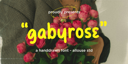 Proudly Presenting, Gabyrose A Monoline Hand drawn Font. Gabyrose is perfect for any titles, logo, product packaging, branding project, megazine, social media, wedding, or just used to express words above the background. Gabyrose also come with Multi-Lingual Support. Enjoy the font, feel free to comment or feedback, send me PM or email. Thank You!
 - Heartcraft by Allouse Studio,
$16.00 Proudly Present, Heartcraft a Handwritten Signature Font. Heartcraft is perfect for any titles, logo, product packaging, branding project, megazine, social media, wedding, or just used to express words above the background. Heartcraft also come with Multi-Lingual Support. Enjoy the font, feel free to comment or feedback, send me PM or email. Thank You!
 - Shinymotion by Allouse Studio,
$16.00 Proudly Presenting, Shinymotion A Monoline Script Font. Shinymotion is perfect for any titles, logo, product packaging, branding project, megazine, social media, wedding, or just used to express words above the background. Shinymotion also come with Multi-Lingual Support. Enjoy the font, feel free to comment or feedback, send me PM or email. Thank You!
 - Lemonmint by Allouse Studio,
$16.00 Proudly Presenting, Lemonmint A Cute Handwriten Script Font. Lemonmint is perfect for any titles, logo, product packaging, branding project, megazine, social media, wedding, or just used to express words above the background. Lemonmint also come with Multi-Lingual Support. Enjoy the font, feel free to comment or feedback, send me PM or email. Thank You!
 - Montageway by Allouse Studio,
$16.00 Proudly Presenting, Montageway A Bold Brush Script Font. Montageway is perfect for any titles, logo, product packaging, branding project, megazine, social media, wedding, or just used to express words above the background. Montageway also come with Multi-Lingual Support. Enjoy the font, feel free to comment or feedback, send me PM or email. Thank You!
 - Ninetys Starfox by Allouse Studio,
$16.00 Proudly Presenting, Ninety Starfox A Playful DIsplay Font. Ninety Starfox is perfect for any titles, logo, product packaging, branding project, megazine, social media, wedding, or just used to express words above the background. Ninety Starfox also come with Multi-Lingual Support. Enjoy the font, feel free to comment or feedback, send me PM or email.
 - Franksthone by Allouse Studio,
$16.00 Proudly Presenting, Franksthone A Handwritten Brush Font Franksthone is perfect for any titles, logo, product packaging, branding project, megazine, social media, wedding, or just used to express words above the background. Franksthone also come with Multi-Lingual Support. Enjoy the font, feel free to comment or feedback, send me PM or email. Thank You!
 - Sweet Square by Sweet,
$39.00The Engraver’s Square Gothic—like its rounder cousin, the engraver’s sans serif, Sweet® Sans,has been one of the more widely used stationer’s lettering styles since about 1900. Its minimal forms, made without curves, were popularized long ago by bankers and others seeking a serious, established feel to their stationery. One might argue that the design is a possible precursor to Morris Fuller Benton’s Bank Gothic® typeface. Sweet® Square is based on antique engraver’s lettering templates called “masterplates.” Professional stationers use a pantograph to manually transfer letters from these masterplates to a piece of copper or steel that is then etched to serve as a plate or die. This demanding technique is rare today given that most engravers now use a photographic process to make plates, where just about any font will do. But the lettering styles engravers popularized during the first half of the twentieth century remain both familiar and appealing. Referencing various masterplates, Mark van Bronkhorst has drawn Sweet Square in nine weights. The sources offered just uppercase, small caps, and figures, yet similar, condensed examples had a lowercase, making it possible to interpret a full character set for Sweet Square. Italics were also added to give the family greater versatility. The fonts are available as basic, “Standard” character sets, and as “Pro” character sets offering special characters, a variety of typographic features, and full support for Western and Central European languages. Sweet Square gives new life to an uncommon class of typeface: an early twentieth-century commercial invention that brings a singular verve to modern design. Its unique style is as useful as it is novel. Bank Gothic is a registered trademark of Grosse Pointe Group LLC. - Sweet Square Pro by Sweet,
$59.00 The Engraver’s Square Gothic—like its rounder cousin, the engraver’s sans serif, Sweet® Sans,has been one of the more widely used stationer’s lettering styles since about 1900. Its minimal forms, made without curves, were popularized long ago by bankers and others seeking a serious, established feel to their stationery. One might argue that the design is a possible precursor to Morris Fuller Benton’s Bank Gothic® typeface. Sweet® Square is based on antique engraver’s lettering templates called “masterplates.” Professional stationers use a pantograph to manually transfer letters from these masterplates to a piece of copper or steel that is then etched to serve as a plate or die. This demanding technique is rare today given that most engravers now use a photographic process to make plates, where just about any font will do. But the lettering styles engravers popularized during the first half of the twentieth century remain both familiar and appealing. Referencing various masterplates, Mark van Bronkhorst has drawn Sweet Square in nine weights. The sources offered just uppercase, small caps, and figures, yet similar, condensed examples had a lowercase, making it possible to interpret a full character set for Sweet Square. Italics were also added to give the family greater versatility. The fonts are available as basic, “/fonts/sweet/square/” character sets, and as “Pro” character sets offering special characters, a variety of typographic features, and full support for Western and Central European languages. Sweet Square gives new life to an uncommon class of typeface: an early twentieth-century commercial invention that brings a singular verve to modern design. Its unique style is as useful as it is novel. Bank Gothic is a registered trademark of Grosse Pointe Group LLC.
 - Laima by TypeTogether,
$39.00 Laima is the brush-formed stencil from Bogidar Mascareñas that will create an ovation for branding, album art, upscale venues, and packaging. If wide appeal, attention to detail, or international reach is necessary for your brand, consider Laima’s high-calibre design as your personal ambassador. The general font user is accustomed to stencil typefaces that have a brute look to them — industrial, mechanical, restrictive, or even militarised. Stencils are commonly used because they serve a function, like spray-painting over template letters, giving the reader a warning that must be heeded for safety, or a command to follow immediately. Wooden crates and grunge art are the medium and black or red paint are the norm. Laima, instead, creates a stencil from the world of calligraphy to turn all this on its head. Laima’s 12 stencil styles (six roman and six italic) use the junctures of calligraphic strokes as an opportunity to achieve an uncommon stencil effect, shifting to create unexpected shapes and the illusion of twisted, disconnected overlaps. Inspired by “Arte Nueva de Escribir”, an engravings book published by Francisco Palomares in 1776, Laima progressed well beyond its beginning as a Type and Media Master’s project at KABK, The Hague (NL). It sometimes required completely new character shapes to accommodate the space needed for clear diacritic marks, and was further enhanced with flourishes and alternates for liveliness and variety in individual or branded work. Laima’s italic begins with swashes and uses OpenType features to automatically turn them off with more than two successive capital letters. Use one swashed character for a drop cap, two for ligatured fun, turn them on or off at your discretion, or change the ascender length and swash shape to suit your creative need. With two styles of numerals and stylistic sets for final forms, Laima’s 12 styles and hundreds of Latin-based languages can turn simple words into an occasion that would immediately benefit high-class brands and special uses. Set that article title, release that new product, code your best-looking UI yet, letterpress that business card, and print that gourmet label. Whatever is next, Laima is the unexpected stencil partner to introduce it to an expectant world.
 - Mikha by Eurotypo,
$19.00 Mikha, designed by Carine de Wandeleer, is a delightfully handwritten family font which keeps the casual drawing of a marker with clean strokes. Its slight bounce and intentional irregularity, gives your words a wonderful flow. This new font family with 736 glyphs, includes Regular, Condensed and Sans. It has OpenType features such as Stylistics alternates, Swashes, Ligatures, up to five Stylistic sets by letter, initial and terminal forms in upper and lower, ornaments that allow you to mix and match pairs of letters and a Central European language support to fit your design. This OpenType features may only be accessible via OpenType-aware applications, or the Character Map to view and copy any of the extra characters to paste into your favorite text editor/app. This will help your creativity and make it easier to make expressive and elegant your typographic work. Also with Mikha Sans it is possible to write all in capitals. Mikha looks lovely on wedding invitations, greeting cards, logos, posters, labels, t-shirt design, logos, business-cards and is perfect for using in ink or watercolor based designs, fashion, magazines, food packaging and menus, book covers and whatever your imagination holds! Enjoy it!
 - Mettalian by Gilar Studio,
$16.00 Mettalian is an modern calligraphy font that is suitable for branding, signature, wedding invitation, promotion, product packaging, logo, quote, and other needs. This font is modern, simple, but still authentic. You will get full set of lowercase and uppercase letters, numerals and punctuation, multilingual symbols, lowercase beginning and ending swashes, and ligatures. All of features and special characters of this font are included in one file. So it is easy to accessed by using program or software that support the opentype like Adobe Illustrator, Adobe Photosop, and Adobe Indesign). This font also very easy to use because compatible for all software even for non-opentype supported. If you don't have a program that supports OpenType features such as Adobe Illustrator and CorelDraw X Versions, you can access all the alternate glyphs using Font Book (Mac) or Character Map (Windows). To Access Alternate Characters Click The Link Below: Adobe illustrator CS https://www.youtube.com/watch?v=geL0Ye02Ryk Adobe illustrator CC https://www.youtube.com/watch?v=V25yiUh8BcE Ms Word https://www.youtube.com/watch?v=HxkhZiCuwEw Coreldraw X7 https://www.youtube.com/watch?v=UBVsufJjons Adobe Photoshop CC https://www.youtube.com/watch?v=BYKXl58AdNY Indesign CS https://www.youtube.com/watch?v=HgZTCxKG14Q Check my other Font here : https://gilarstudio.com/
 - Parteys by Craft Supply Co,
$20.00 Introducing Parteys – Brush Script Dynamic and Captivating: Parteys – Brush Script is a font that exudes dynamism with its varied stroke widths, making it perfect for creating eye-catching displays. Expressive Brush Strokes: This font boasts expressive brush strokes that give your text a lively and energetic appearance, making it ideal for projects that demand a touch of excitement. Versatile Design Possibilities: Parteys – Brush Script offers versatility in design, suitable for a wide range of creative applications, from posters and invitations to branding and social media graphics.
 - Graphit by HVD Fonts,
$40.00 Graphit is a typeface designed by Lit Design Studio & curated by HvD Fonts. It combines clear, geometric shapes with edgy yet finely-crafted details. Graphit features uncompromising characters such as G, Q, f, k and 1. It works well both for impactful headlines and for reading sizes. The type family consists of six weights plus matching italics. In early 2018, Livius Dietzel & Tom Hoßfeld started developing the typeface’s essential character and released a free font named after the studio, Lit. Just a few months later, Hannes von Döhren had a look at the typeface and suggested expanding it into a family – then publishing it with HvD Fonts. They drew every single letter from scratch, and also decided to give the font a new name — Graphit. The family features six low-contrast weights, ranging from Black to Thin. Every character has been crafted to give it a distinctive and individual feel. Medium, Regular and Light are optimized for usage in copy text. For smaller font sizes & longer body copy, the alternate character set features a double-story a and a simplified Q, f, r and t for improved legibility. All fonts are manually hinted for optimal performance on digital devices.
 - Whisky Fudge by Braw Type,
$16.00 Whisky fudge is a tasty handmade font! With its smooth edges and fun style Whisky Fudge will make your creative projects look simply delicious! Giving your design ideas a more personal touch, it’s a great choice for gift tags, greeting cards and invitations. The font comes with a set of standard ligatures (including double letters) and 5 final form characters to add extra flavour to your words. Uppercase letters also look great on their own for added creativity. Enjoy!
 - Delegat by GRIN3 (Nowak),
$16.00 Delegat is a comic book lettering font inspired by handwritting of Frank Ching. The family includes Regular, Italic and Bold version. Delegat contains two variations for each letter and ligatures to swap out any two identical letters that appear next to one another for a pair that is slightly different. Delegat Extra can be used to disguise curse words in comics. Language support includes Western, Central and Eastern European character sets, as well as Baltic and Turkish languages.
 - Eletric Lady by RM&WD,
$49.00 Electric Lady in a light script with a great amount of different possibilities. With Electric Lady font family you can to turn on various features (Ligatures, Stylistic Alternates, Contextual Alternates, Swashes, 3 completely different Stylistic sets) to auto swap out letter sets with alternate versions. - More than 3,000 glyphs - 100 different numbers shapes - 110 different ornaments In the Extra 2 style, you'll find many different standalone words, kitchen icons, menu icons, swashes, and extra fun characters!
 - FS Silas Sans by Fontsmith,
$80.00 The great enigma There are hidden depths to FS Silas Sans. First impressions are of a functional, multi-purpose typeface with a cool, edgy, angular character. Gaze into its eyes a little longer, though, and you'll detect a more nuanced, colourful personality, with full, open, satisfyingly squarish forms balancing the abruptness of the sharply-angled terminals and ascenders. Authoritative, official and stern on the outside; amiable and welcoming on the inside. You’re so Dane The designers, led by Phil Garnham, were trying to capture something straight-talking, authentic, and a little... Scandinavian. ‘We were thinking about some of the characters in Danish dramas that were on in the early stages of the font’s development, like The Killing and The Bridge,’ says Phil. ‘The police officers, that is, not the psychopathic killers. Smart and a bit cool, but with a warm heart.’ For a good Danish name, we settled on Silas. It was that or Hans-Christian. The finer points Silas Sans rewards close inspection. Study, if you will, its amply squarish forms, the roomy ‘o’ and ‘e’, in particular. Observe the angular ascenders and terminals of, for example, the ‘L’, ‘I’, ‘d’ and ‘i’, inferring the movement and lift of a pen. Consider the cuts to the ‘A’ and ‘v’ that create harmony with adjacent letters. And scrutinise the subtle ink traps set within the ‘A’ and ‘Y’ for reproduction at small sizes. A fine subject, we think you’ll agree, and available in a versatile range of weights to make (with FS Silas Slab) a typographic system with a comprehensive hierarchy.
 - Dainty Lady by Solotype,
$19.95You will see this in the old type catalogs as Dainty. Late in the nineteenth century, type founders developed a number of fonts with a "pen-drawn" look. They wanted to complete with the work of the hand lettering artists who were coming into their own, thanks to the new art of photoengraving - Astrospy JNL by Jeff Levine,
$29.00Astrospy JNL is a square-shaped, futuristic techno-style font from Jeff Levine. It is very well suited for short phrases, but caution should be used in setting too many words with it because of legibility issues. Best used in larger point sizes. - Fattty by Drawwwn,
$15.00 Fattty is a chunky fun font with plenty of wobbly bits. It's perfect for bold brands and funky projects. It's friendly curves are a great fit in kids books or on chubby posters. But remember, say it loud I'm fat and I'm proud!
 - Waykers Amor by Maulana Creative,
$15.00 Introducing Waykers Amor Blackletter Font Waykers Amor Blackletter Font is a handmade Modern Victorian handlettering, which is combining modern and classic typography with some awesome alternates. Yes we back to early 1800s, bring classic touch on this decade. Thanks for use this font. MaulanaCreative.
 - MC Allaize by Maulana Creative,
$14.00 Introducing Allaize Blackletter Display Font. Allaize Blackletter Font is a handmade Modern Victorian handlettering, which is combining modern and classic typography with some awesome alternates. Yes we back to early 1800s, bring classic touch on this decade. Thanks for use this font. Maulana Creative.
 - Bahud Aroyek by Maulana Creative,
$22.00 Bahud Aroyek Decorative Display Font Blackletter Bahud Aroyek Vintage is a handmade Modern Victorian handlettering, which is combining modern and classic typography with some awesome alternates. Yes we back to early 1800s, bring classic touch on this decade. Thanks for use this font. MaulanaCreative.