10,000 search results
(0.048 seconds)
- Kamasunday by Alit Design,
$21.00 Introducing Kamasunday Dynamic Blackletter, a typeface that seamlessly blends the timeless elegance of blackletter script with a modern, dynamic twist. This font is a perfect fusion of tradition and innovation, offering an impressive array of 837 meticulously crafted glyphs, ligatures, and alternates that will elevate your designs to new heights. Key Features: Dynamic Wave Design: Kamasunday Dynamic Blackletter features a captivating wave-like design that adds a sense of movement and energy to your text. Each character flows seamlessly into the next, creating a visually stunning and cohesive text. Modern Elegance: This font embodies the essence of modern elegance, making it perfect for a wide range of design projects, from branding and packaging to invitations and posters. Extensive Glyph Set: With a whopping 837 glyphs at your disposal, you have access to a vast selection of characters, including uppercase and lowercase letters, numerals, punctuation, and a variety of special characters, ensuring your design needs are met with versatility. Ligatures: Kamasunday Dynamic Blackletter includes an extensive set of ligatures, allowing you to achieve a more fluid and natural look in your text. These ligatures create seamless connections between characters for a polished and sophisticated appearance. Alternates: The font offers an abundance of alternate characters and swashes, giving you the creative freedom to experiment and customize your text. These alternates add an extra layer of uniqueness to your designs. Versatile Usage: Whether you're designing a vintage-inspired logo, a Gothic-themed poster, or a contemporary Music event poster, Kamasunday Dynamic Blackletter adapts beautifully to various design contexts. Timeless Appeal: While embracing modernity, this font retains the timeless charm of traditional blackletter script, making it a versatile choice for projects that demand a touch of history and sophistication. Elevate your design projects with Kamasunday Dynamic Blackletter, where the past and present merge into a harmonious typographic masterpiece. This font promises to breathe life into your creative visions, making your designs stand out with its unique style and extensive character set.
 - Dersima by Cankat Saribas,
$10.99 Home. Dersima is a stencil display typeface that is a homage to past relatives and ancestors of genocide and oppression. The philosophy of the typefaces missing parts symbolizes the dark and confusing history and the struggle for equality of the Alevi Kurds. The objective of this typeface is to live on and make sure they are not forgotten.
 - Girl Script by Scholtz Fonts,
$10.00 Based on the popular Girltalk font, cute, cheeky Girlscript, was specially designed for the young-teen market. I felt that it was time for Girltalk to have a "big sister" script font to complete the group. Pretty & feminine, with a large dose of cheek, Girlscript is great for: -- “girl style” stationery -- diary covers -- clothing hang-tags -- party invitations -- greeting cards -- book covers -- movie posters -- CD covers -- game advertising media Girlscript is perfect for hen parties, baby showers, pamper parties and other occasions that bring out the “girl in” women. Think sugar 'n spice, think cute 'n cheeky, add a dash of Girlscript and you're on a winning streak! Girlscript is fully professional, carefully letterspaced and kerned. All upper and lower case characters, punctuation, numerals and accented characters are present.
 - Allay by Twinletter,
$15.00 Allay is a display font with a distinctive and appealing shape that may be used in a wide range of creative design projects. Each letter shape is created using a variety of combinations that provide a one-of-a-kind, innovative, entertaining, and unmistakably aesthetic impression when used. This typeface also comes with typical ligatures and can be used in other languages. This font is perfect for games, sporting events, branding, banners, posters, movie titles, book titles, quotes, logotypes, and more. of course, your various design projects will be perfect and extraordinary if you use this font because this font is equipped with a complimentary font family, both for titles and subtitles and sentence text, start using our fonts for your amazing projects.
 - ITC Bolthole by ITC,
$29.99I fell in love at the age of twelve in Wales, recalls Bernard Philpot. "My father brought me to a small graveyard in the Welsh hills to show me two headstones carved by the great Eric Gill. I instantly fell in love with the beauty of the carving and the perfection of the letterforms. I still go back to marvel at these works of art." However, the ITC Bolthole™ design, Philpot's first commercial typographic endeavor, is quite unlike the works of Eric Gill that first captured his heart. Bolthole is a craggy sans serif with a definite grumpy attitude. It's not terribly legible, and, if more than a few words are set in the design, it's not very readable. To round out its cranky personality, Bolthole does not like to be set in small sizes. Like Cheez Whiz® and bullfights, you either love or hate this typeface. But whichever emotion dominates, there is no denying that Bolthole has a personality to be reckoned with - one with ample magnetism to ensure reader attraction. If used to set brief blocks of display copy, the typeface makes a powerful statement. Bolthole was originally designed to complement a whimsical ad for the Royal Society for the Prevention of Cruelty to Animals. As Philpot recalls, "although the ad didn't win any awards, the type attracted some very positive comments for its original look and feel." Philpot studied graphic design and typography at the London School of Printing, and soon after graduation found himself working in a large advertising agency in London. According to Philpot, "After designing type for everything from packaging to ads, I thought it time to convert one of my designs into a complete font - and Bolthole was born." ITC Bolthole could very well be the Shrek™ of typeface design - which might not be such a bad thing." - Kapsalon by Hanoded,
$12.00 It could be you’ve never heard of Kapsalon and I will forgive you for that. Kapsalon is a Dutch word, meaning ‘hairdresser’s’. Since 2003 it is also a very popular snack food, which consists of french fries, döner kebab, lettuce, sambal, garlic sauce and melted Gouda cheese, served in an aluminium tray. I have to admit that I have never eaten a Kapsalon myself, as I am not too fond of fast food. I named this font package Kapsalon, because, like its namesake, it consists of several unrelated elements that work really well when combined.
 - Garbata by Zetafonts,
$39.00 Garbata was designed in 2020 by Francesco Canovaro, looking for an approach to sans serif design that ignored the over-exploited grotesque and modernist models. It takes its skeleton from old style typefaces like Windsor or Cooper, keeping the quirky sloped shapes of some letters and adding to the historical smooth shapes a flat brush calligraphic sensibility. The result of these different historical influences is a humble yet distinctive sans serif typeface, developed in a wide range of weights, with finely-tuned differences between the medium, text-oriented cuts (with wider tracking and more regular design) and the more extreme, display-oriented weights. This play on subtlety allows Garbata to be surprising in all uses: humble and readable when set in body text, it shows all its elegant, whimsical qualities in logo design and display use. Equipped with all advanced OpenType features you expect from a production typeface, Garbata comes with an extended character set covering over two hundred languages with latin and Cyrillic glyphs. Designed with an Italian sensibility mixing craftsmanship and artistry, Garbata is ready to help you make your designs timeless, elegant and unusual.
 - Equip by Hoftype,
$49.00 Equip, a new versatile geometric sans face in 16 styles, designed on a geometric base, forms together with EquipCondensed and EquipExtended a superfamily of 48 styles. Low contrasted lines and a sturdy ductus give it a strong appearance. It looks open, generous and unsentimental. A large selection of weights and many useful OpenType features allow an easy adjustment for a wide range of applications, in print and on the web. Equip is very well suited for ambitious typography. The Equip family comes in OpenType format with extended language support. All weights contain semi-ligatures (design optimized single characters), proportional lining figures, tabular lining figures, proportional old style figures, lining old style figures, matching currency symbols, fraction- and scientific numerals and arrows.
 - Sassoon Joined NORDIC by Sassoon-Williams,
$66.00 These fonts will join-as-you-type in your OpenType application as shown in the posters above. Choose Use Contextual Alternates option in your app to get basic recommended baseline joins for teaching. Additionally, use can choose from 7 Stylistic Sets of alternative letterforms that are so important for Teachers. Create ‘pen lifts’ anytime too! Fonts display unjoined by default on this website and are delivered that way - joining is controlled by your application. Designed for teaching children, these fonts enable progressive pupil exercises for a smooth transition between separate letters and the teaching of joined handwriting. Purchase a single font or the complete package contains the typeface ‘Sassoon Joined’ in a Regular weight only, for the 5 Nordic languages; Finnish (Suomi), Danish (Dansk), Icelandic (íslenska), Norwegian (Norsk), Swedish (Svenska), with English as the default language in all fonts. These fonts are for use with a compatible OpenType applications such as Word to get joined text. Or, enter " | " between letters for unjoined text. Free to download resources Stylistic Sets and how to access the alternative letters feature in these OpenType fonts Purchasers of this font package may use their Order Number to receive a free Copybook PDF by Rosemary Sassoon recommended for effective teaching
 - Middle Thread by Maculinc,
$15.00 Middle Thread is a Script Font with a retro style. Soft curves are combined with high-contrast glyphs, conveying an attractive retro and vintage quality. This font consists of 4 Middle Thread Fonts Regular, Extrude, Swash and Swash Extrude, with many unique ligatures and alternatives provided. Great in layout design for quotes or body copy, best used as a display for posters, headings, logos, branding, magazines, product packaging, and a wide variety of things. Mix Regular and Swash to create a unique and very beautiful look, especially when you add the Extrude feature of the font, it really adds uniqueness and interest by looking even more amazing. What do you get: Middle Three Regular, Swash, Extrude and Swash Extrude OTF, this font is accessible in Adobe Illustrator, Adobe Photoshop, Adobe InDesign, it even works in Microsoft Word. Fully Encoded Characters are accessible without additional design software. Fonts include multilingual support. Images used : All photos/images/vectors used in the preview are excluded, for illustration purposes only. (www.vecteezy.com) Feel free to follow, like and share. thank you very much for checking my store!
 - ITC Holistics by ITC,
$29.99Some words from the designer... Like a tree rooted in ancient philosophy with branches reaching into the new age, ITC Holistics encompasses 82 pictographs of astrology, healing, magic, nature and spirituality. In an illustration style that originates from hand-carved rubber stamps, west coast designer Teri Kahan shines new light on these timeless symbols. ITC Holistics is functional collectively and individually for graphics and logos. As with Teri's companion font ITC Connectivities, ITC Holistics can also be used as a divining tool. Just type your name in caps and lower case and see what the images tell you! - Rodrigues by Mans Greback,
$59.00 Rodrigues is a casual signature script, designed by Amin Mario and Mans Greback in 2020. A font full of personality and curves, created using quick strokes to for a natural handwritten effect, which to gives the font an organic look in a digital world. The typeface comes with OpenType features such as alternates and ligatures, a bold style and multiple decorative elements. Use { } < > [ ] anywhere in a word to create a swash. Example: Mag[ical The font has extensive lingual support, covering all European Latin scripts. It contains all characters you'll ever need, including all punctuation and numbers.
 - Greater Delight by Allouse Studio,
$16.00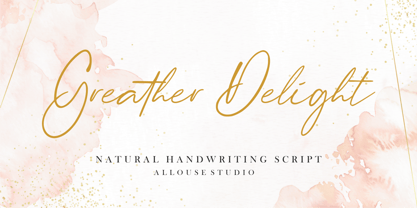 Greater Delight a Natural Handwritting Script. Feel the natural and beautiful handwriting impression! Greater Delight is perfect for any tittles, logo, product packaging, branding project, megazine, social media, wedding, or just used to express words above the background. Greater Delight come with Beginning and Ending swash, also come with multilingual support to fulfill your need! We highly recommend using a program that supports OpenType features and Glyphs panels like many of Adobe apps and Corel Draw, so you can see and access all Glyph variations. Enjoy the font, feel free to comment or feedback, send me PM or email. Thank You!
 - Historium by Burntilldead,
$15.00 Life is a journey and every journey has their own special moments that give a deep personal feeling and memories to always remember. The Historium family is an attempt to capture that. A Harmonious Set: Historium comes with full set of uppercase, lowercase, alternate uppercase, alternate lowercase, ligatures, discretionary ligatures, contextual alternate, subscripts, and superscripts. Please see preview 5 to see the detail. OpenType Support: Please use a software or app that support opentype panel so you can easily access all the characters set like Adobe Photoshop CC, Illustrator CC, Indesign CC, MS Word 2010 or higher, QuarkXPress, ETC.
 - Pixel Retro by JK Creative,
$16.00 Introducing Pixel Retro - Display Typeface Font Pixel Retro is a bitmap font base on the from Namco Arcade Games. This Font is Perfect for Movie, Game, Film, Logo Brand and T shirt Design FEATURES - Uppercase and Lowercase letters - Numbering and Punctuations and Multilingual Support - Works on PC or Mac - Simple Installation - Support Adobe Illustrator, Adobe Photoshop, Adobe InDesign, also works on Microsoft Word Hope you Like it. **Note: All images on the demo is just for preview purpose only and not actually included on the files**
 - HT Neon by Dharma Type,
$19.99 HT Neon shines as if to invite us.This rounded and monoline font is very striking. But it is readable because the characters are arranged naturally when they are typed. HT Neon is great to use on your design projects such as Shop Sign,Packaging, Logotype and more.When you type the character “µ”, it becomes a electrical cord! Holiday Type Project offers retro hand drawing scripts. Inspired by retro script on shopfront lettering, wall paint advertisements in Italy around 1950s. Check out the script fonts from Holiday Type!
 - Nassim Latin by Rosetta,
$60.00 Nassim is a contemporary typeface for multilingual text-setting. With its lively texture and balanced rhythm, Nassim is a proven workhorse for a vast array of applications, from literature to the sciences, scholarly publications to contemporary news. Nassim Latin is stout in colour and resolute in its construction, standing up to the demands of long-form reading. But the heartiness that keeps it going is balanced with lively details: the asymmetric serifs and calligraphic modulation allude just enough to broad-nib flourishes to keep the reader alert and looking for what comes next. Nassim has always been ahead of the curve, bridging the distinct typographic traditions of Arabic and Latin without forcing the typographer into compromise. Nassim Latin offers upright and true italic styles across five weights, supporting more than 110 languages, and designed to pair harmoniously in multi-script settings with Nassim Arabic. Beyond that, it is equipped with smart OpenType features like small caps, case-sensitive punctuation, and a full palette of ranging numerals, fractions, and superior and inferior figures ensure that Nassim Latin is up to any task, be it print publications or delivering late-breaking online news.
 - Essenco Paradiso by Carpiola Studio,
$12.00 Essenco Paradiso is a beautiful and timeless retro vintage-style display font. It is the best choice for creating eye-catching wall posters, logos, branding and quotes. Each letter has a unique and beautiful look, which will bring your designs to life with a playful touch.
 - Grota by Latinotype,
$26.00 Grota is a very expressive font, has a gestural character inspired by the hand lettering . Grota is grotesque, unicase and exceptional. It has six weights ranging from thin to black with their italics. It is ideal for logos, brands, magazines, headlines, books. etc. Photography by Matías Troncoso
 - Zeitung Pro by Underware,
$50.00 Zeitung is a sans serif family which works equally well on print and web. First of all: Zeitung is a sans serif made according to contemporary standards: 8 weights, romans and italics, all equipped with small caps. Lots of OpenType features, like uppercase punctuation or 5 figure styles to make sure any of your mathematical or financial charts, tables and diagrams look cool. Zeitung’s typographic palette focuses on utility and legibility, but in the farthest corners you’ll discover a rich array of flavours: punchy black weights, fashionable thin styles, carefully hand crafted true italics, distinct small caps. But Zeitung has more to offer. Its optical sizes offer the best style for each size of your text. Zeitung fonts are devided to two optical families: Zeitung Standard and Zeitung Micro. Zeitung Standard works great in most sizes, while Zeitung Micro fonts are specially made for very small sizes in print and web. Zeitung Micro fonts are perfectly legible in web, where the same technical font styles have to survive in many environments, from older browsers to most up to date mobile screens. Next to that: the lightest weights also function as grades, because they share the same metrics. This can be very handy for selecting the optimal weight for your specific situation, especially on screens or when type is printed by a newspaper press. Letters are rendered in many various ways on different screens. Maybe the interface of your next app requires a different grade than your latest website? Zeitung allows you to change the weight of your text without any further consequence for the design. That is a welcome relief during the design process. Zeitung will help to bring your message across in many different circumstances, from large text in print to small type on screens.
 - Czykago Rough by TypoGraphicDesign,
$19.00 From 2019 back to the 90s … The typeface “Czykago Rough” by Alexander Branczyk and Manuel Viergutz is a re-issue of the font “Czykago” published in 1995 by the font label “Face2Face”. Designed as a re-release for the Font Foundry “Typo Graphic Design” in 2019. The rough sans serif display font is inspired by the 80s and 90s. Glyhph-Set: Latin Extended (Adobe Latin 3). 907 glyphs with 3× A–Z & a–z and 350+ decorative extras like icons, arrows, dingbats, emojis, symbols, sign of the zodiac, geometric shapes, catchwords, decorative ligatures (type the word #LOVE for ❤ or #SMILE for ☺ as OpenType-Feature dlig) and stylistic alternates (4× stylistic sets). For use in logos, magazines, posters, advertisement plus as webfont for decorative headlines. The font works best for display size. Have fun with this font & use the DEMO-FONT (with reduced glyph-set) FOR FREE! ■ Font Name: Czykago Rough ■ Font Weights: Cond + Stretch + Mix + CondBG + Icons + DEMO (with reduced glyph-set) ■ Font Category: Display for headline size ■ Font Format: .otf (OpenType Font for Mac + Win) + .ttf (TrueType Font) ■ Glyph Set: 907 glyphs with 350+ decorative extras like icons ■ Language Support: 80+ for Latin Extended (Adobe Latin 3). Afrikaans, Albanisch, Baskisch, Bemba, Bena, Bosnisch, Dänisch, Deutsch, Englisch, Estnisch, Färöisch, Filipino, Finnisch, Französisch, Friulisch, Galizisch, Gusii, Indonesisch, Irisch, Isländisch, Italienisch, Kabuverdianu, Kalenjin, Katalanisch, Kinyarwanda, Kölsch, Kornisch, Kroatisch, Lettisch, Litauisch, Luhya, Luo-Sprache, Luxemburgisch, Machame, Madagassisch, Makhuwa-Meetto, Makonde, Malaiisch, Manx, Morisyen, Niederländisch, Niedersorbisch, Nord-Ndebele, Norwegisch Bokmål, Norwegisch Nynorsk, Nyankole, Obersorbisch, Oromo, Pare, Polnisch, Portugiesisch, Rätoromanisch, Rombo, Rukiga, Rumänisch, Rundi, Rwa, Samburu, Sango, Sangu, Schottisches Gälisch, Schwedisch, Schweizerdeutsch, Sena, Shambala, Shona, Slowakisch, Slowenisch, Soga, Somali, Spanisch, Suaheli, Taita, Teso, Tschechisch, Türkisch, Turkmenisch, Ungarisch, Vunjo, Zulu ■ Specials: Alternative letters, stylistic sets, automatic contextual alternates via OpenType Feature (3× different versions of A–Z & 0–9 + a–z), Euro, kerning pairs, standard & decorative ligatures, Versal Eszett (German Capital Sharp S), 350+ extras like Dingbats & Symbols, arrows, hearts, emojis/smileys, stars, further numbers, lines & geometric shapes ■ Design Date: 1995–2019 ■ Type Designer: Alexander Branczyk and Manuel Viergutz
 - Baker Street by Kimmy Design,
$20.00 Baker Street was inspired by a recent trip to London, England where I happened upon a bustling pub with beautiful typographic signage. Early sketches created an array of specialized ligatures from which the font really took shape. The family is comprised of regular, italic, inline and a rustic textured style. Baker Street delivers a multitude of Opentype features, primarily including hundreds of discretionary ligatures that connect letter pairs through varying flourishes. These distinct ligatures are used in combinations between two capital letters, two lowercase letters, uppercase to lowercase pairs and specific number combinations. For a number of capital and lowercase letters, large swashes expand above and below the characters. Contextual swashes are also applied to some characters when placed at the beginning or end of a word. Stylistic Alternatives and Titling Alternatives offer distinct style variations to capital letters. Tabular Lining and Oldstyle Figures provide several numerical alternatives. Lastly, the family also includes two sets of ornaments created specially to work with Baker Street’s style. With all that, Baker Street provides each and every user the tools to solve their own case. The game is on!
 - Secret Scrypt by Canada Type,
$29.95Emulating real handwriting has always been an aim of font designers in the digital age. The standard mainstream scripts and doodles that were available for the longest time have not successfully reached that goal. A letter always looked the same wherever you placed it. Some workarounds, such as letter alternates and ligatures, were used in many fonts, but they were a bit inconvenient to use, and in some cases didn't work correctly because they had to be placed in separate fonts from the main character set. Not until now, with OpenType technology, have we been able to emulate real handwriting, by including multiple character sets in the same font and programming it for smart form changes through letter sequence counting. Secret Scrypt was the first Canada Type font to make it to the bestseller list in the summer of 2004. In early 2005 a New York restaurant chain picked Secret Scrypt to use on its menus and internal signage, but they wanted to look even more like real handwriting, where two or three instances of the same letter used in one word would automatically change and look different from each other. Using OpenType technology, Canada Type produced a Secret Scrypt Pro for that restaurant chain under the direction of Mucca Design in New York City. That initial version contained three different character sets in the same font, and some intelligent programming that determines the sequence of the letters and change their shapes accordingly. Now the retail version of Secret Scrypt Pro is available, with four character sets built into the font for even more variety on the real handwriting theme. Make sure to check out the Secret Scrypt Pro PDF in the MyFonts gallery for tips on using Secret Scrypt Pro. Secret Scrypt is perfect for menus, handwritten notes, theater programmes, charity organization posters, and any design that attempts to get close to people with the personal magic of real handwriting. - Penelope by Solotype,
$19.95This was originally brought out as a caps-only font, but later the foundry scrounged up a lowercase that wasn't our idea of a very good match. So we cleaned up the caps and made them a bit bolder, then drew a harmonizing lowercase. - Oktah Neue by Groteskly Yours,
$25.00 Oktah Neue is an extended version of a more limited Oktah family. Since its release in 2019, Oktah Neue received two major updates, the most recent in June 2022. The latest version of Oktah Neue is comes in 22 styles as well as one variable font. Oktah Neue inherits the best traits of Oktah—great legibility, simple geometric letters shapes, low contrast across all styles—but also introduces what Oktah fell short of: extensive language support and enhanced OpenType features. While working on Oktah Neue, we strove to create a neutral typeface that would be a workhorse for designers, typographers and other font users alike. Building onto the familiar shapes of Oktah, we tried to make them more neutral, at the same time preserving the unique character of the typeface. Certain characters remained the same, others have undergone a complete transformation, which left them better tailored for the wide implementation range of Oktah Neue. Over the past years the size of the character set in Oktah Neue was significantly expanded (currently standing at 2500+ characters). In addition to Extended Latin, new language systems (Extended Cyrillic, Greek — both Basic and Polytonic — and Hebrew) were introduced. The already vast Cyrillic set also includes localised forms for such languages as Bulgarian, Serbian and many others. Oktah Neue is OpenType friendly: it knows how to do alternatives, contextual alternatives, switch various between stylistic sets and adjust the height of punctuation and symbols as you type. Small Caps include all listed languages as well as numerals and symbols. Oktah Neue comes equipped with various styles of numerals — from standard Proportional Lining figures to Oldstyle, Tabular Oldstyle. Sub- and Superscript, Fractions and two sets of circled numbers. Oktah Neue is well-kerned with more than 3000 kerning pairs and automatically hinted. Oktah Neue comes in 22 styles (11 uprights and 11 italics), two of which — Ultra Light and Black Italic — can be downloaded free of charge to get a firsthand experience of what Oktah Neue is ready to offer. The latest update of Oktah Neue introduced a fully variable option: now, both axes (Slant and Weight) can be accessed in the same file for utmost convenience.
 - Caballero by Fabio Godoy,
$29.95 Typographical Caballero is a family created by Fabio Eduardo Godoy Angel, the concept is inspired by a type with firm and clear, with perfect posture and personality to be used by Graphic Designers and Architects, in terms of print, TV Corporate Identity, Merchandising - Other Projects. Ideal for antetétulos, titles, subtitles, texts from 12 Pts. Caballero Outline and Caballero Outline Italic, are presented as an option for antetétulos, titles and subtitles as well as short texts from 20 Pts. Caballero in his presentation Outline, allows wide range of applications in regard to the use of color, and be combined with Caballero Regular and Caballero Italic. Font Project Caballero, is set with a vertical and horizontal logic calligraphic lines, amount of contrast medium, antlers mullet and its completions are straight.
 - Zin Serif by CarnokyType,
$46.00 Zin Serif is a contemporary typeface designed for various situations of typographic usage. Characteristic feature is a large x-height and balance between neutral construction of letters (strictly vertical axis) and dynamic open forms (opened terminals). Another typical feature is a visually narrower connection between stems and strokes. The complete font family consist of three width proportions (Normal, Condensed and Extended). Every sub-family has 5 weights, ranging from Light to Black with matching Italics. Zin Serif can be effectively used for both text and display typesetting. It can be used especialy in magazine layouts and editorial design, as well in advertising typography, orientation systems, corporate identities and many other situations. Zin Serif is a member of the Zin super family, which also includes Zin Sans, Zin Slab and Zin Display fonts.
 - Point Soft by Ndiscover,
$29.00 Point™ Soft is more than the rounded edges version of Point™, it is a reinterpretation of what a geometric soft font should look like. Clean, simple, and above all: huggable. Point™ Soft conveys that warm and soft feeling. With 20 styles it gives you a lot of versatility (From Hairline to Black), plus it comes with two FREE styles for you to play with before commit yourself to buy it. It has Extended Latin and Cyrillic support, old style, lining and tabular figures and much more. It has a wide range of use possibilities. Since it is a very readable font in small font sizes and the details really pop out in display sizes. Be it on small or large font sizes, Point will make its point.
 - Constant by Underscore,
$32.00 Constant is a meticulously constructed slab serif display typeface of a sturdy lineage. The strong horizontal and vertical rhythm and calculated angles dominate its appearance, yet sweeping broad shapes infuse the design with an overall warm undertone. Constant is best suited for setting short headlines, word marks, posters and other visual communication ephemera. Particular when set in all uppercase the typeface’s squarish and resolute nature commands attention and projects authority. Despite the prominent slab serifs and their angular corner details, these fonts work well also for shorter text passages, especially in the lighter to medium weights. When typesetting Constant in paragraphs spanning several lines the face requires a fair amount of leading to not appear vertically compressed. As customary for Underscore’s catalog the fonts have very extensive support for languages in the Latin script, reaching from Afrikaans to Vietnamese and Zulu. The fonts are carefully spaced, kerned and hinted, and include a variety of typographic glyphs and OpenType features like various ligatures, number features and case alternatives. Constant has been developed and released in 2018 as the proud forth release from the Underscore label. This design by Johannes Neumeier is available from the Underscore webshop as well as selected retailers.
 - Malambo by Sudtipos,
$59.00 The master of the dancing brush, Angel Koziupa, and the node-obsessed perfectionist, Alejandro Paul, offer up another bucket of fun with Malambo. This time Koziupa allows his brush to jitter one whole millimeter, and Paul digitizes with two eyes instead of his usual three. Follow your heart, but consume an ounce of peroxide first. Full of energy and cheeky mischief, Malambo tells the eye amusing stories of mirrorless shaving accidents, wine mistakenly poured over the morning cereal, and someone who trips over his own shadow on the dance floor, yet keeps on dancing. And dancing is what this typeface is all about. Malambo is a traditional Argentine dance performed by the gauchos (the Argentine equivalent of 19th century North American cowboys?). The gauchos are still around in the less than touristic areas of Argentina. And although they dance quite passionately and make the heartiest parrillas, most of them probably don't know what a font is. But you know, and we know. And that's something. Malambo was selected as the Best in show display font at the Biennial Letras Latinas.
 - Cooper Screamers by Wordshape,
$- In 1925, at the request of Barnhart Brothers & Spindler, the foundry he worked for, Oswald Bruce Cooper designed a wide selection of "screamers", oversized exclamation points used to grab attention in display advertising. The foundry rushed the screamers into production, much to Cooper's dismay. Cooper was disappointed with the final form of the screamers– they were designed in assorted weights to match the assorted Cooper series of typefaces, as well as in a variety of other formal solutions- squaredoff, incised, wavy, Tuscan, and rounded. Cooper's working design methodology was to re-draw his projects a number of times in order to refine the formal results. However the screamer project was hastily cut by the head of BB&S's matrix engraving room in fourteen sizes from the initial sketches, causing Cooper to fire off a fiery missive stating, "Everything I draw is bum the first half-dozen times I draw it; the trouble with these is that I drew them only once!" This typeface is the result of researching Cooper's original drawings and series of engraved proofs for the screamers, as well as the original Screamer type specimen. Cooper Screamers have never been available before in digital format.
 - Elefont Emboss by Emboss,
$13.45 Designed to be fat, loud and heavy.
 - Journal Sans New by ParaType,
$40.00 The Journal Sans typeface was developed in the Type Design Department of SPA of Printing Machinery in Moscow in 1940–1956 by the group of designers under Anatoly Schukin. It was based on Erbar Grotesk by Jacob Erbar and Metro Sans by William A. Dwiggins, the geometric sans-serifs of the 1920s with the pronounced industrial spirit. Journal Sans, Rublenaya (Sans-Serif), and Textbook typefaces were the main Soviet sans-serifs. So no wonder that it was digitized quite early, in the first half of 1990s. Until recently, Journal Sans consisted of three faces and retained all the problems of early digitization, such as inaccurate curves or side-bearings copied straight from metal-type version. The years of 2013 and 2014 made «irregular» geometric sans-serifs trendy, and that fact affected Journal Sans. In the old version curves were corrected and the character set was expanded by Olexa Volochay. In the new release, besides minor improvements, a substantial work has been carried out to make the old typeface work better in digital typography and contemporary design practice. Maria Selezeneva significantly worked over the design of some glyphs, expanded the character set, added some alternatives, completely changed the side-bearings and kerning. Also, the Journal Sans New has several new faces, such as true italic (the older font had slanted version for the italic), an Inline face based on the Bold, and the Display face with proportions close to the original Erbar Grotesk. The new version of Journal Sans, while keeping all peculiarities and the industrial spirit of 1920s-1950s, is indeed fully adapted to the modern digital reality. It can be useful either for bringing historical spirit into design or for modern and trendy typography, both in print and on screen. Designed by Maria Selezeneva with the participation of Alexandra Korolkova. Released by ParaType in 2014.
 - Northlane by Hindia Studio,
$15.00 Northlane is minimalist font with smooth and elegant rounded edges. This font is projecting modern and futuristic vibes, perfectly suited for graphic design application ranging from editorial and corporate design to web and interaction design.
 - Conthey Inline by ROHH,
$29.00 Conthey Inline™ is your new retro-display best friend! The one and only, unique IN-AND-OUT typeface with strong personality and outstanding flexibility. This display sans features amazing variable fonts letting you adjust not only width of the letters, but also let you fluently transition from thin inline styles to thin outline ones. This mechanics opens a world full of layering possibilities as well as a great fine-tuning ability. The family consists of 39 OpenType fonts - 18 pure inline/outline styles in 3 widths (Narrow, Condensed, Normal) and 21 styles carefully prepared and tuned for layering. For even greater flexibility 3 variable fonts are included in the set. In addition to flexible width and inline-outline transitioning, this playful typeface features 4 different inline styles to spice up things even more! All styles were meticulously crafted with the highest attention to detail in the letterforms as well as spacing. Conthey Inline is a sibling of Conthey, a display unicase family as well as Lutschine, a versatile modern narrow display typeface. Conthey Inline composes perfectly with its family members, covering a very broad range of design scenarios. All these typefaces are a part of big type system containing also a workhorse sans serifs such as Rothorn and Montreux Grotesk. You will have a lot of success using Conthey Inline for any kind of playful, vintage/retro, organic, friendly and stylized designs. Especially, industries such as food & beverage, travel, hospitality, fashion, healthcare, sports, lifestyle, music, art, entertainment and products for youth are perfect areas to make Conthey Inline shine with all its charm.
 - Rahere Esoteric by ULGA Type,
$25.00 Rahere Esoteric is a gothic-flavoured, quasi-Roman display font with an eccentric persona and more quirks than a Tim Burton film. A member of the extended Rahere typeface family, it’s the enigmatic cousin of Rahere Roman Display & Rahere Sans. This is a niche display font that doesn’t try to please everyone. Rahere Esoteric revels in its mystical aura, using a bewildering array of ligatures to magically transmute itself as characters loop, curl, jerk and strut, randomly connecting and disconnecting into words like a retro-futuristic steam train clattering along a disused railway track, challenging and delighting the reader at the same time. To add more sparkle, there are alternatives, inferior and superior caps plus a [Wicca] basketful of symbols, ornaments, weird faces and even a snake-infused ampersand. Whilst Rahere Esoteric has been designed primarily as an all-caps font, the lowercase slots contain small caps with corresponding numerals. However, because this is an arcane, unpredictable font, order and regularity are frowned upon, which means there are no tabular numerals – so company reports or accounts are a solid no! Unless they’re for the Golden Circle of Alchemists PLC or Gothic Blackstar Corporation. It is ideal for all things pagan, esoteric, alchemy, other-worldly or magic-related projects and particularly useful for music genres across the Gothic / Darkwave / Ethereal spectrum. What about legibility? Hey, look into my eyes: Esoteric is all about the mystique. If a secondary font is needed for the important stuff, I recommend its cousin, Rahere Sans, which pairs beautifully with this display font and is perfect for long passages or small text. The initial idea for Rahere Esoteric came about during a visit to Whitby, a small coastal town in Yorkshire, UK and famous for its inclusion in Bram Stoker’s novel, Dracula. A Steampunk festival was in full swing and the narrow streets of the town centre were teeming with people adorned in a glorious fusion of clothing and accessories influenced by a love of 19th-century life, science fiction, horror, fashion and art. I was fascinated by the juxtapositions of colour, patterns, material and style – archaic mechanical Sci-fi, gothic, the American Wild West and romantic Victorian. But what intrigued me the most, somehow, all the disparate elements worked as a whole. Thus, like Frankenstein, this font jolted into existence. Supported languages include Western Europe, Vietnamese, Central/Eastern Europe, Baltic, Turkish and Romanian.
 - Makeup by Andinistas,
$28.00 Andinistas.net presents Makeup Script. Expressive hand-made typography to design sentences with high textured impact; has 4 creative tools. Our priorities are continually updated and we prefer to use the elevator since taking the stairs is a very long process. If you see a long text, you close it and look for something shorter. For quick calligraphy you need to consume hours and hours of learning, discomfort and effort. Think of calligraphic words or phrases to write about a photo no matter how expressive it may be. Try to write quickly with signature style for logos, labels or packaging for clothes, suitcases, shops, malls, department stores, etc. Do you want to be able to calligraphy well? STUDY. Do you want to be a calligrapher? PRACTICE. Want to produce good ideas? PUSH YOURSELF. If you practice for hours every day, those hours will turn into years, but for many, to think in years of study and practice is too long, since most want everything instantaneous and few want to cultivate skills related to calligraphic patience. Makeup was born in the midst of this type of reflections about countless themes about art, beauty and calligraphy. All the ideas that revolve around makeup parade through its insightful and solitary design, lover of instant and fast writing for graphic design related to food, household goods, fashion, etc. CFCG. teamwork by Carolina Suarez & Illustrations by Eder Salas. In that order of ideas Makeup offers the following tools: • Makeup Script (238 glyphs): It is a script with vibrant fleeting strokes that form capital letters, lowercase letters, numbers and character sets and extended punctuation for Central, Eastern and Western Europe. • Makeup Alternates (238 glyphs): Offers new script possibilities, different from uppercase, lowercase, numbers that work at the beginning or end of words, in a way that your design will look more real and calligraphic. • Makeup Swashes (238 glyphs): These are tiny script letters that reinforce the idea of fast binding between handwritten letters that will fill your design or concepts with power and expressiveness through multiple textured contours. • Makeup Extras (80 glyphs): Here you'll find over 70 exciting, hand-crafted decorations that are ideal for underlining your ideas written in Makeup.
 - Bang by ITC,
$29.00Bang was designed by David Sagorski in 1993 as a playful font of spirals. It consists of two capital alphabets which can be combined like the usual capitals and small caps, although both have the same height. They differ from one another only in the decorative forms which adorn them and the highly decorated characters of one set are complemented by the slightly more reserved characters of the second. Serious this font is not, rather, with its circles and spirals, Bang is best in point sizes 12 and larger and is meant for short texts and headlines. - Landsdowne Commercial by Greater Albion Typefounders,
$18.00 ‘Landsdowne Commercial’ is a development of one of our designer’s earlier public domain releases, ‘Landsdowne’. All glyphs have been completely redrawn and refined. An extensive range of stylistic alternates and ligatures have been added, as well as a completely new bold face and several forms of numerals. Landsdowne commercial is ideal for period-inspired design work, such as posters and book covers as well for clear elegant communications.
 - Exelancer by Popskraft,
$19.00 We are proud to present the futuristic Excelancer font. This font was inspired by passion for space stories. The uniqueness of this font lies in the rare combination of a wibrant style of decorative capital letters and perfectly balanced lowercase charachters that read well in any massive text. Thus, you get a universal font kit with which all the tasks of futuristic design are solved. However, this font will become a decoration not only for fantastic stories, but also for everything related to technology, development, progress and even sports. In short, this is the pure energy of the future!