10,000 search results
(0.051 seconds)
- Realitta by Allouse Studio,
$16.00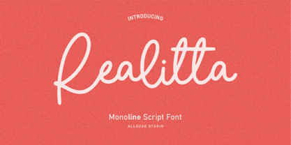 Proudly Presenting, Ralitta a Monoline Script Font. Ralitta is perfect for any tittles, logo, product packaging, branding project, megazine, social media, wedding, or just used to express words above the background. Ralitta also come with Multi-Lingual Support. We highly recommend using a program that supports OpenType features and Glyphs panels like many of Adobe apps and Corel Draw, so you can see and access all Glyph variations. Enjoy the font, feel free to comment or feedback, send me PM or email. Thank You!
 - Keithey by Enigma Lettering Studio,
$16.00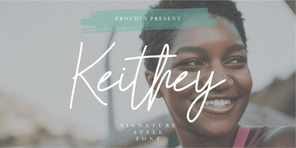 Introducing by Enigma Lettering Studio Proudly Present, Keithey Kithey is a Signature Style Font Keithey is perfect for product packaging, branding project, megazine, social media, wedding, or just used to express words above the background. Keithey also come with Multi-Lingual Support. We highly recommend using a program that supports OpenType features and Glyphs panels like many of Adobe apps and Corel Draw, so you can see and access all Glyph variations. Enjoy the font, feel free to comment or feedback, send me PM or email.
 - Asher Punk by Allouse Studio,
$16.00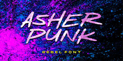 Proudly Presenting, Asher Punk a Rebel Handwritten Font. Asher Punk is perfect for any tittles, logo, product packaging, branding project, megazine, social media, wedding, or just used to express words above the background. Asher Punk also come with Multi-Lingual support. We highly recommend using a program that supports OpenType features and Glyphs panels like many of Adobe apps and Corel Draw, so you can see and access all Glyph variations. Enjoy the font, feel free to comment or feedback, send me PM or email. Thank You!
 - Naofumi by Allouse Studio,
$16.00 Proudly Present, Naoufumi a Rough Brush Font. Naofumi come along with Multi-Lingual Support to fulfill your need. We highly recommend using a program that supports OpenType features and Glyphs panels like many of Adobe apps and Corel Draw, so you can see and access all Glyph variations. Naoufumi is perfect for any tittle, product packaging, branding project, megazine, social media, wedding, or just used to express words above the background. Enjoy the font, feel free to comment or feedback, send me PM or email. Thank You!
 - Tall Tales by Comicraft,
$39.00 In a World where no stories are small stories... In a Land where words need to be Bold, Meaningful and maybe even Italic... Comes a font worthy of telling Marvelous Tales some thought Too Tall, Too Astonishing to be told... And when those Untold Stories, those Astounding Tall Tales, are finally told... THAT WORLD WILL NEVER BE THE SAME AGAIN! From Visionary Font Director John Roshell and the Studio that brought you BlahBlahBlah, you must not miss TALL TALES! In theaters and Streaming now.
 - Kamuy by Andinistas,
$39.95 Kamui is a font designed by Carlos Fabian Camargo G. and used to write headlines. Its strategy makes it ideal for covers and advertisements with Japanese-style manga comics requiring latin style. Precisely its purpose was inspired by typographical classics such as Mistral by R. Excoffon and Zapfino by H. Zapf that then were diluted by separate strokes as blackletter calligraphy. However, high doses of miscegenation and lettering untimely torn between 50% esthetic and 50% legibility. That way his radical expression is highly profitable for composing and designing words and phrases with Eastern look. And more importantly, the writing seems drawn quickly with thin-tipped brush staining over a rough surface, from that process comes the idea of corroded outlines and changes in contrast. In conclusion, some diagonal strokes, horizontal, curved and vertical stand or hide from their simulation of scarcity or abundance of ink clots. That way each stroke seems inconsistent, footprint of the 423 brush drawing glyphs in Regular Kamuy. In that sense, the OpenType features included are: Standard Ligatures, Contextual Alternates, discretionary ligatures, swash, stylistic alternates, alternatives for titles, ordinals, fractions. And to end the Variable “Kamuy Dingbats” has is 52 fictitious drawings and zamurais.
 - Machtwerk by Volcano Type,
$29.00Religions are filled with signs and symbols. Some of them, like the the star of David and the Swastika-Rune received other significance during the third Reich. The superimposition of these two shapes creates the basis for this font. Matchwerk is a font, that critically questions and recalls the darkest chapter of our history. - Mothman by Hanoded,
$15.00 In 1966 and 1967 a series of weird events spooked Point Pleasant, a small town in West Virginia. Townspeople described a creature that looked like a man, with red eyes and moth-like wings, which appeared at several locations around town. The Mothman myth was born. Mothman font is spooky as well. It is a very scratched and distorted typeface, completely hand drawn, using ink and various sharp utensils. Mothman font will surely leave a lasting impression!
 - 1955 by Alan Smithee Studio,
$9.00 1955 Is a fresh grotesque interpretation. Any detail too historically referenced is replaced by strong geometry and idiosyncratic features. Round dots and punctuation, curved “l” foot, single storey “g” etc. all these details make 1955 a very contemporary typeface (unlike the name suggests!). With a range of weights going from Thin to Black including Italics, OpenType Features, extended character-set, tailored for print and digital, 1955 has everything to become your new go-to typeface for every project!
 - Contingent Font Duo by Typehill Studio,
$10.00 Introducing Contingent Duo: An elegant serif typeface paired with a casual handwritten script. With its modern and minimal look, Harlow Font Duo brings a luxurious and clean style to websites, modern logos, branding identity, social media quotes, wedding stationery, and whatever your heart dreams up! The Serif includes two weights - regular and bold - and built in OpenType kerning features for a professional touch. Stylish modern font duo consisting of elegant and elegant script and serif fonts.
 - Roughwell by Invasi Studio,
$16.00 Roughwell Family is a rough hand-drawn display font with a retro stamp character. As a result, carefully crafted styles develop. The imperfections keep it casual but it is still legible. It can be easily matched to an incredibly wide range of projects, so give it a try and see how it boosts your creative ideas! It's ideal for headlines, flyers, posters, greeting cards, product packaging, book covers, printed quotes, logotype, and album covers, among other applications.
 - Stenka by Katatrad,
$39.00 Stenka is a sans-serif stencil typeface that stand for display typeface to use in any typographic situation. It has his own unique style in expressed perfect condensed forms. Stenka is an ideal font family for display, print, corporate identity, mobile devices, magazine cover, signage, and web design creation, with a set of ligatures and alternative characters for your design in any layout. The family has 4 weights ranging from Light to Black and their italic.
 - Konstanz by W Type Foundry,
$25.00 Konstanz is a sans serif font family inspired by the design of books and magazines for museums, art galleries, design biennials, architecture, and theater, among others. Its design focuses on a grotesque aesthetic but brings back certain shapes from Bauhaus and Futura. Konstanz includes 8 weights plus its matching italics, besides a stylistic set that increases its use possibilities. Konstanz ensures a graphic with a high impact and is ideal for designing editorial projects, posters, branding, and advertising.
 - Anisette Std Petite by Typofonderie,
$59.00 Geometric font inspired by shop signs in 4 styles Anisette has sprouted as a way to test some ideas of designs. It has started with a simple line construction (not outlines as usual) that can be easily expanded and condensed in its width in Illustrator. Subsequently, this principle of multiple widths and extreme weights permitted to Jean François Porchez to have a better understanding with the limitations associated with the use of MultipleMaster to create intermediate font weights. Anisette built around the idea of two widths capitals can be described as a geometric sanserif typeface influenced by the 30s and the Art Deco movement. Its design relies on multiple sources, from Banjo through Cassandre posters, but especially lettering of Paul Iribe. In France, at that time, the Art Deco spirit is mainly capitals. Gérard Blanchard has pointed to Jean Francois that Art Nouveau typefaces designed by Bellery-Desfontaines was featured before the Banjo with this principle of two widths capitals. The complementarity between the two typefaces are these wide capitals mixed with narrow capitals for the Anisette while the Anisette Petite – in its latest version proposes capitals on a square proportions, intermediate between the two others sets. Of course, the Anisette Petite fonts also includes lowercases too. Anisette Petite, a geometric font inspired by shop signs in 4 styles So, when Jean François Porchez has decided to create lowercases the story became more complicated. His stylistic references couldn’t be restricted anymore to the French Art-déco period but to the shop signs present in our cities throughout the twentieth century. These signs, lettering pieces aren’t the typical foundry typefaces. Simply because the influences of these painted letters are different, not directly connected to foundry roots which generally follow typography history. The outcome is a palette of slightly strange shapes, without strictly not following geometrical, mechanical and historical principles such as those that typically appear in typefaces marketed by foundries. As an example, the Anisette Petite r starts with a small and visible sort of apex that no other similar glyphs such as n or m feature, but present at the end of the l and y. The famous g loop is actually inspired by Chancery scripts, which has nothing to do with the lettering. The goal is of course to mix forms without direct reports, in order to properly celebrate this lettering spirit. This is why the e almost finishes horizontally as the Rotis – and the top a which must logically follow this principle and is drawn more round-curly. This weird choice seemed so odd to its designer that he shared his doubts and asked for advise to Jeremy Tankard who immediately was reassuring: “Oddly, your new top a is fine, it brings roundness to the typeface, when the previous pushes towards Anisette Petite to unwanted austerity.” The Anisette Petite, since its early days, is a mixture of non-consistent but charming shapes. Anisette, an Art Déco typeface Anisette Petite Club des directeurs artistiques, 46e palmarès Bukva:raz 2001
 - D-block A by AType,
$19.95The history of this font is those. Once I assorted the old children's books which have stayed from times of my childhood. On one of them I have seen a trade mark of a printing house consisting of two Russian letters "L" and "B". From they were begun also with my font. And though finally from these letters a little that remained, elements of these letters can be seen in font D-block B. - Cohen by TripleHely,
$16.00 Hello! Let me introduce Cohen – a handwritten font named in memory of the great poet and singer Leonard Cohen. On the day he passed away I did my routine calligraphy practice and wrote a part of his song 'Night Comes On'. You may see this work in presentation pictures, and after time I designed a font based on this calligraphy. Cohen signature font is perfect for logos, branding, web, blog headlines, invitations, magazine and book design, product packaging – or for any text on postcards and on your favorite photos. Cohen includes: a standard set of characters with wide multilingual support: Western-, Central- and Eastern-European, Baltic, Turkish, Latin-type Africans, and Asian (94 languages in total) two additional character sets: lowercase letters with alternates shapes and lowercase letters with a little end-swash - for the position at the end of a word 39 ligatures for double letters and frequent combinations Cohen has a large number of embedded context-dependent auto-replacement features that give the text a natural, handwritten look and correct inharmonious combinations of letters. These features work well in many apps (even simple ones like Notepad/TextEdit), and if you need to customize their application – you could use programs that support OpenType features (for example, Adobe apps or CorelDraw). All these additional glyphs are PUA-encoded, so if your software does not support OpenType — you could access them through Character Map (Windows) or Font Book (Mac). I hope you will like Cohen and create great designs with it! And if you have any questions, feel free to contact me via e-mail: triple.hely@gmail.com
 - Rough Motion by Atharuah Studios,
$16.00 Introducing the Rough Motion Font Duo! Rough Motion is strong and high-energy font. Make it a balanced composition in a sans serif font and a brush pen in a script font to show the realistic elements of the font. This is a font that is suitable for you to use in all your creative needs. Such as branding, logos, posters, web design, music artwork, etc. Each font file includes uppercase, lowercase, numbers, punctuation, and multilingual support. Rough Motion Script also includes a set of 10 swashes, ideal for underlining individual words and adding that extra 'custom' style. You can access it in every alternative letter A-J. That's it! I hope you enjoy it. Feel free to comment if there are issues or queries. You can also say hello to me on Instagram: https://www.instagram.com/atharuah_ Thank You!
 - Gridiot by Peter Bain,
$10.00 Gridiot is a constructed, semi-serif, two-weight stencil family that expands an approach taken by Josef Albers. Intended for display or headline setting, it features chamfered or bevel-cut corners, used instead of curves. The individual letter components sometimes vary in depth, avoiding a strictly modular approach, while the widths are kept consistent. The lining figures provide a standard set of numbers, and the oldstyle figures align with the lowercase, encouraging lowercase-only setting. Currency and other useful numerical symbols are provided in both versions. The zero is intentionally lighter, following early Renaissance types; there are filled versions as stylistic alternates. While horizontal scaling distorts the relationship between verticals and horizontals in a typeface, since every chamfer in Gridiot is at 45°, changing the horizontal scaling of the type will affect all diagonals equally. When used at a large size, or for a just few words, Gridiot can be very tightly spaced. Remember, any idiot can design a typeface on a grid: Gridiot.
 - NT Gagarin by Novo Typo,
$26.00 Anna Gagarin is the loving matriarch of the Gagarin Family. Her life was full of love and passion. She had several affairs with Futurist and Contstructivist artist in the beginning of the 20th century. She was in love with the Russian poet Vladimir Majakovski (born on July 19th, 1893 and died in Moscow on the April 14th, 1930). She gave birth to his son Boris. She called him 'a cloud with trousers'. After this love story, Anna Gagarin met the designer and artist Gustav Klucis in Italy. His radical and political ideas were much too childish for her. After a period of love and passion Anna gave birth to his son. At that time they were in Italy, which explains his italic forms. After her return to Moscow in the beginning of the 1920's Anna was introduced by Alexander Rodchenko. They were heavenly in love but Ilja Stepanova was very jealous on her husband. Anna once said that 'Alexander fills mine construction with love...' That phrase can be an explanation for the term Constructuvism as an art movement. Alexander was the great love of Anna. She gave birth to their love-baby Dimitri Gagarin. That night Alexander designed his most famous poster. A decade before that Anna told it was 'a time for a change'. In a local bar in Sint Petersburg she met Gregory Rasputin. At that time Rasputin was a well known person and a respected member of the Sint Petersburg upper class.His diabolic character influenced Anna and after several months she gave birth to their son Kurt. He inherited the main characteristics of his father. The Gagarin Family wants to give love and wants be loved...
 - Hope Sans by Monotype,
$50.99 Hope Sans™ takes the jaunty style of 1950s and 60s lettering and melds it with the jubilant 1970s swashes of Bookman. The result is a sans serif family that is lively, inviting and deeply customizable. Its basic sans serif forms create engaging text, while a roaring collection of swash designs, alternate characters and ligatures make it a natural for attention-grabbing display typography. Hope Sans has been selected by the judges of the 22nd Annual TDC Typeface Design Competition to receive the Certificate of Typographic Excellence. The middle weights of the family are easy on the eyes and shine at smaller sizes and in blocks of text copy. Their friendly vibe also translates well to web and interactive design projects. Spacing is open, counters are large and Hope Sans’ range of six weights can provide just the right design for virtually any need. Headlines, subheads, banners and navigational links are naturals for its lightest and boldest weights – either with, or without, the swash letters. “Hope Sans is a paint box,” says its designer, Charles Nix. “In its basic form, it’s a sturdy grotesque, capable of setting text in a cool and relaxed way. But a bit of accenting with the alternate forms easily creates an entirely different mood and meaning. And for those that are willing to really mix with it, the variety of alternate characters can build truly unique typographic statements.”
 - Dienstag Variable by insigne,
$100.00 Introducing Dienstag Variable, the latest addition to insigne's popular Montag family of fonts! With its extended sans-serif style, Dienstag boasts a sleek and sophisticated look that's perfect for a wide range of projects. Whether you're designing a website, creating branding materials, or producing print publications, Dienstag's refined elegance is sure to make a lasting impression. Compared to Montag, Dienstag has a slightly more formal feel, thanks to its lack of rounded terminators. But that doesn't mean it's any less versatile – in fact, Dienstag's four original weights have now been expanded to ten, giving you even more flexibility in your designs. With OpenType features that include simplified versions of many characters, you can easily create unique and eye-catching titles that stand out from the crowd. But Dienstag is just one part of the larger Montag superfamily, which also includes Mittwoch, and Donnerstag. Each font in this collection offers its own unique style and flair, giving you a wealth of options to choose from when it comes to your next project. Whether you're looking for a bold and dynamic font or a more refined and understated style, you're sure to find the perfect fit in the Montag family. So why wait? Check out Dienstag and the rest of the Montag superfamily today, and start creating designs that are sure to captivate and inspire! With its elegant style and versatile functionality, Dienstag is the perfect choice for designers who demand the best.
 - Letterboard by Sunday Creative Co.,
$12.00 Creatives understand the compulsion to make something of worth. And each creative person has a toolbox they grab from often. Letterboard Lite is the narrow geometric sans that can headline or support whatever project is next on your list — the one unfussy tool you’ll use time and again. With its geometric shapes, Letterboard is a ground-floor sans that stabilizes the foundation upon which everything else will be built. It cements the context unobtrusively without begging to be acknowledged. Pair Letterboard with any script typeface and it will highlight that script’s qualities, whether capricious or elegant. Pair it with a serif or slab serif for an obvious change of tone: With a modern slab, trends will be respected, but it will act more coy with an old-school chunky slab. Letterboard’s geometry is easily subsumed as a partner to a range of serifs, from classics to the latest releases. These qualities and its narrowness make it easy for Letterboard to be used as a large display font in headlines or branding applications. Letterboard comes with 270 characters necessary for setting over 150 Latin-based languages: A–Z with diacritics, lining numerals, and the most common punctuation and symbols.
 - Standing Flower by Din Studio,
$25.00 A must have item for your design, here's the Standing Flower. Standing Flower is a handcrafted script font combined with a refined sans serif font which suit your needs. Together, these complementary fonts portray elegant and modern vibes. The script font has natural feel to it, thanks to the handwritten letters not always connecting-much like when someone is written in cursive for a while and adds their unique spin to it. Besides that, the sans serif brings a flare of modern and sense of elegance. The organic feel of this font duo is enhanced by the amazing features provided. Easy to work with and pleasant to look at what else can you possibly need? Features: Ligatures Stylistic Sets Multilingual Supports PUA Encoded Numerals and Punctuation It works perfectly for for many design projects, such as poster, logo, book cover, branding, heading, printed product, merchandise, quotes, social media campaign, etc. Learn more about how to use it by seeing the font preview. Thank you for purchasing our fonts. Please don’t hesitate to contact us, if you have any further question or issues. We’re happy to help. Happy Designing.
 - Tiqqun by Harvester Type,
$20.00 Tiqqun appeared as a font for a monumental, but at the same time futuristic design. During the creation process, many variations for each glyph came to mind. Therefore, it was decided to create an entire system of alternative options. As a result, we have more than 130 alternative characters and as many as two full-fledged alternative sets. The font contains monumentality, brutality, futurism, rigor and uniqueness of some forms. As a result, Tiqqun has become a font system that can cover a large range of your design needs: Prints on clothes, logo, packaging, banner, title, text, poster, merchandising, identity, branding or product design. - 360+ Glyphs - 130+ Alternative Glyphs - Supports 80+ Languages - Special Symbols and Features - 2 Full Alternative Set - OT Features: aalt, case, kern, ordn, salt, sups, ss01-09
 - Sunday Notes by Jafar07,
$10.00 Introducing Sunday Notes, a unique and beautiful handwritten font crafted with love and precision. This font offers a relaxed and friendly writing style, perfect for your creative projects. Inspired by the calm and cozy vibes of a Sunday, Sunday Notes adds a personal touch and warmth to your designs. Sunday Notes comes in two main variations: Regular and Italic, allowing you to express your creativity even more. Each letter in this font also offers multiple alternatives, providing flexibility to create captivating and eye-catching text. With Sunday Notes, you can bring a warm and friendly atmosphere to projects like logo design, greeting cards, invitations, merchandise, websites, and more. It's compatible with various devices and design software, making it easy to use seamlessly in your creative work. Whether you're a professional designer or an art enthusiast, Sunday Notes is the perfect choice to add a personal touch and beauty to your projects. Let's create stunning designs using Sunday Notes as the captivating handwritten font. Now, you're ready to introduce Sunday Notes to the world and inspire others with the beauty and warmth of this handwritten font.
 - Klartext Mono by Fonts With Love,
$20.00 Klartext [plain talking, clear words] A modern monospaced type family of 10 weights. Klartext Mono combines a classical monospaced font and modern monolined sans-serif with a humanistic touch. It is characterized by a large x-height, slightly condensed glyphs with well shaped curves and soft strokes. As a special feature, Klartext contains a bunch of uncommon glyphs like the German capital sharp S, a nice arrowset and a basic phonetic alphabet (20 letters in IPA Extensions, some more in Latin Basic thru Extended B).
 - Sherbet BF by Bomparte's Fonts,
$39.00 Sherbet BF is a robust, bouncy handwritten-style script with an enthusiastic voice. A number of Automatic Ligatures and Contextual Alternates, are included in the font, along with Stylistic Alternates for lowercase letters g, and y. Enable these features in OpenType-savvy programs (such as InDesign CS+, Illustrator CS+ and QuarkXpress 7 and later) to enhance your typography. As with most scripts, it is not recommended that word settings be in all uppercase, but rather in settings of initial capitals together with lowercase letters.
 - Kaffemoster by Hanoded,
$16.00 Kaffemoster is a Swedish slang word for a lady, usually a bit older, who likes to drink coffee and gossip while she’s drinking it. I have decided to study a bit of Swedish, so I downloaded an app and I am practising my Swedish vocabulary every night! Det går långsamt, men jag klarar det! Kaffemoster is a nice, handmade pencil font. It comes with extensive language support (including Swedish) and a nice set of alternates for the lower case letters. Kaffemoster är ett riktigt bra typsnitt!
 - Clementine by Okaycat,
$24.50Clementine, from Okaycat, is a font designed to be expressive. First, we wanted Clementine to be uplifting, friendly and warm. Secondly, we wanted it to be familiar, but neither staid nor boring. To make Clementine more warm and friendly, 90 degree corners and cubic forms were not allowed. All straight edges are either subtly curved or lightly tapered (with the small exception of the serif foundations, to create a secure base). To add an uplifting feel, all tapering flows towards the apex of the forms and the ascenders were allowed extra rising freedom above the capital height, similar to the effect intended in the architecture of old European churches -- to point all elements gently upwards towards heaven. To keep Clementine familiar, traditional type setting shapes were used throughout the font. To avoid the usual coldness of typical typewritten fonts, all forms were opened up, calligraphic touches were introduced, and any unnecessary serif elements were omitted. The result is a look that brings a touch of nostalgia or a "retro" feel. Clementine is highly appropriate anywhere a soft and friendly feel is desired. Can work well as a body text, or as ad copy. Clementine is extended, containing the full West European diacritics & a full set of ligatures, making it suitable for multilingual environments & publications. - Righton by Letterhend,
$13.00 Introducing, Righton - a luxurious font duo that brings a classy and luxury look. It contains two fonts, script and serif, which perfectly pair. They work great if you need a typeface for headlines, logotypes, apparel, invitations, branding, packaging, advertising etc. This typeface is comes in uppercase, lowercase, punctuation, symbols, numerals, stylistic set alternate, ligatures, and also has Multi-Lingual support. We hope you enjoy the font, please feel free to comment if you have any thoughts or feedback. Or simply send me a PM or email me at letterhend@gmail.com
 - Jetlab by Swell Type,
$15.00 Jetlab is a typographic time machine that drops you squarely into the techno-futuristic optimism of the 1960s, 1970s and 1980s! While certain weights may conjure familiar space race-era logos from the sci-fi movies, board games, sports teams, new wave bands and sneaker brands of the late 20th century, the complete 45-weight Jetlab font family is loaded with modern features to power your retro-futuristic designs with near-infinite versatility. Features: 45 weights provide widths from squeezed to stretched and weights from light to heavy, plus reverse-stress (that's thick horizontal strokes with thin verticals) high, medium and low crossbar options upper and lowercase letters provide two distinct styles a four-axis variable font provides precise control of width, vertical & horizontal weight, and crossbar height 500 glyphs support 223 languages, including Western & Central Europe and Vietnamese
 - Baldufa by Letterjuice,
$66.00Baldufa is a charming typeface with strong personality, which looks very comfortable in text. There is a search to obtain complicated curves and detailed features, which give the typeface a touch of beauty and elegance. However, this is also a self-conscious design that claims appreciation for quirkiness and human imperfection through the rounded serifs and irregular vertical stems. The typeface family is also a multi script project, containing Latin and Arabic scripts. The Latin consists of Regular, Bold and Italic styles, including Small Caps and many other typographic features. Whereas Arabic Naskh includes Regular and Bold weights. The whole family has been designed to work harmoniously together to help to produce catalogues and small publications of cultural content. We believe that Baldufa is a tiny but nice contribution to build bridges between cultures and this make us very happy. The letterforms in the Latin are inspired by the slight distortions and idiosyncrasies that came with old printing methods. It has distinct, features such as rounded serifs, irregular vertical streams, ink traps and extremely thin junctions. In the Italic, serifs have been removed to enhance movement and expressivity. These experiments in form have not come at the cost of legibility: The typeface remains suitable for both small and display text. To certain extent, the design of the Arabic gathers the same interest for experimentation than its Latin companion. Baldufa Arabic respects the basic features of Arabic script such as thick stokes in the baseline, multiple vertical axis, genuine stem modulation and good linking between words. However, it steps away from traditional Calligraphic Style. It has rounded top terminals and the traditional contrast between curves and straight stokes has been softened. Letter shapes sometimes slightly differs from tradition in order to obtain more expressivity. Overall, Arabic has been designed to acquire the same elegant and quirky aspect of the Latin. - Grota Rounded by Latinotype,
$26.00 Grota Rounded is a very expressive font, has a gestural character inspired by the hand lettering . Grota Rounded is grotesque, unicase and exceptional. It has six weights ranging from thin to black with their italics. It is ideal for logos, brands, magazines, headlines, books. etc.
 - Wendling by Good Java Studio,
$20.00 Wendling - with Sweet Swashes is romantic script font make with many swashes in start and ending character. Make a beautiful style heart with swash. This font includes full set of swash heart lowercase letters, numerals, and punctuation. Also it includes: - short lowercase beginning and ending swashes - lowercase ending heart swashes, which serve to connect two words or letters. This is so perfect for invitations, monograms, wedding, fashion, branding, label. or logotype.
 - Coffee & Tea Doodles by Outside the Line,
$19.00 Coffee and Tea Doodles are a font of coffee and tea things-- beans, cups, drinks, tea bag, iced tea, tea sets etc. Perfect set of clip art for coffee or tea shop menus, ads, invitations, etc. Includes scripted words that include coffee, tea, coffee break and tea for 2.
 - Two Sugars by Set Sail Studios,
$16.00 Introducing the Two Sugars Script Font! Two Sugars is a playful yet striking clean monoline script font, available in 2 weights and includes bonus extra stars & underlines. It's chunky, hand-drawn letterforms are guaranteed to stand out whether that be on light hearted merchandise designs or more impactful quote designs. The Two Sugars family consists of; Two Sugars Regular • A clean, connecting script font containing upper & lowercase characters, numerals, and a large range of punctuation. Two Sugars Extras • A set of 26 hand-drawn stars & underlines designed to compliment your Two Sugars script fonts. Simply install this as it's own separate font, and type any A-Z character to generate one of the extras. Two Sugars Bold & Two Sugars Extras Bold • If you're looking for a chunkier version of the Two Sugars & Two Sugars Extras fonts, simply switch to the bold versions! Alternates • Are available for lowercase descenders g, j, z, & y. These have elongated tails to add some extra flair to your text, and are accessible by switching on 'Stylistic Alternates' or via a Glyphs panel. Language Support • Two Sugars supports the following languages; English, French, Italian, Spanish, Portuguese, German, Swedish, Norwegian, Danish, Dutch, Finnish, Indonesian, Malay, Hungarian, Polish, Croatian, Turkish, Romanian, Czech, Latvian, Lithuanian, Slovak, Slovenian
 - Robine by Craft Supply Co,
$20.00 Introducing Robine – Condensed Sans Serif Robine – Condensed Sans Serif font is the ideal choice for creating attention-grabbing titles and headings. With its high x-height, this modern sans-serif typeface offers a sleek and contemporary appearance, ensuring your designs will stand out. Stylish and Space-Efficient: Robine – Condensed Sans Serif strikes the perfect balance between style and space efficiency. Its condensed design allows you to fit more text into tight spaces without sacrificing readability. Versatile Usage: This font is incredibly adaptable, making it suitable for a wide range of design projects. Whether you’re designing posters, logos, or web graphics, Robine – Condensed Sans Serif adds a touch of modern sophistication to your work. Exceptional Clarity: Robine – Condensed Sans Serif ensures your titles and headings remain easily readable, even at smaller sizes, thanks to its clear and legible characters. It’s designed to make a bold statement while maintaining clarity.
 - Ambra Sans by Zetafonts,
$39.00 Designed by Cosimo Lorenzo Pancini with Francesco Canovaro as a development and reinvention of Tarif by Andrea Tartarelli, Ambra Sans is a humanist sans typeface family, drawn around a lively, expressive skeleton but developed with a contemporary, post-digital sensibility that implies low contrast and tall x-height. In designing Ambra Sans, the authors wanted to research the elusive natural signature of handmade humanist letter shapes, in the effort of preserving it while still developing all the capabilities of type as a technical tool in the digital age. Like a frail insect preserved in amber, humanist design is the "ghost in the machine" of this font, that aims at seducing the viewers with its soft, welcoming text flow, firmly opposing the rigid, formal tone of most sans serif fonts. Born to provide a useful tool to graphic designers with branding and editorial needs, Ambra Sans develops around two subfamilies with slight but fundamental differences. The display family offers a taller x-height, optimizing readability and spacing in headings and display use, while offering a single story lowercase g to provide more consistent branding usage. The text family, on the other side, goes for a smaller x-height to give more traditional proportion to the text and removes the slight tapering in the stems to provide better rendering on screen in small formats. Both subfamilies of Ambra Sans develop around a wide range of seven weights with corresponding true italics, with Ambra Display sporting an extra heavy weight for maximum versatility. In total the family counts 30 fonts, each with over 600 glyphs for a wide language coverage. Open type features and glyph alternates further enrich the usage possibility of this typeface that wants to offer contemporary designer an alternative, unexpectedly human approach to contemporary sans type, softly preserving the spirit of handmade calligraphy while encasing its frail nature in a transparent, strong and powerful design language.
 - Corporative by Latinotype,
$26.00 The first typeface developed by Latinotype Team. Corporative is a semi serif font that has a marked personality and distinctive traits, what makes it suitable to be used at large text sizes.Since it is a condensed font, it can also be used in smaller sizes. Corporative and Corporative Sans come with the Latinotype’s standard set of 350 characters, making it possible to use the font in 128 different languages. Corporative provides users with a wide range of characters, weights and widths for every project. By combining different variants,designers can achieve the best results. The family consists of 64 fonts: a basic family that includes 8 weights plus italics, an alternative family of 8 weights with matching italics and 2 condensed families, one regular and one alternative, both with italics. Latinotype has added new faces to its team. Latinotype Team nowcomprises: Javier Quintana, César Araya, Bruno Jara, Luciano Vergara and DanielHernández. Corporative was created by Latinotype Team and developed by Javier Quintana and César Araya, under the supervision of Luciano Vergara, Miguel Hernández and Daniel Hernández.
 - Miss Donna by Scholtz Fonts,
$15.00 Miss Donna - contemporary, powerful, versatile and casual. Curvy, sassy, fast-talking, and utterly useable, she takes you into the world of movie posters, decor ads, fashion posters and tags, greeting cards and invitations. Her lines are bold, clean and legible. The Miss Donna family comes in four styles: - REGULAR - clean good lines and generous curves - for decor ads, greeting cards, copy - NARROW - slim (more compact), and elegant with contained curves - for greeting cards, invitations, copy - BLACK - bold statement, round, generous curves - for movie posters, fashion posters - BLACK CAPS - especially designed for "all-caps" printed text. Use for headings & subheads. Miss Donna Black Caps contains capitals in two sizes and this gives you the ability to generate text of two types: - a correctly spaced and kerned upper case, OR - a TRUE Small Caps -- as opposed to the false Small Caps produced by a well-known word processing application. In a correctly proportioned Small Caps the stroke width should not be reduced in the same proportion as the letter height is reduced. The stroke width of the small capitals should rather be equal or close to the stroke width of the corresponding upper case characters. Note: When using script fonts it is NOT usually advisable to use text in ALL caps. The best effects for headings and subheads are obtained with an initial upper case letter followed by lower case characters. BUT, Miss Donna will still produce excellent results with all caps if you are using an application that supports kerning. If you are using upper and lower case then it is not necessary to use kerning, although it may make a slight difference on occasion. Miss Donna contains over 235 characters - (upper and lower case characters, punctuation, numerals, symbols and accented characters are present). It has all the accented characters used in the major European languages.