10,000 search results
(0.065 seconds)
- FS Lucas by Fontsmith,
$80.00 Pure and not-so-simple Maybe it’s the air of purity, openness and transparency that they transmit, but geometric typefaces are more popular than ever among leading brands. Based on near-perfect circles, triangles and squares, geometric letterforms look uncomplicated, even though making them readable is anything but – something the designers of the first wave of geometric fonts discovered nearly a century ago. Many of the world’s most recognisable brands in technology, retail, travel, food, manufacturing and other industries continue to be drawn to the straightforward, honest character that geometric fonts convey. Fontsmith set out in 2015 to develop a typeface in the same tradition, but optimised for the demands of modern brands – online and offline usage, readability and accessibility. And, of course, with the all-important Fontsmith x-factor built in. FS Lucas is the bold and deceptively simple result. Handle with care The letterforms of FS Lucas are round and generous, along the lines of Trajan Column lettering stripped of its serifs. But beware their thorns. Their designer, Stuart de Rozario, who also crafted the award-winning FS Millbank, wanted a contrast between spiky and soft, giving sharp apexes to the more angular letterforms, such as A, M, N, v, w and z. Among his inspirations were the colourful, geometric compositions of Frank Stella, the 1920s art deco poster designs of AM Cassandre, and the triangular cosmic element symbol, which led him to tackle the capital A first, instead of the usual H. The proportions and angles of the triangular form would set the template for many of the other characters. It was this form, and the light-scattering effects of triangular prisms, that lit the path to a name for the typeface: Lucas is derived from lux, the Latin word for light. Recommended reading Early geometric typefaces were accused of putting mathematical integrity before readability. FS Lucas achieves the trick of appearing geometric, while taking the edge off elements that make reading difficult. Perfectly circlular shapes don’t read well. The way around that is to slightly thicken the vertical strokes, and pull out the curves at the corners to compensate; the O and o of FS Lucas are optical illusions. Pointed apexes aren’t as sharp as they look; the flattened tips are an essential design feature. And distinctive details such as the open terminals of the c, e, f, g, j, r and s, and the x-height bar on the i and j, aid legibility, especially on-screen. These and many other features, the product of sketching the letterforms in the first instance by hand rather than mapping them out mechanically by computer, give FS Lucas the built-in humanity and character that make it a better, easier read all-round. Marks of distinction Unlike some of its more buttoned-up geometric bedfellows, FS Lucas can’t contain its natural personality and quirks: the flick of the foot of the l, for example, and the flattish tail on the g and j. The unusual bar on the J improves character recognition, and the G is circular, without a straight stem. There’s a touch of Fontsmith about the t, too, with the curve across the left cross section in the lighter weights, and the ampersand is one of a kind. There’s a lot to like about Lucas. With its 9 weights, perfect proportions and soft but spiky take on the classic geometric font, it’s a typeface that could light up any brand.
 - FS Lucas Paneureopean by Fontsmith,
$90.00Pure and not-so-simple Maybe it’s the air of purity, openness and transparency that they transmit, but geometric typefaces are more popular than ever among leading brands. Based on near-perfect circles, triangles and squares, geometric letterforms look uncomplicated, even though making them readable is anything but – something the designers of the first wave of geometric fonts discovered nearly a century ago. Many of the world’s most recognisable brands in technology, retail, travel, food, manufacturing and other industries continue to be drawn to the straightforward, honest character that geometric fonts convey. Fontsmith set out in 2015 to develop a typeface in the same tradition, but optimised for the demands of modern brands – online and offline usage, readability and accessibility. And, of course, with the all-important Fontsmith x-factor built in. FS Lucas is the bold and deceptively simple result. Handle with care The letterforms of FS Lucas are round and generous, along the lines of Trajan Column lettering stripped of its serifs. But beware their thorns. Their designer, Stuart de Rozario, who also crafted the award-winning FS Millbank, wanted a contrast between spiky and soft, giving sharp apexes to the more angular letterforms, such as A, M, N, v, w and z. Among his inspirations were the colourful, geometric compositions of Frank Stella, the 1920s art deco poster designs of AM Cassandre, and the triangular cosmic element symbol, which led him to tackle the capital A first, instead of the usual H. The proportions and angles of the triangular form would set the template for many of the other characters. It was this form, and the light-scattering effects of triangular prisms, that lit the path to a name for the typeface: Lucas is derived from lux, the Latin word for light. Recommended reading Early geometric typefaces were accused of putting mathematical integrity before readability. FS Lucas achieves the trick of appearing geometric, while taking the edge off elements that make reading difficult. Perfectly circlular shapes don’t read well. The way around that is to slightly thicken the vertical strokes, and pull out the curves at the corners to compensate; the O and o of FS Lucas are optical illusions. Pointed apexes aren’t as sharp as they look; the flattened tips are an essential design feature. And distinctive details such as the open terminals of the c, e, f, g, j, r and s, and the x-height bar on the i and j, aid legibility, especially on-screen. These and many other features, the product of sketching the letterforms in the first instance by hand rather than mapping them out mechanically by computer, give FS Lucas the built-in humanity and character that make it a better, easier read all-round. Marks of distinction Unlike some of its more buttoned-up geometric bedfellows, FS Lucas can’t contain its natural personality and quirks: the flick of the foot of the l, for example, and the flattish tail on the g and j. The unusual bar on the J improves character recognition, and the G is circular, without a straight stem. There’s a touch of Fontsmith about the t, too, with the curve across the left cross section in the lighter weights, and the ampersand is one of a kind. There’s a lot to like about Lucas. With its 9 weights, perfect proportions and soft but spiky take on the classic geometric font, it’s a typeface that could light up any brand. - Gerard Display by Rafael Jordan,
$25.00 Clean, elegant & flexible… Gerard Display is a beautiful rational typeface, a Scotch Roman dressed up as a high-contrasted Didot for this optical size. Its 6 weights and 6 widths made it adaptable and versatile with 36 fonts, from a solid “Compressed Regular” to a broader “ExtraExpanded Heavy” without losing a bit of grace. Gerard Display counts on an extended character set that covers a wide range of Latin languages and a lot of features (as stylistic sets, local forms, or a complete set of figures).
 - Pasek by Edyta Demurat,
$16.00 The inspiration for this font was a two-sided piece of paper. The glyphs were created by bending strips of this paper, then scanned and recreated digitally.
 - Mundbind NL by Hanoded,
$15.00 I just visited my good friend Jakob Fischer from Pizzadude.dk in Denmark. As always we talked fonts, drank coffee and walked endlessly through Copenhagen, the city where he lives. We thought it would be a fun idea to each create a font from a handmade sign we saw in the city. We only had like 7 glyphs to work with, so the rest was up to our imagination. We also thought it would be nice to give the fonts a similar name. Mundbind means mask in Danish. When you Google translate it, it will give you the wrong translation (it will say 'mouth piece'), so trust me on this one! My font is called Mundbind NL - where the NL stands for Netherlands. Jakob will hopefully call his finished font Mundbind DK - where the DK stands for Denmark. Mundbind NL comes with a monster load of diacritics (including Vietnamese) and two alternate glyphs for the lower case letters that will cycle as you type.
 - Fosho by Chank,
$49.00 For more than 70 years the 10-foot tall letters displaying the word FOSHAY have illuminated the Foshay Tower in the Minneapolis skyline. However, the typestyle has never been made into a font before. This new modern font family, dubbed Fosho Book, is optimized for book print usage as well as functioning as big bold display type on screen. The Fosho fonts are available in three styles: Outlines, Dotted Bulb Inlines and Composite with both. You can use the three styles in overlapping colors for dramatic chromatic effects.
 - Syntachron by Mofr24,
$11.00 Syntachron is an extraordinary monospaced font that stands out with its futuristic and mecha-inspired design. What sets this font apart is its unique ability to combine simplicity, modernity, and boldness, resulting in a visually captivating typeface. It is the perfect choice for those seeking to create impactful posters, eye-catching marketing materials, captivating logos, attention-grabbing headlines, and engaging book and magazine layouts. One of the distinguishing features of Syntachron is its compatibility with the Cyrillic alphabet, offering versatility and style for a wide range of design projects. Whether you're working on international branding campaigns or multi-language publications, this font seamlessly integrates with the Cyrillic characters, ensuring consistency and cohesiveness across different languages. In terms of typeface pairing, Syntachron harmonizes exceptionally well with related families and typefaces that share its sleek aesthetics and futuristic vibe. It complements and enhances other fonts, enabling designers to create stunning combinations that amplify the impact of their designs. Beyond its striking appearance, Syntachron excels in its functional aspects. The font comes in a variety of styles, allowing for versatility in design choices. Its monospaced nature ensures consistent character widths, making it ideal for code snippets, technical documentation, and typewriter-style layouts. Furthermore, Syntachron offers a comprehensive character set with special features, enabling the seamless creation of diverse and engaging designs. The design concept behind Syntachron was to capture the essence of a futuristic world and merge it with the mechanical elements of mecha-inspired aesthetics. The result is a font that exudes a sense of cutting-edge technology and boldness, empowering designers to create visually striking and impactful designs that captivate their audience. Syntachron was meticulously created to fulfill the need for a font that seamlessly merges modern simplicity with futuristic design elements. Its purpose is to provide designers with a versatile tool that sparks creativity and enables them to craft stunning visual experiences. With its sleek aesthetics, support for the Cyrillic alphabet, and functional aspects, Syntachron is an indispensable asset for any design project seeking to embrace the future.
 - Shynta by Malindo Creative,
$10.00 Shynta is a modern hand-based typography, This font is made up of irregularly flowing letters, both between top-down and with subsequent letters, which makes it suitable for Logotype, posters, businness cards, merchandise, wedding invitations, greeting cards, banners blogs, clothing, water-based paint designs / prints, correspondence, quotes and more! This Font Equipped: -Uppercase -Lowercase -Figures & Punctuation -Accented -Stylistic Alternatives -Ligatures -Additional currency symbols To enable the OpenType Stylistic alternates, you need a program that supports OpenType features such as Adobe Indesign, Adobe Illustrator CS & CorelDraw X6-X7, Microsoft Word 2010 or later versions. -This font is PUA encoded which means you can access all of the glyphs and swashes with ease! -If you have any questions, please contact me at. malindocreative@gmail.com. -Thanks for Support -Feel free to contact me if you have any questions, I am happy to help you.
 - Alchemila by Heyfonts,
$18.00 Alchemila "UNIQUE serif modern font" likely refers to a typeface that combines elements of traditional serif design with contemporary and distinctive features. Serif fonts have small lines or strokes attached to the ends of characters, which can contribute to a more formal or traditional appearance. The term "modern" in this context typically implies a contemporary or updated style. Here's an explanation of the characteristics and significance of a UNIQUE serif modern font: -Serif Elements: Serifs are the small lines or strokes at the ends of characters, and they are a hallmark of traditional typography. In a UNIQUE serif modern font, these serif elements are likely to be present but may have a distinctive shape or style that sets them apart from more conventional serif fonts. -Contemporary Design: The "modern" aspect of the font suggests a contemporary or updated design. This may involve a departure from the more classical serif styles seen in traditional typefaces, incorporating modern design principles, cleaner lines, and a more minimalist aesthetic. -Distinctive Characters: A UNIQUE serif modern font is likely to feature characters with unique and individual design elements. This could include unconventional serifs, letter shapes, or other stylistic details that make the font stand out and contribute to its uniqueness. -Versatility: While serif fonts are often associated with formality and readability, a UNIQUE serif modern font may offer versatility suitable for a range of design applications. It could be used in both traditional and modern contexts, providing flexibility for various design projects. -Applicability to Branding: Fonts play a crucial role in branding, and a UNIQUE serif modern font could be an excellent choice for businesses or projects that want to convey a sense of tradition and reliability while maintaining a contemporary and innovative image. -Digital and Print Design: Modern serif fonts are often designed with both digital and print applications in mind. The clarity of the typeface, even at smaller sizes, and its aesthetic appeal make it suitable for a variety of design projects, from websites and apps to print materials like brochures and posters. -Attention to Detail: The uniqueness of the font may be reflected in the careful attention to detail in each character. This could include refined curves, balanced proportions, and other design elements that contribute to the overall visual appeal and readability of the font. -Available Features: Unique serif modern fonts may come with additional features, such as alternative characters, ligatures, or stylistic sets, allowing designers to customize the appearance of the text for specific design needs. When selecting or working with a UNIQUE serif modern font, designers should consider the overall design goals, the intended audience, and the context in which the font will be used
 - Kernig Braille by Echopraxium,
$5.00 This font is the younger sister of HexBraille with which it may be combined to create new patterns. This also explains why their introductory text are similar. Introduction The purpose of this monospace font is to display braille in an original and "steganographic" way. The Kernig prefix means "Robust" in German, this is because of the crank shapes . The core of the glyph design is a flat hexagon which can be read as 3 rows of 2 dots (i.e. regular braille glyph grid). Even if within a glyph, braille dots ("square dots" indeed) are placed on the vertices of a flat hexagon, the difference with HexBraille is that edges connecting vertices are not straight lines but "crank shapes" instead. This can be summarized by saying that the whole glyph is a Hexcrank (a flat hexagon where vertice pairs are connected by a crank shape) NB: The initial design is illustrated by glyphs 'ç' (no dot) and 'û' (6 dots) as shown by poster 6. A. "Kernig Lattice" In KernigBraille, glyphs are connected to each other, thus for each Hexcrank glyph there are 6 connections: 2 on left/right and 4 on top/bottom. In the final design some cranks were removed for esthetical reason (i.e. leave empty space for allowing patterns diversity). In summary, a text using this font won't display a honeycomb but a lattice instead. NB: Please notice that in order to obtain the lattice without vertical gaps, you must set the interline to 0. The lattice is made from 3 kind of shapes: a.1. Hexcrank a.2. Square a.3. Irregular cross (mostly unclosed) The design favored squares over crosses. The whole slightly resembling a PCB. B. Text Frames It's possible to frame the text with 4 sets of frame glyphs (as illustrated by poster 2) b.1. Kernig { € ° £ µ § ¥ ~ ¢ } b.2. Rectangular-High { è é ê ï î à â ä } b.3. Rectangular-Low { Â ù Ä Ê Ë Ô õ ö } b.4. Mixed Kernig+High: a mix of Kernig and Rectangular-High frame glyphs When using frame glyphs, it is advised to show Pilcrow (¶) and Non Breaking Space, which are replaced by empty shapes in this font (e.g. in Microsoft Word, use CTRL+8 or use [¶] button in the ribbon).
 - Motopica by Anomali Creative,
$19.99 Motopica was born when I watched a show, namely "the pickers". At that time I realized that there were still many communities or people who really loved Western culture (Cowboy), Vintage Style in the 40s - 60s era and Classic Motorbike style (Caferacer). So I intend to combine these three concepts into a single font, and Motopica was born, which brings the spirit of the three styles, namely Western Cowboy, Vintage, Beer and motorbike. Motopica can be used as a Vintage Poster, Vintage Signage, Vintage badge What's Included Motopica Reguler Motopica Italic Motopica College Motopica Bold How to install your new font This font can be used with all software that can read standard fonts. Check out my instagram for update: https://www.instagram.com/anomalikreatif/ Thanks so much for checking out my shop! All the best, Krisna
 - Utily Sans by Latinotype,
$39.00 Utily Sans emerges from the question: "What would the world be like if Paul Renner had had greater inclination towards humanism rather than geometry?" Utily Sans glyph proportions and shapes make it suitable for long-form text. This typeface shows geometric simplicity with humanist shapes. It looks like Futura, but has a feel closer to Garamond. Utily Sans is composed of 6 weights with their matching italics, an alternate character set that brings it back to its geometric origin, uppercase discretionary ligatures for expressive titles, as well as small caps, lining figures and old style numbers. These features make the font well-suited for large and small sized compositions, for short or long text. Utily Sans is the first Latinotype font with Cyrillic support, additional to the usual support for over 200 Latin-based languages.
 - Blackest by Zetafonts,
$39.00 Download PDF Specimen See Blacker and Blacker Sans , the perfect matching companions of Blackest. Blackest is an inverse contrast wedge serif typeface family, designed by Francesco Canovaro and Andrea Tartarelli as a development of the Blacker typeface designed by Cosimo Lorenzo Pancini. The classical skeleton and sharp edges of the original have been kept while bringing the contrast of the typeface in the realm of the so called “italian” or reverse-contrast typefaces. The result is a typeface family that manages to be quirky but classical, and playful without losing elegance. With its exuberance and six weights of eye-catching proportions, Blackest is perfect for display use: editorial & magazine design, poster design and logo development - but to allow its usage as a for typesetting of longer texts a text variant in two weights has been developed, with less contrast, looser spacing, and high readability. Blackest features an extended character set that covers over 220 languages using the Latin alphabet, as well as Russian Cyrillic. Open type features include small caps, positional figures, alternate letter forms, stylistic sets, arrows and extra punctuation and discretionary ligatures.
 - Kadigan by Missy Meyer,
$12.00 Kadigan: (noun) A placeholder word. A kadigan can be used to substitute for any other noun: persons (John Doe, Acme Company), places (Anytown, 123 Main Street) or things (whatchamacallit, thingamajig). Just like kadigans can be used in nearly any situation, the members of the Kadigan font family can be used in nearly any design! These sans-serif beauties are clear and easy to use, but they also have a little bit of wiggle in their strokes and weights, for a fun hand-lettered look! The three members of the family: - Kadigan Light: An all-purpose lightweight stroke, with sharp corners. - Kadigan: A nice mid-weight stroke, with slightly rounded corners. - Kadigan Heavy: A thick, chonky stroke with pillowy rounded corners. And each member of the family is packed with features, including: - All of the basic stuff you expect from every font; - 340+ extended Latin characters; - Cyrillic character set; - Greek character set; - Those character sets? Support over 110 languages! - 52 double-letter ligatures for variety (That's right, EVERY letter. I'm looking at you, savvy revved trekkers!); - A full set of small caps (including Cyrillic & Greek); - And more! (Seriously, it was hard to stop.) So whether your work is in English, Español, български, ελληνικά, Türkçe, or over a hundred other languages, this cute and fun sans-serif may be just what you've been looking for!
 - Hanna by Wilton Foundry,
$29.00Hanna has its roots in the Plato and Cilantro fonts published earlier by Wilton Foundry. It is an informal roman and very legible at any size - a rare combination for many applications. Hanna was specifically designed to generate additional income for an orphanage in Ethiopia. Hanna Teshome runs an orphanage of roughly 140 children in Addis Ababa, Ethiopia. She is an amazing lady with a deep passion for orphan kids as well as innocent kids that find themselves in jail because their mothers have been imprisoned - they are treated as prisoners and are typically sexually abused - it is not uncommon for them to commit suicide when they are released from jail at age 18. Most of the orphans end up with Hanna because one or both of their parents have died from AIDS. Hanna relies entirely on donations to keep her orphanage running and this font is a small but tangible way for you to help make a difference in the lives of the orphan kids. I am committed to helping Hanna after visiting the orphanage several times and seeing the jails from where the kids have been rescued. Hanna is my hero because she stepped out of her comfort zone, with no financial support, to take care of the kids. My hope is that you will use this font as a messenger of good. All of Wilton Foundry royalties for this font will go to the support of Hanna’s orphanage in Ethiopia. Thank you in advance for your support on behalf of Hanna and the kids! - Aracne by Antipixel,
$15.00 The all-caps Aracne collection features tall, slightly scrawled letterforms, and is available in regular, condensed and ultra condensed styles for maximun functionality. With a spiritted quality and casual character, it will add a personal style to your work. Aracne is a full of energy handwritten font, with light and regular styles, including italics. It provides a wide range of possibilities, including the Aracne Soft and Stamp, which offer softer and cleaner edges. It’s has a glyph coverage supports languages such as English, Spanish, French, German, Polish, Czech, among many others. It’s recommended usage is for display titles, and small ammount of text, because of its good legibility and quality of glyphs. Check out her sisters Aracne Condensed and Aracne Ultra Condensed!
 - Rotulo Variable by Huy!Fonts,
$195.00 Rotulo Variable is a contrasted sans family which combines the Thick & Thin signpainter's style and some 70s feeling in a huge font family with three axis: Width, Weight and Slant. A visit to an exhibition of Spanish movie posters by Jano was the beginning of Rótulo (Spanish for Sign) project. Classic thick & thin signpainter style was featured in many letterings of those posters, as it was a very common style in 60s and 70s Spanish design. Unfortunately, today very few Contrasted Sans are seen, something that was quite common years ago has fallen into disuse in favor of Helvetic monotony. Rótulo recapture all that personality, with an extense range of weights and widths to be used in striking headlines and short texts.
 - Brownhill Script by sizimon,
$20.00 Brownhill Script is hand written fonts set . Very cool for logos, name tag, handwritten quotes, product packaging, merchandise, social media & greeting cards. And very easy to make design t-shirts and other products. Very save time in making the design of a product. It contains a full set of lower & uppercase letters, a large range of punctuation, numerals, and multilingual support. What's Include : Brownhill Script Brownhill Script Swash 3 sets of lowercase letter 2 sets of uppercase letter Bonus Swash Multilingual support To access the alternate glyphs, you need a program that supports OpenType features such as Adobe Illustrator CS, Adobe Photoshop CC, Adobe Indesign and Corel Draw. If you have any question please do not hesitate to contact me. Thank You!
 - Russell Brush by Tom Chalky,
$11.00 Introducing Russell - An organic and expressive handwritten brush script font designed for versatility. It's legible; making it perfect for product packaging, editorial work, and poster design, and it oozes personality; great for branding, invitations, and more. This font packs a real punch with super duper textures and a ton of useful extras (that line is certainly getting copyrighted!) including custom catchwords, ink splatters, underlining brush strokes, and italics! Take a look below to see everything that's included. ---------------------- What's Inside? ---------------------- - Russell: The original Russell script font boasting a full glyph range with multilingual support. - Russell Alternative: An entirely new font with slightly different lowercase and uppercase letters - perfect for improving the handwritten aesthetic. - Russell Extras: A font full of useful extras (Swashes, strokes, and splatters) that look great with the Russell fonts. Simply select the 'Russell Extras' font and start typing. - Russell Catchwords: Just like the extras above, this font is packed with 23 bonus custom catchwords that beautifully complement the family. - Russell & Russell Alternative Italic: Both Russell and Russell Alternative have italic options included, opening up more design possibilities.
 - Amariya by Monotype,
$40.99 Designed by Nadine Chahine, the Amariya™ typeface family is intended for long form, on-screen textual content. It supports the Arabic, Persian and Urdu languages. The design is consistent with traditional text typeface models popular in the Middle East, but has a lower level of stroke contrast optimized for on-screen reading. The family is available in nine weights ranging from a light hairline to a very bold black. The middle weights are intended for setting text copy while the extreme hairline and black designs are best suited for headlines, sub heads and similar applications. The Amariya family can be used for numerous projects from branding to blogs, in a variety of interactive design environments on both large and small screens. The fonts include the ITC Charter design by Matthew Carter as a Latin companion.
 - Weaver Birds by Essentials Studio,
$16.00 introducing by Essentials Studio Weaver Birds Is a A Playfull Handwriting Font Weaver Birds is perfect for product packaging, branding project, megazine, social media, wedding, or just used to express words above the background.
 - Impermanence by Essentials Studio,
$16.00 Introducing by Essentials Studio Proudly Present, IMPERMANENCE IMPERMANENCE is a Black Letter Font IMPERMANENCE is perfect for product packaging, branding project, megazine, social media, wedding, or just used to express words above the background.
 - Camedyan by Essentials Studio,
$16.00 Introducing by Essentials Studio Proudly Present, Camedyan Camedyan Is a Modern Handwritten Font Camedyan is perfect for product packaging, branding project, megazine, social media, wedding, or just used to express words above the background.
 - Bulgathi by Essentials Studio,
$16.00 Introducing by Essentials Studio Proudly Present, Bulgathi, Bulgathi Is a Modern Script Font Bulgathi is perfect for product packaging, branding project, megazine, social media, wedding, or just used to express words above the background.
 - Kickbox by Ahmad Jamaludin,
$19.00 Introducing KICKBOX Fonts - Unleash the Power of Nostalgia and Captivate Pop Culture, Lifestyle, and Music and Film Branding Looking to infuse your brand with a burst of retro charm and a dash of pop culture? Say hello to our KICKBOX Fonts! Designed with 3 styles: Narrow, Regular, Wide to make your brand stand out in the realms of pop culture, lifestyle, music, and film branding. These fonts are an absolute game-changer. KICKBOX transports you to the golden era of the past, evoking a sense of nostalgia that resonates with pop culture enthusiasts. Seamlessly blending boldness and authenticity, they captivate the hearts of your audience, adding a unique and irresistible touch to your brand identity. KICKBOX has 3 widths on each type: Narrow - Regular - Wide so can be perfect for any retro project like logotype, branding, title, packaging, and many more Features: Kickbox Main File Has 3 Variable: Narrow - Regular - Wide Instructions (Access special characters, even in Cricut Design) Unique Letterforms Works on PC & Mac Simple Installations Accessible in Adobe Illustrator, Adobe Photoshop, Microsoft Word even work on Canva! PUA Encoded Characters Fully accessible without additional design software. Embrace the captivating allure of our KICKBOX today and unleash a world of endless possibilities! Enjoy Designing! Dharmas Studio
 - Ainda by Resistenza,
$45.00 We always had a crush for multilinear fonts and a great love story with script types. So we decided to bring them together and create Ainda. A new multiline script font based on and English copperplate skeleton. A modern approach to classic flourished scripts, designed with a slanted angle that gives dynamism and creates a ribbon effect when the lines come together in the connections, adding depth and perspective. Ainda family includes 2 weights, Regular & Bold. This Display font will light your layout with a contemporary and elegant flair. Highly recommend to use it on big sizes.
 - Pardesi by Hanoded,
$15.00 Pardesi font is named after a song from Raja Hindustani, a 1996 Bollywood movie directed by Dharmesh Darshan. The lead roles were played by Aamir Khan and Karisma Kapoor. Together they sing: 'Pardesi, pardesi, jaana nahi', meaning so much as: 'Foreigner, foreigner, don't go'. I remember this song very well, as I was backpacking through India and Nepal at the time and it was played over and over again on all long distance buses I took. Pardesi font is a fat, rounded, marker-pen font, ideal for books and posters. It comes with extensive language support.
 - ST Remona Neue by Skinny Type,
$18.00 ST Remona Neue is a confident serif. Designed to reflect nature, it creates a sense of softness and natural expression. We pushed the concept in a usability-focused direction, to work as a bold tool and a beautiful communicator. ST Remona Neue allows for fluid designs in 3 styles. Regular, Italic, Outline and Latin based main language. The right slant advances aesthetics, brings energy and makes it suitable for modern design. The type family blends organic curves and soft repetition into strong and harmonious types. At large dot sizes you can appreciate the shape of the letters, while the same control and focus creates an even texture for small dot sizes and long reads. Fonts extend their use by providing a variety of unique language and style supports. The ST Remona Neue character set combines additional symbols, style alternatives, unique binding, and case sensitive punctuation - resulting in a stable, hardworking family ready to tackle projects of any size. Happy Designing
 - Aodaliya by Type Associates,
$30.00 As a practicing graphic designer there have been numerous occasions when I have needed a font that didn’t exist. More often than not the style I was looking for was described as an extra-condensed sans-serif with a contemporary look that was available in a variety of weights. Small caps would be useful, so would a range of numeral styles. And matching italics too, of course. The proportions would consider viewing on hand-held devices, cell phones, remote controllers. And not forgetting that the font would be used in situations which required stacking the lines close. So the overshoots needed to be eliminated – the exaggeration of extremities that are intended to avoid round characters appearing smaller than their more squarish counterparts, often colliding when linespacing is tight. As I refined the design, I tested it on several works-in-progress providing a valuable testing ground and proving popular with my clients.
 - Futura Round by URW Type Foundry,
$39.99 Futura is THE prototype of a geometric or constructed linear sans serif and the font most commonly font of its kind used to date. Futura, very much influenced by the Bauhaus movement in Germany, was designed in 1927 by Paul Renner. Although being around for almost 90 years, Futura seems eternally young and fresh which also explains its continuous popularity with designers and typographers. Futura simply means efficiency and functionality documented by both its many usages as corporate type (e.g. Volkswagen, formerly IKEA, Vuitton, Shell, formerly HP, SMA and many more) as well as in various famous film projects (e.g. Kubrick, Anderson etc.). Futura’s iconic status was probably established when it walked on the moon with the Apollo 11 crew in 1969. It was used for the lettering of the plaque that was left up there. Now, URW has expanded its range of Futura styles by Futura Round with 14 additional styles.
 - Maison Paris by Shakira Studio,
$19.00 "Introducing Maison Paris - Where Modern Elegance Meets Timeless Sophistication! Maison Paris is the font that defines contemporary style, making it an absolute must-have in today's design scene. This font effortlessly marries modern chic with timeless sophistication, embodying the very essence of what's trending now in the world of typography. With a versatility that knows no bounds, Maison Paris is your key to creating stunning designs that demand attention in today's competitive landscape. Whether you're crafting a high-end brand's logo, a cutting-edge editorial layout, or a minimalist wedding invitation, this font adds an element of tasteful extravagance that's currently sought after. Don't miss the chance to infuse your designs with the most sought-after modern stylish serif font of the moment. Maison Paris is your ticket to ensuring your projects are impeccably current and stylish. Embrace the future of design today with Maison Paris!" Here's what you get: Regular, Italic All Multilingual symbol Opentype features ( ligature, alternate ) Accessible in the Adobe Illustrator, Adobe Photoshop, Adobe InDesign, even work on Microsoft Word. PUA Encoded Characters - Fully accessible without additional design software. Multilingual character supports : (Afrikaans, Albanian, Catalan, Croatian, Czech, Danish, Dutch, English, Estonian, Finnish, French, German, Hungarian, Icelandic, Italian, Lithuanian, Maltese, Norwegian, Polish, Portuguese, Slovenian, Spanish, Swedish, Turkish, Zulu) Follow my shop for upcoming updates, and for more of my work, Thank you!
 - Hostil by Intellecta Design,
$34.95Hostil is a modern typeface ready to fight for you. In any territory. Hostil has complete sets in Latin, Hebrew, Cyrillic, and Greek chracters. Plus Central European, Vietnamese, Baltic, Turkish complete sets with all diacritic signs and punctuation marks and extra characters belonging this ranges. Hostil has a wide variety of presentations, like Regular, Bold, Italic, Outline Wide, ExtraWide, Shadow and Compressed. - Christmas Sundaylab by ahweproject,
$14.00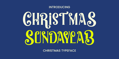 Christmas Sundaylab is a festive and very classy display font. It’s ideal for any of your winter vacation creations, so add it to your designs and bring them to life! Christmas Sundaylab is perfect for branding projects, logo, wedding designs, social media posts, advertisements, product packaging, product designs, label, photography, watermark, invitation, stationery and any projects that need handwriting taste.
 - Growing Garden by Wyarecreatype,
$7.00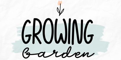 Growing Garden is an elegant and natural trio handwritten font. This original look will appeal to a wide range of crafty ideas. It looks stunning on wedding invitations, thank you cards, quotes, greeting cards, logos, business cards and every other design which needs a handwritten touch. Includes: Uppercase and lowercase For every questions or help, Please contact me. Happy Creating! Thanks!
 - Wordwalker by Cititype,
$16.50 Wordwalker is a freehand casual marker script that designed to appear as if it was written by wide marker. This original look will appeal to a wide range of crafty ideas, from letterheads and titles, to stationery. A clean legible style yet friendly & fun. Wordwalker features extended characters, containing West European diacritics & ligatures, making it suitable for international environments & publications.
 - Regnante by BustanType,
$19.00 Regnante was created with all of my heart. It has a luxury style, is stylish and lovely, and has a strong personality, so it will catch your attention. This font is ideal for a wide range of tasks including branding, logos, packaging, and more. Regnante includes 12 fonts, including 4 weight variations and Italic style. Regular and Alternate are come separately. You can make your selection based on your personal preferences and requirements.
 - More Than Life by Ronny Studio,
$19.00 The More Than Life Bubble graffiti tag font is a typography style commonly used in street art and graffiti culture. It features rounded and inflated letters that create a three-dimensional, bubble-like effect. This style is often used for tagging, a form of graffiti in which an artist writes their name or a stylized chosen word to mark their territory or establish their presence. This font is perfect for your design needs with a graffiti theme. Features : - All Caps - numbers and punctuation - multilingual - PUA encoded Please contact us if you have any questions. Enjoy Crafting and thanks for supporting us! :) Thank you
 - Zaloga by Youthlabs,
$12.00 Introducing ZALOGA Display Serif Font. ZALOGA is a serif font that gives modern touch on your design. It looks so good for fashion brand logo. With different style of shape, ZALOGA will make it easier for you to use various design functions, be it for logos, typography, magazine, fashion, branding, advertising, and more. Need to test words in this font? Just type the box below, and see what it looks like For more information on accessing alternative flying machines, you can see this link (http://adobe.ly/1m1fn4Y) Thanks, stay safe and healthy, and have a nice day.
 - Dear Penpal Script by Giaimefontz,
$6.00 This is a fully connected script font, not calligraphic, but entirely designed to follow handwritten cursive ligatures rules as teached in schools. In order to correctly visualize it, you have to enable OpenType features (Contextual Alternates, Discretionary Ligatures, Standard Ligatues and Kerning). Trying to write All Capitals will generate Block Letters writings, since cursive style doesn't allow more than the first uppercase per word, however this font is not meant to be a Block Letters font. Using specific type combinations will generate special glyphs. All of these features are intended to reproduce a classic schoolboy or schoolgirl notebook.
 - FS Millbank by Fontsmith,
$80.00 A sign of something better When designer Stuart de Rozario surveyed the fonts used in signage on London’s public transport systems, he reached a dead end. They seemed staid, sterile, lacking in personality, and ill-suited to use by modern brands. He was pointed in another direction entirely. ‘The driving force behind my thoughts was to design something more current and fresh without compromising legibility and clarity. A font with both personality and function, that’s versatile and large and small sizes, and effortless to read, but which also says something new.’ Speed reading Late for a meeting and can’t find your way? Trying to catch a flight? Lost in a hospital? Reading signs is a different business to reading a book or a newspaper. Text on signs needs to be deciphered quickly and effortlessly. So the legibility criteria for signage letterforms are different to those for normal reading, too. Throughout FS Millbank’s uppercase and lowercase alphabets, characters have been given features for extra definition, including: wide ink traps on the A, K, M, V, W, X and Y; a serifed i, accentuated spurs on the a, d, l u; and different x-height shapes on the b, g, p and q. Distinctive forms and generous, open internal shapes all help the quick reading of sign text, and wide, open terminals and counters allow similar letter shapes to be distinguished easily when viewed at different angles. Running down a corridor, maybe... Positive/negative Standard type tends to glow on the kind of dark backgrounds often used for signage, and look heavier than its true weight. To correct the imbalance caused by this optical trick, special weights of the typeface have to be drawn for these ‘negative’, light-on-dark applications. These are lighter than their comparable positive weights to overcome the ‘glow’ effect. After extensive tests of the negative weights, at all sizes, we achieved the right optical balance. Glowing, glowing, gone. Icons This wouldn’t be a signage typeface without its own set of icons, or symbols, to help people find what they’re looking for. So, to sit alongside the positive and negative fonts, we’ve created a comprehensive set of 172 icons, covering a wide range of applications from transport and user interface to information and directional. Designed within the typeface capital height, they sit on the baseline and are spaced centrally.