10,000 search results
(0.325 seconds)
- TC Astariah by Tom Chalky,
$19.00 Whimsical, timeless, and elegant. Three words typically used to describe yours truly, and when one is introducing my latest typeface, Astariah. Drawing inspiration from typefaces of the late 1800s, Astariah is perfect for all designs requiring a splash of quirky elegance. UPDATE: Astariah now includes an additional ‘Outline’ style that perfectly aligns with the original. Both styles also host a variety of discretionary ligatures and stylistic alternates, providing buckets more creative potential!
 - Mooncat by VladB,
$32.00 Mooncat is a modern sans serif geometric font with rounded edges, includes upper and lower case characters, Latin, Cyrillic, Latin Eastern Europe, Turkish, Baltic and other. Mooncat family consists of 8 fonts, divided into 2 subgroups (according to the type of style - Op, Rg), and have the 4 types of thickness in each subgroup. Mooncat fonts will be useful in developing a brand, creating posters and other graphic products, and for word processing.
 - Mercury Script by Fenotype,
$35.00 Mercury Script is an action packed type family of three weights. Click on Swash, Contextual or Stylistic alternates in any Open type savvy application for plenty of extra grooviness and combine with Mercury Ornaments for superb results. Turn on Small Caps to activate a complete set of block capitals designed to go with the font. Mercury Script is based loosely on hand lettering found in a vintage lingerie advertisement, only containing the words “light control”.
 - Meytha by HandletterYean,
$14.00 Meytha simplifies elegance into a one truly outstanding handwritten font. It maintains its classy calligraphic influences while feeling contemporary and fresh. This versatility will appeal to a wide range of crafty ideas, from letterheads and titles to stationery, also greeting cards, invitations, store names, posters, labels, quotes, and any kind of design. To access the alternate glyphs, you need a program that supports OpenType features such as Adobe Illustrator CS, Adobe Photoshop CC, Adobe Indesign, and CorelDraw. More information about how to access alternate glyphs, check out this link: http://goo.gl/ZT7PqK
 - Chubby Monster by Sipanji21,
$17.00 "Chubby Monster" is a display font with chubby and bold characters. Fonts like this are often used in various designs that aim to convey a cute or adorable feel. The chubby and bold letterforms give a cheerful and inviting appearance, making it suitable for a wide range of design projects that want to emphasize a sense of playfulness, such as children's designs, toy products, or cute decorations. If you have further questions about using this font or need assistance in a specific design context, please feel free to ask!
 - Ronnia by TypeTogether,
$45.00 One of the most remarkable characteristic of this humanistic sans serif is its versatility. Ronnia’s personality performs admirably in headlines, but is diffident enough for continuous text and small text alike. The heavier weights deliver very cohesive shapes, and they have been successfully used for branding and newspaper headlines. Its ten styles grant the designer a broad range of coherent color and texture variations in text blocks, necessary tools to solve complex information and editorial design problems. Ronnia has been mainly engineered for newspaper and magazine applications manifested in its properties: economic in use, highly legible, and approaching the reader with some friendliness and charm. Ronnia features about 800 characters per weight, including small caps, fractions, old style and lining numbers, scientific superior/inferior figures, and a set of symbols and arrows. It supports over 40 languages that use the Latin extended alphabet. Ronnia Basic is a reduced version of Ronnia. It is still an OT-font but without any particular features except of a set of ligatures, class-kerning and language support including CE and Baltic.
 - Label Machine JNL by Jeff Levine,
$29.00 Label Machine JNL is Jeff Levine's take on the embossed labels popularly used for years as a marking and identifying method. This font has a limited character set. On the left bracket is a wide blank for label ends, and the right bracket has a narrower space for use between words.
 - Reina Neue by Lián Types,
$29.00 Hey! See Reina Neue in action here! INTRODUCTION When I designed the first Reina¹ circa 2010, I was at the dawn of my career as a type designer. The S{o}TA, short for the Society of Typographic Aficionados, described it as complex display typeface incorporating hairline flourishes to a nicely heavy romantic letterform². And it was like that; that’s what I was pursuing at that time since I was very passionate about ornaments and accolades of Calligraphy. Why? I felt that Typography, in general, needed more of them. These subtle flourishes could breathe life into letters. Maybe, I thought it was the only way I could propose something new into the field of type. However, after some years, I came across a very interesting quote: –Beautiful things don’t ask for attention– Wow! What did this mean? How could something be attractive if it’s not actually showing it. Could this be applied to my work? Sure. I think every type-designer goes through this process (aka crisis) regarding his or her career. At the beginning we love everything. We are kind of blind, we only see the big picture of a project. And that’s not because we are lazy. We actually can’t see the small mistakes nor the subtleties that make something simpler beautiful. We are not able. But, the small subtleties… They are actually everything: With experience, one puts more attention into the details and learns that every single decision in type has to be first meticulously planned. Here I am now, introducing a new Reina, because I felt there was a lot of it that could be improved, also the novelty of Variable Fonts caught my attention and I had to take that to my type library. THE FONT A thing of beauty is a joy forever Now, a decade later, I’m presenting Reina Neue. This font is not just an update of its predecessor: –A thing of beauty is a joy forever– is the first line of the poem ‘Endymion’ by John Keats, and despite the meaning of “beauty” may vary from person to person, and even from time to time (as read in the last paragraph), with Reina I always wanted to bring joy to the eye. In 2010, and now, in 2020. I believe the font is today much better in every aspect. It was entirely re-designed: Its shapes and morphology in general are much more clean and pure. The range of uses for it is now wider: While the old Reina consisted in just one weight, Reina Neue was converted into a big family of many weights, even with italics, smallcaps and layered styles. The idea behind the font, this kind of enveloping atmosphere made out of flourishes, is still here in the new Reina. This time easier to get amazing results due to the big amount of available alternates per glyph and also more loyal from a systemic point of view. However, and as read in the introduction -Beautiful things don’t ask for attention-, if none of the flourishes are activated the font will look very attractive anyway. Reina Neue is ready to be used in book covers, magazines, wedding cards, dazzling posters, storefronts, clothing, perfumes, wine labels and logos of all kind. Like it happened with the previous Reina, I hope this new font satisfies every design project around the world if used, and can be a joy forever. SOME INSTRUCTIONS Before choosing the right style for your project, hear my advice: -Reina Neue Display was meant to be used at big sizes. If you plan to print the font smaller than 72pt, I suggest using Reina Neue, not Display. Otherwise, if the font will be BIG or used on a digital platform, Reina Neue Display should be your choice. For even smaller sizes, use Reina Neue Small. This style was tested and printed in 12pt with nice results. (Note for variable fonts: Print them in outlines) -Reina Italic is not a slanted version of the roman, and this means some flourishes are different between each other. The Italic version has other kind of swirls. More conservative, in general. -All the styles of Reina Capitals have Small Capitals inside. -Reina Capitals Shine should be used/paired ONLY with Reina Capitals Black. The engraved feeling can be achieved if Reina Capitals Black and Reina Capitals Shine are used as layers, with the same word. Variable fonts instructions: -For more playful versions, choose Reina Neue VF, Reina Neue Italic VF or Reina Neue Capitals VF: With them you can adjust between 3 axes: Weight (will change the weight of the font) – Optic Size (will thicken/lighten the thin strokes and open/close the tracking) – Accolades (will modify the weight of the active flourishes). SOME VIDEOS OF REINA NEUE VF https://youtu.be/8cImmT5bpQM https://youtu.be/1icWfPmKAkg https://youtu.be/YC9GkJDL1a8 NOTES 1. The original Reina, from a decade ago: https://www.myfonts.com/fonts/argentina-lian-types/reina/ 2. In 2011, Reina received an honourable mention by S{o}TA. “Great skill is shown in the detailing, and an excellent feel for the correct flow of curves and displacement of stroke weight.” https://www.typesociety.org/catalyst/2011/ Reina was featured in the “Most Popular Fonts of the year” in MyFonts in 2011 https://www.myfonts.com/newsletters/sp/201201.html In 2012, the font was also selected in Tipos Latinos, the most prestigious competition of type in Latinoamerica. https://www.tiposlatinos.com/bienales/quinta-bienal-tl2012/resultados Also, chose as a “Favorite font of the year” in Typographica. https://typographica.org/typeface-reviews/reina/
 - Vaccine by ParaType,
$30.00 Vaccine is a slab serif font family with a mixture of the usual and one-sided serifs. We call it ‘semi semi slab serif’. Serifs and terminals have soft rounded shapes, but stem junctions on the contrary use hard constructions. Such combination of basic design features makes the font distinct and strong in a setting and delicate and soft in appearance. This design peculiarity, together with low contrast and strong serifs, produces the qualities needed for using the font in small sizes, in low quality print, and in bad reading conditions. Vaccine got modern stylish design and has a prominent place in the set of popular faces. The family consists of 10 members - five weights with the corresponding italics. It can be used in a wide range of applications - magazines, advertising, corporate identity, urban navigation, packaging, children books, etc. Design by Manvel Shmavonyan with the help of Gayane Bagdasaryan as a consultant. Released by ParaType in 2013.
 - Lens Grotesk by Typedepot,
$39.99 Lens Grotesk is a Neo-grotesque type family of 16 fonts born as a result of a very conscious research in the field of the neutral Swiss aesthetic. There's a reason for all the prominent examples of this design like Helvetica and Univers to be used on a daily basis for more than 70 years and it's a simple one - they just work. The closed terminals, the low contrast, uniform widths and proportions makes the Neo-grotesques feel just right. Although very often branded as stiff, the neutral Neo grotesques are here to stay and Lens Grotesk is our own reading of the popular style. Lens Grotesk takes the Neo-grotesk model one step further adding a pinch of Geometric sans-serif to the mix thus creating a way more modern and contemporary looking design. Characterized with more generous oval proportions and slightly more open terminals, Lens Grotesk keeps the modulation and rhythm needed for a slightly longer texts while visibly keeping everything in order. Zooming in you'll find traces of the Geometric aesthetic - the robust almost right angled approach of the arches and tails (look t, f, j, y) and the way more circular rounded shapes. Like all our fonts, Lens Grotesk is equipped with a range of OpenType features, stylistic alternatives and of course Cyrillic support. It comes in a pack of 16 fonts with 8 styles and their matching italics or one variable font file available with all full family purchases. Live Tester | Download Demo Fonts | Subscribe
 - Mode Style by Motokiwo,
$10.00 Fashion is about style, pairing the right one with the best one. Let me introduce Mode Style, best paired font between Sans Serif and Handwritten Script. It's suitable for logo, display purpose, or something else that needs elegant style. YOU'LL GET: 1. Mode Style Sans, an elegant Sans Serif font with medium wide characters. This is All Caps font with large range of punctuation and multilingual support. 2. Mode Style Script, a classy thin Handwritten Script font with natural pen stroke feel. Comes with ligature make this font more close to the real handwritten, also support multilingual and already PUA Encoded.
 - Mellyna by HandletterYean,
$16.00 Mellyna is an elegant and flowing handwritten font. It is PUA encoded which means you can access all of the glyphs and swashes with ease! It features a varying baseline, smooth lines, gorgeous glyphs and stunning alternates. It maintains its classy calligraphic influences while feeling contemporary and fresh. Fall in love with this font and bring your projects to the highest levels! To access the alternate glyphs, you need a program that supports OpenType features such as Adobe Illustrator CS, Adobe Photoshop CC, Adobe Indesign, and CorelDraw. More information about how to access alternate glyphs, check out this link: http://goo.gl/ZT7PqK
 - Skull Toys by Mvmet,
$12.00 Skull Toys is a cool rough retro-looking display font with halloween twist, you’ll love it if you want to create something with fun halloween theme. It will elevate a wide range of design projects to the highest level. You can use this font for many design ideas such as stickers, t-shirt designs, amazing logo designs, magazine or book covers, comics, cartoon drawings, and many more. This font will add a cool touch to your designs!
 - Sivana by Muflihin Nurhabib,
$18.00 Introducing Sivana: An elegant and modern serif typeface. With its modern and minimalist appearance, CAKELAN brings a luxurious and clean style to your projects such as websites, modern logos, branding identities, social media quotes, wedding stationery, and various other needs! Sivana displays the capital letters A to Z which are unique and classy, of course because they are made with great care so that they become beautiful fonts and can be adapted to various large projects that you want.
 - Blessed Love by Create Big Supply,
$15.00 With its unique style, Blessed Love brings a touch of elegance and charm to your designs, regardless of the topic or purpose. Whether you're working on branding, invitations, posters, or any other creative endeavor, this font has the potential to elevate your creations and leave a lasting impression. Blessed Love features both uppercase and lowercase letterforms, offering versatility and allowing you to experiment with various typographic compositions. Complete with numbers, punctuation marks, and extensive multilingual support, this font ensures seamless integration into your design projects, catering to diverse audiences across the globe. One of the standout features of Blessed Love is its PUA Encoding, which provides easy access to special characters and glyphs. This empowers you to infuse your designs with unique flourishes and personalized touches, allowing your creativity to shine. Embrace the cool and friendly vibe of Blessed Love and unlock a world of design possibilities. With its extensive character set and exceptional versatility, this font is ready to enhance your projects and create a memorable visual experience.
 - Berenjena by PampaType,
$40.00 Berenjena is a captivating font family designed by type designer Javier Quintana Godoy in Santiago de Chile. Berenjena has the right combination of comfort in reading and a lyric spirit. This helps keep readers in the delicate atmosphere in which novels and tales can display all their charm. Most typefaces created for books cannot reach this. Either they are too expressive so they tire the eyes of the reader, or they are dull and reading becomes a tedious task. Berenjena was designed for text use bearing in mind this concept of subtle balance. Berenjena (Spanish for aubergine or eggplant) gives your text that spicy environment in which words shapes are easy to read while letterforms maintain their capricious feeling. It comes in roman and cursive declined in four weights: Blanca, Fina, Gris, Negra. All Berenjena character sets include extensive diacritics coverage for more than 200 languages plus the usual contextual features. The Berenjena Pro fonts (available at PampaType.com) include smalls caps, elegant ligatures, cute swashes, every kind of figures, and all contextual sorts. Berenjena will give your design a very individual character. It wears captivating details of calligraphic poetry which link subtlety to vernacular sign painting from Santiago de Chile. See a pdf of Berenjena here http://origin.myfonts.net/s/aw/original/306/0/156716.pdf or visit PampaType.com for more information.
 - HU Handserif KR by Heummdesign,
$25.00 HU Handserif KR contains KOREAN words and Latin alphabets. HU Handserif KR expresses the heart written down by hand in a font. Since there are no curved serifs, it is a handwritten typeface that is easy for children to follow correctly. It was produced using the order of strokes so that Hangeul can be written in the correct order, and the shape and size of the initial consonants, middle consonants, and final consonants were produced correctly. It also has an honest and correct form based on the basic principles of letters and the structure according to the form.
 - Weekend Date JNL by Jeff Levine,
$29.00 Sheet music from 1910 with another one of those ridiculous thirteen word titles (“I Love My Steady but I’m Crazy for My “Once-in-a-While’”) had the lengthy verbiage hand lettered in a bold serif typeface with slightly spurred serifs. This has been recreated in a digital typeface with a much shorter name: Weekend Date JNL, which is available in both regular and oblique versions.
 - Authority by Juncreative,
$15.00 Authority i a script elegant font, handwrittien perfect for your projects. It has lots of alternate characters that you can find in the glyphs panel. This font is suited for branding projects, as well as packaging. FEATURES Alternate Characters Uppercase and Lowercase letters Numbering and Punctuations Multilingual Support Works on PC or Mac Simple Installation Support Adobe Illustrator, Adobe Photoshop, Adobe InDesign, also works on Microsoft Word
 - Katzenjammer by Hanoded,
$15.00 Katzenjammer is a German word meaning 'Cat's Wail' - it is used to describe a hangover. Katzenjammer font is a slightly eroded, squarish typeface, which would be ideal for headlines, packaging, posters and websites. This all caps font comes with different upper and lower case glyphs and a non-eroded set of alternates for the lower case - for those who like their alphabet nice and neat.
 - Naturallus by MJB Letters,
$17.00 Naturallus is a Casual display font which is very perfect for branding, signature, wedding designs, social media ads, logos and others Naturallus includes full set of uppercase and lowercase letters, numeral, punctuations and ligatures. Included in this set: Works on PC & Mac Simple installations Accessible in the Adobe Illustrator, Adobe Photoshop, Adobe InDesign, even work on Microsoft Word. PUA Encoded Characters Fully accessible without additional design software
 - Widdershins by Hanoded,
$15.00 I like strange words. Widdershins is one of them: it means ‘to go counter clockwise’ and I picked it up from a book I am reading at the moment. Widdershins font was created using a broken bamboo satay skewer and Chinese ink. It is a little messy, uneven and maybe even unnerving, but I am sure you’ll find a way to put it to good use.
 - Holy Golden by Putracetol,
$24.00 The Holy Golden - Bold Retro And Classic Font is a robust typeface that effortlessly blends retro charm with classic elegance. It offers two versions to choose from: a clean version and a rough, textured variant. With its nostalgic and classic aesthetic, this font brings out the vintage vibes in any design. Perfect for use in logos, posters, stickers, business names or branding, titles, headlines, business cards, and quotes, Holy Golden adds a touch of timeless appeal to your creative projects.
 - SG Sunblum by Studio Gulden,
$20.00 Introducing the "SG-SUNBLUM" font, a modern sans-serif typeface that stands out from the crowd with its extraordinary design elements. This font features sleek, elongated lines and bold, asymmetrical letterforms that give it a dynamic and eye-catching appearance. It also includes an extensive range of special characters and multilingual support for added versatility. Whether you're looking for a font for a headline, logo, or any other design project, SG-SUNBLUM is sure to make a bold statement and capture attention.
 - Taconic by Kellie Jayne Studio,
$10.00 Taconic Font is a quirky handwritten font with a playful feel. It was inspired by a hiking trip by the Taconic mountain range. To keep your designs fresh, Taconic features a set of stylistic alternates for both uppercase and lowercase letters, plus over 50 discretionary ligatures. It is easy to achieve a totally handwritten look with natural variations in the letterforms. This font works great for editorial designs, marketing materials, blogs, or whatever you'd like to add some handwritten pizzazz to!
 - Rondoy by High Peak,
$25.00 High Peak is proud to present Rondoy, a clean, readable yet distinctive sans-serif typeface. The Rondoy family comes in six weights and matching italics for a total of 12 styles to unleash maximum expression and creativity, ready to give you all you need to bring your project to the next level. Each glyph in this family is crafted with passion and care. Rondoy is designed to be used in any context where style, modernity and legibility is a requirement. Enjoy!
 - Happy Holidays by Comicraft,
$19.00 Back in 2006 when we first released our Happy Holidays font, we thought the War on Christmas was over! We'd taken down our Menorahs, our Christmas trees, reclining Buddhas and red, black and green Kwanzaa decorations, and were prepared to sprinkle nothing more than a little Season's Greetings over our end of year celebrations. When we saw our friends and neighbors at department stores, we'd greet them with a simple, cordial, non-denominational “Happy Holidays.” But the font showed up at our company party this year having learned over 200 new languages (and, it must be said, a little bit loaded on Stylistic Alternates) in a mood to celebrate EVERYTHING. It was wishing people happy Bodhi Day, Solstice, Festivus, you name it! It even brought (count 'em) THREE new outfits based on the colors of Christmas, Hanukkah and Kwanzaa. So may the designs on the cups of the hot beverages that take you through the long dark coffee break of the soul that stretches from Halloween to Thanksgiving to New Year's Day be a little more festive this year with the refreshed, Remastered, all-inclusive spirit of Happy Holidays!
 - Chadelova by Almarkha Type,
$35.00 chadelova font with a natural handwritten feel. It has sweety swash that are perfect for any creative design. This handmade font will make your design has a beautiful natural touch for each details. It is perfect for any design project as Invitation,logo, book cover, craft or any design purposes. This font is PUA encoded which means you can access all of the magical glyphs and swashes with ease! It also features a wealth of special features including alternate glyphs and ligatures. Simple installations Accessible in the Adobe Illustrator, Adobe Photoshop, Adobe InDesign, even work on Microsoft Word. PUA Encoded Characters - Fully accessible without additional design software. Fonts include multilingual support Image used : All photographs/pictures/vector used in the preview are not included, they are intended for illustration purpose only. Cheers! Thank You
 - Punkaholic by Sharkshock,
$115.00 Punkaholic started out as a loopy, all caps display font with a semi condensed feel. Before completion some of the letters such as A and W were given a more traditional look and were penciled in for alternates. In the end, however, they were added as uppercase characters instead. For this reason most words in lowercase vary in appearance from their uppercase counterparts. This dichotomy between straight lined capitals and rounded ones makes for some interesting contrasts. Punkaholic works best in less formal settings such as café menus, t-shirts, or children’s publications. It comes in 3 styles and contains Latin, extended Latin, punctuation, and kerning.
 - Break Age Graffiti by Sipanji21,
$17.00 Break Age is an awesome display font with a graffiti style and break characters with bandages to make your design look awesome! It will elevate a wide range of design projects to the highest levels, be it branding, headings, wedding designs, invitations, signatures, logotypes, wall art illustrations, apparel, labels, and more!
 - Spiky Frog Graffiti by Sipanji21,
$18.00 Spiky Frog is a spectacular decorative font with a graffiti style and included some swash for your design look awesome. It will elevate a wide range of design projects to the highest level, be it branding, headings, wedding designs, invitations, signatures, logotype, wall art illustration, apparel, labels, and much more!
 - Blue Monsta Graffiti by Sipanji21,
$18.00 Blue Monsta is a spectacular decorative font with a graffiti style and included some swash for your design look awesome. It will elevate a wide range of design projects to the highest level, be it branding, headings, wedding designs, invitations, signatures, logotype, wall art illustration, apparel, labels, and much more!
 - Slashmine by Din Studio,
$29.00 Slashmine is authentic and modern blackletter font. The font is suitable for any branding project like logo, t-shirt printing and many more. Outstanding in a wide range of contexts. Featured : Alternates Accents (Multilingual characters) PUA encoded Numerals and Punctuation (OpenType Standard) Thanks for downloading premium font from Din Studio
 - Aleksa by AlfaBravo,
$25.00 Sans serif family Aleksa combine some of traditional Ukrainian letter shapes with contemporary vision. It makes a beautiful contrast that works really well with a modern design. The family features 9 weights, ranging from Thin to UltraBlack including italics. Designed by Kyrylo Tkachov and Marchela Mozhyna. Released by AlfaBravo in 2020.
 - Black Orchard by ErlosDesign,
$19.00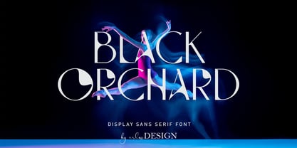 Black Orchard is a sans serif font with modern style. It includes uppercase letters, numeral, a large range of punctuation and also multilingual support. Perfects for poster, web design, magazine cover, album cover , branding and many more. The file you will get is: • Works on PC & Mac • Simple installation Enjoy!
 - Cornucurlia by Calligraplay,
$13.00 Cornucurlia is a carefully constructed typeface comprising curvaceously connected characters. Designed as a display font, use it for posters, signage, branding and any type-based artwork that needs stylish, standout lettering. Multi-lingual and with a range of symbols, the font includes 368 glyphs that link together with geometric curves.
 - Karty Solid by Eurotypo,
$22.00 Karty Solid is a freehand typeface that was inspired by John Baskerville’s designs. Karty Solid comes in three version: Regular, condensed and Expanded, including a large set of swashes, ligatures and stylistic alternatives, which bring the chance to create logotypes, originals headlines for fashion magazines, children books, advertising and much more.
 - Yoda by MysticalType,
$10.00 Yoda is a super-compressed font family with some suitable special characters. Perfect for posters, display copies, headlines, magazine header copies. It comes in 10 weights ranging from extra light to black so it is versatile. The extra lightness can give you great height because of how narrow it is.
 - Karty by Eurotypo,
$22.00 Karty is an outline freehand typeface that was inspired by John Baskerville’s designs. Karty comes in two version: Outline and Shadow fonts, including a large set of swashes, ligatures and stylistic alternatives, which bring the chance to create logotypes, originals headlines for fashion magazines, children books, advertising and much more.
 - Black Indie by Din Studio,
$29.00 Black Indie is a bold and authentic display font. The font is suitable for any branding project like logo, t-shirt printing and many more. outstanding in a wide range of contexts. Featured : Accents (Multilingual characters) PUA encoded Numerals and Punctuation (OpenType Standard) Thanks for downloading premium font from Din Studio