10,000 search results
(0.118 seconds)
- Buum by Ondrej Chory,
$70.00 The Buum typeface evolved from the explosive lettering originally designed as part of a house style for an interactive science centre for kids. Beside its usual application as a strong display font in print and on screen, the bold angular shapes of glyphs are adapted for negative machine- or laser-cutting into structural materials such as iron sheets, plywood, or stone ... and for creating tactile expressive surfaces and 3D objects. This pictogrammic and dazzling font remotely echoes the morphology of the lettering of futurism and constructivism, when avant-garde typography was once an exciting adventure. It is a lettering building kit with a number of stylistic alternatives of glyphs that enable a user to shape the same word differently each time. Buum is recommended by nine out of ten old school futurists, favored by steampunk CNC operators and respected by the majority of infantile anarchists.
 - Bureau Grot by Font Bureau,
$40.00 Bureau Grot is now accepted as the essence of tooth and character in an English 19th-century sans. The current family was first developed by David Berlow in 1989 from original specimens of the grotesques released by Stephenson Blake in Sheffield. These met with immediate success at the Tribune Companies and Newsweek, who had commissioned custom versions at the behest of Roger Black. Further weights were designed by Berlow for the launches of Entertainment Weekly and the Madrid daily El Sol, bringing the total to twelve styles by 1993. Jill Pichotta, Christian Schwartz, and Richard Lipton expanded the styles further, at which point the family name was shortened from Bureau Grotesque to Bureau Grot; FB 1989–2006
 - Meguro Serif by GT&CANARY,
$34.00 Potent, clean and classy. Meguro serif has a modern-styled boxy shape with small glyphic serifs emphasizing the edge of its vertical and horizontal strokes. Inspired by iconic fonts of the 1900s, Meguro serif incorporates the sophistication of the digital age to strike its own unique character. Its mono-line oriented, pointy serifs and very high X-height ensure that it is extremely legible and creates a strong impression. The Meguro serif font family is comprised of 10 styles with 5 different weights from light to black, along with matching italics offering possibilities for use in web, print, package and sign design, all with the goal of building an established look for brands in wide range of industries.
 - XXII Centar by Doubletwo Studios,
$19.00 Centar Sans is a simple, modern, universal, powerful, invisible but not characterless, sans serif family. The family is designed for identities & corporate projects. Its wide range of styles covers lots of possibilities of use, from headlines to texts. It supports a lot of languages including cyrillic and comes along with 19 OpenType features - Small Caps, ligatures, alternates and many more. Regular styles are FREE! Extended detail here. or here.
 - SF Old South Arabian by Sultan Fonts,
$9.99Historical Background Old South Arabian Script (OSA) was used before the Islamic era not only in the southwest corner of the Arabian Peninsula, but actually in the entire Peninsula. In addition, samples of OSA have been found as far as Uruk in Mesopotamia, Delos in Greece, and Giza in Egypt. Archaeological finds show that as far back as the 8th century BCE, OSA was used in trade, religious writing, and in civil records. Following the spread of Islam in Yemen, the decline of OSA began in the 7th century CE as it was gradually supplanted by Arabic script. OSA was typically known by the name of the then-dominant peoples in the Southern Peninsula. At various times, it was known as Sabaean, Qatabani, or Hadramite, among others. Although it was used for a variety of languages, OSA is most strongly associated with Sabaean. Many Peninsular languages borrowed OSA before introducing further changes of their own. Prime examples are the Thamudic, Safaitic, and Lihyanite scripts which eventually developed into independent scripts. The westward migration of the Sabaean people into the Horn of Africa introduced the South Arabian consonantal alphabet into the region. The transplanted script formed the roots of the Geez script of Ethiopia, which, in time and under presumably external influences, developed into a rich syllabary unlike any other Semitic script in history. Even a cursory examination of the letter forms of Modern Ethiopic writing reveal a striking similarity to South Arabian Script. OSA inscriptions typically reveal a dominant right-to-left directionality, although there are also many cases of alternating directions, known as boustrophedon writing. Figure 1 is a fine example of this style of writing. OSA inscriptions were discovered early in the 19th century. Soon thereafter, two orientalists, Gesenius and Rödiger, made great strides towards deciphering the script. Styles of Writing Old South Arabian inscriptions have survived primarily on stone, ceramic, and metallic surfaces. Hundreds of artifacts have been found and, to this day, continue to be discovered. Some of the best examples number of inscriptions on softer materials, such as wood and leather, have also been discovered. Although there is a significant difference between the styles of letters on the hard surfaces and those on the soft. Old South Arabian (Musnad) is composed of 29 letters , that is one letter more than the Arabic alphabet, which is between “S” and “Sh”, and names “Samekh”. Aspects of difference between Musnad and the present Arabic writing is that Musnad is written in separate letters, and the shape of the letters do not change according to its place in the word. However, some letters change according to the beginning of the writing. Musnad is either prominent, or deep. Prominent writings are for important writings and deep writings are for ordinary. The material on which the Musnad was written were stones, rocks, wood, and metal. In the course of its development the Musnad use appeared in the “Lehyanite’, “Thamudic”, “Safaitic”, pen to which many changes and amendments were made. And from it “Habashi’ writing was born. As regards his place among the Arabs of the Peninsula , when we look at the internet and its role in cultural dialogue , the Arabs of the Peninsula considered Musnad inscription which was indisputably their national writing until the dawn of Islam. It was used by people in all parts of Arabia in their homeland and abroad . It was their means of chronology and record of their glories and history.2- Features of Musnad Script: 1. It is written from right to left and vice versa. 2. Its letters are not joined. 3. Shape of letters are uniform despite their positions in the word. 4. Words are separated by vertical lines. 5. A letter is doubled in case of assertion. 6. No points and punctuations. 7. Easy to be learned by beginners. My OSA Musnad Font My design and technical work is only a treatment of the OSA Musnad as a symbol of writing. And it is possible to use in computer.. My design is not aimed at demonstrating the linguistic and intellectual structure of the Old South Arabian (Musnad). It is so simple that it could be easy to learn by learners and those who are interested in the OSA Musnad letters in computer. The basis of such importance is that it spares a lot of time and effort for researchers and students in this field. Formerly they used to write the Musnad texts either by handwriting or scan them , But now they can easily write its texts in OSA Musnad by using keyboard directly, so that they can change , amend and fulfill easily and accurately . So, we made use of speed, easiness and accuracy. And anyone interested in the South Arabian history in any part of the world can due to this design read and write OSA Musnad letters most easily. This design will also be used by historians and archeologists. , as well as specialist linguistics . The design also demonstrates the aesthetics of the Himyarit writing. About this font family Old South Arabian is An Arabic, Old South Arabian and Latin typeface for desktop applications ,for websites, and for digital ads. Old South Arabian font family contains two types: Old South Arabian and Old South Arabian serif. The font includes a design that supports Arabic, Old South Arabian and Latin languages. Old South Arabian typeface comes with many opentype features. - Blend by Typesenses,
$49.00 Blend is a hand drawn collection that takes its cues from the visual universe of bakeries and coffee shops. The name refers to the combining of different kinds of coffee beans to get a balanced taste, and Blend does just that, although here each typographic flavor can also be enjoyed separately. Projects such as branding, children’s books, wedding invitations and labels are sweetened with this cute family. The bouncing informal Script programmed with Open Type offers a wide range of features like ligatures, swashes, endings, initial forms and lots of alternates. Use professional software that widely support Open Type features. Otherwise, you may not have access to some glyphs. Keep the Standard Ligatures feature always active. For further information about features and alternates, see the User Guide Blend has extensive Western, Central and Eastern European language support. Make some coffee and enjoy!
 - Belisha by Letterena Studios,
$9.00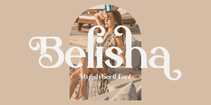 Belisha is a lovely and distinct serif font. It will elevate a wide range of crafting ideas, from cards, to branding, labels and much more. This font is PUA encoded which means you can access all glyphs and swashes with ease!
 - Love4Sale by Jelloween,
$15.95This summer there's LOVE FOR SALE! Come get some... Love4Sale is a sexy, boldish font that will certainly steal your heart away. It contains a wide range of accented characters and is available in Truetype, Opentype and Windows PostScript format. - Adelaide Sky by Omaikraf Studio,
$14.00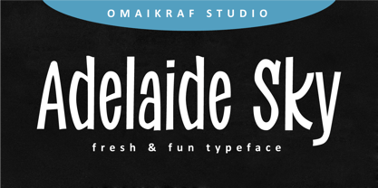 Adelaide Sky is a fun and relaxed display font. Casual and versatile, this font fits a wide range of designs, such as branding, product packaging, invitation, quote, t-shirt, label, poster, logo or any other idea that you wish to develop.
 - Hemmah Arabic by Eraqy TF,
$24.00 Hemmah is an Arabic display font that features a dynamic, heavy and playful letterform design. This font is an excellent choice for a various range of creative projects including publication design, branding and advertising. Hemmah supports web, print and mobile applications.
 - Equalis Stencil by Eurotypo,
$28.00 Equalis Stencil is a slab-serif typeface. This OpenType font comes in three weights, alternates and symbols, with support for CE languages. Equalis Stencil can be used as display type, headlines, packaging, signs routing and a wide range of projects.
 - Time Breaker by Motokiwo,
$15.00 Time Breaker, a bold caps typeface crafted from a classic brush with stylish and casual gesture. It's great for branding, logo, headline, poster, title, etc. This font contains all caps characters, numeral, large range of punctuations, and also multilingual support.
 - Request by Din Studio,
$29.00 Request is a bold and authentic display font. It celebrates abstract shapes in all their eclectic beauty. This font will look truly outstanding in a wide range of contexts. Featured : Accents (Multilingual characters) PUA encoded Numerals and Punctuation (OpenType Standard)
 - No Parking JNL by Jeff Levine,
$29.00 No Parking JNL was inspired by a hand-cut stencil of those words painted in an area of a department store's parking lot.
 - Kukulkan by Sudtipos,
$149.00 Introducing "Kukulkan," a font designed by Raúl Plancarte, adorned with accolades, that unravels the structural possibilities nestled within the realms of ancient Roman letters and fantastical styles, infusing them with a contemporary essence. This typeface exudes a conspicuous plasticity and expressiveness, seamlessly harmonizing within its original intended context as a font for continuous text, bolstered by its robust and assured strokes. It stands as the triumphant culmination of a thorough exploration, meticulously considering legibility. Infused with nuanced elements that evoke a pre-Hispanic idealization of Mayan culture, this essence takes center stage in its darker iterations. However, it is adept at adapting to a myriad of ethnic and cultural nuances prevalent in our global village. Noteworthy is the fact that the "Kukulkan" font family is available as a variable font, offering a dynamic range of styles across its 18 fonts, endowing it with a lively, human, and refined demeanor. Additionally, it features a variant known as "Kukulkan Ornaments," a collection of 150 dingbats comprised of icons, symbols, and frames intricately inspired by the iconography of Mayan hieroglyphs. In its natural application, "Kukulkan" thrives in contexts of art, lifestyle, culture, seamlessly bridging tradition and avant-garde. This font excels in the realm of editorial design, evident in its adeptness at crafting robust headlines, and in select cases, it lends itself to creating striking brand identities.
 - FF Child's Play by FontFont,
$62.99 British type designer John Critchley created this script FontFont in 1993. The family has 7 weights, and is ideally suited for advertising and packaging, editorial and publishing as well as poster and billboards. FF Child's Play provides advanced typographical support with features such as ligatures and alternate characters. It comes with a complete range of figure set options – oldstyle and lining figures, each in tabular and proportional widths.
 - Folk Retro by Mvmet,
$9.00 Folk Retro is a cool and playful handlettered font, inspired by vintage western sign paintings. It will elevate a wide range of design projects to the highest level. You can use this font for many design ideas such as stickers, t-shirt designs, amazing logo designs, magazine or book covers, comics, cartoon drawings, and many more. Fall in love with its incredibly versatile style, and use it to create lovely designs!
 - Equalis by Eurotypo,
$44.00 From Latin aequālis (equal). The case conveying an equality with another noun. Equalis, sets its sights on applied mathematics. Equalis is a slab-serif typeface characterized by a tall x-height and very short ascenders / descenders. This OpenType font family comes in two weights and italics, with support for CE languages. Equalis can be used as display type. Suitable for body text, headlines, package & a wide range of projects.
 - Informative by Latinotype,
$39.00 Informative is a typeface consisting of a whole family of sans fonts and a collection of thematic pictograms. This combination of two different types of communication reflects the current need for using text and images as means of conveying information in a complementary way. The family comes with a text version of 7 weights (with matching italics)—Thin, Light, Regular, Medium, SemiBold, Bold and Black, and includes 7 thematic icons sets which allude to elements related to alimentation, city, energy, people, politics, sports and work. Each set contains 88 glyphs and includes both outline and black versions. The text font contains a set of 423 glyphs that support 207 different languages. Informative is a clean, simple and versatile typeface well-suited for a wide range of graphic design and visual communication projects. This font has especially been designed for infographics, maps and digital applications.
 - MFC Whitworth Monogram by Monogram Fonts Co.,
$19.00 The inspiration source for MFC Whitworth Monogram is an alphabet set from a vintage embroidery alphabets book, Alphabets Broderies No. 238 by N. Alexandre & Cie. What began as 26 referenced capital letters has been expanded to three sets of alphabets within a single typeface. True to the original reference, the Capitals are the stylized cursive capital letters in all their gorgeousness. The lowercase encapsulates the capital letters intertwined within rectangular frame. By enabling Stylistic Alternates and typing any lowercase letter, you get each letter encapsulated and intertwined within an oval frame. A handful of decorative forms are placed in the 0-6 numeral slots. Originally intended to adorn handkerchiefs and other linens, this digital revival opens it up to a whole new realm of possibilities. This is one of many monogram designs from the late 1800's to early 1900’s that is loaded with panache and intricate detailing.
 - Little Boxes by Resistenza,
$39.00 A new happy handwritten sans serif font has arrived! Little Boxes has been designed with felt pen on smooth paper to create the illusion of human craft and then digitalized. Three different fonts Regular, slanted and dance. Optimized shapes to obtain the best readability without loosing the analogical feeling of the original designing tool, makes this font perfect both for printing and digital environments and it allows the use of the font on any project with different media supports. This fresh font family is ready for text, but check your opentype features window while using the font and discover a beautiful set of alternate letters. Create catchy words and add more fun to any layout, which makes it a perfect match for titles and display too. A friendly typeface to give a whimsical touch to your projects. We highly recommend using Little Boxes for App, web, ePub, digital Ads, Video games, and a great fitting for printing; headlines, posters, DIY hand-lettered artwork, books, holiday cards, invitations, T-shirts, labels, packaging, artisanal goods, etc.
 - Chat Love by Sakha Design,
$9.00 Chat Love is a cute and adorable display font. Fall in love with it and bring your projects to the highest levels!
 - Peckham by Los Andes,
$29.00 Peckham, designed by Daniel Hernández, is a contemporary and versatile slab serif of 8 weights (and matching italics)—ranging from an elegant Thin to a heavy Black—with strong serifs that give it a playful look while preserving the overall geometric structure of the font. Peckham comes with the standard Latinotype set of 395 glyphs resulting in a language support for 94% of the languages using the Latin alphabet. The font also includes stylistic alternates (A, R, Y, a) which provides extra versatility. The name of the font reminds us of the city that witnessed the birth of Vincent Figgins (1766). Figgins became known as the type designer who first included slab serif fonts in a commercial catalog. Peckham pays homage to classic typefaces yet looks very contemporary. Digital editing and corrections by Alfonso García.
 - Autumn Stories by Tlatous Type,
$19.00 Introducing Autumn Stories by Tlatous Type. Autumn Stories is a Modern Script Handwritten Font. This font is perfect for product packaging, branding project, megazine, social media, wedding, or just used to express words above the background.
 - Bike Power by PizzaDude.dk,
$19.00 I love my bike, and I couldn't dream of not using it on a daily basis - I use my bike in rain, sun, snow, and windy days...all year, in other words! This font is dedicated to my bike, and is the first in a series of handmade fonts! Play around with the three layers and your favourite colours, for awesome effects. All versions comes with Contextual Alternates, which means several versions of each letter. In this case, every letter has 5 different versions that automatically cycles as you type! A quite awesome thing, because it makes your text more lively and natural looking!
 - Bike Jam by PizzaDude.dk,
$17.00 I love my bike, and I couldn't dream of not using it on a daily basis - I use my bike in rain, sun, snow, and windy days...all year, in other words! This font is dedicated to my bike, and is the second in a series of handmade fonts! Play around with the 5 layers and your favourite colours, for awesome effects. All versions comes with Contextual Alternates, which means several versions of each letter. In this case, every letter has 7 different versions that automatically cycles as you type! A quite awesome thing, because it makes your text more lively and natural looking!
 - Wasabi by Positype,
$20.00 Remastered in 2019. Wasabi is the re-imagining of my very first release, Iru. Like Iru, Wasabi was heavily influenced by the monument lettering style, Vermarco. The simple, geometric forms allowed for small lettering sizes to be sandblasted cleanly and has been a monument lettering workhorse for decades… the only issue centered around the lack of a lowercase or any other letters beyond the 26 uppercase glyphs and the numerals. Wasabi solves this with the same simple, efficient line reminiscent of the old Vermarco while bringing it into the 21st century. Visual and optical incongruities of the original uppercase were replaced with new interpretations for the capital letters, a new lowercase and small caps were produced and the original single weight alphabet was replaced with six new weights. Wasabi has several ‘lighter’ weights primarily because the thin lines and simple transitions produce very elegant relationships… and I wanted to make sure those relationships could be explored regardless of the scale of letter. Stylistic Alternates show up through the upper, lowercase and small cap glyphs that attempt to simplify these shapes even more when the opportunity arises. Wasabi is as much a utilitarian typeface as it is a headline face. This realization led to the decision to produce a companion Condensed version shortly after the initial regular weights were developed and tested; so, try them all!
 - Wasabi Condensed by Positype,
$20.00 Remastered in 2019. Wasabi is the re-imagining of my very first release, Iru. Like Iru, Wasabi was heavily influenced by the monument lettering style, Vermarco. The simple, geometric forms allowed for small lettering sizes to be sandblasted cleanly and has been a monument lettering workhorse for decades… the only issue centered around the lack of a lowercase or any other letters beyond the 26 uppercase glyphs and the numerals. Wasabi solves this with the same simple, efficient line reminiscent of the old Vermarco while bringing it into the 21st century. Visual and optical incongruities of the original uppercase were replaced with new interpretations for the capital letters, a new lowercase and small caps were produced and the original single weight alphabet was replaced with six new weights. Wasabi has several ‘lighter’ weights primarily because the thin lines and simple transitions produce very elegant relationships… and I wanted to make sure those relationships could be explored regardless of the scale of letter. Stylistic Alternates show up through the upper, lowercase and small cap glyphs that attempt to simplify these shapes even more when the opportunity arises. Wasabi is as much a utilitarian typeface as it is a headline face. This realization led to the decision to produce a companion Condensed version shortly after the initial regular weights were developed and tested; so, try them all!
 - Semiotic by Letterhend,
$19.00 Semiotic is a stylish condensed font. The uniqueness of this font is have the same size of uppercase and lowercase, so you can playaround to create a nice wording with this font. Very suitable for logo, headline, tittle, and the other various formal forms such as invitations, labels, logos, magazines, books, greeting / wedding cards, packaging, fashion, make up, stationery, novels, labels or any type of advertising purpose. Features : uppercase and lowercase numbers and punctuation multilingual ligatures alternates PUA encoded We highly recommend using a program that supports OpenType features and Glyphs panels like many of Adobe apps and Corel Draw, so you can see and access all Glyph variations. How to access opentype feature : letterhend.com/tutorials/using-opentype-feature-in-any-software/
 - Nouveau Showcard JNL by Jeff Levine,
$29.00 The 1920 song “Noah’s Wife Lived a Wonderful Life (‘Cause Noah Had to Stay Home)” is another example of one of those overly-worded song titles from early 20th Century composers. What’s more important for type enthusiasts is that the title was hand lettered with a round nib pen in a slightly ragged Art Nouveau style. Cleaning up the ragged design, the end result became Nouveau Showcard JNL, which is available in both regular and oblique versions.
 - VLNL Brak by VetteLetters,
$35.00 Brak is the dutch word for ‘brackish’, the mix of fresh and salten sea water found in river deltas and estuaries. Brak is also VetteLetters’ straightforward display font with straight lines and rounded ends, and comes in two weights. It does really well in sea food dishes like fish, lobster, mussels and shrimps. Brak doesn't beat around the bush, it is an all-caps typeface with alternative capital letterforms assigned to the lowercase positions, for a variety of combinations.
 - Fitz Sans SRF by Stella Roberts Fonts,
$25.00 Fitz Sans SRF was contributed to the Stella Roberts Fonts project by graphic designer Matt Yow after receiving word of the project from Ray Larabie of Typodermic Fonts. A light, attractive text face, Fitz Sans SRF also lends itself well to headlines and titles. The font is available in both regular and oblique versions. The net profits from my font sales help defer medical expenses for my siblings, who both suffer with Cystic Fibrosis and diabetes. Thank you.
 - Romanist by Rochart,
$25.00 Introducing Romanist - a modern twist on the classic textura/blackletter style font that brings a bold and contemporary edge to your designs. This versatile typeface combines the rich heritage of traditional blackletter with sleek, clean lines and a touch of modern sophistication. With its distinctive Gothic-inspired letterforms, Romanist adds a touch of elegance and intrigue to any design project. Whether you're creating stunning t-shirt designs, captivating magazine covers, or eye-catching posters, this font is sure to make a statement. Whether you're a professional graphic designer, a clothing brand, or a magazine publisher, Romanist is your go-to font for adding a touch of sophistication and originality to your designs. Elevate your creative projects to new heights with the timeless allure of Romanist. Experience the power of Romanist and let your imagination run wild as you create captivating designs that leave a lasting impression.
 - Xotor by Typogama,
$19.00 Xotor is a double styled typeface family destined for use in titling and headlines. The main style, the Triline weight, is a modular typeface composed of three strokes and is best used in large sizes. For smaller bodies of text, the second Regular style is based on the same letter construction but in a simple, solid stroke. Both weights can either be used individually or combined to add extra effect to any layout. With an extended Latin language support, Xotor covers most Latin based scripts and equally features a range of Opentype features, from ligatures, alternative letters or different styles of numerals.
 - Timber by Pelavin Fonts,
$25.00 Hand-hewn from sturdy planks with nary a splinter, Timber is a font with origins in the forests of our imagination whose genesis is displayed in its undulating grain. Using just the fill attribute it can present a diverse range of species from mellowest Maple to deepest Ebony. Additional layers of fill and stroke attributes provide the option for an endless variety of outlines and shadows, all the while preserving its luscious texture. If you’ve ever pined for a typographic solution which combines legibility with an organic character, you just might like to get on board.
 - Naga by Canada Type,
$24.95 Naga is Hans van Maanen's original creation of art deco shapes interected with intricate mazes of what could be Celtic or Mesoamerican knotwork art. The totality of the typeface borders on the mysterious, exotic and yet clearly discernible as far as readability is concerned. Naga comes with a companion outline style that emphasizes its intricacy. Both fonts hold up quite strongly when combined with photo/illustration masks. The Naga family comes in both OTF and TTF formats, and includes an extended range of characters covering most Latin-based languages. A few unicase forms are also included.
 - Our Infinity Love by Putracetol,
$28.00 Our Infinity Love - Monoline Wedding Font. Our Infinity Love wedding script fresh & modern script with handmade calligraphy style. This font is inspired by monoline the character's style which shows the romance of a relationship through hand strokes with the added "love" symbol at the end of the line. This font is perfect for a professional touch making this font more elegant and suitable for all types of projects you are working on, especially for romantic-themed work. But this font is also suitable for logos, branding, greeting cards, invitation cards, advertisements, titles, healines, book titles, stickers, packaging, quotes, posters, t-shirts/apparel, billboards and others. The alternative characters were divided into several Open Type features such as Swash, Stylistic Sets, Stylistic Alternates, Contextual Alternates, and Ligature. The Open Type features can be accessed by using Open Type savvy programs such as Adobe Illustrator, Adobe InDesign, Adobe Photoshop Corel Draw X version, And Microsoft Word. This font is also support multi language.
 - Hisham by Linotype,
$187.99Hisham is a modern Arabic headline face, designed by the Lebanese calligrapher, Ahmed Maged, originally for Linotype-Hell Ltd. The Hisham design has a distinctive style with a strong baseline, relieved by strategic cut-away effects, which is counterbalanced by the bold vertical strokes and some strong diagonals. This somewhat compact font adds a new style to the range of Linotype’s Arabic headline fonts. This OpenType font includes Latin glyphs from Optima Extra Black, allowing users to set text in both most Western European and Arabic languages without switching between fonts. Hisham incorporates the Basic Latin character set and the Arabic character set, which supports Arabic, Persian, and Urdu. The font also includes tabular and proportional Arabic, Persian, and Urdu numerals, as well as a set of tabular European (Latin) numerals. - Papillon Script by Fenotype,
$30.00 Papillon Script is an eloquent pen script with large display capitals and small but legible lowercase letters. It’s ideal for logo, headline, brochure, model for a neon sign or any display use like that. Papillon Script is completely monolinear and it gives a clear but vivid impression of a hand writing style. Papillon Script is equipped with following OpenType features: • Standard Ligatures is automatically on and it adds variation and smoothness to typing. If a same letter repeats in the same word the latter will automatically change to an alternative version. • Contextual Alternates is an optional feature that cuts the connection between letters every once in awhile. • Titling Alternates changes the last character in every word into an ending Swash alternative. • From Stylistic Set 1 you’ll find a set of 34 ornaments, strokes and arrows. • Small Caps turns lowercase into a set of legible capital letters.
 - Balgin by Studio Sun,
$12.00 Balgin brings back the nostalgic era of 90's. The 90’s were a magical time – a time of the Docs, Game Boys, and Cartoon. As everything that was once old is new again, the 90’s are making a come back. The basic of typeface are from geometric/basic shapes (Triangle, Square, Circle) form. Some character in Display font are modified, like 'R'K' stroke are more dynamic. and the tail of 'g' are more generic. Balgin are available in 3 Flavour Typefaces (Display - Normal - Text) and have 6 different weights (For Normal are available on 5 Widths). Available with Variable Fonts on Balgin Display & Balgin Normal