10,000 search results
(0.028 seconds)
- Social Networking Icons by Matt Grey Design,
$26.00The Social Networking Icons font family has been designed to simplify the process of routinely loading and pasting social icons around, for both print and on the web – reducing server load and saving time. They are great for embedding in webpages or for use on product packaging, posters, flyers and other marketing materials. Comes with a PDF guide and an interactive symbol sheet with labelled icons for reference. v4.0 Is out now with multiple improvements and updates on most icons. - Burgues Script by Sudtipos,
$99.00 Burgues Script is an ode to the late 19th century American calligrapher Louis Madarasz, whose legendary pen has inspired schools of penmanship for over 100 years. His talent has caused some people to call him “the most skillful penman the world has ever known.” I use the word ‘ode’ in a colloquially ambitious manner. If I was an actual poet, my words would be about things I desire but cannot attain, objects of utter beauty that make me wallow in humility, or people of enormous talent who look down at me from the clouds of genius. But I don’t write poems. My work consists of letters drawn to fit together, that become an element of someone’s visual poetry. I am the poet’s assistant, so to speak. Once in a while, the assistant persists on what the subject of the poem will be. And occasionally, the poet gives in to the persistence. I hope you, visual poet, find my persistence justified in this case. The two main sources for Burgues were the calligraphy examples shown in Zaner Bloser’s The Secret of the Skill of Madarasz: His Philosophy and Penmanship Masterpieces, and C. W. Jones’s Lessons in Advanced Engraver’s Script Penmanship by L. Madarasz. These two references were the cornerstone for the concept I was trying to work with. I did have to change many of the letters in order to be able to produce digital calligraphy that can flow flexibly and offered the user a variety of options, while maintaining its attractive appearance. To this end, many ligatures and swashes were made, as well as full flourished sets of letters for use at the beginnings or endings of words and sentences. All of this has been tied together with OpenType and tested thoroughly within today’s standard design and desktop publishing software. After working with digital scripts for so long, at one point I thought that Burgues Script would become a bit of a chore to complete. I also thought that, like with most other scripts, the process would regularize itself after a while and be reduced to a mechanical habit. Surprisingly, and fortunately for me, this did not happen. The past holds as many surprises as the future. Madarasz’s method of penmanship was fascinating and challenging to translate into the strict, mathematically oriented language of the computer. It seems that the extremely high contrast of the forms, coupled with the required flow and connectivity of such lettering, will always be hard work for any visual artist to produce, even with the aide of a powerful machine. I can only imagine what steady nerves and discipline Madarasz must have had to be able to produce fully flourished and sublimely connected words and sentences on a whim. When I think of Madarasz producing a flourished calligraphic logotype in a few seconds, and try to reconcile that with the timelines of my or my colleagues’ work in identity and packaging design, the mind reels. Such blinding talent from over a hundred years ago. Burgues is the Spanish word for Bourgeois. In the end, I hope Burgues Script will serve you well when a flourished word or sentence is required for a design project. One of the wonders of the computer age is the ability to visually conjure up the past, serving both the present and the future. With Burgues, you have a piece of “the most skillful penman the world has ever known,” at your service. Burgues received important awards such as a Certificate of Excellence TDC2 2008 and a Certificate of Excellence at the Bienal Tipos Latinos 2008.
 - Maritote by I Can Be Your Type,
$20.00While designing a logotype for a client, she described herself as "loud and colorful." Thinking about some eras in typefaces that portrayed this idea, I instantly thought of the "Roaring 20s" and the Prohibition era where the cinema is starting to take off and the Italian mafia are running the bars. (Which is coincidental because my client has family connections to Al Capone.) One of the most iconic typefaces designed for these times was Broadway by Morris Fuller Benton in 1925. This typeface was the zeitgeist of Broadway, the big city, theater, and cinema, which can now be seen in use almost everywhere an old family run cinema is located. Using the heavy influences of the thick and thin contrast of this typeface, Maritote brings the charm of Broadway into the 21st century. - Sánchez Niu by Latinotype,
$- Sánchez Niu is a redesign of Sánchez—one of the first font families by Latinotype designed in 2011. In the typedesign industry the terms ‘nova’, ‘neue’, ‘next’, ‘new’ are often used to refer to a typeface that has been modified in different ways: redesign, technical readjustments, greater number of characters, etc. At Latinotype we are now starting to use the word ‘niu’ to refer to these kinds of typefaces. Niu is an adaptation of the original word ‘new’, i.e., we have adapted this English word to the phonology and spelling of our own language but keeping the original meaning. Race mixing, diversity, change and adaptation are part of the essence of Latin American culture and, at Latinotype, we are all constantly expressing these elements in everything we do. Latin Power! This new version includes improvements that make it work well with longer text. Such improvements have not had a major effect on the look of the font, though. We have adjusted the original proportions and added a number of new characters as well as OpenType features such as small caps, oldstyle figures, tabular numbers and stylistic alternates. Sánchez Niu contains a set of 720 characters that support 219 languages. The font is well-suited for long text, headlines and logotypes, and it has been optimised for web usage. Sánchez Niu comes with two free fonts—Regular and Regular Italic! Corrections, digital editing and review by César Araya, Rodrigo Fuenzalida and Alfonso García.
 - Palma by FaceType,
$10.00 Handwriting fonts have a great disadvantage when it comes to double letters: they look fake. With Palma come loads of ligatures for double letters to make your design look authentic (as shown on the image above).
 - Rotisserie Menu JNL by Jeff Levine,
$29.00 A 1928 menu for the restaurant “Rotisserie Du Cardinal” had the word “Cardinal” hand lettered in quite an unusual Art Nouveau type design consisting of thick and thin lines using angles to form the letter shapes. This eccentric (yet charming) style of lettering is now available as Rotisserie Menu JNL in both regular and oblique versions.
 - Freibeuter NR by Otto Maurer,
$23.00 FREIBEUTER NR is a typical Western font but this is based on a FAMOUS Motorcycle Club from the television that everyone knows. The word FREIBEUTER is the German version of pirate. FREIBEUTER did in earlier times what pirates do, but they do it with the government togetherness. NR stands for NIEDERRHEIN, this is the area where I live and work. The PATCH Version is the best way to make fast a nice Banner or Patch with this font. You can use the WrapTEXT tool in Illustrator or Photoshop to wrap the banner in al forms!
 - Bandung Pro by Majestype,
$34.00 Bandung Pro from Majestype was made to capture the natural movement of a brush script infused with the elegance of copperplate hand. With 6 months in the making, we want to make sure that the character set connects each other as natural and seamless as handwriting would be. We give you vast amounts of glyph options(700+) added with lots of swashes and flourishes to give you an authentic look of hand-made brush letters. Aceserif Pro is an all-caps serif font inspired by traditional serif and art deco design. Equipped with 220 Glyphs and has the current OpenType features. We made the uppercase letters slightly larger than the lowercase letters to give a good impression when used in designs that don’t require a lot of words, such as headlines or headers. You can try it like this, “HeadlineS” - Capital letters are at the beginning and end of a word. Bandung Pro & Aceserif Pro is suitable for a wine label, photography, invitation, ID card, tattoo, poster, logo, title, tees, branding, etc.
 - Kitchen Stink by Bogstav,
$15.00 Just like a nice breakfast, Kitchen Stink is a great way to start the day! :) You may already have guessed that the fontname is the result of a wordplay. Sometimes it's funny how a single letter can completely change the meaning of a word. In this case! With this font, you are dealing with a gentle mixture of a basic handwritten font, a comic font and oldschool grafitti! The result is this steady, sometimes a bit off, but legible crunchy handwritten font!
 - Blueberry Spring by Balpirick,
$15.00 Blueberry Spring is a Handwritten Font. Our handwritten font takes inspiration from the fluidity and uniqueness of human handwriting, ensuring that each letter carries a sense of character and charm. With its graceful curves and delicate strokes, this font adds an intimate and personal feel to your written words. Perfect for creating notes, memos, journal entries, or beautiful quote designs, our handwritten font elevates your messages with a sense of authenticity and warmth. It transforms your ordinary words into a beautiful composition, breathing life into your writing. This font only has allcaps letters. - also multilingual support Enjoy the font! Feel free to comment or feedback! Thank you!
 - Hernández Niu by Latinotype,
$29.00 In the typedesign industry the terms ‘nova’, ‘neue’, ‘next’, ‘new’ are often used to refer to a typeface that has been modified in different ways: redesign, technical readjustments, greater number of characters, etc. At Latinotype we are now starting to use the word ‘niu’ to refer to these kinds of typefaces. Niu is an adaptation of the original word ‘new’, i.e., we have adapted this English word to the phonology and spelling of our own language but keeping the original meaning. Race mixing, diversity, change and adaptation are part of the essence of Latin American culture and, at Latinotype, we are all constantly expressing these elements in everything we do. Latin Power! Hernández Niu was designed by César Araya and Daniel Hernández. The font is based on the design of Hernández Bold: the thickest weight has been adapted to fit small text better. Five new styles have been added, ranging from neutral to more expressive fonts. Hernández Niu is a display slab serif font of thickened serifs, functional expressive ink-traps and true italics. Detailed forms and counterforms allow this typeface to be used in very large sizes. Hernández Niu is well-suited for publishing, small text and headlines. A wide variety of weights make the font a perfect choice for hierarchical type-setting, branding, logotypes, magazines, etc. This font consists of 6 weights, ranging from Extra Light to Heavy, each with matching true italics. Hernández Niu comes with a set of 397 characters, making it possible to use the font in 212 different languages.
 - Spur Stencil JNL by Jeff Levine,
$29.00 Spur Stencil JNL gets its inspiration from the single word "stencils" lettered on a vintage package of Glass Wax Christmas stencils.
 - American Sensation by Megami Studios,
$12.50 This font is styled after artwork from the cola signs of old. Signs that talked about "America's Sensation", with "Cool, Refreshing Taste" and other words of a bygone era, one with cane sugar and not corn syrup. Filled with a retro feeling of sophistication and playfulness, this font can be used in a variety of fashions.
 - Sandwich by Suitcase Type Foundry,
$85.00The all-caps display face Sandwich was inspired by historic, hand lettered sans serif alphabets with slightly sloping terminals, as found in showcard lettering and on billboards. Besides a number of alternate glyphs located in the lowercase area of the font, the typeface features about forty 'ligatures'. These are not ligatures in the traditional sense of the word, but short two- or three-letter combinations — mostly prepositions, conjunctions, articles and so on — in different languages, which are positioned vertically, not horizontally. Since the number of such pre-fabricated ligatures in a font is limited and cannot possibly cover all the desired combinations, a special algorithm programmed into the OpenType font permits the user to compose any two- or three-letter words, provided no accented characters are used. This is why Sandwich includes five versions of each letter. Using the full possibilities offered by the OpenType format, the automatic vertical aligning of glyphs is based on a combination of optional ligatures, style sets, and modified kerning. - Lilla Letter Lover by Letterground Foundry,
$11.99 "Lilla Letter Lover" is a captivating font designed specifically for children's books. This delightful typeface brings an element of playfulness to reading, while also enhancing phonemic awareness. The font's remarkable strength lies in bridging the gap between handwritten and printed letters. For early readers, this transition can be challenging, but "Lilla Letter Lover" simplifies the process. It merges the familiar aspects of handwritten letterforms with the clarity of printed text, providing a seamless reading experience. This feature ensures that children can comfortably navigate both forms of writing, enhancing their overall literacy skills. The whimsical charm of "Lilla Letter Lover" instantly captures young readers' imaginations. Each letter is thoughtfully designed with basic shapes and simplicity in mind, for an experience where letters come to life, fostering a love for reading and storytelling. Additionally, "Lilla Letter Lover" offers a unique opportunity for sight-based spelling learning. The visually distinctive presentation of words helps young readers to develop a strong visual memory of spelling patterns. This visual association enables them to recognize and recall words with ease, strengthening their reading and writing proficiency. In summary, "Lilla Letter Lover" is not just a font; it is an enchanting gateway to make reading a joyous adventure for children of all ages.
 - Compressed Wood JNL by Jeff Levine,
$29.00 Two word examples (“nice” and “bud”) from the J.G. Cooley & Co.’s Specimens of Wood Type catalog for the typeface ‘Roman Triple Extra Condensed Fifty Line’ offered only seven letters to work with. Despite this lack of characters, it inspired Compressed Wood JNL, which is available in both regular and oblique versions.
 - Sassoon Primary Cond by Sassoon-Williams,
$48.00 Those who design books for young children should consider the different needs of their readers. When laying out pages for young readers, particular care should be taken over word spacing. Don't forget that justifying short lines disrupts spacing. Justification should be used only when absolutely necessary. In the research undertaken with young readers the importance of consistent spacing was clear. It also appeared that the poorer readers profited from wider word spacing, while spacing that suited the poorest readers, positively annoyed the better readers. These typefaces have built-in letter spacing because of their exit strokes, as well as extra clarity designed into them. Sassoon Primary Medium Condensed is a compact style for headlines combining the right amount of weight, yet in a friendly style. When used at large sizes the friendliness of Sassoon types really shines. Why not use it for headings throughout a book. You can find many other new ways to use this typeface. Ideal perhaps for the masthead or a magazine? Free to download resources: How to access Stylistic Sets of alternative letters in these fonts
 - 1968 GLC Graffiti by GLC,
$38.00 This font was inspired by the paint brushed letters in use in the 60 - 70s for protest slogans tagged on the cities walls. In those days, we didn't commonly use aerosols like today, so we used paint brushes, with paint or tar cans, drew the letters, and ran away quickly ! Capitals and lower case have the same size, and a lot of alternates characters or ligatures allows the user to vary each letter (until tree alternates for single letters) in each word of a text . Likewise, the words may be easily underscored or intersected by a few stains looking like paint spots, substituted to the following standards characters: [greater], [less], [dagger], [backslash], [bullet], and [underscore].
 - Taylor Hand by Mans Greback,
$59.00 Taylor Hand is an elegant signature font. Drawn by hand and created to be a typeface for chic and modern work in a classy setting. Use { } [ ] < > anywhere in a word where you want a swash. Example: Tay[lor The font comes in two styles, Upright and Italic, and also includes a Swash style for decorative additions to your lettering. It is completed with a full alternate alphabet and a big set of ligatures, which together give the handwriting genuine dynamics and a natural flow. It has extensive lingual support, covering all European Latin scripts. The font contains all characters you'll ever need, including all punctuation and numbers.
 - Chopped Black by Tipo Pèpel,
$24.00 This typeface was inspired by the font Pabst Heavy, designed by Chauncey Hawley Griffith in 1928 for Linotype. Because of its formal characteristics, recalls the popular Cooper Black and probably was the reaction of Linotype to counter the popularity of this font distributed by the "American Type Founders" was acquired. It's a heavy typeface, ideal for headlines or for use in creating logos, rounded shapes and gestures evoke dynamism and make it perfect to highlight specific words or phrases.
 - Showgirl JNL by Jeff Levine,
$29.00 Showgirl JNL was inspired by a photo of a 1940s-era Minsky's Burlesque theater. The neon letters on the marquee spelling out the word 'burlesque' exuded a wonderful period look.
 - Revolancer Pro by Popskraft,
$18.00 The Revolancer Pro font was designed in addition to the unique Revolancer font, so this font looks more familiar. But this is only at first glance. This typeface combines the simplicity of classic grotesque typefaces with the freedom and independence of a Revolancer typeface. This font will give you freedom. The freedom to be unique, not like everyone else. Each character in Revolancer font knows its place, and it is impossible to achieve such a smooth and organic flow of words using a regular font.
 - TC Europa by Monotype,
$29.99Europa gives a rectangular appearance to words. Strokes have lightly flaired terminals to give the effect of serifs. The Europa font is excellent for headlines in journals. - Carimbo by Misprinted Type,
$15.00 Carimbo is probably one of the most handy dirty fonts around. It works well with most projects, creating that stamp-like effect, without being too much distressed. It has 2 uppercase variations, so you can combine letters without repeating them in the same word.
 - African Elephant Trunk by Dharma Type,
$14.99 Based on retro vinyl records in the early and middle of 20th century. This font includes small caps for advanced typography. There are three other fonts designed by in the same concept. -Moon Star Soul -Rebel Train Goes -Word From Radio -African Elephant Trunk
 - Janetanice by Essentials Studio,
$16.00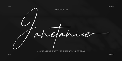 Janetanice Is a Luxury Signature Font Janetanice is perfect for product packaging, branding project, magazines, social media, weddings, or just used to express words above the background. This font is PUA encoded, which means you can access all of the glyphs and swashes with ease!
 - Coriander by Adobe,
$29.00Coriander is the work of British designer Timothy Donaldson. It started out as a doodle one afternoon Donaldson was bored and uninspired. He wrote the word Coriander" and was then distracted by the sun beating through an adjacent window. He taped the writing paper up on the window as a shade. He took it down a few months later, folded it up, and stuck it in his pocket. When the piece of paper fell out of his pocket a week later, he was inspied to draw the rest of the characters, two alphabets in his sketchbook. The final digitized characters were created by Donaldson using a Wacom tablet and later refined on the screen." - Quijote Sauvage by Lián Types,
$45.00 It was in the beginning of 2008 when I designed a font named Quijote, its predecessor. In the middle of 2009, I looked at it again and thought it could be a good idea to make an update of it. Variables and Features: Quijote Sauvage Pro is the most complete variable. It includes all the ligatures, alternates and swashes. It has the OpenType function in order to alternate glyphs easily when running applications which support this. The font is also offered separately. Quijote Sauvage Standard has the right glyphs to get an equilibrium between wildness and softness. It includes standard and discretionary ligatures. Quijote Sauvage Stylistic has the sharpest glyphs. Its decorative traces are discreet in order not to have problems as regards legibility. Its upper case are less wild than the other variables. Quijote Sauvage Text is the most discreet of its partners. This one was thought in order to improve legibility. Its ascenders and descenders are shorter, so the words are easier to read in small sizes. Quijote Sauvage Contextual, Swash and Titling, are the ones with wonderful terminals. They decorate words, adding a wonderful look of wildness or passion.
 - Hangulatin EN by URW Type Foundry,
$99.99 To obtain maximum pleasure in working with Hangulatin, please use the typeface as follows: 1 Open an OpenType-savvy program 2 Select the "Hangulatin“ typeface. 3 Copy the following test text into your document: HEL LO WORLD ! THE QUICK BROWN FOX JUMPS O VER THE LA ZY DOG . If this fails to bring about the desired result, please make sure that you are using an OpenType-savvy program and that usage of the OpenType features is activated in that program. Standard graphic programs are suited to that purpose. The same applies to Microsoft Word starting from the 2010 version upwards.To have fun and success with your new typeface, please write all words in the format shown in the sample text, i.e. all syllables need to be written in capital letters and separated from one another using spacecharacters (for single letters leave 2 spaces). If, however, a desired syllable is not to be substituted, proceed as follows: Please check + to see whether it is a word from the English language; + whether the word has been spelled correctly; + whether the word has been subdivided into syllables correctly; + whether the syllable has been terminated with a space character (allow 2 spaces for single letters).
 - Bandoliers by PintassilgoPrints,
$19.90 Dusty and charmingly rustic, Bandoliers is a hand-drawn family of eight loud speaking fonts. Not quite sure which one to pick? Ask the dust... Or just take them all! (Be sure to put your earplugs in!)
 - Appelsin by Bogstav,
$15.00 Perhaps all people knows that oranges are healthy. One single orange provides almost every daily need of vitamin C. This font is called Appelsin, which is the danish word for orange. Perhaps this font is just as healthy for your designs as well? ;)
 - Admire Gustavo by Balpirick,
$15.00 Admire Gustavo is a Handbrushed Font. Our handwritten font takes inspiration from the fluidity and uniqueness of human handwriting, ensuring that each letter carries a sense of character and charm. With its graceful curves and delicate strokes, this font adds an intimate and personal feel to your written words. Perfect for creating notes, memos, journal entries, or beautiful quote designs, our handwritten font elevates your messages with a sense of authenticity and warmth. It transforms your ordinary words into a beautiful composition, breathing life into your writing. - also multilingual support Enjoy the font! Feel free to comment or feedback! Thank you!
 - Creative Wonder by Balpirick,
$15.00 Creative Wonder is a Modern Handwritten Font. Our handwritten font takes inspiration from the fluidity and uniqueness of human handwriting, ensuring that each letter carries a sense of character and charm. With its graceful curves and delicate strokes, this font adds an intimate and personal feel to your written words. Perfect for creating notes, memos, journal entries, or beautiful quote designs, our handwritten font elevates your messages with a sense of authenticity and warmth. It transforms your ordinary words into a beautiful composition, breathing life into your writing. - also multilingual support Enjoy the font! Feel free to comment or feedback! Thank you!
 - Remora Camilla by Grezline Studio,
$20.00 Remora Camilla is a display script and unique sans font pair with a charming retro personality. They also have strong and bold characteristics. This font will be an appealing asset to your fonts’ library, as they have the potential to enhance any design project. Remora Camilla is perfect for headings, covers, posters, logos, quotes, product packaging, merchandise, social media and much more! Combine them to make your creation more spectacular! Feature : - A lot of Alternates ( With a Total of 700+ Glyphs ) - Multilingual Language - Works on PC & Mac - Simple installations - Accessible in the Adobe Illustrator, Adobe Photoshop, Adobe InDesign, even works on Microsoft Word.
 - Liebfraumilch by Yanone,
$25.00 Liebfraumilch is a vivid handwriting script that relies on the OpenType features Contextual Alternates, Discretionary Ligatures and Stylistic Alternates, which are available only in OpenType-aware applications such as the Adobe Creative Suite or Quark Xpress. Liebfraumilch or Liebfrau(en)milch is a style of semi-sweet white German wine which may be produced in the regions Rheinhessen, Palatinate, Rheingau and Nahe. The name is a German word literally meaning "Beloved lady's milk". The original German spelling of the word is Liebfrauenmilch, given to the wine produced from the vineyards of the Liebfrauenkirche or Church of Our Lady in the Rhineland-Palatinate city of Worms since the 18th century. The spelling Liebfraumilch is more common on labels of exported wine. (Wikipedia)
 - Spinnenkop by Hanoded,
$15.00 Spinnenkop is an old Dutch word which means both ‘spider’ and (in dialect) cobweb. The word forms the basis for that English word: cobweb. Spinnenkop is a magical font. I didn’t use witchcraft to create it, but when it was finished, it reminded me of old fairytales, spell-books and potion recipes. Use it for anything you like, but book covers, product packaging and posters come to mind. Comes with a few swashed letters and a weird alternate g.
 - Andes Condensed by Latinotype,
$29.00 Andes, designed by Daniel Hernández, is a display typeface that has neo-humanist characteristics. Its different terminals, among other elements, give it a look of mixed typography. Andes is a typeface with 10 Upright weights ,10 Italics & Condensed version, ranging from Ultra Light to Black, each of the same x-height. This typeface contains additional italic glyphs (a, y, z, g) that help to emphasise text or words. Andes is based on the design of Merced and both of them share several features.
 - Worldwide by Shinntype,
$39.00 Proven in newspapers around the world, Worldwide is a classic news face in the modern idiom, somewhat condensed, especially in the display weights. The Regular font of the Text family is loaded with features.
 - Komorebi by LiffeyType,
$9.00 Komorebi consists of handmade letters made with just a Stabilo pen. It is perfect for large scale texts and headlines. This font is suitable for posters, flyers, business cards or just a beautiful visual with a signature word. The family consists of three styles with both lower and upper case letters, accent characters and special characters. Though I personally recommend using all caps to give your words that bold touch, lower case works just as well!
 - ITC Hornpype by ITC,
$29.99ITC Hornpype is the work of California freelance designer Mott Jordan, a cheerful display face inspired in part by the cartoons of the 1920s and 30s. According to Jordan, the typeface's name and three-dimensional quality can be traced to an early cartoon in which a cat blows on a horn with such force that the instrument bulges out. For the three-dimensional look, Jordan added highlights to the thicker strokes to create letters that look as though they were, in his words, squeezed from a toothpaste tube". Jordan suggests his eye-catching font for shorter words in larger point sizes. ITC Hornpype is a lively font perfect for anything needing a "fun, goofy" look."