10,000 search results
(0.052 seconds)
- Borscena by IbraCreative,
$17.00 Borscena is a luxury classic serif font that exudes timeless elegance and sophistication. Its meticulously crafted letterforms feature exquisite, ornate detailing and graceful, high-contrast strokes, making it the epitome of refined typographic design. Borscena’s regal presence and intricate serifs harken back to the golden age of print, offering a sense of opulence and exclusivity, ideal for conveying a sense of prestige and tradition in branding, editorial, or decorative applications. This font stands as a symbol of timeless beauty and an embodiment of the grandeur of bygone eras, making it the perfect choice for projects seeking a touch of sophistication and sophistication.
 - ITC Humana Serif by ITC,
$29.99ITC Humana font is the work of British designer Timothy Donaldson, an extended and versatile font family with a large array of variations. Donaldson first created ITC Humana Script with a broad-tipped pen and then went on to design the corresponding roman. ITC Humana is the perfect font for anything requiring both clarity and a touch of personality. - Chanson De Paris JNL by Jeff Levine,
$29.00 A couple of pieces of sheet music from France [circa 1925] offered the inspiration for Chanson De Paris JNL (Song of Paris), which is available in both regular and oblique versions. This hand lettered Art Nouveau style features a unique take on thick-and-thin lettering which foreshadows the Art Deco typefaces to come during the 1930s.
 - Serenity Retro by Ferry Ardana Putra,
$29.00 Introducing “Serenity” – a captivating vintage font that elegantly blends the charm of yesteryears with a contemporary flair. With its distinctive squared appearance, “Serenity” pays homage to the classic typography of vintage eras while embracing modern design sensibilities. This font is a visual journey that invites you to explore the fusion of timeless aesthetics and innovative creativity.
 - Arch Creek JNL by Jeff Levine,
$29.00Arch Creek JNL is Jeff Levine's all-caps re-interpretation of a classic typeface of the past; Beton. Clean lines and slab serifs make this design a wonderful display face for attention-getting headlines. The beautiful watercolor print used in the font flag is by a good friend of Jeff's - Miami artist Michael George, and is used by permission. - Ungap Blocks Variable by Pedro Teixeira,
$25.00 This font was designed by blocks, square glyphs. Terminals/crossbars of some glyphs can be extended in a way that you can customize the text of your design by using the selection bars in "variable font" button. That button will appear in the text editor of your program, if such option is available, like in recente illustrator and photoshop.
 - Little Angel by Sabrcreative,
$25.00 Enhance your creative projects with the captivating charm of the Little Angel Handwriting Font. This exquisite handwriting font offers a harmonious blend of elegance and playfulness, making it an ideal choice for a wide range of design ventures. Crafted with meticulous attention to detail, the font includes both uppercase and lowercase characters, ensuring versatility in your typography.
 - Night Mares by Ake,
$12.00 Experience the enchantment of Halloween with Night Mares a mesmerizing duo font that weaves elegance and minimalism into the spooky season. This font brings a touch of eerie sophistication to your designs, whether its haunted invitations or modern posters. Unleash the magic of Night Mares and let it create a bewitching atmosphere for your Halloween creations.
 - Art Lover JNL by Jeff Levine,
$29.00While browsing through a Dan Solo type reference book, Jeff Levine fell in love with the multiline stylings of one particular typeface, then sat down and re-drew from scratch his own interpretation of the design. Jeff's version is called Art Lover JNL - offering kudos to art in general, the Art Deco movement and (of course) type design. - Brunswick Black by Letterbox,
$80.00 Named after its place of birth, Brunswick (Melbourne, Australia), this black display face builds upon the rich heritage of Cooper Black whilst minimizing the more cartoon-like aspects of the original and basing it on a very sturdy broad serif. With its solidity responding well to tight kerning, Brunswick Black features not only small caps but also petite caps.
 - Muffin Cake by Raditya Type,
$11.00 Muffin Cake is a suitable font when used for logos and product names. Especially products related to the world of children who are fun and cheerful. Such as food products, toys, or institutions related to the world of children, such as children's school names, the world of parenting. This font is also suitable for brand playgrounds.
 - Lautren by Azzam Ridhamalik,
$16.00 Introducing Lautren, a new delightful bold script with reversed contrast typeface. The Ideas of this fonts came from funny summer vibes mood which is made more neater and smoother. Lautren created with a tons of opentype features like contextual alternates, stylistic sets, ligatures, and swashes at the ending of the letters. A fun typeface to play with!
 - Censorship JNL by Jeff Levine,
$29.00 Censorship JNL joins the wide array of stencil-themed fonts from Jeff Levine. An advantage to this particular design is the larger amount of stencil sections per letter or number. When used with a plotter/cutter, stencils in excess of 12 inches high can be cut into masking material without the cut-out characters becoming floppy or unstable.
 - Mareline Script by Mega Type,
$10.00 Introducing Mareline Script Font Duo, a sweet handlettered font, casual and dynamic with a bold and irregular baseline. Contains a complete set of lowercase, uppercase, alternates, ligatures, punctuation, numbers, and multilingual support. And additional Mareline Sans, working in harmony with Mareline script to create awesome typographic creations. Get some inspiration from the preview above. This font ideal for use in watercolor design or bold hand lettering style, such as posters, wedding elements, t-shirt, apparel, cover books, business cards, greeting cards, branding, merchandise, invitations and handmade quotes and more. Mareline Script Font Duo features OpenType stylistic alternates, ligatures and International support for most Western Languages. To enable the OpenType Stylistic alternates, you need a program that supports OpenType features such as Adobe Illustrator CS, Adobe Indesign & CorelDraw X6-X7, Microsoft Word 2010 or later versions. How to access all alternative characters using Adobe Illustrator: https://www.youtube.com/watch?v=XzwjMkbB-wQ Mareline Script Font Duo is coded with PUA Unicode, which allows full access to all the extra characters without having special designing software. Mac users can use Font Book , and Windows users can use Character Map to view and copy any of the extra characters to paste into your favorite text editor/app. How to access all alternative characters, using Windows Character Map with Photoshop: https://www.youtube.com/watch?v=Go9vacoYmBw If you need help or have any questions, please let me know. I'm happy to help. Thanks & Happy Designing!
 - Gazi by Fontuma,
$24.00 Gazi is the honorary title given by the state to the commanders who defeated the enemy by showing extraordinary benefits. This title was first given to Mustafa Kemal Atatürk by the Turkish Grand National Assembly on September 19, 1921. Gazi font was designed for Mustafa Kemal Atatürk, who founded the Turkish Republic. This type face consists of two families:: ▪ Gazi: Font family with Latin alphabets ▪ Gazi Pro: Font family including Latin and Arabic alphabets The Gazi font family is ideal for those looking for a new and aesthetic serif font. This font with modern lines can be used in all broadcast and printing areas. Gazi font will meet your needs and expectations in terms of the number of glyphs and the languages it supports. The font family includes many open type features, as well as some ligatures, and many currency symbols.
 - Gazi Pro by Fontuma,
$38.00 Gazi is the honorary title given by the state to the commanders who defeated the enemy by showing extraordinary benefits. This title was first given to Mustafa Kemal Atatürk by the Turkish Grand National Assembly on September 19, 1921. Gazi font was designed for Mustafa Kemal Atatürk, who founded the Turkish Republic. This type face consists of two families:: ▪ Gazi: Font family with Latin alphabets ▪ Gazi Pro: Font family including Latin and Arabic alphabets The Gazi font family is ideal for those looking for a new and aesthetic serif font. This font with modern lines can be used in all broadcast and printing areas. Gazi font will meet your needs and expectations in terms of the number of glyphs and the languages it supports. The font family includes many open type features, as well as some ligatures, and many currency symbols.
 - SF Square Head Pro by CheapProFonts,
$10.00 A completely square typeface. And wide. It is all futuristic and fast. I have redesigned the uppercase D (which was identical to the O), V and Y - and also a couple of the lowercase letters: a narrower r, a more identifiable t and f and weight corrections to the v, x and z. This font only had a very basic ASCII character set, so I have created a large amount of glyphs, and expanded it with the usual multilingual support. The future is now. ALL fonts from CheapProFonts have very extensive language support: They contain some unusual diacritic letters (some of which are contained in the Latin Extended-B Unicode block) supporting: Cornish, Filipino (Tagalog), Guarani, Luxembourgian, Malagasy, Romanian, Ulithian and Welsh. They also contain all glyphs in the Latin Extended-A Unicode block (which among others cover the Central European and Baltic areas) supporting: Afrikaans, Belarusian (Lacinka), Bosnian, Catalan, Chichewa, Croatian, Czech, Dutch, Esperanto, Greenlandic, Hungarian, Kashubian, Kurdish (Kurmanji), Latvian, Lithuanian, Maltese, Maori, Polish, Saami (Inari), Saami (North), Serbian (latin), Slovak(ian), Slovene, Sorbian (Lower), Sorbian (Upper), Turkish and Turkmen. And they of course contain all the usual "Western" glyphs supporting: Albanian, Basque, Breton, Chamorro, Danish, Estonian, Faroese, Finnish, French, Frisian, Galican, German, Icelandic, Indonesian, Irish (Gaelic), Italian, Northern Sotho, Norwegian, Occitan, Portuguese, Rhaeto-Romance, Sami (Lule), Sami (South), Scots (Gaelic), Spanish, Swedish, Tswana, Walloon and Yapese.
 - DINfun Pro Grunge by CheapProFonts,
$10.00 A collection of DIN Mittelschrift variants with some typical grunge style treatments. The Plain font is included if you buy the family pack, and can be mixed in. The DINfun Pro fonts are special versions of the classic DIN 1451 Mittelschrift, far removed from the original typeface's serious and no-nonsense roots. I have made them as companions to the classic, with some some very different expressions, complete with a large multilingual character set. Time to spice up that DIN profile! :) ALL fonts from CheapProFonts have very extensive language support: They contain some unusual diacritic letters (some of which are contained in the Latin Extended-B Unicode block) supporting: Cornish, Filipino (Tagalog), Guarani, Luxembourgian, Malagasy, Romanian, Ulithian and Welsh. They also contain all glyphs in the Latin Extended-A Unicode block (which among others cover the Central European and Baltic areas) supporting: Afrikaans, Belarusian (Lacinka), Bosnian, Catalan, Chichewa, Croatian, Czech, Dutch, Esperanto, Greenlandic, Hungarian, Kashubian, Kurdish (Kurmanji), Latvian, Lithuanian, Maltese, Maori, Polish, Saami (Inari), Saami (North), Serbian (latin), Slovak(ian), Slovene, Sorbian (Lower), Sorbian (Upper), Turkish and Turkmen. And they of course contain all the usual "western" glyphs supporting: Albanian, Basque, Breton, Chamorro, Danish, Estonian, Faroese, Finnish, French, Frisian, Galican, German, Icelandic, Indonesian, Irish (Gaelic), Italian, Northern Sotho, Norwegian, Occitan, Portuguese, Rhaeto-Romance, Sami (Lule), Sami (South), Scots (Gaelic), Spanish, Swedish, Tswana, Walloon and Yapese.
 - SK Femme Fatale by Shriftovik,
$48.00 SK Femme Fatale is a decorative typeface inspired by strong women and their contributions to culture and design. The typeface is built with great attention to detail, its curves are thought out to the smallest detail, which gives the symbols a unique sophisticated character. The symbolic composition is rich not only visually, but also in typesetting: the typeface supports many languages, including extended Cyrillic alphabet and Latin alphabet. For better visual communication, ligatures have been added to the typeface. They enhance the interaction of the character form. A wide range of additional characters, numbers, arrows, etc., expand the possibilities of using the typeface in various areas of design.
 - Fournier by Monotype,
$29.99 Fournier was made by Monotype in 1924. The design is based on types cut by Pierre Simon Fournier circa 1742, some of the most influential designs of the eighteenth century. Fournier's types were among the earliest of the transitional" style of typeface and were a stepping stone to the more severe "modern" style made popular by Bodoni later in the century. They had more vertical emphasis than the old style types, greater contrast between thick and thin strokes and little or no bracketing on the serifs. Fournier has a light, clean look on the page, provides good economy in text and retains an even colour.
 - Scriptek by ITC,
$29.99 Scriptek was created by British designer David Quai in 1992, based on the constructivist forms which became popular after the First World War with the progressing industrialization in Moskow. Typefaces such as Scriptek were often used in the propaganda of totalitarian political systems and can still be seen on monuments like the central train station in Milan or political posters of the 1930s and 40s. The robust Scriptek has strong serifs in the upper left and lower right of characters and this, together with the diagonal strokes of many lower case letters, gives the font a dynamic feel. Scriptek is best used for headlines and display.
 - Jalopy JNL by Jeff Levine,
$29.00 History, as it's said, tends to repeat itself. The round-point pen lettering used in the 1920s logo and ads for Dodge Brothers cars (pre-General Motors) is an early predecessor to the techno type styles of the 1980s. Square in shape, with unique stylization to some letters, Jalopy JNL can cross the decades and be used for a 1920s period piece and still look fresh in an ad for computer parts. Rather than round out the inside lines of the characters to fully emulate the strokes of a lettering pen, the inside lines have straight intersections for the contemporary side of this font's design.
 - Fan Script by Sudtipos,
$99.00 A friend of mine says that sports are the ultimate popular drug. One of his favorite things to say is, “The sun’s always shining on a game somewhere.” It’s hard to argue with that. But that perspective is now the privilege of a society where technology is so high and mighty that it all but shapes such perspectives. These days I can, if I so choose, subscribe to nothing but sports on over a hundred TV channels and a thousand browser bookmarks. But it wasn't always like that. When I was growing up, long before the super-commercialization of the sport, I and other kids spent more than every spare minute of our time memorizing the names and positions of players, collecting team shirts and paraphernalia, making up game scenarios, and just being our generation’s entirely devoted fans. Argentina is one of the nations most obsessed with sports, especially "fútbol" (or soccer to North Americans). The running American joke was that we're all born with a football. When the national team is playing a game, stores actually close their doors, and Buenos Aires looks like a ghost town. Even on the local level, River Plate, my favorite team where I grew up, didn't normally have to worry about empty seats in its home stadium, even though attendance is charged at a high premium. There are things our senses absorb when we are children, yet we don't notice them until much later on in life. A sport’s collage of aesthetics is one of those things. When I was a kid I loved the teams and players that I loved, but I never really stopped to think what solidified them in my memory and made them instantly recognizable to me. Now, thirty-some years later, and after having had the fortune to experience many cultures other than my own, I can safely deduce that a sport’s aesthetic depends on the local or national culture as much as it depends on the sport itself. And the way all that gets molded in a single team’s identity becomes so intricate it is difficult to see where each part comes from to shape the whole. Although “futbol” is still in my blood as an Argentinean, I'm old enough to afford a little cynicism about how extremely corporate most popular sports are. Of course, nothing can now take away the joy I got from football in my childhood and early teens. But over the past few years I've been trying to perceive the sport itself in a global context, even alongside other popular sports in different areas of the world. Being a type designer, I naturally focus in my comparisons on the alphabets used in designing different sports experiences. And from that I've come to a few conclusions about my own taste in sports aesthetic, some of which surprised me. I think I like the baseball and basketball aesthetic better than football, hockey, volleyball, tennis, golf, cricket, rugby, and other sports. This of course is a biased opinion. I'm a lettering guy, and hand lettering is seen much more in baseball and basketball. But there’s a bit more to it than that. Even though all sports can be reduced to a bare-bones series of purposes and goals to reach, the rules and arrangements of baseball and basketball, in spite of their obvious tempo differences, are more suited for overall artistic motion than other sports. So when an application of swashed handlettering is used as part of a team’s identity in baseball or basketball, it becomes a natural fit. The swashes can almost be visual representation of a basketball curving in the air on its way to the hoop, or a baseball on its way out of the park. This expression is invariably backed by and connected to bold, sleak lettering, representing the driving force and precision (arms, bat) behind the artistic motion. It’s a simple and natural connective analysis to a designer, but the normal naked eye still marvels inexplicably at the beauty of such logos and wordmarks. That analytical simplicity was the divining rod behind Fan Script. My own ambitious brief was to build a readable yet very artistic sports script that can be a perfect fit for baseball or basketball identities, but which can also be implemented for other sports. The result turned out to be quite beautiful to my eyes, and I hope you find it satisfactory in your own work. Sports scripts like this one are rooted in showcard lettering models from the late 19th and early 20th century, like Detroit’s lettering teacher C. Strong’s — the same models that continue to influence book designers and sign painters for more than a century now. So as you can see, American turn-of-the-century calligraphy and its long-term influences still remain a subject of fascination to me. This fascination has been the engine of most of my work, and it shows clearly in Fan Script. Fan Script is a lively heavy brush face suitable for sports identities. It includes a variety of swashes of different shapes, both connective and non-connective, and contains a whole range of letter alternates. Users of this font will find a lot of casual freedom in playing with different combinations - a freedom backed by a solid technological undercurrent, where OpenType features provide immediate and logical solutions to problems common to this kind of script. One final thing bears mentioning: After the font design and production were completed, it was surprisingly delightful for me to notice, in the testing stage, that my background as a packaging designer seems to have left a mark on the way the font works overall. The modern improvements I applied to the letter forms have managed to induce a somewhat retro packaging appearance to the totality of the typeface. So I expect Fan Script will be just as useful in packaging as it would be in sports identity, logotype and merchandizing. Ale Paul
 - Linden by Journey's End,
$12.00I hope that you enjoy the "Linden" font. The basis for this new font is my Leaf font. As much as I love the Leaf font, however, I felt (and still feel) the desire to have a larger font, for three reasons: 1. I enjoy customizing my internet browser to show different fonts. The original "Leaf" font was a bit too small for that. The new "Linden" font is perfect for this function. 2. Some of the fonts that I use in writing e-mails look their best at sizes 24 or 36. That’s fine for me, but unless I want to go to the trouble each time of changing the size, then the recipients oft my e-mails get wolloped with an enormous-sized font. When I use "Linden" for my e-mails, it’s automatically a perfect size at 12 or 14, solving this problem. 3. I also enjoy customizing the font in which I read my e-mails. Unfortunately, there are only a few which are legible in the tiny size in which this is configured. Again, "Linden" is configured to be large enough automatically so that it can easily be read by anyone. I am pleased to offer a pleasant font for use in any or all of the scenarios; I love fun solutions and hope that you will enjoy the "Linden" font. (Just a tip: when printing out documents using the "Linden" font, I love it best in font size 11!) - Teenage Workhood by Teenage Foundry,
$19.00 Teenage Workhood typeface, a classic and vintage-inspired font that brings a charming and nostalgic touch to your designs. Designed to evoke the essence of youthful creativity and the timelessness of workmanship, this typeface is perfect for projects that require a touch of vintage appeal. This versatile typeface lends itself well to a range of design projects. Whether you're creating old-school logos, vintage posters, retro packaging, or even designing an authentic vintage-inspired website, Teenage Workhood is the go-to choice to add that classic touch.
 - Inklination by Emtype Foundry,
$69.00 Inklination is a new grotesque that goes against the 'genre rules' and has a low x-height. It breathes quite better than larger x-height typefaces, with the sensation of air and more whitespace. This, combined with long ascenders and descenders, makes it look luxurious, elegant and refined. The family has two sets of italics, a regular one with 10º of inclination, and a more brutalist one with 20º. A monospaced version of five weights complete this versatile family. For more info visit emtype website.
 - Turquoise Inline by Resistenza,
$49.00 Turquoise Inline is a new version of our bestseller Turquoise This version of roman capitals is more focused on display use, with the details of an inline roman type. This font can be used, for ads, labels, wine labels, logo and all kind of display uses. Open Type features needs to be activated for all the ligatures and alternates. Enjoy it! We recommend to combine Turquoise Inline with Nautica Sottile & Auster
 - Camijo by Kavoon,
$15.00 Camijo is a contemporary serif typeface with characteristic and defined features. This font was inspired by the idea of mixing different types of terminals in order to give the font a singular appearance. Its design is composed of diverse styles such as Didone and contemporary faces. Camijo comes with a set of 352 characters. This font was specially designed for branding, advertising, editorial design, and use on Tv and social media.
 - Primot by Plau,
$49.00 Primot is an upright script heavily influenced by italian gelaterias . After releasing 3 sans serifs , we were looking for an opportunity to design a display type with less constraints for legibility and expression. We started playing with brush lettering and looking into vintage scripts from different eras. Some cool things that made it into Primot were some unusual vertical connections and the sweet brush flairs in the letter endings. From that point on, we set out to create a beautiful looking vertical script – something we don’t see that often – in which each word set could would make a nice piece of graphic design (think logos, video game titles, shop windows etc.). We also made it smart by including hand-lettering inspired features such as initial and final forms for letters, contextual alternates and swashes. The result is a versatile 900+ glyphs display typeface, suitable for a wide range of applications. We hope you have as much fun with it as we had designing it! And while we’re here, you may like that it also pairs beautifully with our sturdy sans-serif family Motiva Sans .
 - Histeria Dinamond by Mega Type,
$12.00 INTRODUCING Histeria Dinamond is a new variant of beautiful script type with linkable hearts that is here to complete your script font collection. Histeria Dinamond comes with additional alternate characters up to 1254 glyphs. Histeria Dinamond is perfect for branding, wedding invitations, business cards, posters, quotes and other romantic projects. Histeria Dinamond features OpenType stylistic alternates, ligatures and International support for most Western Languages is included. To enable the OpenType Stylistic alternates, you need a program that supports OpenType features such as Adobe Illustrator CS, Adobe Indesign & CorelDraw X6-X7, Microsoft Word 2010 or later versions.How to access all alternative characters using Adobe Illustrator: https://www.youtube.com/watch?v=XzwjMkbB-wQ Histeria Dinamond is coded with PUA Unicode, which allows full access to all the extra characters without having special designing software. Mac users can use Font Book , and Windows users can use Character Map to view and copy any of the extra characters to paste into your favourite text editor/app.How to access all alternative characters, using Windows Character Map with Photoshop: https://www.youtube.com/watch?v=Go9vacoYmBw If you need help or have any questions, please let me know. I'm happy to help :) Thanks & Happy Designing!
 - Glittera by Natural Ink,
$12.00 Glittera Script is a modern calligraphy design, including Regular. This font is casual and beautiful with swash. Can be used for various purposes. such as logos, product packaging, wedding invitations, branding, headlines, signage, labels, signatures, book covers, posters, quotes, and more. Glittera Script includes a change of the OpenType language style, binding and international support for most Western languages. To activate the OpenType Stylistic alternative, you need a program that supports OpenType features such as Adobe Illustrator CS, Adobe Indesign & CorelDraw X6-X7, Microsoft Word 2010 or newer versions. How to access all alternative characters using Adobe Illustrator: https://www.youtube.com/watch?v=XzwjMkbB-wQ Glittera Script is coded with PUA Unicode, which allows full access to all additional characters without having to design special software. Mac users can use the Font Book, and Windows users can use Character Map to view and copy one of the additional characters to insert into your favorite text editor / application. How to access all alternative characters, using Windows Character Map with Photoshop: https://www.youtube.com/watch?v=Go9vacoYmBw If you need help or have questions, please let me know. I am happy to help :) Thank you & Congratulations on Designing! Script is coded with PUA Unicode, which allows full access to all additional characters without having to design special software. Mac users can use the Font Book, and Windows users can use Character Map to view and copy one of the additional characters to insert into your favorite text editor / application. How to access all alternative characters, using Windows Character Map with Photoshop: https://www.youtube.com/watch?v=Go9vacoYmBw If you need help or have questions, please let me know. I am happy to help :) Thank you & Congratulations on Designing!
 - Hwaiting Handwriting by Konstantine Studio,
$20.00 Inspired by the emerging Korean culture that grabbing the worldwide actuation in so many realms of the industry. To bridge the vibes and to make it easier to consume, we found the gap to fill with simple things in life that are useful for it, and yes, it’s a new day it’s a new font. So without any further ado, please welcome Hwaiting Handwriting. 1/3 series of Korean vibes typefaces. It’s handwriting-based fonts with the reference of the ancient style ink and brush strokes but make it modern. Crafted with deep research about Korean traditional letters, shaped up with the approach of universal Latin letters. This is the first drop of 3 series from the Hwaiting family. So stay tuned for the upcoming release.
 - Hypercreepos by Bisou,
$15.00 Hypercreepos is a sweet and creepy hyper-bold font inspired by the horror comic books of the 60s. Handmade in La Chaux-de-Fonds (Switzerland) on lined A4 papers, the letter's shape is conscientiously designed to give a punchos impact on the reader. The unique and vibrant contours are drawn on an improvised backlit table inherited from Bisou's mother. Definitely contemporary, the overall feeling given off by Hypercreepos is profound and human, evoking the graphite smell of the comic's workshops. Exclusively made for titles, this impactos font will suite with delight the text of posters, signs of comics bookstore, gaming bar, horror movie theater or film festival. That said, the designer is not responsible for the use of Hypercreepos and wish it will serve beyond all expectation.
 - Alaskan Malamute by Letterara,
$12.00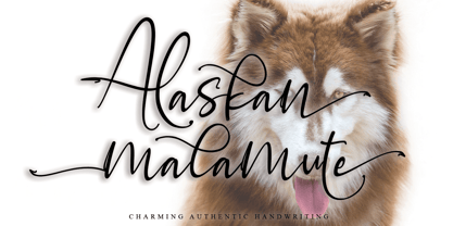 Alaskan Malamute is charming authentic handwriting font. This is a beautiful combination of timeless elegance and authentic calligraphy. Alaskan Malamute is the perfect font for making original and outstanding designs. This font is PUA encoded which means you can access all of the cute glyphs and swashes with ease! It also features a wealth of special features including alternate glyphs and ligatures.
 - Monster Scratch by Letterara,
$12.00 Monster Scratch is a display font created to complement each of your Halloween parties. Spooky and incredibly unique, this font will elevate each of your designs to the highest level. Add it to your Halloween crafts, horror movie posters, and anything else that requires a spectacular look. This font is PUA encoded which means you can access all of the glyphs.
 - Hedgerow by Typodermic,
$11.95 Step into a world of magic and enchantment with Hedgerow, the phenomenal calligraphic typeface. Inspired by the liner notes of Led Zeppelin IV, Hedgerow captures the mysticism and wonder of a bygone era. With its Art Nouveau tone and intricate interlocking letters, Hedgerow adds a touch of elegance and sophistication to any design. But it’s not just beautiful; in OpenType savvy applications, Hedgerow’s capricious character pairs will surprise and delight you, taking your words to the next level. Hedgerow is more than just a typeface; it’s a journey through time. Let it add a touch of magic to your designs and captivate your audience with its bewitching voice. Most Latin-based European writing systems are supported, including the following languages. Afaan Oromo, Afar, Afrikaans, Albanian, Alsatian, Aromanian, Aymara, Bashkir (Latin), Basque, Belarusian (Latin), Bemba, Bikol, Bosnian, Breton, Cape Verdean, Creole, Catalan, Cebuano, Chamorro, Chavacano, Chichewa, Crimean Tatar (Latin), Croatian, Czech, Danish, Dawan, Dholuo, Dutch, English, Estonian, Faroese, Fijian, Filipino, Finnish, French, Frisian, Friulian, Gagauz (Latin), Galician, Ganda, Genoese, German, Greenlandic, Guadeloupean Creole, Haitian Creole, Hawaiian, Hiligaynon, Hungarian, Icelandic, Ilocano, Indonesian, Irish, Italian, Jamaican, Kaqchikel, Karakalpak (Latin), Kashubian, Kikongo, Kinyarwanda, Kirundi, Kurdish (Latin), Latvian, Lithuanian, Lombard, Low Saxon, Luxembourgish, Maasai, Makhuwa, Malay, Maltese, Māori, Moldovan, Montenegrin, Ndebele, Neapolitan, Norwegian, Novial, Occitan, Ossetian (Latin), Papiamento, Piedmontese, Polish, Portuguese, Quechua, Rarotongan, Romanian, Romansh, Sami, Sango, Saramaccan, Sardinian, Scottish Gaelic, Serbian (Latin), Shona, Sicilian, Silesian, Slovak, Slovenian, Somali, Sorbian, Sotho, Spanish, Swahili, Swazi, Swedish, Tagalog, Tahitian, Tetum, Tongan, Tshiluba, Tsonga, Tswana, Tumbuka, Turkish, Turkmen (Latin), Tuvaluan, Uzbek (Latin), Venetian, Vepsian, Võro, Walloon, Waray-Waray, Wayuu, Welsh, Wolof, Xhosa, Yapese, Zapotec Zulu and Zuni.
 - Linotype EEC Pi by Linotype,
$40.99This font contains a set of symbols that are used on the EEC - Hebrew Pirkei Avot Std by Samtype,
$49.00 This is beautiful script font based in typeface of the Pirkei Avot book.
 - Bergamot by Emily Lime,
$20.00 Bergamot was inspired by vintage apothecary labels, but this font is actually quite modern in both style and effects. It features all caps plus 2 sets of alternates (so, 4 total variations for each letter). The coolest part… they intermingle randomly as you type! Ok, so it’s not exactly random, but that’s the easiest way to explain what you'll see. The letters are actually coded to rotate with their respective alternates. This effect is both useful or can be purely for fun! Let’s talk about the useful part for a sec… Repeating characters are often a dead giveaway that a font is being used. And sometimes we don't want that, right? We want to give the illusion that our design has been custom hand-lettered for a particular project… and can't be recreated by another. That’s exactly what this font aims to do. The randomizing effect is built into the Contextual Alternates feature and will likely be “on” automatically in your chosen program. Alas, even random doesn't guarantee that like characters won't appear in close proximity. So for those of you with access to the “Stylistic Alternates” feature, easily change repeated letters that are near each other simply by turning this feature “on”. Voila! Custom…hand…lettering. Bergamot also features separate files for Frames & Ornaments. Check them out below.
 - Motor City by Carmel Type Co.,
$19.00 An industrial strength slab-serif inspired by Detroit itself, Motor City is a heavyweight titan of type that breathes diesel and exudes brawn. Defined by its trapezoidal serifs that were characteristic of many Detroit-centric sign-painters during the dawn of the 20th century, this typeface is a modern adaption of a classic aesthetic. This typeface can be layered with the outline version to add levels of detail quickly and easily making an already strong statement even more powerful and prominent. This uppercase only typeface comes with a set of true small capitals that is certain to add an extra level of style to your next project. Features Include: Over 330 glyphs Uppercase Only Small CapsSupports 75+ Latin Languages OTF files Designed and Developed by Jason Carne