10,000 search results
(0.041 seconds)
- P22 Barabajagal by IHOF,
$29.95 P22 Barabajagal is a unique take on the display fat face by way of doodling fun. Somewhat informed by the shapes of an early 1970s film type called Kap Antiqua Bold, this font’s aesthetic is the stuff of boundless energy and light humour, where an uncommon “peak” angle drawing perspective results in sturdy trunks, fat bottom curls, and active ascenders eager for mobility in space. This is the kind of font that makes you wonder whether it was drawn with rulers, protractors and compasses, or just by a mad doodler’s crazy-good free hand. Regardless, Barabajagal easily turns the geometry of modern forms into an exercise in sugar-loaded fun. It’s a very good tool to use in design geared at kids and young adults, such as food and toy packaging, books, animation, cartoons and games. Barabajagal comes with over 550 glyphs, lots of alternates, and a few ligatures and swash caps. It also contains extended support for Latin languages.
 - Nature Boy by Adorae Types,
$20.00 Nature Boy was born in a fantasy world of old, where you can find magic, elegance, dreams and fun all together... just like nature in its purest form with its leafy curves and shapes that make it peacefully enjoyable. Soft and simple yet fairly ornamental, attributes that create an enchanting atmosphere but keep the texts legible at the same time when combined. Nature Boy can bring life and magic to every design, from editorial to posters, brands and packagings. Just picture this font on any product intended to move your soul and take you on a journey into a different and most beautiful place and time and let the adventure begin. This font family is made up of optically corrected regular, italic and bold types. All of them contain functional ligatures with alternative glyphs for texts and words to be dynamical and fluently graphed.
 - Goldilocks_Revised - 100% free

- Glyphstream - 100% free

- Transitore by PintassilgoPrints,
$- Transitore is a lively hand-drawn font with loads of alternates and ligatures which, managed by advanced OpenType features, help create a convincing handcrafted look. The contextual alternates feature automagically substitute glyphs, providing a cool random effect, while the discretionary ligatures feature bring on witty interlocks and curly elements. Turn on both and multiply the possibilities! But wait; there's more! This font also brings a handy set of swashes for adding that extra special touch. And yet, there are three supplementary fonts: Transitore Color A and Transitore Color B work as stackable layers for easily adding colors, while Transitore Splashes generate irresistible splashes of ink. This family is a smart and complete toolbox that offers endless ways to style your text compositions. Enjoy!
 - Appleton by Decade Typefoundry,
$35.00 Back to 1880-1900 when a number of events were coming together, the country was evolving from a local market economy to mass merchandising, rail systems were being built and color lithography was becoming more affordable. The first rail cars full of oranges were being shipped from Southern California to the East - what a treat during a cold winter’s day. Labels were pasted on every fruit crate and these labels had large images of oranges and orange groves. With technological advances in soldered cans, canneries popped up all over the country. In order to market their products many California Canneries pooled their resources to form the California Fruit Canners Assn. in 1899. This font was inspired from that era. Loaded with alternates, swashes, stylistic and multilingual support.
 - Pricing Labels JNL by Jeff Levine,
$29.00Pricing Labels JNL gives you a set of digital price gun labels in fifty-one of the most common store departments, plus an untitled title label on the lower case ‘z’ key. Additionally, numbers for creating prices are on the standard keystrokes (for dollar amounts), and smaller numbers/underscores (for cents amounts) are on the shift key groupings for the number keys. The dollar and cents sign are on the left and right brackets, the decimal point is on the period key and the words “each” and “for” [set sideways] are on the greater and lesser keys. - Reverie by District,
$15.00 Reverie is a cheerful band of letters that bounce across the page and get together to create words in three weights. Generous spacing and a modest x-height project an airy typeface that's open but not frail. Quirky without being too whimsical. Use the regular weight for surprisingly readable text or put the light and bold weights to use for decorative headlines and titles.
 - Cypher by Typeco,
$29.00Cypher is a techno looking font that attempts to employ the Gestalt principal of closure. It may, at larger sizes look like some sort of code or a bunch of dots and dashes, but when viewed at smaller sizes it falls together into legible words. This font family was first inspired by an experiment to try to make a legible upper and lower alphabet with the smallest grid possible that would still describe the letterforms. The original conclusion was that it could be done in a 3x6 grid. This made a fun design exercise, but it makes a lousy font. The grid was expanded a bit for aesthetic reasons to a 3x8 grid, But not restricted so severely and so occasionally goes wider than 3 for the certain letterforms. From this a whole family of widths and weights was born, and rather than simply obliquing for italics, a true italic of sorts was created. Cypher is a versatile family of 24 fonts – 4 widths, each with 3 weights and their accompanying italics. - Joker by ParaType,
$30.00 The original sketch of Joker was drawn by Viktor Kharyk in 1978 as experiment on creation type by a method of subtraction. In 2000 the font was digitized, modified and Hebrew, Greek, Georgian, Armenian and Arabi? alphabets and outline style were added. As a display face, Joker allows the creation of decorative compositions, easily combining a vertical and horizontal arrangement of words. Its characters are easy for filling with images. In line the face creates ornamental effect very appropriate for logotype design. The font is good to set small expressive advertising texts also. Joker type family received the third prize at TypeArt 2001 Cyrillic type design competition in Moscow.
 - Arendahl by insigne,
$21.99Arendahl is a natural-looking, irregular connected handwriting script. The script has a fluctuating baseline and swirling ending swashes to give the lettering a soothing flow. Arendahl utilizes OpenType ligatures and alternates to prevent duplicate letterforms, and automatically substitutes the best letter combination or word glyph. Arendahl includes 64 discretionary ligatures based on the most common pairs in the English language, a full set of alternates for every English letter, ending swashes and ornaments. The Arendahl family is made up of eight fonts, including an alternate, bold weights and script versions. - arnica by Justi,
$15.00 Arnica is a display font based on a simple geometry that uses circles (and modules) as a structure. It is an experimental project where, in place of upercases, has alternate characters and swashes. Furthermore, arnica has 50 discretionary ligatures which, when activated, give a totally different touch to the font and also has the bold weight, which reinforce the experimentalism of the project. Combining lowercases with upercases, plus discretionary ligatures and bolds, you can write the same word in several different ways. The character set offers more than 400 glyphs and support for many languages.
 - Verily Serif Mono - Unknown license

- Boilermaker by Stiggy & Sands,
$29.00 A Stylish Condensed Sans Boilermaker began as a digitization of a film typeface from LetterGraphics dubbed Flair G100. From this origin, it has evolved to a much more robust character set than its original. From the inclusion of original unicase and lowercase alternates to the addition of a Russian language expansion, Boilermaker really shines. See the 4th graphic for a comprehensive character map preview. Boilermaker is loaded with features to give you plenty of customisation options: - Stylistic Alternates feature for Unicase & Lowercase alternates. - Russian language coverage. - A Full set of Inferiors and Superiors for Limitless Fractions - Tabular and Proportional figure sets Approx. 602 Character Glyph Set: Boilermaker comes with a glyphset that includes standard & punctuation, international language support, unicase & lowercase alternates, alternate numeral styles, subscript and superscript.
 - Willow by Adobe,
$29.00Willow is an Adobe Originals typeface designed in 1990 by Joy Redick for the Adobe Wood Type series. Willow is a condensed typeface modeled on nineteenth-century wood types known as Clarendons (wood type Clarendons do not resemble the English metal types of that name). Clarendon condensed faces were originally so well-designed that words or a line of display type have an even color that is remarkable for wood types. Taken from proofs of type in the Rob Roy Kelly Collection housed at the University of Texas at Austin, Willow can be used for display work such packaging, advertising, and posters. - DT Paperside by Dragon Tongue Foundry,
$15.00 Paperside: Neither Papyrus nor SSI Countryside. Inspired in some ways by the Papyrus form, but untextured and smoother, with the dimensions and proportions more open, like that of Countryside SSi, with its larger easily readable lowercase body, and more consistent, shorter stems. Paperside has an open scripted feel which is pleasing on the eye and easy to read. Paperside can enhance the first letter of most sentences automatically, and changes other letters to suit their position within words, and the letters they appear beside. Now comes in 5 weights plus italic. For best results, use this ‘smart font’ with Contextual Ligatures turned on. Mulitiple Stylistic Alternatives are included. Inspiration for this font came from two other fonts. Papyrus: was designed by Chris Costello and created in 1982, it is a hand-drawn textured typeface, emulating texts written in biblical times. One of the most used (and misused) fonts of all times. Owned by Letraset, and currently published by the Internation Typeface Corporating (ITC). Countryside SSi: The serif font of an unknown designer, is currently licensed by Southern Software Inc. Feel free to preview some of the Dragon Tongue fonts that are yet to be released, at https://www.dragon-tongue.com/fonts
 - Checkmark by Set Sail Studios,
$14.00 Make your mark with Checkmark; a slick, high energy signature-style script font guaranteed to make a big impression. Digitally hand-drawn, it's super-clean smooth flow and high-intensity pen strokes make an unmistakeable impact in logo/branding projects, large header text and product packaging. Checkmark is packed full of extra features to give you plenty of customization options. This includes; a full set of upper and lowercase alternate letters, 20 ligatures (double letters) to help the script lettering flow more naturally, 26 swashes and a full set of lowercase end forms to give your text that extra flair and finesse. Here's a run through everything in more detail; Checkmark • A smooth-edged signature style font containing upper & lowercase characters, numerals, and a large range of punctuation. Checkmark Alt • This is a second version of Checkmark, with a completely new set of both upper and lowercase characters. If you wanted to avoid letters looking the same each time to recreate a custom-made style, or try a different word shape, simply switch to this font for an additional layout option. Checkmark Swash • A third font containing 26 hand drawn swashes. Simply type any a-z or A-Z character in this font to generate a swash. Perfect for underlining your Checkmark text and adding a bit of extra flair! Ligatures • 20 ligatures (double-letters) are included to help your lettering flow more naturally. Many programs will automatically have this feature switched on for you, but if you need any help accessing them, please feel free to drop me a message. End forms • Are available for all lowercase characters when using the Checkmark font. Use these characters at the end of your word to add a stylistic 'end-swash'. These are accessible via software with opentype capability, by turning on 'Stylistic Alternates', or via a Glyphs panel. Language Support • Checkmark fonts support the following languages; English, French, Italian, Spanish, Portuguese, German, Swedish, Norwegian, Danish, Dutch, Finnish, Indonesian, Malay, Hungarian, Polish, Croatian, Turkish, Romanian, Czech, Latvian, Lithuanian, Slovak, Slovenian.
 - banister by One Fonty Day,
$15.00 Banister looks both contemporary and vintage. It contains a total of 12 styles including two main styles (Normal and Loaded), and for each style it comes with two widths (Semi-condensed and Semi-Expanded) and three weights (Light, Regular and Bold). The 40’s inspired style is subtle in banister, so it comes across more contemporary. Also, slightly curved strokes can be found on some letters, which gives a more organic feeling overall. To gain full advantage of banister, you can toggle “Fill” and “Stroke” on any editable applications to experiment the style, also layering normal and loaded styles let you discover something unexpected. Banister is versatile, simple and organic looking typeface, and good for headlines, logos, tiles and any large texts.
 - Vintage Painting by Aestherica Studio,
$12.00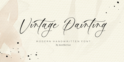 Introducing the new Handwritten Script Font by Aestherica Studio. Proudly Present, Vintage Painting Vintage Painting is perfect for product packaging, branding project, megazine, social media, wedding, or just used to express words above the background. This font includes multilingual support. Enjoy the font, feel free to comment or feedback, send me PM or email.
 - Imagist by Fenotype,
$35.00 The mystic sadness of the sight Of a far town seen in the night. Like the poetry movement of the early 20th century, from which the font takes its name, Imagist relies on the power of concrete images and brings an organic vibration to the words it forms. Imagist is a lively and decorative serif typeface with prominent features that appear especially in the letters K, R, M, N, W, V, k, w, v and y. Powerful ball terminals also bring recognizable attraction. Imagist contains six weights and corresponding Italics. Italics have a cursive-style letter s for as Stylistic Alternate. Old Style Numerals and Small Caps can be found in all cuts. Poem by T. E. Hulme.
 - Final Six by Type-Ø-Tones,
$64.00 FinalSix is the typographic adaptation of a lettering. Working on the graphic image for a sports event (the European Waterpolo Final in 2014) we had the idea of creating a character set that reflected the idea of the undulating movement of water in a pool. In practice, we draw characters with rounded tops, bottoms and diagonals and using the word WATERPOLO as a visual reference for a wavy feeling, in a process that we could define as “form follows meaning.” To preserve its personality as much as possible, the most idiosyncratic characters are found in the Default set, while we can find more standardized variations for editorial use in a Stylistic set.
 - Roundabout by URW Type Foundry,
$35.99 Roundabout is a typeface that is extracted from an ellipse shape. Each and every character started at the same geometrical figure. By cutting it up in sections, twist and rotate the separate characters could be build. The ellipse provides this typeface with evident and smooth looking features. The name Roundabout is misleading, an ellipse is not round. But the word Roundabout has a nice ring to it and it seems to fit this typeface perfectly. The Roundabout as we know it is a place where the traffic circles. Sometimes in the greater metropoles it jams like clotting veins. Various exits are presented for those who know which way to go, for those who don’t it seems an eternal treadmill. Unlike my typeface, that seems rather careless, light weighted and knows her way around. A roundabout in a child’s mind is a playful carrousel or a merry go round. Merry go round has the sweetest sound and a match is found. My Roundabout is a joyful, optimistic and open typeface, which can be used over and over and over again for many or any purposes. ----- Roundabout ist eine Schrift die aus der Form einer Ellipse entstand. So teilen alle einzelnen Zeichen denselben geometrischen Ursprung. Durch das zerteilen, verdrehen und verflechten der elliptischen Grundform konnten die separaten Zeichen so geformt werden, dass sie einen klaren und weichen Charakter erhielten. Der Name Roundabout scheint auf den ersten Blick etwas irreleitend - ist eine Ellipse ja nicht wirklich rund. Er hat aber einen schönen Klang und doch eine tiefe Verbindung zu dieser Schrift. In unseren Gedanken ist Roundabout ein Kreisverkehr: Manchmal, in großen Städten, kann er blockieren, so wie eine verstopfte Ader. Verschiedenste Auswege zeigen sich denen, die ihr Ziel kennen; für alle anderen erscheint dieser Ort wie eine endlose Schlaufe. Dieses Bild widerspricht dem Auftreten meiner Schrift, welche eher sorglos und leichtfüßig ist; sie kennt ihren Weg. In dem Kopf eines Kindes jedoch ist ein Roundabout ein verspieltes Karussell, ein „merry go round“. ,,Merry go round“ klingt bezaubernd und so fiel die Entscheidung. Meine Roundabout ist eine fröhliche, optimistische und offene Schrift, die immer und immer wieder genutzt werden kann, zu jedem erdenklichen Zweck.
 - Power Talks by Essqué Productions,
$35.00 Inspired by fonts used in financial and law arenas. Bold style reminiscent of 1920s deco era. Great font for play cash or Monopoly-themed party invitations. Vibes of Wall Street movers and shakers. Includes letters from Latin, Greek, Hebrew, and Cyrillic Alphabets - with some common diacritics. Also includes small caps and English feature words like "the", "of", "with", "and", etc. for marquee style accents.
 - I'm Fashionista! by Fontscafe,
$39.00 We’re delighted to bring you ‘I’m Fashionista,’ which simply oozes trendiness, style, glamour, and of course high fashion! This is a font that sings out ‘elite’ in the design sense of the word. Its sophisticated sensibility sets it apart from any other font you may have used. If you’ve ever needed to create your own fonts to use on a fashion flyer, you can already appreciate the value of having ready-to-use fonts such as ‘I’m Fashionsita’ in your bag of tricks! Anything to do with fashion and glamour needs to have that touch of delicacy, charm, beauty, and exclusivity to it, and we find the ‘I’m Fashionsita’ a perfect fit for such jobs. ‘I’m Fashionista’ is a must-have for any designer, especially those working with modern and upmarket designs.
 - Mariage by Linotype,
$40.99Morris Fuller Benton, the principal designer of the American Type Founders, designed Mariage in 1901. Mariage, which has been sold under a plethora of different names during the last century, is a blackletter typeface belonging to the Old English category. The term blackletter refers to typefaces that stem out of the historical printing traditions of northern Europe. These letters, called gebrochene Schriften, or "broken type" in German, are normally elaborately bent and distorted. Their forms often print large amounts of ink upon the page, creating text that leaves a heavy, black impression. The Old English style is a subset of blackletter type that dates back to 1498, when Wynken de Worde introduced textura style printing to England. Continental printers had been printing with textura style letters since Gutenberg's invention of the printing press fifty years earlier. Italian printers stopped using them around 1470. For northern Europeans, texturas remained the most popular form of typeface design until the invention of the fraktur style in Nuremberg. Mariage is heavily classicized sort of Old English type. During the Victorian era, designers admired the Middle Ages for its chivalric, community-based values and its pre-industrial lifestyle. Yet they also found the basic medieval textura letterform too difficult to read by present standards. They desired to modernize this old style. Today, this sort of update is often referred to not as "modernization" but as classicism. Benton's design for ATF builds upon earlier Victorian classicist interpretations of Old English/textura letters. For an example of what these Victorian designs looked like, check out the popular 1990 revival of the genre, Old English . Old English style types often appear drastically different from other blackletters. For contrast, compare Mariage to a classical German fraktur design, Fette Fraktur , a schwabacher style face, or the popular early 20th Century calligraphic gothic from Linotype, Wilhelm Klingspor Gotisch . Especially in the United States, classicist Old English typefaces are thought to espouse tradition and journalistic integrity. These features, together with the inherent, complex beauty of Mariage's forms, make this typeface a perfect choice for certificates, awards, and newsletter mastheads. - Zebramatic by Harald Geisler,
$14.99 Zebramatic - A Lettering Safari Zebramatic is a font for editorial design use, to create headlines and titles in eye-catching stripes. Constructed to offer flexible and a variety of graphical possibilities, Zebramatic type is easy to use. The font is offered in three styles: POW, SLAM and WHAM. These styles work both as ready-made fonts and as patterns to create unique, individualized type. The font design’s full potential is unleashed by layering glyphs from two or all three styles in different colors or shades. Working with the different styles I was reminded of the late Jackson Pollock poured paintings—in particular the documentation of his painting process by Hanz Namuth and Paul Falkernburg in the film Jackson Pollock 51. In Pollock’s pictures the complex allure arises from how he layered the poured and dripped paint onto the canvas. Similar joyful experience and exciting results emerge by layering the different styles of Zebramatic type. Texture In the heart of the Design is Zebramatics unique texture. It is based on an analog distorted stripe pattern. The distortion is applied to a grade that makes the pattern complex but still consistent and legible. You can view some of the initial stripe patterns in the background of examples in the Gallery. Zebramatic POW, SLAM and WHAM each offer a distinct pallet of stripes—a unique zebra hide. POW and WHAM use different distortions of the same line width. SLAM is cut from a wider pattern with thicker stripes. The letter cut and kerning is consistent throughout styles. Design Concept Attention-grabbing textured or weathered fonts are ideal for headlines, ads, magazines and posters. In these situations rugged individuality, letter flow, and outline features are magnified and exposed. Textured fonts also immediately raise the design questions of how to create alignment across a word and deal with repeated letters. Zebramatic was conceived as an especially flexible font, one that could be used conveniently in a single style or by superimposing, interchanging and layering styles to create a unique type. The different styles are completely interchangeable (identical metrics and kerning). This architecture gives the typographer the freedom to decide which form or forms fit best to the specific project. Alignment and repetition were special concerns in the design process. The striped patterns in Zebramatic are carefully conceived to align horizontally but not to match. Matching patterns would create strong letter-pairs that would “stick out” of the word. For example, take the problematic word “stuff”. If Zebramatic aligned alphabetically, the texture of S T and U would align perfectly. The repeated F is also a problem. Imagine a headline that says »LOOK HERE«. If the letters OO and EE have copied »unique« glyphs - the headline suggests mass production, perhaps even that the designer does not care. Some OpenType features can work automatically around such disenchanting situations by accessing different glyphs from the extended glyph-table. However these automations are also repeated; the generated solutions become patterns themselves. Flip and stack To master the situation described above, Zebramatic offers a different programmatic practice. To eliminate alphabetic alignment, the letters in Zebramatic are developed individually. To avoid repetition, the designer can flip between the three styles (POW, SLAM, WHAM) providing three choices per glyph. Stacking layers in different sequences provides theoretical 27 (3*3*3) unique letterforms. A last variable to play with is color (i.e. red, blue, black). Images illustrating the layering potential of Zebramatic are provided in the Gallery. The design is robust and convenient. The font is easily operated through the main font panel (vs. the hidden sub-sub-menu for OpenType related features). The process of accessing different glyphs is also applicable in programs that do not support OpenType extensively (i.e. Word or older Versions of Illustrator). International Specs Zebramatic is ready for your international typographic safari. The font contains an international character set and additional symbols – useful in editorial and graphic design. The font comes in OpenType PostScript flavored and TrueType Format.
 - PAG Syndicate by Prop-a-ganda,
$19.99Prop-a-ganda offers retro-flavored fonts inspired by lettering on retro propaganda posters, retro advertising posters, retro packages all the world over. This is perfect font for your retrospective project. PAG Syndicate is rectangle and rather narrow font. This font has squarish face designed only by straight line, it spices up even the short words. - Sodra by Harvester Type,
$20.00 Sodra is a wide-accented antiqua with sharp serifs and hints of futuristic forms. This typeface emerged from a passage in the Manifesto del Futurismo by Filippo Tommaso Marinetti. One short word was the inspiration and the guidance for the creation of this font. An attempt to create something unique and distinctive, an attempt to add a bit of futurism to something historical. The special aesthetics and expressiveness the type conveys will make you look closely at each letter and draw attention to your design. The font has been in development for a long time and painstaking work has been done on it. Large language support, about 470 characters and almost 4,000 kerning pairs. Hinting and testing the font itself in business and in a wide variety of applications. The uses of the type are very wide. Whether it's a branding, logo, identity or merch, a headline or product design. The nature of typeface is not limited to something rough and gloomy, on the contrary, it all depends on how you look at it. I've shown you my point of view, you in turn will see yours!
 - Sinete by Ndiscover,
$89.00 Sinete, besides being and elegant and charming typeface, is also an extraordinary monogram set. You can create any 2 letter combination with its more than 350 handmade interlocking monograms. There is also the possibility of creating stylish 3 letter combinations. But that is not all, Sinete provides you with 30+ numeral ligatures and a variety of frames to combine with the monograms. This font also gives you the ability to create many text textures with its 4 case design approach (Uppercase, Small Caps, cantered Small Caps and “Opulent” Case). This gives you plenty of versatility. Make sure you play with the 9 Stylistic Sets provided. Sinete is all about creating wonderful words. Perfect for wedding invitations and other events as well as for refined logos and branding. This is also a great typeface for titles due to its delicate design and captivating look.
 - Jherlitha Signature by Yeen Studio,
$19.00 Introducing Jherlitha - Signature Font This Font can be used for any variety of purposes, such as: Photography, Wedding Invitation, Packaging Product, Logo Type, Brand, and also can be used for personal purpose. This Font Template contains Modern, Elegant, creative, Professional and Unique Concept. FEATURES Uppercase & Lowercase letters Numbering and Punctuations Ligatures Multilingual Support Works on PC or Mac Simple Installation Support Adobe Illustrator, Adobe Photoshop, Adobe InDesign, also works on Microsoft Word. All images on the demo is just for preview purpose only and not actually included on the files Hope you Like it. Thanks.
 - Thunderion by Sipanji21,
$20.00 Thunderion is The ThunderStrike font is a striking display font that captures the electrifying energy of thunderstorms. Each character in this unique typeface is adorned with a dynamic thunder accent, adding a powerful and dramatic effect to your text. With its captivating design, ThunderStrike is perfect for headlines, posters, and any creative project that requires a bold and attention-grabbing aesthetic. Whether you want to emphasize a specific word or phrase, or you're looking to make a lasting impact with your design, this font will deliver a thunderous punch.
 - Alphonse by RagamKata,
$16.00 Alphonse Script Font exudes charm with its distinctive letter details. Crafted with a bold yet modern style, this font presents characters that are not just clear but also invite the eye to explore the beauty of its typography. With available alternate swash accents, each word comes alive, allowing users to express their creativity in an elegant and captivating manner. This font is good for logo design, Social media, Movie Titles, Books Titles, a short text even a long text letter and good for your secondary text font with sans or serif.
 - Bogani Gottan by Yeen Studio,
$19.00 Introducing Bogani Gottan This Font can be used for any variety of purposes, such as: Photography, Wedding Invitation, Packaging Product, Logo Type, Brand, and also can be used for personal purpose. This Font Template contains Modern, Elegant, creative, Professional and Unique Concept. FEATURES - Uppercase & Lowercase letters - Numbering and Punctuations - Ligatures - Multilingual Support - Works on PC or Mac - Simple Installation - Support Adobe Illustrator, Adobe Photoshop, Adobe InDesign, also works on Microsoft Word. All images on the demo is just for preview purpose only and not actually included on the files Hope you Like it. Thanks.
 - Amantta by Yeen Studio,
$19.00 Introducing Amantta Script Font This Font can be used for any variety of purposes, such as: Photography, Wedding Invitation, Packaging Product, Logo Type, Brand, and also can be used for personal purpose. This Font Template contains Modern, Elegant, creative, Professional and Unique Concept. FEATURES - Uppercase & Lowercase letters - Numbering and Punctuations - Ligatures - Multilingual Support - Works on PC or Mac - Simple Installation - Support Adobe Illustrator, Adobe Photoshop, Adobe InDesign, also works on Microsoft Word. All images on the demo is just for preview purpose only and not actually included on the files Hope you Like it. Thanks.
 - Odense by Linotype,
$40.99Franko Luin, Odense's designer, on this typeface: With Odense I entered the field where Optima reigns in royal majesty. The first question I received was, in fact, why I designed another Optima. Look closely: Odense has as much in common with Optima as Garamond with Baskerville. Am I right? Odense Neon is a special variant that can be used for logos or single words. I had the idea for it when I noticed that the neon tubes in a sign over a store only partially followed the characters. The name comes from the Danish town Odense, the town of the famous storyteller Hans Christian Andersen, author of, e.g., 'The Little Mermaid.' Odense is also the place where the first book in the Nordic countries was printed, the 'Breviarium Ottoniense', in 1482. - Hyper Turfu by Bisou,
$10.00 Made in La Chaux-de-Fonds (Switzerland), HyperTurfu was born during the shooting of “The Return of Hyperturfu Xpress 2”. A GoPro on a lego electric train, meters and meters of rails, an empty industrial space, loads of puppets, paper, cardboard, pizza boxes, lights, hot glue and a bunch of friends preparing a one shot scene for a month. The title of the movie was made out of lego pieces, painted with golden spray and hanged over the rails. It was the first inspiration for this awsome superbold font. HyperTurfu is thought from ground up to give a strong impact. It’s gothic retro science fiction 80’s style makes it best suitable for metal music albums or posters. As the “Banco” font it works perfectly with short texts for advertisement, bar, cofee shops concert places or even fancy hairdresser. Just hang it over a pet shop and see what cool animals will come in.
 - Planet Adventure by Putracetol,
$28.00 Introducing PLANET ADVENTURE - SCIFI FONT. This font is inspired by techno circuit boards, combined with the scifi font type. PLANET ADVENTURE is great for any kind of display purpose from logos, Tshirt, apparel, product packaging, tittle header, poster, merchandise, social media, labels, branding. The alternative characters were divided into several Open Type features such as Swash, Stylistic Sets, Stylistic Alternates, Contextual Alternates, and Ligature. The Open Type features can be accessed by using Open Type savvy programs such as Adobe Illustrator, Adobe InDesign, Adobe Photoshop Corel Draw X version, And Microsoft Word. This font is also support multi language.
 - Spaza by Scholtz Fonts,
$15.00In parts of Africa, in the poorer, rural and peri-urban areas there are many small shops or convenience stores which are called "Spaza" shops. The owners of these shops often don't have access to commercial signwriting and write their signs themselves. The font "Spaza" is based on these hand-lettered signs. This lettering has a refreshing simplicity and spontaneity, yet retains great legibility. In the font "Spaza", there are three styles: - Spaza Regular - with normal upper and lower case; - Spaza Small Caps - in which the lower case is a true "small caps" and not a shrunken version of the upper case (generated by the operating system); - Spaza Double Caps - in which the lower case characters have been replaced by an alternate set of capital letters. The font thus contains two sets of differing upper case characters. You can use characters from both these sets to give a true feeling of randomness because if the same character occurs twice in a word, different versions of the character can be used. Spaza can be used with great effect in a great variety of applications such as advertisements, flyers, posters and in magazine pages. Spaza contains a full character set and has been carefully spaced and kerned. - Mister Mustard by AdultHumanMale,
$12.00 MisterMustard is a chubby art deco style font, not thin or elegant, but plump and jolly. The font is available in two styles regular and italic. While it was designed to be playful, this font has both an uppercase and a lower case, so it works for practically everything (maybe not a headstone or obituary). It’s loaded with extra foreign glyphs so it gives you plenty of options. Buy. Install. Enjoy.
 - Bridney Signature by Typestory,
$15.00 Bridney Signature is an enchanting handwritten font. This versatile script font has a wide spectrum of applications ranging from greeting cards to headlines and is guaranteed to add a romantic feel to your next project. What’s Included : Ligature, Alternate & Swashes Works on PC & Mac Simple installations Accessible in the Adobe Illustrator, Adobe Photoshop, Adobe InDesign, even work on Microsoft Word. PUA Encoded Characters – Fully accessible without additional design software.


