10,000 search results
(0.078 seconds)
- Bold Fashion by Mans Greback,
$59.00 Bold Fashion is a heavy slab-serif font of the disco era. Its funk-style design, coupled with soft, rounded serifs, embodies the soul of retro, bringing forth memories of neon lights, bell-bottoms, and roller discos. Each letter is profoundly heavy, yet they prance with a bouncy, comfy rhythm, akin to catchy 70s beats. The swashes adorning the uppercase letters add flair, reminiscent of iconic burger joint signs and groovy vinyl covers.
 - Neue Schwabacher by RMU,
$25.00Neue Schwabacher is a revival of a revival. Albert Anklam modified the medieval letter forms of Schwabacher according to the fashion of the fin-de-siècle era, and his font was first released by Genzsch & Heyse in 1876. This most widespread font face of the 19th century was fresh redrawn and made fit for nowadays’ usage. To get access to all ligatures, it is recommended to activate both Standard and Discretionary ligatures. - Petrov Sans by Fontfabric,
$35.00 Petrov Sans Font Family is a font with a geometric approach that is out of this world. Featuring 9 uprights and 9 italics, Petrov Sans Font Family is a versatile typeface that will elevate any design project. Developed by the talented type designer Asen Petrov, finished by our own Stefan Yatanski and with the support of the CEO of Fontfabric – Svet Simov, Petrov Sans is the perfect blend of tradition and innovation.
 - Bronwen by Hanoded,
$15.00 In Welsh mythology, Bronwen was the daughter of Llyr, the god of the sea. It is a popular girls name in Wales and it apparently means "white breast" or "pure heart". I really like this name and I think it fits the font. Bronwen is a fantasy font with a bit of roughness to it. It comes with some curly swashes and a handful of alternates. Use it for your books, cards and products!
 - Grivas by Nathatype,
$29.00 Prepare to be entranced by the unparalleled allure of Grivas, a serif display font that redefines typographic elegance. Each letter of Grivas is a work of art, meticulously crafted with two distinct outlines that harmoniously coexist. One outline boasts a refined delicacy, evoking a sense of timeless sophistication, while the other exhibits bold strokes that command attention and add a modern twist. For the best legibility use this font in the bigger text sizes.
 - Fast Rewind by Wing's Art Studio,
$20.00 Fast Rewind: A Timeless Handwritten Script Font A handwritten brush script with a versatile, relaxed and nostalgic feel. This illustrative brush script owes its inspiration to the 1950s art direction typical of mainstream magazines and book covers. A relaxed hand-lettered title was often paired with illustrations of handsome couples or escapist scenes, encouraging readers to settle into the latest gripping story from authors such as Ray Bradbury, Donald Westlake or Arthur Miller. Fast Rewind aims to repurpose this vintage look for contemporary designers with two handwritten fonts, drawn in ink and brush, and then digitally mastered to maintain those all-important human imperfections. Included are the Regular and Alternative designs, with a complete set of uppercase and lowercase characters, along with numbers, symbols and language support. Also included are a variety of underlines and illustrations as seen in these visuals. Each style also comes with its own selection of extra glyphs to helps you achieve the perfect flow between characters and avoid tell-tale repetition. Thanks to all the great photographers who provided images for these visuals.
 - Dynamic Duo by Comicraft,
$19.00 Batman & Robin! Thelma & Louise! Butch Cassidy & The Sundance Kid! Hip Flask & Farrell! Frodo & Sam! Sonny & Cher! Calvin & Hobbes! Bert & Ernie! Dynamic Duos exist in all forms of literature & entertainment, and now Comicraft is proud to introduce its latest alliterative offering, DYNAMIC DUO! A buddy movie in font form, Dynamic Duo is a team-up of Solid and Open weights who can’t decide who is the lead and who is the sidekick! In the fine tradition of all two-in-ones and company-wide comic crossovers, first they fight and then they team up — to take your design on the biggest, loudest, most intense adventure of All Time. Dynamic Duo features comic-book style hook caps and alternate uppercase letters which automatically cycle for a more natural, hand-drawn appearance. Solid and Open weights can be layered to create chromatic effects, and matching variable fonts allow near-infinite control of weight and slant. Each weight contains 478 glyphs and supports 220 languages. Comicraft fonts are created BY comic book letterers FOR lettering comic books. Accept no substitutes! Artwork by Axel Medellin from Elephantmen #73
 - Whoa Nelly NF by Nick's Fonts,
$10.00In his book of Showcard Alphabets, Dan X. Solo called this one Funhouse, and we couldn't agree more. Wild, wacky and slightly tacky, but suitable for the whole family. The Opentype version of this font supports Unicode 1250 (Central European) languages, as well as Unicode 1252 (Latin) languages. - RM Softsans by Ray Meadows,
$19.00 Strong and distinctive, yet soft and cuddly. This is a rounded sans serif design that features slightly thicker horizontals. Due to the modular nature of this design there may be a slight lack of smoothness to the curves at very large point sizes (around 100 pt and above).
 - Binghamton NF by Nick's Fonts,
$10.00This typeface gets its inspiration from a face designed by Vincent Pacella for PLINC named Bingham, and is evocative of steam locomotives and the Old West. Both versions of this font include the Unicode Latin 1252 and 1250 Central European character sets, with localization for Moldovan and Romanian. - Versacrum NF by Nick's Fonts,
$10.00 This typeface finds its inspiration from hand-lettering by Albert Roller for Ver Sacrum magazine in 1903, made famous by its revival on many psychedelic posters of the 1960s. Both flavors of this font feature the 1252 Latin, 1250 Central European, 1254 Turkish and 1257 Baltic character sets.
 - Greenling by Palmer Type Company,
$20.00 Styled after the monogram of the USS Greenling 213 emblem (a submarine that my grandpa proudly served on), I created this typeface in honor of his long and wonderful life. With both Regular and Rough styles, this typeface comes complete with multi-language support, special characters and symbols.
 - Vuvuzela NF by Nick's Fonts,
$10.00A signpainter's chapbook called this style Show Card Casual, although "casual" might be understating the case a bit. Guaranteed to put some fun, and a wee bit of mischief, into your headlines. Both versions of this font include the complete Latin 1252 and Central European 1250 character sets. - Breakfast Pastry by Missy Meyer,
$12.00 I’d been thinking for a while about making a serif font with ball terminals: big fun round ends to the letters anywhere I can squeeze them in. So I made Breakfast Pastry! I started with a hand-drawn set of basic letters, then went hog-wild making alternates and ligatures galore with fun swirls, curls, and even more balls! I’ve cleaned the letters up significantly to make them smooth and easy for any cutting or printing you may want to do, but I’ve also left in some of the hand-drawn character so that the letters are warmer and not too formal. Then I took the first font, and made a second solid version without the cutouts. After that I thought: I tend to make plumper fonts ... why not make an even thinner version? So I did! All three versions have the same character set (over 700 glyphs total), which means they all have the same extras and alternates. All three fonts have over 300 extended Latin characters for language support, as well as over 200 bonus items: alternate letters, letters with swashes, two-letter ligatures, small caps, catchwords, and even some bonus ornaments and elements to make the fonts even more flexible. (After all, if one swash on a letter is good, two or three might be great!)
 - Johny Palkons by Prioritype,
$15.00 The impression of a textured font made me excited and it crossed my mind to make this font. With 2 styles I present this font (regular and stamp) so that you can use it in your designs easily and full of inspiration. Suitable for logotype designs, posters, merchandise , social media posts, packaging, landing pages, advertisements etc. See some of the previews above for reference. Features: -Uppercase -Lowercase -Numeral -Multilingual Note: Use a program that supports the Opentype feature and the glyph panel is available, so you can see the various alternative characters available. Examples of programs such as Adobe Illustrator, Corel Draw or Inkscape. Thanks.
 - Custer by Font Bureau,
$40.00 In 2009, a book from 1897 in the library of the University of Wisconsin caught David Berlow’s attention. It was set in a clear text face—a predecessor of Bookman—cast by the Western Type Foundry who called it Custer. Upon noting how well the typeface worked in sizes of 6 and 7 points, Berlow developed it into a member of the Reading Edge series specifically designed for small text on screen. Custer RE was a broad and approachable typeface drawn large on the body with a tall x-height to maximize its apparent size when set very small. This was the beginning of the newly expanded series; in 2020, Berlow added new optical sizes and weights, growing the original design’s versatility up to headline sizes.
 - La Taqueria by Sudtipos,
$39.00 Mexico’s storied culture is one of the most recognizable today. Its amazing vibrant art and delicious foods have made the leap to influence many parts of the world in recent years. This proud, intense and diverse identity was the inspiration behind La Taqueria, a set of four fonts that express different characteristics of Mexican pop culture. The heavy and spicy, the light and gentle, the constant dynamism, all come together with one rhythm to produce an explosion of personality. Just like its predecessors Distillery and Scrapbooker, the La Taqueria set contains down-to-earth alphabets perfect for chalkboard art and handmade design. All the fonts include alternates and ligatures, providing plenty of variation for that spontaneous appearance everyone is looking for these days.
 - Monotalic by Kostic,
$30.00 Monotalic was created as a fun experiment, exploring better solutions for the monospaced type design. Most monospaced (fixed-width) typefaces have the same main design problem regarding the lowercase – filling the empty space around l, f, i, j and r. That usually brings the addition of slab serifs to those narrow characters, causing many monospaced fonts to look and feel alike. Monotalic solves that problem by adopting the handwritten (or cursive) form for those problematic characters, which allows them to be defined in more strokes, thus getting a better distribution of form in that fixed-width space. On the other hand, cursive writing usually lacks the legibility of a Roman (Regular upright) style, so Monotalic was created to be a hybrid, taking the best of both worlds. Monospaced fonts today are mostly used for coding. Modern code editors use colored text in order to differentiate between different kinds of code. So, in that environment there’s actually no need for traditional text styling by adding Italics, Bold or other styles, because the code lines are overstated as it is. That is why Monotalic focuses on one style only, in three widths and four weights. The weights allow users to choose the perfect contrast of text on screen, depending on their monitor resolution and background color in the editor. Movie scripts are almost exclusively set in 12pt Courier. It became the industry standard because when set in the specific “screenplay format" it helps with the breakdown of the schedule and budgeting process of the film production. Although it looks completely different, text set in Monotalic (Normal width) will take the same amount of space as Courier.
 - Etrusco Now by Italiantype,
$39.00 Etrusco Now is the revival of a lead typeface originally cast in lead by Italian foundry Nebiolo in the early 1920s. Heavily inspired by the design of the Medium weight of Schelter & Giesecke's Grotesk, Etrusco was, like Cairoli, an early precursor of the modernist grotesque superfamilies: a solid, multi-purpose "work-horse" typeface family that could solve a wide range of design problems with its range of widths and weights. When designing the new incarnation of Nebiolo's Etrusco, the Italiantype team directed by Cosimo Lorenzo Pancini and Mario de Libero decided to extend the original weight and width range to keep this "superfamily" approach. Etrusco Now has twenty-one styles widths in three widths of seven weights each, with matching italics; the original weights for the typeface have been collected in the Etrusco Classic subfamily. Etrusco Now new widths allowed the team to include in the design many nods and homages to other vintage classics of Nebiolo. The lighter weights of the normal width have been heavily influenced by the modernist look of Recta, while the heavy condensed and compressed widths refer to the black vertical texture of Aldo Novarese's Metropol. This infuses the typeface with a slightly vintage mood, making Etrusco at the same time warmly familiar and unexpected to eyes accustomed to the formal and cold look of late modernist grotesques like Helvetica. Contemporary but rich in slight historical quirks, Etrusco Now is perfect for any editorial and branding project that aims to be different in a subtle way. Etrusco Now's deviations from the norm are small enough to give it personality without affecting readability, while its wide range of open type features (alternates, stylistic sets, positional numbers) and language coverage make it a problem solver for any situation. Like its cousin Cairoli, Etrusco is born out of love for lost letterforms and stands like its lead ancestor from a century ago, at the crossroads between artsy craftsmanship and industrial needs.
 - Opal by Linotype,
$29.99 Opal Pro is a text family designed by Hannes von Döhren in 2008. It gives every text a noble character. The typeface has long ascenders that clearly rise above the capital letters and a low x-height. Opal’s letters sport inktraps at stroke junctions, which on one hand create a cutout feeling and on the other hand strengthens the image in larger point sizes. In total, the letterforms have clear emphasis on their verticals and horizontals; they do not fear the weight on their curves. In addition to the Italic and Bold, the Opal type family includes a Script face, whose letterforms include connections, similar to handwriting. On top of that, the typeface possesses swash letters for italic and script, small caps, many ligatures and borders & ornaments. With a little bit of care, designers will be able to create the finest of traditional, elegant work with this family.
 - Yolk by Monotype,
$31.99 Yolk is an Eggcentric Sans Serif Typeface consisting of nine weights in both roman and italic. Essentially, this is a geometric sans typeface that has been inspired by the shape and proportions of an egg. With its bottom-heavy glyphs, Yolk has an unusual personality – it’s not too awkward to be off-putting, and it’s not too uniform to be associated with the myriad of generic geometric sans fonts that are available. Yolk has a distinctive presence in its upright form, while the italics exude a more flamboyant nature. When combined, your typographic results will be pleasing and perhaps a little quirky too. This 18-font type family achieves a good balance of personality, versatility, and usability. Small Caps are available at the click of a button, then add Stylistic Set 1 to achieve Petite Caps. The petite caps harmonise with the regular lowercase forms, so that you can create unicase-style typography too. All Latin-based languages are covered within the 1000+ glyphs of each Yolk font. Key Features: • 18 font family – 9 weights in Roman and Italic • Small Caps, Petite Caps, with Proportional, Old Style, and Small Cap figures, plus Fractions, Numerators, Denominators, Superiors, and Inferiors • Full European character set (Latin Extended) • 1,000+ glyphs per font.
 - Mignon by Supfonts,
$10.00 My new font is beautiful and smooth modern calligraphic script with a straight baseline. And I also added a separate font with cute swashes at the beginning and at the end. You do not need special software, everything works simply and clearly :) Mignon will look beautiful on Christmas and holiday invitations, wedding invites and stationery, logos, and more. I love using it for emphasis words and pairing it with serifs. Test it out below to see how it could look for your next project! Includes: Uppercase and lowercase Numbers and punctuation Foreign language support Check out my blog: https://www.instagram.com/zloillev pinterest.com/dmitriychirkov7
 - Hijrah by Omotu,
$17.00 Hijrah! A blackletter display font with 2 styles, regular (clean) and textured (stamped). Hijrah is perfect for logos, apparel, T-shirt, Hoodie, product packaging, or anything else. What's Included? 1. Uppercase and lowercase characters 2. Supports international languages 3. Numerals, punctuations, stylistic alternates, stylistic sets 4. Accessible in the Adobe Illustrator Glyphs panel, or under Stylistic Alternates in the Adobe Photoshop OpenType menu, Adobe InDesign, Corel Draw, even work on Microsoft Word. Thanks for looking, and I hope you enjoy it! Please don't hesitate to drop me a message if you have any issues or queries. (ibnu.blawong2@gmail.com)
 - Youngblood Antique by insigne,
$21.99 Youngblood Antique is a distressed non-connected formal script with tall, sweeping ascenders. Three variants are available, including an inked regular font, a font drawn with a dry brush and a distressed, grungy version. Sixty-four OpenType ligatures add a realistic, natural effect and ensure that no two letters in a word repeat. Youngblood Antique also includes OpenType ending swashes, and old style figures and 30 alternate characters that allow designers to customize the ascender and descender swashes. Be sure to check out the non-distressed original Youngblood. Youngblood Antique works great in conjunction with insigne Splats!.
 - Salim by Omotu,
$18.00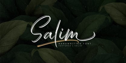 Salim is a handwritten brush font with 2 styles, regular (brush texture) and solid. Salim is perfect for branding, logotype, apparel, T-shirt, Hoodie, product packaging, quotes, flyer, poster. Comes with Uppercase and lowercase characters, Supports international languages, Numerals, punctuations, ligatures, stylistic alternates, and stylistic sets. Accessible in the Adobe Illustrator Glyphs panel, or under Stylistic Alternates in the Adobe Photoshop OpenType menu, Adobe InDesign, Corel Draw, even work on Microsoft Word. Thanks for looking, and I hope you enjoy it! Please don't hesitate to drop me a message if you have any issues or queries.
 - Sattinda by MC Creative,
$10.00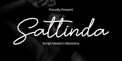 Sattinda is a thin and elegant handwritten font. It features a cute and joyful style that will take your designs to the next level! perfect for branding projects, logo, wedding designs, social media posts, advertisements, product packaging, product designs, label, photography, watermark, invitation, stationery and any projects that need handwriting taste. What’s Included : Standard Glyphs Ligature Works on PC & Mac Simple installations Accessible in the Adobe Illustrator, Adobe Photoshop, Adobe InDesign, even work on Microsoft Word. PUA Encoded Characters – Fully accessible without additional design software. Fonts include multilingual support for; ä ö ü Ä Ö Ü ß ¿ ¡
 - Alles Kaputt by Kitchen Table Type Foundry,
$16.00 Alles Kaputt means ‘everything’s broken’ in German. I always wonder why my stuff breaks so easily, especially my mobile phones (I have had 7 in the last two years). Maybe I am careless, but I believe that there is a more or less scientific explanation that chaos and destruction are far easier than harmony and creation. I am no scientist, so don’t take my word for it! Alles Kaputt is a nice script font. I made it with a felt tip pen I borrowed from the kids. Use it for texts on product packaging, book covers and websites. Or, whatever you fancy!
 - Magical Brush by Hanoded,
$15.00 Personally I think a brush font should have the word ‘Brush’ in its name. It’s not that easy finding a name - you need some magic to come up with a good one! Magical Brush is a completely handmade font. I used a small brush (a number 3 to be precise) and Chinese Ink. I wanted just a little ‘erosion’, so I used copier paper rather than my expensive French water color paper (which is quite rough). Magical Brush comes in the normal variant and a chickenpox one. Use it for your posters, your book covers and your Christmas invitations!
 - Receding Hairline NF by Nick's Fonts,
$10.00 Based on L&C Hairline, this family of faces is weighted to achieve stroke consistency in a variety of sizes. Both versions of this font support the Latin 1262, Central European 1250, Turkish 1254 and Baltic 1257 codepages.
 - Brush Hand Marker by TypoGraphicDesign,
$19.00 The typeface Brush Hand Marker is designed from 2020 for the font foundry Typo Graphic Design by Manuel Viergutz. The rough sans-serif display typeface with 4 font styles (Italic, Invert, Shadow, 3d) is inspired by handwriting. 348 glyphs incl. 100+ decorative extras like icons, arrows, dingbats, emojis, symbols, geometric shapes, catchwords, decorative ligatures (type the word #LOVE for ❤ or #SMILE for ☺ as OpenType-Feature dlig) and stylistic alternates (2 stylistic sets). For use in logos, magazines, posters, advertisement plus as webfont for decorative headlines. The font works best for display size. Have fun with this font & use the DEMO-Font (with reduced glyph-set) for FREE! Font Specifications ■ Font Name: Brush Hand Marker ■ Font Weights: Italic, Invert, Shadow, 3d + DEMO (with reduced glyph-set) ■ Font Category: Display for headline size ■ Font Format:.otf (Mac + Win, for Print) + .woff (for Web) ■ Glyph Set: 348 glyphs ■ Specials: Alternative letters, stylistic sets, automatic contextual alternates via OpenType Feature. Dingbats & Symbols, arrows, hearts, emojis/smileys, stars, further numbers, lines & geometric shapes ■ Design Date: 2020 ■ Type Designer: Manuel Viergutz
 - Delthami Script by Bexxtype,
$15.00 Delthami Script a new fresh & modern script with a handmade calligraphy style, decorative characters and a dancing baseline. So beautiful on invitation like greeting cards, branding materials, business cards, quotes, posters, and more. Delthami Script come with 704 glyphs. The alternative characters were divided into several OpenType features such as Swash, Stylistic Sets, Stylistic Alternates, Contextual Alternates. The OpenType features can be accessed by using OpenType savvy programs such as Adobe Illustrator, Adobe InDesign, Adobe Photoshop Corel Draw X version, And Microsoft Word. And this Font has given PUA unicode (specially coded fonts). so that all the alternate characters can easily be accessed in full by a craftsman or designer. If you don't have a program that supports OpenType features such as Adobe Illustrator and CorelDraw X Versions, you can access all the alternate glyphs using Font Book (Mac) or Character Map Windows). If you have any question, don't hesitate to contact me by email bexxtype@gmail.com Thanks and happy designing :-) Thank You for purchase!
 - Roberto by Letterara,
$12.00 Roberto is a charming and magical hand-lettered script font. The playful rounded characters make it the perfect font for creating stunning calligraphy results. Roberto comes packed with beautiful swashes, that will allow you to add a decorative touch within seconds. Get inspired by its authentic feel and use it to create greeting cards, branding materials, business cards, quotes, posters, and more! What’s included: • Works both on Mac & PC • Simple installations • Alternate, Swash & Ligature • Accessible in the Adobe Illustrator, Adobe Photoshop, Adobe InDesign, CorelDraw, even works on Microsoft Word. • Multi-lingual Support: ä ö ü Ä Ö Ü ß ¿ ¡ • To access the alternate glyphs, you need a program that supports OpenType features such as Adobe Illustrator CS, Adobe Photoshop CC, Adobe Indesign, and CorelDraw. More information about how to access alternate glyphs, check out this link (http://goo.gl/ZT7PqK) To stay up to date for my latest job, follow me and let’s be friends because there will be many promos.
 - Coumins by ryan creative,
$10.00 Coumins has soft, elegant brushstrokes, with typography that looks like handwriting. The brushstrokes appear to be produced by fluid, skillful hand movements, giving the font an artistic and handcrafted feel. Medium to large typography sizes will display brush stroke details clearly. This lettering font is perfect for designs that require a personal and organic touch. Coumins is supported with additional characters that have Alternate forms and swashes that will help you achieve beautiful styles with your own creations. FEATURES; -Uppercase, Lowercase, Foreign Support, Numbers and Punctuation -Alternative, Swash -Works on PC -Simple installation -Accessible in Adobe Illustrator, Adobe Photoshop. Adobe InDesign, even works in Microsoft Word - Fully accessible without additional design software. Coumins is encoded with Unicode PUA, which allows full access to all additional characters without having to design special software. Mac users can use the Font book, and Windows users can use the Character map to view and copy any extra characters to paste into your favorite text editor/app. Thank you for visiting:)
 - Schoolroom JNL by Jeff Levine,
$29.00 Based on the type style used for the Superior Sign and Chart Printer No. 929, this simple and clean sans serif font was perfectly suited for use by teachers in the classroom and for businesses and organizations that needed to make signs, price cards, charts and notices. Digitally redrawn as Schoolroom JNL, it is available in both regular and oblique versions. The Superior Marking Equipment Company [formerly of Chicago] was not only a major supplier of materials for the rubber stamp industry, but for most of its existence manufactured date and numbering stamps, sign and chart printers (such as the one used for this font), and a line of children’s printing toys (amongst other items).
 - Bradley Texting by Monotype,
$57.99Bradley Texting: a clear, friendly and easily legible calligraphy font, also suited to electronic devices With Bradley Texting, Richard Bradley has published another calligraphic typeface that recalls the style of Bradley Hand and Bradley Type. In this case, however, Bradley has advanced the style with clearer forms for display on electronic instruments and on other formats. Two other font families paved the way to the newly introduced Bradley Texting. In the mid-1990s, Bradley published Bradley Hand, with its rough contours. Since these coarse forms do not cut a good figure in the larger font sizes, Bradley Type followed, with smooth letters. During the development of Bradley Type, the idea for a further font came about ? one in the style of the two other calligraphic typefaces, but with simpler, easily legible forms and suited to electronic devices like mobile phones or tablets. The letters for Bradley Texting began with a marker on paper. Looking back, Bradley describes one of the biggest challenges as having the calm required to draw the relaxed-looking letters repeatedly while still making them fit the general style.The somewhat narrow and dynamically designed letters have round line ends, like those left by a felt-tipped pen. As a hand-written print font, the individual letters are not connected to one another. Nonetheless, they demonstrate the influence of a written font, such as the extended ends and the flowing transitions. Clear forms with open counters and a large x-height guarantee Bradley Texting good legibility in the smaller font sizes. Bradley Texting is also effective under more challenging conditions, such as on mobile phones, e-book readers or tablets; the fonts friendly and lively character comes through. With Regular, Semibold and Bold, Bradley Texting is adequately equipped for use as a headline or text font in various sizes. The selection of characters covers the Western European languages and German typographers will be happy to note the presence of the upper-case ß. Use the dynamic and clear forms of Bradley Texting anywhere you need a friendly character with a personal accent. Bradley Texting is persuasive in the print realm, in advertisements or on posters, as well as on electronic devices. - Henrician by Greater Albion Typefounders,
$16.50 Henrician can claim two sources of inspiration. One of these was a set of beautiful capital letterforms seen on the cover of a 19th century album of engravings. The engravings contained therein depicted lovely examples of half-timbered Tudor architecture and there was a clear 'Tudor' intent behind the letterforms. The second source of inspiration is more conceptual-the title lettering of period films from the 30's to the 60's…think if the opening text when Errol Flynn plays Robin Hood, or think of Richard the Lionheart, or even that great comedy Classic 'Carry on Henry', and it's discussion of Sir Thomas de Cobbler….but we digress! Henrician is a set of eight display and text (but perhaps not Body Text) faces in a 'Tudor Revival' spirit. Like any good revival design they are somehow at home with a wide range period themed design work, covering the medieval until, perhaps, the 18th century, just so long as we're more concerned with fun and appearance than strict historical accuracy. The family will be at home in the realms of advertising, posters, cover design and web design. Try Henrician out today!
 - Ambroise Std by Typofonderie,
$59.00 An exquisite Didot font in 18 series Ambroise is a contemporary interpretation of various typefaces belonging to Didot’s late style, conceived circa 1830, including the original forms of g, y, &; and to a lesser extent, k. These unique glyphs are found in Gras Vibert, cut by Michel Vibert. Vibert was the appointed punchcutter of the Didot family during this period. It is the Heavy, whom sources were surest that Jean François Porchez has been used as the basis for the design of the typeface family. In the second half of the 19th century, it was usual to find fat Didots in several widths in the catalogs of French type foundries. These same typefaces continued to be offered until the demise of the big French foundries in the 1960s. Ambroise attempts to reproduce more of what we see printed on paper in the 19th century; a more accurate representation of Didot punches. So, the unbracketed serifs are not truly square straight-line forms but use tiny transitional curves instead. The result on the page appears softer and less straight, particularly in larger sizes. The illustrious Didot family of type founders and printers Every variation of the typeface carries a name in homage to a member of the illustrious Didot family of type founders and printers. The condensed variant is called Ambroise Firmin. The extra-condensed is called Ambroise François. Ambroise Pro brought back to life: fifteen years in the making! Club des directeurs artistiques, 48e palmarès Bukva:raz 2001
 - Thicker by Zetafonts,
$39.00 Thicker is a type-family designed for Zetafonts by Francesco Canovaro with Andrea Tartarelli. A geometric sans typeface on steroids, it was first designed in the muscular Extrablack weight with the aesthetics of high-power dynamic typefaces used in sports communication, and then developed in the lighter weights where the shapes show some vintage-inspired proportions and the slightly squared look that nods to Novarese famous Eurostile, eponymous with retro-futurism. With these diverse influences the typeface allows for both impressive display use and effective logo design as well as more fine-tuned editorial use in body text - with a natural inclination for effective and powerful advertising. Sports typography usually uses italics to add dynamism and impact, and Thicker complies with this by offering a choice of three alternate italic forms with different slant, made even more customizable by the inclusion of variable font technology that allows fine tuning of the weight range as well as precise choice of typeface slant. In each of the 44 weights of the typeface family (as well as in the all-in-one variable type solution) Thicker offers a extended charset of over 900 latin, Cyrillic and Greek glyphs, covering over two hundred languages and including useful Open Type features (Alternate forms, Positional Numerals, Small Caps and Case Sensitive Forms) for flawless typesetting.
 - Funny Nature by URW Type Foundry,
$39.99 Funny Nature is not a typeface but a collection of small, comic-like symbols. Lüdicke used to work often for a supplier of gardening equipment etc. He had to come up with new, original and vivid ideas for the design of catalogues and ads. He designed Funny Nature, a wonderful collection of illustrations. Can you hear the humming and buzzuing, can you smell the flowers?
 - Ratilla Script by Krafted,
$10.00 Be yourself; everyone else is already taken -- Oscar Wilde Being a human being often means fulfilling who you really are. It’s about fulfilling your potential and living to the best of your abilities. And the Ratilla Script will help you show the world who you are! The Ratilla Script paves the way for you to write the information you need to send out to your audience. Make your projects to works of art, conveying your intentions clearly with the font! Maximize your designs with this urban and wavy font. It surely fits anywhere you want them to, giving them a place perfectly tucked in between your designs. Connect with your audience and stand out in the crowd as these fonts will show you that you and your works deserve their attention. Show your boldness as you make the world see of the elegant details put together in your projects! The Ratilla Script will be the perfect addition to aid you in your journey to be who you really are. Let the world see your beauty, bring it out through your handiwork and give your viewers a new perspective!