10,000 search results
(0.076 seconds)
- Glorisa by Black Studio,
$18.00 Glorisa is a new elegant serif font that will add a touch of luxury and style to your projects. This is a very versatile font that works well in large and small sizes. Perfect for editorial projects, magazine headers, Logo designs, Clothing Branding, product packaging, and showcasing masculine and feminine qualities. Glorisa is equipped with uppercase, lowercase, numbers and full punctuation + Multi language support and PUA-encode. To activate the OpenType Stylistic alternative, you need a program that supports OpenType features such as Adobe Illustrator CS, Adobe Indesign & CorelDraw X6-X7, Microsoft Word 2010 or a later version. Features: 3 Font weight Uppercase & lowercase letters Alternative & Ligature Styles Numbers & Punctuation Characters with accents Supports Multiple Languages This type of family has become a work of true love, making it as easy and enjoyable as possible. I really hope you enjoy it! I can't wait to see what you do with Glorisa! Feel free to use #Black Studio tags and #Glorisa Serif fonts to show what you've been up to.
 - Monotype Goudy by Monotype,
$40.99Over the course of 50 years, the charismatic and enterprising Frederic W. Goudy designed more than 100 typefaces; he was the American master of type design in the first half of the twentieth century. Goudy Old Style, designed for American Type Founders in 1915-1916, is the best known of his designs, and forms the basis for a large family of variants. Goudy said he was initially inspired by the cap lettering on a Renaissance painting, but most of the flavor of this design reflects Goudy's own individualistic style. Recognizable Goudy-isms include the upward pointing ear of the g, the diamond-shaped dots over the i and j, and the roundish upward swelling of the horizontal strokes at the base of the E and L. The italic was completed by Goudy in 1918, and is notable for its minimal slope. Goudy Bold (1916-1919) and Goudy Extra Bold (1927) were drawn not by Goudy, but by Morris Fuller Benton, who was ATF's skillful in-house designer. Goudy Catalogue was drawn by Benton in 1919-1921 and was meant to be a medium weight of Goudy Old Style. Goudy Heavyface was designed by Goudy for Monotype in 1925, and was intended to be a rival to the successful Cooper Black. Goudy Modern was designed by Goudy in 1918; its small x-height, tall ascenders and shorter caps impart a spacious and elegant feeling. Benton designed Goudy Handtooled, the shaded version that has just a hairline of white through its bold strokes. The Goudy faces, especially the bolder weights, have long been popular for display and advertising design. They continue to pop up all over the world, and still look reassuring to our modern eyes." - Goudy Ornate MT by Monotype,
$29.99Over the course of 50 years, the charismatic and enterprising Frederic W. Goudy designed more than 100 typefaces; he was the American master of type design in the first half of the twentieth century. Goudy Old Style, designed for American Type Founders in 1915-1916, is the best known of his designs, and forms the basis for a large family of variants. Goudy said he was initially inspired by the cap lettering on a Renaissance painting, but most of the flavor of this design reflects Goudy's own individualistic style. Recognizable Goudy-isms include the upward pointing ear of the g, the diamond-shaped dots over the i and j, and the roundish upward swelling of the horizontal strokes at the base of the E and L. The italic was completed by Goudy in 1918, and is notable for its minimal slope. Goudy Bold (1916-1919) and Goudy Extra Bold (1927) were drawn not by Goudy, but by Morris Fuller Benton, who was ATF's skillful in-house designer. Goudy Catalogue was drawn by Benton in 1919-1921 and was meant to be a medium weight of Goudy Old Style. Goudy Heavyface was designed by Goudy for Monotype in 1925, and was intended to be a rival to the successful Cooper Black. Goudy Modern was designed by Goudy in 1918; its small x-height, tall ascenders and shorter caps impart a spacious and elegant feeling. Benton designed Goudy Handtooled, the shaded version that has just a hairline of white through its bold strokes. The Goudy faces, especially the bolder weights, have long been popular for display and advertising design. They continue to pop up all over the world, and still look reassuring to our modern eyes." - Goudy Handtooled by Monotype,
$40.99Over the course of 50 years, the charismatic and enterprising Frederic W. Goudy designed more than 100 typefaces; he was the American master of type design in the first half of the twentieth century. Goudy Old Style, designed for American Type Founders in 1915-1916, is the best known of his designs, and forms the basis for a large family of variants. Goudy said he was initially inspired by the cap lettering on a Renaissance painting, but most of the flavor of this design reflects Goudy's own individualistic style. Recognizable Goudy-isms include the upward pointing ear of the g, the diamond-shaped dots over the i and j, and the roundish upward swelling of the horizontal strokes at the base of the E and L. The italic was completed by Goudy in 1918, and is notable for its minimal slope. Goudy Bold (1916-1919) and Goudy Extra Bold (1927) were drawn not by Goudy, but by Morris Fuller Benton, who was ATF's skillful in-house designer. Goudy Catalogue was drawn by Benton in 1919-1921 and was meant to be a medium weight of Goudy Old Style. Goudy Heavyface was designed by Goudy for Monotype in 1925, and was intended to be a rival to the successful Cooper Black. Goudy Modern was designed by Goudy in 1918; its small x-height, tall ascenders and shorter caps impart a spacious and elegant feeling. Benton designed Goudy Handtooled, the shaded version that has just a hairline of white through its bold strokes. The Goudy faces, especially the bolder weights, have long been popular for display and advertising design. They continue to pop up all over the world, and still look reassuring to our modern eyes." - Goudy by Linotype,
$39.00Over the course of 50 years, the charismatic and enterprising Frederic W. Goudy designed more than 100 typefaces; he was the American master of type design in the first half of the twentieth century. Goudy Old Style, designed for American Type Founders in 1915-1916, is the best known of his designs, and forms the basis for a large family of variants. Goudy said he was initially inspired by the cap lettering on a Renaissance painting, but most of the flavor of this design reflects Goudy's own individualistic style. Recognizable Goudy-isms include the upward pointing ear of the g, the diamond-shaped dots over the i and j, and the roundish upward swelling of the horizontal strokes at the base of the E and L. The italic was completed by Goudy in 1918, and is notable for its minimal slope. Goudy Bold (1916-1919) and Goudy Extra Bold (1927) were drawn not by Goudy, but by Morris Fuller Benton, who was ATF's skillful in-house designer. Goudy Catalogue was drawn by Benton in 1919-1921 and was meant to be a medium weight of Goudy Old Style. Goudy Heavyface was designed by Goudy for Monotype in 1925, and was intended to be a rival to the successful Cooper Black. Goudy Modern was designed by Goudy in 1918; its small x-height, tall ascenders and shorter caps impart a spacious and elegant feeling. Benton designed Goudy Handtooled, the shaded version that has just a hairline of white through its bold strokes. The Goudy faces, especially the bolder weights, have long been popular for display and advertising design. They continue to pop up all over the world, and still look reassuring to our modern eyes." - Whitechapel BB by Blambot,
$20.00During the investigation of the infamous murders in Whitechapel, police received several letters allegedly from Jack the Ripper. Of the hundreds received, the so-called, “Dear Boss” letter actually included some details of a crime that had yet to be committed. Soon after, the information in this letter would be corroborated at a crime scene. This font was inspired by the handwriting in that letter. It includes dozens of European characters…and just might be the writing of Jack himself! - Cabrito Sans by insigne,
$24.99 It's time to kick off your shoes and feel the "sans" between your toes. Like Cabrito Inverto , its stress-reversing cousin, the new Cabrito Sans serves up something nice and cool in the heat of the project. A quick recap: the original Cabrito is an insigne Design slab serif produced for the kid's book The Clothes Letters Wear. It's been pretty well-received--even more than I expected. I promised to grow the family with a free-standing inverted style that could pair well with Cabrito. (See Cabrito Inverto.) Now, I'm rounding out the family with this well-crafted sans. And so now, Sans is where it's at. Strip away the serifs of Cabrito, and you have a laid back, rounded sans serif alternative served up over easy. This handwriting-inspired creation--like its relatives--is definitely not uptight about its forms (though not afraid to show them off a little). Cabrito Sans' whole pack of alternates is accessible in any OpenType-enabled program. This kiddo consists of a workforce of alternates, swashes, and alternate titling caps to give the font a little extra sweetener to its flavor. Also bundled are swash alternates, old style figures, and compact caps. Check out the interactive PDF brochure to test out each these options. This font family members also consists of the glyphs for 72 various languages. Cabrito Inverto and Cabrito do pair nicely with Cabrito Sans (in case you doubted). Use Sans--or all three of these amigos--to express friendliness on just about anything: food, candy, toys, cars (if you're feeling bold). Don't wait, though. Purchase Cabrito Sans today, and bring a one-of-a-kind look to whatever your computer's next design party is.
 - Greene Designs by Woodside Graphics,
$19.95This font consists of 26 design elements derived and adapated from various architectural works of Charles and Henry Greene who created hundreds of designs for houses, furniture and decorative arts in their own unique interpretation of the "Arts & Crafts" style in the early years of the 20th Century, mostly in Pasadena, California. Many of the picture elements are designed to form distinctive borders, and the variety of designs contained in this font encourages their use in many creative ways. - Waltograph UI - Unknown license

- Garmisch Rund NF by Nick's Fonts,
$10.00Emil Rudolf Weiss's eponymous Rundgotisch of 1937 provided the pattern for this streamlined version of classic German blackletters. All versions of this font include the Unicode 1250 Central European character set in addition to the standard Unicode 1252 Latin set. - Lunanic by Ingrimayne Type,
$9.00 Lunanic is a geometric novelty typeface family with a touch of graffiti. The letters are formed from a circle with a notch or nick taken out, a shape that reminds me of a partial lunar eclipse. Half of the family have the nick on the left and half on the right. The faces are monospaced and so tightly spaced that there is no space between most of the letters so the filled styles cannot be used alone without tweaking. There are several ways to tweak them to make them readable: adjacent letters can be colored differently, the characters spacing can be increased, or an outlined style can be layered on top of the filled letters. The family does not have a true lower case. Most of the characters in the lower-case slots are alternates for those on the upper-case keys and they can be mixed in whatever way the user finds best. The family has twelve members: two orientations with three weights each and each of these six has an outline style to go with it. Lunanic is fun, bizarre, weird, and obviously a decorative display font.
 - Hebrew Siddur by Samtype,
$59.00 This is a classic design from the beginning of the 20th century. This font can be used in many kinds of books. This font has the modern Hebrew punctuation: Shevana, Kamatz Katan, Dagesh Hazak, and Cholam Chaser.
 - MVB Embarcadero by MVB,
$79.00 MVB Embarcadero lies in a space between grotesque sans serifs and the vernacular signage lettering drawn by engineers. It’s a style that happens to convey credibility and forthrightness without pretense—it’s anti-style, actually. All of this makes for the most versatile of typefaces, capable of delivering any kind of message while staying out of the way. As is often the case with a type design that develops over several years, Embarcadero isn’t the realization of a specific concept. In the ’90s Mark van Bronkhorst began digitizing a blocky slab serif from the Victorian era, which was then set aside for many years. He later revisited the design, paring it down to its bare essentials, and as more time passed, it evolved from a grid-based outline to curves that echoed the rigid skeleton of the original. Eventually it became a complete family with all the readability requirements of a text sans serif, yet maintaining the subtle eccentricities of its inspiration. Functionally, the Embarcadero family is as adaptable as its design. The OpenType Pro set of 20 fonts contains two widths and five weights, each with italics, small caps, a full set of figures, bullets and arrows, and support for most Latin-based languages. In all, Embarcadero is suitable for headlines or text. And—thanks to its simple, square form—it’s ideal for type on screen too.
 - Qarlient by Pixesia Studio,
$19.00 Introducing Qarlient - A Modern Serif Font Qarlient is a powerful modern serif font with freshness, elegance and unique appearance. This font concept includes a wide range of inspirations, from ancient to classical to modern, making it a perfect font for low-key, modern and refined appearance. Ton of beauty and luxury alternates make this serif font very versatile. This gives any branding or logo design looks unique. Qarlient font is perfect for Magazine, Social Media, Poster, Business Card, and Many more that needs Unique touches. FEATURES - Stylistic Alternates - PUA Encode - Uppercase and Lowercase letters - Numbering and Punctuations - Multilingual Support - Works on PC or Mac - Simple Installation - Support Adobe Illustrator, Adobe Photoshop, Adobe InDesign, also works on Microsoft Word Hope you Like it. Thanks.
 - Inglenook Corner NF by Nick's Fonts,
$10.00This whimsical wonder is based on the lettering of Laurence Schall, as presented in Lewis F. Day's 1910 classic, Alphabets Old and New. The typeface radiates a charm reminiscent of the works of many talented artists (including Howard Pyle and Arthur Rackham) who illustrated children's books around the turn of the twentieth century. The Opentype version of this font supports Unicode 1250 (Central European) languages, as well as Unicode 1252 (Latin) languages. - Old Miami Beach JNL by Jeff Levine,
$29.00 The grandeur of what was Miami Beach had its golden years peak in the 1940s. One of the grande dame hotels that stood at Collins Avenue and 23rd Street was the Roney Plaza; built in the 1920s and demolished around 1969. An online auction offered a pair of gummed labels provided by the hotel to be used by their guests for shipping souvenir packages back home, thus also giving the hotel a promotional plug. Jeff Levine not only created two typefaces from this hand-lettered label - Old Miami Beach JNL and Old Miami Beach Nights JNL (a solid black version), but painstakingly recreated the look of the label for the promotional flag and banner for the fonts.
 - Chipen by 38-lineart,
$14.00 I am pleased to present you an excellent futuristic font "Chipen" in unique graphic style! This font consists of regular, expanded, regular italic and expanded italic, these 4 fonts are encapsulated in one variable. With one font variable, this will cover 4 styles and cover all the weights between regular and expanded. If you are used to working with variable fonts it will give you more weight options, if you have never tried this variable font it will be an amazing new experience for you, take a look at this video snippet: https://youtu.be/jgqNPGeoVjc Chipen comes in bold and with a “RoundCube” cut, this is perfect for modern, Sci-Fi, and technology themes. Coupled with the stripe in the middle of the makes it appear more sporty. Not only that, this stripe can also display "Eighties" if you package it in a retro concept. Another strength of this font is the lowercase ligature, we present a lot of ligatures and one of them might be suitable for your logo brand. Finally, this font is a dynamic font with a variable concept capable of covering more 'weight', unique to appearing in various eras, exploring the world of retro and even science and fiction.
 - VLNL Bint by VetteLetters,
$35.00 Kornelis de Vries, a headmaster from the Dutch province of Friesland, cultivated new potato breeds that he named after pupils in his school. In the early 1900s he came up with the tasty Bintje (a Frisian girl’s name) and it became a big success – in Belgium and France it has remained the most popular potato for french fries to this day, more than a century since its introduction. Donald Roos took 10 kilos of fresh Bintje potatoes and cut the Bint typeface by hand with a short, sharp knife. He then inked each character once and printed it twice; the second, lighter printing is accommodated in the lower case alphabet. The Bint family offers a script to make the letters bounce up and down the baseline; with OpenType functionality the font randomly chooses each character from the upper- or lowercase alphabet. ‘Tabular lining figures’ will activate a series of negative numerals in boxes; ‘Discretionary ligatures’ activates specially designed letter combinations like ‘www’ as well as arrows and stars. Bint has a distinct, slightly rough handmade appearance, making it useful for a wide range of designs.
 - Kachelofen by Proportional Lime,
$9.99 Konrad Kachelhofen was a printer in the city of Leipzig beginning around 1483. He printed many works by contemporary authors and also many of the classics. He acquired an unusually large amount of typefaces for his shop, a place that included a wine bar and book store. This particular face is based on the Typ.8:170G GfT101 Gesamtkatalog der Wiegendrucke. He probably died in 1529 after passing his business on to his son-in-law Melchior Lotter.
 - Catalina by Kimmy Design,
$10.00 Earlier this year I visited a bakery in Newport Beach, CA and fell in love with the organic design and typography of the place. Hand-drawn menus, table cards, chalkboards, and wall quotes surrounded the charming spot. It inspired me to create a new font family based on the combination of hand drawn fonts. Included in this package are 5 font families, with 2 graphic ornament fonts. Each font family contains at least a light, medium and bold. Here is a breakdown of what's cookin' at Catalina's Bakery: Catalina Anacapa: Tall and skinny, this font comes in 3 weights for both sans and slab serif styles. It includes contextual alternatives (giving 3 versions of each letter), stylistic alternatives for select letters (A, K, P, Q, R, Y) and also includes Small Caps. Catalina Avalon: Based off Anacapa, this sub family has a high contrasting line weight. It comes in light, regular and bold as well as an inline alternative for both sans and slab serif styles. Avalon also includes opentype features such as contextual alternatives (giving 3 versions of each letter), stylistic alternatives for select letters (A, K, P, Q, R, Y) and small caps for each letter. Catalina Clemente: In a more standard width, Clemente is one of the two sub families that can be used for paragraph text as well as headlines. It's organically geometric in style and comes in ALL CAPS and lowercase, includes upright and custom italics, and has the opentype feature giving 3 versions of each letter. Catalina Script: A great compliment with the display sub-families, Catalina Script rounds out the package with a hand-drawn cursive flair. It includes contextual alternatives (giving 2 variations to each letter) as well as stylistic alternatives for many of the capital and lowercase letters. It has special ligatures for some letter combinations, and titling alternatives for all the capital letters. Catalina Typewriter: The second of the paragraph text sub-families, this typewriter inspired hand-drawn font family works great as either a display or paragraph text. It has contextual alternatives with 3 versions of each letter, and comes in both upright and custom italics versions. Catalina Extras! These two fonts go perfectly with the Catalina Family. They includes borders, frames, arrows, banners, flourishes and more. Catalina Flourish has all of it's options in a light and bold style, to use the light version type all lowercase letters, then to make something bold, used it's uppercase (or shift+) characters. For a breakdown of graphic/letter correlation, see the breakdown PDF. All of Catalina was drawn by the same hand, using the same ink and technique. While they contrast in their type styles, they work together perfectly to create one cohesive font family.
 - CP Company by FSD,
$23.37 C.P. Company is a group of types including 4 different forms and it is a complementary sign of communication for the C.P. Company clothes maker. C.P. Company communication makes use of media such as the press and the web and that’s the reason why we have always felt the need for a font that would not show incongruities through the monitor. Therefore we have decided to change the structure of glyphs like a, e, g, s… in the most contrasted versions to prevent the serifs from touching the internal parts of the letters and in this manner we have made a really unusual stylistic choice for a group of types. The difference between the height of caps and smalls is very low (about 20%) so that the smalls are easy to read even when their dimensions are on a very small scale. Moreover this stylistic solution gives the possibility to avoid using the small capitals in case of charts and catalogue codes (i.e. Tricot M5) and provides more vertical compactness between the lines. Even a sentence written in capital letters next to another one written in smalls does not look so much contrasted from a typographical point of view and then it is not unpleasant. The limits due to different constructive principles have been overcome by means of a grid based on the automatic division of EM square of 9-point type and in this manner the letters have a wider face. The font is even more unusual owing to the style chosen that belongs to the classical tradition of hair-lined types for glyphs like e and also thanks to ligatures like ? in the characters set. CP Company is a geometrical font whose alphabet makes use of the style of types that preceded the Helvetica, matched with more experimental and updated solutions. Numbering is monospaced. The bending of number 2, the slight raising of the oblique serif of number 4 and the presence of a hair-line in number 7 are the solutions adopted to make the types match in a more balanced manner.
 - PR Swirlies 02 by PR Fonts,
$10.20 This font is a collection of calligraphic ornaments suitable for invitations, gift tags,etc. These designs are assembled from hand drawn elements, and mirrored elements have been modified slightly, to increase the hand-drawn appearance. They would also be right at home framing the dialogue screens of a silent film.
 - BD Gitalona Variable by Balibilly Design,
$139.00 We introduce our Variable Font from the high-complex BD Gitalona font family. Consisting of 3 axes; weight, optical size, and serif, that will give you a different experience extending the family of BD Gitalona. We don't want to mention how many families can be generated from this variable font. During the development process, we got up to more than 50 families and stopped to allow you to continue to play with the slide buttons. And again, BD Gitalona is filled with an explorative and experimental decorative version that we present separately. Figure out the decorative version BD Gitalona Moxa to make the aesthetic appeal of this whole typeface here! Inspiration The world of entertainment moves non-stop. One by one, figures appeared and left. We expect to create something to entertain previous trends with packaging more relevant to the present. More specifically, we admire and are inspired by some of the world's leading and top singers with a segmented nature. We imagine so many figures that can affect every viewer. However, each artist or singer has a segment because almost all of them have characteristics. The Design The basic design of this typeface begins with a transitional serif shape with sharp, shapeless corners. Then in the middle of the invention, there was an opportunity to explore it further from the readability side by adding an optical variable that can adjust the serif thickness when used together between large, medium to paragraph text sizes for editorials. The shift from serif to sans-serif with the contrast initiated by the shift of the serif family form as a different variable also makes this font richer in terms of the features it contains. Parts are expected to add to the user satisfaction with the complexity of this font. The Features BD Gitalona consists of one sub-family intended for body text with nine weights from Thin(100) to Black(900) and four other display sub-families such as Display serif, Flick, Harmony Sans and Contrast Sans. Each consists of four weights Thin(100), Regular Weight(400), Bold(700), and Black(900). And again, there are also retailed separately; the BD Gitalona Variable font, which is designed to accommodate all Subfamily in 1 font file, and BD Gitalona Moxa, an experimental typeface. A total of 700+ glyphs in each style. Advanced OpenType features functionally and aesthetically, such as Case-sensitive forms, small caps, standard and discretionary ligatures, stylistic alternates, ordinals, fractions, numerator, denominator, superscript, subscript, circled number, slashed zero, old-style figure, tabular and lining figure. Supports multi-languages including Western Europe, Central Europe, Southeast Europe, South America, and Oceania.
 - Leather by Canada Type,
$24.95 Over the past few years, every designer has seen the surprising outbreak of blackletter types in marketing campaigns for major sports clothing manufacturers, a few phone companies, soft drink makers, and more recently on entertainment and music products. In such campaigns, blackletter type combined with photos of usual daily activity simply adds a level of strength and mystique to things we see and do on a regular basis. But we couldn't help noticing that the typography was very odd in such campaigns, where the type overpowers all the other design elements. This is because almost all blackletter fonts ever made express too much strength and time-stamp themselves in a definite manner, thereby eliminating themselves as possible type choices for a variety of common contemporary design approaches, such as minimal, geometric, modular, etc. So extending the idea of using blackletter in modern design was a bit of a wild goose chase for us. But we finally found the face that completes the equation no other blackletter could fit into: Leather is a digitization and major expansion of Imre Reiner's forgotten but excellent 1933 Gotika design, which was very much ahead of its time. In its own time this design saw very little use because it caused problems to printers, where the thin serifs and inner bars were too fragile and broke off too easily when used in metal. But now, more than seventy years later, it seems like it was made for current technologies, and it is nothing short of being the perfect candidate for using blackletter in grid-based settings. Leather has three features usually not found in other blackletter fonts: - Grid-based geometric strokes and curves: In the early 1930s, blackletter design had already begun interacting back with the modern sans serif it birthed at the turn of the century. This design is one of the very few manifestations of such interaction. - Fragile, Boboni-like serifs, sprout from mostly expected places in the minuscules, but are sprinkled very aesthetically on some of the majuscules. The overall result is magnificently modern. - The usual complexity of blackletter uppercase's inner bars is rendered simple, geometric and very visually appealing. The contrast between the inner bars and thick outer strokes creates a surprising circuitry-like effect on some of the letters (D, O, Q), wonderfully plays with the idea of fragile balances on some others (M, N and P), and boldly introduces new concepts on others (B, F, K, L, R). Our research seems to suggest that the original numerals used with this design in the 1930s were adopted from a previous Imre Reiner typeface. They didn't really fit with the idea of this font, so we created brand new numerals for Leather. We also expanded the character set to cover all Western Latin-based languages, and scattered plenty of alternates and ligatures throughout the map. The name, Leather, was derived from a humorous attempt at naming a font. Initially we wanted to call it Black Leather (blackletter...blackleather), but the closer we came to finishing it, the more respect we developed for its attempt to introduce a plausible convergence between two entirely different type categories. Sadly for the art, this idea of convergence didn't go much further back then, due to technological limitations and the eventual war a few years later. We're hoping this revival would encourage people to look at blackletter under a new light in these modern times of multiple design influences.
 - Entitled JNL by Jeff Levine,
$29.00Way back before digital imaging, video tape and computer editing, the home movie enthusiast had to shoot on film his own titles using any one of a variety of movie titling kits on the market. One common approach was to arrange white ceramic letters on a colored background and film them. A set of such letters provided the inspiration for Entitled JNL from Jeff Levine. The classic, sleek Art Deco lines of this font makes it an all-purpose design for any headline needs. - Disquete by Tipos do aCASO,
$23.90Inspired by the shape of a 3.25" floppy disk this unicase font was designed from the combination of three square modules. Made in 1998 Disquete is one of the first projects of Buggy, founder of the Brazilian type foundry Tipos do aCASO. - Emily In White by Juliasys,
$59.00 She did not live to experience her breakthrough as a poet, but today she is considered one of the pioneers of literary modernity – the American lyricist Emily Dickinson (1830–1886). She left behind a life’s work of manuscripts on scraps of paper, note pads and letters – and a last wish, that these were to be burned. Emily’s younger sister Lavinia did not fulfill her wish – and thus preserved the ingenious manuscript-objects for posterity. For Julia Sysmäläinen, designer of the award winning Kafka type family FF Mister K, Dickinson’s manuscripts were an inspiration and a source for creating her new typeface “Emily In White”. Emily In White – named after Emily Dickinson’s preference for white clothes – captures the most filigree letterforms of the poet’s multifaceted writing style. With hundreds of alternates and ligatures and a complex OpenType feature code it manages to revive the lively sequence of single and connected glyphs of a delicate handwriting which has been described as “breezing” and “reminding of bird tracks”. Emily in White is available in three weights designated I, II and III. For each weight, there is an associated Swashes font. See the PDF in the Gallery section for details. Language support Western and Central European, over 1800 glyphs.
 - Crystal Angles by Balpirick,
$12.00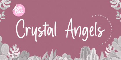 Crystal Angles is a Modern Monoline Font. Crystal Angles is a sweet and relaxed handwritten font. It is perfect for product packaging, branding projects, magazines, social media, wedding designs, or just used to express words on a background. This font includes, Crystal Angles also multilingual support.
 - Jumbo Sale by Eko Bimantara,
$19.00 Jumbo Sale is a bold and comical display font designed and published by Eko Bimantara in August 2022. This font has fun, bold and loud characteristics. Fit for titles, brand, product packaging and big size display. It has more than 300 glyphs which cover broad latin languages.
 - Toulouse by Scholtz Fonts,
$21.00Toulouse is a city of culture. It has long nurtured literature, music, dance, theater and concerts. It is therefore an entirely appropriate name for an elegant and classical french-style font. Toulouse, the font, is classically calligraphic with a sharp-edged look to the character terminus that speaks of skilled penmanship. Careful attention has been paid to the weights of the vertical strokes, keeping them consistent with the pen angle, and enhancing the faithfulness of this font to the period style. Toulouse will be very useful wherever an ambience of measured elegance is required. It will enhance the appearance of advertisements, wedding and other invitations, as well as menus, headlines and posters. It contains a full character set and is professionally letter-spaced and kerned. - Lettro Script by Ferry Ardana Putra,
$15.00 Make your own retro design with Lettro Font! Lettro is an exquisite bold script typeface inspired by the retro design from 70-80-ish. Lettro is created with a ton of stylistic alternates, swashes, and ligatures, and also comes with 5 total Layered fonts: Regular, Extrude, Extrude Outline, Double Extruded, and Double Extruded Outline. Perfect fitted layer to give you more contrast, more bold look of the title. Every glyph for alternates is curated for the best and possible without eliminating the characteristic of these fonts! Combine that many styles and create an awesome retro design! This retro typeface is perfect for logotypes, t-shirts, vintage badges, retro quotes, branding, packaging, posters, signboards, social media needs, etc. ——— Lettro features: A full set of uppercase & lowercase characters Layered Style Numbers & punctuation Multilingual language support PUA Encoded Characters OpenType Features +563 Total Glyphs +212 Stylistic Alternates +49 Ligatures +47 Swashes and more (Shiny and Spray Effect Included!) ——— ⚠️To enable the OpenType Stylistic alternates, you need a program that supports OpenType features such as Adobe Illustrator CS, Adobe InDesign & CorelDraw X6-X7, Microsoft Word 2010, or later versions. There are additional ways to access alternates/swashes, using Character Map (Windows), Nexus Font (Windows), Font Book (Mac), or a software program such as Pop Char (for Windows and Mac). ⚠️For more information about accessing alternative, you can see this link: http://adobe.ly/1m1fn4Y ——— 🔑Important tutorial from the author: Tutorial for Mollusca font trio: https://lnkd.in/d984CQD6 How to use Midway | Retro Script Font on illustrator: https://lnkd.in/eusbZd7s How to use Midway | Retro Script Font on Photoshop: https://lnkd.in/evsYrwgs Happy Designing...😊
 - Ambicase Fatface by Teeline Fonts,
$48.00 Most fonts include uppercase and lowercase letters. Some experimentally-minded designers have proposed unicase typefaces as well: rather than having two different forms for a given letter, unicase fonts have one, chosen from the upper- or lowercase forms. Ambicase Fatface takes the next step, offering not "either/or", but rather "both/and". Each letter in Ambicase Fatface is a combination of its traditional upper- and lowercase forms, in an extra-bold style. Its inventive, hybrid forms are a bolder take on those of its 2010 sibling typeface, Ambicase Modern. Ambicase Fatface stands out as a carefully crafted experimental font: its eccentric forms do not hinder its readability. It is suitable for high-style display settings. Ambicase Fatface offers a large character set and extensive OpenType features. Most notably, in modern OpenType-aware applications, Ambicase Fatface can be set in swash mode, which features sophisticated decorative flourishes that differ depending on whether the letter is at the beginning, middle, or end of a word. Ambicase Fatface is available in two optical sizes: Regular and Poster. At very large sizes, the Poster cut, with its finer details, is recommended.
 - Dsert by Latinotype,
$26.00 D Sert—based on the Pirata typeface—is inspired by 70s Chilean constructivist design and the political propaganda posters artwork of La Unidad Popular (Chilean political coalition). D Sert is the result of the combination of the Chilean graphic art revival with new trends, such as the handmade movement and super font families. The super family comprises 47 weights and comes with two versions: D Sert and D Sert Alt, plus extras. Diagonal strokes are significantly different between the two versions: diagonals of the Alt version are much more logical than the diagonals of the normal version. Another difference is the bowls of the capitals: in the D Sert version, they slightly project above the cap height, making it a more daring version and bringing it closer to calligraphy; contrarily, in the Alt version, bowls do not project above the cap height, which makes it a more tidy font. This way, the combination of the two versions and extras provides the user with the freedom to create any kind of artwork.
 - Almoneda by Sudtipos,
$49.00 Almoneda: Sale at public auction of movable goods, generally used. And also: private and voluntary sale of jewelry and junk that is made without the intervention of justice. Formerly, it was nothing more than the market or sale of things and spoils won from the enemy in war. Nowadays, the almoneda is practically associated with spaces where the sale of "old things" takes place and, in Madrid, they are usually concentrated in the area of El Rastro, an open-air market that is set up on Sundays and some holidays in the center of Madrid. There, you can find everything and, if you walk around a lot and look hard enough, great typographic finds. It is there where I find a large number of elements (usually from the late nineteenth and early twentieth century) such as boxes, posters, books, etc.. in which appear uppercase letters with a variety of shapes, letters embedded, rare ligatures ... In addition, many elements extracted from street signs, tiles from bars and commemorative elements of Madrid have been used to complete this font design made with care and patience. Thus was born Almoneda, a modern typeface with a marked axis and great contrast, and an uppercase with several sets of characters to play with and enjoy. It also includes a large number of ligatures and discretionary ligatures. A Variable font is included with the full package license. Almoneda, a typeface that will not leave you indifferent. They take it out of my hands, hey!
 - Deco Eccentrique JNL by Jeff Levine,
$29.00 The inspiration for Deco Eccentrique JNL was initially hand drawn contoured lettering from a mid-1920s piece of sheet music; the style of the letters showing influences of the upcoming Art Deco movement. This was made into a digital font entitled Poster Contoured JNL. Once all of the excess parts of the previous design were stripped away to only the inner letters, the pre-Art Deco influences remained along with characters of varying stroke widths and shapes. This non-conformist type face is available in both regular and oblique versions.
 - Scarlette Script by Fargun Studio,
$12.00 Introducing Scarlette Script, a modern mono-line script font. Scarlette Mono-Line Script will be perfect for many different project ex: display, quotes, blog headers, posters, wedding invitations, branding, logo, fashion, apparel, letter, invitations, stationery and more design concept! Alternates The alternative characters were divided into several Open Type features such as Swash, Stylistic Sets, Stylistic Alternates, and Ligature. The Open Type features can be accessed by using Open Type savvy programs such as Adobe Illustrator, Adobe Photoshop , Corel Draw X version, And Microsoft Word. And this Font has given PUA Unicode (specially coded fonts). so that all the alternate characters can easily be accessed in full by a craftsman or designer.
 - Hostens signature by Pointlab,
$13.00 Hostens Signature a new fresh & modern script with a handmade calligraphy style, decorative characters and a dancing baseline. So beautiful on invitation like greeting cards, branding materials, business cards, quotes, posters, and more. Hostens Signature come with 545 glyphs. The alternative characters were divided into several Open Type features such as Swash, Stylistic Sets, Stylistic Alternates, and Ligature. The Open Type features can be accessed by using Open Type savvy programs such as Adobe Illustrator, Adobe InDesign, Adobe Photoshop Corel Draw X version, And Microsoft Word. And this font has given PUA unicode (specially coded fonts). so that all the alternate characters can easily be accessed in full by a craftsman or designer.
 - Madelon Script by ijemrockart,
$13.00 Madelon Script a new fresh & modern script with a handmade calligraphy style, decorative characters and a dancing baseline. So beautiful on invitation like greeting cards, branding materials, business cards, quotes, posters, and more. Madelon Script comes with 347 glyphs. The alternative characters were divided into several Open Type features such as Swash, Stylistic Sets, Stylistic Alternates, and Ligature. The Open Type features can be accessed by using Open Type savvy programs such as Adobe Illustrator, Adobe InDesign, Adobe Photoshop Corel Draw X version, And Microsoft Word. And this Font has given PUA unicode (specially coded fonts). so that all the alternate characters can easily be accessed in full by a craftsman or designer.
 - Kiysoom Signature by Pointlab,
$15.00 Kiysoom Signature is a new fresh & modern script with a handmade calligraphy style, decorative characters and a dancing baseline! So beautiful on invitation like greeting cards, branding materials, business cards, quotes, posters, and more!! Kiysoom Signature come with 250 glyphs+. The alternative characters were divided into several Open Type features such as Swash, Stylistic Sets, Stylistic Alternates, and Ligature. The Open Type features can be accessed by using Open Type savvy programs such as Adobe Illustrator, Adobe InDesign, Adobe Photoshop Corel Draw X version, And Microsoft Word. And this Font has given PUA unicode (specially coded fonts). so that all the alternate characters can easily be accessed in full by a craftsman or designer.
 - Barnstormer Script by Dear Alison,
$29.00 Have you ever wondered why sign painter scripts, even though they can sometimes be filled with unusual letterforms strike up such a personal connection of familiarity? Is it the weight of the brushstrokes, or is it the quick fluidity of the strokes? Whatever the reason, a sign painter script just has personality! Barnstormer Script taps into that association and brings a speedy sassiness reminiscent of retro travel brochures and appliance advertisements. But for whatever you might need this script for, you'll find it up for the task. Add a little flavor to your font collection and pick up Barnstormer Script today!
