10,000 search results
(0.062 seconds)
- Puffy Chips by Say Studio,
$15.00 Hallo everyone, puffy chips! puffy chips - it's groovy,retro, bold, chubby, and playful, chubby typeface of circle in groovy style. Perfect for make any project like header, quote, layout magazine and other. Even better if you use it on 60s and 70s design project Embracing the psychedelia era combine with groovy style, open type features such as stylistic alternates and multilingual support What's you get? - Unique letterforms - Works on PC & Mac - Accessible in the Adobe Illustrator, Adobe Photoshop, Microsoft Word even work on Canva! - PUA Encoded Characters - Fully accessible without additional design software. Have a wonderful day, *Say Studio*
 - Ancukaseyo by Allouse Studio,
$16.00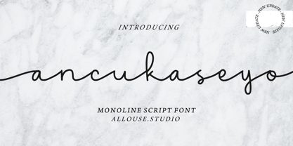 Proudly Presenting, Ancukaseyo a Monoline Script Font. Ancukaseyo come with Start Alternate Lowercase, Ligatures and Multi-Lingual Support which will fulfill your need with some exploration. We highly recommend using a program that supports OpenType features and Glyphs panels like many of Adobe apps and Corel Draw, so you can see and access all Glyph variations. Ancukaseyo is perfect for any tittle, logo, product packaging, branding project, megazine, social media, wedding, or just used to express words above the background. Enjoy the font, feel free to comment or feedback, send me PM or email. Thank You!
 - Planton Script by Genesislab,
$15.00 Planton Script is a new script calligraphy, hand lettered, modern variant font. There are more than 433 glyphs in the font including stylistic sets, Contextual Substitute & Special Unicode Code etc. OpenType features with the Stylistic Alternates, a few characters that allows you to mix and match pairs of letters according to your design. To access alternate glyphs, you need a program that supports OpenType features such as Adobe Illustrator CS and Adobe InDesign, Corel Draw, Microsoft Word 2010. Can be used for various purposes such as title, signature, logo, wedding invitations, t-shirts, letterhead, signage, labels, newsletters, posters, badges etc.
 - Elvishwild by Allouse Studio,
$16.00 Proudly Presenting, Elvishwild a Traditional Tattoo Typeface with 6 styles to fullfil your projects. Elvishwild is perfect for any titles, logo, product packaging, branding project, megazine, social media, wedding, or just used to express words above the background. Elvishwild also come with alternates, ascender swash, descender swash and Multi-Lingual Support. We highly recommend using a program that supports OpenType features and Glyphs panels like many of Adobe apps and Corel Draw, so you can see and access all Glyph variations. Enjoy the font, feel free to comment or feedback, send me PM or email. Thank You!
 - Broneo by Omotu,
$16.00 DETAILS Broneo! A handwritten script font. Broneo font is perfect for branding, logotype, apparel, T-shirt, Hoodie, product packaging, quotes, flyer, poster, etc. Whats Include? 1. Uppercase and lowercase characters 2. Supports international languages 3. Numerals, punctuations, ligatures. 4. Accessible in the Adobe Illustrator Glyphs panel, or under Stylistic Alternates in the Adobe Photoshop OpenType menu, Adobe InDesign, Corel Draw, even work on Microsoft Word. Please message me if you're unsure of any language support. Thanks for looking, and I hope you enjoy it! Please don't hesitate to drop me a message if you have any issues or queries. Omotu
 - Aprillia Wijaya by Allouse Studio,
$16.00 Proudly Presenting, Aprillia Wijaya a Handmade Lettering Font. Aprillia Wijaya come with Stylistic-Alternates, Swash and Multi-Lingual Support which will fulfill your need with many choices. We highly recommend using a program that supports OpenType features and Glyphs panels like many of Adobe apps and Corel Draw, so you can see and access all Glyph variations. Aprillia Wijaya is perfect for any tittle, logo, product packaging, branding project, megazine, social media, wedding, or just used to express words above the background. Enjoy the font, feel free to comment or feedback, send me PM or email. Thank You!
 - Fake Nice by Allouse Studio,
$16.00 Proudly Present, Fake Nice a Handwritten Font which will give you an abstract impression with rough detailed brush. Fake Nice come along with Multi-Lingual Support to fulfill your need. We highly recommend using a program that supports OpenType features and Glyphs panels like many of Adobe apps and Corel Draw, so you can see and access all Glyph variations. Fake Nice is perfect for any tittle, logo, product packaging, branding project, megazine, social media, wedding, or just used to express words above the background. Enjoy the font, feel free to comment or feedback, send me PM or email. Thank You!
 - Namira by Omotu,
$12.00 Namira is a modern calligraphy script font. Namira is suitable for branding, logotype, apparel, T-shirts, Hoodies, product packaging, quotes, flyer, poster, advertising, and more. What's Included? 1. Uppercase and lowercase characters 2. Multilingual support 3. Numerals, punctuation 4. Accessible in the Adobe Illustrator Glyphs panel, or under Stylistic Alternates in the Adobe Photoshop OpenType menu, Adobe InDesign, Corel Draw, even work on Microsoft Word. Please message me if you're unsure of any language support. Thanks for looking, and I hope you enjoy it! Please don't hesitate to drop me a message if you have any issues or queries. Omotu Studio
 - Lontare by RGB Studio,
$17.00 Lontare script typeface works really well for Logos and Apparel Design. It's also great for creating Prints or Merchandise, as you can use the illustrative qualities of the shapes to create an art piece. Lontare script typeface includes many different alternates for each lowercase letter. It's extremely fun to use as each word can be transformed to your liking. Files Include : Basic Latin A-Z and a-z Numbers Symbols PUA Encode Multilanguage Support Thanks and have a wonderful day, If you have any questions, please get in touch with us Don't forget to check out our other products.
 - Admiral by Greater Albion Typefounders,
$12.00 Admiral was inspired by and extrapolated from the Art Nouveau lettering incised into the facade of a local hostelry. This gave us some inspiration for the capitals 'A', 'B', 'C', 'E', 'H', 'I', 'L', 'O', 'S', 'T' and 'U'; we then had great fun extrapolating the rest! The source of the name Admiral can be spotted if you look at characters such as 'A', 'H' and 'N'. Admiral's distinctive charm and humour lends it to projects with a 1900s Art Nouveau theme, be they book covers, posters, signage, invitations, cards, or anything else you enjoy!
 - Electric Cable by Harald Geisler,
$39.00 ''Sometimes, you fall in love with someone, and, sometimes, you fall in love with something. I fell in love with the work of Harald Geisler. Harald and I met through our work on a couple of Kickstarter projects (Typographic Wall Calendar and The Montserrat Typeface). We sympathised immediately with each other, and that lead us to start a new project. The electricity we felt was captured in Electric Cable (that’s what we named it), a typeface designed in our own image and likeness. Electric cable is connected, and that power leads it to write unexpected things. It’s a letter for the flâneur: it carries within itself a high voltage that makes it lively. It has energy and spark. That’s exactly what we would like in a person. It is a display typeface, current and contemporary. It is based on the connection of two friends who felt the need to create a common language even without speaking the same language. In editorials use, your words will become strikingly beautiful. Electric Cable features geometric, humanistic qualities,and also some script, but ,above all, it has a sense of humor.’’ Julieta Ulanovsky (Usage tip: Use the “
 - Visine FF by Koral Creative,
$32.00 Visine FF is a typeface that aims to question the geographical borders that in so many ways can define people's lives. It was developed with the experience of advertising and commercial use in mind. The name Visine can be translated most simply as HEIGHTS. Visine FF was developed out of the necessity to make the most of the space on the visual format. With the tall arches and narrow bodies with exceptional, easy-to-read features, Visine FF aims to complement visual languages in many linguistic regions. Visine FF was developed in the Balkans, where Cyrillic, Latin and Glagolitic were the three historical writing systems used in the former Yugoslavia to denote cultural, ethnic, religious and political identities. Today, the languages of the Western Balkans are so similar that they can easily be called dialects, although they are written in different scripts. This is the result of their coexistence and parallel evolutions, which gave a rise to the common traits. This font family celebrates all the languages and scripts of the Western Balkans and is a labour of love. Love of design, love of language and the human need to communicate across borders, cultures and identities.
 - Arlune by Creative Juncture,
$15.00 How does one describe Arlune. It started as a typeface with curves based on the arc of a crescent moon (Arc + Lunar = Arlune), then evolved into what it is. A very unique graphic typeface with a dynamic character that works well for titles, headings, and other lines of text that need to grab your attention. This is a typeface that is sure to leave an impression. One that will make people stop, take pause, and maybe even ponder the meaning of life as they study its intricacies. It has a significant number of characters and symbols to meet the needs of many languages.
 - Mousse Script by Sudtipos,
$79.00 Mousse Script is based on Glenmoy, a 1932 Stephenson Blake typeface. Glenmoy a prime example of what display typography was in pre-WWII American ad art. It graced the pages of magazines, sold numerous products and services, then simply died out when the typographic trends shifted towards the more personalized, stylized and handwritten types of calligraphy. The current trend in typography is a revivalism that brings all of the distinctive display typography of the 20th century, without chronological discrimination, back in the name of ‘retro’. Who are we to deny the masses what they want? Mousse Script doesn’t just bring Glenmoy back from the ashes of the 20th century. It expands upon the limited metal character set nearly twice over and takes advantage of the latest type technologies. This makes Mousse Script a striking typeface, both functionally and visually. A simple, attractive display font on the surface, Mousse Script is unique in its bold upright calligraphy, something rarely found these days. The OpenType version of Mousse Script combines both the regular and alternate character sets into a single, cross-platform package that takes advantage of the extended typographic features of the OpenType format.
 - Nomina by Tokotype,
$40.00 Nomina is a family of sans serif fonts for use from large to small sizes. The weights of the family itself contain 16 styles plus italic, ranging from ExtraLight to Black. The font family takes was inspired by classic Grotesk typefaces such as Venus and Akziden Grotesk. Unlike any other modern Grotesk typefaces, the details of the contrast in this font family are quite subtle and yet still harmonize while standing in between another character, the open apertures help them to increase the quirkiness accompanied by the sharp terminals on each rounded glyphs. The Nomina family is well equipped with lots of selective alternates and OpenType features, and the main usage of this font is universal, this means this can use it any design style as long as the look and feel keep match with its characteristics.
 - Signsurfers Script by Learning Kiddos,
$18.99 Signsurfer is a unique retro font - a signpainter font, handwritten by me. Inspired by the golden ages of handlettering, this script font highlights: - a bouncy baseline - tight spacing - and full Latin support --- Lots of really cool catchwords & shapes (you will get all the catchwords & shapes seen in the preview pics), five alternates and 37 ligatures help you to really get creative with this one. --- What you can use it for: - branding - logotype - poster - t-shirt designs - all kind of labels - greeting cards - wedding invitations ...and so much more --- This font also works great as a running text, too. = ) --- Process behind it: first I drew all of those fancy letters & catchwords with a brush on paper. I then carefully traced all of those letters & catchwords in Illustrator and transferred them into my Font Creator program. This helped getting the unique sign painters flow. --- Note: You will a need program that support OpenType Features for accessing the alternative glyphs.
 - DT Skiart Lexiconic by Dragon Tongue Foundry,
$10.00 Apparently, Lexicon is the most expensive font in the world. ‘Skiart Lexiconic’ has been on a long growing path getting to where it is now. This font family was originally inspired by the san serif font ‘Skia’, by Mathew Carter for Apple. ‘Skiart’ was designed to feel more like a serifed font, but without any actual serifs. It took a small step between sans serif and serif fonts. Next on the path towards a serif font came Skiart Serif Mini, with tiny serifs added. This was a true serif font, although they were subtle. Then came ‘Skiart Serif Leaf’. and now... We present to you... DT Skiart Lexiconic. Having evolved from the Skiart family, we chose to give it the serifed styling of Lexicon. This is no way a copy or clone of Lexicon. It still has the basic bones of the original Skiart font, but the position, shape and size of the serifs were very much influenced by the world famous Lexicon font. DT Skiart Lexiconic is not the most expensive font in the world.
 - Mango Style by Creativemedialab,
$20.00 Mango Style is a modern branding font with a stylish script alternates. This font is ideal for crafting logos for fashion, apparel brand, luxury projects. Tips: Insert stylish alternates between words for more fashionable look
 - Artiste by ITC,
$29.00A casual, open brush script style designed with a shadow effect for a three-dimensional impression by British designer Martin Wait. This typeface looks best with tight letter and word spacing in large display settings. - South Rose by The Ocean Studio,
$15.00 South Rose is modern sweet Calligraphy South Rose is such the perfect typeface for any kind of your project, such as advertisements, branding, graphic design, quotes, wedding design, logo for online or offline business, photography, and others. Make your business more beautiful! Note : this helps you to use all of our font functions To get Special Characters like Our Preview Image · Adobe Photoshop go to Window - glyphs · Adobe Illustrator go to Type - glyphs You can get special characters by access Character Map for Windows user, and Font Book for MAC user. Download tutorial below : How to Access special characters, You can Download the link for Support you http://www.mediafire.com/file/o3sml68hxp6h6yd/Access_Spesial_Characters.pdf/file This is information and tutorial how to use ligatures in Adobe Illustrator, Adobe Photoshop, Microsoft Word (Windows and Mac). And Enable alternates characters in other apps. Download the guide here : http://www.mediafire.com/file/edm9sjjwx9g1vi2/How_to_Active_Ligature.pdf/file if you get a trouble on our font kerning : http://www.mediafire.com/file/9e0q5sjzx97e06m/how_to_slove_trouble_kerning.pdf/file Includes · Beginning and Ending Characters · Ligatures · Numbers + punctuation · International Languange
 - Crystal Sky by Set Sail Studios,
$16.00 Add a little sparkle to your designs with Crystal Sky! A clean & modern signature-style font set, perfect for creating authentic hand-lettered text quickly & easily. With exaggerated strokes and an extra bouncy baseline, Crystal Sky has an unmistakable charm; perfect for logos, wedding stationery, cards, gift designs, product packaging and handwritten quotes. ★ New Update • Crystal Sky Hearts! Add some passion to your Crystal Sky text with Crystal Sky Hearts, a new font included in your download! These bonus designs add a beautiful, flowing decorative heart at the beginning, middle & end of your Crystal Sky Script text at the click of a button. Crystal Sky is packed full of great features to give you plenty of customisation options; Crystal Sky Alt • This font includes an entire alternate lowercase glyph set. If you wanted to avoid letters looking the same each time to recreate a custom-made style, or try a different word shape, simply switch to this font for an additional layout option. Crystal Sky Caps • Have you ever noticed that script fonts tend to be a bit tricky when it comes to typing in all-caps? 'Crystal Sky Caps' includes a totally separate set of A-Z letters - designed to work in harmony with each other during those moments when you need to hit your caps-lock button and go a bit wild! ★ New! Crystal Sky Hearts • Simply install this as its own separate font, and type any a-z or A-I character in this font to generate 1 of 35 heart decorations, designed to pair beautifully with the Crystal Sky Script font. (Please see the image above for a use guide).
 - Authemart by Great Studio,
$17.00 Introducing a new quality calligraphy font is Authemart Script. High-quality script fonts come with modern and vintage touches in them. Inspired by a mixture of copper calligraphy with handlettering style. OpenType feature with Stylistic Alternatives, Swash, Ligatures, Stylistic sets. It allows you to mix and match letter pairs to fit your design, and also comes with modern ornaments to make this font look elegant and perfect. Authemart is attractive like a smooth, clean, feminine, sensual, glamorous, simple and very easy to read. The classic style is perfect to be applied in various formal forms such as invitations, labels, menus, logos, fashion, make up, stationery, letterpress, romantic novels, books, greeting / wedding cards, packaging, labels, and more. Authemart also supports in pragram, Adobe Illustrator, Adobe Photoshop, Adobe InDesign, Corel Draw X version, Microsoft Word, Language Support : Albanian, Basque, Breton, Chamorro, Danish, Dutch, English, Faroese, Finnish, French, Frisian, Galician, German, Icelandic, Italian, Malagasy, Norwegian, Portuguese, Spanish, Swedish. How to access all alternative characters using Adobe Illustrator: • https://www.youtube.com/watch?v=XzwjMkbB-wQ How to use stylistic sets fonts in Microsoft Word 2010 or later versions: • https://www.youtube.com/watch?v=NVJlZQ3EZU0 There are additional ways to access alternates / swashes, using the Character Map (Windows), Nexus Font (Windows) Font Book (Mac) or a software program such as PopChar (for Windows and Mac). How to access all the alternative characters, using the Windows Character Map with Photoshop: • https://www.youtube.com/watch?v=Go9vacoYmBw Need help? If you need help or advice, please contact me by e-mail : "Greatstudio92@gmail.com" Thank you for your purchase!
 - Plethora by Sudtipos,
$49.00 A few years ago I've discovered the work of one of the most prolific typeface designers of the Bruce type Foundry in NYC during late nineteenth century. Browsing Julius Herriet's work I found a very unique kind of ligatures in his patented "Old Style Ornamented" type design. Some letters were designed with a little top tail that allowed them to connect to each other. After that, I found that he also designed a single italic weight of the same font 7 years later. Since the beginning of the Opentype days I’ve been deeply obsessed with exploring different ways to build ligatures, so that lead me up to this point where I felt the need to create “Plethora”, this new font inspired by Herriet’s work. Extrapolating weights, adding variable technology and playing with additional interconnected letters and alternates. Definitely, Plethora means a large or excessive amount of something, and this font tries to bring back this abundance of details two centuries later. Available in 9 weights, from roman to italic, and also as variable format, “Plethora” supports plenty of latin languages and is a perfect choice for today’s design tides.
 - Deckissa by Mokatype Studio,
$24.00 Deckissa is a reverse contrast serif font that is suitable for headlines and logos. Deckissa is built with a light stem, simple design, and nice curve that makes this font look elegant and luxurious. This font includes some ligature that you can combine to create a Headline, poster, or logo. Works on PC & Mac, simple installations, accessible in Adobe Illustrator, Adobe Photoshop, Adobe InDesign, and even works on Microsoft Word. PUA Encoded Characters - Fully accessible without additional design software. Fonts include multilingual support Image used: All photographs/pictures/vectors used in the preview are not included, they are intended for illustration only. Thank You
 - Gens De Baton by HiH,
$10.00 Gens De Baton is based on a charming lower case alphabet that appeared in the Almanach des Enfants pour 1886 (Paris 1886) under the heading “Amusing Grammar Lessons.” Gens De Baton means simply “Stick People.” The unknown designer turned the bare letter forms into drawings of people for the enjoyment of the children for whom the almanac was intended. The letter forms themselves were based on the French Romain du Roi (King’s Roman), except for the ‘g’ and the ‘j’ -- which were based on Baskerville. The letters ‘w’ and ‘y’ were not included, as they are seldom seen in French. We have left the letters somewhat rough, as they appeared in the Almanach des Enfants , resisting the temptation to clean up all the lines and render them with digital perfection. We have used our HiH Firmin Didot to supply an upper case and auxiliary characters, as Didot was originally a modified version of Romain du Roi. It is interesting to observe the contrast between the polished look of the Didot upper case and the rough, hand-drawn look of the lower case. Purchasers of this font have our permission to use it for the amusement of adults as well as children. We recommend setting Gens De Baton at 24 points or larger.
 - ITC Don't Panic by ITC,
$29.99ITC Don't Panic's distressed shapes and craggy outlines evoke the feeling you get when you're just barely in control of a situation. This is type design on the edge. ITC Panic is further down the emotional track, when you've actually lost control and there is no hope in sight. Thompson says the inspiration for these faces arrived one day in the mail. I received an envelope that looked like it had a rough trip; the type that was stamped on it had a tired, ragged appearance. Ironically, the haggard envelope woke me up. I got excited and wanted to replicate the look as a font of type." Thompson designed ITC Don't Panic, then stood back and looked at it and decided it cried out for a more agitated companion. ITC Don't Panic gave birth to the positively psychotic offspring, ITC Panic. Both are all-cap designs with alternate characters in the unshift position. Creating an authentically disturbed appearance proved to be a challenge for Thompson. "I tried to design agitated characters, but they looked staged. So I tried multiple photocopies, but that didn't work. Eventually, I laser-printed the basic characters, wadded up the lasers, then flattened them out and stomped on them with heavy boots. The end result was scanned and used as the basis for the rest of the design." Thompson's work on web sites and multimedia has influenced his interest in type and typography that transcends the cool, unemotional nature of the computer." - ITC Panic by ITC,
$29.99ITC Don't Panic 's distressed shapes and craggy outlines evoke the feeling you get when you're just barely in control of a situation. This is type design on the edge. ITC Panic is further down the emotional track, when you've actually lost control and there is no hope in sight. Thompson says the inspiration for these faces arrived one day in the mail. I received an envelope that looked like it had a rough trip; the type that was stamped on it had a tired, ragged appearance. Ironically, the haggard envelope woke me up. I got excited and wanted to replicate the look as a font of type." Thompson designed ITC Don't Panic, then stood back and looked at it and decided it cried out for a more agitated companion. ITC Don't Panic gave birth to the positively psychotic offspring, ITC Panic. Both are all-cap designs with alternate characters in the unshift position. Creating an authentically disturbed appearance proved to be a challenge for Thompson. "I tried to design agitated characters, but they looked staged. So I tried multiple photocopies, but that didn't work. Eventually, I laser-printed the basic characters, wadded up the lasers, then flattened them out and stomped on them with heavy boots. The end result was scanned and used as the basis for the rest of the design." Thompson's work on web sites and multimedia has influenced his interest in type and typography that transcends the cool, unemotional nature of the computer." - Royal Kingdom by Pixesia Studio,
$23.00 Introducing Royal Kingdom - Modern Blackletter Font Royal Kingdom is a modern blackletter font that elegantly blends contemporary design elements with the essence of Old English Gothic scriptures. Royal Kingdom is perfectly suited for branding projects, logos, social media posts, advertisements, product packaging, labels, photography, watermarks, stationery, and any creative project seeking a touch of modern blackletter elegance. FEATURES: - Stylistic Alternates - Ligatures - PUA Encoded - Uppercase and Lowercase letters - Numbering and Punctuations - Multilingual Support - Works on PC or Mac - Simple Installation - Support Adobe Illustrator, Adobe Photoshop, Adobe InDesign, also works on Microsoft Word Hope you Like it. Thanks.
 - Bavaria Gates by Nathatype,
$29.00 Ready to enhance your branding? Looking for that “something” that’ll make your audience go WOW and clients get on board immediately? Bavaria Gates-A Serif Font Bavaria Gates is a serif typeface that is made all characters in uppercase. An excellent choice to add the right amount of modern touch. With style looks very interesting for loads of different projects and promotions. A great all-in-one package for your logo, book cover, poster, t-shirt, branding, and advertisement needs. Features: Ligatures Alternates Swashes PUA Encoded Numerals and Punctuation Thank you for downloading premium fonts from Nathatype
 - Letter Gothic 12 Pitch by ParaType,
$30.00 The Bitstream version of Letter Gothic designed by Roger Robertson in 1956-62 for IBM electric typewriter. It is a condensed, monospaced font resembling a typewriter face, suitable for tabular material. Primarily used for slide presentations and for word processing applications, Letter Gothic is very helpful for printing out software source listing, for informal office communications and for tabular charts where alignment of columns is important. Besides, being a clear and easy-to-read font, Letter Gothic is popular now for display and advertising matters. Cyrillic version was developed for ParaType in 2000 by Gayaneh Bagdasaryan.
 - Mainstream by Mans Greback,
$59.00 Mainstream is a graffiti handwriting font, designed created by Måns Grebäck. It is vivid, artistic and contains a wide range of characters. Write underscores after any word to make an underline. Example: Mainstream_ Write * after any letter to put a crown on it. Example: Mainstre*am
 - Wayfinding Sans Symbols by FDI,
$29.00 Placing pictograms as single vector images makes designing signage a time-consuming task. But with Wayfinding Sans Symbols and its built-in OpenType intelligence using pictograms becomes as easy as typing words. With Wayfinding Sans Symbols you don’t need to scroll through endless glyph palettes to look for one symbol among hundreds of symbols. Just active ligatures and type in the mnemonic codes like #wheelchair, #parking, #toilet and so on. An overview of these codes can be found in the type specimen PDF. Each pictogram is available in 4 different versions and you can easily assign an additional background color or turn the symbol into a prohibition sign. Wayfinding Sans Symbols has a full coverage of the Unicode range “Transport & Map symbols” and a lot of additional signs that are missing in the typical wayfinding symbol sets. Beside the pictograms, Wayfinding Sans Symbols also has a huge set of arrows for every possible situation and you can easily switch between the different sets using OpenType feature controls. The enclosed letters and figures make it easy to set transport line numbers, room & storey numbers and much more. Wayfinding Sans Symbols is the perfect addition to Ralf Herrmann’s signage typeface Wayfinding Sans Pro, but it can also be used with any other typeface.
 - Bacterio by Wiescher Design,
$39.50 Bacterio is a typeface I designed for this hulk of a friend of mine who is a kitchen designer. He is huge but has a very delicate feeling for form. One day he said he was trying out something new and if I couldn't make a font for him. Then he showed me the surface design, a hard-plastic covered multilayered wood. The surface design was called "Bacteria" and it looked just like that, only in multicolors. Well here is "Bacterio" the font that looks just like that surface of my hulky friend. Yours very design infected Gert Wiescher
 - Strak by Kustomtype,
$25.00 Strak is a font that was born out of admiration for the work of E. Vermeulen, a Belgian artist known for his tight, precise line and an unseen masterpiece that is spread around the world. He has published and exhibited his work in London, Liverpool, Angoulême, New York, Geneva, Amsterdam, Lyon and Turku (in Finland) and he even signed for the New York Times. Based on a few characters, a complete font was composed by Kustomtype. After a few sketches, Strak came to life. The name Strak, in this case, refers to the slender, beautiful woman with the correct waistlines and proportions. The font is designed this way; it is completely hand-drawn, digitized and can be used in all modern and graphic media. Strak is available in 8 different styles, has class and will make many people's mouth water when they see it on your designs. Do you want quality and style? Then Strak is the font-perfect solution!
 - Helvetica Now Variable by Monotype,
$328.99 Helvetica Now Variable Helvetica Now 2.0 builds on the groundbreaking work of 2019’s Helvetica Now release—all of the clarity, simplicity, and neutrality of classic Helvetica with everything 21st-century designers need. In this 2021 release, we introduce Helvetica Now Variable and add condensed weights to the Helvetica Now static fonts. Helvetica Now 2.0 includes 96 fonts in three distinct optical sizes (Micro, Text, and Display), now with 48 new condensed weights. The Helvetica Now Variable fonts include even more: 144 instances—48 normal, 48 condensed, and 48 compressed. Helvetica Now Variable gives you over a million new Helvetica styles in one state-of-the-art font file (over two-and-a-half million with italics!). Use it as an extension of the Helvetica Now family or make custom-blends from its weights (Hairline to ExtraBlack), optical sizes (four point to infinity), and new Compressed and Condensed widths. Create infinite shades of expression, incredible typographic animations, and ultra-refined typography. Its single font file makes it easier to use and wickedly fast. Load one file and access a million fonts—in a fraction of the size of a traditional font family. More freedom. More expression. More power. More. Helvetica. Now. Each one of the Helvetica Now static fonts has been carefully tailored to the demands of its size. The larger Display versions are drawn to show off the subtlety of Helvetica and spaced with headlines in mind, while the Text sizes focus on legibility, using robust strokes and comfortably loose spaces. Helvetica Now's Micro designs are simplified and exaggerated to maintain the impression of Helvetica in tiny type. There's also an extensive set of alternates, which allow designers the opportunity to experiment with and adapt Helvetica's tone of voice. The new Condensed weights put more type into smaller spaces—for intense emphasis, sophisticated contrast, or just everyday space-fitting. Helvetica Now 2.0 is, quite simply, more: more versatility; more power; and more creative possibilities. “For more than six decades, Helvetica has been the essential typeface,” says Monotype Type Director Charles Nix. “The release of Helvetica Now insures that it will be a typographic force for decades to come.”
 - Northwell by Set Sail Studios,
$16.00 Introducing: Northwell! A rustic, dapper handwritten font with a personal charm. With quick dry strokes and a signature style, Northwell is perfect for branding projects, homeware designs, product packaging - or simply as a stylish text overlay to any background image. ★ New Update • Northwell Clean! Northwell has now been updated to include 2 styles; a rustic textured version, and a totally clean & smooth version. This gives you the option to completely switch the style of your font at the click of a mouse, whether you’re looking for a more rustic, hand-made style, or a silky smooth finish. The Northwell Family includes 6 font files; 1. Northwell • A handwritten script font containing upper & lowercase characters, numerals and a large range of punctuation. 2. Northwell Alt • This is a second version of Northwell, with a completely new set of both lower and uppercase characters. If you wanted to avoid letters looking the same each time to recreate a custom-made style, or try a different word shape, simply switch to this font for an additional layout option. 3. Northwell Swash • A set of 20 hand-drawn swashes, the perfect finishing touch to underline your Northwell text. Simply install this as a separate font, select it from your font menu and type any A-U character to create a swash. 4. Northwell Clean, Northwell Clean Alt & Northwell Clean Swash • Clean versions of the above 3 fonts, with the rough brush texture removed and replaced with a completely smooth edge. Ideal for specialist printing (e.g. Cricut/Silhouette Studio), or simply for a smoother finish to your designs. Fonts include multilingual support for English, French, German, Spanish, Italian, Portuguese, Czech, Danish, Dutch, Estonian, Finnish, Hungarian, Norwegian, Polish, Slovak, Slovenian, Swedish, & Turkish. Standard Ligatures • Are also available for several lowercase characters (double-letters which flow more naturally). Ligatures will automatically replace the standard letter pairs whenever available, when using any OpenType capable software.
 - Galderglynn Esquire by Typodermic,
$11.95 Welcome to the world of Galderglynn Esquire. This typeface is a celebration of the sans-serif types from the 1800s, with a unique twist that sets it apart from the rest. Galderglynn Esquire is not just a simple revival of a specific typeface, but rather, it’s a concoction of them all. With a bold personality and a distinct voice, Galderglynn Esquire is full of inconsistencies that make it stand out. It’s as if the letters have a mind of their own, dancing and shifting on the page. This typeface is perfect for those who want to add a touch of whimsy to their designs. And speaking of designs, Galderglynn Esquire has a variety of numerals to choose from. Whether you need standard, monospaced, old-style, inferior, or superior numerals, Galderglynn Esquire has got you covered. It’s a typeface that’s as versatile as it is unique. But don’t take our word for it, try it out for yourself. Galderglynn Esquire comes in seven weights and italics, giving you even more options to play with. And if you prefer a more well-behaved version of this typeface, check out Galderglynn 1884. With Galderglynn Esquire, you’re not just getting a typeface, you’re getting a piece of history. This typeface pays homage to the sans-serif types of the past. It’s a typeface that’s as timeless as it is modern, perfect for designers who want to create something truly unique. So why settle for the ordinary when you can have the extraordinary with Galderglynn Esquire. Most Latin-based European, and some Cyrillic-based writing systems are supported, including the following languages. A Afaan Oromo, Afar, Afrikaans, Albanian, Alsatian, Aromanian, Aymara, Bashkir (Latin), Basque, Belarusian (Latin), Bemba, Bikol, Bosnian, Breton, Bulgarian, Cape Verdean, Creole, Catalan, Cebuano, Chamorro, Chavacano, Chichewa, Crimean Tatar (Latin), Croatian, Czech, Danish, Dawan, Dholuo, Dutch, English, Estonian, Faroese, Fijian, Filipino, Finnish, French, Frisian, Friulian, Gagauz (Latin), Galician, Ganda, Genoese, German, Greenlandic, Guadeloupean Creole, Haitian Creole, Hawaiian, Hiligaynon, Hungarian, Icelandic, Ilocano, Indonesian, Irish, Italian, Jamaican, Kaqchikel, Karakalpak (Latin), Kashubian, Kikongo, Kinyarwanda, Kirundi, Komi-Permyak, Kurdish (Latin), Latvian, Lithuanian, Lombard, Low Saxon, Luxembourgish, Maasai, Macedonian, Makhuwa, Malay, Maltese, Māori, Moldovan, Montenegrin, Ndebele, Neapolitan, Norwegian, Novial, Occitan, Ossetian, Ossetian (Latin), Papiamento, Piedmontese, Polish, Portuguese, Quechua, Rarotongan, Romanian, Romansh, Russian, Sami, Sango, Saramaccan, Sardinian, Scottish Gaelic, Serbian, Serbian (Latin), Shona, Sicilian, Silesian, Slovak, Slovenian, Somali, Sorbian, Sotho, Spanish, Swahili, Swazi, Swedish, Tagalog, Tahitian, Tetum, Tongan, Tshiluba, Tsonga, Tswana, Tumbuka, Turkish, Turkmen (Latin), Tuvaluan, Uzbek (Latin), Venetian, Vepsian, Võro, Walloon, Waray-Waray, Wayuu, Welsh, Wolof, Xhosa, Yapese, Zapotec Zulu and Zuni.
 - Librum Sans by Hackberry Font Foundry,
$24.95 This is the companion sans family to make the Librum serif families work as well as they do. By companion, I do mean stylistically compatible. But mainly, they have the same vertical metrics. So they work very well for run-in heads, inline character styles, and all the rest of the needs in large books with complex formatting. They are designed for use in InDesign, and they work very well in that environment. The fonts use the same OpenType feature files as the rest of the Librum families. The feature files for the italic and bold are more limited—as I have rarely used things like that [over the past 20+ years]. The character shapes are a bit whimsical. The original ancestor of this book design sans was a very playful font I released as Aerle. It’s been calmed down a lot but is still loose and friendly. For a great deal, see Librum Book Design Group , for a package containing all fifteen fonts!
 - Doriss Girls by Open Window,
$- Dorriss girls were the dancing troop at the Moulin Rouge. I had the idea for this font while trying to come up with an alternative to beveling. I thought it would be interesting to create this sort of stepped effect as I've never really seen this treatment on a font before. Then my need to create chaos shows up again with Doriss Girls informal. A hand drawn take on the forms. This seemed like it would appear on an old art nouveau poster by the great Toulouse Lautrec, so there you have the genesis of this font. I've been somewhat compelled by the letterforms so I may expand and create a more normal version of this font someday with a range of weights. That would be the bees knees.
 - Analogue Pro by Ingo,
$42.00 very traditional forms strongly slanted italic consistant proportions extraordinary ligatures swashes alternate letters alternate figures lower case l with a hooked “foot” Believe it or not, there are hardly any sans serif fonts in which the lower case letter l also has the hooked form of an l. Instead, we readers have to constantly distinguish whether we are seeing an uppercase I or a lower case l — just take a look at the word “Illinois”... The ingoFont Analogue was developed for exactly this reason. The intent: To create a pretty much »ordinary«, even classical font with its most striking characteristic being the inclusion of the “crooked l.” As a model, I used the »mother of all sans serifs«, Akzidenz Grotesk from Berthold, with its beginnings going back to the 19th century. Analogue is so to say a new interpretation of Akzidenz Grotesk from ingoFonts. All characters — following the model — have been newly designed. And if you want to emphasize the shape of the hooked foot even more, you can also activate the alternate styles for d, h, m, n (Style Set 1). Conversely, the alternate a somewhat softens the “hooked” impression (Style Set 2). The slanted versions — it isn’t truly a real cursive font — are noticeably stronger with 13° than the italics in comparable fonts, and were given a round e with a mind of its own which distinguishes itself considerably compared to the upright characters in the overall appearance of the font. More modern and formal solutions in detail were chosen for some of the characters, for example the M was given lightly slanted sides; the a reflects the curves of the s; the “feet” of a, l and t match; the flared legs of K and R became a “foot”, too. General proportions were carried over almost completely with no changes from Akzidenz Grotesk as well as the slanted trimming on the open forms of a, c, e, s; in comparison, C, G and S were given straight endings. Analogue contains many ligatures, even discretional ligatures, plus proportional, old style as well as tabular figures. All in all, at first sight Analogue brings back memories of the charm of its well-known predecessor; and yet, many small differences give Analogue an unmistakable certain something...