10,000 search results
(0.027 seconds)
- Schnitzle AOE by Astigmatic,
$19.95 Inspired by lettering from a series of old detergent ads, Schnitzle is a stylish and playful typeface. Easy to read, fun to look at, a perfect typeface for childrens' books, advertisements, and playful designs!
 - Classic Heritage by Gleb Guralnyk,
$15.00 This vintage typeface named "Classic Heritage" has a steampunk look and was inspired by old-school lettering styles. The 13 stylistic alternate letters can help you to create a unique and interesting text composition.
 - Laureen by aRc,
$10.00 Laureen is a clean, smooth-edge, casual script with many potentials made possible by its 429 glyphs and great legibility. This TrueType font was manually kerned & edited for its semi-connected and informal look.
 - Hello Sister by Haffastudio,
$12.00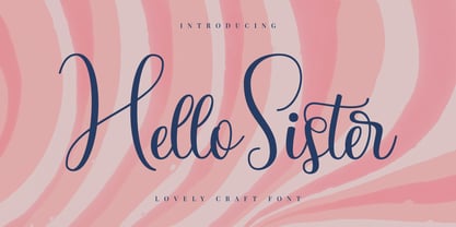 Hello Sister is a beautiful and refined script font. It has a classy, elegant and modern look that can be used for logos, branding, invitations, stationery, wedding designs, social media posts, and much more!
 - Capetown Signature by MJB Letters,
$15.00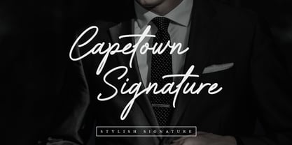 Capetown Signature is a modern and classic script font, perfect for signatures, branding, logos, photography, looks very clean and elegant, it will give the impression of luxury to your design. What’s include: – Ligature – Swash
 - Gladsome Morning by Seemly Fonts,
$14.00 Gladsome Morning is a cool, clean, and simple display font. It will look stunning on any food packaging design, poster, flyer, or print. Use this font for your designs and explore its endless possibilities.
 - Second Song by Supfonts,
$16.00 Here's my new experiment, Second Song. This font breaks the boundaries even more. Now the inscription looks as authentic as possible. Includes: Regular Script Uppercase and lowercase Numbers and punctuation Foreign language support Ligatures
 - Remind Him by Seemly Fonts,
$12.00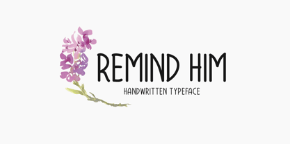 Remind Him is a cute and simple lettered handwritten font that can be used for all chalkboard quotes or teaching material! Its authentic look will add a personal and realistic feel to your designs.
 - Sofya by Gaslight,
$30.00 This funny script font based on the logo which we did. It will look great on the package, restaurant menus, logos and magazine headlines. A large number of ligatures help you vary your design.
 - Angkasa Script by Struggle Studio,
$16.00 Looking for vintage script fonts? Angkasa is a vintage handwritten font inspired by traditional Calligraphy, Angkasa font includes a full set of Classic upper and lower case letters, multilingual symbols, numbers, punctuation and ligatures.
 - Solleno by AEN Creative Studio,
$12.00 Solleno is a great font for your projects. It's an elegant script font that carries a personal look & feel. Get inspired by its unique charm, and turn any design idea into a true standout.
 - Winter Wonderland by Ake,
$12.00 Winter Wonderland is a cute and simple lettered handwritten font that can be used for all chalkboard quotes or teaching material! Its authentic look will add a personal and realistic feel to your designs.
 - Vintage Badges by Decade Typefoundry,
$28.00 An awesome premium quality set of 26 layered badges. It’s a very versatile, “old timey” look, vintage and that can be used as logos, member badges, company badges, stamps, price reductions and much more.
 - Wood Factory by Kustomtype,
$25.00 Wood Factory is a western styled typeface created by Kustomtype. Wood Factory is an old Wood Type favorite. It was designed specifically for display, headlines and titles where a wanted poster look is desired.
 - Never Give Up by Seemly Fonts,
$14.00 Never Give Up is a simple and friendly handwritten font, featuring the perfect amount of trendiness. This original look will appeal to a wide range of crafty ideas, from letterheads and titles to stationery.
 - Ames' Weathered by Greater Albion Typefounders,
$16.00 Ames’ Weathered is the ‘antique’ accompaniment to our Ames’ typeface families. It has that ‘tumbled’, weather knocked about look. Just the thing for posters, headings and signage where there’s a need to suggest age.
 - Regiola Script by Lucky Type,
$16.00 Regiola Font Duo is an elegant serif typeface paired with natural handwritten script. By presenting a luxurious and chic look, for websites, modern logos, social media quotes, brand identities, wedding stationery and much more.
 - Igor by A New Machine,
$19.00 Igor is a hand drawn font designed for display use - it is mainly all cap with different glyphs for capitals and lowercase. Its purposefully messy design will look great on invitations, posters and headlines.
 - Bumbbled by Viswell,
$19.00 Bumbbled is a rounded monoline script featuring 2 styles and is well suited for your design project with a playful and fresh look. Features: Uppercase & Lowercase Characters Numerals & Punctuation Standard Multi-ligual Support Alternates
 - Tangent Slice by The Arborie,
$11.00 Looking for a structured font that screams elegance? You've found it. This handmade font is modern yet is a tinge of retro to give you a unique combination that is sure to stand out.
 - Freeform 721 by Bitstream,
$29.99Auriol font was the basis for the lettering used by Hector Guimard for the entrance signs to the Paris Metro. Bitstream’s Freeform 721 with his brush stroke look, is well-suited to display settings. - Lancashire Stencil JNL by Jeff Levine,
$29.00 The Butterfly Brand [from the UK] manufactured some lettering stencils (circa the 1950s) with a distinctively British look and feel. These inspired Lancashire Stencil JNL, which is available in both regular and oblique versions.
 - Well Hope by Seemly Fonts,
$12.00 Well Hope is a cute and simple lettered handwritten font that can be used for all chalkboard quotes or teaching material! Its authentic look will add a personal and realistic feel to your designs.
 - Butter Carney by Zeenesia Studio,
$16.00 Introducing Butter Carney, Butter Carney is handwritten font with a modern calligraphy feel, Looks amazing on wedding invitations, thank you cards, quotes, greeting cards,tshirt design, mugs, logos, business cards and any other design.
 - Splendid Moment by Seemly Fonts,
$12.00 Splendid Moment is a cute and simple lettered handwritten font that can be used for all chalkboard quotes or teaching material! Its authentic look will add a personal and realistic feel to your designs.
 - Happy Moment by Seemly Fonts,
$12.00 Happy Moment is a cute and tall lettered handwritten font that can be used for all chalkboard quotes or teaching material! Its authentic look and feel will add a realistic feel to your designs.
 - Pumpkin Smile by Sakha Design,
$12.00 Pumpkin Smile is a spooky and cool-looking display font. No matter the topic, this font will be an incredible asset to your fonts’ library, as it has the potential to elevate any creation.
 - Gianna by Jonahfonts,
$35.00 Gianna is designed for many applications for that calligraphy look. Invoking Contextual-Alternates all lower case text followed by a space will automatically prompt its Glyph Terminal, including many ligatures complete with latin diacritics.
 - Contraform by Gleb Guralnyk,
$14.00 Hello! Introducing a high contrast font named Contraform. It's a geometric shape bold typeface with modern creative look. This font includes lots of multilingual characters (check out a screenshot with available letters and signs).
 - Oboe by Graviton,
$4.00 Oboe font family has been designed for Graviton Font Foundry by Pablo Balcells in 2012. It is display typeface with a geometric rounded look. Oboe consists of 6 styles, 2 of which are free.
 - Kabyah by Alit Design,
$17.00 Presenting 🕌Kabyah Ramadhan Typeface🕌 by alitdesign. Kabyah Ramadhan Typeface is a beautifully crafted font that combines traditional Arabic calligraphy with modern design elements. The font has a contemporary look and feel, with elegant swashes and alternate characters that add a unique touch to any design project. The font draws inspiration from the rich cultural heritage of the Arabic language, with its intricate shapes and ornate embellishments. The strokes and curves of Kabyah Ramadhan Typeface are carefully crafted to create a harmonious balance between legibility and aesthetic appeal. With its clean lines and precise detailing, Kabyah Ramadhan Typeface is perfect for a variety of design applications, including branding, packaging, logos, and headlines. It is also an ideal choice for print and digital media, such as posters, brochures, and social media graphics. The Kabyah Ramadhan Typeface has 820 characters, supports multilingual characters, and includes PUA Unicode encoding, makes it a very versatile font. Designers can use it to create designs in a variety of languages and scripts, making it a great choice for global projects. In addition to its extensive character set, the font also includes Kabyah Dingbats with 304 characters, which can be used to add decorative elements to designs. These dingbats can be used to create unique and eye-catching designs, adding an extra layer of creativity to any project. Overall, Kabyah Ramadhan Typeface seems like a fantastic font with a lot of potential for designers who are looking for an Arabic-inspired modern font with lots of characters and flexibility. Language Support : Latin, Basic, Western European, Central European, South European,Vietnamese. In order to use the beautiful swashes, you need a program that supports OpenType features such as Adobe Illustrator CS, Adobe Photoshop CC, Adobe Indesign and Corel Draw. but if your software doesn't have Glyphs panel, you can install additional swashes font files.
 - Sharp End by Asritype,
$18.00 Sharp End fonts support Latin Based Languages only (see Tech Specs). Sharp End's creation is inspired by Gothic sharpness shape but only applied to the ends of normal letters. Make the font look beautiful and elegant, look as semi-serif, as calligraphic touch or others. The base of the Capital Characters is set a little bit lower than the small cases/lowercases. On small/normal size typing, the difference is less visible (obscure), but will be more visible/more clear as the typing set larger. Thus, Sharp End fonts will work well for both text and display. The fonts has also character variants. The character variations (in PUA) set in 5 stylistic sets ss01 ... ss05 (see Sharp End opentype features poster). So, these character variations will be easier accessible in more common application such as MS Words, Text Edit or the others. The glyphs may also be accessed via Character Map, Character viewer, insert character, insert symbol or other similar tools. You can use Sharp End for most of typing and design means such as: greeting, invitation, wedding and other cards; books, magazines, news, banners, logos, Pamphlets, advertising etc., for printing or digital/web display. As addition, with 3 weight variants, the regular will fit for longer text for normal use, while the bold and semi-bold is more suited for the covers, impressions, titling, Logos, design or other usage. With its smoothness curve and sharp ends, Sharp End will pairs well to most fonts of various kinds: Sans Serif, Serif, Handwritten, Scripts and others. As the example in one poster, Sharp End is paired with Astonice and Apresia Script (ornamented script font, one of the richest letter variations and ornaments). Thank you for visiting. Again, thank you very much for downloading this awesome fonts.
 - Cooper Nouveau by House Industries,
$33.00 Few fonts reach cult status. Despite its ubiquity—and perhaps because of its lack of subtlety—for a hundred years Cooper continues to draw the faithful. It’s even come to define an entire typographic genre and recently starred in its own documentary. Cooper Nouveau is Dave West’s imaginative contribution to the Cooper oeuvre. Drawn in 1966, Nouveau refreshes Oswald Cooper’s original italic with an energetic pitch, simplified contours, and a plump friendly figure. Uniform strokes and generous curves push the font’s playful personality and springy silhouette even further. A selection of swashed characters and ligatures offers options for lively logos and strong captions. While Cooper Nouveau looks laid-back and easy-going, it’s more than capable of pulling it’s own typographic weight. Put it to work where relaxed needs to project confident. Set Nouveau large for eye-magnet posters, packaging, and advertisements. Maximize its youthful energy for kids’ themes, craft action, and apparel bounce. Or set it alongside a master like Benguiat Buffalo or Chalet to show how Cooper Nouveau can communicate on paper and screens with an inherent ability to speak the language of style in many tongues. But like any cult icon: beware! Cooper has a way of setting the needle, and Nouveau just may become your go-to design fix. FEATURES ALTERNATES: Cooper Nouveau contains several alternate characters, which add flair to your designs and can help solve spacing issues LIGATURES: Many letter combinations in Cooper Nouveau form a ligature to solve spacing issues and produce more pleasing designs. COOPER NOUVEAU CREDITS Typeface Design: Dave West Digitization: Dave Foster Typeface Direction: Ben Kiel, with Ken Barber Like all good subversives, House Industries hides in plain sight while amplifying the look, feel and style of the world’s most interesting brands, products and people. Based in Delaware, visually influencing the world.
 - Explorer by Fenotype,
$30.00 Explorer - a classy typeface collection. Explorer collection includes following: • 8 Fonts - a clean and textured version of each • Catchwords • Swooshes • Pictures Explorer’s core is a strong script type with straight edges. All the fonts are designed to work nice together. Here’s a short introduction to the styles: •Explorer Script is equipped with Contextual Alternates that make the connections between letters smooth. In addition it has Swash, Stylistic and Titling Alternates for standard characters for more customised look. Explorer Script has three weights. •Explorer Sans is a wide all caps sans-serif that doesn’t shy away from taking it’s own space. Explorer Sans has two weights. •Explorer Condensed is a sturdy all caps condensed sans-serif with rounded edges. Explorer Condensed has two weights. •Explorer Serif is a bulky all caps serif. •Explorer Swoosh is a collection of strokes and swooshes designed to go with the Script. Try adding a connecting one in the end of a word written with Script or place a loose swoosh above or below a word. •Explorer Catchword is a collection of catchwords designed to go with Explorer fonts.
 - Liesel by Magpie Paper Works,
$26.00 What happens when historical calligraphy and modern lettering kiss? Liesel! This six-font, hand-lettered family is loosely based on traditional letterforms. Used alone, Liesel Regular reflects a warm, antique aesthetic. But when you pair her with Brush, Pencil, and Shadow - all of which were designed for layering - a modern, artistic look emerges! Experiment with textures, overlays and blending modes to create realistic water colored text. Both Liesel Printed & Liesel Shadow Printed are highly detailed, distressed versions of their solid counterparts, and can be layered to recreate an authentic letterpress or screen printed effect. Opentype features programmed into each text font include contextual alternates, stylistic alternates, swashes, true fractions, and old style numerals. Each Liesel font features PUA coding so all characters, including swashes and alternates, can be accessed with Character Viewer (Mac), Character Map (PC) or PopChar. For more information, including a complete PUA code listing, please review our user guide. We recommend pairing Liesel with Quimbly. Please note: because its outlines are complex & highly detailed, Liesel Printed and Liesel Printed Shadow may process slowly in some applications.
 - Island Life by Wing's Art Studio,
$24.00 Island Life is a font inspired by the loose, wavy style of the type associated with 1970s surf culture. Often found on lo-fi surf movie posters, t-shirts, and decals, it’s an aesthetic that promotes a laid-back, summer-loving style. With a zen “be like water” approach, this font has no straight edges. Behaving like letters inside a Lava Lamp, each individual character blends into a harmonious whole; perfect for groovy titles, logos and headers. The Island Life font features unique uppercase and lowercase characters, along with numerals, punctuation and language support, symbols and lots of custom ligatures for a truly hand-made look. All ligatures function automatically and can be turned on/off using the opentype features built into your software of choice. It’s the perfect font for the summer season and works great across posters, logos, t-shirts, menus and more. I recommend first laying out your text and then experimenting with warp, wave and bulge effects for some excellent results. Check out the visuals to see it in action. Enjoy!
 - Mr Eaves Modern by Emigre,
$59.00 Mr Eaves is the often requested and finally finished sans-serif companion to Mrs Eaves, one of Emigre’s classic typeface designs. Created by Zuzana Licko, this 2009 addition to the Emigre Type Library expands the versatility of the original Mrs Eaves with two complimentary families: Mr Eaves Sans and Mr Eaves Modern. Mr Eaves was based on the proportions of Mrs Eaves, but Licko took some liberty with its design. One of the main concerns was to avoid creating a typeface that looked like it simply had its serifs cut off. And while it matches Mrs Eaves in weight, color, and armature, Mr Eaves stands as its own typeface with many unique characteristics. The Sans version relates most directly to the original serif version, noticeably in the roman lower case letters a, e, and g, as well as in subtle details such as the angled lead in strokes, the counter forms of the b, d, p, and q, and the flared leg of the capital R, the tail of the Q. The distinctly loose-fitting letter spacing of Mrs Eaves was applied also to the Sans version. This, together with generous built-in line spacing due to a small x-height and extended ascenders and descenders, renders the same kind of lightness and airiness when setting text that is so characteristic of Mrs Eaves. Deviations from the original Mrs Eaves are evident in the overall decrease of contrast, as well as in details such as the flag and tail of the f and j, and the finial of the t, which were shortened to maintain a cleaner, sans serif look. And the lower case c had to be balanced out differently after it lost its top ball terminal. And with the loss of serifs, Mr Eaves set width is slightly narrower. Mr Eaves Italic also carries over many forms from its Mrs Eaves model, most notably the v, w, and z, which are unusually flamboyant for a sans italic design. It also utilizes lead in and terminal tails that are reminiscent of the serif italic. The biggest departure here is the width of the characters. The extra narrow gauge and delicate features seemed more appropriate for the Serif than the Sans. To allow for a comfortable fit, Mr Eaves Italic has a more robust design and wider character width. Meanwhile, the Modern family provides an overall less humanistic look, with simpler and more geometric-looking shapes, most noticeably in the squared-off terminals and symmetric lower case counters. This family has moved furthest from its roots, yet still contains some of Mrs Eaves’ DNA. The Modern Italic is free of tails, and overall the Modern exhibits more repetition of forms, projecting a cleaner look. This provides stronger differentiation from the serif version whenever a more contrasting look is desired. Each version (Sans and Modern) contains its own set of alternates providing unique options for applications such as headlines, word logos, letterheads, pull quotes, and other short text settings. Both the Sans and Modern come in six weights. The simpler forms of a sans-serif provide the opportunity of more weights than do serif letter forms, which are more complex in structure, making it difficult to accommodate additional weight without distortions. Regular and Bold match the original Mrs Eaves weights, while the Heavy provides an additional weight for extra emphasis.
 - Mr Eaves Sans by Emigre,
$59.00 Mr Eaves is the sans-serif companion to Mrs Eaves, one of Emigre’s classic typeface designs. Created by Zuzana Licko, this 2009 addition to the Emigre Type Library expands the versatility of the original Mrs Eaves with two complementary families: Mr Eaves Sans and Mr Eaves Modern. Mr Eaves was based on the proportions of Mrs Eaves, but Licko took some liberty with its design. One of the main concerns was to avoid creating a typeface that looked like it simply had its serifs cut off. And while it matches Mrs Eaves in weight, color, and armature, Mr Eaves stands as its own typeface with many unique characteristics. The Sans version relates most directly to the original serif version, noticeably in the roman lower case letters a, e, and g, as well as in subtle details such as the angled lead in strokes, the counter forms of the b, d, p, and q, and the flared leg of the capital R, the tail of the Q. The distinctly loose-fitting letter spacing of Mrs Eaves was applied also to the Sans version. This, together with generous built-in line spacing due to a small x-height and extended ascenders and descenders, renders the same kind of lightness and airiness when setting text that is so characteristic of Mrs Eaves. Deviations from the original Mrs Eaves are evident in the overall decrease of contrast, as well as in details such as the flag and tail of the f and j, and the finial of the t, which were shortened to maintain a cleaner, sans serif look. And the lower case c had to be balanced out differently after it lost its top ball terminal. And with the loss of serifs, Mr Eaves set width is slightly narrower. Mr Eaves Italic also carries over many forms from its Mrs Eaves model, most notably the v, w, and z, which are unusually flamboyant for a sans italic design. It also utilizes lead in and terminal tails that are reminiscent of the serif italic. The biggest departure here is the width of the characters. The extra narrow gauge and delicate features seemed more appropriate for the Serif than the Sans. To allow for a comfortable fit, Mr Eaves Italic has a more robust design and wider character width. Meanwhile, the Modern family provides an overall less humanistic look, with simpler and more geometric-looking shapes, most noticeably in the squared-off terminals and symmetric lower case counters. This family has moved furthest from its roots, yet still contains some of Mrs Eaves' DNA. The Modern Italic is free of tails, and overall the Modern exhibits more repetition of forms, projecting a cleaner look. This provides stronger differentiation from the serif version whenever a more contrasting look is desired. Each version (Sans and Modern) contains its own set of alternates providing unique options for applications such as headlines, word logos, letterheads, pull quotes, and other short text settings. Both the Sans and Modern come in three weights. The simpler forms of a sans-serif provide the opportunity of more weights than do serif letter forms, which are more complex in structure, making it difficult to accommodate additional weight without distortions. Regular and Bold match the original Mrs Eaves weights, while the Heavy provides an additional weight for extra emphasis.
 - Fragua Pro by deFharo,
$14.00 Fragua Pro is a family of 14 fonts (Latin Extended-A and the Cyrillic alphabet) Condensed Sans Serif of geometric construction inspired by the Russian constructivism of the mid-20th century; the typography has a rounded finish in all corners to avoid the coldness of the rectilinear fonts and providing warmth and docility, the ascending and descending short and a high height of the x make it very compact, all this results in a unique typeface with maximum readability due to the careful configuration of metrics and Kerning. The cursive styles have an inclination of 8 degrees and a narrower proportion than the regular ones, they also have their own letters and meticulous optical corrections to compensate for the deformations produced by the inclination. Fragua Sans has Advanced Open Type functions, several alternative letters, full support for numbers, monetary symbols and crypto currencies and more. 681 glyphs. This typography is specially designed for advertising and editorial composition, behaving correctly in both short and medium texts and headlines where horizontal space saving is needed, being an ideal typographic system for signage, editorial or corporate design. This typography is dedicated to the memory of my grandfather C·ndido (Pa), the blacksmith of my town. THE COMPLETE 14 FONTS PACKAGE INCLUDES THE REGULAR VERSION IN "VARIABLE FONT" FORMAT, compatible with Adobe CC 2018.
 - Seibi Shiba by Nihon Literal,
$169.00 Although it is an orthodox semi-cursive script, Kana is designed to be somewhat larger for better line alignment and is tailored to both horizontal and vertical typesetting. Bold can be selected for the subheading, body text, or headline. オーソドックスな行書体ですが、タテ組ヨコ組両方に適した書体となるよう、仮名をやや大きめにデザインし、ライン揃えを意識しました。独特の組み版効果が特徴です。太さに合わせて、小見出し用から本文、大見出し用に活用いただけます。一筆書きの脈絡を多用し、続け書きによる「連綿線」を持つ書体です。行書体の特徴である流れるような筆の運びを表現できるよう心がけました。同じ部首でも「へん」と「つくり」で処理が異なる字があるのは行書体の特徴でもあります。