10,000 search results
(0.034 seconds)
- VLNL Mais by VetteLetters,
$30.00 The design of VLNL Mais started out as a thought experiment – "How would it look if you dressed up FuturaBlack in LatinWide serifs?” DBXL drew up the first sketches on graph paper in 2014. Although the concept looked promising enough, it ended up dormant in a desktop folder. To be resurfaced recently when covid-19 started spreading and we were asked to all stay home. The final design ended up with a distinct latino flavour due to the long spikey serifs. They look like tortilla chips. And as maize is the main ingredient in many South-American and specifically Mexican dishes – tortillas, burritos, nachos, tamales, tacos – a name was quickly found. VLNL Mais was designed by DBXL, and can be used for logos, headlines, flyers or posters (and not just for Mexican restaurants). It can be found in the VetteLetters vegetable section.
 - Pueblito by Corradine Fonts,
$15.00 Pueblito is a hand drawn font with a rustic and antique appearance. Was inspired from old books and newspapers but express a very own personality and not necessary represent a specific classic style. The family consists of twelve fonts in six weights plus a set of ornaments in order to compose all kind of texts. Using Pueblito in your projects, you can obtain an original aged flavor and just by adding a subtle texture effect will help you to obtain the desired vintage look.
 - Chups by Jafar07,
$15.00 Chups is a retro groovy font with rounded corners that is perfect for designing with a retro style. With bold style and unique shapes, Chups brings a touch of retro and grooviness to any design project. The Chups characters are carefully crafted to provide a strong and striking appearance and give a consistent and appealing look. Whether for poster designs, book titles, or product designs, Chups is the perfect choice for those seeking a retro font that will create eye-catching and memorable designs.
 - Mundbind DK by PizzaDude.dk,
$15.00 A few days ago, my good friend David from Hanoded.com visited me for a few days. We drank a lot of coffee and walked the streets of Copenhagen - we even took a trip up in Rundetårn! :) Well, on one of our walk (of course looking for inspiration for new fonts) we spotted this handmade sign. We agreed to make a font of the 7 letters available, using our own imagination and style! I called my font Mundbind DK and David named his Mundbind NL - of course it is the landcodes of Denmark and Holland. As you can tell, the font is uneven and somewhat unpredictable - following only the "rules" of the person who handprinted that sign ... and not many of the rules of the good old and respected painter who make beautiful signs ... however, this sign had it's beauty in a natural and innocent way.
 - Gothikka - Unknown license

- Strangelove by FaceType,
$12.00 Strangelove is inspired by the title sequence of Stanley Kubrick’s movie Dr. Strangelove. The original titles were designed by Pablo Ferro, who is one of the most acclaimed film title designers, especially famous for his hand-drawn lettering. With the Bombs also come illustrations referring to scenes from the film. Looking for a serif version? Have a look at Strangelove NextSlab!
 - Rage Italic by ITC,
$40.99 Rage Italic is the work of American designer Ron Zwingelberg. It was one of the first casual brush style scripts with a rough, textured edge. The initial-like capitals complement a lowercase alphabet which links together to create the look of true handwriting. Rage Italic font is ideal for work that should have the spontaneous look of pen writing on parchment.
 - Murbia by PizzaDude.dk,
$20.00Murbia was written with a glimmer-pen which has left the letters with a grungy look. What's even better is that the font comes with loads of ligatures for both double letters/numbers and the most common letter combinations...just to make the font look more like real scribbled handwriting! You will need to use OpenType supporting applications to use the autoligatures. - Linotype Markin by Linotype,
$29.99 Markin is named after the writing utensil with which it looks like it was drawn, the marker. Its even strokes display characteristics similar to those of a sans serif typeface, but the stroke endings with their typical handwritten look give Markin a personal touch. Extremely versatile, it is the perfect choice for any work where individuality and spontaneity are the emphasis.
 - Dirty Bubble Gum Grunge by TypoGraphicDesign,
$15.00 The character of the rough, rugged and raw handmade typeface has a very unique sticky atmosphere. Letters lovingly decorated with chewing gum. Warmth, love, handmade. For support of human warmth. CONCEPT/ CHARACTERISTICS Experimental analog handwritten style. Handwritten in ink in a conventional roll-on deodorant. The dirty, grimmy Grunge-Look and the sloppy, rough Handwritten-Look script character, gives the typeface a high recognition value and uniqueness. The motto is handmade, rough & experimental. APPLICATION AREA The rough, ink-like, handwritten look of the handmade font „dirty deo hand ink“ would look good at logos, display size for poster, flyer, comics and graphic novel lettering, headlines in magazines or websites, packaging, music covers or webbanner etc. TECHNICAL SPECIFICATIONS Headline Font | Display Font | Raw Trash Script Font „dirty deo hand ink“ OpenType Font with & 282 glyphs & 1 style (regular). Symbols and ligatures (with accents & €)
 - Hont by Remedy667,
$18.00 Hont, the original Haunted Font is here. We've captured the essence of an old-school horror film and now you can use it to create awesome-looking titles for all your projects. With its chunky appearance, this font is perfect for vintage poster designs, t-shirt designs, logos, or anything that needs a hint of spooky. Hont is the ultimate Haunted Font that looks amazing on all projects. Inspired by classic mid-century horror films, it will give your projects just the right amount of classic horror. Features Doubles Elimination gives you a more natural look. Inspired by classic mid-century horror films. Includes a Remedy667 Font Catalog PDF, all your favorite fonts in one handy catalog. Possibly haunted, may possess you to create awesome work.
 - Eastern by me55enjah,
$14.00 Eastern family, sans serif fonts designed with a vintage print look. Rounded edges and imperfections were added to the characters to give a vintage vibe. The font family also works great for creating quotes, title, and still legible in a bunch of text. For those looking for some peculiar characters, available on Blind and Rusty texture versions as well. Add some Ornament to complete your vintage print look.
 - Kobold by Luxus,
$19.00 Kobold is a font system consisting of a hand drawn serif and a connecting script. The all caps serif combines a handmade look and angled, modern looking letter forms. It also contains rough styles with a printed vintage look. Kobold Script is warm and friendly and has an expressive charm. Use Kobold for logotypes, magazine headlines, packaging, invitations, clothing, labels, greeting cards, posters, ads and the various web usages.
 - ITC Johnston by ITC,
$29.00ITC Johnston is the result of the combined talents of Dave Farey and Richard Dawson, based on the work of Edward Johnston. In developing ITC Johnston, says London type designer Dave Farey, he did “lots of research on not only the face but the man.” Edward Johnston was something of an eccentric, “famous for sitting in a deck chair and carrying toast in his pockets.” (The deck chair was his preferred furniture in his own living room; the toast was so that he’d always have sustenance near at hand.) Johnston was also almost single-handedly responsible, early in this century, for the revival in Britain of the Renaissance calligraphic tradition of the chancery italic. His book Writing & Illuminating, & Lettering (with its peculiar extraneous comma in the title) is a classic on its subject, and his influence on his contemporaries was tremendous. He is perhaps best remembered, however, for the alphabet that he designed in 1916 for the London Underground Railway (now London Transport), which was based on his original “block letter” model. Johnston’s letters were constructed very carefully, based on his study of historical writing techniques at the British Museum. His capital letters took their form from the best classical Roman inscriptions. “He had serious rules for his sans serif style,” says Farey, “particularly the height-to-weight ratio of 1:7 for the construction of line weight, and therefore horizontals and verticals were to be the same thickness. Johnston’s O’s and C’s and G’s and even his S’s were constructions of perfect circles. This was a bit of a problem as far as text sizes were concerned, or in reality sizes smaller than half an inch. It also precluded any other weight but medium ‘ any weight lighter or heavier than his 1:7 relationship.” Johnston was famously slow at any project he undertook, says Farey. “He did eventually, under protest, create a bolder weight, in capitals only ‘ which took twenty years to complete.” Farey and his colleague Richard Dawson have based ITC Johnston on Edward Johnston’s original block letters, expanding them into a three-weight type family. Johnston himself never called his Underground lettering a typeface, according to Farey. It was an alphabet meant for signage and other display purposes, designed to be legible at a glance rather than readable in passages of text. Farey and Dawson’s adaptation retains the sparkling starkness of Johnston’s letters while combining comfortably into text. Johnston’s block letter bears an obvious resemblance to Gill Sans, the highly successful type family developed by Monotype in the 1920s. The young Eric Gill had studied under Johnston at the London College of Printing, worked on the Underground project with him, and followed many of the same principles in developing his own sans serif typeface. The Johnston letters gave a characteristic look to London’s transport system after the First World War, but it was Gill Sans that became the emblematic letter form of British graphic design for decades. (Johnston’s sans serif continued in use in the Underground until the early ‘80s, when a revised and modernized version, with a tighter fit and a larger x-height, was designed by the London design firm Banks and Miles.) Farey and Dawson, working from their studio in London’s Clerkenwell, wanted to create a type family that was neither a museum piece nor a bastardization, and that would “provide an alternative of the same school” to the omnipresent Gill Sans. “These alphabets,” says Farey, referring to the Johnston letters, “have never been developed as contemporary styles.” He and Dawson not only devised three weights of ITC Johnston but gave it a full set of small capitals in each weight ‘ something that neither the original Johnston face nor the Gill faces have ‘ as well as old-style figures and several alternate characters. - Bibliophile Script by Sudtipos,
$79.00 A friend once jokingly told me that what I really do is mine extinct arts for parts to use in modern things, like going to the scrapyard to pick up bumpers, quarter-panels and dashboards off of Datsuns and Ponies to build a shiny new Ferrari. I still kind of grin at that, but I certainly do spend a lot of time looking at old things and imagining ways they would work today. This shiny new Ferrari here is called Bibliophile, and it contains scrap heap parts from various pages by Louis Prang, the Prussian-American printer and publisher who inspired my Prangs fonts. This is my second engagement with the late 19th century man, and it’s quite a bit more intricate than just an italic Didone with a connected lowercase. Bibliophile marries Round Hand calligraphy with Italian capitals, two styles not often relayed in the same alphabet, but work together beautifully when combined well. When you combine them well with a few long-practised tricks of the trade, then mix in a few trusted features from my previous work over the years, you get my usual crazy exuberance, like 17 different shapes for the d, 21 different forms for the y, endings, beginnings, swashes, ornaments, and so on. It’s no secret that I can get carried away when I’m so consumed by an idea. — Bibliophile comes in 2 weights, each of them with over 900 glyphs covering all the latin languages. Bibliophile also comes with a bold weight, something I’m always reluctant to do with something as adventurous and complex as the structure of this historical mashup. But I couldn’t chase away the idea of increasing the contrast while maintaining the hairlines in a lowercase this narrow. Part of it was the curiosity about the outcome, and part was the sheer challenge of it. I think it turned out OK. Words set in either weight will show delicateness and elegance, and the more time you spend inside the font and micro-manage the setting, the more ways you will find to magnify either. Bibliophile can be as muted or luxurious as you want it to be. This is the kind of alphabet that fits well in fashion marketing and high-end packaging, from the very subdued to the super-exquisite. Enjoy the gleaming new vehicle made with freshly polished old parts.
 - Loulou by Wiescher Design,
$39.50 LouLou is a scriptlike typeface that looks as if it came right out of the sixties and seventies. Flowerpower! I enjoyed doing this one. Your swinging type designer Gert Wiescher
 - Cobblestones by Funk King,
$5.00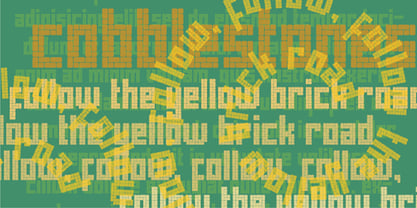 Cobblestones is inspired by the look of cobblestone streets and pavers.
 - Stuyvesant by Image Club,
$29.99The Stuyvesant fonts include delicate incline alphabets with an engraved look. - Stuyvesant Engraved by Monotype,
$29.99The Stuyvesant fonts include delicate incline alphabets with an engraved look. - Creeps by Nerfect,
$30.00Creeps is based on a series of drawings by Britton Walters. You can't escape the Creeps, they are everywhere! Be they looking at you funny on the bus or telling you about their collection of chicken bones in the break room at work. There is a little creep in us all. - Komikaze - 100% free

- Molly Hugs by Yumna Type,
$15.00 Finding out an attractive font regarding your project design can be such hard work as you take risks of either losing your clients or killing your good reputations once you pick the wrong font. However, Molly Hugs is the right solution for you. It is a rounded display font to add warm, fun character touches on every design. Its shapes and geometry are simple and without too many detailed points for a legibility reason. Additionally, Molly Hugs, completed with a clipart as a bonus, is perfectly applied for big text sizes to be legible and you can make use of some available features here. Features: Multilingual Supports PUA Encoded Numerals and Punctuations Molly Hugs fits best for various design projects, such as brandings, posters, banners, headings, magazine covers, quotes, printed products, merchandise, social media, etc. Find out more ways to use this font by taking a look at the font preview. Thanks for purchasing our fonts. Hopefully, you have a great time using our font. Feel free to contact us anytime for further information or when you have trouble with the font. Thanks a lot and happy designing.
 - Enoway by Valentino Vergan,
$17.00 Enoway is a modern elegant typeface, which leans towards the Neue Nouveau style. The Enoway typeface was inspired by the early the Art Nouveau typographic designs, which was characterized by decorative designs and embellished stroke endings. The Enoway typeface has a high-contrast and a thin hairline, this gives the typeface a modern but nostalgic look. The Enoway typeface comes in two styles, Regular and Oblique. The Enoway typeface can be paired with a minimal sans serif or light script font, this combination will give your next project a modern and unique look. The Enoway typeface is very versatile and can cover a wide range of project such as: fashion branding, mastheads, magazines, feminine logos, facebook banners, wedding invitations, Instagram posts, websites, blog posts, pull quotes, editorials, product packaging, trendy social media posts, advertisements and much more. If you are looking for something modern and nostalgic for you next project, Enoway is the font for you. ENOWAY INCLUDES A FULL SET OF: Uppercase and lowercase letters. Numbers. Punctuation. Ligatures. Alternate characters. Multilingual symbols. We hope you enjoy using the Enoway typeface.
 - Saint Saturn by Factory738,
$15.00 Are you looking for a new font to add to your collection? Look no further than St Saturn, a retro serif font that is both stylish and versatile. Whether you’re designing a logo, creating a website, or working on a print project, this font has the potential to elevate your work to the next level. Keep reading to learn more about the features that make St Saturn unique and how to use it effectively. 7 Weights Basic Latin A-Z and a-z Numerals & Punctuation Stylistic Ligatures and Alternate Glyphs Multilingual Support for ä ö ü Ä Ö Ü … Free updates and feature additions Thanks for looking, and I hope you enjoy it.
 - Sophia Bella by madeDeduk,
$15.00 Sophia Bella is a gorgeous handmade signature font. It includes more than 170 ligatures to make everything look natural handmade signature and is perfect for poster design, book covers, merchandise, fashion campaigns, newsletters, branding, advertising, magazines, greeting cards, album covers, and quote designs and more.
 - Foria by Chromatype Studio,
$20.00 foria is a Neo-classic serif inspired by a combination of Baskerville and Bodoni with round corners to give a soft impression, looks feminine and classy so it is perfect for fashion, branding, menus, cooking, and female inspiration and is also suitable for neutral typography
 - Quelline by Maulana Creative,
$14.00 Introducing Quelline Font. Are you looking for a bold handlettering decorative font that has a medieval gothic feeling? We can help! Try to download our Quelline Font. Suitable to use for any occasion such as book, logo, print, game, event, music, invitation and others. Thanks!
 - Charlie by Fype Co,
$16.00 Charlie is a contemporary and stylish display sans serif typeface. Charlie is made with inspiration from art deco style. Charlie works best for use in such as book titles, stationery designs, quotes, branding, logos, packaging designs, posters, and more. it's look classy and authentic!
 - Zesty Lime by Hanoded,
$15.00 Zesty Lime is a condensed typeface, hand made with a small brush and China ink. Zesty would look good on book covers, posters and packaging - but I guess you're not limited to those three options. Just enjoy! Comes with a generous squeeze of diacritics.
 - Emilyne by Sibelumpagi,
$14.00 Emilyne is a sweet hand-lettered calligraphy font. It includes swashes and alternates which can be used to give your design looks beautiful and elegant. It’s perfect for logos, product packaging, wedding invitations, branding, headlines, signage, labels, signature, book covers, posters, quotes and many more.
 - Sugar Medley by Scrowleyfonts,
$16.00 Sugar Medley was originally inspired by piped icing writing on celebratory cakes. It lends itself to any project requiring a ‘controlled messy’, fun feel. It has a total of 885 glyphs, every letter has 5 alternates to create that hand lettered look. Sugar Medley also includes a full set of stylistic alternates which really goes wild with curls and swirls. These are complemented by a total of 38 ornaments including reflections and rotations.
 - Squid Ninja by Epiclinez,
$18.00 Squid Ninja is a bold, fun display font with unique characters and playful vibes. It's a good choice for creating exciting logotypes, eye-catching headlines, catchy titles, and more. Squid Ninja offers a wide range of possibilities to make your work look dynamic and more enjoyable. Squid Ninja font includes : Basic Latin Uppercase and Lowercase Numbers, symbols, and punctuations Multilingual Support. Simple Installations & Works on PC & Mac Thank You and happy designing!
 - Lambresia by Kotak Kuning Studio,
$16.00 Lambresia is a handwritten script with a natural & stylish flow. This font has a multitude of natural looking ligatures in its OpenType features - making the font look as close to natural handwriting as possible. This collection of scripts is perfect for personal branding. Lambresia is perfect for many different projects such as logos & branding, invitation, stationery, wedding designs, social media posts, advertisements, product packaging, product designs, label, photography, watermark, special events or anything. I highly recommend using a program that supports OpenType features and Glyphs panels such as Adobe Illustrator, Adobe Photoshop CC, Adobe InDesign, or CorelDraw, so you can see and access all Glyph variations. This font is encoded with Unicode PUA, which allows full access to all additional characters without having special design software. Mac users can use Font Book, and Windows users can use Character Map to view and copy one of the extra characters to paste into your favorite text editor/application. We hope you enjoy the font, please feel free to comment if you have any thoughts or feedback. Or simply send me a PM or email me at kotakkuningstudio@gmail.com. Thanks for purchasing and have fun!
 - Sketchbook - Unknown license

- Jacky Black by DLetters Studio,
$30.00 Jacky Black, Handwritten ink style letters font that have a simple and natural shape, but still look elegant and exclusive. Jacky Black, It is suitable for use in your creative ideas, who want unique and natural-looking writing to support your beautiful design. This is a listing of all 229 glyphs contained in the font, including OpenType variants that may only be accessible via OpenType-aware applications. Each basic character (“A”) is followed by Unicode variants of the same character (Á, Ä…), then OpenType variants (small caps, alternates, ligatures…). This way you can see all the variations on a single character in one place. Thanks for your support, please kindly send us a message for any question about our product. Hope you like it.
 - Campora by W Type Foundry,
$25.00 This year we attended the Bologna Children’s Book Fair in Italy. In our days off, we went to Piazza Maggiore to see what the city had to offer and luckily for us we saw an incredible store sign saying CAMPORA. We took some pictures of the typed font and later back in the studio we discovered that it was Dynamo. Immediately our minds were blown away by its beauty and thus we decided to design a new font inspired by its sharp and geometric design adding new weights and OpenType features. In the process we realized that both Dynamo and one of our favorite fonts Avant Garde, share a similar structure, so we made a type mashup between these beauties, including the sharpness of Dynamo and the revolutionary ligatures of Avant Garde.
 - LiebeRuth by LiebeFonts,
$29.90 LiebeRuth is your 100 percent hand-made organic type. She absolutely loves to be typeset in large *and* small sizes, because Legibility is her middle name. (Yes, we know it’s not a typical girl’s name.) She is friendly and polite, but she also has a few quirks. Her friends are impressed with how natural she manages to look every day. Her four weights ensure that Ruth has the right boldness for any context: birthday invitation, personal correspondence, photo album, or billboard ad. During the creation of this font, her designer ate plenty of healthy, organic foods. We think this is the reason why Ruth looks so fresh and lively. And of course Ruth has been designed with lots of Liebe (which is German for “love”—and she speaks many other languages, too). One more thing Ruth is marvelous at: showing off her curly-swirly swashed alternative letterforms that can be activated via OpenType. (Please make sure your software supports OpenType if you wish to use the advanced features.) Each style contains more than 560 gluten-free glyphs—now that is great value! If you like this font, you may want to look at LiebeRuth’s bolder sister LiebeDoni and our best-sellers LiebeErika and LiebeKlara. Or add in some LiebeOrnaments to prepare a curly-licious feast. By the way: LiebeRuth also gets along great with our wide range of illustrative fonts, including LiebeCook, LiebeFish, and LiebeTweet.
 - Diecast by Device,
$39.00 A companion piece to Mulgrave, this font is the intermediary design between the chunky Victorian style that Mulgrave reproduces and the Ministry of Transport sans introduced in 1933 and digitised as Ministry. Although they date from between 1910 and 1933, these signs show the beginnings of several features Ministry later incorporated, notably the thinner strokes and the more modern forms of the G, M, R and S. The letter widths are approaching a monospace - the L, F and E are relatively wide compared to the W and M, a feature that may have something to do to the casting process. These idiosyncracies were all ironed out when the first version of the MOT alphabet was produced. The Device digitization, as with Mulgrave, stays true to the worn and repainted original metal source material and preserves the unusual widths.
 - Rabenk by Sealoung,
$20.00 Rabenk is a fun quirky look serif. With a modern look, it looks perfect when paired with conventional serif/sans serifs. It can be used for mastheads, posters, business identities and just about anything. Use this font to beautify your designs and make your work look more beautiful.
 - Zn Branch by Zeenesia Studio,
$15.00 Introducing BRANCH - Elegant Serif Typeface BRANCH is a beautiful and smooth serif font created by a romantic and lovely look. I created some natural ligatures to make this font very elegant and look so classy. It is perfect for greeting cards, wedding invitations, posters, logotypes, product branding, and much more. This font is PUA encoded, which means you can access all of the glyphs and swashes with ease!


