10,000 search results
(0.042 seconds)
- Florals Bright by Letterena Studios,
$10.00 Florals Bright is a chic and trendy looking serif font. It is PUA encoded which means you can access all of the glyphs and swashes with ease! Add it confidently to your projects, and you will love the results.
 - Nadianne by Monotype,
$40.99Aldo Novarese, the famous Italian type designer (ITC Novarese, Eurostile, and many others), designed Nadianne. The elegant, readable Agfa Nadianne looks as good on an invitation as it does on a business letter. Featured in: Best Fonts for Tattoos - Second Impression JNL by Jeff Levine,
$29.00Second Impression JNL is the solid version of Lasting Impression JNL by Jeff Levine. It emulates the look of ink-stamped letters and numerals. Based on a 1930s-era set of rubber stamps, there is a limited character set. - Royal Stencil JNL by Jeff Levine,
$29.00 An image spotted on the internet of a brass shipping stencil for the Royal Quality Brand (for the John H. Fitch Company of Youngstown, Ohio – a coffee and spice merchant). The lettering style for “Royal Quality” was a hand-cut, condensed, slightly flared sans serif with various character flourishes, giving the letters a stylish, somewhat regal look. Expanding on this idea, a full character set was developed and redrawn digitally as Royal Stencil JNL, which is available in both regular and oblique versions.
 - CA Recape by Cape Arcona Type Foundry,
$49.00 CA Recape is a weird and beautiful vintage script family with two styles. It’s an excellent choice for creating logotypes, headlines, signs, poster and any design that requires a custom-made feeling. The basic inspiration for CA Recape comes from American 50s lettering. But instead of reviving one special style, it is a kind of “Best of”-Remix. It takes the weirdest and most beautiful letterforms of a weird and beautiful time and merges them into one font. The outcome is a charming bastard. Guess what it looks like: Weird and beautiful. CA Recape is packed with a lot of OpenType features like underlining swashes, Stylistic, Discretionary, Titling and Contextual Alternates and Ligatures for use in OpenType savvy programs. It also comes with some nice Ornaments. Derived from the original typeface, Cape Arcona Type Foundry also offers a Raw style that has the distressed look of a poorly printed raw font. See the specimen PDF in the Gallery for all OpenType features and instructions.
 - Areplos by Storm Type Foundry,
$53.00To design a text typeface "at the top with, at the bottom without" serifs was an idea which crossed my mind at the end of the sixties. I started from the fact that what one reads in the Latin alphabet is mainly the upper half of the letters, where good distinguishableness of the individual signs, and therefore, also good legibility, is aided by serifs. The first tests of the design, by which I checked up whether the basic principle could be used also for the then current technology of setting - for double-sign matrices -, were carried out in 1970. During the first half of the seventies I created first the basic design, then also the slanted Roman and the medium types. These drawings were not very successful. My greatest concern during this initial phase was the upper case A. I had to design it in such a way that the basic principle should be adhered to and the new alphabet, at the same time, should not look too complicated. The necessary prerequisite for a design of a new alphabet for double-sign matrices, i.e. to draw each letter of all the three fonts to the same width, did not agree with this typeface. What came to the greatest harm were the two styles used for emphasis: the italics even more than the medium type. That is why I fundamentally remodelled the basic design in 1980. In the course of this work I tried to forget about the previous technological limitations and to respect only the requirements then placed on typefaces intended for photosetting. As a matter of fact, this was not very difficult; this typeface was from the very beginning conceived in such a way as to have a large x-height of lower-case letters and upper serifs that could be joined without any problems in condensed setting. I gave much more thought to the proportional relations of the individual letters, the continuity of their outer and inner silhouettes, than to the requirements of their production. The greatest number of problems arose in the colour balancing of the individual signs, as it was necessary to achieve that the upper half of each letter should have a visual counterbalance in its lower, simpler half. Specifically, this meant to find the correct shape and degree of thickening of the lower parts of the letters. These had to counterbalance the upper parts of the letters emphasized by serifs, yet they should not look too romantic or decorative, for otherwise the typeface might lose its sober character. Also the shape, length and thickness of the upper serifs had to be resolved differently than in the previous design. In the seventies and at the beginning of the eighties a typeface conceived in this way, let alone one intended for setting of common texts in magazines and books, was to all intents and purposes an experiment with an uncertain end. At this time, before typographic postmodernism, it was not the custom to abandon in such typefaces the clear-cut formal categories, let alone to attempt to combine the serif and sans serif principles in a single design. I had already designed the basic, starting, alphabets of lower case and upper case letters with the intention to derive further styles from them, differing in colour and proportions. These fonts were not to serve merely for emphasis in the context of the basic design, but were to function, especially the bold versions, also as independent display alphabets. At this stage of my work it was, for a change, the upper case L that presented the greatest problem. Its lower left part had to counterbalance the symmetrical two-sided serif in the upper half of the letter. The ITC Company submitted this design to text tests, which, in their view, were successful. The director of this company Aaron Burns then invited me to add further styles, in order to create an entire, extensive typeface family. At that time, without the possibility to use a computer and given my other considerable workload, this was a task I could not manage. I tried to come back to this, by then already very large project, several times, but every time some other, at the moment very urgent, work diverted me from it. At the beginning of the nineties several alphabets appeared which were based on the same principle. It seemed to me that to continue working on my semi-finished designs was pointless. They were, therefore, abandoned until the spring of 2005, when František Štorm digitalized the basic design. František gave the typeface the working title Areplos and this name stuck. Then he made me add small capitals and the entire bold type, inducing me at the same time to consider what to do with the italics in order that they might be at least a little italic in character, and not merely slanted Roman alphabets, as was my original intention. In the course of the subsequent summer holidays, when the weather was bad, we met in his little cottage in South Bohemia, between two ponds, and resuscitated this more than twenty-five-years-old typeface. It was like this: We were drinking good tea, František worked on the computer, added accents and some remaining signs, inclined and interpolated, while I was looking over his shoulder. There is hardly any typeface that originated in a more harmonious setting. Solpera, summer 2005 I first encountered this typeface at the exhibition of Contemporary Czech Type Design in 1982. It was there, in the Portheim Summer Palace in Prague, that I, at the age of sixteen, decided to become a typographer. Having no knowledge about the technologies, the rules of construction of an alphabet or about cultural connections, I perceived Jan Solpera's typeface as the acme of excellence. Now, many years after, replete with experience of revitalization of typefaces of both living and deceased Czech type designers, I am able to compare their differing approaches. Jan Solpera put up a fight against the digital technology and exerted creative pressure to counteract my rather loose approach. Jan prepared dozens of fresh pencil drawings on thin sketching paper in which he elaborated in detail all the style-creating elements of the alphabet. I can say with full responsibility that I have never worked on anything as meticulous as the design of the Areplos typeface. I did not invent this name; it is the name of Jan Solpera's miniature publishing house, in which he issued for example an enchanting series of memoirs of a certain shopkeeper of Jindrichuv Hradec. The idea that the publishing house and the typeface might have the same name crossed my mind instinctively as a symbol of the original designation of Areplos - to serve for text setting. What you can see here originated in Trebon and in a cottage outside the village of Domanín - I even wanted to rename my firm to The Trebon Type Foundry. When mists enfold the pond and gloom pervades one's soul, the so-called typographic weather sets in - the time to sit, peer at the monitor and click the mouse, as also our students who were present would attest. Areplos is reminiscent of the essential inspirational period of a whole generation of Czech type designers - of the seventies and eighties, which were, however, at the same time the incubation period of my generation. I believe that this typeface will be received favourably, for it represents the better aspect of the eighties. Today, at the time when the infection by ITC typefaces has not been quite cured yet, it does absolutely no harm to remind ourselves of the high quality and timeless typefaces designed then in this country.In technical terms, this family consists of two times four OpenType designs, with five types of figures, ligatures and small capitals as well as an extensive assortment of both eastern and western diacritics. I can see as a basic text typeface of smaller periodicals and informative job-prints, a typeface usable for posters and programmes of various events, but also for corporate identity. Štorm, summer 2005 - Autoray by PizzaDude.dk,
$16.00 Usually fonts that are related to computers, space, future are not handmade, but rather digital made. Autoray is 100% handmade, and I am not sure which category it fits in. It has this futuristic and intergalactic look, but at the same time the handmade details are pointing in a more grafitti and comic way. I will let you decide where to go with Autoray! I have added 5 different versions of each letter, and they automatically changes as you type - and of course, there's multilingual support - and even intergalactic gravity! :)
 - Clocko by upirTYPO,
$7.00 Clocko automatically turns the time stamp text into an analog clocks using the OpenType ligatures. Even when the ligatures are turned off, the time is still visible and readable, and it does not change or ruin the layout. Perfect for web usage and even for small sizes. For a crisp look, please use sizes divisible by 30, for example 30pt or 60pt. To make a custom analog clock, type any uppercase or lowercase letter to have a border (see previews for examples), and then type the time in 12 hour or 24 hour format with or without seconds. Use colon, comma, semicolon, hyphen, period or plus as a separator. Few examples: 12:45 9:25:46 10.50 13:30.10 The borders can be mixed together for more interesting look, please see the screenshots above. An additional background shape can be added to the clocks by typing a symbol (! # $ % & ( ) < = > ) as a first character, for example %A12:40:55. Please note that in order to keep the clocks visible, the background shape and the clocks need to have a different colors.
 - Balltimore Sans by Java Pep,
$7.00 Introducing Balltimore Sans is hand lettering sans font that made for making ends meet your DIY project so that looks more natural and catchy. This font made based on my own regular handwriting. The package that you’ll get - Balltimore Sans. It’s the regular font that has uppercase, lowercase, numeral, punctuations and multilingual support. - Balltimore Caps. This font has uppercase, numeral, punctuations and multilingual support. Combine and pair your awesome design with Balltimore Sans, Thanks for using this font, don't hesitate to give me the message. Have a nice day :)
 - Urban Maxim 3d Graffiti by Sipanji21,
$15.00 Urban Maxim" is a graffiti font that features three different layers: solid, shadow, and inner shadow. By using this combination of layers in your design, you can create a three-dimensional (3D) effect on your text. Fonts like this are often used in street art, posters, or other designs that aim to add depth and dimension to their typography. With "Urban Maxim," you have the flexibility to create text that looks distinct and more pronounced by using the various layers. This allows you to customize the appearance of your text to fit your design aesthetics.
 - Wonderful Writing by Rhd Studio,
$18.00 Wonderful writting is a calligraphy script font that comes with beautiful alternate characters. copper calligraphy mix in handlettering style. Designed to convey an elegant style. Wonderful writting is attractive because it is smooth, clean, feminine, sensual, glamorous, simple and very easy to read. Its classic style is perfect to apply to all kinds of formal items such as invitations, labels, menus, logos, fashion, make up, stationery, letterpress, romantic novels, magazines, books, greeting/wedding cards, packaging, labels. Wonderful writting features 450+ glyphs and 254 alternate characters. including multiple language support. It features OpenType with alternative styles, binders and character swashes, which allows you to mix and match letter pairs to suit your design, as well as a touch of ornamentation to make this font look elegant. To enable the OpenType Stylistic alternative, you need a program that supports OpenType features such as Adobe Illustrator CS, Adobe Indesign & CorelDraw X6-X7, Microsoft Word 2010 or a later version. There are additional ways to access swashes, using the Character Map (Windows), Nexus Fonts (Windows), Font Books (Mac) or a software program such as PopChar (for Windows and Mac).
 - Mastering by Rhd Studio,
$15.00 Mastering Script is an aTypeface script font that comes with great alternative characters. mix of copper calligraphy in a handlettering style. Designed to convey an elegant style. Mastering Script is attractive because it is subtle, clean, feminine, sensual, glamorous, simple and very legible. Its classic style is very suitable to be applied to all types of formal items such as invitations, labels, menus, logos, fashion, make up, stationery, letterpresses, romantic novels, magazines, books, greeting / wedding cards, packaging, labels. Mastering Script features 247+ glyphs and 57 alternate characters. includes multiple language support. With OpenType features with stylistic alternates, ligatures and swash characters, which allow you to mix and match pairs of letters to suit your design, and also a touch of ornament makes this font look elegant. To activate the OpenType Stylistic alternative, you need a program that supports OpenType features such as Adobe Illustrator CS, Adobe Indesign & CorelDraw X6-X7, Microsoft Word 2010 or a later version. There is an additional way to access swashes, using the Character Map (Windows), Nexus Fonts (Windows), Font Books (Mac) or a software program such as PopChar (for Windows and Mac).
 - Air Leving by Jehansyah,
$9.00 Air Leving this is an elegant font This is an elegant font, with alternatives that you can use as needed, this font is also very suitable to be used as a logo or product icon, it adds to your creative experience and will look much different from the others, suitable for all types of elegant and minimalist themed designs. Include : numeric alternate Latin Thank you very much
 - Downey by Sarid Ezra,
$17.00 Introducing, a casual and powerful wide sans, Downey Font Family! Downey is a casual and essential all caps sans. With slightly wide form and strong look, this font will suitable for your any project and designs. You can use it for a tittle, logo, quotes, or become a pairing with any font. This font also contain the outline version each weight. This font also support multi language!
 - Wargear by Grontype,
$12.00 Wargear is a black display type. Simple in a good way and tough look. This font designed with tight kerning making this font a perfect choice if you want a bold way in your design. The font is great to create a logo tagline, flyer header, or even magazine title. Features: All Standard Glyphs Multilingual Support Numbering & Punctuation Thankyou for Choosing this font Regard, Grontype
 - Obsypac by Fontdation,
$18.00 Introducing Obsypac, our latest vintage serif. Inspired by the old lettering/signpainting, refined to make it relevant in this modern era. This all-caps font will give a strong and clean look on your design, make it work perfectly for headlines, logos/logotypes, labels and packagings, t-shirt designs, etc. If you're a fan of classic typography, make sure you add this font to your design toolbox.
 - Roughpen by Putracetol,
$28.00 Roughpen is a bold, hand-drawn brush typeface. With this font you can create stunning custom hand drawn brush looks. Roughpen also includes lots of binding characters which make the project even more amazing. You can use this font for making an awesome logos, header, titles, prints, apparel, logotype, quotes, packaging, flyer, poster, cover & other creative process possibilities. This font also support multi language.
 - Mega Drone by Sarid Ezra,
$17.00 Mega Drone is a black and fat display font with unique lowercase. You can use this font for many project that require strong and bold vibes. This font also including icons and catchwords that you can access just from ligature. Just mix the uppercase and lowercase in a word for better looks. This font also suitable for logo and more. Mega Drone also support multi language!
 - Bigestar by Mevstory Studio,
$25.00 Bigestar is a sans based font with unique lowercase & uppercase that will make your design looks futuristic and modern. You can use this font for any purpose, especially to make hi-tech logotype. This font is also suitable for science-fiction movie poster. You can mix and match the uppercase and lowercase to make your logo more unique and stand-out. This font also support multi language.
 - Broken Drive by Sarid Ezra,
$15.00 Introducing, Broken Drive, a grunge display font! Broken Drive is a grunge sans based font that have natural textures. This textured font will make your poster and presentations looks more bold and stand out! You can use this font for any purpose, especially for movie poster. You can combine the uppercase and lowercase to make your design more natural and handmade. This font also support multilingual.
 - Gertrud by T4 Foundry,
$21.00First place in a spelling-bee competition, a Harvard University diploma or the Nobel Peace Prize? You can't go wrong with this classic Swedish calligraphy font, created by veteran designer Bo Berndal. He named Gertrud after his better half, but was also inspired by old handwritten documents: "Gertrud is a calligraphic letter design from the 16th century. I used it when I engrossed diplomas with a flat-nibbed pen in the 1980's. When I got my Mac I generated the typeface in Fontographer." Gertrud (the typeface) comes in three weights, with roman and italic. It is an OpenType creation, for both PC and Mac. Swedish type foundry T4 premieres new fonts every month. Gertrud is our sixth introduction. - Adorable Moggie by RagamKata,
$16.00 Adorable Moggie is a type of elegant display font that features large, bold lettering with unique decorative details on each character. The font gives off an elegant and classic feel, while still appearing modern and in line with current design trends. Adorable Moggie is well-suited for a variety of projects that require a high-end, eye-catching look, such as wedding invitations, luxury product packaging design, or promotional materials for brands looking to convey an exclusive and luxurious image. This serif font is also suitable for logo design or website design that aims to showcase a creative and elegant look, while still maintaining a professional and classic appearance." Features : - Ligatures & Alternates - Letters, numbers, symbols, and punctuation - No special software is required to use this typeface even work in Canva - Multilingual Support Please contact us if you have any questions. Enjoy crafting and thanks for supporting us! Thank you.
 - PaperCutPeach by PineStreet,
$25.00 PaperCutPeach is unique in that it is a paper cut font but also a SCRIPT FONT. With PaperCutPeach you can create extraordinary lettering that looks effortless, casual and handmade. Each and every glyph is based on a paper letter cut by hand with a pair of scissors by me in my studio. Ideal for packaging for organic products, illustrated goods, book covers, editorial illustrations and other freestyle projects.
 - Left Hand Path by Dawnland,
$19.00 Part casual but legible. Part strict but playful. All handwriting. With 6 weights ranging from thin to black and slanted and back-slanted variants it is easy to find a suiting style for your project. A perfect font for invitations, notes, signage, children’s books and comics Left hand Path comes with a full set of extended latin glyphs and ligatures for double letters for a varied handwritten look and feel.
 - Krispiest Signature by Omotu,
$19.00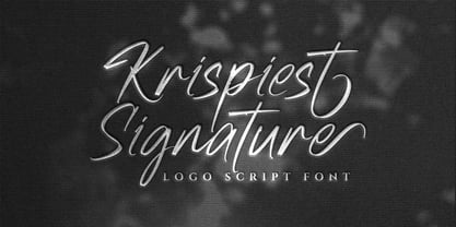 Krispiest Signature! A handwritten script brush font, all caps. Krispiest Signature font is suitable for branding, logotype, apparel, T-shirt, business card, product packaging, quotes, flyer, poster, book cover, advertising, etc. Whats Include? Opentype support Multilingual support PUA encoded Features: Uppercase, lowercase, numerals, punctuations, alternates, and ligatures Thanks for looking, and I hope you enjoy it! Please don't hesitate to drop me a message if you have any issues or queries.
 - Neosim by Smartfont,
$20.00 A striking modern display font in three styles. Neosim is for any kind of design work. Every single letters have been carefully crafted to make your text looks beautiful. Created with creativity, passion and imagination. PERFECT FOR Titles, greeting cards (Christmas, Birthday, Helloween, other holidays), logos, posters, phrases, cover album, gift shops, books, comics, presentation, Pinterest or Instagram, other. Have fun with Neosim and expand your creativity in all areas.
 - Kunjani by Scholtz Fonts,
$21.00Kunjani, (the Zulu word for "How are you?") is a feisty, contemporary "African Renaissance" font, vibrant and richly decorative, embodying the spirit of modern Africa. The characters are full of movement and excitement, combining a hand-carved look with contemporary elegance. Traditional and contemporary designs are used to make the upper-case alphabet essentially African, while lending variety to the already interesting structure. The font is a must for creators of the contemporary look of Africa. It is perfect for music media & promotions, film media & promotions, clothing hang tags & promotions, posters for "Support Africa" events, and indeed, any project that has its focus on Africa. The font has been carefully letterspaced and kerned. All upper and lower case characters, punctuation, numerals and accented characters are present. - Grungy Old Typewriter by FontFuel,
$14.00 Grungy Old Typewriter is based on two typed letters, each on two pages and dated 1901. The results are eroded, rough, irregular and grungy. The final results are a vintage look. As a designer, I wanted as much flexibility as possible, so there are six versions that are designed to work together. Additionally, I decided to keep the grunge and irregularities within the shape and not include surrounding typewriter or paper marks. I leave it to the design to add those elements as desired. One note, the letter spacing is much tighter than an old typewriter. I felt that readability for modern readers suffered from the added space. Of course, you can get that same look by increasing the letter spacing in your favorite design program.
 - QEWUR by Twinletter,
$15.00 Introducing QEWUR, our newest font, an authentic font with a Japanese style theme, with an attractive and decent font shape to make your project elegant, special, gorgeous, and charming, and easy to remember for the audience. Logotypes, food banners, branding, brochure, posters, movie titles, book titles, quotes, and more may all benefit from this font. Of course, using this font in your various design projects will make them excellent and outstanding; many viewers are drawn to the striking and unusual graphic display. Start utilizing this typeface in your projects to make them stand out.
 - Essonnes by James Todd,
$40.00 Made up of sixteen individual weights and spread over three different optical sizes, Essonnes is designed to bring utility back to the Didot genre. It’s a common belief among designers that Didones don’t work for text. This wasn’t true in 1819 and it isn’t true today. Like its forbearers, Essonnes is a truly optical family—not just a study in adjusting contrast. The text and display weights have been designed from the ground up for their intended roles. This means that everything from the height of the uppercase & lowercase letters have been specifically tuned for their intended purpose. Like many typefaces, Essonnes started after falling in love with a piece of history. In this case, it was the eccentric forms of Pierre Didot’s Type and the evolution of the High contrast Didone throughout the 19th century. It was out of curiosity and love for these forms that led to the first draft of what would become Essonnes back in 2011. These unique situations—screens, modern printing methods, the previous 200 years of typographic innovation since the original design, my own life experiences—have led to a typeface that, while based on history, is not stuck in it.
 - Bandiera Del Legno NF by Nick's Fonts,
$10.00 This typeface appeared in the William H. Page Woodtype specimen book as Gothic Tuscan Condensed Reversed—quite a mouthful. Banner elements appear in the brace and bracket positions, and reversed spaces can be found in the underscore and bar positions. Both versions of this font support the Latin 1252, Central European 1250, Turkish 1254 and Baltic 1257 codepages.
 - Piercing by Linotype,
$29.99Piercing is part of a series of typographic experiments from the young Swiss designer Michael Parson. In the Piercing family, which contains three separate weights, Parson has successfully transformed the movements of points and lines into a fabulous display of alphabets. But you can use Piercing as your key to the techno scene: these letters, made up of fine lines terminated by dots, virtually groove with the beat as you set them in text. Like a musical score, they provide a fantastic look just right for your next flyer. Piercing is one of ten experiments in constructed letter design that Parson has included in the Take Type 5 collection from Linotype GmbH." - Castlerigg by Hanoded,
$15.00 A long time ago, I lived and worked in the English Lake District. When I first arrived there, I camped out not far from a neolithic monument called Castlerigg Stone Circle. Castlerigg Stone Circle is one of the most beautiful stone circles in the whole of Britain; the views are great and it makes for a nice walk from Keswick. This rather grungy font was made with a Sharpie pen I initially wanted to throw away, because it was dry, but then decided I could at least get one more font out of it. The result is Castlerigg - a rather neolithic looking all caps font. Castlerigg comes with double letter ligatures for the lower case.
 - Giambattista by Wiescher Design,
$39.50 Giambattista is a long-time project of mine finally come to an end. After redesigning all of Giambattista Bodoni's work and then some additional cuts I started a long time ago with this Non-Bodoni Bodoni. The idea came to me while redesigning the original Chancellerosa (chancery). I thought Bodoni just didn't have the right approach to a chancery, this was just not his cup of tea! Maybe that is why he never used the Chancellerosa very much for his own printshop in Parma. So I thought someone has to design a script, that looks like Bodoni could have designed it but is more lively than his. Over the years I have been working on and off on the face and it turned out to become three typefaces which can be freely mixed. Here is my modern version of a script in the style of Giambattista, meant as an hommage, I called it Giambattista. Your modern scribe Gert Wiescher
 - Hurson by Garisman Studio,
$20.00 HURSON is born from original and hand-drawn style font. This font gives a feel of vintage, classic, old, handmade looked like. Already PUA Encoded and I think this font is perfect for people looking for vintage aesthetic or hand-drawn logo. Suitable for any graphic designs such as branding materials, t-shirts, prints, business cards, logos, posters, photography, quotes, and more.
 - Amoore by Garisman Studio,
$20.00 Amoore is born from original and hand-drawn style font. This font gives a feel of a classic, old, handmade looked like. Already PUA Encoded and I think this font is perfect for people looking for an aesthetic or hand-drawn logo. Suitable for any graphic designs such as branding materials, t-shirt, print, business cards, logo, poster, t-shirt, photography, quotes .etc.
 - Barbies Jalous Sisters - Unknown license

- Viktorie by Three Islands Press,
$39.00 Viktorie might easily be mistaken for the handwriting of a note-taker in a hurry: it looks swiftly jotted down. These energetic characters pay little heed to such arbitrary contraints as baseline or x-height -- taken together, they give the effect of casual penmanship that's both curiously legible and inspiringly unleashed. Viktorie has a single, medium-light weight and comes, of course, with a full character set.
 - Rumo Script by Bean & Morris,
$35.00 Rumo Script is a bright, breezy, free-flowing contemporary script to lighten the load when a change of pace is required to communicate freshness, fun, lifestyle and a general 'good feeling'. Designed so that some letters connect while others don't giving a spontaneous feel at the same time keeping it a 'considered' style. Rumo (pronounced Roo-mo) will enhance your graphics and give them that 'wow' look!
 - Neubau Grotesque by TipografiaRamis,
$29.00 Neubau Grotesque is an upright italics variation of Neubau Sans and is built in three weights. The main difference of this typeface is that it presents a softer and more human look (less techno), while retaining the condensed geometric structure of its counterpart. Neubau Grotesque is recommended for use as a display font, and has been generated in a single OpenType format with Western CP1252 character set..
