10,000 search results
(0.043 seconds)
- Pink Blue by Rometheme,
$25.00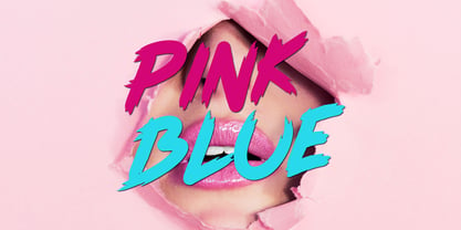 Pink Blue is a modern handdrawn font, this font looks elegant, classy, readable, stylish, catchy and easy to use. Pink Blue Font is the best choice for your professional design projects, including : quotes, album cover, business card, logo, branding, magazines, social media, advertisements, product designs, and many other design project.
 - Original Script by Monotype,
$29.99This script collection is used in advertising, invitations, greeting cards, and wherever a formal hand-lettered or engraving look is desired. Original Script has an elegant connecting alphabet based on formal handwriting. The Original Script font is a safe choice for invitations to weddings and formal occasions, and personal stationery. - Bitline by Grontype,
$15.00 Bitline is bold swirly font. comes with more alternate style each glyphs and ligature. The font is unique and modern vintage look. This is an adaptable font. Suitable for any project types, from magazine header, wedding invitation, branding design, poster or flyer header design, until logo tagline and so much more.
 - Bondjlo by Muksal Creatives,
$13.00 Bondjlo is font a vintange serif, and Bondjlo features unique and modern serif look and feel.is a fancy and modern serif font will elevate a wide variety of projects, from logos and stationery to magazine covers and social media posts. This typeface will take your designs to the next level!
 - Pastry Shop JNL by Jeff Levine,
$29.00 In the 1960 edition of Sam Welo’s “Studio Handbook – Letter and Design for Artists and Advertisers” you’ll find a bold, hand lettered Art Deco sans serif typeface designed by Welo with a decidedly 1930s-1940s look. This is now available as Pastry Shop JNL, in both regular and oblique versions.
 - Beautyca California by Letterena Studios,
$9.00 Beautyca California is a lovely and delicate script font that exudes elegance and class. This font was particularly crafted for those who need a beautiful and refreshing look to their designs. Beautyca California is PUA encoded which means you can access all of the amazing glyphs and ligatures with ease!
 - Ragtime by ITC,
$29.00Ragtime was designed by Alan Meetks, an all capital condensed sans serif typeface. It features thick/thin weight variances and fine line casing adornment which recalls magazine styles of the 1940s. This typeface should not be letter spaced too closely. Ragtime is excellent for anything requiring an elegant, refined look. - Talaga Lakes by Aminmario Studio,
$20.00 Talaga Lakes Font Talaga Lakes is a casual script font. Its modern charm makes it appear wonderfully, readable, and, ultimately, incredibly versatile. This font will look outstanding in any context, whether it’s being used on busy backgrounds or as a standalone headline! Thank you for the purchase. Happy creating design :)
 - Sendertime by Aminmario Studio,
$20.00 Sendertime is a stylish and incredibly elegant handwritten font. It looks stunning on wedding invitations, thank you cards, quotes, greeting cards, logos, business cards and every other design which needs a handwritten touch. This font is PUA encoded which means you can access all of the glyphs and swashes with ease!
 - Sanelya by Niyyos Studio,
$16.00 Falena is a stylish and incredibly elegant script font. It looks stunning on wedding invitations, thank you cards, quotes, greeting cards, logos, business cards and every other design which needs a handwritten touch. This font is PUA encoded which means you can access all of the glyphs and swashes with ease!
 - Antique by Storm Type Foundry,
$26.00The concept of the Baroque Roman type face is something which is remote from us. Ungrateful theorists gave Baroque type faces the ill-sounding attribute "Transitional", as if the Baroque Roman type face wilfully diverted from the tradition and at the same time did not manage to mature. This "transition" was originally meant as an intermediate stage between the Aldine/Garamond Roman face of the Renaissance, and its modern counterpart, as represented by Bodoni or Didot. Otherwise there was also a "transition" from a slanted axis of the shadow to a perpendicular one. What a petty detail led to the pejorative designation of Baroque type faces! If a bookseller were to tell his customers that they are about to choose a book which is set in some sort of transitional type face, he would probably go bust. After all, a reader, for his money, would not put up with some typographical experimentation. He wants to read a book without losing his eyesight while doing so. Nevertheless, it was Baroque typography which gave the world the most legible type faces. In those days the craft of punch-cutting was gradually separating itself from that of book-printing, but also from publishing and bookselling. Previously all these activities could be performed by a single person. The punch-cutter, who at that time was already fully occupied with the production of letters, achieved better results than he would have achieved if his creative talents were to be diffused in a printing office or a bookseller's shop. Thus it was possible that for example the printer John Baskerville did not cut a single letter in his entire lifetime, for he used the services of the accomplished punch-cutter John Handy. It became the custom that one type founder supplied type to multiple printing offices, so that the same type faces appeared in various parts of the world. The type face was losing its national character. In the Renaissance period it is still quite easy to distinguish for example a French Roman type face from a Venetian one; in the Baroque period this could be achieved only with great difficulties. Imagination and variety of shapes, which so far have been reserved only to the fine arts, now come into play. Thanks to technological progress, book printers are now able to reproduce hairstrokes and imitate calligraphic type faces. Scripts and elaborate ornaments are no longer the privilege of copper-engravers. Also the appearance of the basic, body design is slowly undergoing a change. The Renaissance canonical stiffness is now replaced with colour and contrast. The page of the book is suddenly darker, its lay-out more varied and its lines more compact. For Baroque type designers made a simple, yet ingenious discovery - they enlarged the x-height and reduced the ascenders to the cap-height. The type face thus became seemingly larger, and hence more legible, but at the same time more economical in composition; the type area was increasing to the detriment of the margins. Paper was expensive, and the aim of all the publishers was, therefore, to sell as many ideas in as small a book block as possible. A narrowed, bold majuscule, designed for use on the title page, appeared for the first time in the Late Baroque period. Also the title page was laid out with the highest possible economy. It comprised as a rule the brief contents of the book and the address of the bookseller, i.e. roughly that which is now placed on the flaps and in the imprint lines. Bold upper-case letters in the first line dramatically give way to the more subtle italics, the third line is highlighted with vermilion; a few words set in lower-case letters are scattered in-between, and then vermilion appears again. Somewhere in the middle there is an ornament, a monogram or an engraving as a kind of climax of the drama, while at the foot of the title-page all this din is quietened by a line with the name of the printer and the year expressed in Roman numerals, set in 8-point body size. Every Baroque title-page could well pass muster as a striking poster. The pride of every book printer was the publication of a type specimen book - a typographical manual. Among these manuals the one published by Fournier stands out - also as regards the selection of the texts for the specimen type matter. It reveals the scope of knowledge and education of the master typographers of that period. The same Fournier established a system of typographical measurement which, revised by Didot, is still used today. Baskerville introduced the smoothing of paper by a hot steel roller, in order that he could print astonishingly sharp letters, etc. ... In other words - Baroque typography deserves anything else but the attribute "transitional". In the first half of the 18th century, besides persons whose names are prominent and well-known up to the present, as was Caslon, there were many type founders who did not manage to publish their manuals or forgot to become famous in some other way. They often imitated the type faces of their more experienced contemporaries, but many of them arrived at a quite strange, even weird originality, which ran completely outside the mainstream of typographical art. The prints from which we have drawn inspiration for these six digital designs come from Paris, Vienna and Prague, from the period around 1750. The transcription of letters in their intact form is our firm principle. Does it mean, therefore, that the task of the digital restorer is to copy meticulously the outline of the letter with all inadequacies of the particular imprint? No. The type face should not to evoke the rustic atmosphere of letterpress after printing, but to analyze the appearance of the punches before they are imprinted. It is also necessary to take account of the size of the type face and to avoid excessive enlargement or reduction. Let us keep in mind that every size requires its own design. The longer we work on the computer where a change in size is child's play, the more we are convinced that the appearance of a letter is tied to its proportions, and therefore, to a fixed size. We are also aware of the fact that the computer is a straightjacket of the type face and that the dictate of mathematical vectors effectively kills any hint of naturalness. That is why we strive to preserve in these six alphabets the numerous anomalies to which later no type designer ever returned due to their obvious eccentricity. Please accept this PostScript study as an attempt (possibly futile, possibly inspirational) to brush up the warm magic of Baroque prints. Hopefully it will give pleasure in today's modern type designer's nihilism. - Plandscape by Akrtype Studio,
$19.00 Plandscape smooth monoline font is a beautiful and simple handwriting script font, contemporary and fashionable, Plandscape smooth monoline font looks elegant for a wide variety of designs. This elegant font can be read and looks good as a title or body text. This font will be perfect for many different designs for magazine headlines, social media, branding, wedding invitations, cards, etc. Plandscape smooth monoline font include ligatures, capital letters and alternate letters. They are easy to use and perfect for expressing your thoughts, posting quotes and simple daily updates on social media.
 - PAG Novembris by Prop-a-ganda,
$19.99Prop-a-ganda offers retro-flavored fonts inspired by lettering on retro propaganda posters, retro advertising posters, retro packages all the world over. This is perfect font for your retrospective project. PAG Novembris is narrow and serif font with art deco look. “A”, “G”, “H” and “M” have different letter form in uppercase and lowercase, and they give decorative accents on your typography. PAG Novembris is perfect font for your retrospective project. - Stupid Questions by Bogstav,
$15.00 First of all: there is no such thing as a stupid question! But now there is a font called Stupid Questions! :) A classic handmade sans font - super legible and somewhat clean. Use your favourite of the 5 different versions, mix them in layers with your favourite colours. I've added 4 different versions of each lowercase letter, and they automatically cycle as you type - a great way to make your text look more natural and organic!
 - TessieAnimals by Ingrimayne Type,
$18.95 A tessellation is a shape that can be used to completely fill the plane. Simple examples are isosceles triangles, squares, and hexagons. Tessellation patterns are eye-catching and visually appealing, which is the reason that they have long been popular in a variety of decorative situations. These Tessie fonts have two family members, a solid style that must have different colors when used and an outline style. They can be used separately or they can be used in layers with the outline style on top of the solid style. For rows to align properly, leading must be the same as point size. To see how patterns can be constructed, see the “Samples” file here. Shapes that tessellate and also resemble real-world objects are often called Escher-like tessellations. This typeface contains many Escher-like tessellations that resemble animals including horses, goats, rabbits, fish, frogs, and other vertebrates. Most or all of these shapes were discovered/created by the font designer during the past twenty years in the process of designing maze books, coloring books, and a book about tessellations. (Earlier tessellation fonts from IngrimayneType, the TessieDingies fonts, lack a black or filled version so cannot do colored patterns. The addition of a solid style that must be colored makes these new fonts a bit more difficult to use but offers far greater possibilities in getting visually interesting results.)
 - TessieFlyingBirds by Ingrimayne Type,
$19.95 A tessellation is a shape that can be used to completely fill the plane—simple examples are isosceles triangles, squares, and hexagons. Tessellation patterns are eye-catching and visually appealing, which is the reason that they have long been popular in a variety of decorative situations. These Tessie fonts have two family members, a solid style that must have different colors when used and an outline style. They can be used separately or they can be used in layers with the outline style on top of the solid style. For rows to align properly, leading must be the same as point size. To see how patterns can be constructed, see the “Samples” file here. Shapes that tessellate and also resemble real-world objects are often called Escher-like tessellations. This typeface contains many Escher-like tessellations that resemble flying birds. Most or all of these shapes were discovered/created by the font designer during the past twenty years in the process of designing maze books, colorings books, and a book about tessellations. (Earlier tessellation fonts from IngrimayneType, the TessieDingies fonts, lack a black or filled version so cannot do colored patterns. The addition of a solid style that must be colored makes these new fonts a bit more difficult to use but offers far greater possibilities in getting visually interesting results.)
 - Notte Alexia by Joelmaker,
$20.00 Notte Alexia Serif & Script an old-fashioned font that has been rewritten in a modern style combined with unique ligatures and beautiful and attractive swirly, making this font even more energetic and paired with a very beautiful Script so that it looks more dynamic. Note Alexia Serif & Script,can be used for various purposes such as Magazine Title, Poster, Logo, T-Shirt, Sub Title, Business cards, Magazines, Book Covers, Wedding Invitations,Templates Instagram Story Post, Greeting Cards, Quotes, etc. Features: Stylistic Alternates Swashes Titling Alternates Stylistic Set Standard Ligatures Thank You Very Much.
 - Emperator by Latinotype,
$35.00 Marcelo's new typeface Emperator —based on his knowledge gained from instruction by master calligraphers— provides a fresh perspective on classic typefaces. Emperator comes in 3 variants that make your designs look elegant, legible and expressive. This font is perfectly suitable for a wide range of applications such as titles, wedding invitations, short text, logos, labels, book covers, posters, packaging, etc. Emperator's character set includes small caps (letters, figures and symbols), fractions, stylistic alternates, ligatures, mathematical symbols, etc.— more than 750 glyphs in all, supporting over 200 Latin-based languages.
 - Skid Rock by HansCo,
$12.00 Skid Rock is a modern, bold and clean font that will be perfect for multipurpose projects. This font looks cool in any design and is very recommended for craft, posters, books, branding, quotes, print templates, packaging, invitations, music labels or anything else that needs a touch of something bold and clean. Skid Rock comes in uppercase and lowercase, with punctuation, symbols, numerals, swashes and it also has multilingual support. Swashes is alternate from numeral 0 - 9. You can access swashes from your OpenType panel in your design software.
 - Carilo by Reyrey Blue Std,
$16.00 Introducing Carilo. Modern and classy serif that combines two types of typefaces, classic calligraphy and serif fonts. You will also get 20+ ligatures and several stylistic alternates that will make your work look more unique, luxurious and elegant. This font is perfect for to create logos, branding, stickers, shirts, signs, posters, quotes, instagram posts, procreate designs. book or movie title design, fashion brand, magazine, clothes, lettering, quotes, and so much more. Features : · All Uppercase and Lowercase · Number & Symbol · Supported Languages · Alternates and Ligatures · PUA Encoded Hope you enjoy with our font!
 - Story Tales by Resistenza,
$39.00 A fairy tale, is a folklore genre that takes the form of a short story. Story tale, is a new type family for wonderous, romantic, magical and playful narratives brought to you by Resitenza. The 1970s were wild and whimsical times. Book covers from this time were iconic, innovative and enduring; bold colour and stylised pattern dominated. Story Tales forms were inspired by 70s books covers, and aims to encapsulate the zeitgeist of the time, but the typeface is by no means constrained to revivals of this era. There are nods to 60's flower power & psychedelia, chromatic type and decorative queues from the 1800s and the spirit of post-war era children's almanacks. It is also perfectly suited to inspiring curiosity, imagination and fantasy in today's audiences. Each of Story Tales 8 styles (4 upright and 4 italics) stack on top of one another giving the designer broad aesthetic range. This layering of styles and the ornamental illumination allows striking multi-coloured typography for your book covers, editorial and poster designs.
 - Schelter Grotesk NF by Nick's Fonts,
$10.00This forerunner of Helvetica made its debut as Breite Grotesk in the 1886 specimen book of the Schelter & Giesecke foundry in Leipzig. This classic face still retains its freshness, even after more than a century. Both versions of this font contain the complete Latin A Extended character set, as well as extended ligatures and fractions. - Red Tape by Wiescher Design,
$39.50 Red Tape is three fonts that were designed by sticking letters together with red tape. It makes for a wonderful makeshift set of fonts. And I really enjoyed sticking those letters together. Of course I did it on screen using bits and pieces of scanned red tape. Just use it as you like, I won't give you any red tape in how to use the fonts. »Red Tape« is since February 2012 on permanent display in the »German National Library« – next to the likes of »Bodoni«, »Garamond« and »Helvetica« – being part of the exhibition about type through the ages. Your (now a little famous) unproblematic type designer, Gert.
 - Reaf Singer by Dicubit,
$13.00 Reaf Singer is a modern monoline typeface/font designed with carefully handcrafted. This perfectly made to be applied in logo or branding, stationery, books, packaging, fashion, magazines, t-shirt, novels, labels and many advertising purposes. Features: Uppercase, Lowercase, Number, Punctuation, Symbol, Multilingual, Ligature, Alternate, Swash. All the pictures used in the preview are not included. They are intended only for illustration purpose.
 - Minthy Stones by Dicubit,
$15.00 Minthy Stones is a modern script typeface/font designed with carefully handcrafted. This perfectly made to be applied in logo or branding, stationery, books, packaging, fashion, magazines, t-shirt, novels, labels and many advertising purposes. Features: Uppercase, Lowercase, Number, Punctuation, Symbol, Multilingual, Ligature, Alternate, Swash. All the pictures used in the preview are not included. They are intended only for illustration purpose.
 - Sertona by Sarid Ezra,
$17.00 Introducing, Sertona, a trendy bold font with italic alternates! Sertona is a modern and trendy font based sans that have unique looks. This font contains uppercase and lowercase that have different form. You can use the lowercase and uppercase in the same word that will make your text more stand out! And the best of this font is the italic version as the alternates which mean you can combine it all without worrying about the kerning! You can use this font for the magazine, poster, and suitable for headline. This font also support multi language. What you will get: All Caps Font with different uppercase and lowercase Italic version as the alternates. Well Kerned.
 - Platinor by Larin Type Co,
$16.00 Platinor this is a beautiful and elegant Display Serif font. You can use this font in the classical style, with it you can highlight exactly what you need. But Platinor can also be more expressive, playful and looking vintage due to the many alternatives and ligatures that are harmoniously combined in this font. Try changing alternatives, ligatures and you will get many options for your project, which will make it unique. This font is easy to use as it has OpenType features.
 - Whomp by Sudtipos,
$59.00 Whomp takes its inspiration from the work of an American master in sign painting and alphabet manipulation: Alf Becker . In 1932, Becker began designing a series of alphabets to be published in Signs of the Times magazine at the rate of one alphabet per month. Nine years later, 100 of those alphabets were compiled in one book that became an enormous success among sign painters. In the late 1990s and early 2000s, many Alf Becker alphabets were digitized with blurbs that falsely credit an “Alf Becker typeface”. Alf Becker was not really a typeface kind of guy. He was more of a calligrapher and sign painter. His alphabets were either incomplete or full of variations on different letters, and didn't become typefaces until the digital era. This particular Becker alphabet was quite incomplete. In fact, it wasn't a showing of an alphabet, but words on a poster. Alejandro Paul took the challenge of drawing, digitizing, restructuring, and finally building a complete usable typeface from that partial alphabet. He then extended his pleasure by once again playing with the wonderful possibilities of OpenType. Whomp comes with more than 100 alternates, tons of swashy endings and ligatures, all built into the font and accessible through OpenType palettes in programs that support such features. This is the in-your-face kind of font that stands among other Becker-based alphabets as paying most homage to the vision of this great American artist who saw letters as live ever-changing beings. Whomp is right at home when used on packaging, signage, posters, and entertainment related products.
 - Finador by Julien Fincker,
$24.00 Finador is a modern, soft geometric sans family. The functional style of a geometric sans has been soften by open apertures and rounded corners. This makes it functional and friendly. The default version has open, modern apertures. Stylistic Set 2 includes the whole set with closed, classic apertures. A slightly different look. It´s like having a second font in just one font. So it´s up to you to choose the right look for your projects. The Finador family includes 8 weights, from thin to heavy + their matching italics. With 900+ glyphs per style it supports over 200+ latin based languages, includes an extended currency symbol set and a lot of Open Type Features like small caps, ligatures, fractions, alternates and many more. The lightest and boldest weights are good for display usage, while the middle weights can be also used for body text. As a versatile allrounder Finador supports almost every of your needs. It has the ability to become your next favorite workhorse family.
 - Scottsdale Desert by Adam Fathony,
$39.00 Scottsdale Desert is inspired by a classic contemporary Display combined with a simple modern Serif look. It's a versatile font, it can be used for a lot of design styles. Characteristic for Scottsdale are the small to bigger rounded serif strokes that make it look sharp and comfy. Thin, light strokes define the modernity and simplicity of the typeface itself. The OldStyle Numerical match with the characteristic of this fonts. Using Scottsdale Desert's lowercases for a long text will work, but it is at its best as Header or Display. Scottsdale Desert comes with most OpenType Features: - Powerful ligatures as Discretionary Ligatures - Stylistic Alternates on Uppercase and Lowercase - Contextual Swashes adding a Terminal (first swash) on the First Uppercase letters - Small Capitals (can be operated with the Titling Alternates button) - Catchword are created with Contextual alternates (see the images to show how it works). - Punctuation and Symbol are perfectly matched with all letters - Numerical features are available : Tabular Figures Numerator Denominator Superscript/Superior -Subscript/Inferior and Fraction.
 - NEON CLUB MUSIC by TypoGraphicDesign,
$19.00 The typeface Neon Club Music is designed in 2011 for an Logo-Design of a electronic music label from South Germany. 324 glyphs incl. decorative extras like arrows, dingbats, emojis, symbols, geometric shapes, decorative ligatures (type the word #SMILE for ☺ or #LOVE for ♥ as OpenType-Feature dlig) and stylistic alternates (as OpenType-Feature salt. For use in logos, magazines, posters, advertisement plus as webfont for decorative headlines. The font works best for display size. Have fun with this font & use the DEMO-FONT (with reduced glyph-set) FOR FREE! CONCEPT/CHARACTERISTICS The geometric and rounded character of the typeface is a very unique futuristic sci-fi atmosphere. The sans-serif monoline letter-forms looks very modern, clean, fresh and fancy. APPLICATION AREA The fancy, geometric & round party, music & movie font “NEON CLUB MUSIC” would look good at display size for party flyer & movie poster, music covers or headlines in magazines or websites…
 - Sodra by Harvester Type,
$20.00 Sodra is a wide-accented antiqua with sharp serifs and hints of futuristic forms. This typeface emerged from a passage in the Manifesto del Futurismo by Filippo Tommaso Marinetti. One short word was the inspiration and the guidance for the creation of this font. An attempt to create something unique and distinctive, an attempt to add a bit of futurism to something historical. The special aesthetics and expressiveness the type conveys will make you look closely at each letter and draw attention to your design. The font has been in development for a long time and painstaking work has been done on it. Large language support, about 470 characters and almost 4,000 kerning pairs. Hinting and testing the font itself in business and in a wide variety of applications. The uses of the type are very wide. Whether it's a branding, logo, identity or merch, a headline or product design. The nature of typeface is not limited to something rough and gloomy, on the contrary, it all depends on how you look at it. I've shown you my point of view, you in turn will see yours!
 - Dro by KC Fonts,
$25.00 The Dro family is an all uppercase handmade font that resembles cut-out construction paper; Both fonts have 6 glyphs for each letter & 2 per number which are accessed by uppercase, lowercase, small caps & Contextual Alternates. Each font has 550+ glyphs total. When using Opentype applications Dro and Dro Fill take the handmade look further by cycling through Contextual Alternates, Small Caps & Double Letter Ligatures for a unique and authentic look to your creative. When not using the Contextual Alternates feature, you can still alternate between uppercase and lowercase letters and using Stylistic Sets to switch up the flow. The Dro family has an extended character set for multilingual support.
 - Catto Puroo by Attype Studio,
$15.00 Introducing Catto Puroo, the perfect font for all animal-related products. With three different versions - regular, display, and extruded - Catto Puroo offers versatility and a range of design possibilities. The display version features a paw print on the font, which is perfect for creating fun and playful designs. Combine it with the extruded version for a 3D look that will make your designs stand out. Catto Puroo is the go-to font for animal lovers, pet enthusiasts, and anyone looking to create designs that are fun, quirky, and memorable. Features : - Catto Puroo Family Fonts - Ligatures - Multilingual, US Roman, Latin 1 Support --- Hope you enjoy with our font! Attype Studio
 - Yum Yum NF by Nick's Fonts,
$10.00The Cleveland Type Foundry strikes again, with this delightful little number from their 1893 specimen book, originally named "Mikado". This version takes its name from one of the characters in the Gilbert and Sullivan operetta of the same name, and the name aptly describes the tasty nature of this frolicking face. Both versions of this font include the complete Latin 1252 and CE 1250 character sets, with localization for Romanian and Moldovan. - Xbka by Andfonts,
$17.00 Introducing Xbka, the new must-have font for anyone looking for a vintage-modern, futuristic, cool, and sporty font. This display font is perfect for those looking to make a statement with their headlines or branding. With its unique blend of modern and vintage styles, Xbka is the perfect choice for anyone looking to give their designs a fresh and youthful feel. Its italic style adds an extra touch of elegance and creativity to any project. Whether you're designing a logo for a new sports brand, creating eye-catching headlines for a magazine or website, or adding a touch of urban style to your marketing materials, Xbka is the perfect choice. This font is great for use in a wide range of applications, including advertising, branding, web design, and print design. It's a versatile font that can be used in a variety of contexts, from sports and fitness to streetwear and fashion. Overall, Xbka is a unique and eye-catching font that is sure to make your designs stand out. So why not add it to your collection today and start creating something truly special?
 - Rockinstead by PintassilgoPrints,
$35.00 Rockinstead counts 1, 2, 3, 4, 5, 6, 7, 8... Eight variations per letter, plus alternates for numbers and even for punctuation marks! It is equipped with some clever OpenType programming to make substitutions on-the-fly: the Contextual Alternates feature, with the help of a very careful kerning table, takes care of cycling the alternates in an amazing random-like way, impressively mimicking a true handwritten text. The Discretionary Ligatures feature manages the substitution of handy cursive catchwords, adding that charming twist. To put it more bluntly, this font AUTOMATICALLY alters your typing so that it substitutes glyph variations while you do nothing but type away! No need to use PopChar here to do the substitutions manually, the font itself takes care of that for you. This typeface was originally painted on paper, drawing inspiration from Ralph Steadman’s seminal lettering style. On a first glance it may look quite wild - and it proudly is, indeed. But look again: it is stylishly wild, it is strong, unpredictable, full of attitude and good energy. This multifaceted font will certainly strike its way for free-spirited design applications. Just please be warned: it’s seriously addictive!
 - Kingdom Ink by Nathatype,
$29.00 Do you want to present an unforgettable design? We have the right display font for you. This is Kingdom Ink, a display font carefully crafted by our professional designers for the highest quality font. Its bold, prominent characters are perfect to add effects and certain characters to your designs. In addition, the professional, outstanding appearances of this font convey that it will leave amazing impressions to your audience. Some of the letters have swinging end wipes to look visually interesting. On the other hand, its aesthetic, low contrast shapes are inapplicable for small text sizes. Furthermore, you can enjoy the available features here. Features: Stylistic Sets Multilingual Supports PUA Encoded Numerals and Punctuations Kingdom Ink fits best for various design projects, such as brandings, posters, banners, headings, magazine covers, quotes, printed products, merchandise, social media, etc. Find out more ways to use this font by taking a look at the font preview. Thanks for purchasing our fonts. Hopefully, you have a great time using our font. Feel free to contact us anytime for further information or when you have trouble with the font. Thanks a lot and happy designing.
 - Bender Script by Dear Alison,
$29.00 Would you hire one of the top hand lettering artists that worked for companies like Max Factor for your designs? Of course you would! Chas Bluemlein passed away many years back, and you couldn't have afforded his services anyway, but his lettering prowess which graced many advertisements, primarily cosmetic ads, has been pulled together from numerous samples to make this font. Bender Script comes with BONUS Swash alternates to mix up the flavor a bit, and exudes passion and confidence! Now you can own not only a piece of his lettering legacy, but you can also put it to work for you! This beauty is a sure fit into any font collection, so what are you waiting for, buy it today!
 - Rotis Semi Sans by Monotype,
$40.99 Rotis¿ is a comprehensive family group with Sans Serif, Semi Sans, Serif, and Semi Serif styles, for a total of 17 weights including italics. The four families have similar weights, heights and proportions; though the Sans is primarily monotone, the Semi Sans has swelling strokes, the Semi Serif has just a few serifs, and the Serif has serifs and strokes with mostly vertical axes. Designed by Otl Aicher for Agfa in 1989, Rotis has become something of a European zeitgeist. This highly rationalized yet intriguing type is seen everywhere, from book text to billboards. The blending of sans with serif was almost revolutionary when Aicher first started working on the idea. Traditionalists felt that discarding serifs from some forms and giving unusual curves and edges to others might be something new, but not something better. But Rotis was based on those principles, and has proven itself not only highly legible, but also remarkably successful on a wide scale. Rotis is easily identifiable in all its styles by the cap C and lowercase c and e: note the hooked tops, serifless bottoms, and underslung body curves. Aicher is a long-time teacher of design and has many years of practical experience as a graphic designer. He named Rotis after the small village in southern German where he lives. Rotis¿ is suitable for just about any use: book text, documentation, business reports, business correspondence, magazines, newspapers, posters, advertisements, multimedia, and corporate design.Today Rotis ia also available with pan european caracter set.