6,414 search results
(0.192 seconds)
- Southern Nights by Breauhare,
$35.00 Based on the hit album by Glen Campbell, Southern Nights is the font with a style that’s “free as a breeze,” as the song says. It’s fun and casual, yet it has a flair for fashion and elegance. It also has an art nouveau look which lends itself to greeting cards as well as the branding of perfume, clothing, retailing, dining, and other luxury/high-end uses. This font includes alternate characters for the upper R, S, and T, the lower g and z, plus ligatures that include a double lower t and double lower l (L). As the song might say, I apologize to anyone who can truly say that they have found a better font! Digitized by John Bomparte.
 - Halewyn by Hanoded,
$15.00 Heer Halewijn (The Song of Lord Halewijn) is a 13th century Dutch folk tale which survives in folk ballad. The story tells of a man called Halewijn, who lives in the woods and who lures pretty women with his songs (whom he then kills). One day a princess visits Halewijn, but when he wants to kill her, she requests he remove his robe, so as not to stain it with her blood. He obliges and when he is undressing, the princess seizes his sword and chops off his head. Halewyn is a handmade font, which was loosely based on my Languedoc font and Garamond. Use it for product packaging, books and posters. Comes in 4 weights (with italics) and a ballad full of diacritics.
 - The font "WereWolf" by GautFonts is a unique and expressive typeface that truly stands out due to its thematic design and playful character. This font has been meticulously crafted to evoke the myste...
- FEMME is an intriguing and evocative typeface that embodies a fluid and expressive aesthetic, designed to capture attention at first glance. While I'm crafting a fictional description given there isn...
- Smelted Demo - Unknown license

- Callgest by Martype co,
$15.00 Introducing Callgest serif display. A brand new font with tapered serif, made with love to make it more versatile and stylish. This font also suitable for Branding Design, Logotype, Wedding Invitation, Headline, Posters, Business Card and etc. You can combine with Montserrat, Gotham, or Helvetica to make awful fusion combo font! What's inculded? - Callgest Tall - Callgest Regular - Callgest Wide Multilingual Support support many different languages 60+ Thanks & Happy Designing!
 - Porker by Ingrimayne Type,
$6.95 Porker was an experiment in making a barely readable but very simple and very bold typeface with no curves. It is caps only with some of the letters on the lower-case keys giving alternate versions. Include are three variants, a tall version, a striped version, and a randomized version. The striped version can be placed in a layer above the regular version to give two-colored letters.
 - Farm Doodles by Outside the Line,
$19.00 Farm Doodles... perfect collection of illustrations to be used for everything from the farm to table movement to the current weddings on a farm trend. 30 illustrations of farm animals... beehive, fish, bunny, chickens, cows, goat, sheep, pig and horse. Farm buildings, weather vane, windmill, tractor, milk can, hay bale, trees. And food... tomato, carrots, peas, spinach, apples, beets. Mix and match with other Outside the Line illustration fonts.
 - Durable JNL by Jeff Levine,
$29.00 The front page of a late-1940s sales catalog for the [now defunct] Duro Decal Company of Chicago had its company name hand-lettered in a tall, condensed chamfered sans serif type design. Although chamfered lettering had been popular for decades, the way the "R" was shaped gave the letters a bit of an Art Deco influence, and this influence was carried through in the creation of Durable JNL.
 - Speeding Bullet by Comicraft,
$19.00 Introducing... SPEEDING BULLET -- featuring SPEED TRAILS for increasing the, ah, speed of your bullets! Quick as The Flash, slicker than Quicksilver, the latest in our popular line of silver age display fonts could probably outrun a locomotive AND jump buildings in a single bound. It’s ASTOUNDING, it’s STARTLING, it’s ELECTRIFYING, PERAMBULATING, DISCOMBOBULATING and RETROFITTING. It really is Faster than a Speeding Bullet. Try it out for yourself. Under adult supervision, natch'.
 - Tecna by Corradine Fonts,
$24.95 Tecna is a modern sans typeface with straight cuts, rounded angles and curved thinnings at the endings that make the letter shapes fresher. The rounded characters are squarish giving to the layout a very structural appearance. Its wide proportions give big impact to the texts. It has a tall x-height that enhances its legibility in smaller sizes. Its character set has coverage for Western and Central European languages.
 - Equalis by Eurotypo,
$44.00 From Latin aequālis (equal). The case conveying an equality with another noun. Equalis, sets its sights on applied mathematics. Equalis is a slab-serif typeface characterized by a tall x-height and very short ascenders / descenders. This OpenType font family comes in two weights and italics, with support for CE languages. Equalis can be used as display type. Suitable for body text, headlines, package & a wide range of projects.
 - Thorowgood Wide by Wooden Type Fonts,
$20.00 One of the original Clarendon types, an English design, here derived from a specimen taken from an American foundry, no identifying marks. With a tall x-height, wide version, unlike more traditional Clarendons, not a square serif but bracketed. Unique to this Clarendon are the rounded openings at the points where the horizontal and vertical stems meet in the capital B, D, P and R, not common in other Clarendons.
 - ITC Odyssée by ITC,
$29.99ITC Odyssée is the work of French designers Roselyne and Michel Besnard, who were inspired by the digital imagine of type which opened up possibilities for new visual illusions. The serifs of this font recreate the virtual lines formed by optical residue" on TV screens, looking like horizontal serifs trailing off to the right. ITC Odyssée is a clear and legible typeface which features a simplicity and grace in its forms." - Kembara Cinta Outline by Fargun Studio,
$12.00 Kembara Cinta Outline is a new, fresh, and modern hand lettered font, decorative characters and a dancing baseline! So beautiful on handicrafts, greeting cards, branding materials, business cards, quotes, posters, and more. Features: Unique ligatures Stylistic sets Basic Latin A-Z and a-z Numbers International Symbols included Punctuation Need help? If you need help or advice, please contact me by e-mail "fargunstudio@gmail.com" Thank you for your purchase
 - Smart Deco by Lindstrom Design,
$15.00 A nostalgic font referencing the 1920s and 1930s during the Golden Age of Hollywood, art moderne and the rise of luxury items. Highly geometric with wild variations in glyph widths that demand attention. Smart Deco is a display font with clean simple lines, tall ascenders and expressive Capitals that descend below the baseline. The intention is to create a sleek elegance that symbolizes the sophistication of a bygone era.
 - Han Zi by ParaType,
$25.00 The display typeface that is based on the shapes of traditional Chinese hieroglyphic characters. Designing the font for imitations in the Chinese style the author nevertheless demonstrates serious attitude and thoroughness using the table of keys of the regular Kaishu script. As a result the font looks stylistically authentic and genuine. The typeface was designed by Aleksandra Egorova, the young type designer from St. Petersburg, and released by ParaType in 2008 .
 - Pastrami by Font Kitchen,
$9.99 Enjoy Font Kitchen’s all-natural Pastrami! This rounded geometric sans is served with a tall glass of ligatures, a heaping portion of all kinds of fractions, and your choice of stylistic alternates. Inspired by warm, whimsical typefaces of 70s American diners, Pastrami is perfect for adding a stylized charm to your next piece. Available in seven weights, Pastrami is sure to add a dash of flavor to your next project.
 - Vonnes by Font Bureau,
$40.00 Vonnes was designed by David Berlow working closely with Neville Brody on corporate redesign for Jim Von Ehre at Macromedia. Core weights are loosely based on Bauer’s Venus, 1907–1910. Berlow expanded the ideas behind the series to 56 fonts, the heart of the redesign. The Macromedia program was hailed as one of the most successful models of modern total design for innovative cutting edge companies; FB 2007
 - Prelom by Tour De Force,
$25.00 Prelom is modern serif family inspired by retro designed typefaces. Comes in 5 Normal weights, 5 true Italics and 5 Condensed weights. With tall x-height, sharp serifs like fishing hooks, original Italics and distinctive character overall design, Prelom is ideal family for editorial use or branding. Beside extended Latin character set, Prelom contains Cyrillic characters as well. It is equipped with Initials, Ligatures, Fractions and Tabular Numbers as OpenType features.
 - Locarno by ITC,
$29.99Locarno is the work of British designer Alan Meeks and is his adaptation of Rudolf Koch's original design for the Klingspor type foundry. The unique design of the roman weight features geneous capitals and a reserved lowercase. The italic capitals have an open, engraved decoration that combines perfectly with the lowercase with its tall, elegant ascenders. Locarno is a typeface with the sophisticated look of the 1920s and 30s. - Fleurons of Paris by Outside the Line,
$19.00 The Fleurons of Paris were inspired by an iron gate, an iron railing, a Metro tile, a Metro stop, the Eiffel Tower, Notre Dame, a rainy afternoon, a glass of wine, an outdoor cafe and the list goes on and on. Absorbing all things visual was immensely satisfying second only to coming home and reliving the trip tiny graphic by tiny graphic. Also look at the Ornaments of Paris.
 - Kembara Cinta by Fargun Studio,
$12.00 Kembara Cinta - a new fresh & modern hand lettered font, decorative characters and a dancing baseline! So beautiful on invitation like handicraft, greeting cards, branding materials, business cards, quotes, posters, and more design concept! Features : Unique ligatures Stylistic sets Basic Latin A-Z and a-z Numbers International Symbols included Punctuations Need help? If you need help or advice, please contact me by e-mail "fargunstudio@gmail.com" Thank you for purchased
 - Noa by Linotype,
$29.99The Danish designer Nina Lee Storm designed Noa for use on television and computer screens during the late 1990s. She began her six-member type family with the creation of bitmap fonts, developing their print outlines only secondarily. Noa’s letters exhibit a tall x-height, coupled with very short ascenders and descenders. Storm is proud to report that her typeface also looks very “Danish.” Why don't you give it a try? - Ray Johnson by K-Type,
$20.00 The Ray Johnson font was inspired by the Father of Mail Art. It's based on the block lettering style used by Ray to add the names of his correspondents to their bunny head portraits (the film How to Draw a Bunny is a superb introduction). The font includes blank bunny heads and other Ray Johnson graphics as scalable vector images, and separate bitmap images are also provided as jpegs and gifs.
 - Levato by Linotype,
$29.99 Levato, the first font designed by Felix Bonge, is an Antiqua that is full of character and is refined but by no means sterile. This typeface provides for a wide range of options for creating individual designs. It was not really Felix Bonge's intention to create a whole font family when, as a second year student, he began several exercises in contrast and proportion as part of the typeface design course of Professor Veljovi? at Hamburg University of Applied Sciences. However, these initial studies developed into a project that Bonge persisted with over the following years while working towards his degree. He continually had new insights and ideas that he was able to exploit for his font. Of particular importance, he claims, was a calligraphy seminar, which prompted him to completely rework his concept. It took him several years before his extensive font Levato™ was ready. Although the forms of Levato are ultimately derived from Renaissance Antiqua, Bonge has slightly increased the relative contrast in his version. This gives the font a graceful appearance that is further emphasized by the reduced x-height and the associated prominence of the ascenders. And, in addition, the relatively fine serifs, which are almost linear at their ends, infuse Levato with a hint of classical Antiqua á la Bodoni. At the same time, Bonge cleverly compensates for the sterilising tendency of this font form. Soft and rounded serif attachments and rounded line apexes offset the severe nature of the font and provide it with an aura of vivacity. This effect is promoted by the calligraphic-like foot of the lowercase h, n and m and the not quite horizontal bars of the uppercase E and F. Overall, Bonge has succeeded in creating a refined and yet very dynamic typeface. Levato is available in five weights; Light, Regular, Medium, Bold and Black, in each case with the corresponding italic versions. Bonge treats Levato Italic as a genuine cursive typeface. Its letters are thus slightly narrower than the analogous upright letters and their forms are considerably more curvilinear. All the versions of Levato boast an enormous range of characters to meet all possible requirements. In addition to four sets of minuscule and majuscule numerals for tabular and proportional typesetting, there are also small caps, numerous ligatures, ornamental characters and even swash variants of letters. With their generous, sweeping curves, the swash variants (available as OpenType versions) can be used for striking titling effects or as initials.
 - EcuyerDAX is a distinctive font that encapsulates an essence of classic elegance and timeless appeal, yet with a subtly modern twist that sets it apart from traditional script fonts. Its design intri...
- As of my last update in April 2023, there is no widely recognized font specifically named "Chlorinej". However, let's imagine a font with this unique name and what characteristics it might embody, dr...
- MARIAMNE by Type Innovations,
$39.00 MARIAMNE is an original design by Alex Kaczun. It is an elegant, modern and traditional interpretation based on and modeled after his successful "Contax Pro" and "New Age Gothic" typeface series. As such, it has generous proportions with clean, crisp lines—ideally suited for easy reading and long lines of copy. Alex felt that the skeleton for "Contax" was perfectly suited to transform the design into a modern version of 'old-style', somewhat reminiscent of German Black Letter. Numerous modifications where made to the body proportions, stems and shapes. True 'old-style' serifs and unusual 'cross-strokes' where added for a touch of distinction. The 'cross-strokes' where added at exactly visual mid-point on the overall heights. This gives the typeface a romantic, female-like quality to the overall design. Strong, yet delicate. Visually stimulating in appearance and function. The result is a truly unique transitional and modern design. Unlike other typefaces, MARIAMNE incorporates uniform stems throughout the capitals, lower case and figures. This gives the design a uniform appearance in overall color and strength. There is a perfect visual balance between inter-letter spacing, stem weights and proportions. The accents are equally large, bold and command attention. This font includes a large 'Pro' character set, which supports most Central European and many Eastern European languages. As a result, the design is ideally suited for display copy as well as text composition. In the near future, Alex plans to expand the typeface series to include a light and heavy weight, along with true italics.
 - Achates by Karandash,
$29.00 Good, faithful Achates… Named after the trusty Trojan that followed Aeneas throughout his adventures, Achates is a humanist sans workhorse well suitable for broad range of design projects. Its soft, delicate and almost cursive shapes define warm and friendly typeface that is legible and easy on the reader's eye. Following into the footsteps of its namesake, it is humble, informal yet stable and trustworthy. Ideally suited for advertising and packaging, editorial and publishing, logo, branding and creative industries, poster and billboards, small text and signage as well as web and screen design. Achates provides a broad range of advanced typographical features such as language localization, alternates, stylistic alternates, extended ligatures, fractions and case-sensitive forms. It comes with a complete figure range set of old-style, lining and tabular figures. The family has extensive multilingual support, covering more than 70 Latin-based languages and specially designed Cyrillic with Bulgarian and Russian localization. As Achates was a humble hero, a devoted friend and faithful companion to Aeneas on his journey to greatness, so this font can be your trusty sidekick on your creative path. The marvelous Agate is also named after the Trojan hero. It is considered as the stone to call on for support when you need stability and grounding in your life. Along with its supportive energy, the Agate stone has been long admired for its incredible beauty. So… a Trojan hero or a thing of beauty – it is up for you to decide… or just maybe both!
 - Makeup by Andinistas,
$28.00 Andinistas.net presents Makeup Script. Expressive hand-made typography to design sentences with high textured impact; has 4 creative tools. Our priorities are continually updated and we prefer to use the elevator since taking the stairs is a very long process. If you see a long text, you close it and look for something shorter. For quick calligraphy you need to consume hours and hours of learning, discomfort and effort. Think of calligraphic words or phrases to write about a photo no matter how expressive it may be. Try to write quickly with signature style for logos, labels or packaging for clothes, suitcases, shops, malls, department stores, etc. Do you want to be able to calligraphy well? STUDY. Do you want to be a calligrapher? PRACTICE. Want to produce good ideas? PUSH YOURSELF. If you practice for hours every day, those hours will turn into years, but for many, to think in years of study and practice is too long, since most want everything instantaneous and few want to cultivate skills related to calligraphic patience. Makeup was born in the midst of this type of reflections about countless themes about art, beauty and calligraphy. All the ideas that revolve around makeup parade through its insightful and solitary design, lover of instant and fast writing for graphic design related to food, household goods, fashion, etc. CFCG. teamwork by Carolina Suarez & Illustrations by Eder Salas. In that order of ideas Makeup offers the following tools: • Makeup Script (238 glyphs): It is a script with vibrant fleeting strokes that form capital letters, lowercase letters, numbers and character sets and extended punctuation for Central, Eastern and Western Europe. • Makeup Alternates (238 glyphs): Offers new script possibilities, different from uppercase, lowercase, numbers that work at the beginning or end of words, in a way that your design will look more real and calligraphic. • Makeup Swashes (238 glyphs): These are tiny script letters that reinforce the idea of fast binding between handwritten letters that will fill your design or concepts with power and expressiveness through multiple textured contours. • Makeup Extras (80 glyphs): Here you'll find over 70 exciting, hand-crafted decorations that are ideal for underlining your ideas written in Makeup.
 - See You Later JNL by Jeff Levine,
$29.00 The sheet music cover of Lew Brown and Albert Von Tilzer's 1917 wartime song "Au Revoir, But Not Goodbye (Soldier Boy)" had its title hand-lettered in a condensed sans serif design with the influence of Art Nouveau styling. This has now been re-drawn digitally as See You Later JNL.
 - Lovely Summer by Sakha Design,
$12.00 Lovely Summer is a romantic and sweet calligraphy typeface with characters that dance along the baseline. It will add a luxury spark to any design project that you wish to create! This font is PUA encoded which means you can access all of the amazing glyphs and ligatures with ease!
 - Disgrunged ABCD by Aah Yes,
$12.00Disgrunged is a distressed grunge font, as you might guess, and industrial sans-serif in feel. The Disgrunged ABCD family resembles bad printing with rubber stamps, with corners showing, along with misprinted letters, and the typeface has four versions (A, B, C, D) giving increasing amounts of chaos, jumbledness and irregularities. - Dreamy JNL by Jeff Levine,
$29.00 Dreamy JNL was modeled from the hand-lettered title on the sheet music cover for "If I'm Dreaming" and features an Art Deco type design with engraved lines in both regular and oblique versions. The Jerome Kern song was from the 1929 First National/Vitaphone picture "Sally" starring Marilyn Miller.
 - Gorgeous Angels by ErlosDesign,
$19.00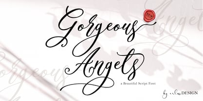 Gorgeous Angels - A Beautiful Script Font by erlosDESIGN Gorgeous Angels is a beautiful and magical modern calligraphy font, with characters that dance along the baseline. It has a casual, yet elegant touch. This font is PUA encoded which means you can access all of the glyphs and swashes with ease!
 - Amsi Pro AKS by Stawix,
$79.00 Amsi has been designed to equipped with three different widths; Normal, Narrow and Condensed, addition to expanding weights to support various usabilities ranging from Thin, XLight, Light, Regular, SemiBold, Bold, Black and Heavy. Which makes Amsi along with a numerous features support the creativities of the designer from the Font Menu.
 - Nouveau Roundcorner JNL by Jeff Levine,
$29.00 1920s sheet music for the song "You Can't Get Away From It" provided the hand lettered title which acted as the basis for Nouveau Roundcorner JNL. A square letter form with rounded terminals, this condensed face is perfect for titling, yet has a bit of an informal, casual charm to it.
 - Art Techno JNL by Jeff Levine,
$29.00 The simple song title "May I", found on the sheet music from the 1934 Bing Crosby-Carole Lombard film "We're Not Dressing" was hand lettered in a blocky, ultra-bold Art Deco design that foreshadowed the techno look of the 1970s and 1980s. This became the basis for Art Techno JNL.
 - Juwitha by Letterafandi Studio,
$14.00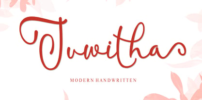 Juwitha is a modern handwitten font featuring charming, playful characters that seem to dance along the baseline. It will add a luxury spark to any design project that you wish to create! This font is PUA encoded which means you can access all of the glyphs and swashes with ease!
