10,000 search results
(0.023 seconds)
- Dheatnote by Runsell Type,
$16.00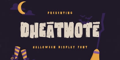 Dheatnote font is perfect for many of your projects like logos & branding, photography, invitations, watermarks, advertisements, product designs, stationery, wedding designs, labels, product packaging, special events and much more.
 - Modernist by Fly Fonts,
$15.00Modernist is a square font with very clean lines that is currently available in 4 weights. Works well in a number of sizes to create a stylish, modern look. - Weisshorn Brush by Bal Studio,
$12.00 Weisshorn Brush is a new brushed textured font which includes extra swashes. Perfect for brand projects, logos, product packaging, posters, invitations, greeting cards, news, blogs, everything including personal charm.
 - Colaste by Runsell Type,
$16.00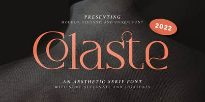 Colaste font is perfect for many of your projects like logos & branding, photography, invitations, watermarks, advertisements, product designs, stationery, wedding designs, labels, product packaging, special events and much more.
 - Rakels by Runsell Type,
$16.00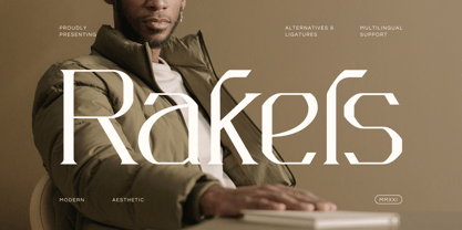 Rakels font is perfect for many of your projects like logos & branding, photography, invitations, watermarks, advertisements, product designs, stationery, wedding designs, labels, product packaging, special events and much more.
 - P22 Atomica by P22 Type Foundry,
$24.95 Atomica looks back to the dawn of the nuclear era when fall-out shelters were all the rage. This font contains 62 Atomic Age symbols and Civil Defense emblems.
 - Bestro by Maulana Creative,
$17.00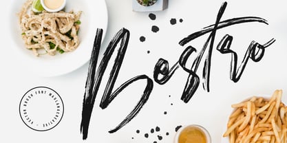 Give your designs an authentic handcrafted feel. "Bestro" is perfectly suited to signature, stationery, logo, typography quotes, magazine or book cover, website header, clothing, branding, packaging design and more.
 - Sillyheads by PizzaDude.dk,
$10.00 Need something VERY silly for your headlines and still keep the legibility?! Then Sillyheads could be your no. 1 choice! Sillyheads has got that funny, weird, cute, crazy look!
 - Cigesar by Runsell Type,
$16.00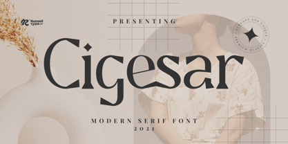 Cigesar font is perfect for many of your projects like logos & branding, photography, invitations, watermarks, advertisements, product designs, stationery, wedding designs, labels, product packaging, special events and much more.
 - Scuad by Runsell Type,
$16.00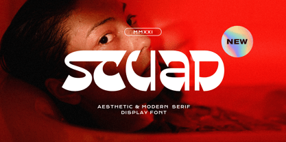 Scuad font is perfect for many of your projects like logos & branding, photography, invitations, watermarks, advertisements, product designs, stationery, wedding designs, labels, product packaging, special events and much more.
 - Roxike by Runsell Type,
$16.00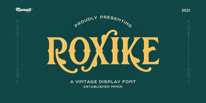 Roxike font is perfect for many of your projects like logos & branding, photography, invitations, watermarks, advertisements, product designs, stationery, wedding designs, labels, product packaging, special events and much more.
 - Cachalote by PintassilgoPrints,
$19.00 Positively bold, Cachalote was drawn by subtracting negative space. The resulting glyphs show unexpected, original forms, packed in an unicase font. Suited for impact. For the coolest looks. Positively.
 - Retro Cool by Nirmana Visual,
$22.00 Retro Cool , Inspired by 60s - 70s Design Era. Retro Cool offers beautiful typographic harmony for a diversity of design projects, including logos & branding, social media posts, advertisements & product designs.
 - Gargefo by Runsell Type,
$16.00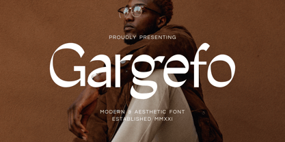 Gargefo font is perfect for many of your projects like logos & branding, photography, invitations, watermarks, advertisements, product designs, stationery, wedding designs, labels, product packaging, special events and much more.
 - Astrolove by Maulana Creative,
$15.00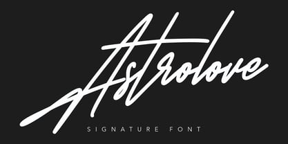 Give your designs an authentic handcrafted feel. "Astrolove" is perfectly suited to signature, stationery, logo, typography quotes, magazine or book cover, website header, clothing, branding, packaging design and more.
 - Voina by Runsell Type,
$16.00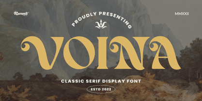 Voina font is perfect for many of your projects like logos & branding, photography, invitations, watermarks, advertisements, product designs, stationery, wedding designs, labels, product packaging, special events and much more.
 - Mollandia by Romie Creative,
$13.00 Mollandia is a romantic typefaces. bold, elegant & fun vintage script font. Can be used for various purposes.such as logos, wedding invitation, t-shirt, letterhead, signage, news, posters, badges etc.
 - Fancy Antique Display by The Infamous Foundry,
$49.00 Fancy Antique Display is a uppercase display font inspired by French decorative alphabets from the 1940's and 1950's. Perfect for headlines, logos and everything above the body.
 - Qualie by Runsell Type,
$16.00 Qualie font is perfect for many of your projects like logos & branding, photography, invitations, watermarks, advertisements, product designs, stationery, wedding designs, labels, product packaging, special events and much more.
 - Quecker by Runsell Type,
$16.00 Quecker font is perfect for many of your projects like logos & branding, photography, invitations, watermarks, advertisements, product designs, stationery, wedding designs, labels, product packaging, special events and much more.
 - Kinesthesia by Typodermic,
$11.95 Introducing Kinesthesia, the hypermodern typeface that channels the sleek, futuristic aesthetic of liquid crystal displays. With its sharp diamond points and hi-tech letterforms, Kinesthesia is the perfect choice for anyone looking to communicate their message with a cool, technical tone. Whether you’re designing a cutting-edge website, a high-tech advertisement, or a bold logo, Kinesthesia will give your work an unmistakable edge. But what sets Kinesthesia apart from other typefaces on the market? For starters, it offers a wide range of monetary symbols, as well as numeric ordinals, primes, and OpenType fractions. So whether you’re writing a report for work or creating a digital design for a client, you can be confident that Kinesthesia has all the symbols and characters you need to convey your message with precision. And of course, let’s not forget Kinesthesia’s angular design. With its sharp, diamond-shaped points, this typeface is the perfect choice for anyone looking to add a contemporary edge to their work. Available in Ultra-Light, Extra-Light, Light, Regular, Semi-Bold, Bold, and Heavy with obliques, Kinesthesia offers a wide range of weights and styles to suit any design need. So if you’re ready to take your design game to the next level, look no further than Kinesthesia. With its technical aesthetic and wide range of features, this typeface is the perfect choice for anyone looking to make a bold, unforgettable statement. Most Latin-based European writing systems are supported, including the following languages. Afaan Oromo, Afar, Afrikaans, Albanian, Alsatian, Aromanian, Aymara, Bashkir (Latin), Basque, Belarusian (Latin), Bemba, Bikol, Bosnian, Breton, Cape Verdean, Creole, Catalan, Cebuano, Chamorro, Chavacano, Chichewa, Crimean Tatar (Latin), Croatian, Czech, Danish, Dawan, Dholuo, Dutch, English, Estonian, Faroese, Fijian, Filipino, Finnish, French, Frisian, Friulian, Gagauz (Latin), Galician, Ganda, Genoese, German, Greenlandic, Guadeloupean Creole, Haitian Creole, Hawaiian, Hiligaynon, Hungarian, Icelandic, Ilocano, Indonesian, Irish, Italian, Jamaican, Kaqchikel, Karakalpak (Latin), Kashubian, Kikongo, Kinyarwanda, Kirundi, Kurdish (Latin), Latvian, Lithuanian, Lombard, Low Saxon, Luxembourgish, Maasai, Makhuwa, Malay, Maltese, Māori, Moldovan, Montenegrin, Ndebele, Neapolitan, Norwegian, Novial, Occitan, Ossetian (Latin), Papiamento, Piedmontese, Polish, Portuguese, Quechua, Rarotongan, Romanian, Romansh, Sami, Sango, Saramaccan, Sardinian, Scottish Gaelic, Serbian (Latin), Shona, Sicilian, Silesian, Slovak, Slovenian, Somali, Sorbian, Sotho, Spanish, Swahili, Swazi, Swedish, Tagalog, Tahitian, Tetum, Tongan, Tshiluba, Tsonga, Tswana, Tumbuka, Turkish, Turkmen (Latin), Tuvaluan, Uzbek (Latin), Venetian, Vepsian, Võro, Walloon, Waray-Waray, Wayuu, Welsh, Wolof, Xhosa, Yapese, Zapotec Zulu and Zuni.
 - Brownstone Sans by Sudtipos,
$59.00 One design sparks another. As Alejandro Paul experimented with the strokes and curves of the monoline script Business Penmanship, he discovered interesting new forms and shapes that didn't fit the Spencerian theme of that typeface. These forms simmered in Ale’s subconscious over the next three years, during which time he visited New York City, pored over rare type specimen books in the New York Public Library, and explored Brooklyn’s neighborhoods. Brownstone, the face born from these explorations, is an original 21st-century design, yet one subtly infused with historical and cultural references -- keen observers might spot influences from decorative typefaces of 19th-century foundries. And just as faces from that era were influenced by contemporary architecture, the frames included with Brownstone echo the ornate iron railings of Park Slope’s row houses. (There’s also a slight 1960s vibe to Brownstone, of novelty swash-sans photocompositing faces, that can be played up at your discretion.) Influences aside, Brownstone has broad appeal to modern audiences. A soft, monoline sans-serif, with elements of Swiss geometry (see the ‘k’ and ‘x’), its marriage of highly legible, draftsman-like letterforms with decorative swashes and ornaments reflects the old-meets-new aesthetic of the DIY craft culture seen in Brooklyn and other urban centers. It’s ornamental but unfussy, romantic but understated. Brownstone includes character sets for Latin-based languages, including Western and Eastern European, Baltic, Turkish, Maltese, Celtic and Welsh. Over 1500 glyphs, including small capitals, swash characters, alternates, and ligatures, in both Light and Thin weights. Ornamental frames are also included in both weights. The Brownstone Frames fonts are available as separate fonts in the new Brownstone Slab family.
 - Sonrisa by CastleType,
$59.00 Sonrisa is a design that evolved from my sketches of the skeletal structure of Jakob Erbar’s Koloss, trying to discover its underlying essence without all the contrast and bulkiness of the original design. Sonrisa Thin was the resulting font, from which the other weights of the family were developed. Gentle curves, open counters, generous x-height, and sleekly tapered terminals give Sonrisa a very legible, modern, elegant appearance. When she saw the first draft of this typeface, the smile on my friend Jennifer’s face gave me the idea to call it “Sonrisa” (Spanish for “smile”). Jennifer, a clinical psychologist, described Sonrisa’s personality as: "happy, clean, clear, open, joyful, spacious, playful, calm. I can see it being used for body product lines such as oils and lotions. Can see it being used in home/travel magazines or even Architectural Digest. Yoga magazine, definitely." Sonrisa is what some foundries call a “Pro” typeface family with all the bells and whistles that provide typographic versatility: true small caps, oldstyle numerals, arbitrary fractions, discretionary ligatures, and other powerful OpenType features. All fonts in the family, except Sonrisa Titling, support most European languages, including modern Greek and languages that use the Cyrillic Alphabet. (Cyrillic glyphs designed in consultation with Ukrainian type designer, Sergiy S. Tkachenko.) Sonrisa is available in the original Thin, monoline version as well as six weights (Light, Regular, Medium, Bold, Extra Bold, Black), and a Titling font that is essentially a display font construction kit. If you enjoy using Sonrisa even half as much as I enjoyed creating it, then I know you will have a “sonrisa” (smile) on your face!
 - ITC Tactile by ITC,
$29.99ITC Tactile is a puzzle of subtle typographic contradictions. Capitals have traditional epigraphic proportions, but the lowercase has a uniform optical width. Light weights are stately and elegant, but bold designs are almost jolly. This paradoxical alphabet even combines two distinctively different serif designs. Designer Joe Stitzlein says, “I wanted to create a modern and dynamic serif face that draws its forms from antiquity. I also wanted to have as much fun as possible with the drawing and architecture of each letter. Hopefully I've created a very legible typeface that grabs the reader's eye in a nice, 'tactile' way.” The apparent inconsistencies of the design are the result of careful consideration. Of the seemingly odd serif design, Stitzlein explains, “The transitional serif is an entry point for the eye into the letterform, and the long slab is an exit, leading to the next letter.” The result is a typeface that's easy to read at text sizes but offers surprising details when enlarged to display sizes, setting ITC Tactile apart from more traditional designs. While this is his first commercial typeface design, Stitzlein has ample experience creating custom typefaces for corporate branding, including companies such as Silicon Graphics and Sempra Energy. His graphic design business has served a wide range of clients, including Apple Computer and the 2002 Salt Lake City Olympics. The ITC Tactile family is available in three weights, with complementary italic designs and a suite of small caps for each of the roman designs. Stitzlein drew the small caps to match the height of the lowercase x-height, which enables “bi-form” or “unicase” setting in display copy. - Torcao by insigne,
$24.00 Torcao is one of the sporks of the font universe, a useful and functional outlier. Half square, half circle, this uncommon squircle of a family with its asymmetry of curved and angular shapes drives through headlines and body copy with forward velocity. The robust, technical appearance is light-hearted and inviting, and its organic nature plays off of its one-of-a-kind kinks and hybrid forms. Torcao is not merely an experimental font, though. The figures have been crafted and refined into a functional, hard-working typeface that lends itself to many sizes and environments. The font family features a tall x-height and light modulation, which give the typography its unique color highly effective in headlines but still quite legible in longer text. This family contains a comprehensive range of nine weights--slender to black--and features condensed and extender selections for a complete set of forty-eight fonts. The font has been decked out for experienced typographers, together with swash alternates and simplified titling. The typeface also contains a range of numeral sets, together with fractions and old-style figures. OpenType-capable programs including Quark or the Adobe suite allow quick changes to ligatures and alternates. Previews of these options can be found in the .pdf brochure. Torcao also features the glyphs to enable all Central, Eastern, and Western European languages. In all, the font supports around forty languages that utilize the prolonged Latin script, making it an excellent option for multi-lingual publications and packaging. Simple, technical, and open, the Torcao type family could just be the perfect choice for your web type or print project.
 - Simplo by Durotype,
$49.00 Simplo: the ‘Italian Futura’. Simplo is a geometric sans serif typeface, built in sixteen styles. It is a tribute to the 1930s typeface Semplicità, designed by Nebiolo’s Alessandro Butti. Although many details of Simplo differ from Semplicità, it preserves the spirit of the original. Simplo is ideal for use in display sizes. It is also quite legible in text, and is well suited for graphic design and corporate identity design. Simplo has sixteen styles, extensive language support, eight different kinds of figures, sophisticated OpenType features — so it’s ready for advanced typographic projects. The most notable characteristics of this typeface are the ‘t’ and the ‘f’. The ‘t’ is the culmination of simplicity: a vertical line with just a simple right-side crossbar. The ‘f’ also has just a right-side crossbar, and is really tall: it reaches both the highest and lowest vertical position of the typeface. The top of the distinctive ‘s’, is much narrower than its bottom. The ‘a’, ‘b’, ‘d’, ‘g’, ‘p’, ‘q’, and ‘u’ are spurless, and show a family resemblance with Hans Reichel’s 1990s typeface Dax. However, these letters are rounder and more geometric than Dax’s counterparts, because of Dax’s higher x-height and narrower design. In Paul Shaw’s Imprint article about typefaces that have been overlooked and/or underappreciated, “Overlooked Typefaces”, he concluded his discussion of Semplicità as follows: “These idiosyncrasies suggest that Semplicità might find a warm reception today, given the current love affair with Gotham, Neutraface and Proxima—and the resurgence of ITC Avant-Garde Gothic.” Free demo font available. For more information about Simplo, download the PDF Specimen Manual.
 - Range Serif by Eclectotype,
$36.00 Range Serif is a sharp, contemporary, wedge serif typeface with just a hint of fraktur influence. There are five weights from light to black, each with corresponding italics. This is a typeface designed for demanding typographic work; it’s legible at small sizes, but unique at display sizes. There is an abundance of OpenType features in each font, including: Ligatures - all fonts contain standard f-ligatures. Contextual Alternates - Range Serif has been carefully designed to not ‘need’ ligatures. If you choose to deactivate them, the contextual alternates feature will make sure an alternative f is used before certain letters to avoid clashing. Fractions - When activated, numbers separated by a slash will automagically turn into fractions. Numerals - There are many different figure sets. These are Proportional Lining, Tabular Lining, Proportional Oldstyle, Tabular Oldstyle, Superiors and Scientific Inferiors. A slashed zero feature is also included. Small Caps - All styles include small caps, for both small caps and capitals to small caps functions. Ornaments - For convenience, the arrows are grouped in the ornaments feature. Case Sensitive Forms - There are different punctuation and bracket glyphs for all caps usage. Stylistic Alternates / SS01 - The italic fonts contain alternates for the letters A, K, R, U and X. Range Serif is a versatile and fully-featured typeface, ideal for corporate identities, contemporary art catalogs, even t-shirt slogans. The language coverage is impressive (Latin Extended A is fully covered) so Range Serif should prove a useful text and display workhorse for speakers of many different tongues. The typeface includes an array of currency symbols, including the new symbols for Indian Rupee and Turkish Lira. Also check out the accompanying sans serif version, Range Sans.
 - Karoline by Gilar Studio,
$16.00 Karoline is a lovely script font with beginning and ending swashes, 31 ligatures that add more beautiful and aesthetic fonts to perfect your extraordinary project. Karoline is a lovely script with handwritten, sophisticated flows. It is perfect for branding, wedding invites, and other romantic projects. "Karoline" includes a full set of uppercase and lowercase letters, multilingual symbols, Alternate,numerals, punctuation and ligatures. Also it includes: -short lowercase beginning and ending swashes which serve to connect two words or letters (This is so perfect for invitations, monograms) All of features and special characters of this font are included in one file. So it is easy to accessed by using program or software that support the opentype like Adobe Illustrator, Adobe Photosop, and Adobe Indesign). This font also very easy to use because compatible for all software even for non-opentype supported.so it would be perfect for all types of printing techniques+you can do embroidery, laser-cut, gold foil, etc. You can mix and match with Opentype feature: Ekstras 31 ligature More than 540 of glyphs Alternates Stylistic sets from ss01 to ss04 If you don't have a program that supports OpenType features such as Adobe Illustrator and CorelDraw X Versions, you can access all the alternate glyphs using Font Book (Mac) or Character Map (Windows). To Access Alternate Characters Click The Link Below: Adobe illustrator CS https://www.youtube.com/watch?v=geL0Ye02Ryk Adobe illustrator CC https://www.youtube.com/watch?v=V25yiUh8BcE Ms Word https://www.youtube.com/watch?v=HxkhZiCuwEw Coreldraw X7 https://www.youtube.com/watch?v=UBVsufJjons Adobe Photoshop CC https://www.youtube.com/watch?v=BYKXl58AdNY Indesign CS https://www.youtube.com/watch?v=HgZTCxKG14Q Check my other Font here : https://gilarstudio.com/ Thanks and happy designing :-)
 - Franzi Variable by Wannatype,
$211.00 The new sans-serif Franzi typeface family – as neutral as can be, but at the same time individual and striking. Its unmistakable character lies in the detail, with no effect pushing itself to the fore. As a wide-running typeface with a relatively large x-height, the typeface family is perfectly suited to small text sizes but, with its elegant details, it leaves nothing to be desired in display applications either. Originally designed with constructed, often rectangular elements, Franzi has gradually been rounded during the development process and is now less hard in order to guarantee optimal legibility. Franzi Variable is designed alongside the italic and the weight axes. The italics are softly and elegantly drawn, while the upright characters appear much more severe. The design appeal reveals itself in the two-storey ‘a’ – a tribute to legibility in body copy; however, for those who prefer the geometric in applications, an alternative single-storey ‘a’ is also available. All styles have small caps, superscript and subscript lowercase letters, lining, non-lining and small caps figures, fractions as well as several ligatures, alternative fonts, symbols and arrows. The Latin uppercase letters are also available as discreet swash variants. In addition to the extended Latin alphabet, the typeface family also includes the complete Greek, Cyrillic and International Phonetic Alphabet IPA. Franzi was created as a further development of an order to produce a sign for a therapy practice in Vienna’s Franz-Hochedlinger-Gasse – hence the name, which is more common as an abbreviation for Franziska than as a diminutive for the male name Franz: Franzi is therefore a hybrid typeface name which has female tendencies.
 - Aure Jane by Aure Font Design,
$23.00 Aure Jane defines grace under fire. These clean, sans-serif forms engage the reader with a subtext of trust. Jane’s excellent legibility will stand up under almost any typographic challenge, bringing confidence to text and titles, and clarity to astrological expressions and chartwheels. Jane is an original design developed by Aurora Isaac. After more than a decade in development, 2018 marks the first release of the CJ and KB glyphsets in regular, italic, bold, and bold-italic. The CJ glyphset is a full text font supporting a variety of European languages. A matching set of small-caps complements the extended lowercase and uppercase glyphsets. Supporting glyphs include standard ligatures, four variations of the ampersand, and check-mark and happy-face with their companions x-mark and grumpy-face. Numbers are available in lining, oldstyle, and small versions, with numerators and denominators for forming fractions. Companion glyphs include Roman numerals, specialized glyphs for indicating ordinals, and a variety of mathematical symbols and operators. The CJ glyphset also includes an extended set of glyphs for typesetting Western Astrology. These glyphs are also available separately in the KB glyphset: a symbol font re-coded to allow easy keyboard access for the most commonly used glyphs. In addition to Aure Jane’s versatility as a text font, Jane can enhance the message of other designs. Aure Jane pairs well as an innocuous foil to any decorative font; Aure Sable, for example, will shine all the more beside Jane’s sensible utility. The witty highlights of Aure Brash will sparkle against Jane’s practicality. Give Aure Jane a trial run! You may discover a permanent place for this font family in your typographic palette. AureFontDesign.com
 - European Soft Pro by Bülent Yüksel,
$19.00 EUROPEAN SOFT PRO ABOUT FAMILY: What makes "European Soft Pro" elegant, friendly and contemporary is its very rounded curves with very open terminals. "European Soft Pro" has been designed with a higher "x-height" than other fonts in its class to make tiny readability more obvious in any use situation. It will be ideal for use in small sizes such as business cards or mobile applications. This typeface is also equipped with powerful OpenType features to satisfy the most demanding professionals. It has solid features like case sensitivity, small, true capitals, full ligatures, tabular figures for tables, old style figures to elegantly insert numbers into your sentences and more alternative characters to give personality to your projects. The extended, "European Soft Pro" supports around 85 languages in the Latin, Cyrillic and Greek scripts, and its non-Latin components were developed with native consultants. With over 1200+ glyphs per style, "European Soft Pro" cares about localised letterforms and has the OpenType features to match. FEATURE SUMMARY: - 9 weights: Thin, ExtraLight, Light, Book, Regular, Medium, Bold, ExtraBold, and Black. - 4 widths: Normal, Narrow, Condensed, and Extra Condensed. - Matching italics (12º) for all weights and widths . - Matching small caps for all weights and widths. - Lining and old style figures (proportional and tabular). - Alternate characters (A, G, M, N, R, U, a, g, l, m, n, u, y). - Unlimited fractions. - Automatic ordinals (1st, 2nd, 3rd, etc.). - 24 Dingbats + 19 Social Media and Block Chain icons. - Extended language support: Most Latin-based scripts (including Vietnamese), Cyrillic, and Greek. - Extended currency support. You can contact me at buyuksel@hotmail.com, pre-purchase and post-purchase with questions and for technical support. You can enjoy using it.
 - European Sans Pro by Bülent Yüksel,
$19.00 EUROPEAN SANS PRO ABOUT FAMILY: What makes "European Sans Pro" elegant, friendly and contemporary is its very rounded curves with very open terminals. "European Sans Pro" has been designed with a higher "x-height" than other fonts in its class to make tiny readability more obvious in any use situation. It will be ideal for use in small sizes such as business cards or mobile applications. This typeface is also equipped with powerful OpenType features to satisfy the most demanding professionals. It has solid features like case sensitivity, small, true capitals, full ligatures, tabular figures for tables, old style figures to elegantly insert numbers into your sentences and more alternative characters to give personality to your projects. The extended, "European Sans Pro" supports around 85 languages in the Latin, Cyrillic and Greek scripts, and its non-Latin components were developed with native consultants. With over 1200+ glyphs per style, "European Sans Pro" cares about localised letterforms and has the OpenType features to match. FEATURE SUMMARY: - 9 weights: Thin, ExtraLight, Light, Book, Regular, Medium, Bold, ExtraBold, and Black. - 4 widths: Normal, Narrow, Condensed, and Extra Condensed. - Matching italics (12º) for all weights and widths . - Matching small caps for all weights and widths. - Lining and old style figures (proportional and tabular). - Alternate characters (A, G, M, N, R, U, a, g, l, m, n, u, y). - Unlimeted fractions. - Automatic ordinals (1st, 2nd, 3rd, etc.). - 24 Dingbats + 19 Social Media and Block Chain icons. - Extended language support: Most Latin-based scripts (including Vietnamese), Cyrillic, and Greek. - Extended currency support. You can contact me at buyuksel@hotmail.com, pre-purchase and post-purchase with questions and for technical support. You can enjoy using it.
 - Aspire SmallCaps by Grype,
$18.00 Geometric/Technical style logotypes have been developed for car chrome labels since the early 1980's. Many of these sleek logotypes are lacking an expansive family to enhance and express their brand in a richer sense, becoming true brand workhorses. The Aspire SmallCaps family finds its origin of inspiration in the ACURA automotive company logo, and from there expands to an 6 font family of weights & oblique styles, striving to become a workhorse. Aspire SmallCaps is perhaps the most true to form tribute to the original all capitals inspiration logotype. It maintains all capital forms (whether standard or smallcaps) and yet is still strikingly powerful in its presence and readability including numerals, and a comprehensive range of weights, creating a straightforward, uncompromising collection of typefaces that lend a solid foundation and a broad range of expression for designers. Here's what's included with the Aspire SmallCaps Family bundle: - 438 glyphs per style - including Capitals, Small Caps, Numerals, Punctuation and an extensive character set that covers multilingual support of latin based languages. (see the 6th graphic for a preview of the characters included) - Stylistic Alternates - alternate characters that remove the angled stencil cuts for a more standardized text look. - 3 weights in the family: Light, Regular, & Black. - 3 obliques in the family, one for each weight: Light, Regular, & Black. - Fonts are provided in TTF & OTF formats. The TTF format is the standard go to for most users, although the OTF and TTF function exactly the same. Here's why the Aspire SmallCaps Family is for you: - You're in need of automotive sans font family with a range of weights and obliques - You're love that ACURA letter styling, and want to design anything within that genre - You're looking for an alternative to Eurostile with more stylized letterforms. - You're looking for a battle-tech typeface for your futuristic war chest labelling. - You just like to collect quality fonts to add to your design arsenal
 - Duality by Typodermic,
$11.95 Are you ready to unleash your wild side? Look no further than Duality, the tough and eccentric display typeface that will add a truly unique and unforgettable flair to your message. These fonts are not for the faint of heart—their wild slab-serifs and insane ball-terminals will make your text stand out in a sea of bland and boring fonts. Choose from three different styles to make your message truly pop. The regular style is perfect for making a bold statement, while the gritty Sand style adds an extra layer of texture and edge. And if you really want to make a statement, go for the letterpress Steel style—its rugged, industrial look will make your text look like it was stamped onto the page with raw, unbridled power. Whether you’re designing a poster, a logo, or anything in between, Duality is the perfect choice for anyone who wants to inject some wild, untamed energy into their typography. So go ahead, embrace the madness, and let Duality take your design to the next level. Most Latin-based European writing systems are supported, including the following languages. Afaan Oromo, Afar, Afrikaans, Albanian, Alsatian, Aromanian, Aymara, Bashkir (Latin), Basque, Belarusian (Latin), Bemba, Bikol, Bosnian, Breton, Cape Verdean, Creole, Catalan, Cebuano, Chamorro, Chavacano, Chichewa, Crimean Tatar (Latin), Croatian, Czech, Danish, Dawan, Dholuo, Dutch, English, Estonian, Faroese, Fijian, Filipino, Finnish, French, Frisian, Friulian, Gagauz (Latin), Galician, Ganda, Genoese, German, Greenlandic, Guadeloupean Creole, Haitian Creole, Hawaiian, Hiligaynon, Hungarian, Icelandic, Ilocano, Indonesian, Irish, Italian, Jamaican, Kaqchikel, Karakalpak (Latin), Kashubian, Kikongo, Kinyarwanda, Kirundi, Kurdish (Latin), Latvian, Lithuanian, Lombard, Low Saxon, Luxembourgish, Maasai, Makhuwa, Malay, Maltese, Māori, Moldovan, Montenegrin, Ndebele, Neapolitan, Norwegian, Novial, Occitan, Ossetian (Latin), Papiamento, Piedmontese, Polish, Portuguese, Quechua, Rarotongan, Romanian, Romansh, Sami, Sango, Saramaccan, Sardinian, Scottish Gaelic, Serbian (Latin), Shona, Sicilian, Silesian, Slovak, Slovenian, Somali, Sorbian, Sotho, Spanish, Swahili, Swazi, Swedish, Tagalog, Tahitian, Tetum, Tongan, Tshiluba, Tsonga, Tswana, Tumbuka, Turkish, Turkmen (Latin), Tuvaluan, Uzbek (Latin), Venetian, Vepsian, Võro, Walloon, Waray-Waray, Wayuu, Welsh, Wolof, Xhosa, Yapese, Zapotec Zulu and Zuni.
 - Gameness by Typodermic,
$11.95 Step back into the 1990s with Gameness, the font that embodies the spirit of the era’s gaming culture. Inspired by the Game Boy box art for Final Fantasy Adventure, Gameness evokes a sense of nostalgia while still looking fresh and modern. But this isn’t just any retro font. Gameness is sleek and sophisticated, with a narrow elegance that sets it apart from other throwback designs. Its tall letters are perfect for headlines, logos, and branding materials, giving your projects a bold, confident look. For clients who demand only the best, Gameness comes with an alternate barred “A”, adding even more versatility to your designs. And in OpenType-enabled applications, the “S” shape subtly alters to match the adjacent letters, ensuring a smooth, harmonious look every time. So why settle for ordinary fonts when you can make a statement with Gameness? Download it now and bring a touch of retro cool to your next project. Most Latin-based European writing systems are supported, including the following languages. Afaan Oromo, Afar, Afrikaans, Albanian, Alsatian, Aromanian, Aymara, Bashkir (Latin), Basque, Belarusian (Latin), Bemba, Bikol, Bosnian, Breton, Cape Verdean, Creole, Catalan, Cebuano, Chamorro, Chavacano, Chichewa, Crimean Tatar (Latin), Croatian, Czech, Danish, Dawan, Dholuo, Dutch, English, Estonian, Faroese, Fijian, Filipino, Finnish, French, Frisian, Friulian, Gagauz (Latin), Galician, Ganda, Genoese, German, Greenlandic, Guadeloupean Creole, Haitian Creole, Hawaiian, Hiligaynon, Hungarian, Icelandic, Ilocano, Indonesian, Irish, Italian, Jamaican, Kaqchikel, Karakalpak (Latin), Kashubian, Kikongo, Kinyarwanda, Kirundi, Kurdish (Latin), Latvian, Lithuanian, Lombard, Low Saxon, Luxembourgish, Maasai, Makhuwa, Malay, Maltese, Māori, Moldovan, Montenegrin, Ndebele, Neapolitan, Norwegian, Novial, Occitan, Ossetian (Latin), Papiamento, Piedmontese, Polish, Portuguese, Quechua, Rarotongan, Romanian, Romansh, Sami, Sango, Saramaccan, Sardinian, Scottish Gaelic, Serbian (Latin), Shona, Sicilian, Silesian, Slovak, Slovenian, Somali, Sorbian, Sotho, Spanish, Swahili, Swazi, Swedish, Tagalog, Tahitian, Tetum, Tongan, Tshiluba, Tsonga, Tswana, Tumbuka, Turkish, Turkmen (Latin), Tuvaluan, Uzbek (Latin), Venetian, Vepsian, Võro, Walloon, Waray-Waray, Wayuu, Welsh, Wolof, Xhosa, Yapese, Zapotec Zulu and Zuni.
 - Gloss by Typodermic,
$11.95 Are you ready to unleash your inner punk fashionista? Look no further than Gloss, the ultimate typeface for anyone who wants to make a statement. With its roots in Champion, a classic metal script from the ’50s, Gloss combines vintage vibes with a modern twist. But don’t be fooled by its retro origins—this font is anything but ordinary. Thanks to OpenType ligatures, each paint drip in Gloss is unique and unpredictable, adding a touch of spontaneity to your designs. And when set on an incline, the slightly skewed letters make a bold and dramatic statement. But what really sets Gloss apart is its trashy fashion edge. With a twice-recycled look that blends the best of the ’50s and ’80s, Gloss is the perfect choice for anyone who wants to embrace their inner rebel. So why settle for ordinary when you can make a splash with Gloss? Whether you’re designing a poster, creating a logo, or just looking to add some edge to your typography, Gloss is the ultimate choice for anyone who wants to stand out from the crowd. Most Latin-based European writing systems are supported, including the following languages. Afaan Oromo, Afar, Afrikaans, Albanian, Alsatian, Aromanian, Aymara, Bashkir (Latin), Basque, Belarusian (Latin), Bemba, Bikol, Bosnian, Breton, Cape Verdean, Creole, Catalan, Cebuano, Chamorro, Chavacano, Chichewa, Crimean Tatar (Latin), Croatian, Czech, Danish, Dawan, Dholuo, Dutch, English, Estonian, Faroese, Fijian, Filipino, Finnish, French, Frisian, Friulian, Gagauz (Latin), Galician, Ganda, Genoese, German, Greenlandic, Guadeloupean Creole, Haitian Creole, Hawaiian, Hiligaynon, Hungarian, Icelandic, Ilocano, Indonesian, Irish, Italian, Jamaican, Kaqchikel, Karakalpak (Latin), Kashubian, Kikongo, Kinyarwanda, Kirundi, Kurdish (Latin), Latvian, Lithuanian, Lombard, Low Saxon, Luxembourgish, Maasai, Makhuwa, Malay, Maltese, Māori, Moldovan, Montenegrin, Ndebele, Neapolitan, Norwegian, Novial, Occitan, Ossetian (Latin), Papiamento, Piedmontese, Polish, Portuguese, Quechua, Rarotongan, Romanian, Romansh, Sami, Sango, Saramaccan, Sardinian, Scottish Gaelic, Serbian (Latin), Shona, Sicilian, Silesian, Slovak, Slovenian, Somali, Sorbian, Sotho, Spanish, Swahili, Swazi, Swedish, Tagalog, Tahitian, Tetum, Tongan, Tshiluba, Tsonga, Tswana, Tumbuka, Turkish, Turkmen (Latin), Tuvaluan, Uzbek (Latin), Venetian, Vepsian, Võro, Walloon, Waray-Waray, Wayuu, Welsh, Wolof, Xhosa, Yapese, Zapotec Zulu and Zuni.
 - Lonsdale by Typodermic,
$11.95 Introducing Lonsdale, the ultimate disconnected script typeface that’s going to take your designs to the next level. With its elegant curves and unique technical quality, Lonsdale is the perfect choice for those looking to add a touch of sophistication to their designs. Partially based on the iconic Parkway Script font produced by Emil Hirt in 1964, Lonsdale combines classic script elements with a contemporary twist. The result is a font that not only looks stunning, but also instills a sense of serenity in your designs. One of the most striking features of Lonsdale is its curved corners, which give it a soft, gentle look that’s sure to catch the eye. Whether you’re designing a logo, a poster, or anything in between, Lonsdale will help you create a design that’s truly unforgettable. So why wait? Add Lonsdale to your font collection today and start creating designs that are as sweet as they are beautiful! Most Latin-based European writing systems are supported, including the following languages. Afaan Oromo, Afar, Afrikaans, Albanian, Alsatian, Aromanian, Aymara, Bashkir (Latin), Basque, Belarusian (Latin), Bemba, Bikol, Bosnian, Breton, Cape Verdean, Creole, Catalan, Cebuano, Chamorro, Chavacano, Chichewa, Crimean Tatar (Latin), Croatian, Czech, Danish, Dawan, Dholuo, Dutch, English, Estonian, Faroese, Fijian, Filipino, Finnish, French, Frisian, Friulian, Gagauz (Latin), Galician, Ganda, Genoese, German, Greenlandic, Guadeloupean Creole, Haitian Creole, Hawaiian, Hiligaynon, Hungarian, Icelandic, Ilocano, Indonesian, Irish, Italian, Jamaican, Kaqchikel, Karakalpak (Latin), Kashubian, Kikongo, Kinyarwanda, Kirundi, Kurdish (Latin), Latvian, Lithuanian, Lombard, Low Saxon, Luxembourgish, Maasai, Makhuwa, Malay, Maltese, Māori, Moldovan, Montenegrin, Ndebele, Neapolitan, Norwegian, Novial, Occitan, Ossetian (Latin), Papiamento, Piedmontese, Polish, Portuguese, Quechua, Rarotongan, Romanian, Romansh, Sami, Sango, Saramaccan, Sardinian, Scottish Gaelic, Serbian (Latin), Shona, Sicilian, Silesian, Slovak, Slovenian, Somali, Sorbian, Sotho, Spanish, Swahili, Swazi, Swedish, Tagalog, Tahitian, Tetum, Tongan, Tshiluba, Tsonga, Tswana, Tumbuka, Turkish, Turkmen (Latin), Tuvaluan, Uzbek (Latin), Venetian, Vepsian, Võro, Walloon, Waray-Waray, Wayuu, Welsh, Wolof, Xhosa, Yapese, Zapotec Zulu and Zuni.
 - Raincoat by Typodermic,
$11.95 Looking for a typeface that oozes class and style? Look no further than Raincoat. This stunning display font combines the best of both worlds, with a geometric sans serif that’s been given a timeless, antique feel. But Raincoat is more than just a pretty face. With its OpenType features, it’s a font that can truly personalize your designs. Letter combinations are transformed into custom ligatures, making your work truly unique. From the altered ends of the “T” to the interlocking rings of the “O”, Raincoat is a typeface that adds a touch of personality to any design. So if you’re looking to make a statement, whether it’s for a logo, poster, or website, Raincoat is the perfect choice. With its candid style and classy design, it’s a font that’s sure to impress. So why not try Raincoat today and see for yourself the creative design options it can bring to your work? Most Latin-based European, Greek, and most Cyrillic-based writing systems are supported, including the following languages. Afaan Oromo, Afar, Afrikaans, Albanian, Alsatian, Aromanian, Aymara, Bashkir, Bashkir (Latin), Basque, Belarusian, Belarusian (Latin), Bemba, Bikol, Bosnian, Breton, Bulgarian, Buryat, Cape Verdean, Creole, Catalan, Cebuano, Chamorro, Chavacano, Chichewa, Crimean Tatar (Latin), Croatian, Czech, Danish, Dawan, Dholuo, Dungan, Dutch, English, Estonian, Faroese, Fijian, Filipino, Finnish, French, Frisian, Friulian, Gagauz (Latin), Galician, Ganda, Genoese, German, Greek, Greenlandic, Guadeloupean Creole, Haitian Creole, Hawaiian, Hiligaynon, Hungarian, Icelandic, Ilocano, Indonesian, Irish, Italian, Jamaican, Kalmyk, Kaqchikel, Karakalpak (Latin), Kashubian, Kazakh, Khalkha, Kikongo, Kinyarwanda, Kirundi, Komi-Permyak, Kurdish, Kurdish (Latin), Kyrgyz, Latvian, Lithuanian, Lombard, Low Saxon, Luxembourgish, Maasai, Macedonian, Makhuwa, Malay, Maltese, Māori, Moldovan, Montenegrin, Ndebele, Neapolitan, Norwegian, Novial, Occitan, Ossetian, Ossetian (Latin), Papiamento, Piedmontese, Polish, Portuguese, Quechua, Rarotongan, Romanian, Romansh, Russian, Rusyn, Sami, Sango, Saramaccan, Sardinian, Scottish Gaelic, Serbian, Serbian (Latin), Shona, Sicilian, Silesian, Slovak, Slovenian, Somali, Sorbian, Sotho, Spanish, Swahili, Swazi, Swedish, Tagalog, Tahitian, Tajik, Tatar, Tetum, Tongan, Tshiluba, Tsonga, Tswana, Tumbuka, Turkish, Turkmen (Latin), Tuvaluan, Ukrainian, Uzbek, Uzbek (Latin), Venetian, Vepsian, Võro, Walloon, Waray-Waray, Wayuu, Welsh, Wolof, Xhosa, Yapese, Zapotec Zulu and Zuni.
 - Aspire by Grype,
$18.00 Geometric/Technical style logotypes have been developed for car chrome labels since the early 1980’s. The styles are loaded with inspiration for great font families, but surprisingly, many of these sleek logotypes are lacking an expansive family to enhance and express their brand in a richer sense, becoming true brand workhorses. The Aspire family finds its origin of inspiration in the ACURA automotive company logo, and from there expands to an 6 font family of weights & oblique styles. Aspire pays homage the techno display styling of the inspiration logotype, further evolving beyond its brand inspired origin to give birth to a font family that pulls on modern and historical styles. It adopts a sturdy yet approachable style with its uniform stroke forms and curves, and goes on to include a lowercase, numerals, and a comprehensive range of weights, creating a straightforward, uncompromising collection of typefaces that lend a solid foundation and a broad range of expression for designers. Here’s what’s included with the Aspire Family bundle: 477 glyphs per style - including Capitals, Lowercase, Numerals, Punctuation and an extensive character set that covers multilingual support of latin based languages. (see the 6th graphic for a preview of the characters included) Stylistic Alternates - alternate characters that remove the angled stencil cuts for a more standardized text look. 3 weights in the family: Light, Regular, & Black. 3 obliques in the family, one for each weight: Light, Regular, & Black. Fonts are available in TTF & OTF formats. The TTF format is the standard go to for most users, although the OTF and TTF function exactly the same. Here’s why the Aspire Family is for you: - You’re in need of automotive sans font family with a range of weights and obliques. - You’re love that ACURA letter styling, and want to design anything within that genre. - You’re looking for an alternative to Eurostile with more stylized letterforms. - You’re looking for a clean techno typeface for your starship console labelling. - You just like to collect quality fonts to add to your design arsenal.
 - Hamptons BF by Bomparte's Fonts,
$40.00 Hamptons BF is a beautiful, elegant sans serif with dramatic individuality. A font that steps out in Art Deco style. As a design movement Art Deco came into prominence during the 1920s and 30s when forms were typically sleek, symmetrical, geometric or highly stylized. Today the influence of this enduring style can be clearly seen in architecture, industrial design, fashion, art, graphic design, and yes, even type design. Art Deco style exemplifies luxury, glamour and modernity. I believe Hamptons BF captures something of that retro look in a nod to the past without ever looking dated, all the while retaining a contemporary flair. Named after the well-known New York resorts synonymous with style and elegance, this gothic or sans serif type is based upon University Roman, an early 1970s serif design which in turn was influenced by yet another serif design called Forum Flair (late 1960s); and that in turn owes its pedigree to the late 1930s’ Stunt Roman, which is the original source of inspiration for all of these. Quite a family tree! There’s dynamic interplay between certain wide, full-round letters such as C, D, G, O, P, Q, R, S and narrow ones like A, E, F, H, K, L, M, N, U, etc. This contrast repeats throughout certain lower case letters and serves to create a unique look of distinction. Light and Regular weights communicate a romantic, feminine appeal while the Bold offers a complementary emphasis. The font is somewhat versatile as in addition to its primary purpose for display, Hamptons BF also succeeds in settings containing short blocks of large text. It’s right at home in a variety of typographic environments: branding, packaging, signage logos, magazine headlines, invitations, menus, trendy cafes and more. Among the included OpenType features are Stylistic Alternates, Automatic Ligatures and Fractions. There is extended language support for Western, Central and Eastern Europe and Turkish.