10,000 search results
(0.021 seconds)
- LiebeFish by LiebeFonts,
$19.90 LiebeFish is a collection of 172 individually hand-drawn fish. Each has its very own personality; some are happy, some are sad. Some like company, some are bored, most are cute and a few are weird. If you look closely, some fish will surely look like people you know. LiebeFish probably is the most comprehensive collection of hand-drawn fish ever. They look great on almost any greeting card, birthday card or invitation. LiebeFish also serve as a perfect companion to any informal graphic design that needs a personal, handmade touch. If you like this font, have a look at our other cute fonts such as LiebeTweet and LiebeRobots.
 - CA Cula by Cape Arcona Type Foundry,
$40.00 CA Cula is standing in the tradition of cool tempered sans serif typefaces like DIN. But at a closer look it reveals a tendency towards rounder reading-friendly forms. The denaturalized ink traps give CA Cula a very special and individual look in display sizes, whereas in smaller sizes the positive aspects of huge ink traps show effect. The text looks clean and bright without black dots in the typographic image. This makes CA Cula suitable even for longer text, while the bold weight makes pretty cool headlines. The choice of weights aims at an easy straight forward use. A set of five well balanced weights ought to be enough to cover most needs without throwing the typographer into questions like: demibold or semibold? If you are looking for the extra kick, look out for CA Cula Superfat.
 - Rammstein - Unknown license

- Snip Tuck by BA Graphics,
$45.00A well balanced distinctive look; great for all applications. - Rancho Grande by BA Graphics,
$45.00A well balanced distinctive look; great for all applications. - Metro Gothic by BA Graphics,
$45.00An up-beat gothic with that trendy retro look. - Orange Whip by G. Alex Gonzalez,
$10.00Get that vintage sign lettering look with Orange Whip. - Droporado 4F by 4th february,
$30.00 Funny font for decorating posters, logos and small headings.
 - Lorraine Script by BA Graphics,
$45.00A powerful yet elegant script with a unique look. - Maslul MF by Masterfont,
$59.00 Super clear and bright font for headlines and logos.
 - "Manno" is a sophisticated and versatile font that captivates with its unique blend of elegance and contemporary design. Its genesis lies in the harmonious balance between traditional typeface charac...
- Droid Sans is a contemporary sans-serif typeface family designed by Steve Matteson of Ascender Corporation. Introduced as part of Google's Android operating system, the primary intention behind the c...
- Yukarimobile, designed by Vic Fieger, is a distinctive font that stands out due to its unique design characteristics. This typeface is designed to imbue text with a playful yet clear and legible appe...
- LC Body is a contemporary typeface, meticulously designed to meet the needs of extensive text settings while maintaining an elegant and approachable character. Its design philosophy embodies a balanc...
- Albion Signature by TofinoType,
$90.00 Albion Signature is a value packed font of exceptional character, with lots of old world charm to make your next project personal and special. Containing over 2,200 glyphs, it’s large enough to handle any demanding project, big or small. It also contains over 400 flourishes in three sections (dingbats, geometric shapes, and misc. geometric shapes) in numerous styles, that can be used in endless combinations. It’s like several fonts in one. Everything you need to do a stellar project is included. A script font that lines up perfectly with a few extra endings and hidden treasures spread throughout. It also contains a complete easy to use PDF index, so you will be able to find exactly the glyph you are looking for fast. This font can only enhance the fonts that you already own, making them more versatile and useful. On its own, it is a very elegant calligraphy script, that will make every project you create look great. The capital letters overlap and intertwine just like in days gone by, for a unique style. Also included are tools that can give you very precise spacing, right inside a word processor. Usage: Photoshop styles, InDesign, personal promotion logos, monograms & signatures.... That’s where it shines, yet it’s still great for art, cards, fancy documents, really fancy labels & even notes to Mom. Imagine, most people used to write letters like these at one time. Now you too can have documents that look like the work of a studied penman.
 - Rosamund Cyrillic by Ira Dvilyuk,
$17.00 Rosamund Cyrillic Script Font is an inky brush script with heavy downstrokes, and skinny loops, and upstrokes. It was made with my favorite brush pen and retains a playful handwritten look for all your designs and will be perfect for use in your projects, be it logos, signatures, labels, packaging design, or blog headlines. Also, it will look great in mugs, cards, gorgeous typographic designs, stationery, and much more. Rosamund Cyrillic Script contains a full set of uppercase letters and 2 full sets of lowercase letters, (standard and alternative), and 17 ligatures. Use alternate lowercase and double-letter ligatures to create a perfect hand-painted look in your creations. The Cyrillic part of the font includes a full set of gorgeous uppercase and lowercase letters, ligatures, numerals, a large range of punctuation. Rosamund Symbols is a font with over 50 unique, hand-drawn doodles and illustrations that can help to make your design awesome. A different symbol is assigned to every uppercase and lowercase standard character so you do not need graphics software just simply type the letter you need. Multilingual Support for 32 languages: Afrikaans, Albanian, Basque, Bosnian, Catalan, Danish, Dutch, English, Estonian, Faroese, Filipino, Finnish, French, Galician, Indonesian, Irish, Italian, Malay, Norwegian Bokmål, Portuguese, Slovenian, Spanish, Swahili, Swedish, Turkish, Welsh, Zulu And Cyrillic glyphs support for Russian, Belorussian, Bulgarian, Ukrainian, and Kazakh languages. Works perfectly on the Canva platform. For Cricut & Silhouette recommended. Thanks!
 - Mightiest Autograph by Din Studio,
$29.00 Digital designs seldom show personal touches to make them stand out and to give unique displays. Generic fonts are no longer enough to do so. You need something special to make great impacts on your work. Therefore, a handwritten font can be the perfect solution to such a necessity. This is the Mightiest Autograph. Mightiest Autograph is a handwritten font in a signature looking style to add elegant, personal nuances on your designs. The curves and wipes in the swinging ends of the letters are the main characters. Like the other cursive fonts, each letter is connected to one another to make the font legible. The letters’ proportions are made different for a more artistic looking style applicable for such romantic texts. You can apply this font for any text sizes due to its great legibility. Additionally, you can enjoy the available features here. Features: Alternates Ligatures Multilingual Supports PUA Encoded Numerals and Punctuations Mightiest Autograph fits best for various design projects, such as brandings, posters, banners, invitations, greeting cards, magazine covers, quotes, printed products, merchandise, logos, social media, etc. Find out more ways to use this font by taking a look at the font preview. Thanks for purchasing our fonts. Hopefully, you have a great time using our font. Feel free to contact us anytime for further information or when you have trouble with the font. Thanks a lot and happy designing.
 - Rigel by Supremat,
$15.99 Rigel was inspired by one poster by American artist and illustrator Katherine Milhous. It was a poster promoting the Ephrata Cloister in 1936. The letters from the Ephrata title on this poster are very concise and expressive, reminiscent of blackletter, but have a simplified look, which looks quite fresh even today. It was very inspiring to bring this font to life. In the process of redrawing and redesigning, the font has been slightly modified, but retained the character of those six letters from the reference poster. This is a header font consisting only of uppercase letters. It contains 6 styles from Light to ExtraBold. Despite the fact that the font has the character of blackletter, due to simplified forms, increased contrast and sharp lines, the font looks like a modern rethinking of Gothic script and it has found a new life. The name Rigel is taken for a reason. Rigel is a star, an blue supergiant in the constellation of Orion, and the Ancient Egyptians associated Rigel with the Sah - king of stars and patron of the dead. The human body after mummification was also seen as the embodiment of the soul. Of course, there is no direct connection between the font and Egyptian mythology, but indirectly in this way I wanted to emphasize even more the idea of incarnation, rebirth. Rigel is good for posters, large headlines, logos and any other large font compositions.
 - Nathaniel by Mevstory Studio,
$25.00 Nathaniel The "Nathaniel " font family epitomizes beauty and elegance in every character. With two distinct styles, Regular and Italic, this font is the perfect choice to infuse sophistication into your design projects. Key Features: Elegance and Beauty: Nathaniel has been meticulously crafted to ensure each letter is visually captivating. It's an ideal choice for creating stunning quotes and long paragraphs in your designs. Feminine Appeal: This font is perfectly suited for designs with a feminine touch, such as fashion, magazines, and logos with a simple yet enchanting design. Artistic Pairings: Nathaniel seamlessly complements script fonts, enhancing the artistic appeal of your projects. Combine these two font styles to create unique and attention-grabbing designs. Recommended Uses: Inspirational Quote Designs: Use Nathaniel to create motivational and inspirational quotes for social media, posters, or merchandise. Fashion and Magazine Design: Nathaniel is the perfect choice to create a luxurious and feminine look in magazine layouts and fashion promotions. Simple and Classy Logos: Craft simple yet character-filled logos using Nathaniel to represent your brand with unmatched style. Nathaniel is the perfect fusion of beauty and functionality, elevating your design projects to the next level. With this font, you'll be able to create impressive and captivating works. Get Nathaniel today and start making your design projects stand out. Don't miss out on this opportunity! Get Nathaniel now and start inspiring the world with your captivating designs.
 - Hello January Cyrillic by Ira Dvilyuk,
$19.00 The slope and clear rhythm of the Hello January Cyrillic cursive script font will harmoniously blend in with the laconic design of your projects. Also, elements from the Hello January symbols font will be a good addition to it when creating logos. The font pair Hello January script font will look gorgeous on wedding stationery, love stories, branding materials, monoline logos, business cards, Insta quotes, elegant fashion sketches, and much more. Hello January script font contains the Cyrillic glyphs too. Hello January script is pretty monoline cursive font, plus a Symbols font with 36 lovely hand-drawn swashes and illustrations. Hello January script font contains a full set of uppercase and lowercase letters. Hello January Symbols is a font with over 36 hand-drawn elements, illustrations, and swashes that can help you to make your design unique and matchless. Combine and merge swashes and illustrations to create your own designs and make borders, frames, dividers, logos, and more (just use A-Z or a-z and 0-9 keys in the included Hello January Symbols font). A different symbol is assigned to each uppercase or lowercase standard character, so you do not need graphics software, just type the letter you need. Multilingual Support for 31 languages: Latin glyphs for Afrikaans, Albanian, Basque, Bosnian, Catalan, Danish, Dutch, English, Estonian, Faroese, Filipino, Finnish, French, Galician, Indonesian, Irish, Italian, Malay, Norwegian Bokmål, Portuguese, Slovenian, Spanish, Swahili, Swedish, Turkish, Welsh, Zulu. Cyrillic glyphs support Russian, Belorussian, Bulgarian, and Ukrainian languages.
 - Ringtail by Din Studio,
$25.00 Every font designer has their own favorite font type, which you do not need to find as it takes too much time to figure it out for you until you can match it with a perfect font. Ringtail has the best answer to your needs. Ringtail is a font containing two font types to use together or separately: sans serif and script fonts. Sans serif font has firm, modern, simple looking lines without curvy edges. Meanwhile, the script font has curvy lines in water paint or ink textures. The textures are extra lines added to each letter and to the background letter patterns. A textured script font looks more artistic and more detailed than the other ordinary script fonts to show elegant, romantic impressions in your designs. Additionally, script font can be applied for adding extra visual contrasts to designs with sans serif font. Features: Stylistic Sets Ligatures Multilingual Supports PUA Encoded Numerals and Punctuations Ringtail fits best for various design projects, such as brandings, posters, banners, logos, magazine covers, quotes, headings, printed products, invitations, name cards, merchandise, social media, etc. Find out more ways to use this font by taking a look at the font preview. Thanks for purchasing our fonts. Hopefully, you have a great time using our font. Feel free to contact us anytime for further information or when you have trouble with the font. Thanks a lot and happy designing.
 - Unigeo by Zetafonts,
$39.00 Designed by Cosimo Lorenzo Pancini with the help of Francesco Canovaro, Unigeo is an eulogy to the design style of vintage computing, with its obsession for geometric modularity, ultra-tight tracking and striped rainbow overload. It aims at giving a new perspective to the ever-useful geometric sans genre, by adding a vintage flair to selected letters while keeping optical adjustments to the minimum, to prioritize the modular, constructed look aspect of the typeface. Furthermore, like every vintage gaming system, Unigeo has been developed with different "memory versions":32, 64 and 128. The main family, Unigeo 64, is display and logo-design oriented, featuring tight tracking and iconic signature letterforms, and referencing vintage design and typefaces from the photo-lettering era. These letterforms are substituted in the Unigeo 32 variant with more contemporary shapes, resulting in a workhorse geometric sans, highly optimized for text use but still suited for logo design and display use thanks to its wide weight range. Last but not least, the Unigeo 128 subfamily gives the same skeleton a striped treatment reminescent of optical art and modernist computer logos. All Unigeo families are developed in eight weights, ranging from Thin to Extrabold, for a total of 40 styles, each provided with an extended character set covering languages using latin, cyrillic and greek glyphs. Full Open Type Features are provided, including positional numbers, legatures and alternate glyphs, as well as a variable font version for each subfamily.
 - Malow by Putracetol,
$28.00 Malow - Display Font Malow is a stunning display font that will bring elegance and sophistication to any project. This font was designed with a contemporary style that still maintains a classic look, making it perfect for a wide range of applications. The idea behind the creation of Malow was to develop a font that combines a modern aesthetic with a touch of timeless elegance. The result is a typeface that looks fantastic on branding projects, logos, packaging designs, posters, and more. Malow is a versatile font that can be used in a variety of design contexts, whether it's for print or digital projects. Its clean lines and bold appearance make it an excellent choice for headlines and titles, while its legibility also makes it ideal for body text. This font comes with a range of features that make it even more appealing. It includes uppercase and lowercase letters, opentype alternates and ligatures, and full multilingual support, ensuring that it can be used for projects in any language. In the font package, you will find three different file formats, including OTF, TTF, and WOFF. This makes it easy to use the font across a range of design software, including Adobe Illustrator, Photoshop, InDesign, and more. If you're looking to add a touch of sophistication to your design project, then Malow is an excellent choice. Its clean lines and elegant style make it a versatile font that will elevate any design. In summary, Malow is an elegant display font that combines modern and timeless styles, making it a great choice for a wide range of design projects. Its features include multilingual support, opentype alternates and ligatures, and three file formats in the package. This font is perfect for anyone looking to add a touch of sophistication to their project.
 - Mrs Eaves XL Serif by Emigre,
$59.00 Originally designed in 1996, Mrs Eaves was Zuzana Licko’s first attempt at the design of a traditional typeface. It was styled after Baskerville, the famous transitional serif typeface designed in 1757 by John Baskerville in Birmingham, England. Mrs Eaves was named after Baskerville’s live in housekeeper, Sarah Eaves, whom he later married. One of Baskerville’s intents was to develop typefaces that pushed the contrast between thick and thin strokes, partially to show off the new printing and paper making techniques of his time. As a result his types were often criticized for being too perfect, stark, and difficult to read. Licko noticed that subsequent interpretations and revivals of Baskerville had continued along the same path of perfection, using as a model the qualities of the lead type itself, not the printed specimens. Upon studying books printed by Baskerville at the Bancroft Library in Berkeley, Licko decided to base her design on the printed samples which were heavier and had more character due to the imprint of lead type into paper and the resulting ink spread. She reduced the contrast while retaining the overall openness and lightness of Baskerville by giving the lower case characters a wider proportion. She then reduced the x-height relative to the cap height to avoid increasing the set width. There is something unique about Mrs Eaves and it’s difficult to define. Its individual characters are at times awkward looking—the W being narrow, the L uncommonly wide, the flare of the strokes leading into the serifs unusually pronounced. Taken individually, at first sight some of the characters don’t seem to fit together. The spacing is generally too loose for large bodies of text, it sort of rambles along. Yet when used in the right circumstance it imparts a very particular feel that sets it clearly apart from many likeminded types. It has an undefined quality that resonates with people. This paradox (imperfect yet pleasing) is perhaps best illustrated by design critic and historian Robin Kinross who has pointed out the limitation of the “loose” spacing that Licko employed, among other things, yet simultaneously designated the Mrs Eaves type specimen with an honorable mention in the 1999 American Center for Design competition. Proof, perhaps, that type is best judged in the context of its usage. Even with all its shortcomings, Mrs Eaves has outsold all Emigre fonts by twofold. On MyFonts, one of the largest on-line type sellers, Mrs Eaves has been among the 20 best selling types for years, listed among such classics as Helvetica, Univers, Bodoni and Franklin Gothic. Due to its commercial and popular success it has come to define the Emigre type foundry. While Licko initially set out to design a traditional text face, we never specified how Mrs Eaves could be best used. Typefaces will find their own way. But if there’s one particular common usage that stands out, it must be literary—Mrs Eaves loves to adorn book covers and relishes short blurbs on the flaps and backs of dust covers. Trips to bookstores are always a treat for us as we find our Mrs Eaves staring out at us from dozens of book covers in the most elegant compositions, each time surprising us with her many talents. And Mrs Eaves feels just as comfortable in a wide variety of other locales such as CD covers (Radiohead’s Hail to the Thief being our favorite), restaurant menus, logos, and poetry books, where it gives elegant presence to short texts. One area where Mrs Eaves seems less comfortable is in the setting of long texts, particularly in environments such as the interiors of books, magazines, and newspapers. It seems to handle long texts well only if there is ample space. A good example is the book /CD/DVD release The Band: A Musical History published by Capitol Records. Here, Mrs Eaves was given appropriate set width and generous line spacing. In such cases its wide proportions provide a luxurious feel which invites reading. Economy of space was not one of the goals behind the original Mrs Eaves design. With the introduction of Mrs Eaves XL, Licko addresses this issue. Since Mrs Eaves is one of our most popular typefaces, it’s not surprising that over the years we've received many suggestions for additions to the family. The predominant top three wishes are: greater space economy; the addition of a bold italic style; and the desire to pair it with a sans design. The XL series answers these requests with a comprehensive set of new fonts including a narrow, and a companion series of Mrs Eaves Sans styles to be released soon. The main distinguishing features of Mrs Eaves XL are its larger x-height with shorter ascenders and descenders and overall tighter spacing. These additional fonts expand the Mrs Eaves family for a larger variety of uses, specifically those requiring space economy. The larger x-height also allows a smaller point size to be used while maintaining readability. Mrs Eaves XL also has a narrow counterpart to the regular, with a set width of about 92 percent which fulfills even more compact uses. At first, this may not seem particularly narrow, but the goal was to provide an alternative to the regular that would work well as a compact text face while maintaining the full characteristics of the regular, rather than an extreme narrow which would be more suitable for headline use. Four years in the making, we're excited to finally let Mrs Eaves XL find its way into the world and see where and how it will pop up next.
 - FS Siena by Fontsmith,
$80.00 Eclectic FS Siena is a typeface with history, and not just in the sense of having its origins in classical Roman lettering. Fontsmith founder Jason Smith first committed it to tracing paper while still at college, instinctively redrawing letterforms based on Hermann Zapf’s Optima according to ‘what felt right’. When Krista Radoeva took up the challenge to edit and extend the typeface, she and Jason were determined to preserve its subtly nonconformist and eclectic spirit. Like a great dish, there are individual components throughout the character set that all add flavour, and need to be balanced in order to work together. The smooth connection of the ‘h’ ‘m’ ‘n’ and ‘r’ contrasts with the corners of the ‘b’ and ‘p’. The instantly recognisable double-storey ‘a’ – the starting point of the design – contrasts with the single-storey ‘g’ and the more cursive ‘y’. And only certain characters – ‘k’, ‘w’, ‘v’ and ‘x’ in the lowercase and ‘K’, ‘V’, ‘W’, ‘X’ and ‘Y’ in the caps – have curved strokes. Transitional FS Siena is a contrasted sans-serif typeface, blending classical elegance and modern simplicity. Its construction and proportions are descended from classical broad-nib calligraphy and humanist typefaces, with a high contrast between the thick and thin strokes. The angle of the contrast, though, is vertical, more in the character of pointed-nib calligraphy and modernist typefaces. This vertical stress helps to give FS Siena a strong, cultured presence on the page. Idiosyncratic italics The italics for FS Siena were developed by Krista to complement the roman upper and lower-case alphabets first drawn by Jason. Many of the letterforms are built differently to their roman counterparts: there’s a single-tier ‘a’, a looped ‘k’ and connections more towards the middle of stems, such as in the ‘m’, ‘n’ and ‘u’. These distinctions, along with generally much narrower forms than the roman, give the italics extra emphasis within body copy, where the two are side-by-side. In editorial, especially, the combination can be powerful. To cap it all… In his original draft of the typeface, Jason found inspiration in Roman square capitals of the kind most famously found on Trajan’s Column in Rome. In keeping with those ancient inscriptions, he intended the capitals of FS Siena to also work in all-upper-case text, in logotypes for luxury consumer brands and property developments, for example. A little added space between the upper-case letters lets the capitals maintain their poise in a caps-only setting, while still allowing them to work alongside the lower-case letterforms. The caps-only setting also triggers a feature called case punctuation, which adapts hyphens, brackets and other punctuation to complement the all-caps text.
 - Ghetto Streetz - 100% free

- Kenta by 4RM Font,
$12.00 Unique and funny are the hallmarks of a kenta font, this font is made with a wider width to make it look unique, and is combined with lazy hand strokes to make it look funny. suitable for use in casual themed graphic designs.
 - Love Sweets by Goodigital13,
$20.00 perfectly suited to signature, stationery, logo, typography quotes, magazine or book cover, website header, clothing, branding, packaging design and more.With the script style this modern font will be perfect for many different projects: watermarks, posters, weddings, branding, logos, fashion, clothes, letters, invitations.
 - Ashura by Sipanji21,
$10.00 Ashura is a spectacular display font. A little bit quirky, this font looks incredibly adept on a wide variety of contexts, this font look incredible for any design, and suitable for heading, logotype, advertising, shirt design, packaging, cap design, and much more
 - Falcon Sport by QubaType,
$8.00 Falcon Sport is a square typeface with a bold, easy design. The typeface includes Latin and Cyrillic uppercase, numbers and punctuation. Falcon Sport comes two styles and includes italics. This typeface works great for logos (also sport logos), packaging and other display settings.
 - Aesthico by Heinzel Std,
$16.00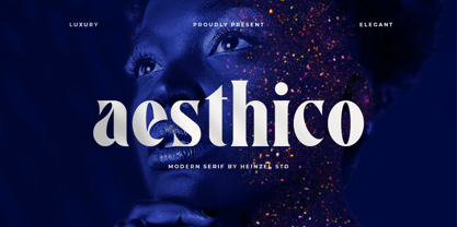 Aesthico is modern, elegant, fashion serif font inspired by a popular magazine logo. Aesthico is great for headlines, logos, covers, posters and other creative designs. This font is PUA encoded which means you can access all of the amazing glyphs with ease!
 - Millport JNL by Jeff Levine,
$29.00Millport JNL is another retro-design font with a look closer to hand-lettering than formal typesetting. Use it for headlines, titles, signs, posters and point-of-sale items. No matter what the application, Millport JNL looks clean and retains its nostalgic feel. - Astarie by Yukita Creative,
$12.00 Astarie is a modern sans with a trendy and not stiff style that will make your poster, cover, or logo more stunning and stand out! This font supports Multi-Language. This font will go well with logos, headlines, titles, and minimal layouts.
 - Dolmen by ITC,
$29.99Dolmen font from Max Salzmann revives the look of the 1920s and suggests all the glamour and culture of the jazz age. Dolmen can be used in all capital or upper and lower case settings and gives any work an Art Deco look. - Contra Flare by Wiescher Design,
$16.50 Contra Flare is the organic design of my Contra family of fonts. It has beautiful curved endings – not serifs – that make it look like it was made out of flowers leafs. But still the font has an elegant look to it. Enjoy!
 - Old English by URW Type Foundry,
$35.00 Old English Old English is related to Black Letter styles from early printed books and have a distinguished, historic look. The Old English font is used in advertising, invitations, greeting cards, and wherever a formal hand-lettered or engraved look is desired.
 - Tangy Cream by Bogstav,
$18.00 Tangy Cream is handmade with a slightly geometric look. And to break the geometry, just a little bit, I have added 3 different versions of each lowercase letters. These automatically cycles as you type, leaving your text even more lively and organic looking!
 - Sevoya Pro by Jonahfonts,
$45.00 Sevoya Pro a captivating robust script font designed with fat strokes for those strong brands and logos. Featuring short ascenders and descenders making it a bit more legible. Sevoya Pro is perfect to create outstanding headings, logos, menus, graphics, and many more applications.
 - Practice Sketch by Jehansyah,
$9.00 Practice Sketch This sketch font is perfect for your needs to look elegant and dignified, a luxurious impression will be seen when you use it, aesthetic and modern, very suitable for types of designs that want to look stylish. Thank you very much
 - Stainless by Gassstype,
$27.00 Here comes a New Font,Introducing Stainless is a Race Theme Display Font.This Handmade Display Font with a stylish touch inspired by the famous minimalist logo . Stainless has is perfect for the purposes of designing templates, brochures, videos, advertising branding, logos and more.

