10,000 search results
(0.19 seconds)
- Black Script by Fenotype,
$35.00 Black Script is a bold connected script family with plenty of weights: Regular, Bold, Inline versions, Caps, Ornaments and Printed versions of all those. For the best price purchase either Black Script Family or Black Script Printed Family or Black Script Complete Pack which contains all versions of the font. Black Script is equipped with automatic OpenType Ligatures, Swash and Stylistic Alternates to let you customise your designs. Find even more alternates from Glyph Palette. Black Script Caps is a block letter font designed to work alone or to support the script. Caps is equipped with Swash alternates. Black Script is a great font family for creating ambitious headlines, logos & posters with a custom-made feeling.
 - Royal Banks by Putracetol,
$20.00 Royal Banks - Retro Bold Font. In Royal Banks, I try to combine retro style with luxury and aesthetics touch. So the Royal Banks can be used in various projects with retro/vintage and luxury themes or another project with bold font. Such as logos, branding, posters, packaging, book covers, clothes/apparel, quotes, titles and others. Royal Banks come with clean and rough font version. Come with Opentype feature with a lot of alternates, its help you to make great lettering. Royal Banks is also support multi language. To access the alternate glyphs, you need a program that supports OpenType features such as Adobe Illustrator CS, Adobe Photoshop CC, Adobe Indesign, Corel Draw, Microsoft Office.
 - The Good Panther by Putracetol,
$24.00 The Good Panther - Bold Quirky Display Font. The Good Panther a bold, quirky display font with a fun and trendy cute characters. With a childish style, it will be very suitable for your project, which is related to children. Such as story books, illustrations, comic books, t-shirts, posters, greeting cards, logos, branding, stickers, svg, crafting. The alternative characters were divided into several Open Type features such as Swash, Stylistic Sets, Stylistic Alternates, Contextual Alternates, and Ligature. The Open Type features can be accessed by using Open Type savvy programs such as Adobe Illustrator, Adobe InDesign, Adobe Photoshop Corel Draw X version, And Microsoft Word. This font is also support multi language.
 - Avid Pro by Naghi Naghachian,
$49.00 Avid Pro font family is designed by Naghi Naghashian. A modern interpretation of classic Sans Serif characters in 6 weights: Thin, Light, Regular, Demi Bold, Bold and Heavy. The character set of this Font family supports most western languages including: Afrikaans, Basque, Breton, Catalan, Danish, Dutch, English, Finnish, French, Gaelic, German, Icelandic, Indonesian, Irish, Italian, Norwegian, Portuguese, Sami, Spanish, Swahili and Swedish. There are 17 additional symbol characters: euro, litre, estimated, omega, pi, partialdiff, delta, product, summation, radical, infinity, integral, approxequal, notequal, lessequal, greaterequal, and lozenge. It also includes the characters necessary to support the following central European languages: Croatian, Czech, Estonian, Hungarian, Latvian, Lithuanian, Polish, Romanian, Serbian (Latin), Slovak, Slovenian and Turkish.
 - Las Palmas by Fenotype,
$20.00 Las Palmas is a vintage type collection with print texture. • Brush - Two weights of a connected Brush Script with Contextual and Swash Alternates • Pen - A connected monoline Script with Contextual and Swash Alternates • Slab - Two weights of a chunky Slab Serif with rounded corners, Bold has the same proportions but fuller texture. • Condensed - A bold and tight condensed Sans Serif with rounded corners. Las Palmas fonts are designed to work together - in pairs or more. Las Palmas is great for branding, posters or any display use. If you need a clean version of Las Palmas try Steak And Cheese by Fenotype. All fonts are PUA encoded and have a wide language support.
 - FF Meta Correspondence by FontFont,
$97.99 German type designer Erik Spiekermann created this sans FontFont between 1997 and 2002. The family contains 4 weights: Regular, Italic, Bold, and Bold Italic and is ideally suited for logo, branding and creative industries. FF Meta Correspondence provides advanced typographical support with features such as ligatures, alternate characters, case-sensitive forms, fractions, super- and subscript characters, and stylistic alternates. It comes with a complete range of figure set options – oldstyle and lining figures, each in tabular and proportional widths. As well as Latin-based languages, the typeface family also supports the Cyrillic and Greek writing systems. This FontFont is a member of the FF Meta super family, which also includes FF Meta, FF Meta Headline, and FF Meta Serif.
 - Apricosa by SG Type,
$19.00 Apricosa – A beautiful bold serif with vintage swashes, alternate letters and ligatures. Apricosa is a delightful, modern take on a vintage font. Packed with plenty of alternates and ligatures to really bring it to life! Create stunning designs that are truly unique to your brand. Vary between a light and heavy vintage look based on how many letters you alter. Due to its large selection of alternate letters and ligatures, Apricosa is very versatile, covering a wide range of project types, from unique branding, to bold magazine design, to vintage wedding invitations, and so much more. FEATURES Uppercase alphabet Lowercase alphabet 41 alternate glyphs 36 ligatures big range of numbers, symbols & punctuation comprehensive language support
 - Marleone Brando by IKIIKOWRK,
$13.00 Introducing Marleone Brando - Condensed Sans, created by ikiiko. Marleone Brando is a bold-sturdy font with strong character, inspired by the typeface in mafia films. Marleone Brando has two types of letters, regular and oblique. A simple font with a bold size with shadow line inside, make this font look elegant and classy impression. This typeface is perfect for an elegant logo, branding, movie poster, layout magazine, sport wear, packaging product, quotes, or simply as a stylish text overlay to any background image. What's included? 2 Weights Regular & Oblique Uppercase & Lowercase Number & Punctuation Multilingual Support Works on PC & Mac Enjoy our font and if you have any questions, you can contact us by email : ikiikowrk@gmail.com
 - Ctoxina by FSdesign-Salmina,
$39.00 The Ctoxina family is growing. Due to the success the author decided to add an outline version of the font. The typeface is now available in 6 different styles: light, light italic, regular, italic, bold and bold italic. The Atoxina family is designed especially for the burgeoning market of starships and other space cruisers. The fonts are ideal for internal and external use (including zero-g and occasional bursts of cosmic rays), and with their simplified forms are expected to survive well in non-linear galaxies. With their unusual diagonal half-pixels the fonts are striking as abstract designs at astronomical sizes, where small text may be placed within the black holes formed inside the letters.
 - Curwen Sans by K-Type,
$20.00 Curwen Sans is a monoline sans-serif dating from the early twentieth century. Though contemporary with Johnston’s Underground and Gill Sans, and emerging from the same artistic milieu, Curwen Sans was created solely for in-house use at the Curwen Press in London so never achieved a wide audience or recognition. The original face was cut only in a Medium weight, but the new digital family consists of four weights, each with an optically corrected Oblique, and all containing a full complement of Latin Extended-A characters. K-Type Curwen Sans comprises three packages: • Basic Family (Regular, Oblique, Bold, and Bold Oblique) • Light (Light and Light Oblique) • Medium (Medium and Medium Oblique)
 - Churchward 69 by BluHead Studio,
$25.00 Churchward 69 is a ten weight typeface family originally designed during the late 1960’s by the late type designer Joseph Churchward. From the extremely condensed Regular weight to the outlandishly heavy Ultra Black, this square sans serif makes an audacious statement. Even the Italics are extreme at their 17 degree angle! Churchward 69 includes 5 weights, Regular, Bold, Extra Bold, Black, and the gorgeous Ultra Black, and their italics. Joseph sure knew how to draw heavy weights! All members of the Churchward 69 family have OpenType features, including proportional and tabular figures, unlimited fractions, superior and inferior figures, and ordinals. Each font also has an extensive character set to support many western European languages.
 - Banthani by Nurf Designs,
$25.00 Banthani is a dynamic bold script font. Inspired by its predecessor Raphtalia, it comes with a bold script style and is equipped with Opentype Features (Stylistic Alternate, Contextual Alternate, Ligature, etc.). You can get a different character in almost every glyph, you can choose it according to your design needs. We designed some characters to change “DYNAMICALLY” when they meet other characters, in order to create readability and harmony in each appearance. Banthani is very suitable for the needs of Logotype, Branding, Header and designs that require distinctive features. Works on PC & Mac Simple installations Accessible in the Adobe Illustrator, Adobe Photoshop, Adobe InDesign, even work on Microsoft Word. PUA Encoded Characters – Fully accessible without additional design software.
 - ED Laurentsa by Emyself Design,
$9.00 Introducing - ED Laurentsa is a classic serif font family consisting of 9 Weights (Thin, ExtraLight, Light, Regular, Medium, Semibold, Bold, ExtraBold, and Black). Try DEMO Version : https://emyselfdesign.gumroad.com/l/pgtit ED Laurentsa has a classic minimalist look with a condensed style and has a wide variety from thin to black to suit your needs. This font is perfect for your design needs, such as logo design, branding, apparel, headings, web, etc. This font can also be easily combined with other fonts to create the perfect typography. Bold fonts are perfect for displays such as logos, or in-text headings. while the font with a thin style is suitable for covers, posters, or social media posts.
 - Ablation by VP Creative Shop,
$20.00 Introducing Ablation Sans Serif Typeface - 6 weighs Ablation is casual, clean typeface that contains 6 weights to enchant your next project. They have basic latin, advanced latin, basic Cyrillic and advanced Cyrillic character sets. Very versatile fonts that works great in large and small sizes. Ablation is perfect for branding projects, home-ware designs, product packaging, magazine headers - or simply as a stylish text overlay to any background image. Uppercase, numeral, punctuation & Symbol Hairline Light Regular Bold Extra Bold Black Basic and advanced latin character sets Basic and advanced Cyrillic character sets Feel free to contact me if you have any questions! Mock ups and backgrounds used are not included. Thank you! Enjoy!
 - Dreams Note PS by pentagonistudio,
$14.00 Dreams Note Is A Modern Family Font Serif Including 8 Font Style. Font Features : Dreams Note Thin Dreams Note Extra Light Dreams Note Light Dreams Note Regular Dreams Note Medium Dreams Note Semi Bold Dreams Note Bold Dreams Note Black SOFTWARE REQUIREMENTS : Fonts and alternate: No special software is required they may be used in any basic program /website app that allows standard fonts That's it, folks! You can go ahead and get cracking :) Follow My Shop For Upcoming Updates Including Additional Glyphs And Language Support. And Please Message Me If You Want Your Language Included or If There Are Any Features or Glyph Requests, Feel Free to Send me A Message. Have a Good Day!
 - Triplex by Emigre,
$39.00 Although initially designed as a rational/geometric font, Triplex developed into one of Zuzana Licko's most intuitive typeface designs at the time. Its first extensive use was in Emigre magazine #14, a special issue devoted to Swiss designers published in 1990. Triplex was intended as a friendly substitute for Helvetica. The name Triplex refers to the three versions that make up the entire family; Triplex, Triplex Serif and Triplex Italic. Each version of the typeface comes in light, bold and extra bold. The italic was designed and drawn by type designer and sign painter John Downer, and was designed to work with both the serif and sans serif versions. See also Triplex Italic OT.
 - GR Altosa by Garisman Studio,
$35.00 GR Altosa is a very cool typeface for headline designs with a bold and bold theme. With a strong display and clean nodes make text in the design become more character and great. Inspired by headline trends in a poster or magazine today. So that with a firm and a very modern style makes your design better! This font is formed from the headline display font of a very careful title. Suitable for all graphic design projects, prints, logos, posters, t-shirts, packaging, website, ticket and applies to several types of graphic design. Especially for the use of a title! Very suitable! GR Read is compatible with any software without pain, especially in headlines with GR Altosa pairing
 - HV Philosykos by Harmonais Visual,
$15.00 Looking to add a touch of refinement to your designs? Look no further than Philosykos. With its carefully crafted details and more than 80 ligature choices, Philosykos is the perfect choice for adding a cultured, sophisticated look to your artwork. This typeface comes in four styles - Regular, Italic, Bold, and Bold Italic - making it versatile enough for a wide range of designs. Whether you're creating a logo, designing packaging, or working on a book cover, Philosykos will help elevate your work to the next level. So if you're looking for a typeface that exudes elegance and style, look no further than Philosykos. Try it out today and see the difference for yourself.
 - Peloric by TanveerType,
$8.00 Introducing fresh PELORIC sans serif typeface which is well crafted for the classic and modern outlook. It can be read easily from a small size to a large size. Feeling fresh & trendy with it’s distinctive visual. It is well suited for branding, website & mobile layout and many more. It can also be used for branding materials, business cards, social media, packaging, prints, quotes & posters, etc. It comes up with 12 different weights as thin, thin italic, light, light italic, regular, italic, medium, medium italic, bold, bold italic, inline & inline italic. So, if you are looking for a new stylish and unique font, then here is the best font just designed for you and supporting any operating system and platform.
 - ED Muskrat by Emyself Design,
$9.00 ED Muskrat is a display font family that looks elegant classic and modern, this font is designed from a combination of serif and semi blackletter fonts that add a unique feel to the font. ED Muskrat has 9 styles: Thin, ExtraLight, Light, Regular, Medium, SemiBold, Bold, ExtraBold, and Black. ED Muskrat is equipped with ligatures, alternative characters, and supports multiple languages. and also this font is perfect for your design needs such as branding, poster design, books, fashion, social media design, logos, etc. Features: Stylistic alternates ( C, E, F, I, J, N, Q, S, Z ) Ligatures ( fi , fj , tt ) 9 Styles ( Thin, ExtraLight, Light, Regular, Medium, SemiBold, Bold, ExtraBold, and Black ) Multi Language Support 373 Glyphs
 - Ms Kitty NB by No Bodoni,
$35.00Some scribbles on a bar napkin, a note from a cute girl passed in history class, what is there to say but why not a typeface? Actually it's that late night, �let's get this typeface done� madness that causes these flights of fancy. Anything to relieve the boredom of doing all those kerning pairs. Or maybe it's sunspots? Ms Kitty is all uppercase letterforms so there are two versions of each letter, one in the cap position, another in the lowercase position. Besides the regular weight and bold, there�s a bolder and much bolder in the works. And perhaps there will be a "too bold to be believed" version. Depends on the sunspots. - Origami Bats by Lauren Ashpole,
$15.00 The art of paper folding in dingbat form. The uppercase alphabet is made up of origami animals and the lowercase offers those shapes decorated in traditional origami paper patterns. Full patterns, flowers, and partial foldings fill out the symbols and numbers.
 - Revoluzia MF by Masterfont,
$59.00 A revival of old hand painted sign in Old Jaffa, from the mid of 20th century.
 - Rough Bits by Matthias Luh,
$15.00 Some old broken characters. It reminds me of old labels on walls, streets or on tanks.
 - Jump Style by Maulana Creative,
$15.00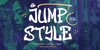 Give your designs an graffiti display Font handcrafted feel. “Jump Style Graffiti Display Font” is perfectly suited to stationery, logos and much more. Many Thanks, Maulana Creative
 - Hazel Page by Fromletterel,
$14.00 Hazel Page has natural stroke and casual look that gives youth and friendly vibes, suitable for branding, video editing material, printing and any other kind of designs
 - Belinar by TM Type,
$12.00 Belinar is a sleek, signature script that will give your work instant class and style. Use this font for branding, logos, signatures, invitations and any other designs.
 - Dainty Cursive by Supfonts,
$15.00 Dainty Cursive it is cute handwritten marker font This font is perfect for branding, cricut projects, wedding invitations, logos, vinyl, svg files, stickers, cards, signs and more!
 - Antique Decorations JNL by Jeff Levine,
$29.00 Antique Decorations JNL collects more images of vintage letterpress embellishments [primarily from wood type sources]; redrawn in digital format and made available in one convenient font file.
 - Honey Painting by Zefrar,
$19.00 Honey Painting is a font inspired from both Honey and Painting, same imagination if a user do painting with Honey, this font now is giving this option.
 - Wheat by Atlantic Fonts,
$26.00 Like fresh, warm just-out-of-the-oven bread, Wheat is wholesome and comforting. Wheat's crusty texture and bubbly, hand-drawn letters give it all natural appeal.
 - P22 Albion by IHOF,
$24.95 An open, lightweight font of classical Roman proportions, designed for text or display setting. The serifs are slightly hooked, giving the face a liveliness on the baseline.
 - Yexivela by Typo5,
$9.95A beautiful unusual handwriting. It works good at any size and adds a weird look. Its exaggerated features give it a truly unique look while keeping legibility. - Black Range by Maulana Creative,
$14.00 Give your designs an authentic brush handcrafted feel. �Black Range Brush Font� is perfectly suited to stationery, logos and much more. Caps only fonts. Many Thanks! MaulanaCreative
 - Saxophone by Tour De Force,
$25.00 With lively Stylistic Alternates in capital letters, the Saxophone font family is a metaphorical equivalent of the instrument, which can be used in almost all music genres.
 - Buncher Georgia by Fargun Studio,
$16.00 Buncher Georgia is a vintage display typeface inspired by the art of ancient decoration which is suitable for retro-style designs with ancient concepts. File Included Multilingual
 - Malabar by Linotype,
$29.99 Malabar is a type family for extensive text. Its design was developed with a nod toward newspapers. Malabar's characters are seriffed and of the Old Style genre. A strong diagonal axis is apparent within the curves. Sturdy serifs help strengthen the line of text in small point sizes, as well as define the overall feeling of the face. Malabar's x-height is very high, a deliberate choice that makes the most important parts of lowercase letters visibly larger in tiny settings. The height of the capital letters is also rather diminutive, allowing for better character fit, as well as eliminating a bit of clumsiness in German, which often includes quite a few uppercase letters. Diacritical marks and additional alphabetic forms required by many Western, Central, and Eastern European languages are naturally a part of the character set, including those needed in the Baltic states, for Romanian, and for Turkish. Malabar's accents are bold and direct, sitting well with their base glyphs. The family includes three weights, each with a companion Italic. Malabar Regular is equipped with small caps, and both it and Malabar Italic include oldstyle figures. All members of the family have both proportional and tabular-width lining figures, as well as special variants of certain punctuation marks vertically adjusted for all-caps text setting. Malabar is informed both by contemporary ideas of typeface design (sheared terminals, the wider-drawn s) as well as by 16th-century masters. Malabar Heavy and Heavy Italic are very loud; their blackness almost shouts out from the page. The Regular's wedge serifs become more slab-ish in nature as the letters' weight increases. Malabar Heavy and Heavy Italic are best relegated to headline use only. Malabar Bold and Bold Italic may be used for text emphasis, a job for which the Heavy is to dark. Malabar received a Certificate of Excellence in Type Design at the Type Directors Club of New York TDC2 competition in 2009.
 - Laurentian by Monotype,
$29.99 Maclean's is a weekly Canadian newsmagazine with a broad editorial mission. A typical issue covers everything from violence on the other side of the globe to the largest pumpkin grown in a local county. In 2001, Maclean's invited Rod McDonald to become part of the design team to renovate" the 96-year-old publication. The magazine wanted to offer its readers a typographic voice that was professional, clean, and easy to read. Above all, the typeface had to be able to speak about the hundreds of unrelated subjects addressed in each issue while remaining believable and uncontrived. A tall order, perhaps? Now add in that this would be the first text typeface ever commissioned by a Canadian magazine. McDonald, who some have called Canada's unofficial "typographer laureate," took on the challenge. McDonald used two historic models as the basis for Laurentian's design: the work of French type designer Claude Garamond, and that of the English printer and type founder, William Caslon. From Garamond Laurentian acquired its humanist axis, crisp serifs and terminals that mimic pen strokes. Caslon's letters are less humanistic, with a more marked contrast in stroke weight and serifs that appear constructed rather than drawn. These traits also made their mark on Laurentian. Using these two designs as a foundation, McDonald drew Laurentian with the narrow text columns and small type sizes of magazine composition in mind. He gave his letters strong vertical strokes and sturdy serifs, a robust x-height and a slightly compressed character width A tall order, per McDonald's genius is evident in the face's legibility, quiet liveliness and in the openness of the letters. The result is a typeface that not only met Maclean's demanding design brief, but also provides exceptional service in a wide variety of other applications. Laurentian is available in three weights of Regular, Semi Bold and Bold, with complementary italics for the Regular and Semi Bold, and a suite of titling caps."
 - RePublic by Suitcase Type Foundry,
$75.00In 1955 the Czech State Department of Culture, which was then in charge of all the publishing houses, organised a competition amongst printing houses and generally all book businesses for the design of a newspaper typeface. The motivation for this contest was obvious: the situation in the printing presses was appalling, with very little quality fonts existing and financial resources being too scarce to permit the purchase of type abroad. The conditions to be met by the typeface were strictly defined, and far more constrained than the ones applied to regular typefaces designed for books. A number of parameters needed to be considered, including the pressure of the printing presses and the quality of the thin newspaper ink that would have smothered any delicate strokes. Rough drafts of type designs for the competition were submitted by Vratislav Hejzl, Stanislav Marso, Frantisek Novak, Frantisek Panek, Jiri Petr, Jindrich Posekany, and the team of Stanislav Duda, Karel Misek and Josef Tyfa. The committee published its comments and corrections of the designs, and asked the designers to draw the final drafts. The winner was unambiguous — the members of the committee unanimously agreed to award Stanislav Marso’s design the first prize. His typeface was cast by Grafotechna (a state-owned enterprise) for setting with line-composing machines and also in larger sizes for hand-setting. Regular, bold, and bold condensed cuts were produced, and the face was named Public. In 2003 we decided to digitise the typeface. Drawings of the regular and italic cuts at the size of approximatively 3,5 cicero (43 pt) were used as templates for scanning. Those originals covered the complete set of caps except for the U, the lowercase, numerals, and sloped ampersand. The bold and condensed bold cuts were found in an original specimen book of the Rude Pravo newspaper printing press. These specimens included a dot, acute, colon, semicolon, hyphens, exclamation and question marks, asterisk, parentheses, square brackets, cross, section sign, and ampersand. After the regular cut was drafted, we began to modify it. All the uppercase letters were fine-tuned, the crossbar of the A was raised, E, F, and H were narrowed, L and R were significantly broadened, and the angle of the leg and arm of the K were adjusted. The vertex of the M now rests on the baseline, making the glyph broader. The apex of the N is narrower, resulting in a more regular glyph. The tail of Q was made more decorative; the uppercase S lost its implied serifs. The lowercase ascenders and descenders were slightly extended. Corrections on the lower case a were more significant, its waist being lowered in order to improve its colour and light. The top of the f was redrawn, the loop of lowercase g now has a squarer character. The diagonals of the lowercase k were harmonised with the uppercase K. The t has a more open and longer terminal, and the tail of the y matches its overall construction. Numerals are generally better proportioned. Italics have been thoroughly redrawn, and in general their slope is lessened by approximatively 2–3 degrees. The italic upper case is more consistent with the regular cut. Unlike the original, the tail of the K is not curved, and the Z is not calligraphic. The italic lower case is even further removed from the original. This concerns specifically the bottom finials of the c and e, the top of the f, the descender of the j, the serif of the k, a heavier ear on the r, a more open t, a broader v and w, a different x, and, again, a non-calligraphic z. Originally the bold cut conformed even more to the superellipse shape than the regular one, since all the glyphs had to be fitted to the same width. We have redrawn the bold cut to provide a better match with the regular. This means its shapes have become generally broader, also noticeably darker. Medium and Semibold weights were also interpolated, with a colour similar to the original bold cut. The condensed variants’ width is 85 percent of the original. The design of the Bold Condensed weights was optimised for the setting of headlines, while the lighter ones are suited for normal condensed settings. All the OpenType fonts include small caps, numerals, fractions, ligatures, and expert glyphs, conforming to the Suitcase Standard set. Over half a century of consistent quality ensures perfect legibility even in adverse printing conditions and on poor quality paper. RePublic is an exquisite newspaper and magazine type, which is equally well suited as a contemporary book face. - Urban Brigade - Personal use only

