10,000 search results
(0.033 seconds)
- Bejo by Twinletter,
$15.00 BEJO is a display font in the Japanese style, with each letter having its own individual personality. This font is appropriate for a wide range of project demands, particularly those involving Asian features. By utilizing this typeface, you will create a project with a gorgeous, original, and elegant appearance that will be remembered by many people. Logotypes, food banners, branding, brochure, posters, movie titles, book titles, quotes, and more may all benefit from this font. Of course, using this font in your various design projects will make them excellent and outstanding; many viewers are drawn to the striking and unusual graphic display. Start utilizing this typeface in your projects to make them stand out.
 - Belhampton by Greater Albion Typefounders,
$18.00 Belhampton is a lively display family, full of the spirit of the Edwardian era. Six typefaces are offered: regular, bold, light, oblique, embossed and outline. All include an extensive range of stylistic alternates and discretionary ligatures, as well as lining and old-style numerals. Belhampton is ideal for poster and display work, or just the thing for any piece of Belle Epoque design.
 - Goat by Oliveira 37,
$30.00 Goat is a font display with extremely fine and sharp serifs, inspired by Gothic architecture, which brings a vertical elongation in extent and an allusion to the typical ogival vaults of the style. A font that not only carries a texture of writing with magnitude and elegance, but also causes some kind of strangeness for the subversion of some typographic laws.
 - New Comer Sans by ave,
$12.00 New Comer Sans is a combination of two ideas. First is my speed writing with flat acrylic marker on boards. And second is to make new bold font something like puffy «comic sans» font. Unstable stems (vertical main lines) give it some playful unserious character. The result is cute funny font. You can use it in short text blocks in huge and medium sizes. For example, for comic books or kids applications. NewComerSans includes: uppercase lowercase more than 480 glyphs which support Latin, Western European, Central European languages (Cyrillic is also included) Hope you are enjoying using New Comer Sans. Please do not hesitate to ask me any questions about the product. (c) Photo credit - Unsplash
 - Maengame by Product Type,
$17.00 Meet Maengame Font Display, Bring Fun and Power to Your Designs! Maengame is not just a font; it's a gateway to a world of joy and power in your designs. With eye-catching display themes and a strong game style, Maengame brings a unique touch to your projects. Inject a fun twist into each character with a bubble-filled design, adding a fun element to each letter. Maengame also brings a sense of courage and resilience, making your projects stand out with passion. Maengame is the perfect solution for projects that require a unique touch. Whether you're working on a bold display, a lively game, or an entertaining event, this font ensures that every design carries unforgettable charm. Do not miss this opportunity! Get Maengame Display Font now and turn every design into an unforgettable game!
 - Yaty by Mans Greback,
$59.00 Yaty is a relaxed and spontaneous script font. With its long descenders, bold capital letters and genuine style, this typeface fits perfectly for a down-to-earth logo or headline, emitting familiarity and friendliness. The font contains ligatures and support for an extensive range of world-wide languages.
 - Hergon Grotesk by Katatrad,
$29.00 Straightforward tone resulting in a modernist, Hergon Grotesk is a family of modern sans-serif. This Typeface is characterized by Neo-Grotesque which gives it a strong character, perfectly suited for any visual communication application. The family has 10 fonts ranging from thin to extrabold with matching italics.
 - Ambule BT by Bitstream,
$50.99Huxley Vertical meets Peignot in this stylized cap/lowercase hybrid design called Ambule. French designer Julien Janiszewski has created a clean, straightforward design that is strikingly effective in both text and display settings. Ambule Oblique and Ambule Outline complete the typeface family, extending its range of possible uses. - Vast by ParaType,
$30.00 Vast is a variable sans serif with a range of styles from thin to black and from normal to extra wide. This versatile font family of both of a serious and friendly nature can be used for various purposes, such as text, logos, headings, and branding. Vast was designed by Manvel Shmavonyan with the assistance of Alexander Lubovenko and released by Paratype in 2021.
 - Lasta by Tour De Force,
$25.00 Lasta is small serif font family with simple elegant shapes, refreshing Italics and poetic endings. Containing 2 weights and 2 italics, with lower x-height which brings more air (empty space, white space...) into paragraphs making text more graceful and legible. Thin serifs bring small touch of dynamic into letter forms, just enough to bring specific tone to paragraph. Beside being mainly imagined as fully text family, Lasta is suitable titles or decorative typography as well for, especially the Italics with fancy curvy endings.
 - Pixel Pants by PizzaDude.dk,
$18.00 Pixel Pants is my wanna-be 1980-ies pixelfont. Well, it really looks like a pixel font, but it's kid of fake - at larger sizes you will notice the wacky and uneven lines, but it sure do bring back memories of the 80-ies! I've made 5 different versions of each letter - just to break the monotony of the usual pixel font! Insert coin and enjoy!
 - FF Unit Slab by FontFont,
$104.99 German type designer Erik Spiekermann, American type designer Christian Schwartz, and New Zealand type designer Kris Sowersby created this slab FontFont in 2009. The family has 14 weights, ranging from Thin to Ultra (including italics) and is ideally suited for editorial and publishing, logo, branding and creative industries as well as web and screen design. FF Unit Slab provides advanced typographical support with features such as ligatures, small capitals, alternate characters, case-sensitive forms, fractions, and super- and subscript characters. It comes with a complete range of figure set options – oldstyle and lining figures, each in tabular and proportional widths. As well as Latin-based languages, the typeface family also supports the Cyrillic and Greek writing systems. This FontFont is a member of the FF Unit super family, which also includes FF Unit and FF Unit Rounded.
 - Modern Sans by Larin Type Co,
$16.00 Modern Sans this is a font family that includes 9 weights from thin to black and two styles basic and oblique. In this font you will find a classic and universal grotesque that will perfectly cope with a variety of tasks and will always look stylish and modern, as well as many alternates for Upper and Lowercase, with which you can play and find the most incredible and stunning option. This universal font covers a huge range of possibilities for the design and creation of your project.
 - LoveBirds by PintassilgoPrints,
$24.90 A handful of birds silhouettes. Sing along!
 - Bernhard by Linotype,
$29.99 The German typeface artist Lucian Bernhard designed Bernhard Antiqua as the first of his many text typefaces. The first weights were produced in 1912 by the foundry Flinsch in Frankfurt am Main. Further weights followed in the 1920s, produced by the Bauersche foundry, which had acquired Flinsch in the meantime. Bernhard font is an alphabet with a marked historical influence. It brings the viewer back to the early 20th century, when the bold forms of this typeface graced advertising displays and posters. Distinguishing characteristics of this typeface are the cross of the capital W and the rounding of the capital R. Linotype's Bernhard condensed bold, with its narrow, robust forms, is best for headlines in medium and larger point sizes.
 - Kingthings Pique'n'meex - 100% free

- Midsole SC by Grype,
$16.00 Geometric/Technical style logotypes have been developed for car chrome labels since the early 1980’s, but automobile companies don't monopolize the style by any means. Shoe companies have a foothold in the geometric sans serif styles as well, and range from straightforward to full of techno styled play. Nonetheless, these logotypes all lack an expansive family which shows off all the logotypes are and what they "could" be and do. And that's where we come in. The Midsole SC Family finds its origin of inspiration in the CONVERSE shoe company logo, or an older version of their logo, and from there we expanded it into a 40 font family of weights, widths, and obliques. Midsole pays homage to the styling of the earlier logotype, including unicase variations to match the original look, while further evolving beyond the brand inspiration to yield a family that pulls on modern and historical styles. It adopts a sturdy yet approachable and recognizable style with its uniform stroke forms and curves, and goes on to include smallcaps, numerals, and a comprehensive range of weights, creating a straightforward, uncompromising collection of typefaces that lend a solid foundation and a broad range of expression for designers. Here’s what’s included with the Midsole SC Family bundle: 489 glyphs per style - including Capitals, SmallCaps, Numerals, Punctuation and an extensive character set that covers multilingual support of latin based languages. (see the 10th graphic for a preview of the characters included) Stylistic Alternates - alternate characters and unicase variants for a less standardized text look. 4 weights in the family: Light, Regular, Medium & Bold. 4 obliques in the family, one for each weight: Light, Regular, Medium & Bold. Here’s why the Midsole SC Family is for you: - You’re in need of stylish sans font family with a range of weights and obliques. - You’re love that older CONVERSE letter styling, and want to design anything within that genre. - You’re looking for an alternative to Eurostile & Handel Gothic. - You’re looking for a clean techno typeface for your rave poster designs. - You just like to collect quality fonts to add to your design arsenal.
 - Draughtsman Label Hand by Greater Albion Typefounders,
$35.00 "Draughtsman Label Hand" was inspired by the beautifully executed hand-lettering one set of 19th century engineering drawings. The result is a typeface that combines great legibility with a wealth of decorative flourishes and lively touches of fun. The typeface includes a range of stylistic alternated, ligatures, small and petite capitals, old-style and lining numerals. Draughtsman Label Hand is designed to take full advantage of the capabilities of the opentype format.
 - Chilli Peppers by Letterara,
$12.00 Chilli Peppers is a stylish, quirky, and incredibly distinct script font. Its stand-out feel makes this font incredibly versatile, fitting a wide range of contexts. Whether you’re using it for crafting, digital designing, presentations, poster, logos, events, or greeting card making, it’s perfect! This font is PUA encoded which means you can access all of the awesome glyphs with ease! It also features a wealth of special features including ligatures.
 - Geryline by Slex Studio,
$11.00 Geryline simplifies elegance into one truly outstanding handwritten font. It maintains its classy calligraphic influences while feeling contemporary and fresh. This versatility will appeal to a wide range of crafty ideas, from letterheads and titles, to stationery. This font is PUA encoded which means you can access all of the cute glyphs and swashes with ease! It also features a wealth of special features including alternate glyphs and ligatures.
 - Gardening by Letterara,
$10.00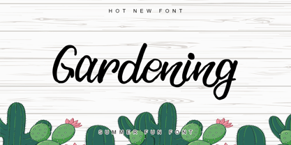 Gardening is a stylish, fun, quirky, whimsical, and incredibly distinct script font. Its friendly feel makes this font incredibly versatile, fitting a wide range of contexts. Whether you’re using it for crafting, digital designing, presentations, or greeting card making, it’s perfect! This font is PUA encoded which means you can access all of the awesome glyphs with ease! It also features a wealth of special features including ligatures.
 - Varisse Variable by AVP,
$79.00 Varisse spans over two centuries of type design and draws its inspiration from well-loved classics that are as fresh today as they were when they were created. The range stretches from a quintessential 18th century transitional serif to an uncompromising 20th century sans. Think Baskerville, think Gill. The idea was to create a family that shared similar forms and the same vertical metrics, allowing them to be mixed to provide impact and readability as required. With a generous x-height and a host of options, Varisse Variable is ideally suited to branding, packaging, magazines and editorial. It also provides a wealth of opportunity in website presentation. The variable axes of weight and serif allow selection of styles from sans light to serif heavy with all the options in between.
 - Nowduke by Just Font You,
$19.00 Nowduke is a bold vintage font. Inspired by the rise of the Retro-Futurism trend in the digital industry nowadays. The undeniable invasion in every industry makes it a big trigger I can say, to bring this pop font to rise in this universe. Perfectly fit for logo, branding, gaming, esport design, poster, music video, album artwork, retro concept, advertising, digital content, stream overlay, cover, book, packaging, merchandise, apparel, fashion, and many more.
 - Distressed Telegraph by Stiggy & Sands,
$29.00 Our Distressed Telegraph brings the unique individuality of the Large Elite Type No. 44 vintage typewriter keyset to the digital age. Vintage typewriters evoke a warmth and comfort to them, primarily because of their unpredictable "grunge" results from force of keystrokes to ribbon and paper. The SmallCaps and extensive figure sets add a more serious note to the nature of the typeface. See the 5th graphic for a comprehensive character map preview. Opentype features include: - SmallCaps. - Full set of Inferiors and Superiors for limitless fractions. - Tabular, Proportional, and Oldstyle figure sets (along with SmallCaps versions of the figures). - Stylistic Alternates for Caps to SmallCaps conversion.
 - Glamoure Everyday by Krismagraph,
$29.00 Introducing Glamoure Everyday Serif Font Family. a variable font, 8 weights regular, and italics. Glamoure Everyday is made mainly for headlines, titles, and other short texts and is well-suited for advertising, vintage mood board, branding, logotypes, packaging, titles, editorial design, modern logos, websites, social media quotes, wedding branding, modern and vintage design.
 - Munika by Gravitype,
$24.90 Munika is a modern sans serif born from the equilibrium between geometric shapes and humanist details. Its lines were forged with the concept of clarity in mind, to make it the perfectly accessible typeface. This global family comes in 9 weights plus matching italics, with ligatures that facilitate readability and the alternative letter “a” in both versions. These features were conceived to further expand the range of use of the type system, to offer multiple aesthetic and technical options. Munika’s unique personality and fresh style make it perfect for a rebrand. Multilingual support is available.
 - Something Great by Din Studio,
$25.00 Need that perfect statement fonts for your designs? Get them the beautiful Something Great., a beautiful font duo. Through the script font, Something Great brings your design to delve deep into the world of elegance, while the serif font creates modern look. This font duo can be combined as a splendid set, or worn separately, with each possessing a head-turning magnificence of its own. Features: Stylistic Sets Ligatures Multilingual Supports Numerals and Punctuations Thank you for purchasing premium fonts from Din Studio. If you have any further questions, don't hesitate to contact us. Happy Designing.
 - HS Hadeel by Hiba Studio,
$50.00 HS Hadeel is a versatile display typeface designed for use in titles and graphic projects that require both Arabic, Persian and English characters. It draws inspiration from the modern kufi style and boasts a unique blend of sharp and curved lines that lend a beautiful and geometric structure to each character. The sharp endings at the bottom of each character add an additional aesthetic touch. With five weights available, ranging from Light to Black, HS Hadeel offers a diverse range of options for designers seeking to elevate their Arabic typography. Overall, HS Hadeel is a great choice for those seeking a visually striking and flexible typeface for their projects.
 - Sista Planteria by Invasi Studio,
$15.00 Meet the delightful duo that brings an organic twist to your designs! Introducing Sista Planteria, the charming pairing of an all-caps serif and a playful script font. Whether diving into illustrative creations, crafting whimsical greetings, adding charm to book covers, designing delightful quotes, or creating enchanting packaging, Sista Planteria is your go-to choice for an organic touch. With its alternates and ligatures, this font duo offers a signature handwriting style that adds a hint of natural elegance to your projects. And don't worry about language barriers – Sista Planteria supports multilingual Latin characters, ensuring your creativity knows no bounds. Get ready to infuse your designs with a dash of organic taste that will captivate hearts and bring smiles. Elevate your creations with the Sista Planteria font duo and let your imagination bloom!
 - Rotis II Sans by Monotype,
$50.99 Developed over several years by the late Otl Aicher and first released in the late 1980s, the Rotis® typeface has become a timeless classic. ROTIS II SANS HISTORY Aicher was a renowned German designer and corporate image consultant. He created the four basic designs of Rotis – sans serif, semi sans, semi seif and serif – within an extended typeface family concept, wherein all designs share a common cap height, lowercase x-height, basic stem weight and general proportions. While each version is part of the large, integrated family, each was also designed to function on its own as a distinctive typestyle. The result is that all members of the Rotis family combine smoothly with each other. Aicher, however, did not design the Rotis family with the weights and proportions normal for more contemporary releases. Rotis Sans Serif, for example, was drawn with just six weights and only two italics. Starting in 2010, Robin Nicholas, senior designer for Monotype Imaging in the UK, and freelance designer Alice Savoie collaborated to bring Rotis Sans Serif up to current standards. The result is Rotis II Sans, a completely new addition to the Rotis family. “We devised our approach together,” recalls Savoie, “deciding which weights to start with, what kind of alterations to make to the original Rotis, etc. I went to work on the typefaces, regularly submitting proofs to Robin. We would then decide in tandem on the next steps to take.” Nicholas elaborates, “We revisited the range of weights and added matching italics so that the new additions to the family offer increased versatility. We optimized the outlines, corrected the weight of several letters and re-examined overall spacing and kerning. In addition to a new set of numerals, with a height similar to the capitals, we also drew case-sensitive punctuation.” ROTIS II SANS USAGE The new Rotis II Sans suite comprises 14 typefaces: seven weights, ranging from extra light to black, each with a companion italic. The designs are available as OpenType® Pro fonts, allowing for automatic insertion of ligatures and fractions. Pro fonts also offer an extended character set supporting most Central European and many Eastern European languages. Aicher’s original Rotis designs were widely used for branding and advertising. With the addition of Rotis II Sans, the family is again poised to become a powerful communicator.
 - P22 Klauss Kursiv by IHOF,
$29.95 P22 Klauss Kursiv is the first ever digital revival and expansion of the last face Karl Klauß designed for the Genzsch & Heyse foundry in Stuttgart before he died in 1956. Karl Klauß’s classical training in the graphic arts gave him solid chops to use as a springboard for design ideas that remained relevant among the countless trends fleeting around the turmoil of two world wars. By the mid-1950s, a kind of ornamental deco aesthetic was well on its way into mainstream design in post-war Europe, and demand was high for unique, lively and non-minimal ad faces. Klauß, a reliable designer with a proven track record of calligraphic faces, pushed the envelope on his own calligraphy and designed something that packages elegance in a boldness seldom seen before in luxury scripts. Quite a bit of talent is on display in Klauss Kursiv. In spite of the restraint this kind of design imposes on itself almost by default, the interplay between thick and thin never seems forced or challenging. Clear, natural strokes build a compact alphabet that demonstrates the wrist control of a veteran calligrapher. Creative nib angling segues into very clever start-and-stop constructs to make attractive forms that work quite well together, yet stand well to individual scrutiny. P22 Klauss Kursiv comes with a load of built-in alternates and ligatures in a font of over 470 glyphs, providing extended support for Latin languages.
 - ArTarumianBehrensInitialen by Tarumian,
$100.00 Behrens Initialen is based on the type graphics of the German architect and type designer Peter Behrens (1868-1940). The drawing of the original typeface is in tune with the Art Nouveau (Jugendstil) style in which Behrens worked. This is a light, delicate, somewhat theatrical typeface, the forms of which bear at the same time a certain shade of Gothic and modernity, and can be used, in particular, when there is a need to make a reference to medieval graphics while maintaining the modern style of composition. In the proposed version, the original initial graphics are used not only for uppercase letters, but also for Arabic figures, while for lowercase letters and for the base of other characters are used the letters themselves - without decorative framing. This feature can be useful for obtaining various effects when using both lower and upper cases in parallel, including when they are overlaid. The font includes the Latin, Cyrillic and Armenian ranges. Created by Ruben Tarumian in 2020.
 - Luxca by Shakira Studio,
$17.00 Introducing Luxca, a font that epitomizes modern luxury within the serif category. This typeface seamlessly blends contemporary sophistication with timeless elegance, making it the perfect choice for designers seeking to infuse their projects with an air of opulence and refinement. With Luxca as your font of choice, you have at your fingertips a versatile tool that can elevate a wide range of design applications. Whether it's high-end branding, editorial layouts, invitations, or packaging.
 - Ostent by Stuart Hazley,
$10.00 Ostent is a font family which is inspired by the early Din-Type fonts. In particular, Din 1451. This is reflected in Ostents simple and uncomplicated design, which results in creating a good sense of legibility. Each of the three weights have been carefully designed to work in conjunction with one another, or individually, complimenting other typefaces. Ostent can be used across a wide range of design mediums (both print and screen).
 - Excalibur Sword by Comicraft,
$19.00 The Sword has been Drawn! The Quest for the Holy Grail has begun! When Arthur took the mighty sword of Excalibur from the Lady of the Lake, little did he know of the stories that would be spun, the myths that would be built around him, the Legend of Camelot and the Knights of the Round Table! And The Font. Merlin might have been King Arthur’s sage advisor, a font of wisdom and magicks, but never was Merlin available in postscript, truetype and opentype formats, nor was Lancelot, Arthur’s First Knight suitable for Celtic Display Lettering! See the families related to Excalibur Sword: Excalibur Stone.
 - Lincoln Electric by Canada Type,
$30.00 Lincoln Electric started its life as an in-house experimental film type Thomas Lincoln drew shortly after concluding his work as part of Herb Lubalin’s famed crew in the late 1960s,. The master alphabet was drawn on illustration boards using pen and ink and press-type lines. The typeface was initially made for use in the branding and promotional material of Lincoln’s new design outfit. This alphabet’s forms are a spin on Bifur, the all-cap deco face designed by Adolphe Mouron (known as Cassandre) in 1929, and published by the Deberny & Peignot foundry in France. Lincoln Electric evolves Cassandre’s idea further by constructing new shapes more in line with minimalist principles rather than art deco geometry — something clearly evident in Lincoln’s minuscules, which exhibit a clear connection to Bauhaus ideas More than 50 years after the typeface’s design, Thomas Lincoln found the original film alphabet tucked away in his archives and brought it over to Canada Type for digital retooling. The result is a modern and thoroughly elaborate set of fonts that belonging prominently in a 21st century designer’s toolbox. The following features are included in Lincoln Electric: • Three fonts for chromatic layering. • More than 1900 glyphs in each font. • Expanded Latin and Cyrillic character sets. • Small caps and Caps-to-small-caps. • Six different sets of stylistic alternates. • Ordinals and case-sensitive forms. For a showing of the stylistic set variations and a sample of demonstration of chromatic layering, please consult this PDF.
 - Endymion by Greater Albion Typefounders,
$10.00 Endymion is a Tuscan display face that speaks of traditional fairgrounds and circuses, or 19th century poster design and even of the wild west. Its name derives from its ogee curves, which have been likened to the bluebell (Endymion) flower. Bring a sense of lively fun to your next design with Endymion.
 - Phone Pro Hebrew by Tamar Fonts,
$30.00 Note: the 'Phone Pro Hebrew' typeface, includes just the Hebrew characters of the comprehensive "Phone Pro" family font, sold separately [on this MyFonts site], so they are economical for those interested just in the Hebrew Characters. And regarding the “Phone Pro” project in general, this is what I wrote: 'PRISTINE'; this font is—neither beautiful nor ugly, neither vigorous nor weak, neither traditional nor modern, neither serif nor sans serif, neither script nor printable, neither a text font nor a display font—it is rather all of the above, which makes it a more versatile typographic tool—[handwritten] characters that are well-suited for a wide variety of applications—from editorial design, [friendly] greeting cards... to branding, advertising, publicity and digital. Each glyph design combines its unique shapes and stylish ink-traps with parabolic curves. Each glyph design has been treated as an 'individual character'—the way I would treat a breathing, living, vulnerable and courteous human being; looking after each and every character as if it was my only child — bringing to light the authenticity and uniqueness of each individual, as well as my objective to bring about peace and harmony between them all as a whole. Designed with the intention of harmonizing between four scripts — Latin, Cyrillic, Greek and Hebrew; the whole family has a comprehensive set of characters—in addition to the Latin letters, the Phone typeface also has a full set of characters for Vietnamese, partially extended Cyrillic, Greek and Hebrew (sold separately). The t_t ligature is something unique to Phone, as well as the t_z ligature, among others and extras. A distinctive trait of the Phone typeface, is a high x-height combined with relatively short ascenders. The Phone typeface is in a way evoking the feeling of some Gaelic font and of the [Egyptian] Papyrus font (by Chris Costello, though, not being based on neither of those), having an exotic and an exquisite look, under the category of "Soft Fonts & Friendly Faces".
 - Super Vibes by HansCo,
$15.00 Super Vibes font is a retro groovy display font. Use this display font to add that special retro touch to any design idea you can think of!. Masterfully designed to become a true favorite, this font has the potential to bring each of your creative ideas to the highest level! Very suitable for logotype, Stickers, Packaging design, Cricut Project, headlines, brand identity, t shirt or apparel industry, posters, magazines, books, YouTube, Instagram, websites, or any of your creative design projects. Enjoy!
 - Soul Wave by HansCo,
$15.00 Soul Wave font is a wavy retro groovy display font. Use this display font to add that special retro wavy touch to any design idea you can think of.. Masterfully designed to become a true favorite, this font has the potential to bring each of your creative ideas to the highest level! Very suitable for logotype, Stickers, Packaging design, Cricut Project, headlines, brand identity, t shirt or apparel industry, posters, magazines, books, YouTube, Instagram, websites, or any of your creative design projects. Enjoy!
