10,000 search results
(0.05 seconds)
- Monolog by Polytype,
$20.00 Monolog is an especially monolinear rounded display typeface, designed to work great alongside monoline illustrations, logos and icons, while still performing well in some text settings. A number of contemporary quirks in its construction establish visual interest, while Monolog’s clean, geometric forms allow it to remain extremely versatile, great for a wide range of applications and themes. Some good uses would include branding and identity work, signage, packaging, web and app design; anywhere from a hip coffee shop to a contemporary arts gallery, a music festival or a craft microbrewery. Stand-out features include double-stacked capital ligatures, abbreviation and catchwords ligatures, interesting capital forms, and alternates – including a stylistic set to swap the default circular forms for ovals to give Monolog a more condensed and pragmatic style. Big thanks to Ilya Ruderman, who kindly helped me to improve my cyrillic alphabet.
 - Hutton by Fettle Foundry,
$10.00 Hutton is a sans-serif typeface with flattened overshoots, such as shoulders, arms, and bowls. There are seven weights, from light to bold, with matching oblique italics. Inspired by using a ruler to write straight lines, and offering additional horizontality to characters, Hutton’s flattened bowls are intended to evoke a sense of flatness and retro influence – as if drawn at a drafting table. Featuring closed counters and low-contrast, Hutton is closely related to grotesque sans serif designs of the 20th Century, but with something a little different. Included is comprehensive European language support with contextual kerning on common diacritic combinations – as well as localised alternatives for languages such as Polish. Also included are two stylistic sets, which feature characters with a more geometric quality or a more humanistic quality, depending on which you would like to bring to your design.
 - Novita by Autographis,
$39.50 Novita is a new something. This font is a new very elegant – extremely slanted – joining script with long ascenders and descenders. It is the fiancée of Novido which is the more elaborate male part of this font pair.
 - Rigidica by Ryan Williamson,
$5.00 Rigidica is a strict geometric type family. Often basic geometry is lost in the stroke contrast of a letter. This type family is an attempt to retain this basic geometry even within the stoke contrast of a letter.
 - Seaside Resort NF by Nick's Fonts,
$10.00Lettering on a 1933 booklet about certain facilities in Italy -- can you guess what they might be? -- by the Bertarelli Design Studio of Milan inspired this decidedly different and engaging monocase face. If you're looking for something that says "casual elegance," this is it. This font contains the complete Latin language character set (Unicode 1252) plus support for Central European (Unicode 1250) languages as well. - Swashington by CounterPoint Type Studio,
$29.99 Inspired by a few letters in a hand-drawn logotype, Swashington is a serif font with both an early 20th Century feel and yet is evocative of the swash fonts of the 1970s as well. The real meat of this typeface comes with using all the swash and ligature variants allowing for an enormous amount of typographic flair. Starting with the original logo, Jason Walcott was moved to develop these interesting letterforms into a full typeface with all the swashy might he could muster. In addition to a comprehensive set of Swash and Alternate letters, there are also over 270 Discretionary Ligatures that can be used to create different possibilities by mixing and matching. Included with the downloaded fonts are two .pdf files showing all the swashes and ligatures, that can be printed and used for easy reference. All of the alternates are available via the Glyph Palette or with OpenType features. The font includes support for all Latin based and Eastern European languages.
 - Goudy National by Matteson Typographics,
$19.95 Frederic Goudy designed National Old Style Roman in 1916. It is loosely based on a logo he lettered for the National Biscuit Company in 1901. Steve Matteson expanded on Goudy’s original by designing a bold, semibold and matching italics. While much of Goudy’s work is strongly influenced by Venetian types of the 15th and 16th centuries - this design has a truly American quality about it. The design is useful for text or headlines that captures a sense of Americana.
 - DejaVu Sans Condensed - Unknown license

- DejaVu Sans - Unknown license

- Space Deco JNL by Jeff Levine,
$29.00 Hand lettering used on the packaging of a space-themed rubber stamp toy set is the basis for Space Deco JNL. Blending the classic thick-and-thin line weights of the Art Deco style with sharply angled cross strokes evoked a sense of movement and "future" in this unique lettering design.
 - Bridone by Tipo Pèpel,
$22.00 Introducing the innovative and original Josep Patau’s new recipe, salsa and wild-type master. 1. In a font, combine a bit of slightly outdated British slab types from the late Victorian period. If you find Vincent Figgins’s variety, do not discard. You'll find plenty to choose from in his specimens, some of then with unexpected vitality an enviably condition, despite it’s age. As aging wine, they had improve their quality with time. Cut Didones into thin slices and add. 2. In a blender, whisk the strength of these Slab serif with highly contrasted strokes from Bodoni or Didot’s neoclassical types. Adjust the mix to get a sweeter or spicier taste, but do not forget to emphasize the contrast to avoid the dressing off. 3. On the page, set the wide variety of weights as your menu demands. If you want to feed fill the stomach of the hungriest holders, use Bridone Titling as main course. If you are serving a traditional menu, starter, main and dessert, then simmer a combination of weights and sizes according to your space. It will not disappoint, much less your guests . 4. Spread thoroughly the page, serve and enjoy . If you like natural, switch to Bridona, your pages will thank you.
 - strokeWeight by Schriftlabor,
$29.00 strokeWeight is inspired by the aesthetics of computer vector graphics. strokeWeight is the name of a processing programming function to set the thickness of a stroke. The single bezier curve that describes a stem as a centerline with a particular stem thickness represents the basic idea of this typeface. The unconventional corners and stem endings derive from the concept. If you buy the complete strokeWeight family you will get a strokeWeight variable font file for free!
 - Grandezza Xtra by Wiescher Design,
$39.50 Grandezza Xtra is the standalone version of my most elaborate script. It is the script for many countries, good for Basic Latin, Latin Eastern Europe, Turkish, Baltic. I first designed 5 different sets and now this Xtra version which has a second set of capitals in the place of the smallcaps. This Xtra set is sufficient for most design jobs. If you need more you can always buy the standard Grandezza 5-font set for the reduced price. -Your script designer, Gert Wiescher
 - Warp Three NF by Nick's Fonts,
$10.00This face is a bit of a time traveler. It combines the lowercase from a font called simply Square Gothic from the 1888 James Conner’s Sons specimen book with the uppercase of Morris Fuller Benton’s 1932 monocase masterwork Agency Gothic, resulting in a high-tech typeface right at home in the twenty-first Century. Available in three weights. All versions of this font include the Unicode 1250 Central European character set in addition to the standard Unicode 1252 Latin set - Abdo Egypt by Abdo Fonts,
$29.50 Abdo Egypt is a geometrical style. This is an OpenType Font supporting Arabic, Persian and Urdu and is compatible with the various operation systems and modern software. The combination of modern Kufi and Geometrical styles and the variation between straight and curved parts made it a beautiful typeface appropriate to titles and text and able to meet the desire of the user in the design of ads and modern designs of various types of audio and visual.
 - 26 Flowers by Celebrity Fontz,
$24.99 26 Flowers is a digital revival and restoration of a beautiful collection of 26 individually unique ornamental letters from historical texts. Each of the 26 letters of the alphabet are contained in a square frame with a different flower in the background and an antique letter in the top right corner; hence, the name 26 Flowers. This highly ornamented typeface is perfect for leading off paragraphs or in any text dealing with the subject of flowers.
 - Abdo Misr by Abdo Fonts,
$29.50 Abdo Misr is a geometrical style. This is an OpenType Font supporting Arabic, Persian, Urdu, abd English to and compatible with the various operation systems and modern software. The combination of modern Kufi and Geometrical styles and varying between straight and curved parts made it a beautiful typeface appropriate to the titles and slogans, and able to meet the desire of the user in the design of ads and modern designs of various types of audio and visual.
 - Koufiya by Linotype,
$187.99 Koufiya is designed by Nadine Chahine in 2003 as part of her MA project at the University of Reading, UK and later released by Linotype in 2007. It is the first typeface to include a matching Arabic and Latin designed by the same designer at the same time with the intention of creating a harmonious balance between the two scripts. The Arabic part is based on the Early Kufi style popular in the 7th to 10th century AD. It is characterized by a strong horizontal baseline, horizontal stacking order, clear and open counters, and a general open feeling. Though based on the earliest styles on Arabic manuscript, the design paradoxically appears quite modern and fresh. The Latin part of Koufiya recalls a Dutch influence in its shallow top arches and rather squarish proportions. Both Arabic and Latin parts have been carefully designed to maintain the same optical size, weight, and rhythm. However, no sacrifices were made to make them appear closer to each other. They are designed so that they work well together on the printed page, and to make sure that the two scripts are harmonious when they are mixed together even if within the same paragraph. The font includes support for Arabic, Persian, and Urdu. It also includes proportional and tabular numerals for the supported languages.
 - British Stencil JNL by Jeff Levine,
$29.00 British Stencil JNL was sketched from images of a vintage stencil set made by Reese and Sons of England that was being sold on ebay. In truth, this is a semi-stencil, as some of the characters are solid; lacking the breaks in the letter shapes so typical of stencil alphabets.
 - Eolia A by Eurotypo,
$24.00 In ancient Greece, the inhabitants of the Aegean islands and the northwest coast of Asia Minor were called "Eolia". Eolia is a family of sans serif fonts that combine grotesque style with certain geometric characteristics. This family composed of six weights harmonically controlled, has blunt strokes, perfectly defined with subtle modulations as a result of careful optical corrections. The control of the counterforms and accurate kerning gives it great readability, personality, aesthetic value and visual impact.
 - Simply Grotesk JNL by Jeff Levine,
$29.00 Up until the advent of vinyl plotters, computers and a myriad of other typesetting and printing changes the world has experienced over the past few decades, the art of hand lettering flourished. An early 1900s book on show card writing displayed a nice example of a Grotesk typeface (a popular style of sans serif of the time). This has been redrawn digitally as Simply Grotesk JNL and is available in four varieties - regular, oblique, condensed and condensed oblique.
 - Mac Sans by Jolicia Type,
$15.00 Introducing Mac Sans: The Perfect Blend of Firmness and Uniqueness Elevate your design projects with Mac Sans, a modern sans serif font that effortlessly combines a strong, authoritative presence with a distinctive character that sets it apart from the crowd. Key Features: Firm Yet Friendly: Mac Sans strikes the perfect balance between a bold, assertive statement and an inviting, approachable style. Its sturdy letterforms convey confidence without sacrificing approachability. Unique Personality: While many sans serif fonts may seem interchangeable, Mac Sans stands out with its one-of-a-kind personality. Each character has been meticulously crafted to ensure that your designs are memorable and captivating. Versatile Design: Whether you're working on a professional presentation, branding materials, web design, or a creative project, Mac Sans adapts effortlessly to various contexts. Its clarity and readability make it suitable for both headlines and body text. Extensive Character Set: Mac Sans includes a comprehensive set of characters, including uppercase and lowercase letters, numerals, punctuation marks, and special symbols. It also supports multiple languages, making it a truly global typeface. 4 Weights: Choose from a range of weights to suit your design needs, from the bold and commanding "Mac Sans Bold" to the sleek and sophisticated "Mac Sans Regular." Mix and match to create dynamic typographic processes. Easy to Use: With a user-friendly design, Mac Sans is a breeze to work with in various design software and applications. It ensures a smooth workflow and consistently outstanding results. Endless Possibilities: Whether you're designing logos, posters, websites, or print materials, Mac Sans empowers you to explore a world of creative possibilities. Its unique character injects personality into your projects, making them truly stand out. Elevate your typography game and leave a lasting impression with Mac Sans. Its firm yet unique character is sure to make your designs shine. Discover the versatility and distinctiveness of Mac Sans today, and let your creativity soar.
 - Neoreby by Graphicfresh,
$25.00 Starting the new year with a new font. We present something different. The font this time has a straight-line theme. This font is inspired by the lamp style of the past few years. Elongated incandescent lamp. We combine aesthetic and elegant styles in the preview. Actually suitable also for styles in neon form. But we're taking a little dive into the style of today's design trends.
 - Codex by Linotype,
$29.99 Codex was designed by Georg Trump and introduced by the font foundry C.E. Weber in 1954. Based on the German Gothic script of the 13th century, this font has the character of handwriting. Its capital letters are extremely big in comparison with the lower case, hence good for contrast in short text, however, this characteristic makes the font better suited to languages which use fewer capital letters.
 - Renard Moderne NF by Nick's Fonts,
$10.00Twentieth Century Poster, designed by Sol Hess for Lanston Monotype in the 1940s, provided the inspiration for this family of faces. Although, historically, the design falls outside the time period normally considered the Art Deco era, its sensibilities are pure Art Moderne. Both versions of this font contain the Unicode 1252 (Latin) and Unicode 1250 (Central European) character sets, with localization for Romanian and Moldovan. - XXII Totenkult by Doubletwo Studios,
$21.99 The “XXII Totenkult” is inspired by the classical letterforms of old roman/renaissance typefaces and an ode to the decay. This is an allCapitals-font and the lowercase glyphs contain a variation of the uppercase. With activated “calt”-feature every second lowercase will be replaced by an alternate, this will give the font a more natural look. Detailed information here: XXII Totenkult on Behance.
 - Tiamaria by Galapagos,
$39.00In the 70's I went out with a girl whose father was a card-carrying member of 3 of the biggest unions in the printing arts. He gave me 2 things, a pre-war Linotype specimen book and an ancient 'how to' lettering book that contained 30 or 40 script specimens from lettering artists of the time. Tiamaria is the developed glyphs of one of these specimens. Tiamaria is the name of one of the islands in the Galapagos chain. - Lost and Foundry by Fontsmith,
$15.00 Breaking the cycle of homelessness We are partnered with The House of St. Barnabas, a private members club in Soho Square, whose work as a not for profit charity aims to break the cycle of homelessness in London. Each purchase (of the family pack) comes with a one month membership to The House and 100% of the proceeds from sales of fonts go directly to the charity to help their essential work. This unique collection of 7 typefaces is based on the disappearing signs of Soho, at risk of being lost forever due to the ever changing landscape of the area. By re-imaging the signage as complete fonts, we have rescued this rich visual history from the streets and present the typefaces into a contemporary context for a bright optimistic future. FS Berwick Thanks to its humble tiled origins, this Egyptian serif type maintains a uniform character width, creating the irregular letter proportions found in the final alphabet. Broad-shouldered, the bracketed serifs firmly ground the font, whilst its extreme hairlines become a necessity due to the uniform width. Of note is the upside down ‘S’, to be found on the original sign on Berwick Street. Perhaps due to its ceramic origins, there is a surprising ‘slippiness’ to its final appearance. FS Cattle Cattle & Son is best described as a wide, but not overly extended, grotesque-style sans serif, showing a uniform width and carrying a robust strength to its form. Whilst lightly functional overall, the purposeful diagonal legs of the ‘K’, ‘R’ and the tail of the ‘Q’ add an urgency to its appearance. The reduced size of the ampersand gives away Cattle & Son’s hand-painted origins, and the oblique compacted ‘LTD’ found on the original sign is also included in the final set. This beautiful sign is tucked away under an arch in Portland Mews, sheltering from the weather. Perhaps this is why it has lasted so long. FS Century This somewhat elongated set of Roman capitals was originally rendered in paint circa 1940, but its roots trace back to the Trajan Column in Rome. Witness the slightly unbalanced ‘W’ and the painter’s hand is revealed. Century’s flared serif style is extremely short, sharp and bracketed. The ‘M’ is splayed and has no top serifs. Century has a uniform appearance of width, probably due to its sign-written origins. Yet is elegant, classic and exudes sophistication. FS Charity A true Tuscan letterform, the original is located on The House of St. Barnabas in ceramic tiles and was revealed in all its broken glory in 2014. FS Charity retains the option of using these incorrect characters (try typing lowercase in the test drive above and compare with the more uniform uppercase characters). FS Charity features fishtailed terminals on its strokes, a curious branched ‘T’ and the ‘S’ displays tear-drop ends to its serifs. Almost uniform in width, the ‘A’, ‘M’ and ‘W’ are the widest characters in this set. FS Marlborough The elongated Marlborough features diagonal terminals to some characters and numerals. Also retained is the space-saving contracted ‘T’ glyph from the original sign, while the ‘R’ features a distinctive wedge-shaped leg. Highly individual in this form, similar signage appears around Soho, but featuring a variety of widths in their design. FS Portland The sister type to Cattle & Son, Portland is oblique rather than italic. The serifs are not overly long, yet still enhance its rather rigid cap height and baseline appearance. Its ‘A’ has a top serif, the ‘M’ is square and the ‘G’ foregoes any spur. Particularly delightful is the open ampersand. Numerals align to encourage the horizontal flavour of the oblique style. Overall, Portland is both confident and graceful. FS St James A lineal Continental style, St James also displays a true sense of ‘Londoness’ in its titling form, perhaps influenced by early Underground signage. Irregular letterforms display a continental flavour, particularly evident in its Deco style ‘W’, ampersand and numerals. The rather high cross bar in the ‘A’ is also reflected in the raised middle strokes of the ‘M’. Noteworthy are the distinctive unions found on all of the characters and the additional small caps. The original lettering is still located on Greek St.
 - Abygaer by Sealoung,
$25.00 Abygaer - a stylish OpenType rich serif with letters that seem to dance and twist harmoniously together - to form unique & elegant typography designs. A large selection of interwoven Opentype ligatures and alternates, means ample selection and variety in your finished look. To access these OpenType features, you will need Opentype capable software such as : Word, Textedit, Photoshop, Sketch, Pages, Keynote, Numbers, iBooks Author, QuarkXPress, Indesign and Illustrator. A wide range of useful glyphs are included - see preview image of all glyphs. Abygaer is also included full set of: -uppercase and lowercase letters -multilingual symbols -numerals -punctuation -stylish alternates -ligature Wish you enjoy our font and if you have a question, don't hesitate to drop message & I'm happy to help :)
 - Egorycastle by Seventh Imperium,
$40.00 Egory castle was inspired from the history of the medieval age. The idea was to make us interested to explore in the aspect of art and decorative letters forms. Lots of studies that we have learned from history in middle age and inspiration from many different sources make very valuable references for us to develop a new idea in the development of this typeface.
 - Ongunkan Runic by Runic World Tamgacı,
$39.99 It is necessary to keep the memories of our ancestors alive. Although the languages and cultures of the past societies were different, in my eyes the ancestor of our humanity is. Having to experience everything in that world, no matter where in the world it is. This font is a Runic member. It is a kind of variety that belongs to different geographical regions.
 - Ongunkan Tifinagh Berber by Runic World Tamgacı,
$45.00 It is necessary to keep the memories of our ancestors alive. Although the languages and cultures of the past societies were different, in my eyes the ancestor of our humanity is. Having to experience everything in that world, no matter where in the world it is. This font is a Runic member. It is a kind of variety that belongs to different geographical regions.
 - Dance Number JNL by Jeff Levine,
$29.00 Vintage sheet music for the song "Just Once for All Time" (from the United Artists release "Congress Dances") provided the bold sans that served as the model for Dance Number JNL. This 1932 film was the English language version of the German comedy "Der Kongrefl tanzt" The movie's plot is based around the Congress of Vienna. There, an Austrian commoner is mistakenly thought to be the Tsar of Russia.
 - P22 Cage by P22 Type Foundry,
$24.95 Based on the handwriting and sketches of American experimental composer John Cage, this set was produced in conjunction with The Museum of Contemporary Art in Los Angeles and the John Cage Trust. This unique collection includes 52 graphic extras culled from the composer's notes and scores, as well as the "Cage Silence" font inspired by Cage's seminal work 4' 33".
 - Kinkajou Stew NF by Nick's Fonts,
$10.00This exuberant face was suggested by a piece of French sheet music from the 1930s for the song Sur un Air de Shimmy, The name comes from an Australian song from the 1950s about a noncompliant boomerang. Both versions of this font contain the Unicode 1252 (Latin) and Unicode 1250 (Central European) character sets, with localization for Romanian and Moldovan. - Catty Wumpas NF by Nick's Fonts,
$10.00Ross F. George, the lettering wizard behind many an edition of Speedball lettering books, called this quirky creation "Spatter and Spot Roman". In this version, the spatters go, but the spots remain, and a good time is had by all. Both versions of the font include the 1252 Latin and 1250 CE character sets (with localization for Romanian and Moldovan). - Super Bob Triline NF by Nick's Fonts,
$10.00One of countless variations possible from the modular lettering system called "Super Veloz", developed by Spanish type designer Joan Truchut-Blanchard in the 1930s. This particular variant, for whatever reason, was called "Bob" in the style sheet announcing the system, and it seemed particularly apt. Both versions of this font include the complete Unicode 1252 Latin and Unicode 1250 Central European character sets. - Our Pal Hal NF by Nick's Fonts,
$10.00Of the many lettering gurus who published chapbooks on handlettering during its heyday, one of the most prolific was H. C. Martin. This quirky poster face was offered in one of his many Idea Books, and it remains as fresh and frolicsome today, some seventy years later, as when it first appeared. Both versions of this font include the complete Unicode Latin 1252 and Central European 1250 character sets. - Mighty Bastion by Lemonthe,
$13.00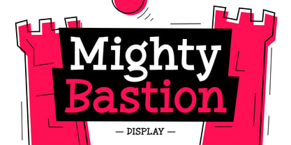 "Mighty Bastion" - an attractive and fun display font. Its classic and dynamic letterforms bring a unique character to your designs, making it ideal for logos & branding, headlines, magazines, posters, quotes, packaging design, labels, and much more!
 - Arkham77 by Jvne77 Studio,
$20.00 Inspired by the works of Howard Philips Lovecraft (1890-1936), and the city of Arkham lying abroad the Miskatonic River... witth all those witchcrafts secrecy and the infamous Necronomicon. The Elder Ones and the mighty Cthulhu, who lies and not dies within the dephts of the ocean in R'lyeh he's awaiting... arf, anyway this font will well set for posters, detective stories or horror books, pulps and others... *Full western latin language with most diacritics and numbers* Included in this set: - ARKHAM77 Black (More formal display) 560 glyphes - ARKHAM77 Elegante (for a creepiest rendition) 590 glyphes - ARKHAM77 Titles (as its name do not tells, for credits, or simple text) 560 glyphes - ARKHAM77 Extras (Embellish your work with this cool collection of frames and ornaments) +100 glyphes

