10,000 search results
(0.738 seconds)
- Cartoon Cavalcade JNL by Jeff Levine,
$29.00 There are times when a customer might look over a dingbat font and like a few of the images because they suit a particular need, but hesitates on purchasing the font because enough of those images isn't available. For all of the lovers of vintage letterpress cartoon cuts, Cartoon Cavalcade JNL collects sixty two assorted images from many of the Jeff Levine Fonts dingbat collections and places them within one singular file.
 - World Pressure by Haksen,
$14.00 Introducing: World Pressure A rustic, dapper handwritten font with a personal charm. With quick dry strokes and a signature style, World Pressure is perfect for branding projects, homeware designs, product packaging - or simply as a stylish text overlay to any background image. World Pressure includes 4 font styles and additional swashes: World Pressure Regular handwritten script font containing upper & lowercase characters, numerals and a large range of punctuation. World Pressure Alternate This is a second version of World Pressure, with a completely new set of both lower and uppercase characters. If you wanted to avoid letters looking the same each time to recreate a custom-made style, or try a different word shape, simply switch to this font for an additional layout option. World Pressure Slant This is a third version of World Pressure, with a completely new set of both lower and uppercase characters in slant version. If you wanted to avoid letters looking the same each time to recreate a custom-made style, or try a different word shape, simply switch to this font for an additional layout option. World Pressure Alternate This is a forth version of World Pressure, with a completely new set of both lower and uppercase characters in slant version. If you wanted to avoid letters looking the same each time to recreate a custom-made style, or try a different word shape, simply switch to this font for an additional layout option. World Pressure Swashes A set of 26 hand-drawn swashes, the perfect finishing touch to underline your Northwell text. Simply install this as a separate font, select it from your font menu and type any A-Z Uppercase and Lowercase also Number 0-9 character to create a swash. Fonts are provided in OTF formats. Fonts include multilingual support. Ligatures are also available for several lowercase characters (double-letters which flow more naturally). These are only accessible via software with opentype capability or a glyphs panel, e.g. Photoshop/Illustrator.
 - Bely by TypeTogether,
$49.00 Bely is the first design by French newcomer Roxane Gataud. Too many typefaces are either governed by fear and never accomplish what they could, or are unrestrained which results in their frenetic dangling like a leaf caught in a spider’s web. Bely’s strength is that it has both restraint and freedom throughout the text weights and into the unique display weight. There is no fear in this type family, but only great respect for both the tradition of reading and the opportunity to make an impression. Bely is a high-class throwback containing four text weights which were built upon classical proportions to capitalise on reading familiarity. Bely Text features balanced capitals and a play between large, triangular serifs at the top and thick, bracketed, rectangular serifs at the bottom. The family is capped by a radical, expressive French-style display weight which pushes the rules of the text weights to their logical extreme. Bely Display, truly daring with its monstrous and angled contrast, exploits the features which make an impression at larger sizes. In the end, Bely Display is adventurous when used in packaging, identities, and headlines with attitude, while Bely Text’s calm baseline and piercing ascenders give paragraphs texture and familiarity. Bely covers the Latin A Extended glyph set and brings its sense of confidence to your projects with its two text weights, matching italics, and unique display style. Bely’s satisfying OpenType features allow for the implementation of typographic niceties such as small caps, both tabular and proportional lining and oldstyle figures, ligatures, alternate characters, case-sensitive variants, and fractions. The complete Bely family, along with our entire catalogue, has been optimised for today’s varied screen uses. Awards – Selected for TypeTogether’s Typeface Publishing Incentive Programme scholarship in 2014. – Selected by French magazine Étapes for the 2014 Diploma Issue. – Selected for the 2014 exhibition “TransFormations” at Centre Pompidou. — Received the SOTA catalyst Award 2016
 - Ice Creamery by FontMesa,
$29.00Ice Creamery is a new variation of our Saloon Girl font family complete with italics and fill fonts which may be used to layer different colors into the open parts of each glyph. We don’t recommend using the fill fonts for Ice Creamery as stand alone solid fonts, Ice Creamery Chocolate was designed as a the stand alone solid font for this font family. Fill fonts go back to the 1850's where they would design matched sets of printing blocks and the layering of colors took place on the printing press, they would print a page in black then on a second printing they would print a solid letter in red or blue over the letters with open spaces to fill them in. Most of the time the second printing didn't line up exactly to the open faced font and it created a misprinted look. With the fill fonts in Ice Creamery and other FontMesa fonts you have the option to perfectly align the fill fonts with the open faced fonts or shift it a little to create a misprinted look which looks pretty cool in some projects such as t-shirt designs. I have some ice cream making history in my family, my Grandfather Fred Hagemann was the manager of the ice cream plant for thirty years at Cock Robin Ice Cream and Burgers in Naperville IL. In the images above I've included an old 1960's photo of the Cock Robin Naperville location, the ice cream plant was behind the restaurant as seen by the chimney stack which was part of the plant. If you were to travel 2000 feet directly behind the Cock Robin sign in the photo, that's where I started the FontMesa type foundry at my home in Naperville. My favorite ice cream flavor was their green pistachio ice cream with black cherries, they called it Spumoni even though it wasn't a true Spumoni recipe. Their butter pecan ice cream was also incredibly good, the pecans were super fresh, their Tin Roof Sundae ice cream was chocolate fudge, caramel and peanuts swirled into vanilla ice cream. One unique thing about Cock Robin and Prince Castle was they used a square ice cream scoop for their sundaes. - SbB Powertrain by Sketchbook B,
$9.00 Bold and angular. SbB Powertrain's glyphs are constructed from simple shapes. All straight edges and lots of right angles, but surprisingly friendly. A wide range of weights and widths make Powertrain perfect for branding projects, posters, logos or any project where you need maximum flexibility. Ten weights and five widths Small caps Stylistic alternatives Opentype figure styles Complete version includes a variable typeface with three axes: weight, width and slant.
 - Rigestha Script by Hrz Studio,
$17.00 Rigestha Script is a calligraphy script font that comes with very beautiful changing characters, a kind of classic decorative copper script with a modern touch, designed with high detail to bring stylish elegance.Rigestha Script is attractive as a typeface that is smooth, clean, feminine, sensual, glamorous, simple and very easy to read, because there are many fancy letter connections. I also offer a number of viable style alternatives for many letters.
 - Blauth by Latinotype,
$29.00 Blauth—a versatile and contemporary sans serif typeface—comes in 8 weights, ranging from Thin to Black, with matching italics and contains a set of alternate characters. Its small x-height gives it an elegant feel that reminds us of classic typefaces. Blauth is well-suited to continuous text and its uppercase set is ideal for high-impact headlines while its softened corners give your designs a warm and contemporary look.
 - TT Runs by TypeType,
$39.00 TT Runs useful links: Specimen PDF | Graphic presentation | Customization options TT Runs Version 2.0—an Unusual Wide-Proportioned Sans Serif! An update that expands the font's capabilities. TT Runs is a font designed for the sports industry. Before starting the development, we researched the identities of various Olympic venues and analyzed current sports brands. We put in maximum effort to design a unique yet elegant modern font well-suited for the sports sector. TT Runs has wide and unusual proportions that are different from traditional ones. It is because of the reversed contrast, which refers to the distinction between the upper and lower parts of letters. The uppercase letters have distinctive inverted proportions, particularly noticeable in characters like K, C, S, and R. This design choice gives the font an original personality and makes the letters look stylish and suitable for both athletic and casual sportswear. While updating the font, we kept its distinctive characteristics and preserved the graphical look of the majority of the characters. However, we thoroughly redesigned the outlines and italic font styles and updated the font's technical aspects entirely. As a result, TT Runs has become more convenient to use, and its range of applications has significantly broadened. - More projects and countries! The set of each font style has expanded from 791 to 917 characters. We added new languages and characters of the expanded Latin and Cyrillic writing systems. - Perfect italics! The new italic font styles are flawless from both graphical and technical points of view. The updated variable font. We have united the roman and italic font styles. You can now change the font on the axes of slope and weight, choosing the suitable values. - The new set of OpenType features! We added the updated numerators with currency symbols, numbers in filled circles, and localization features for the Dutch, Catalan, Turkish, Serbian, Bashkir, Chuvash, Bulgarian, and Romanian languages. TT Runs is an expressive font. It looks aesthetically pleasing on both athletic and casual clothing and is well-suited for printing on any material. Due to its proportions, the font is an ideal choice for headings, offering excellent readability and an elegant appearance in bigger blocks of text. Created with the sports industry in mind, this font brings a touch of style to any modern project. FOLLOW US: Instagram | Facebook | Website TT Runs OpenType features: aalt, ccmp, locl, subs, sinf, sups, numr, dnom, frac, ordn, tnum, onum, lnum, pnum, case, dlig, liga, salt, ss01, ss02, ss03, ss04, ss05, ss06, ss07, ss08, ss09, ss10, ss11, ss12, calt. TT Runs language support: English, Albanian, Basque, Catalan, Croatian, Czech, Danish, Dutch, Estonian, Finnish, French, German, Hungarian, Icelandic, Irish, Italian, Latvian, Lithuanian, Luxembourgish, Maltese, Moldavian (lat), Montenegrin (lat), Norwegian, Polish, Portuguese, Romanian, Serbian (lat), Slovak, Slovenian, Spanish, Swedish, Swiss German, Valencian, Azerbaijani, Kazakh (lat), Turkish, Uzbek (lat), Acehnese, Banjar, Betawi, Bislama, Boholano, Cebuano, Chamorro, Fijian, Filipino, Hiri Motu, Ilocano, Indonesian, Javanese, Khasi, Malay, Marshallese, Minangkabau, Nauruan, Nias, Palauan, Rohingya, Salar, Samoan, Sasak, Sundanese, Tagalog, Tahitian, Tetum, Tok Pisin, Tongan, Uyghur, Afar, Asu, Aymara, Bemba, Bena, Chichewa, Chiga, Embu, Gikuyu, Gusii, Jola-Fonyi, Kabuverdianu, Kalenjin, Kamba, Kikuyu, Kinyarwanda, Kirundi, Kongo, Luba-Kasai, Luganda, Luo, Luyia, Machame, Makhuwa-Meetto, Makonde, Malagasy, Mauritian Creole, Meru, Morisyen, Ndebele, Nyankole, Oromo, Rombo, Rundi, Rwa, Samburu, Sango, Sangu, Sena, Seychellois Creole, Shambala, Shona, Soga, Somali, Sotho, Swahili, Swazi, Taita, Teso, Tsonga, Tswana, Vunjo, Wolof, Xhosa, Zulu, Ganda, Maori, Alsatian, Aragonese, Arumanian, Asturian, Belarusian (lat), Bosnian (lat), Breton, Bulgarian (lat), Colognian, Cornish, Corsican, Esperanto, Faroese, Frisian, Friulian, Gaelic, Gagauz (lat), Galician, Interlingua, Judaeo-Spanish, Karaim (lat), Kashubian, Ladin, Leonese, Manx, Occitan, Rheto-Romance, Romansh, Scots, Silesian, Sorbian, Vastese, Volapük, Võro, Walloon, Walser, Welsh, Karakalpak (lat), Kurdish (lat), Talysh (lat), Tsakhur (Azerbaijan), Turkmen (lat), Zaza, Aleut (lat), Cree, Haitian Creole, Hawaiian, Innu-aimun, Lakota, Karachay-Balkar (lat), Karelian, Livvi-Karelian, Ludic, Tatar, Vepsian, Guarani, Nahuatl, Quechua, Russian, Belarusian (cyr), Bosnian (cyr), Bulgarian (cyr), Macedonian, Serbian (cyr), Ukrainian, Gagauz (cyr), Moldavian (cyr), Kazakh (cyr), Kirghiz, Tadzhik, Turkmen (cyr), Uzbek (cyr), Azerbaijan, Lezgian, Abazin, Agul, Archi, Avar, Dargwa, Ingush, Kabardian, Kabardino-Cherkess, Karachay-Balkar (cyr), Khvarshi, Kumyk, Lak, Nogai, Rutul, Tabasaran, Tsakhur, Buryat, Komi-Permyak, Komi-Yazva, Komi-Zyrian, Shor, Siberian Tatar, Tofalar, Touva, Bashkir, Chechen (cyr), Chuvash, Erzya, Kryashen Tatar, Mordvin-moksha, Tatar Volgaic, Uighur, Rusyn, Karaim (cyr), Montenegrin (cyr), Romani (cyr), Dungan, Karakalpak (cyr), Shughni, Mongolian, Adyghe, Kalmyk, Talysh (cyr) .
 - Panton by Fontfabric,
$47.00 NEW! Update 3.0 What’s New: • New Narrow version of 18 weights • Bulgarian Localization Support • Tabular Figures • Case-Sensitive Punctuation • Extended Glyph Case • Icon Sets PDF Specimen available: http://myfonts.us/suAc3K Panton has been expanded with Panton Narrow! It has 9 uprights and 9 matching italics ranging from Thin to Heavy. The Panton font family includes 54 fonts - 19 uprights with 19 matching italics and 16 icon sets as a bonus! It is characterized by excellent legibility in both web & print design areas, well-finished geometric designs, optimized kerning, excellent web-font performance and legibility etc. Inspired by the classic grotesque typefaces - Panton has his own unique style, expressed in perfectly softened geometric forms. The font family is most suitable for headlines of all sizes, as well as for text blocks that come in both maximum and minimum variations. Panton font styles are applicable for any type of graphic design in web, print, motion graphics etc and perfect for t-shirts and other items like posters and logos.
 - Boilerplate by Wundes,
$18.00Gritty heat-forge stamped metally goodness. Can withstand up to 255 pounds of pressure psi, it even says so right on the graphic. This is a fun display font inspired by the stamped text on barbells, sewer drains, and of course boiler-plates, not that we see many of those anymore, but I digress... This font contains all the standard sub-255 unicode characters, plus a few extras for flavor. Apply this font with liberal amounts of axle grease and she should last ya a lifetime. - Rudal by Twinletter,
$15.00 Rudal is a unique graffiti font that we present to those of you who enjoy the unusual shape of graffiti. By utilizing this typeface, all of your projects will be beautiful and natural, awe-inspiring to everyone who sees them. This graffiti font is great for product logos, poster titles, headlines, packaging, film titles, logotypes, gorgeous writing, and trendy graffiti designs, among other things. Of course, if you utilize this font in your numerous creative projects, they will be perfect and outstanding. Use this typeface right away for your one-of-a-kind and remarkable projects.
 - Lovelope by Ridtype,
$10.00 Lovelope is a cute handwriten font sans serif style. This font is inspired by the expression of happiness from the activities carried out by a little girl in the expression of joy. So we created these fonts to get and feel what they feel. This font is perfect for stickers, printing, logos and other purposes. Thanks for your support of our product, and using it in your project.
 - ViabellaT H Pro by Elsner+Flake,
$40.00 The script version of the typeface Viabella introduces us to the calligraphic side of the Berlin type designer and typographer Karl-Heinz Lange. The sketches for this script typeface, which resulted from the close cooperation with Veronika Elsner and Günther Flake, found their roots in sketch drawings which Karl-Heinz Lange had already drawn in the 1980’s. For the Viabella design, Karl-Heinz Lange drew the basic letterforms of the Black and Regular cuts with a brush. He then re-worked the drawings and transferred them on to tracing paper. The design studio Elsner+Flake in Hamburg cut these typeface extensions and later digitized them manually with the help of the IKARUS Sustem. With the Regular cut as a basis, Elsner+Flake extended the family with the Light version and interpolated and re-worked the Medium weight. The completion of the family was taken over by the type designer Björn Gogalla who had done the same kind of work on Rotola, a design which Karl-Heinz Lange had also created for Elsner+Flake. While Viabella was originally conceived as a headline typeface, its lighter weights can certainly be used for shorter text applications. The Black version creates powerful headlines with highly effective accents. With the help of swashes, which are available for all weights, the user can lighten up longer texts and add special character to titles. In contrast to pure headline fonts, Viabella has been enriched by an extensive complement of special characters. In addition to the Europa-Plus character set which allows setting type in over 70 latin-based languages, the user will find multiple versions of numerals as well as oldstyle figures, tabular and proportional lining figures, diagonal fractions, and a complete set of superior and inferior figures and fractions (60%). With such a rich character set, Viabella is not only ideal for many different uses in the areas of newspaper, magazine and advertising but it will surely be chosen for the design of greeting cards, invitations and other design projects within the privat sphere.
 - LP Philharmonia by URW Type Foundry,
$35.99 Peter Schmidt, well-known designer from Hamburg, browsed in a fashion magazine on a return flight from the United States. At that time he was thinking about a logo for a philharmonic orchestra. In the magazine, he noticed some interesting typography. He removed the page from the magazine and sent it later to Peter Langpeter. That was the inspiration for the creation of the logo. Since Peter Langpeter really liked the classic aesthetics of the resulting letters, he developed a whole new alphabet of it. Initially, only capital letters. Now he has completed this exceptionally beautiful font.
 - Presidentes Portugueses by Pedro Teixeira,
$- This is a list of presidents of the Portuguese Republic, ordered chronologically from the establishment of the republican form of government on October 5, 1910 to the present. This work was built upon original images from this page: https://pt.wikipedia.org/wiki/Lista_de_presidentes_da_Rep%C3%BAblica_Portuguesa
 - Black Oldest by Letterara,
$24.00 Experience the timeless allure of Black Oldest, a font that effortlessly blends style and bold. With its neat and clean design, this serif font is a versatile choice for a wide variety of designs, taking them to new heights of sophistication. Explore the possibilities as you unlock the potential of its alternates and ligatures, allowing you to create the perfect typography design. Whether you're working on a luxury logo and branding, a classy editorial design, magazines, packaging, posters, movies, brands, fashion promotions, or art gallery branding, Black Oldest is the ideal companion for your upcoming projects. Embrace the possibilities and unleash your creativity with this PUA-encoded font, granting you access to all the captivating glyphs it offers. Elevate your designs with the timeless charm of Black Oldest and watch them come to life with elegance and grace.
 - Donsky by Lemonthe,
$14.00 Donsky is a dry brush font. Suitable for any projects such as logos, branding projects, product packaging, mugs, quotes, posters, shopping bags, t-shirts, book covers, labels, photography, watermark, and more. Use this gorgeous and unique handwritten font to bring any DIY project to life!
 - Ozzi Modo NF by Nick's Fonts,
$10.00This double-wide wonder is based on Oswald Cooper’s original drawings for the typeface Cooper Fullface. ATF rejected this offering because they felt that several of the letterforms, and particularly the numbers, were a little too wacky for the mainstream. By now, you know that such an accusation is a "Please don't throw me in the briar patch" plea to yours truly. So, here, proudly and true to their designer’s original intent, are two versions of a really fun font. Both versions of this font include the complete Unicode 1252 Latin and Unicode 1250 Central European character sets. - Mochon by Typodermic,
$11.95 Introducing Mochon, the perfect typeface for architects and designers looking for a touch of personality in their projects. Hand-lettered and inspired by the incredible work of Donald Mochon, the former dean of the RPI School of Architecture, this typeface brings a charming, erudite/hilarious feel to your designs. With Mochon, you can add a touch of wild energy to your work, infusing it with the same creative flair that Don Mochon was known for. This typeface is perfect for designers who want to capture the essence of architectural design in their work. Mochon features automatic shuffling of alphabetic variations, giving your designs a bouncy feel that is both unique and visually interesting. In addition, the letter “I” automatically sprouts serifs in initials and possessive use, adding a touch of elegance to your designs. For those who love to explore stylistic alternatives, Mochon also offers an alternate letter “S” that is accessible through apps that enable OpenType. This means that you can fully customize your designs, giving them a personalized touch that truly stands out. Incorporating Mochon into your design projects is a great way to pay homage to the great Don Mochon while infusing your work with his creative energy. So why not give Mochon a try and see how it can take your designs to the next level? Most Latin-based European writing systems are supported, including the following languages. Afaan Oromo, Afar, Afrikaans, Albanian, Alsatian, Aromanian, Aymara, Bashkir (Latin), Basque, Belarusian (Latin), Bemba, Bikol, Bosnian, Breton, Cape Verdean, Creole, Catalan, Cebuano, Chamorro, Chavacano, Chichewa, Crimean Tatar (Latin), Croatian, Czech, Danish, Dawan, Dholuo, Dutch, English, Estonian, Faroese, Fijian, Filipino, Finnish, French, Frisian, Friulian, Gagauz (Latin), Galician, Ganda, Genoese, German, Greenlandic, Guadeloupean Creole, Haitian Creole, Hawaiian, Hiligaynon, Hungarian, Icelandic, Ilocano, Indonesian, Irish, Italian, Jamaican, Kaqchikel, Karakalpak (Latin), Kashubian, Kikongo, Kinyarwanda, Kirundi, Kurdish (Latin), Latvian, Lithuanian, Lombard, Low Saxon, Luxembourgish, Maasai, Makhuwa, Malay, Maltese, Māori, Moldovan, Montenegrin, Ndebele, Neapolitan, Norwegian, Novial, Occitan, Ossetian (Latin), Papiamento, Piedmontese, Polish, Portuguese, Quechua, Rarotongan, Romanian, Romansh, Sami, Sango, Saramaccan, Sardinian, Scottish Gaelic, Serbian (Latin), Shona, Sicilian, Silesian, Slovak, Slovenian, Somali, Sorbian, Sotho, Spanish, Swahili, Swazi, Swedish, Tagalog, Tahitian, Tetum, Tongan, Tshiluba, Tsonga, Tswana, Tumbuka, Turkish, Turkmen (Latin), Tuvaluan, Uzbek (Latin), Venetian, Vepsian, Võro, Walloon, Waray-Waray, Wayuu, Welsh, Wolof, Xhosa, Yapese, Zapotec Zulu and Zuni.
 - Falstaff MT by Monotype,
$29.99 Falstaff first appeared with Monotype in 1931, an alphabet in the style of a wide, bold antiqua that was especially popular in the first third of the 19th century. Such typefaces distinguished themselves through their consistent basis in the transitional antiqua style. They are characterized by their extremely fine unflexed serifs with no curve connecting them to the thick strokes. The numerals with their generous curves and ball-like stroke endings and beginnings are particularly decorative. The vertical strokes are dominant and give lines of this typeface a column-like and therefore static look. Falstaff is today often used for book titling, especially for mystery novels. It is best used sparingly in middle and larger point sizes.
 - CyberNippon by MXMV Design,
$20.00 CyberNippon is a unique latin script font that references Japanese and Cyberpunk motifs. Literal translation of the name "Cyber Japan" This typeface took many months to complete and was inspired by the style and mood of cyberpunk, for whom Japanese culture is very close. Since the Japanese are inherent in perfectionism, while working on this font, I brought everything to perfection. The result of all the work was, in my opinion, a font that was perfectly verified and worked out for many hours. The main motives that are visible in this work are the modern interpretation of the classic Japanese hieroglyphic systems - hiragana and katakana. Originally, the font was completely handwritten using a calligraphic pen, and then converted to digital format.
 - Helena Signature by Pixesia Studio,
$15.00 Introducing Helena Signature - Signature Script Font Coming with special features combined with such an elegant style, Helena Signature becomes one of a kind typeface that you'll surely need. With its unique, bubbly yet extravagant mode, this Helena Signature typeface will suit any occasion. The handwriting style of this Helena Signature typeface not only shows the authenticity but also provides such a familiar and personal feeling—which adds the kind of intimacy that the readers are probably seeking. The beauty of its style is also engaging, easily catches the readers eye and creates the eager for them to read any kind of message that the Helena Signature is delivering. Hope you Like it. Thanks.
 - Arsapia by URW Type Foundry,
$49.99 Michael Hoffmann manufactures digital fonts for 30 years. At URW++ he contributed to the technological progress. Over the years, he also specialized in the ideal representation of fonts on screen and the complex assembly of international fonts with scripts of all countries. In his latest project he put the emphasis on developing a highly readable typeface. Less interested in the design as in the functionality of this typeface, he designed Arsapia which he has now installed as a system font on all his computers. Michael Hoffmann studied Japanology at the University of Hamburg and traveled in the early years of his professional activity frequently to Japan, there to train the IKARUS font production tools to Japanese customers. In his spare time he plays guitar or golf depending on the weather. The typeface Arsapia has been designed in such a way that all three font styles Light, Regular and Bold have the same width. When a user therefore opts for the use of Arsapia Light, even though he has already written his text in Regular, nothing changes with respect to the letter tracking. When choosing the Bold for emphasis: Nothing changes except the blackness of the letters. A font change does not engender unwanted line and page breaks of itself. All letters can be clearly distinguished from each other. 1 l I O 0 are all different. For programmers and lovers of monospaced fonts Michael Hoffmann has developed a fourth typeface: Arsapia Mono. This is the perfect terminal font.
 - Treasury Pro by Canada Type,
$79.95 The Treasury script waited over 130 years to be digitized, and the Canada Type crew is very proud to have done the honors. And then some. After seven months of meticulous work on some of the most fascinating letter forms ever made, we can easily say that Treasury is the most ambitious, educational and enjoyable type journey we've embarked upon, and we're certain you will be quite happy with the results. Treasury goes beyond being a mere revival of a typeface. Though the original Treasury script is quite breathtaking in its own right, we decided to bring it into the computer age with much more style and functionality than just another lost script becoming digital. The Treasury System is an intuitive set of fonts that takes advantage of the most commonly used feature of today's design software: Layering. Please do help yourself to the PDF and images in the MyFonts gallery for a quick look at the some of the limitless possibilities Treasury has to offer, from simple attractive elegance expressed in the main script, all the way into mysteriously magnificent calligraphic plates. To date in digital type history, this is the most comprehensive and versatile work of its kind. Every designer loves many options to experiment. Experimentation has never been as much fun and productive as it is with Treasury. If you're "compudling" your initial ideas for a layout, or you're just an alphabet fan who loves spending time with letters, working with Treasury is very inspiring and fulfilling. Some of Treasury's features are: - No more endless searching for initial caps that fit your project. The Treasury System lets you build your own initial caps, in any combination of colors, fills, linings or dimensions you like, with a few simple clicks of the mouse. - With two base styles and nine layer fonts, the Treasury System set helps you produce endless possibilities of alternation and variation in dimension, color, and calligraphic combinations to fit your layout's exact needs, down to the very last detail. - 12 pre-combined Treasury fonts are also there to help and inspire layout artists who love shortcuts and don't want to fiddle with too many layers in their layout. Available in small packages on their own, or as part of the complete Treasury package, these 12 fonts can start you up on your way to discovering the perfect fit for your layout. - Every single letter in the Treasury System comes with at least one alternative. Some characters have even three or four alternates. Although the main character set is an authentic rendition of Ihlenburg's 1874 classic, we made sure to include a treasure trove of alternates for maximum usability. - The most gorgeous set of numerals we have seen in a long, long time. The Treasury numbers are what really turned us onto this project in the first place. - Treasury Pro, the incredibly sophisticated OpenType version, combines the complete Treasury System into a single font, programmed for compatibility with Adobe's latest CS and CS2 software programs. Over 2000 characters in one font, for thousands of possibilities. Setting the ideal elegant wordmark, logotype, intitial cap, or headline, no matter how simple or complex, is as easy as taking a minute or two to push a few buttons in Illustrator, Photoshop, or InDesign. We can go on endlessly about the beauty and functionality of this Treasury set, but we really cannot do it justice with words. So try Treasury for yourself and see the amazing possibilities of fun and creativity it has. It can be used pretty much anywhere - signs, book covers, certificates, music inserts, movie posters, greeting cards, invitations, etc. Much thanks are due to the generous and considerable help Canada Type received from the Harvard Library in Boston, Klingspor Museum in Frankfurt, and many type hobbyists and researchers in Canada, England, Germany, the Netherlands, and the United States. Without them it would was near-impossible to track down the lost history of Hermann Ihlenburg, the most prolific German/American type designer and punch cutter of the 19th century. We hope Mr. Ihlenburg is proudly smiling down on us from type designer heaven.
 - Rankfine by Din Studio,
$29.00 Rankfine is a elegant calligraphy with natural and handwritten style. It brings a modern and attractive typeface. Made for any professional project branding. It is the best for logos, branding, wedding and quotes. Includes: Rankfine (OTF) Features: Stylistic Set Beautiful Ligatures Multilingual Support PUA Encoded Numerals and Punctuation Thank you for downloading premium fonts from Din Studio
 - Fiosthic by Din Studio,
$29.00 Fiosthic is a modern signature font with natural and handwritten style. It brings a elegant and attractive typeface. Made for any professional project branding. It is the best for logos, branding, wedding and quotes. Includes: Fiosthic (OTF) Features: Stylistic Set Beautiful Ligatures Multilingual Support PUA Encoded Numerals and Punctuation Thank you for downloading premium fonts from Din Studio
 - Thigles by Abbasy Studio,
$15.00 Thigles, is a font inspired by Signs Painting, these pretty hand painted letters that you can see on buildings, billboards and signboards. Thigles font comes with some alternates and ligature as well to create your design more unique. With additional shadow font you will be able to create the beautiful combination and bring retro touch to your artworks!
 - French Voyager by SilverStag,
$14.00 Vintage & chic, nostalgic & super elegant, modern & art deco! French Voyager is a brand new nostalgic serif font revival that brings all these and even more. It is perfect for logos & quotes, posters & branding, website headlines, newsletters & more! It includes over 60 ligatures and some chic alternate letters, so you can combine it to get the look you want!
 - Roadster Script by Fontop,
$9.00 Welcome my new vintage style ROADSTER font family. With so many extras the font gives additional opportunities for logo creation, branding designs, blogs. Also looks cool when used in headers in signs, layouts, ad materials. OpenType features include swashes and dividers. To use swashes and dividers you need to press dot (.) followed by a number from 1-9 range.
 - Beauty Green by BonjourType,
$13.00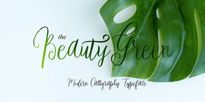 Proudly Present, BeautyGreen Font. BeautyGreen is a modern script font, masterfully designed to become a true favorite. It maintains its classy calligraphic influences while feeling contemporary and fresh. Fall in love with it and bring your projects to the highest levels! Fonts featured : Uppercase, Lowercase, Numbers, Symbols, Accents, Stylistic, Swash, and Ligatures. BeautyGreen also multilingual support
 - Gothic Christmas by Mvmet,
$16.00 Gothic Christmas is a spooky Christmas display font yet playful and fun on the same time. You can use it for anything ranging from t-shirts, book designs, and greeting cards to stickers and posters, or anything that needs a casual touch. Fall in love with its incredibly versatile style, and use it to create lovely designs!
 - Minebold by ahweproject,
$9.00 Minebold is a retro bold handwritten font that will bring you back to the 70s. Fall in love with its unique character and use it to create gorgeous wedding invitations, beautiful stationery art, eye-catching social media posts, and much more! Minebold is PUA encoded, which means you can access all glyphs and swashes with ease!
 - Volta by Linotype,
$29.99Volta is a robust typeface from the 1950s. A revisit to styles that were en vogue at the turn of the century, Bauer type foundry designers Walter Baum and Konrad Bauer designed this type family in1955. The form of Volta's letters are similar to those in New Transitional Serif typefaces, like Cheltenham and Century. Developed after the Didone (i.e., Bodoni) style types, New Transitional Serifs speak more to the zeitgeist of the late 19th Cntury, and were typographic adaptations to it's newer technologies. Already in the period of mass production, typographers and printers at the dawn of the 20th Century had to cope with larger print runs on cheaper materials. The robust letterforms of New Transitional Serifs were designed to compensate for this, but they were also ingenious little inventions in their own right. Form the beginning, the new, peculiar forms of New Transitional Serif letters were adopted for use by advertisers. Their robustness also allowed them to be used in virtually all sizes. Volta was designed especially with advertising display usage in mind. The x-height of Volta's letters is higher than average for serif faces. It is recommended that Volta be used exclusively for shorter tracks of text, above 12 point. Headlines look dashing set in Volta. Four different font styles are available for the Volta typeface: Regular, Medium, Medium Italic, and Bold." - ITC Simran by ITC,
$29.99ITC Simran was created by the London designer Satwinder Sehmi in 1998. The Indian influence is recognizable at first glance and lends the font an exotic feel - at least to the western eye. Sehmi borrowed forms and feelings from northern Indian writing systems for this typeface. Both the upper and lowercase letters make use of the same lowercase forms, but the upperacse letters have the addition of a horizontal bar running over them at the ascender height. This feature is directly reminiscent of writing systems in northern India, and is ITC Simran's most distinguishing characteristic. But there were other influences as well: Sehmi was also inspired by uncial forms when designing this typeface. ITC Simran exhibits the typical look of writing with a broad-tipped pen, with its strong strokes, as well as characteristic letter forms, for example, the a or h. ITC Simran is a fascinating and harmonious symbiosis of a variety of influences from different cultures. This font is best used for headlines and short texts in point sizes of 12 and larger. - Linotype Gotharda by Linotype,
$29.99Linotype Gotharda is part of the Take Type Library, chosen from contestants of Linotype’s International Digital Type Design Contests of 1994 and 1997. This display font started as an experiment of the Croatian-German designer Milo Dominik Ivir. He wanted to design a font with characteristics of both sans serif and Gothic faces. From the Gothic he took the heavy strokes, the narrow letters, the exaggerated overmatter and the high x-height. The modern standard forms of the letters s, a, x and z, the clear capitals and the lack of serifs are the characteristics taken from sans serif faces. The result is a font with a constructed, old German feel. Linotype Gotharda is intended exclusivley for headlines in large point sizes. - Kavarian Serif by Maulana Creative,
$15.00 Kavarian Serif is a handmade Modern Elegant Serif Handmade Typeface, which is combining modern and classic typography with some awesome alternates. Yes we went back to early 1800s, to bring classic touch on this decade. Ligatures: - va ri sn ti gi Font Include: - Ligatures - Multi-lingual support Thanks for use this font. MaulanaCreative.
 - Cantiqe by XdCreative,
$25.00 Cantiqe the rational serif with a circular/ball terminal and strong vertical contrast and fine horizontal hairlines, This makes Cantique a blend of elegant and beautiful. Cantiqe Incredibly versatile is perfect for fashion branding or editorial designs. this font fits a wide pool of designs, elevating them to the highest levels. Add this font to your favourite creative ideas and notice how it makes them come alive! Thank You _xdCreative
 - Spring Has Come by Stefani Letter,
$12.00 Spring has come is a stylish modern handwritten script. It has an unique, striking look which can be used to make any design stand out. Incredibly versatile, this font fits a wide pool of designs, elevating them to the highest levels. Add this font to your favorite creative ideas and notice how it makes them come alive! This font is PUA encoded which means you can access all of the glyphs.
 - Myster by Serebryakov,
$49.00 Myster is a truly random font — each lowercase letter has three alternatives, that interchange in the set. This makes Myster look alive, hand-crafted, painted for a special occasion, rather than a font selected from a regular type case… Of course, the mystical character of the font defines the scope of its usage — film, gaming and publishing industries. However Myster’s field of application goes beyond them. This font is able to create a desired atmosphere in packaging, children books, magazines, as well as in advertising.
 - ITC Ironwork by ITC,
$29.99ITC Ironwork is the work of Serge Pichii, who was inspired by a piece of decorative lettering done by Jan Tschichold in the early 1920s. Tschichold had interlocked a series of rough sans serif letters and embellished them with scattered decorative elements. The original was of only capital letters, touching and overlapping like an ironwork gate made of letters. Pichii completed the typeface with lowercase forms and smoothed the edges. The scrolls of the capitals were extended to the lowercase and Pichii based them on iron scrollwork he found in Vienna and Prague. A lot of attention was paid to the elements of the typeface in order to 'smooth out' and balance proportional relations between the elements," says Pichii. ITC Ironwork is great for signage and display but also works well in short texts."