10,000 search results
(0.065 seconds)
- Romp by Positype,
$30.00 With all ego aside, Romp was designed and influenced by my daughter, Angel. For some time now, she has wanted me to design a font based on her handwriting. But each time I sit down to do it, I run into more that she needs to do and redo. On a recent attempt, I ran into the same situation again. Instead of moving on to something else, I decided to whip out a sumi brush and start making letters...for me, type design is something a little ‘serious’ and never a time to just have fun. This typeface proved that notion wrong—it really was fun. As a result, each letter encouraged another and the design grew...and grew! The happy result spawned 3 separate sets of letters & numerals (small caps and some ligatures too!). Using the beauty of OpenType, these 3 sets have been fused into one, randomly generating font set. If you are using any type of OpenType enabled application, then the Romp Pro typeface is the way to go. They include everything found in the 3 separate variants for each style as well as entirely expanding offering of additional small cap and ligature sets.
 - Selfie Neue Rounded by Lián Types,
$29.00 INTRODUCTION When I started the first Selfie back in 2014 I was aware that I was designing something innovative at some point, because at that time there were not too many, (if any) fonts which rescued so many calligraphy features being at the same time a monolinear sans. I took inspiration from the galerías’ neon signs of my home city, Buenos Aires, and incorporated the logic and ductus of the spencerian style. The result was a very versatile font with many ligatures, swashes and a friendly look. But… I wasn’t cognizant of how successful the font would become! Selfie is maybe the font of my library that I see the most when I finally go out, (type-designers tend to be their entire lives glued to a screen), when I travel, and also the font that I mostly get emails about, asking for little tweaks, new capitals, new swashes. Selfie was used by several renowned clients, became part of many ‘top fonts of the year’ lists and was published in many magazines and books about type-design. These recognitions were, at the same time, cuddles for me and my Selfie and functioned as a driving force in 2020 to start this project which I called Selfie Neue. THE FONT "Selfie for everything" Selfie Neue, because it’s totally new: All its glyphs were re-drawn, all the proportions changed for better, and the old and somehow naive forms of the first Selfie were redesigned. Selfie Neue is now a family of many members (you can choose between a Rounded or a Sharp look), from Thin to Black, and from Short to Tall (because I noticed the feel of the font changed notoriously when altering its proportions). It also includes swashy Caps, which will serve as a perfect match for the lowercase and some incredibly cute icons/dingbats (designed by the talented Melissa Cronenbold) which, as you see in the posters, make the font even more attractive and easy to use. You'll find tons of alternates per glyph. It's impossible to get tired with Selfie! Like it happened with the old Selfie, Selfie Neue Rounded was thought for a really wide range of uses. Magazines, Book-covers, digital media, restaurants, logos, clothing, etc. Hey! The font is also a VF (Variable Font)! So you can have fun with its two axes: x-height and weight, in applications that support them. Let me take a New Selfie! TECHNICAL If you plan to print Selfie Neue VF (Rounded or Sharp), please remember to convert it to outlines first. The majority of the posters above have the "contextual" alternates activated, and this makes the capitals a little smaller. I'd recommend deactivating it if you plan to use Selfie for just one word. Use the font always with the "fi" feature activated so everything ligatures properly. The slant of the font is 24,7 degrees, so if you plan to have its stems vertical, you may use Selfie with that rotation in mind. THANKS FOR READING
 - Holy Mordigan by BlackLotus,
$10.00 Holy Mordigan is a modern script font that is inspired by luxury. Holy Mordigan font makes every design created has an elegant aura. so it has its own value for everyone who sees it. Holy Mordigan also has a variety of alternate options that can be used. What's included in this font pack : -- LARGE GLYPH SETS : There are 409 total glyphs in this font pack. Holy Mordigan comes with a large range of glyphs including punctuation, numerals, international language support, ligatures & additional extra glyphs for stylistic sets. It includes 182 Glyphs of Stylistic Sets to make your text looks natural and beautiful. -- NO SPECIAL SOFTWARE REQUIRED -- INTERNATIONAL LANGUAGE SUPPORT : This font supports English, French, Italian, Spanish, Portuguese, German, Swedish, Norweigen, Danish, Dutch, Finnish, Indonesian, Malay.
 - Amys Hand by Kustomtype,
$15.00 "The Amy Winehouse Script" unveils a unique window into the artistic and personal world of the iconic British singer and songwriter, Amy Winehouse. Renowned for her soulful voice and heartfelt lyrics, Amy's handwriting, a lesser-known facet of her life, offers a captivating story. Amy's script mirrors her artistic and unconventional spirit, marked by artistic flourishes and cursive elegance, echoing her expressive personality. Her cursive style, chosen for its fluidity, mirrors her singing, creating a deep connection between her music and script. Her individualistic script is characterized by varied letter sizes and shapes, reflecting her nonconformist nature and her desire to stand out. It can be messy, much like her turbulent life, representing her emotional journey, marked by highs and lows. Amy's handwriting evolved with her emotional state, sometimes appearing chaotic during difficult times. It's important to note the limited public samples, making it challenging to draw definitive conclusions. "The Amy Winehouse Script" invites you to explore uncharted territories of her life and artistry, offering fresh insights into her unspoken expressions and enduring intrigue. In every line, you can hear the music of her words and the story of her script, reminding us how art transcends boundaries, leaving an indelible mark.
 - Griffith Initials by Celebrity Fontz,
$19.99The Griffith Initials font was inspired by a set of highly stylized capital letters from the remarkable hand of one of Americas foremost penmen, dating back to 1927. They combine a large degree of accuracy, grace, strength, and freedom. This font includes one set of graceful A-Z initials conveniently assigned to both the upper and lower case alphabet characters. - Cavas Nera by Authentype,
$13.00 Cavas Nera modern & elegant font with discretionary ligatures that give each word a different shape. Also contains a swash with an elegant, contrasting, and clean, perfect for logo designs, posters, and various types of promotional media. Including 8 Font weight Thin, ExtraLight, Light, Medium, SemiBold, Bold, ExtraBold, Black. – Standard glyphs uppercase and lowercase letters – Numerals, a large range of punctuation and ligatures. – Swashes. – Multilingual – Works on PC & Mac. Simple installations, accessible in Adobe Illustrator, Adobe Photoshop, Adobe InDesign, even work on Microsoft Word. PUA Encoded Characters – Fully accessible without additional design software. Fonts include multilingual support for; ä ö ü Ä Ö Ü ß ¿¡ _________________________________________________________________________________________ Image used: All photographs/pictures/logo/vectors used in the preview are not included, they are intended for illustration purposes only. Thank you for your purchase! Hope you enjoy our font!
 - Megatura by Haksen,
$19.00 Megatura is a Bold elegant modern vintage with upper and lowercase feel nice balanced curves. This font is inspired by lettering from couple of the good talent artist, but it still has a strong modern appearance. Its wide range of stylistic alternates allows versatile design options and works perfectly for headlines, logos, posters, packaging, T-shirts, postcards and much more. Font Features : Regular and Italic version Character set A-Z Stylistic Alternates & Ligatures Numerals & Punctuation Accented Characters Multiple Languages Supported Recommended to use in Adobe Illustrator or Adobe Photoshop with opentype feature. How to access Alternate Characters? Open glyphs panel : - In Adobe Photoshop choose tool Window > glyphs - In Adobe Illustrator choose tool Type > glyphs If you have questions, just send me a message and I'm glad to help Have a great day Haksen Std
 - Lumien by Craft Supply Co,
$20.00 Lumien – Display Serif: All-Caps Elegance Introduction to Lumien Meet Lumien, a captivating all-caps display serif font that exudes elegance and sophistication. Its timeless design makes it a versatile choice for various applications. Design and Style Lumien boasts a classic serif design with all-capital letters. Its clean lines and sharp edges give it a modern yet timeless appeal, making it suitable for a wide range of display projects. Versatility and Usage This font shines in display settings, making headlines, titles, and logos stand out. It’s an excellent choice for branding, editorial design, and high-impact graphics that demand attention. Distinctive Features Lumien’s all-caps characters ensure clarity and legibility, even at smaller sizes. Its versatility extends to both digital and print media, enhancing the visual impact of any project.
 - Enchanted Land DS by Sharkshock,
$125.00 The 2nd installment of the Enchanted Land family takes us on another medieval adventure, opting to completely rebuild instead of refining the legacy script. More emphasis was put into the undulating nature of the Uppercase characters and how they keep your eyes flowing. For this reason, straight lines and right angles are rarely used in favor of flamboyant terminals and wispy swashes. Lowercase characters, by contrast, adhere to a consistent model defined by its straightened edges and sharp corners. This script flirts with several old world styles but seeks only to borrow elements rather than completely emulate them. German Blackletter, Old English, Uncial, Victorian, it’s in there! Enchanted Land DS would work well in a book, video game, or medieval signage. This family is equipped with Basic Latin, Extended Latin, ligatures, punctuation, a few alternates, and kerning.
 - Overnight Oats by Hanoded,
$11.00 I recently walked part of the South West Coast Path in the UK. A couple of days in the hike, I came across a small cafe and I decided to have an oat latte (I am lactose intolerant). Since it was early in the morning, the breakfast menu was out and one of the items I noticed was ‘Overnight Oats’. I normally cook my oats with some lactose free milk and water, but apparently you can soak them overnight, add fruit and nuts and eat it like that. I tried it, it’s ok, but I think I prefer the cooked version. Overnight Oats is a bit of an odd font: it is very higgledy piggledy, yet legible and unique. If you want something out of the ordinary, then this may be your font!
 - Diesel Rudolf by Ingo,
$82.00 Write like the inventor of the diesel engine — it’s possible with the Diesel Rudolf Script (patterned after the original handwriting of Rudolf Diesel)... In 2008 the city of Augsburg and the MAN Group celebrated the 150th birthday of Rudolf Diesel, inventor of the diesel engine which was named after him. With the help of a few preserved original letters, it was possible to create a convincing digital version of Rudolf Diesel’s personal handwriting. The engineer and inventor Rudolf Diesel was born in Paris in 1858 and also went to school there. In1870 his family moved to England and Rudolf was sent to relatives in Augsburg where he continued going to school. Later, after completing his studies in Munich, he began working as an engineer in the machine factory Linde. Alone this part of his life makes clear why Rudolf Diesel’s handwriting was so ”jerky,“ hesitant and inconsistent. He learned to write according to the French style, that is, Latin cursive — completely different from the very correct and neat German handwriting taught at that time which he had to learn at 13 years of age. These circumstances explain why his handwriting is ”messy“ (especially for those days) with its mixtures of letter forms within a text, even within individual words. Plus, he obviously did not attach much importance to ”pretty writing.“ Sometimes the characters are wide, then narrow, sometimes large and clear and then again crammed and primitive. The individuality is emphasized with characteristics derived from quill and ink. The diversified images of the font Diesel Rudolf Script make more than 80 ligatures and stylistic alternates possible which can be selected with help from the OpenType functions Ligatures and Discretional Ligatures.
 - Frieze by Fine Fonts,
$29.00 The origin of this font was a frieze in the RAF Chapel in Westminster Abbey which Michael Harvey was commissioned to design and create. It was comprised of the names of the top brass in wartime Bomber Command, namely Dowding, Harris, Newall, Tedder, Portal and Douglas. The Brief was to cut the letters in bronze and gild them. Instead, they were cut in perspex and gilded. To sit comfortably within the long and narrow vertical space available beneath the chapel’s stained glass window, extended letterforms were used with many vertical serifs omitted and with lengthened horizontal serifs. Some twenty years later, the missing upper-case letters were drawn together with the lowercase letters and Frieze, the font, was born. Subsequently, additional weights and styles were added to create a font family of six styles.
 - Eugenia by Phoenix Group,
$8.00 Eugenia is a font for display and poster needs. Each stroke reflects the strong nature of a woman who hates what she loves. This font is suitable for posters with the theme of art and enthusiasm. The name Eugenia reflects the glory and the figure who likes to do good, we hope that people who use this font can make something that is good for others.
 - Steinweiss Script by Alphabet Soup,
$59.00 Steinweiss Script began its journey towards daylight when Michael Doret was asked by Taschen Publishing to do cover lettering for the huge commemorative edition they were putting together on the work of Alex Steinweiss—“The Inventor of the Modern Album Cover”. The lettering was to be created to appear similar to the famous “Steinweiss Scrawl” the calligraphy that Steinweiss had used on countless album covers. While designing this piece of lettering, Michael realized that there was great potential for a font that was designed in the spirit of that famous “scrawl”. Through his contacts at Taschen Publishing, he was fortunate enough to be able to contact the Steinweiss family, and get the official Steinweiss approval to proceed with his “Steinweiss Script” project. Michael decided that in addition to giving the font his name as an homage, that he would donate a portion of the proceeds from the sale of this font to the man himself: Alex Steinweiss. Read more about the background of Steinweiss Script in Steven Heller’s article in Imprint. Steinweiss Script is a family of fonts in three weights: Light, Medium, and Bold. Additionally, within each weight there are three variations: Simple, Fancy, and Titling. These variations relate to the size/ratio of the caps to the lowercase, the complexity of those caps, and the size of the ascenders/descenders on the lowercase characters. These variations add usefulness to the font, making it accessible not just for headlines, but for longer passages of text as well. For a better understanding of its unique features please download The Steinweiss Script Users Guide from the Gallery section. PLEASE NOTE: the three Steinweiss Script fonts are cross-platform fonts which depend to some extent on certain advanced OpenType features, therefore they can be used to their full potential only with programs that support those features. When setting Steinweiss Script one should almost ALWAYS select the “Standard Ligatures" and “Contextual Alternates” buttons in your OpenType palette. See the “Read Me First!” file in the Gallery section.
 - Sedid World by Fontuma,
$28.00 Sedid, “solidity; It is an Arabic term meaning “righteousness”. In particular, the correctness and soundness of a word is indicated by this word. The fact that I gave this name to the writing family is to point out its accuracy and robustness. This typeface, which is sans serif, consists of three families: ▪ Sedid: Font family containing Latin letters ▪ Sedid Pro: Font family including Latin, Arabic and Hebrew alphabets ▪ Sedid World: A family of typefaces including Latin, Cyrillic, Greek, Arabic and Hebrew alphabets Do you want a difference in your work? Then meet the Sedid World font family. This font will meet all your expectations in terms of the languages it supports and the variety of glyphs it contains. You can easily use the Sedid World font family in every project. Because this font has beautiful and soft lines. The font family includes open type features, as well as a large number of ligatures, small caps, modifiers, and currency symbols of many countries.
 - Pasmon by HansCo,
$15.00 Pasmon Font is a lettering retro vintage font. You will get alternate characters such as swash on some characters. Equipped with all complete characters ranging from uppercase letters, lowercase letters, numbers, punctuation marks and multi-lingual support, this font is ready to be used in any project. Very suitable for logotype, Stickers, Packaging design, Cricut Project, Headlines, Brand identity, T shirt or Apparel industry, Posters, Magazines, Books, YouTube, Instagram, Websites, Canva, Corjl or any of your creative design projects.
 - Mahezty by DRM Works,
$19.99 Mahezty is a modern, bold and fashionable serif display font. This font is imposing and features uniquely shaped letters, and as a result, it will easily match a wide range of creations that require a distinct touch. Mahezty is perfect choice for people looking for modern, minimalist, elegant, clean, beauty design styles. Suitable for almost any graphic designs such as identity, business cards, branding materials, gift cards, t-shirt, cover, thumbnail, print, poster, photography, quotes .etc
 - Beachwood by Swell Type,
$25.00 Los Angeles’ distinctive “shotgun” style street signs were last produced over sixty years ago, but these durable porcelain and steel signs are still in use all over the city, by both humans and birds, who like to build their nests between the panels. The street names were drawn at wildly different widths to fit on panels which were manufactured in only one size. Beachwood faithfully re-creates the extreme range of widths & weights on these vintage signs, and adds a new matching lowercase. Use the Beachwood Variable font file to access any width, weight or italic angle between the presets — a technology 20th Century sign painters could only dream of! Each weight of Beachwood includes numbers based on the street signs, plus four alternate number sets based on the jerseys of Los Angeles' pro football teams. Beachwood is named for Beachwood Drive, the street which leads to the famous HOLLYWOOD sign, so we just had to include a bouncy HOLLYWOOD mode! FAMILY FEATURES: Five widths (from XTall to XWide), with eight Weights (from ExtraLight to UltraBold), each with matching italics Variable font to access any width, weight or italic slant EACH WEIGHT INCLUDES: 584 glyphs to support 223 languages in Western Europe, Central Europe, Vietnam and Oceania, plus Cyrillics Five styles of numbers, plus Tabular Lining for screen display Ordinals, Fractions and Arrows Hollywood mode!
 - Linotype Sjablony by Linotype,
$29.99Linotype Sjablony is part of the Take Type Library, chosen from the entries of the Linotype-sponsored International Digital Type Design Contests of 1994 and 1997. Designed by Dutch artist Mark van Wageningen, the typeface with its interrupted strokes has the characteristics of the stencils seen on crates and barrels. The difference lies in the raw contours of this font, which make the characters look as though they were slowly eroded away by water and wind. Linotype Sjablony is composed exclusively of heavy capital letters and is particular suitable for initials and headlines with point sizes of 18 and larger. - Grogie by Luhop Creative,
$16.00 Grogie font family consists of 06 families,is a high-contrast typography inspired by transitional and contemporary typography. Fonts extend their use by giving weights ranging from thin to black. The natural curve, a swollen and sloping stem, grows in character as the font gains weight. While the thinner weight has lowered contrast and optical correction to create a warm and soft look. Featuring beautiful, excellent weight and extensive language support. The elegant modern font creates a unique design and is sure to steal the eye of the design target audience. Besides being unique, the Grogie font also has a luxury simple character that makes the design charming and luxurious. Grogie excels in display settings such as headlines, titles, branding projects, Logo design, packaging, magazine headings, advertising, short or long text. Grogie Features: Multilanguange PUA Encoded Alternates Ligatures. Open Type LatPro To be able to access alternative fonts, make sure the software you use can support opentype features such as Microsoft Word, Paint, Adobe, Corel draw, Cricut and other applications. If you need help, please contact me :)
 - ITC Werkstatt by ITC,
$29.99ITC Werkstatt is a result of the combined talents of Alphabet Soup's Paul Crome and Satwinder Sehmi, along with Ilene Strizver and Colin Brignall. It is inspired by the work of Rudolph Koch, the renowned German calligrapher, punchcutter, and type designer of the first third of this century, without being based directly on any of Koch's typefaces. Werkstatt has obvious affinities with the heavy, woodcut look of Koch's popular Neuland, but also with display faces like Wallau and even the light, delicate Koch Antiqua. Brignall began by drawing formal letters with a 55mm cap height, which Sehmi reinterpreted using a pen with a broad-edge nib. “Not an easy process,” says Brignall, “since one of the features of Koch's style is that while it was calligraphic in spirit, most of the time his counter shapes did not bear any resemblance to the external shapes, as they would in normal calligraphy. This meant that Sehmi could not complete a whole character in one go, but had to create the outside and inside shapes separately and then ink in the center of the letters.” The process was repeated, only without entirely filling in the outlines, for the Engraved version. Crome handled the scanning and digitization, maintaining the hand-made feel while creating usable digital outlines. “The collaboration of artisans with particular skills,” says Brignall, “in a modern-day, computer-aided studio environment, seems very much in step with the 'workshop' ethos that Rudolph Koch encouraged and promoted so much.” - Grande SS by Sensatype Studio,
$15.00 grande font is a collections of a modern, feminine, beauty and classy characters, give you unique looks for any branding or logo design needs. grande font is mix of beauty and classy feels, which has a wide range of uses but was mainly intended for logos, perfumes, fashion magazines, invitations, or book covers. Not only you'll find many decorative characters, but also amount of unique alternate characters will make you really adore this font. grande is also included full set of: uppercase and lowercase letters alternates and ligatures multilingual characters numerals punctuations Wish you enjoy our font and if you have a question, don't hesitate to drop message & I'm happy to help :)
 - MattsDinosaurStencils by Ingrimayne Type,
$11.95 This typeface is mostly composed of images of dinosaur skeletons drawn by Matthew Schenk and used as stencils for decoration. I thought they would also make a nice typeface. Check the key map—some of the very large critters are cut into pieces and put on several keys—this may help printing in some situations.
 - Varius by Linotype,
$29.99The shapes of the f-holes on a violin reminded German designer André Maaßen of an italic letter "f". Maaßen used these captivating contours as the theme for his type family, Varius. The name "Varius" is an homage to the manufacturer of the violin that inspired Maaßen's project, Antonio Stradivarius, the most famous manufacturer of violins in music history. Varius has three separate styles. Varius 1 and its italic are the base style of the family, and are typefaces in the baroque serif manner. Varius 2 and its italic are slab serif egyptiennes, slightly heavier than Varius 1's more classical forms. Varius 3 and its italic are semi serif faces; their characters are serifed, but some of the serifs have been cut off. The family is rounded out with two pi faces: an ornaments font (which can be used in conjunction with the text fonts, or on its own to create beautiful borders or individual decorative elements), and a font of musical symbols and notations. Each of the six text fonts has dozens of supplemental ligatures included in their character sets. When these fonts are used in an OpenType-supporting application, such as Adobe InDesign, these ligatures automatically appear in text when the "Discretionary Ligatures" feature is activated. Additionally, the character sets include added alternate glyphs, such as a swash "m" or "n" to finish off a line of text. These can be inserted manually in applications that include glyph palettes (e.g., Adobe InDesign or Illustrator CS). All of the Varius family's letterforms appear slightly narrow, and traces of the wide-nibbed pen can be seen within their forms. Additionally, the shape of a violin's f-hole is a reminiscent element within all of the family's curves. Varius is particularly suited for use many applications, such as body text, newspaper text, display text, headlines, posters, books, screen design, and corporate identity. Use in sizes ranging from body copy text to display and poster format allow the different facets of the typeface to effectively present themselves. The effects can be as versatile as the possibilities! Due to its special character, the typeface could be used in the design of a logo, or within an appropriate corporate design context, to particularly stress individuality. - Helvetica Monospaced by Linotype,
$42.99 Born in 1831, Hermann Berthold was the son of a calico-printer. On completion of his apprenticeship as a precision-instrument maker and after practical experience gained abroad in galvanography, Hermann Berthold founded his "Institute for Galvano Technology" in Berlin in 1858. Very quickly he discovered a method of producing circular lines from brass and not, as customary at that time, from lead or zinc. The soldering normally necessary could also be dispensed with. The lines were elastic and therefore highly durable. They produced outstandingly fine results. Most of German's letterpress printers and many printers abroad placed their orders with Berthold. His products became so popular that the print trade popularized the saying "As precise as Berthold brass". In 1878 Hermann Berthold was commissioned to put an end to the confusion of typographic systems of measurement. With the aid of Professor Foerster he succeeded in devising a basic unit of measurement (1m = 2,660 typographic points). This was the birth of the first generally binding system of typographic measurement. It is still used in the trade. Hermann Berthold served as the head of the Berthold type foundry until 1888.
 - Ringbearer is a font that transports you into the heart of Middle-earth, drawing significant inspiration from the epic narrative and legendary ambiance of J.R.R. Tolkien's "The Lord of the Rings." Th...
- Cranach by profonts,
$41.99 This picturesque, beautiful German Blackletter typeface was originally released by Benjamin Becker Succ, Frankfurt am Main, then named ?K�nstlergotisch?. Ralph M. Unger redesigned, digitally remastered and completed the font based on old catalogues/specimen. In honor of the famous Cranach family, German artists in medieval times, we renamed the font after them. The shadowed version was added for even more eye-catching purposes, e.g. in headlines.
 - Mati by Sudtipos,
$19.00 Father's Day, or June 17 of this year, is in the middle of Argentinian winter. And like people do on wintery Sunday mornings, I was bundled up in bed with too many covers, pillows and comforters. Feeling good and not thinking about anything in particular, Father's Day was nowhere in the vicinity of my mind. My eleven year old son, Matías, came into the room with a handmade present for me. Up to this point, my Father's Day gift history was nothing unusual. Books, socks, hand-painted wooden spoons, the kind of thing any father would expect from his pre-teen son. So you can understand when I say I was bracing myself to fake excitement at my son's present. But this Father's Day was special. I didn't have to fake excitement. I was in fact excited beyond my own belief. Matí's handmade present was a complete alphabet drawn on an A4 paper. Grungy, childish, and sweeter than a ton of honey. He'd spent days making it, three-dimensioning the letters, wiggle-shadowing them. Incredible. A common annoyance for graphic designers is explaining to people, even those close to them, what they do for a living. You have to somehow make it understandable that you are a visual communicator, not an artist. Part of the problem is the fact that "graphic designer" and "visual communicator" are just not in the dictionary of standard professions out there. If you're a plumber, you can wrap all the duties of your job with 3.5 words: I'm a plumber. If you're a graphic designer, no wrapper, 3.5 or 300 words, will ever cover it. I've spent many hours throughout the years explaining to my own family and friends what I do for a living, but most of them still come back and ask what it is exactly that I do for dough. When you're a type designer, that problem magnifies itself considerably. When someone asks you what you do for a living, you start looking for the nearest exit, but none of the ones you can find is any good. All the one-line descriptions are vague, and every single one of them queues a long, one-sided conversation that usually ends with someone getting too drunk listening, or too tired of talking. Now imagine being a type designer, with a curious eleven year old son. The kid is curious as to why daddy keeps writing huge letters on the computer screen. Let's go play some ball, dad. As soon as I finish working, son. He looks over my shoulder and sees a big twirly H on the screen. To him it looks like a game, like I'm not working. And I have to explain it to him again. This Father's Day, my son gave me the one present that tells me he finally understands what I do for a living. Perhaps he is even comfortable with it, or curious enough about that he wants to try it out himself. Either way, it was the happiest Father's Day I've ever had, and I'm prouder of my son than of everything else I've done in my life. This is Matí's font. I hope you find it useful.
 - Shnixgun by Typodermic,
$11.95 In the world of graphic design, the typeface is everything. It’s the foundation on which you build your message, the first impression your reader gets of your brand. And when it comes to creating a unique and memorable brand, there are few typefaces more distinctive than Shnixgun. Based on the venerable Franklin Card Gothic, this inky, textured typeface takes inspiration from the age-old tradition of metal type, infusing it with a modern, edgy twist. Its rustic, weathered appearance is the perfect choice for anyone looking to add a touch of authenticity to their work. But Shnixgun is more than just a pretty face. Thanks to its custom letter pairs, it breaks up the monotony of repetitive letters and adds a level of nuance and sophistication to your message. With Shnixgun, your words become more than just a series of letters—they become a work of art. But what really sets Shnixgun apart is its rusty texture. This is a typeface that wears its age proudly, with every letter infused with the character and patina of a bygone era. Whether you’re designing a vintage-style poster, a hand-crafted logo, or an art magazine spread, Shnixgun is the perfect choice for anyone looking to infuse their work with a sense of warmth, authenticity, and honesty. So don’t settle for a bland, soulless typeface. Let Shnixgun’s rusty glyphs permeate your message with affection and depth, and bring your designs to life with a touch of artistic flair. Most Latin-based European writing systems are supported, including the following languages. Afaan Oromo, Afar, Afrikaans, Albanian, Alsatian, Aromanian, Aymara, Bashkir (Latin), Basque, Belarusian (Latin), Bemba, Bikol, Bosnian, Breton, Cape Verdean, Creole, Catalan, Cebuano, Chamorro, Chavacano, Chichewa, Crimean Tatar (Latin), Croatian, Czech, Danish, Dawan, Dholuo, Dutch, English, Estonian, Faroese, Fijian, Filipino, Finnish, French, Frisian, Friulian, Gagauz (Latin), Galician, Ganda, Genoese, German, Greenlandic, Guadeloupean Creole, Haitian Creole, Hawaiian, Hiligaynon, Hungarian, Icelandic, Ilocano, Indonesian, Irish, Italian, Jamaican, Kaqchikel, Karakalpak (Latin), Kashubian, Kikongo, Kinyarwanda, Kirundi, Kurdish (Latin), Latvian, Lithuanian, Lombard, Low Saxon, Luxembourgish, Maasai, Makhuwa, Malay, Maltese, Māori, Moldovan, Montenegrin, Ndebele, Neapolitan, Norwegian, Novial, Occitan, Ossetian (Latin), Papiamento, Piedmontese, Polish, Portuguese, Quechua, Rarotongan, Romanian, Romansh, Sami, Sango, Saramaccan, Sardinian, Scottish Gaelic, Serbian (Latin), Shona, Sicilian, Silesian, Slovak, Slovenian, Somali, Sorbian, Sotho, Spanish, Swahili, Swazi, Swedish, Tagalog, Tahitian, Tetum, Tongan, Tshiluba, Tsonga, Tswana, Tumbuka, Turkish, Turkmen (Latin), Tuvaluan, Uzbek (Latin), Venetian, Vepsian, Võro, Walloon, Waray-Waray, Wayuu, Welsh, Wolof, Xhosa, Yapese, Zapotec Zulu and Zuni.
 - Noble Line Caps by URW Type Foundry,
$28.00 The basic idea for this headline typeface is to create strictly geometric letters, similar to a script typeface, as far as possible in a single sweep, without setting them down. And similar to a typeface written with a quill, there is a thin and a thicker stroke. The uppercase letters can also be used with the lowercase keys. The varied and unusual variety of forms in this typeface gives headlines, keywords and even short texts the attention they are looking for.
 - Doubleline Caps by URW Type Foundry,
$29.00 The basic idea for this headline typeface is to create strictly geometric letters, similar to script typeface, as far as possible in a single sweep, without setting them down. And similar to a typeface written with a quill, there is a thin and a thicker stroke. The upercase letters can also be used with the lowercase keys. The varied and unusual variety of forms in this typeface gives headlines, keywords and even short texts the attention they are looking for.
 - Letterhack Sans by Comicraft,
$19.00 IT’S MAILBAG TIME! Dear Jolly JG Roshell and Rascally Richard Starkings, Comicraft Fonts are a thing of Beauty and a Joy Forever! You guys must be a Wild Bunch, and I roar with delight whenever a new comicbookfonts release appears in my emailbox. But I have to level with you daredevils...what about us Letterhacks? We need representation too! We haven’t spent years hammering away on our typewriters to be ignored! BRING BACK THE LETTER HACK! In fearless font form. You know it makes sense! Truly Yours, Forbush, Irving, senior.
 - Autor by Latinotype,
$29.00 Autor is a medium-contrast sans serif font with a dynamic stroke modulation. Its clean look and angled terminals give your designs a ‘sharp’ and contemporary feel. Autor Family comes in 7 weights, ranging from Thin to Black, with matching italics, resulting in a total of 14 styles. Autor is well-suited for editorial design, body text in books and magazines, headers and titles. It can also be used—as a display font—for logotypes, branding, advertising and publishing. The font includes a character set containing more than 400 glyphs that support over 200 languages.
 - Rodixu by Product Type,
$17.00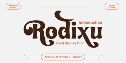 Rodixu is a classic serif font that exudes elegance and sophistication. Each character is carefully crafted with clean lines and balanced proportions, making it perfect for any project that requires a refined touch. Its timeless appeal makes it suitable for anything from editorial layouts to branding materials. With its stylistic alternates and ligatures, Rodixu offers a range of design possibilities and can elevate any project to the next level. Whether you’re creating a logo, website, or print materials, Rodixu is a font that will help you achieve a polished and professional look.
 - Archivo by Scholtz Fonts,
$19.00 Is it calligraphic? Is it handwritten? Something like a fusion - casual, handwritten and calligraphic! My aim was to bring calligraphy into the 21st century, creating a present day version of a calligraphic script. Archivo is clear, legible and extremely versatile. It can be funky and modern, pretty and feminine, serious and old-style. Use it for posters, marketing material, invitations, greeting cards, cosmetic and clothing media. Archivo has standard OpenType features, and language support includes all European character sets. We recommend that you do not use Archivo as an "all-caps" font.
 - Kimberlie Display by Attract Studio,
$23.00 Kimberlie is a luxurious display serif font with unique character by combining geometric shapes with organic curvy details. It is a unique typeface for your individual personality. Inspired by old-style serif and contemporary serif fonts. The extreme contrast between thick and thin strokes gives a harmonic and stylish look. Elegant and sensuality didone serif enhanced by ligatures, alternates and swashes. Kimberlie features OpenType with 1025+ glyphs, 210 Stylistic Alternates, 486 Ligatures. Perfect for a wide range of uses. From greeting cards to magazines, wedding invitations, logos to website etc.
 - Melinda Script by Gatype,
$12.00 The Melinda is a smooth, elegant and flowing handwritten font. It has a beautifully balanced character, it fits into many designs. Melinda features a varied baseline, smooth lines, gorgeous glyphs, and stunning alternatives. Hand-drawn design elements allow you to create many beautiful typographic designs in an instant like branding, web design and editorial, prints, crafts, quotes, It's great for logotypes, wedding invitations, romantic cards, labels, packaging, spelling of names and others. Add to your most creative ideas and watch how they bring them to life! Melinda includes OpenType stylistic alternates, ligatures and International support for most Western Languages.To enable the OpenType Stylistic alternates, you need a program that supports as Adobe Illustrator CS, Adobe Indesign & CorelDraw X6-X7, Microsoft Word 2010 or later versions. How to access all alternative characters using Adobe Illustrator: https://www.youtube.com/watch?v=XzwjMkbB-wQ Melinda is coded with PUA Unicode, which allows full access to all the extra characters without having special designing software. Mac users can use Font Book , and Windows users can use Character Map to view and copy any of the extra characters to paste into your favorite text editor/app. How to access all alternative characters, using Windows Character Map with Photoshop: https://www.youtube.com/watch?v=Go9vacoYmBw
 - June Pro by Schriftlabor,
$33.99 June was first published in 2019 but it got a redesign and upgrade in the character set. It now supports Latin Extended and Vietnamese. It also has OpenType features such as stylistic alternates, case sensitive punctuation, small figures, arrows, superscript, subscript, fractions, and many more. June Pro was inspired by the work of Adrian Frutiger and his exploration into font design and legibility. June Pro is a modern sans-serif family in 10 weights ranging from Thin to Heavy with true italics. It was designed with legibility in mind. It is a versatile and distinctive font that makes it useful for various applications like editorial, web design, or branding.
 - NCL Nostalgic Wedding by Enxyclo Studio,
$12.00 NCL NOSTALGIC WEDDING is romantic wedding script font. It is unique handwritten script font with lots of swash variants. Masterfully designed to become a true favorite, this font has the potential to bring each of your creative ideas to the highest level! It was purposely crafted to be used in large point sizes, although it doesn’t lose its magic in small point sizes. It is perfect for wedding or romantic event, headline, billboard, magazines, website, titles, poster, branding, t-shirt design, and logos. No matter the topic, this font will be an incredible asset to your fonts’ library, as it has the potential to elevate any creation. With this beautiful font, absolutely you can make your project stand out from the rest. See the previews above to get some inspiration on how to use them. FEATURES Contains 478 Glyphs Uppercase, Lowercase & Numeral Punctuation, Symbol & Currencies 70 Stylistic Set 1-4 48 Swash Variants Support for 87 languages: Afrikaans, Albanian, Asu, Basque, Bemba, Bena, Breton, Catalan, Chiga, Colognian, Cornish, Croatian, Czech, Danish, Dutch, Embu, English, Esperanto, Estonian, Filipino, Finnish, French, Friulian, Galician, German, Gusii, Hungarian, Indonesian, Irish, Italian, Kabuverdianu, Kalenjin, Kamba, Kikuyu, Kinyarwanda, Latvian, Lithuanian, Lower Sorbian, Luo Luxembourgish, Luyia, Machame, Makhuwa-Meetto, Makonde, Malagasy, Maltese, Manx, Meru, Morisyen, North Ndebele, Norwegian Bokmål, Norwegian Nynorsk, Nyankole, Oromo, Polish, Portuguese, Quechua, Romansh, Rombo, Rundi, Rwa, Samburu, Sango, Sangu, Scottish Gaelic, Sena, Serbian, Shambala, Shona, Slovak, Soga, Somali, Spanish, Swahili, Swedish, Swiss German, Taita, Teso, Turkish, Upper Sorbian, Uzbek (Latin), Volapük, Vunjo, Walser, Welsh, Western Frisian, Zulu.
 - Ador by Fontador,
$24.99 Ador is a humanist sans serif especially designed for contemporary typography and comes up with 8 weights from ultralight to black plus true italics and 343 ligatures. A large x-height not only creates space in the letters for extra-bold styles, but also lends Ador an open and generous character in the more narrow and semi-bold versions. The nice balance between sharp ink trapped and soft, dynamic shapes helps to work in small sizes. Diagonal stress, angled finials and the 4 degree true italic styles give Ador a dynamic look. The font contains 981 glyphs including small caps, tabular, old style, fractions … and a wide range of flexibility for Latin language support for every typographical needs. Ador is a contemporary sans serif typeface, special for logotypes, brands, magazines and editorial.