171 search results
(0.008 seconds)
- Goudy Two Shoes by Canada Type,
$24.95Goudy Two Shoes is a digitization and expansion of a 1970s type called Goudy Fancy, which originated with Lettergraphics as a film type, then was released into the dry transfer (rub-on) arena, where it became really popular. This digital expansion of the original design contains many additional characters, including "plain" variants on the caps, as well as extra alternates and swashes, and even a few curly ornaments. Goudy Two Shoes comes in all popular font formats. The Postscript and True Type versions ship as 2 fonts, while the OpenType version is a single font programmed with features for OT-savvy applications. - Sanderling by Atlantic Fonts,
$26.00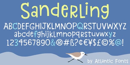 Sanderling is irrepressibly cheerful. Turn on discretionary ligatures to access double-letter ligatures for both cases, plus more chirpy ligatures designed to give flight to Sanderling’s lively character. Sanderling has the legs to make waves!
 - Funky Shed by PizzaDude.dk,
$20.00OMG it's the funky shed! The height and width of each character vary to make it look jumpy. At the same time, Funky Shed, has got a crunchy line which makes it even more funky to look at! - Epos by Serebryakov,
$39.00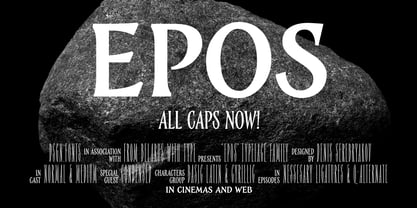 All-cap titling typeface, Epos, comes in three widths and includes a range of decorative ligs & alts – as well as both Latin & Cyrillic scripts. It reminds of hand-lettered book covers from the early and mid 20th century.
 - Doodles by Outside the Line,
$19.00Doodles received honorable mention in U&lc's First Annual Type Design Competition in the Picture Category. Inspiration came from many long hours logged in corporate strategic planning meetings. Check out Doodles the Alphabet designed to compliment the Doodles picture font. - Hopeful Giraffe by JBFoundry,
$18.00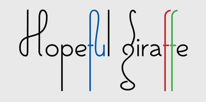 Long legs, long neck, low x-height, it’s Hopeful giraffe. Each of both styles of this family of font contains two stylistic sets. With its ornamental capitals and its varied numerals, you can modulate the aspect of your texts as you want it.
 - Highboy by Elemeno,
$25.00In the world of interior design, a Highboy is a tall chest of drawers with legs. Although this font is wide and bold, it seems ideal for storage. Highboy is best at large sizes, but can easily overwhelm other fonts of lighter weight. - Scrawlerz by Hanoded,
$15.00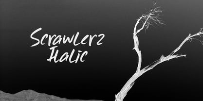 My teacher used to say my writing looked like ‘hanenpoten’ (“rooster legs”). It is a Dutch expression for a scrawly script. When this script emerged, it had ‘scrawl’ written all over it! Scrawlerz is a messy script font with a lot of joie de vivre. Enjoy!
 - Dolina Script by Tour De Force,
$25.00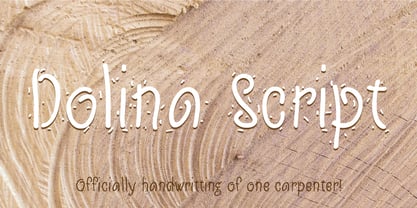 Ingredients: 1) Dusan's right hand; 2) The eye of the Cobra, leg from the dragon, software from the Bill; 3) Elliott Smith (TM) playing in the background; 4) Old grandmother to tell you not to spice it too much; 5) Empty label for your jar/ box/ product...
 - Scurvy Dog by Hanoded,
$15.00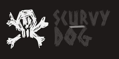 Aye, me lovelies, this be Scurvy Dog, a grand font! The letters were etched into a dead man's chest with a blunt rapier, pickled in brine and covered in spew. Ye could be using this crafty penmanship for yer logs or writing yer dear ol' mothers a letter.
 - Heisenberg by Letteralle,
$17.00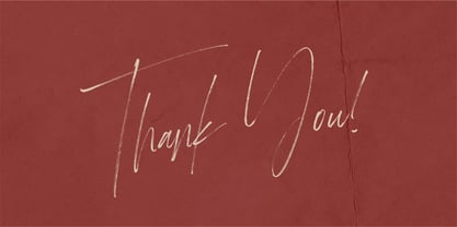 Proudly presenting Heisenberg Rough Signature Font! Heisenberg is a font with wild, natural expressions, yet giving you an elegant impression. This font is handmade, with a spontaneous and free flow. Heisenberg will be able to fulfill your design needs such as packaging, merchandizing, logs, branding, and many others.
 - Marianne by bb-bureau,
$60.00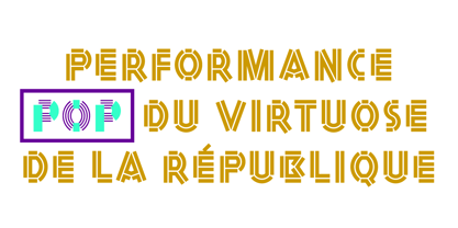 Marianne is a headline lineal designed by Benoît Bodhuin Protest writing (Caps only) made of tape modules joined by drawing a typical notch. 3 styles – Inline, Outline and Solid – each with variants Opentype, many original ligatures (including ‘HTTP’…) and alternative ‘A’ leaning on his right leg, allow many combinations and uses.
 - Deportivo by 8AV,
$15.00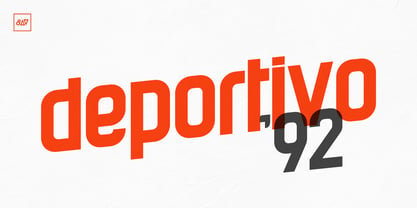 Welcome Deportivo - Spanish for sporty. Deportivo is a simple and powerful typeface based on the lettering on vintage sports equipment. I saw it as a brand on a pair of old skis and fell in love with it because it is so bold and it can be easily read while moving at high speed, making it perfect in a sports and dynamic environment. Due to its high legibility, it gets great results with sports teams, league names and t-shirt numbers and race indications. The high x-height gives the typeface a unique look and a strong tone of voice - that will echo in each arena and outside making it perfect also for headlines in newspapers and magazines and product names. Keep scoring!
 - Guadalupe by Rodrigo Navarro Bolado,
$32.00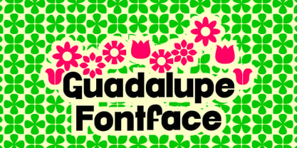 Article to appear on the font family page: According to the Catholic faith, a well known náhuatl story called "Nican Mopohua" (translated as "Here it's narrate") about the Marianas apparitions on the Tepeyac's hill, to the north of the actual Mexico City. After four apparitions, La Virgen de Guadalupe (LVG) told Juan Diego (JD) that he must introduce himself to the first Bishop of Mexico. JD took in his "ayate" some roses (that aren't natives to Mexico's barren territories) and when he dropped them in front of the bishop, the image of LVG appeared in front of him with indigenous features. I’ve worked a lot in this font that appears to came out of nowhere, just like the image of LVG itself, the fact is that I started first sketching some flowers, because I wanted to do something related to this mexican story, so, taking some features from this flowers I started sketching some letters, for example “r” and “i” and the counter forms for some letters like “a” and “o” (that I didn’t use by the way) and the punctuation marks, all inspired by this leaf forms. Lighter weight coming soon! Hope you like it. Any comments: rodrigonabo@gmail.com
 - Buratino by ParaType,
$25.00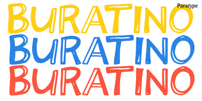 Buratino font got its name from a title character of Russian fairy tale — a clone of Pinocchio. Initially font was cut from a log and then scanned and converted into outline format. The font contains just upper case characters. Can be used in advertising and display typography. Designer — Gennady Fridman. Released by ParaType in 2009.
 - Hilde Sharp by Chank,
$59.00OMG it's got a smiley face underscoring the exclamation point! What a sweet, charming handwriting font from the wrist of an 18-year-old Norwegian girl. A sassy skip and a flowery flair lift this particular marker font up a notch above the rest. Now available in OpenType format for your Personal or Commercial Use. - Scrawny by Maury McCown,
$39.00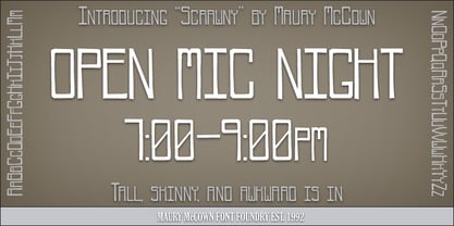 Scrawny is a long-legged beanpole of a font. Quirky, a little retro — and most certainly smile-inducing — Scrawny sports tall and thin characters with high horizontal crossbars to give a feeling of "cute shyness" and "warm fuzziness." Scrawny works great for banners, announcement text, labels, and anything else that requires something with a bit of whimsy.
 - Sabotage by PintassilgoPrints,
$24.00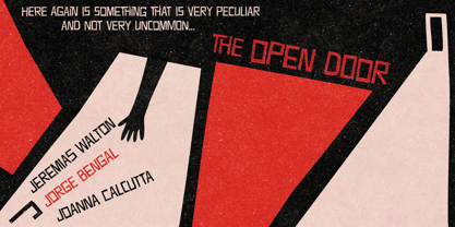 Sabotage is inspired by the iconic Vertigo movie poster by Saul Bass. It is a bold all-caps font that fits a wide range of eye-catching design projects surprisingly well. Check it out! Sabotage offers two versions for each letter, stored in upper- and lower-case slots. When turned on, its contextual alternates feature will instantly alternate these glyphs, preventing double letters from displaying the same letterform while boosting the nice handlettered feel of the typeface. The font is also loaded with a set of stylistic alternates and a couple of discretionary ligatures for even more flexibility. Sabotage is available in 2 flavours, solid and not-that-solid. The family also counts a cool complementary picture font which sort of draws inspiration from the minimalistic - but always striking - book-cover illustrations of Dick Bruna.
 - Hollander by Linotype,
$29.99Hollander is a refined, yet sturdy text typeface designed by Gerard Unger. The name stems from the font’s similarity to the types attributed to van Dijk and Voskens, two Dutch punchcutters from the seventeenth century. Like those earlier Dutch types, Hollander has generous proportions, a tall x-height, and high contrast between thick and thin strokes. It was designed to work in the early arenas of digital technology, when letters were generated as coarse pixels with a cathode ray tube in the typesetters of the 1970s, and then as finer pixels with a laser beam in the machines of the 1980s. Hollander has a well-drawn stability that maintains legibility even on inferior quality paper. When used as a display face, Hollander is an excellent companion to one of Unger’s most successful text faces, Swift. - Eccentric by Monotype,
$29.99Eccentric was designed in 1881 by Gustav F. Schroeder. It is an all-capital, narrow-bodied, monoline display face that could be described as high waisted. With cross-bars and main junctures more than halfway up the letterforms, every letter - except the W - has a long-legged appearance. Eccentric has a wide range of display uses, from playbills to fashion advertisements. - Helsing by Great Lakes Lettering,
$30.00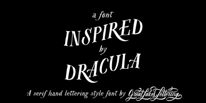 Helsing is a serif style font inspired by Bram Stoker’s 1897 Dracula as well as Edward Gorey’s rendition of the story. Helsing is characterized by his slighting skewed baseline, subtle texture, thick and thin contrasts, and decorative legs. Made as a graphic style font, Helsing is perfect for illustrative titles, small bodies of text, and pairing with contrasting lettering style fonts like Asterism.
 - Courtroom JNL by Jeff Levine,
$29.00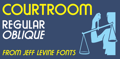 Erle Stanley Gardner’s beloved lawyer “Perry Mason” first appeared on screen in a series of six films with Warren Williams starring in four of them. The hand lettered opening title for 1935’s “The Case of the Lucky Legs” is a classic Art Deco sans serif design, and is now available as Courtroom JNL in both regular and oblique versions.
 - Shandy BF by Bomparte's Fonts,
$40.00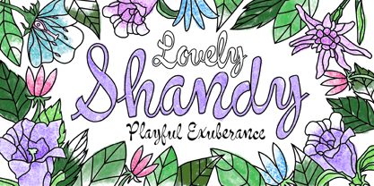 Shandy is a cheerful, free-spirited font that dances jauntily along an undulating baseline. Like Gene Kelly merrily cavorting through that rain-soaked street, in the famous dance scene from Singin’ in the Rain. Curiously, it’s got the liveliness of a bouncy brush script, with some elements of a robust Copperplate-style script, that appear to have been defined by a funhouse carnival mirror. In order to promote variety, no two letters are identical within most occurrences of typical lowercase double-letter pairings (bb, dd, ee, ll, nn, oo, tt, etc.) To enhance your typography, Shandy features many automatic OpenType ligatures, beginning and terminal lowercase forms and Stylistic Alternates for letters E, M and N which are accessible in OpenType-capable applications. Suitable for Branding, Logos, Product Packaging, T-shirts, Magazine headlines, Fashion Glossies, and Food Advertising to name a few arenas.
 - Robots ht by Huerta Tipográfica,
$25.00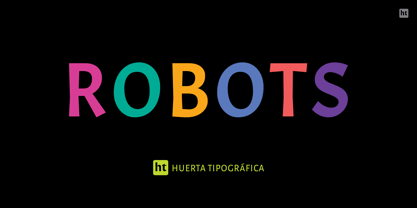 The challenge was to build a family of robots for using assembled or separated into modules. This family consists of 7 styles: the first one contains ready-to-use robots, the other styles contain 387 modules grouped into: heads, torsos, arms & hands, legs & feet, extras (eyes, accessories) and arrows. A family for everyone’s wish. Ready-to-use or make-it-your-own: more than 2 million possible combinations!
 - Al American Legend by Aluyeah Studio,
$125.00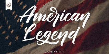 Hello Aluyeaholics! So we tried playing with the script, we hope you like it. American Legend is inspired by vintage handwriting. Comes with 220+ stunning alternates and ligatures. Super easy to use alternates and ligatures. Super Easy to Use alternates - You can easily call alternates using special combination like a.2 a.3 b.5 e.r a.r l.l etc. To get results like the preview just type Ame.rican Leg.9end
 - Sebastian Pro by Storm Type Foundry,
$32.00Sans-serif typefaces compensate for their basic handicap – an absence of serifs – with a softening modulation typical of roman typefaces. Grotesques often inherit a hypertrophy of the x-height, which is very efficient, but not very beautiful. They are like dogs with fat bodies and short legs. Why do we love old Garamonds? Beside beautifully modeled details, they possess aspect-ratios of parts within characters that timelessly and beauteously parallel the anatomy of the human body. Proportions of thighs, arms or legs have their universal rules, but cannot be measured by pixels and millimeters. These sometimes produce almost unnoticeable inner tensions, perceptible only very slowly, after a period of living with the type. Serifed typefaces are open to many possibilities in this regard; when a character is mounted on its edges with serifs, what is happening in between is more freely up to the designer. In the case of grotesques, everything is visible; the shape of the letter must exist in absolute nakedness and total simplicity, and must somehow also be spirited and original. - Else NPL by Linotype,
$29.99At first glance, Else may seem to be similar to many of the Century typefaces, with its prominent figures and sturdy alphabet. But when Robert Norton, of Norton Photosetting Ltd., designed Else in 1982, he added a bit of flair to that basic model. Note the bowl of the g, the splayed legs of the M, the sharply curved G and J, as well as the leading strokes of v and w and both of the graceful ampersands. - Legendary Legerdemain Leggy by Comicraft,
$29.00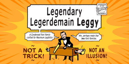 Legendary Legerdemain’s lovely assistant, Leggy is just that -- she’s tall, dazzlingly attractive in her tight-fitting clothes, and has legs right up to her neck! She looks good, strikes attractive poses, and gives LL room to make magic. Gasp as Legendary Legerdemain saws her in half! Cheer as she floats in the air! Look Away as Legendary Legerdemain makes her the target of his knife throwing act! See the families related to Legendary Legerdemain Leggy: Legendary Legerdemain.
 - Shake by Comicraft,
$29.00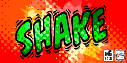 Shake it DOWN! Shake it UP! Shake it OFF! Shake a LEG! You can even shake it like a polaroid picture now that Comicraft has the font that allows you to do just that, in comic book form! Shake is the ideal partner to our font, SHIVER, and yet it does not preclude rattling OR rolling if you're getting ready to RUMBLE! CAUTION: This font may cause you to move to and fro with jerky movements. See the families related to Shake: Shiver.
 - Wandering Pencil by Hanoded,
$15.00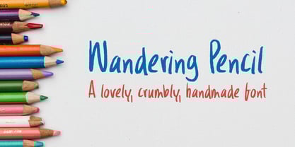 I have a lot of pencils, but when I need one, they seem to have grown legs and have disappeared! When I decided I wanted to create a pencil font, it took me a long time to find the right pencil for the job! Wandering Pencil is a nice, handmade font. It is a bit shaky, a bit rough, but it does have class and will look nice on your designs! Comes with diacritics and double letter ligatures for the lower case.
 - Biago by Letteralle,
$29.00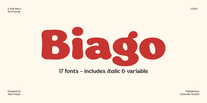 Typeface in 70s and 80s became the inspiration for Biago. soft and bold are the characteristics of Biago. The large and rounded legs make Biago unique and different from other serif fonts. Biago brings a warm, friendly, unique, and simple impression. Biago is intended for display purposes, such as large headlines, titles, logos, or anything that requires special characteristics and attention. Biago's five width, will give you the flexibility to express your interface and design. Italic and alternate versions are also included.
 - Liner Notes by AdultHumanMale,
$20.00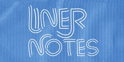 Liner Notes is a fun scrawly, marker felt, ALL CAPS display font. I wanted it to look fun, loud, and to have hints of School graffiti, so it can wail from Posters and Headlines. It has over 260 glyphs and several variations on the standard alphabet and all those extra pésk¥ foreign features. It also has various letters with extra ligatures and flourishes available through OpenType or your Glyphs palette. OMG, LOL I also added some web slang to the glyphs.
 - Whalebone by Hanoded,
$15.00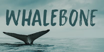 For some reason I had to think of Moby Dick (the classic book by Herman Melville) when I was busy working on this font. No, I don’t live near the sea, nor do I have a pet whale. It’s just one of those things… Whalebone (named after Captain Ahab’s prosthetic leg) is a handmade, all caps brush font. It wasn’t actually made with a brush; I used a broken satay skewer and Chinese ink. Whalebone comes with discretionary ligatures for double letter combinations.
 - Wood Heinz No. 4 by astype,
$50.00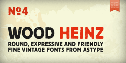 Just Wood Heinz No.4 - the cool display font. Wood Heinz No.4 offering up to four "printed look" variations of all the Latin base letters and figures. An OpenType letter rotator is programmed into the fonts to emulate the randomness of wood type printing. You can switch manually to the alternate letters by using the Stylistic Sets 1 – 4. Stylistic Set 5 will activate the more common look of the capital letter R with a straight leg. PDF Specimen
 - Rodia by Monotype,
$25.00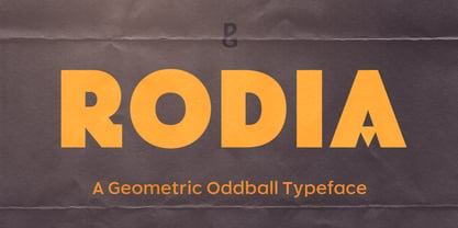 Rodia is an Oddball Geometric Sans Typeface consisting of nine weights in both roman and oblique. It’s a geometric sans with a twist that’s perfect for branding and identity projects – it will also give your body text a unique voice. Inspiration came from the iconic “RADIO” signage that was once in place at 5041, Pico Boulevard, Los Angeles in 1985 (documented at https://tinyurl.com/y2krt2ox). With its distinctive leg, the /R/ provides a personality trait to define the style of the character set. You can clearly see how this characteristic separates Rodia from other geometric sans families – the /k/v/w/x/y/K/R/V/W/X/Y/ glyphs all display the distinctive ‘feet’ and ‘hands’ as terminals to legs and arms. Then there is the /A/ with its triangular crossbar – this triangular motif has been used to embellish alternates in Stylistic Set 1 for /A/E/F/G/H/Q/S/ glyphs. These will add another layer of versatility for your typographic projects. Rodia features an extensive character set covering all Latin European languages. Key features: 9 weights in Roman and Oblique Full European character set (Latin only) 400+ glyphs per font.
 - Camp by Pelavin Fonts,
$25.00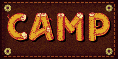 Camp is a rough-hewn, woodsy font that gives new meaning to logging on to your computer. With engraving-like, hand-rendered details, it harkens back to frontier days and simpler times. Whether gliding across a placid lake or trekking through untarnished nature, Camp will let you see the forest among the trees. A family of 5 fonts gives you the option of printing a single color outline w/drop shadow or up to four different colors using the shadow, fill, ends and outline variants.
 - Crafton by Mevstory Studio,
$20.00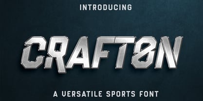 Like traditional athletic block typefaces, Crafton is built with chiseled corners and a rigid skeleton. However, an underlying formula of fervor and functionality emerges in execution. The typeface features traditional block tendencies that are challenged by expressive angles and deviations in line weight that harken to penmanship. Uniquely tapered terminals seen in letters like a, c, and s demonstrate a strong visual energy while increasing legibility. The legs of angled letterforms like the A, v, and y are cropped in a way that further reinforces this motif.
 - Velour by SilkType,
$35.00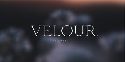 Velour is an elegant display typeface, with thin, bracketed serifs. The typeface’s main features are the curved crossbar on ‘A’ and ‘H’, the long, sophisticated legs of ‘K’ and ‘R’ including an alternative ‘k’ automatically substituted in appropriate places, providing a consistent flow of text and a romantic feel. The typeface comes with a beautiful set of both standard and old-style numerals, two different ampersands and alternates with less complicated letterforms. Velour is available in 6 weights, from Thin to Bold, and supports Western, Central and South Eastern European languages.
 - ITC Cherie by ITC,
$29.99Some words from the designer... Like long legs walking a runway in stiletto heels, ITC Cherie is both sophisticated and feminine. West coast designer Teri Kahan developed this art nouveau-style font into two distinct all capital alphabets – one with a “high waist”, placed in the capital position, and the other a “low-waist,” placed in the lower case position. They work separately or together, and this dual nature gives a designer the ability to make subtle changes in a logo or line of text. Additional flourished letters round out this versatile headline font. - Slinkster by Will Ryan,
$-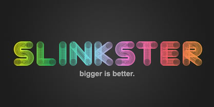 Big. Bold. Beautiful. Slinkster is an intricately unique display face created by carefully overlapping equally-sized circles. The geometric patterns formed become increasingly mesmerizing the larger the type is set. Slinkster works best for display, headers, logotypes, and any other large-scale applications that allow the viewer to become hypnotized by its complexity. Due to how detailed Slinkster is, you may experience some lagging as it can take a while to render. Like this font? Consider donating to encourage further development and new fonts! Donations accepted through this Paypal address: willryan042@gmail.com