1,816 search results
(0.007 seconds)
- Anti by Type Firm,
$39.99 If we look up the definition of the word "grotesque", we find the following: "Odd or unnatural in shape, appearance, or character; fantastically ugly or absurd; bizarre." Following this definition, the design for Anti aims to create an un-compromised version of a grotesque sans-serif – where decorative details live in balance with brutalist shapes. The result is an alphabet with a slightly modernist feeling and an eccentric touch, that work wonders at small sizes. The typeface comes with four weights – light to bold – and features a character set supporting Central and Eastern European as well as Western European languages.
 - Goby by Atlantic Fonts,
$26.00 Goby has several distinct personalities, and can definitely help you make some waves. Lower case Goby is sweet, lively, easy to read, bold, and always friendly. Goby also works great in all-caps, and if you turn on discretionary ligatures, discover a huge stash of funky two and three-letter ligatures that can make ordinary words look extraordinary. The Goby font family also includes Goby Graphics, an ocean-y collection of illustrations by Amy Dietrich. If you need some artful seaweed, a head of coral, a seahorse, or maybe a smiling hermit crab, the unique images of Goby Graphics will work swimmingly.
 - Ersatz by Galapagos,
$39.00Ersatz has its vibrant roots in the Mediterranean climate of Spain. Tired of the functional monoline sanserif fonts used throughout Europe from road signage to corporate identity, Richard Dawson and Dave Farey, British type designers who crave color and sunlight, created a style that is refreshing and lively. The basic constructions are simple and attractive, mixing lower case shapes into the capitals - and unique letterforms into the lower case. There's a raunchy feel to Ersatz, soft curves and back kicks, if you listen very carefully you can hear the sharp guitars and the soft tambourine of the Flamenco. - Tuesnight by PintassilgoPrints,
$29.00 Tuesnight feels like party! Inspired by movie posters from the sixties, but with quite a contemporary accent, this is a lively face, packed with lots of alternates and interlocking pairs. There are also swashes to this side, swashes to that side, stylistic alternates... A zip-zap guide: typing upper- or lower-keys you get different lettershapes. Turn on the Contextual Alternates to get instant cycling of these. For accessing the interlock pairs, click on Standard Ligatures. Or just dive into a glyphs palette and pick your choices. Tuesnight feels like a party, and you're sure invited! Have fun!
 - Genia by Product Type,
$15.00 In every glyph, Genia is lovely and charming. It has a strong, uncompromising style with regulated letterforms and a contemporary edge. Each typeface in the family can stand alone, be lively, and forceful in its own right, and there’s a balance between harsh lines and gentle curves. This typeface also comes with 16 different families to help you create outstanding projects. of course, your various design projects will be perfect and extraordinary if you use this font because this font is equipped with a font family, both for titles and subtitles and sentence text, start using our fonts for your extraordinary projects.
 - Lucky Organics by IbraCreative,
$12.00 Lucky Organic is an endearing and charming handwritten bubble font that radiates pure cuteness and playfulness. With its whimsical and rounded letterforms, Lucky Organic captures the essence of joyful innocence. Each letter is nestled within a delightful bubble, creating a captivating and cheerful visual effect. The font's organic curves and friendly design make it an ideal choice for projects that crave a touch of adorable charm, such as children's books, playful logos, and vibrant signage. Lucky Organic effortlessly transforms any text into a lively display of creativity, bringing a smile to faces and a sense of light-hearted wonder to designs.
 - Walnut Cream by Nathatype,
$29.00 Want to live up the hype of your brand? It's all here. The cute elegant Walnut Cream is a beautiful combination of the handcrafted script font and the uppercase display font to beautify your designs. The font features a set of lower and uppercases, numerals, punctuations, multilingual supports, stylistic sets, ligatures and swashes. It is best to apply for various purposes, such as branding, logotypes, promotions, quotes, and more. See the previews above to get some inspiration on how to use them. Happy designing! Thank you for purchasing from Natha Studio. For further details and queries, feel free to contact us.
 - Liga Sans by Linotype,
$29.99The German designer Alexander Dosiehn developed the Liga Sans type family as part of his graduate thesis at the Fachhochschule Düsseldorf in 2001. Liga Sans is a sans serif typeface that acts as a bridge between classical modern styles. Traces of pen forms and brush strokes can be seen mixed together with the most legible elements from grotesk-style faces in the alphabet’s letterforms. These features work together to create a style that works very in many sizes, including smaller ones! Liga Sans is an original, lively addition to the porfolio from Linotype suitable for text, magazines, and corporate identity work. - Bonbon by Fenotype,
$35.00 Bonbon is a delicious script family of three weights. With the total number of over 850 glyphs per font Bonbon is loaded with alternates: there are at least four alternates for each letter. Turn on Swash, Contextual, Stylistic or Titling Alternates to easily access the variants in any Open Type savvy program or manually select them from Glyph palette. Turn on Small Caps to activate a complete set of clear yet lively capital letters designed to go with the font. For the best results, combine Bonbon with Bonbon Ornaments, a set of 180 swooshes, swashes, ornaments and pictograms to complete your designs.
 - Contemporary Sans by Ludwig Type,
$45.00 Contemporary Sans is a unique grotesque with a distinct contrast between its horizontal and vertical strokes that gives it a lively and elegant appearance. Friendly, subtly formed strokes and individual letter forms make it both legible and pleasant to read at small sizes, and striking at display sizes. Its narrow proportions make it a very easily useable typeface, particularly for narrow columns or tight headlines. It is suited to a wide range of applications, from corporate to editorial design, where a clear and distinctive impression is required. Visit this minisite to see the Contemporary Sans webfonts in action.
 - Fresh Peach by Flawlessandco,
$9.00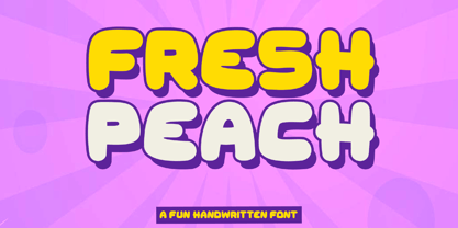 Introducing "Fresh Peach" - a fun and bold handwritten font that brings a burst of energy and playfulness to your designs. With its vibrant and lively letterforms, Fresh Peach adds a delightful touch of creativity and excitement. There's some connected letters and some alternates that suitable for any graphic designs such as branding materials, t-shirt, print, business cards, logo, poster, t-shirt, photography, quotes .etc This font support for some multilingual. Also contains uppercase A-Z and lowercase a-z, alternate character, numbers 0-9, and some punctuation. If you need help, just write me! Thanks so much for checking out my shop!
 - Chunky Dressing by Bogstav,
$14.00 A chunky dressing may not sound very delicate, but I remember my grandmother used make a very chunky dressing for the mashed potatoes. I really loved it - actually I wish I had the recipe so that I could reproduce that particular consistency. But instead I made this font in memory of that lovely chunky dressing! :) Chunky Dressing has got a little Garamond in it, Baskerville as well - and even a touch of Times... Each lowercase letter has 5 different versions and they magically cycles as you type, leaving your text very lively with a natural twist of energetic and organic look
 - Love Potion by HVD Fonts,
$30.00 Hannes von Döhren created Love Potion. Three fonts (Regular/Bold/Ornaments) that include extravagant Ligatures, Swash Letters, Catchwords, Arrows, Borders and other little specials. The hand drawn serif type family is intended to be used in applications like: Food, Clothes, Living, Wedding stationery or basically everywhere where love is in the air… Love Potion is equipped for professional typography. As an exclusively OpenType release, these fonts have an extended character set to support Central and Eastern European as well as Western European languages. In addition to that the fonts contain Standard ligatures, Swash Letters, Catchwords, Arrows, Borders and much more.
 - Blue Goblet Frames and Vignettes #2 by insigne,
$22.00 The designer favorite Blue Goblet series has been extended once again with Blue Goblet Frames and Vignettes #2. These animated and lively frames and vignettes can be resized easily without any loss of quality, and can easily be converted to outlines and modified. Combining them to form unique compositions or inserting them into chapter headings are just a few ideas for these versatile ornaments. Please see the sample .pdf to see all 96 Frames and Vignettes in action, and be sure to check out the original Blue Goblet Frames and Vignettes, Blue Goblet brush script and Blue Goblet Ornaments, Emblems and Florals.
 - Pseudographia by The Ampersand Forest,
$35.00 Pseudographia is a lighthearted, loving pastiche of “Greek-Style” type inspired by J.M. Bergling’s 1917 “Society Greek” lettering. Happily living in the world of kitschy cross-cultural fonts of the kind found on restaurant awnings around the US, Pseudos is blithely unconcerned with legibility. Instead, it embraces its own benign exoticism and revels in its own chicanery! Pseudographia’s standard letterforms are angular Roman forms. Its Stylistic Set One contains a simplified Small Caps version of the kind commonly seen at Mediterranean eateries. Its Stylistic Set Two contains a full set of outlined Ornamental caps. Opa! Part of The Ampersand Forest's Sondheim Series.
 - Merlin by Linotype,
$29.00Linotype Merlin is part of the Take Type Library, which features the winners of Linotype’s International Digital Type Design Contest from 1994 to 1997. This font was designed by Anne Boskamp and its alphabet consists exclusively of capital letters. At the same time aggressive and sensitive, Merlin looks as though it were scratched onto paper with a pen tip saturated with ink. Like characters from another time, the letters fall into place and make an impression which is both vulnerable and strong, lively and reserved. Merlin’s historical roots lie in the archaic pictograms in the caves of Stone Age civilizations. - Cherile by Flawlessandco,
$9.00 Introducing "Cherile" - a lively and playful handwritten font that injects a sense of fun and joy into your designs. With its whimsical letterforms and energetic strokes, Cherile adds a delightful and carefree vibe to any project. There's some connected letters and some alternates that suitable for any graphic designs such as branding materials, t-shirt, print, business cards, logo, poster, t-shirt, photography, quotes .etc This font support for some multilingual. Also contains uppercase A-Z and lowercase a-z, alternate character, numbers 0-9, and some punctuation. If you need help, just write me! Thanks so much for checking out my shop!
 - P22 Huffer by IHOF,
$24.95 Huffer is a chunky and irregular sans-serif font (with a few serifs) that simulates the look of letters crudely cut out of paper. The basic letters were originally inspired by an early 1970s instructional filmstrip dealing with the dangers of glue sniffing. Further inspiration came from other sources of 1960s display lettering. The lower case is almost as tall as the upper case allowing for a mix and match between cases to achieve a more lively display effect. Huffer Pro includes ligatures as well as Cyrillic and Central European character sets with a total of over 500 glyphs.
 - Femi SRF by Stella Roberts Fonts,
$25.00 People often come into your life and make a significant impression that lasts a lifetime. Be they friend, family member or relationship partner, such people are rare and endearing. Sadly, we lose many of these individuals before their time. Femi SRF is dedicated to one such person who was in Stella's life and whose memory will live on long past the duration of his mortal existence. Like Femi himself, this typeface offers a touch of bold elegance and discipline. The net profits from my font sales help defer medical expenses for my siblings, who both suffer with Cystic Fibrosis and diabetes. Thank you.
 - ITC Grimshaw Hand by ITC,
$29.99 ITC Grimshaw Hand is based on the handwriting of its British designer, Phill Grimshaw. Warm and lively, this typeface has the look of spontaneous handwriting with a little extra panache. Note the jaunty k, the swooping f, the simply stylish s, and the absolutely zingy cap Q and R. Grimshaw designed this face in 1995, at a time when he was also playing the guitar and mandolin. Handwriting fonts give an air of intimacy to the graphic design of advertising pieces, packaging, invitations, greeting cards - and ITC Grimshaw Hand has the touch of sweet music in its enthusiastic strokes.
 - M Hei PRC by Monotype HK,
$523.99 Although traditional Heiti typefaces may not be as lively as Songti, the modesty of M Hei makes is enduring and stand out from other similar typefaces. M Hei’s design is based on the hallmarks of traditional Heiti typefaces: it has little to no thick-thin contrast in strokes and has square cut terminals. Its dots (點), ticks (剔) and downstrokes (撇、捺) are subtly curved and longer than usual; all stems (豎) and crossbars (橫) remain simple and clear; and hooks (勾) appear rounded. Together they make a harmonious form which is clean but pure, classy but contemporary.
 - 1483 Rotunda Lyon by GLC,
$38.00 Towards the end of the 1400s, in Lyon (France), was living Barthélémy Buyer, descendant of a rich family of merchants. In the end of 1472, he engaged a typographist from Liège (Belgium): Guillaume Le Roy. The first book stemming from their print shop was the Compendium breve ( by Pope Innocent III.) using Blackletter “textura”. Many books followed, most often illustrated with wood carving. In 1483, to print a French translated “Eneide”, they used a venetian “Rotunda” blackletter. Our font was inspired by this “Rotunda” set, with historical forms and ligatures enriched with accented letters and other characters not existing in the original.
 - Coats by Piñata,
$9.90 We've created a lively antiqua that is perfect for short emotional inscriptions. Coats will warm you up on a cold day and add a little kindness and easiness into any layout. Lines typed with this typeface start “trembling” in long texts, so be careful to use this family for special occasions and in small amounts. Imagine: on a cold day, you've just arrived home from a frosty walk to be rewarded with a cup of hot cocoa topped with marshmallows. We call this feeling the Coats effect. Add to your collection this unique font family that works perfectly in the contemporary digital age.
 - Reardon AOE by Astigmatic,
$19.95 Disco lives on in the alphabet stylings of Reardon AOE. From its uber-fat letterforms to its hole punched counters, Reardon AOE started as a digitization of a film typeface called Joyce Black by LetterGraphics. This flashback typestyle was taken from its limited A-Z and numerals set and fleshed out to include an expanded language glyph set. Reardon AOE finds itself thrown into a late 70’s-early 80’s flashback frame of mind, appealing to all of the disco and video game typography of that time, ready to throw down the vibe for your designs.
 - Quirky Kurlz by Scholtz Fonts,
$22.00 Quirky Kurlz is a cute, curly, vintage font. It's light hearted and funny, rounded and retro. Rounded characters, curly loops and undulating baseline work together to give a lively, look-at-me impression. Use Quirky Kurlz for branding, packaging, girls stuff, kids fashion, greeting cards, party invitations, retro postcards and advertising. Quirky Kurlz has all the features usually included in a fully professional font. Language support includes all European character sets, Greek symbols and all punctuation. Quirky Kurlz makes use of OpenType features to avoid the mechanical look caused by two identical characters side by side.
 - Night Market by Epiclinez,
$18.00 Say goodbye to boring typography and hello to the lively energy that Night Market brings to every design endeavor. From posters promoting events at local night markets to bold signage capturing the spirit of bustling marketplaces, this font is here to infuse your creations with personality and flair with its cool rough textures. Add a dose of playfulness and creativity to your designs with Night Market - because who says business can't be fun? Night Market features : Standard Latin Numbers, symbols, and punctuations Multilingual Support. Fully accessible without additional design software Simple Installations Works on PC & Mac Uppercase Thank You.
 - Jesus Saves by Breauhare,
$13.94 Jesus Saves is a font based on the familiar old logo that has “JESUS” hidden within a maze-like set of multi-branched vertical bars. The characters appear to be an alien, cryptic language at first sight, perhaps even a Japanese, Chinese, or Korean language, thanks to the unusual figures created by the combinations of various letters. It is a teaser for the eyes, as well as a visual feast of De Stijl-type art. It is an attention-getting font that is cool to look at, an eye puzzle that is enticing to decipher. It’s a great font to use for striking logos (see Gallery Images) by the judicious use of ligatures, where in word settings ligatures may be used at the beginnings of words, the middle or the endings of words. Jesus Heals is the missing spaces from the Jesus Saves font, sort of like a doughnut hole font! If you use this font to fill in the spaces in the Jesus Saves font, it becomes whole, or healed, thus the name. Jesus Lives is a raised block/3D or three dimensional version of Jesus Heals. For color combinations in apps that support layering, Jesus Lives synchs and has perfect kerning register with Jesus Heals, as Jesus Heals has with Jesus Saves. The digitization was done by fontmeister John Bomparte.
 - Matahari Sans by Studio Sun,
$36.00 Matahari (English : Sun) is the power source of life. The symbol of power and energy that synergies with other part of daily lives. It is one of the most fundamental thing us humans need, just like communication. And like Matahari itself, words are powerful enough to make a living. Referring to Grotesque Font and influenced by the works of Eric Gill, Matahari Typeface is available in 3 widths and 7 weights, also in Oblique version in each font. The font uses oldstyle and transitional letters (double-story ‘a’ and ‘g’). It has a humanist gesture, the thickness of the font is semi-monolinear where the horizontal and vertical size is almost equal, making the font reach its maximum optical readability even in small sizes. The font anatomy refers to the basic geometric square-sized of the letter ‘M’, while the letters of S/C/G/c/e have uneven curve shape which give the sense of humanist and flexibility. This typeface is ideal for various design needs, from Printing to On-Screen/Digital Reading, from Brand Identity, Posters, Caption, Headline, to Body Text. With the numbers of widths available, the font can be used for all kinds of purposes (Label, Signage, Packaging, Website, etc). Supported well over 75+ languages, including Greek & Cyrillic, Matahari Typeface will give you an excellent way in aesthetic communication and message-delivering.
 - Neue June by Matt Chansky,
$21.00 Four years of development imbue Neue June with its uniquely crafted high x-height, enabling designers to literally and figuratively elevate layout designs. In today’s highly competitive brand marketplace, readability across communication platforms and memorability go hand in hand towards target audience retention. Neue June comes in six weights, from elegant thin to full-bodied emphatic bold, plus italics. You’ll find a robust selection of highly refined multilingual glyphs. In addition to a suite of ligatures, there are a number of extra characters, such as the estimated symbol, the number sign, and directional arrows. When the creative direction calls for sophisticated and memorable tactics—leverage the versatile 385 glyph count for big messages and easily consumable body copy.
 - Bolívar by César Puertas,
$39.95 Bolívar is a contemporary display typeface inspired in the handwriting of one of the most prominent personalities of the Latin American 19th century: Simón Bolívar, “the liberator". The typeface intends to capture the passion of handwritten letterforms and to translate it into type. Among the characteristics that best contribute to its strong personality, are the impressive length of ascenders and descenders as well as the more than 45 degrees of slant. Bolívar mimics certain aspects of handwriting such as the slightly different baseline for each letter and ink clogs in the counters of some letters. Use Bolívar whenever you need to add passion to a piece of text, from logos or single words to sentences and captions.
 - Right In The Kisser by Comicraft,
$29.00 SECONDS OUT! ROUND ONE! The champ comes out swinging, there’s a left hook, a right hook, another left, another left to the chin, a box to the ears, a punch to the stomach, the challenger is reeling, he’s on the ropes, there’s another left to the chin and here’s the knockout, RIGHT IN THE KISSER! The Kisser. The Mouth. You know, what you kiss with? SMAK! It’s a font with a fat lip or one that makes you look like you’re talking’ with a fat lip. Or if you’re more of a lover than a fighter, it’s a big wet kiss from your loved one when the clock strikes midnight on New Year’s Eve. Either way, you win!
 - Amanzi by Scholtz Fonts,
$19.00This African font is modern and fluid. Its name means "water" in the Zulu language, and like the deep rivers that flow through the African jungles, it contains few straight lines. Use it when you want to convey a feeling of strength combined with flexibility. Use it for headings, posters and adverts when you want to create an impact. This African font includes a full character set: - all the upper and lower case letters, as well as all numerals, punctuation and special characters. The numerals are mono-spaced so that they will line up correctly in columns of figures. The letters of the alphabet are spaced according to their width and are carefully kerned to create an attractive appearance. - Neospace Circuit Exp - Personal use only

- Atlantic Sea Washed by URW Type Foundry,
$39.99 The original plan for Atlantic was to design a typeface in the Venetian syle of the Renaissance, with handwriting character and large ascenders. There is a wave-rolling unevenness in both the x- and cap-height caused by the strong ductus pointing to the upper right, together with heavily curved serifs, resulting in a very lively image of text on a page. Atlantic – its name reflects the ocean, ships, carriers and loads, tourism and so on. These are the themes Atlantic is best suited for. The extended family includes a serif, a sans, and a special variant – a SeaWashed. Atlantic was designed for the URW++ SelecType collection.
 - Polynesiac by Poole,
$22.50Polynesiac was discovered deep in the jungle on a cave wall on Gilligan's Island. "I was looking for ancient pictographs, and I find this crap instead!" says designer Wesley Poole. "But, the more I looked at it, the more I appreciated its charms." Sort of tropical, but not strictly Polynesian, this sans serif face never stoops to caricature, and achieves instead, a mysterious new flavor of the South Pacific Islands. Fun as it is, there's a certain dignity to it. "Living in Hawaii you just absorb this stuff. This is a fun loving culture. I hope I captured that, along with some Island Aloha." - Linotype Salamander by Linotype,
$29.99Linotype Salamander is a part of the Take Type Library, selected from the contestants of Linotype’s International Digital Type Design Contests of 1994 and 1997. Designed by German artist Michael Struller, the font seems to be composed of strokes and curves jointed together to form characters. Yet Salamander also looks like a handwriting font, in part because of its slight lean to the right. The font contains four basic weights, from regular to demibold, and two particularly heavy double-weights. Linotype Salamander is a light and lively font, particularly good for short texts of point size 10 and up or, in its heavier weights, for headlines and displays. - Songlines by Fine Fonts,
$29.00 Songlines is based upon a pen-drawn script drawn by Michael Harvey to illustrate a poem by Johannes Thurman. The expressive and rough-edged letterforms of Songlines do not have any lowercase characters. Instead, alternative uppercase characters occupy their positions. By using a mixture of upper-case and lowercase characters, text can be given a very lively and vigorous character. For example, the two versions of L are designed to overlap and interact whichever way round they are used. The augmented Songlines Plus version, has many alternative characters and ligatures added together with Opentype features to enable their automatic substitution where the application in which they are used permits.
 - Stencil Package JNL by Jeff Levine,
$29.00 Stencil Package JNL has its design roots in the brand name hand-lettered on the paper sleeves for the short-lived Stencil-It line of lettering guides produced in 1955 as a direct competitor to Stenso Lettering Guides. Formed by Bernie Aronson [a relative of the Libauers who owned the Stenso Lettering Company and who once worked for them] along with a financial partner (noted artist) Sidney Levyne, the company was soon put out of existence by a court action. It re-emerged in 1956 as the E-Z Letter Stencil Company and existed until the 1990s. Stencil Package JNL is available in both regular and oblique versions.
 - Bodoni Classic Deco by Wiescher Design,
$39.50 Bodoni Classic Deco is against all rules. Giambattista Bodoni himself would probably hate me for doing it; he was a real purist. The whole idea of the Bodoni typeface is no embellishments and here I go and decorate those nice clear letters. Shame on me! But I find this is a very nice and useful typeface for all kinds of cards and certificates. So I just did it for all of you out there that are not born purists, but want a little embellishment to their lives. And to make things worse, I added a Small Caps cut. I even decorated it. Enjoy! Yours, breaking all the rules, Gert Wiescher
 - BD Micron Robots by Typedifferent,
$8.00 The BD Micron Robots variable dingbats font features 52 Microns – micro-tiny robot characters with 5 mutations. The variable font technology helped breathing live into the BD Micron Robots See them in action. The Muta1 version of the font shows the Micron Robots in its original shape. Muta5 is the final stage of the Micron Robots mutations. The Variable version of the Micron Robots font is a variable font and you can determine the grade of the mutation between Muta1 and Muta5 by yourself. By the way: The BD Micron Robots perfectly fit together with the BD Micron Font, also available here at MyFonts.
