10,000 search results
(0.225 seconds)
- RRollie by Eurotypo,
$38.00 RRollie is a typeface family inspired on the proportions of the Roman capital in the Augusto's age, some of them can be seen in inscriptions of Pompeii; in this particular case, it has taken an inscription from a tomb of the year 15 AD. The subtlety of the serif is hardly insinuates, helping to strut the terminals of the stems. Ascenders and descenders are very short. The thickness variation is presented quite delicate, highlighting the light-dark passage and even the agile counterblocks of the typeface. These fonts can be used in many kind of graphic works by its strong personality, visual impact and readability. This font family include OpenType features: Standard and discretionary ligatures, small caps, case sensitive from, old style figures, tabular, diacritics for western languages and many others. Roberto Rollie (1935-2003) was an outstanding professional of Graphic Design, Photography and Visual Artist. He was involved in the creation of the career of Visual Communication Design at the Faculty of Fine Arts (National University of La Plata, Argentina), in the late '60s; he was a pioneer and great teacher too, who loved the Roman Capitals for its subtle and balanced design, especially for high readability and clever design. Those who, like me, knew him as a person and teacher, we are deeply grateful for having received their warmth and enthusiasm for graphic design.
 - ITC Tyke by ITC,
$29.99Tomi Haaparanta got the idea for the Tyke typeface family after using Cooper Black for a design project. He liked Cooper's chubby design, but longed for a wider range of weights. “I wanted a typeface that was cuddly and friendly,” recalls Haaparanta, “but also one that was readable at text sizes.” He started tinkering with the idea, and Tyke began to emerge. Even though Haaparanta knew his boldest weight would equal the heft of Cooper Black, he began drawing the Tyke family with the medium. His goal was to refine the characteristics of the design at this moderate weight, and then build on it to create the light and bold extremes. Haaparanta got the spark to design type in 1990, when he attended a workshop held by Phil Baines at the National College of Art and Design in Dublin. “I've been working and playing with type ever since,” Haaparanta recalls. He released his first commercial font in 1996, while working as an Art Director in Helsinki. After about two dozen more releases, he founded his own type studio, Suomi Type Foundry, early in 2004. At five weights plus corresponding italics, Tyke easily fulfills Haaparanta's goal of creating a wide range of distinctive, completely usable designs. The light through bold weights perform well at both large and small sizes, while the Black is an outstanding alternative to Cooper for display copy. - Wave by Jennifer Delaney Designs,
$23.00 WAVE is characterized by curved lines and intricate details. Each character was individually made in Illustrator and Type Tool using my original illustrations. Wave is a decorative font best used for titles or short bursts of texts in large point settings. The typeface is based on the uppercase letterforms, but I have also created lowercase letters, numbers, and glyphs. The motion lines used in the making of Wave mirror an art deco-style. Inspired by an illustration of a large wave, I was fascinated that by using only lines and solid colors we as artists can depict the translucency and ever-changing movement of waves. I began by delicately sketching out all of the letters using graph paper and micron pens. My work always begins with traditional media. I'm an illustrator, freelance artist, and graphic designer from Chicago, IL. I studied at Texas Christian University, and received my Bachelors of Arts in Graphic Design from Columbia College Chicago. Visit www.jennyddesigns.com for more! :)
 - Cairus by Ixipcalli,
$18.00 Modern typeface for projects for videogames, furutis, space, action,...
 - JBP Pro by PizzaDude.dk,
$25.00 Wicked, cheeky and geeky! That's what went through my mind when updating this font. Originally made around year 2000, and now it comes in a restored and updated version. I cleaned up all curves and lines, added multilingual support and kerning. Based upon classic typefaces like Bodoni and Baskerville, but far more unpredictable and wild.
 - Thrills by Comicraft,
$19.00 Thrills! It's urgent, it's compelling, it's immediate gratification and so much more than a Thrill-a-minute because it's now available in five weights! So Jump, Twist, Flip and Split for this adrenalin-packed family of fonts that will give you a rush of excitement every time you punch in as much as a hyphen!
 - Berlinsa by FadeLine Studio,
$15.00 Berlinsa is a modern script font. It has smooth strokes to give character of a simple, sweet and realistic handwritten style. Berlinsa is perfect for logos, branding projects, homeware designs, product packaging, mugs, quotes, posters, shopping bags, logo's, t-shirts, book covers, name card, invitation cards, greeting cards, and all your other lovely projects.
 - Fresh Pineapple by Zeenesia Studio,
$12.00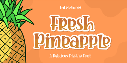 Fresh Pineapple, Delicious handwritten font. It is a beautiful quirky font that perfect for a lettering project like t-shirt design, mugs, advertisements, cutting vinyl, silhouettes, book covers, posters, business cards, social media and more. It supports multiple languages and offers PUA encoding. The doodles make this font so perfect. Hope you love it
 - ALS Agrus by Art. Lebedev Studio,
$63.00 Agrus in Ukrainian means "gooseberry". The letters are rounded like the berries and the sharp end elements remind of the barbs. In fact, the font is an intricate italic type. Optical compensations are purely decorative and rhyme with thin connecting lines. Design of this font is one hundred percent due to “strength of material”
 - Mama Bear by Hanoded,
$15.00 Mama Bear is a playful, neat, children's book typeface. It is cute and happy, very legible and comes with extensive language support, including the 'schwa' glyph found in a handful of languages. Mama Bear was inspired by my 16 month old son, who loves his fluffy bear and likes to play hide and seek.
 - Shaken, Not Stirred by Hanoded,
$15.00 Shaken, Not Stirred. A famous line from just about every James Bond movie (yes, we're talking Martini-time). The font is also quite shaken (and not stirred). It looks like someone scrawled something onto paper, or etched the letters in metal. Shaken, Not Stirred comes with a set of diacritics befitting a Secret Agent.
 - Quimby by Match & Kerosene,
$25.00 Quimby is a retro inspired design marrying love for wedge serifs with grotesque fonts. Inspiration comes from various signage in Detroit, MI. Great for headlines, displays, logos, and short bodies of text. Quimby comes in two styles, and features true small caps, lining numerals for both cap heights, catch phrase words, fractions, and alternates.
 - Rephran by Mirror Types,
$20.00 Rephran is a font completely designed by hand, with brush and black indian ink,all the lines were softly made by hand. Every letter is like a piece of art, including the numbers and signs. Check the PDF in the gallery section to see the details. It includes Capitals, lower case letters, Signs and Numbers.
 - HT Cartoleria by Dharma Type,
$19.99 This font has a lovely roundish shape and gives us cute and relax impression. But because it is upright, it has a well-ordered atmosphere. Holiday Type Project offers retro hand drawing scripts. Inspired by retro script on shopfront lettering, wall paint advertisements in Italy around 1950s. Check out the script fonts from Holiday Type!
 - Roline by HansCo,
$17.00 INTRODUCING ROLINE – Modern Display typeface! ROLINE is a modern lined font with unique style that will make your design looks modern and sophisticated. You can use this font for any purpose, especially to make logotype like a technology logo brand. This typeface is comes in ALL CAPS also support multilingual in ALL CAPS only. Enjoy!
 - Taluhla by Cultivated Mind,
$20.00 Taluhla is lovely handwritten font with a matching set of borders, banners and ornaments. It is unique, elegant and easy to read. Taluhla has 3 different weights (light, regular and bold). It can be best used for invitations, greeting cards, posters, advertising, film, weddings, books, menus and anytime you would like to express yourself kindly.
 - Hearts And Swirls by Outside the Line,
$19.00 Hearts & Swirls is a playful little font by Justine Childs & Rae Kaiser. 52 whimsical hearts and swirls, some solid, some line but lots of little graphics to finish off that wedding, birthday or baby announcement, invitation or flyer. Many ways to say I Love You. 41 hearts for all your Valentine and Wedding needs.
 - Tithua by Muykyta,
$20.00 Tithua is a modern font with strokes clear and well marked, easy to read and simple design. The curved shape on the slab terminations give a harmonious and pleasant smoothing which removes stiffness and enriches the design. For now comes in five different widths and includes Latin extended-A characters and some OpenType features.
 - Bleeding Heart by Romie Creative,
$15.00 Bleeding Heart is a smooth, elegant and flowing handwritten font. It has a beautifully balanced character and as a result, it fits into a wide set of designs. Bleeding Heart has a varied baseline, smooth lines, gorgeous glyphs and amazing alternatives. Add to your most creative ideas and watch how they bring them to life!
 - Calhoun by Josh Grzybowski,
$19.99 Built with both thick and thin lines this display font uses heavy round terminals giving this almost didone-style font a more playful and slightly stylish look. Perfect for magazines and publications as well as for identity and branding. The character set contains typical OpenType features in addition to small caps, and old style numbers.
 - Aphrodite Slim by Typesenses,
$57.00 Aphrodite Slim Pro is not just a lighter version of its sister Aphrodite Pro. Aphrodite Slim Pro has duplicated the quantity of characters of its partner, and that means more than 500 new glyphs, reaching a total of more than 1000. More delicate and meticulous, Aphrodite Slim Pro is once more a new typography with deep calligraphic ideals: We immersed ourselves into the world of each calligraphy ductus and each calligraphy masters by studying from decoration to lettering books. This was the key for the logic of Aphrodite Slim’s behavior. The new concept of Aphrodite Slim Pro was to join diverse styles of calligraphy in one in order to achieve an autonomous expressiveness, in fact, this is what calligraphy aims to, and we agreed to bring those ideals to the world of typography: It is justifiable to be inspired in hundred-year-old calligraphies, but it is even better if the results you obtain have a plus. A personal plus. During the creation process we were wondering whether it was possible to mix certain strokes of such rigid styles as uncial, (Li·n’s favourite style), with strokes of the copperplate, (Sav’s favourite style), and also to take and mix cualities of cancelleresca cursiva, formata and moderna; finally giving our creation a roman-transition italic look. So Aphrodite Slim takes ideals and aspects from those formal styles, following its own logic though, and emphasizing the fact of being a decorative typography. Calligraphy masters of our past are who we are in debt with. They are the cause we have lovely letters now. They have been spontaneous at the moment of creation, what differs from the type-designers of nowadays, whose spontaneity is more limited. Digital faces that we are used to see these days are a result of long hours of optical adjustments, grids, macros and inspirations of other existing typography, but without personal contributions. Aphrodite Slim wants to refute this. Its mission is to rescue de spontaneity of the artesanal lettering in order to obtain unique words; those which only calligraphy masters of our past or lettering artists of our present could give us. We have worked hard to achieve this, making Aphrodite the most universal font we could: It was necessary to study the most common words, focalizing more in the ones referring to “sensitivity”, of four of the most spoken languages in the world. Aphrodite Slim has an enormous quantity of decorative characters and special ligatures for phrases and words in English, French, Spanish and German. (See English, Français, Español, Deutsch PDF in the gallery section). We promise there is no existing type that decorates/ligates glyphs and words like Aphrodite Slim does: It is the first time a font like this really considers its purpose. -The way glyphs are ligated is insane- : Aphrodite Slim rescues some ideals of persons like Jan van den Velde (Italian cancilleresca writing of XVI Century) who understands ascenders and descenders as possibilities to beautify the lines of writing with curved strokes that seem to be dancing above and below of the words. This master also creates ascenders and descenders even where they are not necessary, on letters that do not actually need them: Aphrodite Slim takes this ideal. The font counts with a wide range of glyphs that seem not to be satisfied with its more primitive form and prefer to extreme their parts to be decorative. It also existed masters of calligraphy like José de Casanova of XVII Century, who, with a magnificant skill and a really personal mark, had the particularity of ligating words that were actually separated with spaces. This is another innovative feature in Aphrodite Slim. An investigation of the most common beginnings and endings words of the English language was done. Having that feature activated (discretionary ligatures), common words will start to ligate or to be decorated even when they are separated by spaces. Impossible to forget Francesco Periccioli of XVII Century and our experience us designers to face with works of him: His letters, that today are included in the group of cancellerescas modernas, have been a direct inspiration to the oldstyle figures and historical forms variables in Aphrodite Slim. Giovanni Antonio Tagliente (XVI Century) and his particular way of making tails and diagonals longer than usual, qualities that our creation reflects too. Finally, our adventures in Biblioteca Nacional and Barrio San Telmo, Buenos Aires, were essential for us to make Aphrodite Slim more complete and interesting: Sav did an excellent work when studying how the decorative miscellanea and swirls of early XX century were. She also investigated what particularities made those roman titling characters look antique so she could rescue some ideals for the oldstyle figures and historical forms variables. This also leaded her to create the ornaments variable in Aphrodite Slim. We are really proud of presenting Aphrodite Slim Pro, a typography that was the result of days and nights of working hard, because we do love what we do; and we are glad we are living in a present that gives us the possibility to spread this kind of art, because that is the way we consider our job: Aphrodite Slim Pro is Art. Hope you can appreciate the enormous work this type has. Features. Aphrodite Slim Pro is the most complete variable. It includes more than 1000 glyphs. Thanks to the Open-Type programming, it counts with a easy way to change/alternate glyphs if the application in which the font is used supports this. The variables contained in Aphrodite Slim Pro are also offered separately. Aphrodite Slim Text: It is the variable for lines and paragraphs. Thus it is the least ornamental and the most accurate to achieve a satisfying legibility. It has the Standard Ligatures feature in order to improve the possible conflicts some glyphs could have by others. Aphrodite Slim Contextual: It is the one that makes emphasis in decorating. It has the particularity of ligating/decorating words of common use in English, French, Spanish and German. It also has the quality of ligating common beginnings and endings of the common words in English. Aphrodite Slim Stylistic: With similar features of Slim Contextual. It includes a set of decorative numbers for a display use. Aphrodite Slim Swash: This one has special beginnings and endings to decorate words. Aphrodite Slim Endings: It makes words look as a signature. Aphrodite Slim Historical: It adds an antique look to the written word. It also has the special historical ligature function. Aphrodite Slim Titling: This one is the most decorative. Its copperplate inspired ornaments give words a special color, in order to handle the quantity of decoration, it comes with the standard ligature feature, which has the most common ligatures plus others that make decorative swirls not to be conflictive. Aphrodite Slim Ornaments: A set of 52 ornaments. Aphrodite Slim Pro includes all this features plus the Stylistic Set 1; Stylistic Set 2 and the possibility of Slashed Zero. We recommend you to check out the gallery in order to see all these features in action.
 - Rotis Sans Serif Paneuropean by Monotype,
$98.99Rotis is a comprehensive family group with Sans Serif, Semi Sans, Serif, and Semi Serif styles. The four families have similar weights, heights and proportions; though the Sans is primarily monotone, the Semi Sans has swelling strokes, the Semi Serif has just a few serifs, and the Serif has serifs and strokes with mostly vertical axes. Designed by Otl Aicher for Agfa in 1989, Rotis has become something of a European zeitgeist. This highly rationalized yet intriguing type is seen everywhere, from book text to billboards. The blending of sans with serif was almost revolutionary when Aicher first started working on the idea. Traditionalists felt that discarding serifs from some forms and giving unusual curves and edges to others might be something new, but not something better. But Rotis was based on those principles, and has proven itself not only highly legible, but also remarkably successful on a wide scale. Rotis is easily identifiable in all its styles by the cap C and lowercase c and e: note the hooked tops, serifless bottoms, and underslung body curves. Aicher was a long-time teacher of design with many years of practical experience as a graphic designer. He named Rotis after the small village in southern Germany where he lived. Rotis is suitable for just about any use: book text, documentation, business reports, business correspondence, magazines, newspapers, posters, advertisements, multimedia, and corporate design. - Fresh Sugar by RagamKata,
$14.00 Fresh Sugar takes the classic bubble font style and adds a groovy flair, creating a unique and eye-catching visual language. The rounded, plump letters bring a sense of joy and playfulness to any design, captures the essence of freshness with its vibrant and lively aesthetics. It's like a burst of creativity and positivity in every letterform. Ideal for a range of design projects including posters, social media graphics, packaging, and more. Fresh Sugar adds a touch of sweetness to any creative endeavor.
 - Franken Jr AOE Pro by Astigmatic,
$24.95 Franken Jr. Pro was inspired by the title screen from the 1966 Hanna Barbera cartoon titled, "Frankenstein Jr." The original titling had a unique presence to it, overflowing with charm and offbeat personality. The addition of a Small Caps set, Unlimited Fractionals, Superiors & Inferiors, and Ordinals gave the a bit more serious, but not too serious) titling stance to the Franken Jr. Pro typestyle. Franken Jr. Pro truly embodies the comic lettering of its time, and gives designs a lively retro spark.
 - Marseillette NB by No Bodoni,
$39.00 These four typefaces, Berlinette NB, Lyonette NB, Marseillette NB and Parisette NB, were designed from the same basic shape, a fanciful geometric form that avoids strict horizontals and uses more offbeat triangular shapes. Marseillette is the nasty one, with sharp hook terminations that require careful use. Don�t slip and accidentally stick one in your hand � it will hurt pretty bad and make you blubber like a baby. It�s good for surreal warning signs on dark, forbidding docks where gooey monsters live.
 - Cover Up by Hanoded,
$15.00 Cover Up is a roughish font with a lot of character. Its edges are slightly jagged, there is no real baseline and it looks like the whole thing has been sand blasted. When you get to know Cover Up, you’ll find that it comes with a hidden agenda, because underneath the rough exterior lives an oh-so sweet heart. Use it for your product packaging, book covers and posters - it won’t disappoint you. Comes with an illegal amount of diacritics.
 - Aspen by Ludwig Type,
$39.00 Aspen is a refreshing and resilient typeface for text of any kind. Functional but not faceless, Aspen derives a very distinctive character from an unusual pedigree. It is loosely influenced by early American and European grotesques, but with more warmth and improved legibility. And where these historical models were rigid and bulky, Aspen’s curves have a gentle sway that makes for very comfortable reading. Relatively generous ascenders and descenders allow the typeface to feel spacious even when set with tight leading. These amiable qualities are matched with a lively italic based on cursive writing. The family consists of nine weights, and is intended for both text and display usage. Visit this minisite to see Aspen in action.
 - Blue Goblet Florals by insigne,
$32.99 The designer-favorite Blue Goblet family has grown with the addition of Blue Goblet Florals. Blue Goblet Florals are flowing and abstract ornaments that resemble foliage or flowers rendered in Cory Godbey's unique illustration style. These fresh and lively foliage inspired ornaments can be resized easily without any loss of quality, and can easily be converted to outlines and modified. These floral ornaments can be combined to form unique compositions or inserted directly into layouts. Please see the sample .pdf to see all 55 floral ornaments in action, and be sure to check out the original Blue Goblet brush script and Blue Goblet ornaments, frames and vignettes. Blue Goblet Florals is a collaboration between insigne Design and Portland Studios.
 - Klothilde by Fontroll,
$20.00 Klothilde is a handwriting font which came to life in one of my doodling sessions (I must admit I still doodle with pen and paper). The idea was to create a font which resembles writing with a quill on paper with exaggerated ball terminals. Sometimes there is too much ink which makes the letters fat and the strokes uneven. The paper soaks the ink resulting in blurred line crossings. The form gets blurry. On the other hand, when the quill runs out of ink the stroke gets thinner looking like the light version of Klothilde. In order to emulate the different looks, I created six fonts with a common skeleton but different appearance which can be altered seamlessly by using the Variable Fonts technology (e.g. in latest Adobe apps or CorelDRAW Graphics Suite) along the Weight and Blurred sliders. But even without, Klothilde can be used even in longer copy. Use it from 18 pt upwards, flush left with tight leading and intersecting ascenders and descenders. Due to extensive manual kerning, it gives your text an even colour. To my knowledge, Klothilde is one of the first script Variable fonts in different weights. No, Klothilde’s letters are not connecting. But I added a whole bunch of connecting ligatures which are simply activated by the ligature feature of your app. Even Microsoft Word can do that. Thus Klothilde comes to life, as it should be expected from a handwriting font. In order to add to variety there are additional glyphs for some critical initial and standalone letters. Repeating letter combinations like nn, mm or rr are avoided by replacing the second letter by an alternative form. All features are activated by the standard ligature feature. Ligatures are available for most European languages, some even in Cyrillic (some special Serbo-Croat letters included and accessible through localization or Style Set 08 features). Romanian comma-accent characters and ligatures are accessible through the OpenType locl feature. For the topping on the cake, I added an alternate ampersand (stylistic set 1) and asterisk (ss04), an alternate Cyrillic b (ss02) and t (ss03), a few fleurons, arrows and a skull (OpenType feature ornm), fractions (frac feature), circled numbers (ss06) and an interrobang (ss07) which result in exactly 900 glyphs in each of the six fonts. There should be enough to play with. Should you be missing a special character, do give me a hint.
 - P22 Parrish by P22 Type Foundry,
$24.95 Maxfield Parrish (1870-1966), whose career spanned nearly ninety years, holds a unique place in American art and culture. He was enormously accomplished and successful in both fine art and commercial endeavors. Parrish's hand-drawn letters were a significant part of his works, which bridged the familiar with a startling otherworldliness. P22 has created the Parrish font set in cooperation with the National Museum of American Illustration.
 - Johabu by Monotype,
$29.99Johabu is based on Gebrochene Fraktur, a lighter softer sort of type, compared to the German forms of the same period. Johabu was drawn by Johannes Bureus, around 1620, cut and cast by Peter van Selow in Stockholm. Johannes Bureus, archaeologist and linguist, designed and let Selow cast runes in 1598, and he became the first Swedish keeper, archivist, of the National Record Office State Archives. - Art Museum JNL by Jeff Levine,
$29.00 Art Museum JNL is yet another take on the classic Art Deco "solid letter" fonts that emulate the style of Futura Black. This version comes to you through the courtesy of a vintage WPA (Works Progress Administration) poster promoting national parks and Winter sports. Take note of the unusual inverted middle crossbar on the 'E' and 'F' as inspired by the poster's hand lettering.
 - Adis Ababa by Simeon out West,
$20.00 Adis Ababa is a font based on an ancient Ge'ez script. The Ge'ez alphabet is the written language of the ancient ancestors of the Ethiopian and Eritrean nation. It is not a Latin or Greek based alphabet and I have striven in this font to present a readable Latin alphabet that visually reminds me of some of the examples of the writing that I have seen.
 - Suit Sans Pro by Just in Type,
$29.00 Suit Sans Pro is a typeface designed for multi-purposes with a wide range of 12 weights plus italics. The large set of 1377 glyphs embraces a lot of latin languages, and it’s perfect for multi-national brands. Take a look at the specimen. Suit Sans Pro is too much for you? Take a look on Suit Sans STD, a simpler version for Suit Sans.
 - WildForest by Enfeeltype,
$15.00 This font was born out of love with nature, designed to preserve and instill an even greater appreciation for our world. WildForest is a modern typeface born from the wild. This font was born out of love with this nature, and its intention is to capture the spark of something beautiful, yet wild and full of life. This font was designed with a careful eye on the details and has accents that recall the spirit of nature, made in a style that will be loved by both professionals and amateurs. Made with care and precision, WildForest appeals to both professional designers and amateur designers alike. Worthy of any article or design, WildForest embodies a typeface that is truly unique.
 - Carrara by Hoftype,
$49.00 Carrara is a highly readable text face with a loose reference to classical transitional types. Carrara was designed 2016. It presents a solid structure which makes it very assertive in text applications. In headlines it shows the individual details of the forms which gives it a gentle flow and makes for a distinguished and distinct appearance, while avoiding any noisiness. The Carrara family consists of 12 styles and is well equipped for ambitious typography. It comes in OpenType format with extended language support. All weights contain ligatures, superior characters, proportional lining figures, tabular lining figures, proportional old style figures, lining old style figures, matching currency symbols, fraction- and scientific numerals, matching arrows and alternate characters.
 - Skagwae by Ingrimayne Type,
$7.95 The characters of Skagwae have no curves, just straight line segments. The letter shapes themselves are fairly standard, but the choppy line segments used to construct them give the fonts a crude, unfinished look that is highlighted at large point sizes. At small point sizes the fonts are surprisingly legible. The family has nine styles. The regular, bold, italic, bold italic, shadow, and shadow inside styles are proportionally spaced. Shadowinside is very similar to regular but is spaced to be used in a layer with the shadow style. SkagwaeMono-Regular and SkagwaeMono-Bold are monospaced versions of the family. A third monospaced style, SkagwaeMono-Rippled, is a distorted version with squiggly lines full of curves.
 - Lemonilla by Raditya Type,
$14.00 Lemonilla | Quirky Display Font Lemonilla a bold, quirky display font with a fun, trendy street style vibe. From posters designs to t-shirts and packaging, Lemonilla will give your designs that alternative minimal look and make your creative work look supercharged. Lemonilla was hand-drawn, making its outlines somewhat irregular and quirky. It has an almost hand-lettered look; the characters jump around the baseline giving it a charming but urban look and feel. The modern bold sans serif typeface has a host of alternatives and ligatures included. Combine its bold shapes to give your work a more unique, hipster attitude. Easily create professional cool type lockups that look like hand lettering.
 - Triump by Latinotype,
$26.00 The typeface family Triump is a simple sans serif with 6 weights from Thin, ideal for use as an epigraph, to Black for head titles of special impact. Excellent for applying in graphic design as logos, trademarks, posters, editorial and web design. Inspired by the classic types of the late twentieth century with rounded corners that give the typography a smooth appearance with rounded ends, with a horizontal stroke that exceeds the vertical in the letters A, E, F, H, J and K which gives a distinct personality. Triump comes with a Black weight in normal and italic Line both upper and lowercase letters, especially to give a vintage look to the designs.
 - Sabryne by Subectype,
$15.00 Sabryne is a beautiful and lovely script font. It has a great readability and will add a fun and lovely touch to any design. Sabryne is versatile and can be used on cards, posters, merchandise, book covers, websites, packaging, and basically anywhere you like. The overall feel of the font is warm, elegant and informal and it is perfect if you want to convey a sense of friendliness and style. The script has 250+ lovely glyphs with lots of stylistic variations, ligatures and swashes, which you can mix and match for a more interesting effect. The dancing baseline makes it very casual and full of personality, thus a great addition to every design project.