10,000 search results
(0.105 seconds)
- FG Adam by YOFF,
$15.95FG Adam turned out (it always is like that) a bit crazy with the baseline shift it makes a good greeting card font. I like it and it's fun! - Graffick Wide by Graffiti Fonts,
$12.99Halfway between graffiti & typeography you find styles like Graffick™. These fonts are derived directly from hand written letters made mechanically perfect to behave more like common digital fonts. - Jugelia by PizzaDude.dk,
$20.00Jugelia is love! - FS Sinclair by Fontsmith,
$80.00 ZX Spectrum In 1982, a home computer came on the market that would launch the UK IT industry. The ZX Spectrum sold five million units and spawned thousands of software titles. It was the must-have gadget for every teen. FS Sinclair is inspired by the memory of Sir Clive Sinclair’s greatest creation: the experience of entering its clunky command codes and reading its simple, grid-placed type. Smart, switched-on, great in text and display, FS Sinclair is a modern grid-based font, drawn with the Spectrum in mind and brought to life by well thought-out design. Formula Having completed the font for Channel 4’s brand update, the Fontsmith team defined the formula for its next font: the creative essence of the C4 work but with more structural discipline, more rigid form and a little more seriousness. The new font wouldn’t look self-consciously retro but it would reference the past and, it was hoped, influence the future. Readability Like the ZX Spectrum, it took a while for the new font to do exactly what it was meant to do. Many of the early concepts by Phil Garnham and Jason Smith were too jagged – the result of an awareness of getting too close to existing fonts of the same ilk, such as Wim Crouwel’s Gridnik. Eventually, FS Sinclair evolved into a more readable, functional grid-based type design that answered Phil and Jason’s original, self-set brief. Idiosyncratic There’s a technological, systems feel to FS Sinclair but ultimately, humans are in charge. The lowercase “a”, “n”, “m” and “r” have clean-cut “ears”, and the square-ish design is softened by round joins on the inside of the letterforms. The idiosyncratic design of letters such as “g”, “j”, “k”, “v”, “w” and “y” bring the design up to date. This is a modular font with character, and a range of weights that allow varied application.
 - FS Neruda by Fontsmith,
$80.00 A literary font FS Neruda takes its name from Chilean poet Pablo Neruda, described as “the greatest poet of the 20th century in any language”. As such, it’s a font that references the very best literary typeface traditions. Smart, sharp and classical, FS Neruda bridges the gap between the classical and the offbeat. This font started life in the world of newspapers and books and is the perfect storytelling typeface for savvy, inquiring readers whether in printed journals, hard news, short online missives or poetry. Idiosyncratic precision FS Neruda is clear and legible in body text, while also being a space-saver fitting in more characters on each line than the typefaces that inspired it. In larger sizes it becomes a different beast – livelier, quirkier, but no less sharp. This is a truly classic typeface designed with long text setting in mind, thanks to its large x-heights, and short ascenders and descenders. FS Neruda mixes suave, sharp confidence with a sense of fragility and quirkiness. It’s knowledgeable, informative and idiosyncratic; one for readers and enquiring minds. Subtle weight modifications The construction and details of the letterforms differ across each of the five weights, with each cut separately to evoke different flavours: Thin is typewriter-like, Light is classy, Regular is canonical, Bold is robust, Black is magazine-esque. FS Neruda also boasts a radiant italic companion, a wide set of small caps, lower and uppercase ligatures, case punctuation and spacing, four sets of figures, and some ageless typographic symbols such as manicules, fleurons and teardrop crosses. Suggestive simplicity “The key to success in the current type design landscape is to design a typeface which looks conventional at text sizes but has a few small, suggestive touches visible at bigger sizes that make it distinct,” says designer Pedro Arilla. “Another thing we wanted to achieve with this typeface is simplicity.” FS Neruda is available in ten carefully crafted styles: it’s designed to work perfectly at text sizes, but still glows as a display typeface.
 - Sunblock Pro by Grype,
$19.00 Clean and geometric deco sans typefaces have been used in a range of scientific publications, corporate logotypes, and beauty products over the years. However, a typeface of this style has yet to have an expansive range of widths and weights to become a design workhorse, until now. The Sunblock family finds its origin of inspiration in the Coppertone sunscreen company logo, and from there expands to type megafamily. Sunblock celebrates the rounded geometric forms of deco and bauhaus lettering through a compressed lens, transcending its brand inspired origin to give birth to a font family that pulls on modern and historical styles. It inherited its soothing tone from the limited character logotype that inspired it, and goes on to include a lowercase, small caps, and a comprehensive range of widths and weights, creating a straightforward, uncompromising collection of typefaces that lend a solid foundation and a broad range of expression for designers. Here's what's included with the Sunblock Collection bundle: 643 glyphs per style - including Capitals, Lowercase, Numerals, Punctuation and an extensive character set that covers multilingual support of latin based languages. (see the 7th graphic for a preview of the characters included) 21 fonts in 5 width subfamilies: Ultra Condensed, Extra Condensed, Condensed, Semi Condensed, & Standard. 5 weights per subfamily (except Ultra Condensed): Thin, Light, Regular, Bold, & Black. Fonts are provided in both TTF & OTF formats. The TTF format is the standard go to for most users, although the OTF and TTF function exactly the same. Here's why the Sunblock Collection is for you: You're in need of a deco geometric font family with a big range of weights and widths You're love that Coppertone letter styling, and want to design anything within that genre You're looking for an alternative to Chalet Comprime with a more versatile range of styles You're looking to start up your own derivative Sunscreen product line You just like to collect quality fonts to add to your design arsenal
 - Sure thing! WhoopAss is a distinctive font created by Blambot Fonts, a company renowned for crafting unique typefaces tailored especially for comic book creators and artists. As the name suggests, Wh...
- Giom Mod by Ardyanatypes,
$15.00 Giom Mod is a unique and elegant display font with a distinctive serif style. This font offers nine different thickness options, ranging from Thin to Black, providing a wide range of choices for various applications. Each thickness of Giom Mod has its own unique characteristics, allowing you to select the one that best suits your design aesthetics. For example, Thin may be suitable for light and elegant designs, while Black can be used for more dramatic and bold appearances. Furthermore, Giom Mod comes equipped with various OpenType features. These include features such as ligatures, which allow specific characters to combine beautifully, and alternative letterforms that provide more design options. With these features, you can create more engaging and unique text elements in your designs. Additionally, Giom Mod is designed to support multiple languages, making it suitable for use in many countries. This makes it highly versatile and appropriate for a wide range of multilingual design projects. So, if you are looking for a font that combines the beauty of serif with various thickness options, useful OpenType features, and multilingual support, Giom Mod is the perfect choice to meet your design needs.
 - Aristeo by MysticalType,
$10.00 Aristeo is a font family that is specifically designed for sports-related designs, although it can also be used for other designs. Aristeo is special because it is made with a balanced thickness and full of caution so that it emits a dynamic aura when viewed.
 - Bummill by Awanstudio,
$16.00 Bummill signature font allows you to create stunning and easy hand-lettering in an instant. Ideal for the logo, quotes, wedding, product label/packaging, fashion, letter, advertising, invitation, poster, merchandise, greeting cards, etc. This font came along with lots of ligatures option for more natural looks.
 - Unboring by PintassilgoPrints,
$20.00 Boring titles? Boring chunk of text? Unbore’em all! This nifty stackable family features two fonts, both with two options for each letter. Pile them up and play with opacities for a killer superposed effect. Or use each alone if you prefer. Unboringness guaranteed either way. Cheers!
 - Horror Monster by Yoga Letter,
$18.00 "Horror Monster" is a scary horror font. It has a writing texture with small holes in each letter. This font is equipped with uppercase, lowercase, numerals, punctuation, and multilingual support. This font is perfect for posters, banners, stickers, Halloween, horror movie titles, action movies, and more.
 - Georgina Pro by FoxType,
$9.00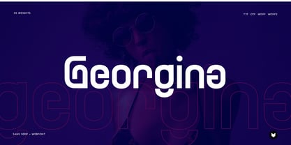 Georgina pro is a Unique Modern Elegant Typeface with Web-fonts. It’s a very versatile font that works great in large and small sizes. Georgina would perfect for branding, logos, headlines, Captions. or simply as a stylish text overlay to any background image. 5 Weights Included.
 - Reveler JNL by Jeff Levine,
$29.00 The sheet music for "Good Night Angel" from the 1937 motion picture "Radio City Revels", had the movie's title hand lettered in a free form Art Deco sans serif design. This has been recreated digitally as Reveler JNL, which is available in both regular and oblique versions.
 - Avenger by Larin Type Co,
$15.00 Avenger is a vintage screen font with many stylish alternative substitutes that will provide you with many options when working with your project. This font can be easier when using lowercase letters, as well as more playful, try using alternatives they will make your design unique.
 - Aiffon by Awanstudio,
$18.00 Aiffon handwritten script allows you to create stunning and easy hand-lettering in an instant. Ideal for the logo, quotes, wedding, product label/packaging, fashion, letter, advertising, invitation, poster, merchandise, greeting cards, etc. This font came along with lots of ligatures options for more natural looks.
 - Handmaster by Atom,
$17.00 Handmaster is an elegant monoline handwriting. with 2 options regular and thin will make your project stand out, look classy, and extraordinary in any of your design projects. Iso it looks natural and unique, perfect for branding, packaging, grating cards, website headlines, and other fantastic projects.
 - Berthalia by Creaditive Design,
$10.00 Berthalia is a lovely and romantic handwritten font. It looks stunning on wedding invitations, books, quotes, business cards,and lovely craft. With the addition of love that will enrich your design choices. Special characters are also available for lowercase letters with added beginning & end swashes, also Ligatures that can make your design more smooth and looks natural.
 - Delivery Note by Hanoded,
$15.00 I like fonts that look like scribbled notes… so I made one! Delivery note was made with a sharpie pen on paper. I didn’t ‘clean’ the glyphs too much, as I wanted it to look like a genuine note script. It comes with double letter ligatures for the lower case glyphs and a fun doodle pack!
 - Karika Hearts by Deniart Systems,
$20.00 Say it with all your heart! Karika Hearts is part of the Karika Collection of fonts and was inspired by our love of swirly patterns that say i love you. These 52 hand drawn, heart-inspired swirls are a splendid choice for all your romantic designs such as valentine cards, wedding invitations, love notes, or stationery.
 - Strawberry Gossip by PizzaDude.dk,
$20.00 Here is something to talk about! Spread the word - spread the gossip! An elegant combination of thin and fragile lines, made with a fine pen. Fine lines, crunchy, sweet curls.
 - Bejraby by Phoenix Group,
$13.00 Bejraby is a handwritten font, which cultivates love, and attracts all the beautiful things in the world. This font was created with the theme of beauty and freedom in love.
 - Ecatherina by BlessedPrint,
$23.00 Hi! It took me almost a year to design Ecatherina script. Finally it is available to purchase! Ecatherina script is an opentype font-family (15 fonts: 5 styles for 3 line thickness) with a bonus (editable wedding invitations, menu, quotes, letters, and more) HOW TO GET ACCESS TO ALTERNATES? Absolutely easy, just type a number after any letter: a1, a2, a3 etc Capital letters have 3-4 options and more. So just type E1, E2, E3 etc and find your favourite one! I found this method the most useful when you need to experiment with design very fast. All characters are available through Glyph panel as well, even more each of the alternate letter has it’s own unicode (PUA) so you can copy/paste from Apple Font Book or Windows Character Map. Total amount of glyphs 1436. Compatible with SILHOUETTE & CRICUT DESIGN SPACE WHAT IS INCLUDED BP-Ecatherina OTF & TTF It goes with 5 weights: Thin, Medium, Regular, Bold, UltraBold BP-Ecatherina-Ex1 The only difference between previous font is that thin line is a bit thicker. BP-Ecatherina-Ex2 Even more thicker line. Help.pdf Help file with most common questions. Bonus - Ecatherina.fig with editable wedding invitations (10+ designs 5x7 inches), menu, quotes, letters. Important! You need to install Figma application (it is free) to access files. With Figma application you can import bonus files and edit the text, export as png, pdf, svg and print it. Bonus - help.pdf file with general information how to work with Figma if you are new. It is very easy application and I recommend it to you! It works with MS Word, I included example.docx file so you can understand how to work.
 - Viva Maria by Autographis,
$39.50 Viva Maria could have been used for that famous, hilarious movie by Louis Malle staring Brigitte Bardot and Jeanne Moreau. Maybe in a remake someone will use this very lively script in the credits and advertising material. Olé!
 - Boomville by Melvastype,
$29.00 Boomville is a bouncy and upright script font. It is fun and lively with a lot of personality. This script is sketched with quite quick brush strokes with a pointed brush to achieve this casual and playful feeling.
 - Vagabond by Studio K,
$45.00 Vagabond is a vintage font family whose natural home is on the back porch, ranch or railroad. A rugged slab serif with a lived-in look, it’s lends a note of earthy authenticity to any graphic design project.
 - Bowman by ParaType,
$25.00Bowman is an informal slab-serif face written by hand with a marker. Its live and playful nature makes it suitable for comic books, illustrations, informal advertising and package design. Designer Alexandra Korolkova. Released by ParaType in 2010. - ITC Tyfa by ITC,
$29.99 Some words from the designer, Frantisek Storm... Designed by Josef Tyfa in 1959, digitalized by F. Storm in 1996. This Roman and Italic are well-known perhaps to all Czech graphic artists and typographers ever since their release. Although this type face in some details is under the sway of the period of its rise, its importance is timeless, in contradistinction to other famous types dating from the turn of the sixties which were found, after some time, to be trite. The italics live their own life, only their upper-case letters have the same expression as the basic design. Thin and fragile, they work excellently, emphasizing certain parts in the text by their perfect contrast of expression. When seen from a distance they are a little bit darker than the Roman face. Tyfa Roman was released in 1960 by Grafotechna in Prague for hot setting. Later on, Berthold produced letter matrices - "rulers" for Staromat devices, used for manual photosetting of display alphabets. In the eighties it was available on dry transfers of Transotype and today it is offered also by ITC. The meticulously executed designs of the individual letters in the 288 point size are arranged into a set of signs on a cardboard of about B2 in size. The yellowed paper reveals retouches by white paint on the ink. Blue lines mark the baseline, the capital line, the ascender and descender lines and the central verticals of the letters. With regard to the format of the flat scanner, the designs had to be reduced, with the use of a camera, to the format A4, i.e. to the upper-case letter height of about 30 mm. These were then scanned in 600 dpi resolution and read as a bitmap template to the FontStudio programme. The newly created bold type faces derive from Tyfa's designs of the letters "a", "n", "p", the darkness of which was increased further, approximately by 3%, to enhance their emphasizing function. The text designs have hairstrokes thickened by one third; the contrast between thin and thick strokes has been modified, in order to improve legibility, in sizes under 12 points. We have used electronic interpolation to produce the semi-bold designs. Josef Tyfa himself recommends to choose a somewhat darker design than the basic one for printing of books.
 - Melody Sunday by Subectype,
$15.00 Melody Sunday is a Chic and Lovely Calligraphy font, described by an Love touch, perfect for your favorite projects. Fall in love with its incredibly distinct and timeless style and use it to create spectacular designs! "Melody Sunday" includes a full set of lovely uppercase and lowercase letters, multilingual symbols, numerals, punctuation and ligatures. Also it includes: Alternates letter for lowercase beginning and ending swashes, lowercase ending heart swashes, which serve to connect two words or letters (This is so perfect for invitations, monograms) Thank You, Subectype
 - Campan by Hoftype,
$49.00 Campan, is a new semi-linear face which unites mono-line and classic elements. It is very strong in headlines and its tall x-height lends itself to comfortable reading in text applications. The Campan family comprises 12 styles and is well suited for ambitious typography. It comes in OpenType format with extended language support. All weights contain ligatures, small caps, proportional lining figures, tabular lining figures, proportional old style figures, lining old style figures, matching currency symbols, fraction- and scientific numerals and matching arrows.
 - Darmhagh Underwood by Evertype,
$20.00Darmhagh Underwood is a “rough” monowidth font based on the face used on the old Underwood manual typewriter. Darmhagh Underwood was first digitized in 1999 by Michael Everson and originally used the MacGaelic character set on the Macintosh platform, and ISO/IEC 8859-14 on the PC. In 2008 Darmhagh Underwood version 3 was released in OpenType format, completely compliant with Unicode encoding and with an extended character set. The particular Underwood typewriter from which samples were taken to design Darmhagh Underwood is on display in the National Library of Ireland. It belonged to Conradh na Gaeilge and was used to draft armistice documentation which led to the end of the Irish War of Independence in 1921. Darmhagh is pronounced [ˈdaɾuː]. - Royalbrick by Bake me a font,
$20.00 Royalbrick is a contemporary display unicase typeface. It is a part of upcoming type family — light and condensed style. The font was inspired by factory stamps’ typography on bricks made in 19-20 century on Russian manufactures — this kind of bricks was also called “royal bricks”. It has a unique image with “squashed” stems and dynamic expanding strokes, and there are also some kind of ancient Cyrillic’s vibes in it’s letterforms. It is an excellent example of combining national character with modern trends and expressive graphics. Royalbrick consist of extended Latin and Cyrillic, figures, two sets of punctuation (normal and "thin" with ss01), few ligatures and stylistic alternatives and a special set for letters with accents — ss02 named "Downstairs Accents". The font has 292 glyphs.
 - Cervo Neue Condensed by Typoforge Studio,
$29.00 Cervo Neue Condensed is the new perfected and Condensed version of Cervo Neue, containing 18 variants. It differs from the previous version of Cervo with the higher accents over glyphs, enlarged punctuation, old-style numerals and the newly added varieties Semi Bold, Bold, Extra Bold and Black. Additionally, there is the variety of grotesque. Font Cervo is inspired by a “You And Me Monthly” published by National Magazines Publisher RSW „Prasa” that appeared from Mai 1960 till December 1973 in Poland. Recently, Cervo Neue Condensed has started being used as a display text in „Przekrój Magazine” which was published in years 1945–2013 in Krakow (2002–2009 in Warsaw) as a weekly and again from 2016 as a quarterly journal in Warsaw.
 - Merlo Neue by Typoforge Studio,
$29.00 Merlo Neue is the younger brother of Merlo. New family received refreshed, more square proportions and a new shape of many glyphs. However, what is the most important in new Merlo, is the wide range of instances – nine new weights, from Hairline to super dark Black – which allows to use the family in a complex way, depending on the user’s needs. Italic version has narrower and lighter proportions. Font has a glyph set for latin script and old-style figures. Merlo Neue would be a great choice for display use as well as for the longer texts. Font Merlo Neue is inspired by a “You And Me Monthly” published by National Magazines Publisher RSW "Prasa” from May 1960 till December 1973 in Poland.
 - Merlo Neue Round by Typoforge Studio,
$29.00 Merlo Neue Round is the younger brother of Merlo Round and cousin of Merlo Neue. This new family received a refreshed, rounded style and a new shape of many glyphs. New Merlo consist of a wide range of instances' seven new weights with italics, from Hairline to Bold allows to use the family in a complex way, depending on the users' needs. The font has a glyph set for latin and cyrylic script, small caps and old-style figures. Merlo Neue Round would be a great choice for display use as well as for the longer texts. This family is inspired by a "You And Me Monthly" published by National Magazines Publisher RSW "Prasa" from May 1960 till December 1973 in Poland.
 - Linotype Laika by Linotype,
$29.99Linotype Laika is part of the Take Type Library, chosen from the entries of the Linotype-sponsored International Digital Type Design Contests of 1994 and 1997. This fun font was created by Dutch designer Mark van Wageningen, who based its forms on those of a sans serif font but gave them wavy, irregular contours. They look almost as though they lie just under the surface of a pool and the movement of the water gives them their undulating appearance. The dynamic Linotype Laika is especially good for headlines in larger point sizes or shorter texts in point sizes of 14 or larger. - Boule Plus by Ingo,
$33.00 CAPITALIZED, geometric, bold and round. If the typographer sees a font like that, it's enough to make his toes curl. But sometimes it just has to be that way. Geometrically constructed fonts do not necessarily have to be pointed and angular; It also works consistently around. And if I say it consistently, then in this case, that's done consistently. The basis for the BOULE is the circle. The letters are drawn with constant line width, the “corners“ and endings all have the same radius, the lines are all the same thickness. The BOULE consists only of capitals. There is only one difference in the use of uppercase and lowercase letters: in the uppercase letters, the round letters are circular, while the lowercase letters are narrow. The character set of the Boule contains all letters and accents to support the Western, Northern, Central and Eastern European languages with Latin alphabet. The BOULE is not only very fat, it also runs very tight; that is, the glyphs are very close to each other. To avoid "holes" due to unfortunate letter combinations, the BOULE contains ligatures for FT, ST, TT and TZ. There are also other versions of the font: BOULE Brillant on the one hand. In this version, simple highlights simulate a light incidence from the top right. These light edges give the font a decorative effect that makes it easy to think of wet sausages or balloons in some shapes. And finally the BOULE Contour. As the name implies, it is the outer contour of the letters, combined with a shadow at the bottom left. The name BOULE (French for ball) says it already: this font is globated. Therefore, it is also very suitable for all three-dimensional alienation effects. With simple light and shadow you can achieve a very convincing 3D effect with little effort.
 - Bleeker by Typodermic,
$11.95 Are you ready to infuse some laid-back vibes into your design game? Look no further than Bleeker! This hand-lettered typeface is like a breath of fresh air, with casual letterforms and relaxed line-treatment that make your message feel effortlessly conversational. But don’t let the carefree nature of Bleeker fool you—this font is also smart and sophisticated. Thanks to custom letter pairings, it looks totally natural in OpenType-savvy applications. And let’s be honest—who doesn’t want to look natural and effortless while still being totally cool? So if you’re yearning for a typeface that feels like a sunny day and a good conversation rolled into one, give Bleeker a try. It’s the perfect blend of whimsy and sincerity that your designs have been craving. Most Latin-based European writing systems are supported, including the following languages. Afaan Oromo, Afar, Afrikaans, Albanian, Alsatian, Aromanian, Aymara, Bashkir (Latin), Basque, Belarusian (Latin), Bemba, Bikol, Bosnian, Breton, Cape Verdean, Creole, Catalan, Cebuano, Chamorro, Chavacano, Chichewa, Crimean Tatar (Latin), Croatian, Czech, Danish, Dawan, Dholuo, Dutch, English, Estonian, Faroese, Fijian, Filipino, Finnish, French, Frisian, Friulian, Gagauz (Latin), Galician, Ganda, Genoese, German, Greenlandic, Guadeloupean Creole, Haitian Creole, Hawaiian, Hiligaynon, Hungarian, Icelandic, Ilocano, Indonesian, Irish, Italian, Jamaican, Kaqchikel, Karakalpak (Latin), Kashubian, Kikongo, Kinyarwanda, Kirundi, Kurdish (Latin), Latvian, Lithuanian, Lombard, Low Saxon, Luxembourgish, Maasai, Makhuwa, Malay, Maltese, Māori, Moldovan, Montenegrin, Ndebele, Neapolitan, Norwegian, Novial, Occitan, Ossetian (Latin), Papiamento, Piedmontese, Polish, Portuguese, Quechua, Rarotongan, Romanian, Romansh, Sami, Sango, Saramaccan, Sardinian, Scottish Gaelic, Serbian (Latin), Shona, Sicilian, Silesian, Slovak, Slovenian, Somali, Sorbian, Sotho, Spanish, Swahili, Swazi, Swedish, Tagalog, Tahitian, Tetum, Tongan, Tshiluba, Tsonga, Tswana, Tumbuka, Turkish, Turkmen (Latin), Tuvaluan, Uzbek (Latin), Venetian, Vepsian, Võro, Walloon, Waray-Waray, Wayuu, Welsh, Wolof, Xhosa, Yapese, Zapotec Zulu and Zuni.
 - Fluire by Lián Types,
$37.00 MAS AMOR POR FAVOR (1) (more love, please) Fluire means -to flow- in Italian and that’s what this font is all about. The story began when a friend of mine asked for a tattoo with the word -Fluir- (to flow in Spanish). She didn't want a tattoo full of swashes and swirls, like I'm used to doing, but something more fluent, soft and minimal. My very first attempts were more related to copperplate calligraphy but I wasn't even close: I discovered that I needed to forget a little bit about the classic contrast and speed of the engrosser's nib and started playing with a tiny flat metal nib. Letters started to flow, and I immediately thought of turning them into a font. Inspired by the tattoo I created and by other tattoos I saw, I started the journey of what would be a very fun process. The result is a very cute, almost monoline font with a wide range of uses. USES If not used for a tattoo (my first ‘target’), the font delivers amazing results in combination with Fluire Caps: These two need each other, they go together, they talk. I designed Fluire Caps Down and Fluire Caps Up so it’s easier to manage their colors. Also there’s Fluire Caps Down Lines, which has a decorative thin line to add yet another dimension. Use the fonts in magazines, book covers, posters, greeting cards, weddings, lettered walls, storefronts! TIPS Since the font is Open-Type programmed, I strongly recommend using it in applications that support that feature. Also, the font looks way better when -contextual alternates- are activated, but it’s your choice :) Try Fluire, and keep flowing. NOTES (1) The phrase alludes to maybe the most tattooed phrase in Latin America.
 - ALS FinlandiaScript by Art. Lebedev Studio,
$63.00 Some 40 km north of Helsinki, surrounded by meadows and a serene Finnish lake, lies Ainola, the former home and now museum of composer Jean Sibelius (1865–1957). I know the place quite well, since it is only a stone’s throw away from the art school where I began my graphic design studies. We sometimes went there after classes—a beautiful walk, especially in spring, when the days were getting longer, the snow melting in the sun and the ice cracking on the lake. The composer often professed his love for this landscape and found constant inspiration in its moods, sounds and scents during different seasons. For many people, Sibelius and his music, most notably his famous symphonic poem Finlandia, are a symbol of Finland. I decided to name the typeface family I’m presenting here FinlandiaScript, because it owes its influence to both Sibelius’ manuscripts and the Finnish landscape around Ainola. The shape of letters, their poise and the rhythm they create resemble Sibelius’ handwriting without copying it. The letters form gently flowing lines of text which is legible without giving up individuality. The font family comes in three styles: FinlandiaScript, FinlandiaScript Bold and FinlandiaScript Frost. Together they are perfect for magazines, websites and brands aiming to create a personal and sincere image. While the fine details of FinlandiaScript Frost are best suitable for display sizes, FinlandiaScript and FinlandiaScript Bold work well in both headlines and texts of smaller sizes. Hundreds of ligatures give them an especially flexible appearance. The FinlandiaScript family contains Western, Central European and Extended Cyrillic character sets and supports almost 100 languages. It is best suited for Opentype savvy programs with the “standard ligatures” and “contextual alternates” features turned on.