10,000 search results
(0.351 seconds)
- Serpentine Sans by Image Club,
$29.99Serpentine is a square-shaped sans serif design that is similar to Eurostile, but with more contrast between thick and thin strokes. The style is reminiscent of digital types and conveys a science fiction feel. The Serpentine font family is suitable for posters, signs and advertising. - Agedage Simple Versal by Dharma Type,
$14.99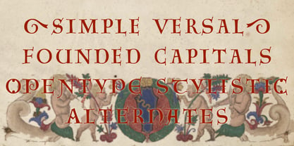 Agedage SimpleVersal is a Opentype font supporting some opentype layout features. To use these functions, you need to use an application which supports OpenType advanced features such as Adobe InDesign CS, Illustrator CS and Photoshop CS. The font includes: Stylistic Alternates Ordinals Numerators, Denominators and Fractions
 - Bummill by Awanstudio,
$16.00 Bummill signature font allows you to create stunning and easy hand-lettering in an instant. Ideal for the logo, quotes, wedding, product label/packaging, fashion, letter, advertising, invitation, poster, merchandise, greeting cards, etc. This font came along with lots of ligatures option for more natural looks.
 - High Castle by Par Défaut,
$40.00 High Castle is a serif family fonts with baroque aspects. Composed of more than 500 glyphs, inculing many Latin accents for as many languages. With also 9 OpenType Features (Fractions, Numerator, Denominator, OldStyle Figure, Ordinal, Case Sensitive, Contextual Alternate, Liguature, All Access Alternate) and arrows support.
 - Hauslan by Álvaro Thomáz Fonts,
$15.00 Hauslan is a simple, minimal and geometric type family inspired by the rationality presented by Bauhaus in 1920 which affected many areas such as architecture and graphic design. Following the concept of basic geometric shapes, Hauslan focuses on readability and versatility, either for small texts or headlines.
 - Unboring by PintassilgoPrints,
$20.00 Boring titles? Boring chunk of text? Unbore’em all! This nifty stackable family features two fonts, both with two options for each letter. Pile them up and play with opacities for a killer superposed effect. Or use each alone if you prefer. Unboringness guaranteed either way. Cheers!
 - Taiko by astype,
$20.00 Taiko is a strong headline typeface based on a design by Otto Arpke from 1928. Taiko Std is the basic version with 235 glyphs. The full version with over 650 glyphs includes the following OpenType features: - central European glyphs - small caps - tabular & mediaeval numerals - dynamic fractions
 - Georgina Pro by FoxType,
$9.00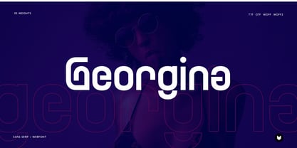 Georgina pro is a Unique Modern Elegant Typeface with Web-fonts. It’s a very versatile font that works great in large and small sizes. Georgina would perfect for branding, logos, headlines, Captions. or simply as a stylish text overlay to any background image. 5 Weights Included.
 - Hardren by Horizon Type,
$40.00 Hardren is a semi condensed sans serif typefamily. It has 20 weights 10 uprights and 10 italics. Each weight includes 500+ glyphs, extended language support, fractions, tabular numbers, arrow sets, alternative characters (stylistic sets) Please see the pdf specimen for more information. PDF Specimen: https://cutt.ly/Swg5M3r4
 - Rollman by Par Défaut,
$9.00 Rollman is a Diplay font family containing 16 Fonts (5 Weight; Left; Right; Straight and Variable), covering many languages using latin and cyrillic alphabet. It's a perfect font for titles. There are also 7 OpenType features (Numerator; Denominator; Fraction; Ordinals; Small Capital; All Access Alternate; Ligature).
 - Antebas by Lafontype,
$35.00 Antebas is a sans serif family with a geometric touch. Available in 16 styles from Thin to Heavy and it's matching italics. OpenType features such as fractions, ordinal, superscript, subscript, numerators, denominators and tabular figures are available. besides Latin letters, Antebas also supports Cyrillic and Greek letters.
 - Ruddy by Inhouse Type,
$33.32 Ruddy is a display sans serif type family. It has a playful and mischievous presence. Exaggerated geometry and varied vertical character stem placement contribute to its animated appearance. Ruddy comes in 4 weights with matching italics. OpenType features include Contextual Alternates, Tabular Figures, Fractions, Numerators and Denominators.
 - Kerndog by Elemeno,
$25.00Thick, ballooned chunks, strung together by thinner sections, Kerndog looks as if it's been constructed from flexible corn dogs. Perfect for kid stuff and unusual advertising needs. Kerndog is legible at most sizes, but best when used large so the thick and thin combination is visible. - Reveler JNL by Jeff Levine,
$29.00 The sheet music for "Good Night Angel" from the 1937 motion picture "Radio City Revels", had the movie's title hand lettered in a free form Art Deco sans serif design. This has been recreated digitally as Reveler JNL, which is available in both regular and oblique versions.
 - Atophuzomekosou by Meyerfonts,
$15.00 Atophuzomekosou is a sans serif typeface that can be used for a lot of purposes, including: signage, posters, campaigns, videos, artworks, billboards, games, and many more. The 7-segment and Arbitrary fraction characters are located in the Private Use Area at U+E000 and U+E100 respectively.
 - Avenger by Larin Type Co,
$15.00 Avenger is a vintage screen font with many stylish alternative substitutes that will provide you with many options when working with your project. This font can be easier when using lowercase letters, as well as more playful, try using alternatives they will make your design unique.
 - Aiffon by Awanstudio,
$18.00 Aiffon handwritten script allows you to create stunning and easy hand-lettering in an instant. Ideal for the logo, quotes, wedding, product label/packaging, fashion, letter, advertising, invitation, poster, merchandise, greeting cards, etc. This font came along with lots of ligatures options for more natural looks.
 - Bobbin Cyrllic by Typoforge Studio,
$25.00 To design the font Bobbin Cyrillic I was inspired by the You And Me Monthly published by National Magazines Publisher RSW Prasa that appeared from Mai 1960 till December 1973 in Poland. In the Bobbin Cyrillic family, every variety contains 3 alternative characters with automatic replacement.
 - Merlo by Typoforge Studio,
$25.00 Font Merlo is the younger sister of Cervo. Font Merlo is characterized by eight different varieties – lower and uppercase characters. It is inspired by a You And Me Monthly published by National Magazines Publisher RSW "Prasa” that appeared from May 1960 till December 1973 in Poland.
 - Handmaster by Atom,
$17.00 Handmaster is an elegant monoline handwriting. with 2 options regular and thin will make your project stand out, look classy, and extraordinary in any of your design projects. Iso it looks natural and unique, perfect for branding, packaging, grating cards, website headlines, and other fantastic projects.
 - Margoth by Asterisk,
$33.00 Margot font family, has more than 1000 + glyphs in each font. The font includes advanced language support, fractions, table shapes, ligatures, and more. Perfect for graphic design and any display use. It can easily work for websites, signage, corporate, and editorial design. documents and folders, mobile interface.
 - Giom Mod by Ardyanatypes,
$15.00 Giom Mod is a unique and elegant display font with a distinctive serif style. This font offers nine different thickness options, ranging from Thin to Black, providing a wide range of choices for various applications. Each thickness of Giom Mod has its own unique characteristics, allowing you to select the one that best suits your design aesthetics. For example, Thin may be suitable for light and elegant designs, while Black can be used for more dramatic and bold appearances. Furthermore, Giom Mod comes equipped with various OpenType features. These include features such as ligatures, which allow specific characters to combine beautifully, and alternative letterforms that provide more design options. With these features, you can create more engaging and unique text elements in your designs. Additionally, Giom Mod is designed to support multiple languages, making it suitable for use in many countries. This makes it highly versatile and appropriate for a wide range of multilingual design projects. So, if you are looking for a font that combines the beauty of serif with various thickness options, useful OpenType features, and multilingual support, Giom Mod is the perfect choice to meet your design needs.
 - FS Sinclair by Fontsmith,
$80.00 ZX Spectrum In 1982, a home computer came on the market that would launch the UK IT industry. The ZX Spectrum sold five million units and spawned thousands of software titles. It was the must-have gadget for every teen. FS Sinclair is inspired by the memory of Sir Clive Sinclair’s greatest creation: the experience of entering its clunky command codes and reading its simple, grid-placed type. Smart, switched-on, great in text and display, FS Sinclair is a modern grid-based font, drawn with the Spectrum in mind and brought to life by well thought-out design. Formula Having completed the font for Channel 4’s brand update, the Fontsmith team defined the formula for its next font: the creative essence of the C4 work but with more structural discipline, more rigid form and a little more seriousness. The new font wouldn’t look self-consciously retro but it would reference the past and, it was hoped, influence the future. Readability Like the ZX Spectrum, it took a while for the new font to do exactly what it was meant to do. Many of the early concepts by Phil Garnham and Jason Smith were too jagged – the result of an awareness of getting too close to existing fonts of the same ilk, such as Wim Crouwel’s Gridnik. Eventually, FS Sinclair evolved into a more readable, functional grid-based type design that answered Phil and Jason’s original, self-set brief. Idiosyncratic There’s a technological, systems feel to FS Sinclair but ultimately, humans are in charge. The lowercase “a”, “n”, “m” and “r” have clean-cut “ears”, and the square-ish design is softened by round joins on the inside of the letterforms. The idiosyncratic design of letters such as “g”, “j”, “k”, “v”, “w” and “y” bring the design up to date. This is a modular font with character, and a range of weights that allow varied application.
 - FS Neruda by Fontsmith,
$80.00 A literary font FS Neruda takes its name from Chilean poet Pablo Neruda, described as “the greatest poet of the 20th century in any language”. As such, it’s a font that references the very best literary typeface traditions. Smart, sharp and classical, FS Neruda bridges the gap between the classical and the offbeat. This font started life in the world of newspapers and books and is the perfect storytelling typeface for savvy, inquiring readers whether in printed journals, hard news, short online missives or poetry. Idiosyncratic precision FS Neruda is clear and legible in body text, while also being a space-saver fitting in more characters on each line than the typefaces that inspired it. In larger sizes it becomes a different beast – livelier, quirkier, but no less sharp. This is a truly classic typeface designed with long text setting in mind, thanks to its large x-heights, and short ascenders and descenders. FS Neruda mixes suave, sharp confidence with a sense of fragility and quirkiness. It’s knowledgeable, informative and idiosyncratic; one for readers and enquiring minds. Subtle weight modifications The construction and details of the letterforms differ across each of the five weights, with each cut separately to evoke different flavours: Thin is typewriter-like, Light is classy, Regular is canonical, Bold is robust, Black is magazine-esque. FS Neruda also boasts a radiant italic companion, a wide set of small caps, lower and uppercase ligatures, case punctuation and spacing, four sets of figures, and some ageless typographic symbols such as manicules, fleurons and teardrop crosses. Suggestive simplicity “The key to success in the current type design landscape is to design a typeface which looks conventional at text sizes but has a few small, suggestive touches visible at bigger sizes that make it distinct,” says designer Pedro Arilla. “Another thing we wanted to achieve with this typeface is simplicity.” FS Neruda is available in ten carefully crafted styles: it’s designed to work perfectly at text sizes, but still glows as a display typeface.
 - Sunblock Pro by Grype,
$19.00 Clean and geometric deco sans typefaces have been used in a range of scientific publications, corporate logotypes, and beauty products over the years. However, a typeface of this style has yet to have an expansive range of widths and weights to become a design workhorse, until now. The Sunblock family finds its origin of inspiration in the Coppertone sunscreen company logo, and from there expands to type megafamily. Sunblock celebrates the rounded geometric forms of deco and bauhaus lettering through a compressed lens, transcending its brand inspired origin to give birth to a font family that pulls on modern and historical styles. It inherited its soothing tone from the limited character logotype that inspired it, and goes on to include a lowercase, small caps, and a comprehensive range of widths and weights, creating a straightforward, uncompromising collection of typefaces that lend a solid foundation and a broad range of expression for designers. Here's what's included with the Sunblock Collection bundle: 643 glyphs per style - including Capitals, Lowercase, Numerals, Punctuation and an extensive character set that covers multilingual support of latin based languages. (see the 7th graphic for a preview of the characters included) 21 fonts in 5 width subfamilies: Ultra Condensed, Extra Condensed, Condensed, Semi Condensed, & Standard. 5 weights per subfamily (except Ultra Condensed): Thin, Light, Regular, Bold, & Black. Fonts are provided in both TTF & OTF formats. The TTF format is the standard go to for most users, although the OTF and TTF function exactly the same. Here's why the Sunblock Collection is for you: You're in need of a deco geometric font family with a big range of weights and widths You're love that Coppertone letter styling, and want to design anything within that genre You're looking for an alternative to Chalet Comprime with a more versatile range of styles You're looking to start up your own derivative Sunscreen product line You just like to collect quality fonts to add to your design arsenal
 - Berthalia by Creaditive Design,
$10.00 Berthalia is a lovely and romantic handwritten font. It looks stunning on wedding invitations, books, quotes, business cards,and lovely craft. With the addition of love that will enrich your design choices. Special characters are also available for lowercase letters with added beginning & end swashes, also Ligatures that can make your design more smooth and looks natural.
 - Delivery Note by Hanoded,
$15.00 I like fonts that look like scribbled notes… so I made one! Delivery note was made with a sharpie pen on paper. I didn’t ‘clean’ the glyphs too much, as I wanted it to look like a genuine note script. It comes with double letter ligatures for the lower case glyphs and a fun doodle pack!
 - Karika Hearts by Deniart Systems,
$20.00 Say it with all your heart! Karika Hearts is part of the Karika Collection of fonts and was inspired by our love of swirly patterns that say i love you. These 52 hand drawn, heart-inspired swirls are a splendid choice for all your romantic designs such as valentine cards, wedding invitations, love notes, or stationery.
 - The Starstruc font, designed by the creative-minded individual known as Afrojet, captures the imagination and transports its audience to a realm of futuristic adventure and retro-nostalgia simultaneo...
- Strawberry Gossip by PizzaDude.dk,
$20.00 Here is something to talk about! Spread the word - spread the gossip! An elegant combination of thin and fragile lines, made with a fine pen. Fine lines, crunchy, sweet curls.
 - Bejraby by Phoenix Group,
$13.00 Bejraby is a handwritten font, which cultivates love, and attracts all the beautiful things in the world. This font was created with the theme of beauty and freedom in love.
 - Ecatherina by BlessedPrint,
$23.00 Hi! It took me almost a year to design Ecatherina script. Finally it is available to purchase! Ecatherina script is an opentype font-family (15 fonts: 5 styles for 3 line thickness) with a bonus (editable wedding invitations, menu, quotes, letters, and more) HOW TO GET ACCESS TO ALTERNATES? Absolutely easy, just type a number after any letter: a1, a2, a3 etc Capital letters have 3-4 options and more. So just type E1, E2, E3 etc and find your favourite one! I found this method the most useful when you need to experiment with design very fast. All characters are available through Glyph panel as well, even more each of the alternate letter has it’s own unicode (PUA) so you can copy/paste from Apple Font Book or Windows Character Map. Total amount of glyphs 1436. Compatible with SILHOUETTE & CRICUT DESIGN SPACE WHAT IS INCLUDED BP-Ecatherina OTF & TTF It goes with 5 weights: Thin, Medium, Regular, Bold, UltraBold BP-Ecatherina-Ex1 The only difference between previous font is that thin line is a bit thicker. BP-Ecatherina-Ex2 Even more thicker line. Help.pdf Help file with most common questions. Bonus - Ecatherina.fig with editable wedding invitations (10+ designs 5x7 inches), menu, quotes, letters. Important! You need to install Figma application (it is free) to access files. With Figma application you can import bonus files and edit the text, export as png, pdf, svg and print it. Bonus - help.pdf file with general information how to work with Figma if you are new. It is very easy application and I recommend it to you! It works with MS Word, I included example.docx file so you can understand how to work.
 - Boomville by Melvastype,
$29.00 Boomville is a bouncy and upright script font. It is fun and lively with a lot of personality. This script is sketched with quite quick brush strokes with a pointed brush to achieve this casual and playful feeling.
 - Vagabond by Studio K,
$45.00 Vagabond is a vintage font family whose natural home is on the back porch, ranch or railroad. A rugged slab serif with a lived-in look, it’s lends a note of earthy authenticity to any graphic design project.
 - Bowman by ParaType,
$25.00Bowman is an informal slab-serif face written by hand with a marker. Its live and playful nature makes it suitable for comic books, illustrations, informal advertising and package design. Designer Alexandra Korolkova. Released by ParaType in 2010. - ITC Napoleone Slab by ITC,
$29.99There is something straight-forward and no-nonsense about slab serifed typefaces. Calligraphic designs, on the other hand, evoke a sense of humanity and immediacy - even intimacy. ITC Napoleone Slab combines both slab serif and calligraphic design traits into a single typeface design. Heady stuff. The result is unlike almost any other slab serif typeface. According to designer Silvio Napoleone, “The concept developed from my explorations as a student in an independent lettering class. I sketched many historical letterforms by brush. I continued experimenting for several years after, sketching by hand and on the computer. Eventually, I chose the slab serif for production because of its distinctive design quality.” ITC Napoleone Slab is exceptionally versatile. The family is economical in width and contains true italic designs, oldstyle numbers and a suite of special ligatures. According to Silvio, “Napoleone Slab was designed to work well at all sizes, and in on-screen applications.” Silvio currently lives in Toronto, where he works for a “young, enthusiastic interactive firm.” His designs have been exhibited nationally and internationally, and his work was also part of a traveling exhibit for the American Institute of Graphic Arts. - Novera by René Bieder,
$29.00 The Novera family is a sharp geometric sans in ten weights plus matching italics, available in two versions – Modern and Classic. It has a contemporary, approachable and multifunctional yet characteristic design, that comes with an extensive glyphs set of 1000+ glyphs per font, meeting all typographic demands. The Design Vertical terminals, circular shapes and angular apexes – Novera truely breathes geometry! But the concept goes beyond the application of rational geometry. The intension was to create a highly legible family suitable for every day usage inspired by the work of Paul Renner, Eric Gill or Jakob Erbar, combining the geometric with the human and the functional with the unconventional. Although Novera is inspired by the past, its appearance is unmistakingly modern. Modern vs Classic Novera is available in two versions - Modern and Classic - born from the same source file but with different characters set as default. This creates subtle but effective distinctions such as the double-storey a (Novera Modern) which is optimized for legibility in longer text paragraphs, as opposed to the single-storey a (Novera Classic) which allows a purely geometric appearance. Another distinguishing feature are the ascenders on Novera Mondern, which extend above the cap height for an elegant presence, compared to the ascenders on Novera Classic, ending at the cap height, for a compact and helvetica-flavored look. Novera Modern was intended for usage in body copy, whereas Novera Classic was planned for headlines, short paragraphs or logos, but both versions can be used vice versa too, of course. Alternate Characters To maintain neutrality and a modern appearance, the standard character set largely dispenses with idiosyncratic forms. This is in contrast to the alternative forms with the gill-like lowercase letters g and t as well as a traditional shape of S and the German ligature t/z, which traces back to old German spellings. Also inspired by German poster designs from the early 20th century are the elongated i-dots and dieresis-dots that can create eye-catchers in headlines or logos. By the way, both versions, Novera Modern and Classic, can be created via stylistic set 1, 17 and 18. Opentype Features and Symbols The family comes with many opentype features to support modern typesetting. This includes ligatures, different number sets or alternative shapes for texts set in all caps. If you like arrows and other shapes, you will love Novera! The family has a built-in extensive symbols-set including 48 different arrows and various geometric shapes or icons. Weights With its 40 styles and 1000+ glyphs per font, the Novera family covers all thinkable design scenarios from branding to web, app or editorial usage. It blends in perfectly in text heavy paragraphs with its mid-weights like Light, Regular, Medium or Bold or stands out like a monument in headlines and posters with its extreme weights like Thin, ExtraLight, Black or Ultra. Testfonts If you like to test the fonts before buying the full version, please follow the link below. Please note, all test fonts are available for evaluation purposes only and contain a limited character set! A commercial license for the full version must be purchased separately. Please send a mail to contact@renebieder.com for more information. Download the test fonts here: https://www.renebieder.com/test-fonts
 - BD Gitalona Variable by Balibilly Design,
$139.00 We introduce our Variable Font from the high-complex BD Gitalona font family. Consisting of 3 axes; weight, optical size, and serif, that will give you a different experience extending the family of BD Gitalona. We don't want to mention how many families can be generated from this variable font. During the development process, we got up to more than 50 families and stopped to allow you to continue to play with the slide buttons. And again, BD Gitalona is filled with an explorative and experimental decorative version that we present separately. Figure out the decorative version BD Gitalona Moxa to make the aesthetic appeal of this whole typeface here! Inspiration The world of entertainment moves non-stop. One by one, figures appeared and left. We expect to create something to entertain previous trends with packaging more relevant to the present. More specifically, we admire and are inspired by some of the world's leading and top singers with a segmented nature. We imagine so many figures that can affect every viewer. However, each artist or singer has a segment because almost all of them have characteristics. The Design The basic design of this typeface begins with a transitional serif shape with sharp, shapeless corners. Then in the middle of the invention, there was an opportunity to explore it further from the readability side by adding an optical variable that can adjust the serif thickness when used together between large, medium to paragraph text sizes for editorials. The shift from serif to sans-serif with the contrast initiated by the shift of the serif family form as a different variable also makes this font richer in terms of the features it contains. Parts are expected to add to the user satisfaction with the complexity of this font. The Features BD Gitalona consists of one sub-family intended for body text with nine weights from Thin(100) to Black(900) and four other display sub-families such as Display serif, Flick, Harmony Sans and Contrast Sans. Each consists of four weights Thin(100), Regular Weight(400), Bold(700), and Black(900). And again, there are also retailed separately; the BD Gitalona Variable font, which is designed to accommodate all Subfamily in 1 font file, and BD Gitalona Moxa, an experimental typeface. A total of 700+ glyphs in each style. Advanced OpenType features functionally and aesthetically, such as Case-sensitive forms, small caps, standard and discretionary ligatures, stylistic alternates, ordinals, fractions, numerator, denominator, superscript, subscript, circled number, slashed zero, old-style figure, tabular and lining figure. Supports multi-languages including Western Europe, Central Europe, Southeast Europe, South America, and Oceania.
 - Sign Vendor JNL by Jeff Levine,
$29.00 Sign Vendor JNL is a simple sans modeled from hand-lettering with a touch of Art Deco influence. The design is from a 1930s poster promoting winter activities in New York State.
 - Shamrock - 100% free

