10,000 search results
(0.037 seconds)
- Thimble Village by Shakira Studio,
$11.30 Thimble Village – Modern Serif Font Is a modern serif font it's a cool modern take on a retro classic, and it's ready to make a lasting impression on your merchandise, quote designs, header text, logos & branding, advertisements and much more. It's packed with plenty of alternates and ligatures to really bring it to life, and give you a wide range of customisation options. Features: · 2 Weights font (Regular,Italic) · Lowercase and Uppercase · Beautiful Alternates & Ligatures · Numerals & Punctuation · Accented characters · Multilingual HOW TO ACCESS ALTERNATE CHARACTERS Open glyphs panel: In Adobe Photoshop go to Window - glyphs In Adobe Illustrator go to Window - Type – glyphs I really hope you'll get pleasure using Thimble Village font and it will be perfect addition to your font collection! Contact me with an inbox message If you have any question. Thank you and enjoy!
 - Nora Grotesque by vve.type,
$34.99 Nora Grotesque is a modern sans serif type family of five weights plus true matching obliques, all completely equipped with opentype features, fractions, lining numbers, old style figures, capsular numbers, superscript and inferiors. It has been designed parallel within the neogrotesque universe of typefaces and is inspired by humanist proportions and humanist-grotesk features in multiple languages, support Central and Eastern European as well as Western European languages. Working on Nora Grotesque type family, we've aimed to create a modern geometric grotesk with the widest implementation range, a reliable workhorse. Nora Grotesque is equipped for complex, professional typography with a high x-height for maximum legibility and a powerful personality then other alternates. We've been especially careful working on the uniq geometry of each glyph, both from the point of view of visual correctness and forms continuity.
 - Kavala by Sohel Studio,
$12.00 Kavala – Modern Serif Font Is a modern serif font it's a cool modern take on a retro classic, and it's ready to make a lasting impression on your merchandise, quote designs, header text, logos & branding, advertisements and much more. It's packed with plenty of alternates and ligatures to really bring it to life, and give you a wide range of customisation options. Features: · 4 Weights font (Regular,Italic,Bold,Outline) · Lowercase and Uppercase · Beautiful Alternates & Ligatures · Numerals & Punctuation · Accented characters · Multilingual HOW TO ACCESS ALTERNATE CHARACTERS Open glyphs panel: In Adobe Photoshop go to Window - glyphs In Adobe Illustrator go to Window - Type – glyphs I really hope you'll get pleasure using Kavala font and it will be perfect addition to your font collection! Contact me with an inbox message If you have any question. Thank you and enjoy!
 - Varisse by AVP,
$19.00 Varisse spans over two centuries of type design and draws its inspiration from well-loved classics that are as fresh today as they were when they were created. The range stretches from a quintessential 18th century transitional serif to an uncompromising 20th century sans. Think Baskerville, think Gill. The idea was to create a family that shared similar forms and the same vertical metrics, allowing them to be mixed to provide impact and readability as required. With a generous x-height and a host of options, the Varisse family is ideally suited to branding, packaging, magazines and editorial. It also provides a wealth of opportunity in website presentation. The fonts are divided into five subfamilies by degree of ‘serification’. Varisse Sans Varisse Soft Sans Varisse (normal) Varisse Soft Serif Varisse Serif Each subfamily contains six weights and accompanying italics.
 - Jinkel by Twinletter,
$18.00 Introducing Jinkel, the perfect font for any design project requiring a retro condensed style. This font features a unique serif design on each end of the letters, providing a distinctive touch to your designs. Jinkel is perfect for titles, headers, logos, and other creative designs that require a touch of vintage inspiration. With alternate characters and ligatures included, you’ll have plenty of design options to choose from. Elevate your designs with Jinkel and give them the retro flair they deserve. What’s Included : - File font - All glyphs Iso Latin 1 - Alternate, Ligature - Simple installations - We highly recommend using a program that supports OpenType features and Glyphs panels like many Adobe apps and Corel Draw so that you can see and access all Glyph variations. - PUA Encoded Characters – Fully accessible without additional design software. - Fonts include Multilingual support
 - Lacosta by Mans Greback,
$59.00 Lacosta is a decorative script typeface, drawn and created by Måns Grebäck during 2020. Perfect for company or product logotypes, or any typographic art that requires that classic custom look. Included in the family is the Lacosta Line typeface, a swash underlined variation of the original font. In addition to being a beautiful, ornamental lettering, it also has a lot of decorative and swash options: Use the symbols [ ] { } _ to create connections, swashes and decorations. Example: Extra[ Sweet] The font contains multiple OpenType functions, and is filled with alternates; stylistic alternates to give extra personality, and contextual alternates to make the letters flow with one another smoothly -- just as a custom logo. Lacosta has a very extensive lingual support, covering all European Latin scripts. The font contains all characters you'll ever need, including all punctuation and numbers.
 - Sina by Hoftype,
$- Sina is a strong, sturdy and self-confident serif accented face. Distinct ascenders and descenders in classical proportions ensure pleasant reading. Robust but assertively warm, it recalls and references the virtues of early classical printing types but presents a distinctly contemporary look. With its even text flow it works very well for long texts. It is also great for headlines and in larger styles. An extended, fine-tuned range of weights renders it suitable for almost every application. Sina comes in 12 styles and in OpenType format. All styles contain standard and discretionary ligatures, small caps, proportional lining figures, tabular lining figures, proportional old style figures, lining old style figures, matching currency symbols, fractions, and scientific numerals. Sina supports West European, Central and East European languages.
 - Zapf Essentials by Linotype,
$29.99Linotype Zapf Essentials is the modernized version of Zapf Dingbats and was also designed by Hermann Zapf himself. Over 372 characters and symbols are included within six fonts and make life a little more communicative, a little more informative, and a lot more interesting. The fonts contain symbols for both professional and everyday uses. With their markers, ornaments and arrows they are informative as well as versatile, timeless and lively. An interesting note to the story of Zapf Essentials: in 1977, Hermann Zapf created about 1000 sketches of signs and symbols. ITC chose those which became known around the world as Zapf Dingbats. For a typesetter, dingbats are the characters in the corner of the type box which can be used for just about anything. The last decade has seen the appearance of new symbols for e-mail, fax, mobile phones and other developments. These are now part of Linotype Zapf Essentials, just as they are now a part of everyday life. For a quick overview of the different Linotype Essentials variations, see the keyboard layout PDF in the Gallery section. It shows the keyboard layout of each font. A helpful hint from Hermann Zapf: Linotype Zapf Essentials should be used sparingly so that the characters retain their emphasis. - Jantar Flow by CAST,
$45.00 Jantar Flow is a humanist sanserif type family tailored for continuous reading for both printing and screen. With its large x-height and low contrast it also performs very well in captions, side notes, and short paragraphs set in small sizes. Jantar Flow Italic is distinct and readable. Following a proper italic construction, it shows the fun side of the family yet keeps the features of the upright. Jantar Flow – as well as its teammate Jantar Sharp – comes in seven weights from ExtraLight to Heavy, each with accompanying italics. It has a tabular and proportional set of figures in both old style and lining options, and also a special set of hybrid figures sitting between x-height and capitals. Superscripts and subscripts are provided together with a vast collection of diacritics covering all European languages as well as a set of case-sensitive characters. Jantar, the pairing superfamily. ‘Jantar’ is an old Polish name for ‘amber’, a fossilised resin – a substance that is robust and organic at the same time. These qualities somehow reflect the feeling behind the Jantar families, ‘Flow’ and ‘Sharp’. Jantar Flow was designed along with Jantar Sharp. As part of the Jantar superfamily these two faces are perfectly paired: though not based on the same skeleton, they share the same design parameters and the same character set, but each one works independently with its peculiar features. Designed for publishing for print and web, as well as for branding, the Jantar superfamily was inspired by common font pairings of the digital age like Helvetica/Times or Verdana/Georgia. Jantar Flow and Jantar Sharp communicate with individual yet complementing voices, just like two trained acrobats can perform alone but also know well how to perform together.
 - Mayence by Isaco Type,
$39.00 Mayence is the French name of Mainz, German city where Johannes Gutenberg was born. It's a manuscript font inspired in the author's calligraphy, with an angular structure, marked by a certain impulsiveness. Besides being a continuous-line font, Mayence explores some deviations and imperfections in the calligraphy practice, as accumulations of paint and anomalies in the thickness variation, characteristics which gives it more naturality. Its main difference is the set of over 430 ligatures (Premium version), based on the research and selection of important character sequences, rather frequent in several languages. For this, a study was done about the diphthongs, triphthongs and di-tri-tetra-pentagraphs more common in languages such as English, Spanish, French, German, Italian, Portuguese, Dutch, Hungarian, Croatian, among others. Ligatures with up to 2 characters are enabled by default and with more than 2 characters are enabled by the Discretionary Ligatures option. Mayence also contains several ligatures based on common words in English and Spanish, exclusive ligatures with numbers and another standard, discretionary, historic and Unicode ligatures. It has 9 different ampersands (&), which can be chosen by the user according to the application context. When you enable the Titling Alternates (in OpenType-savvy programs), these 9 ampersand styles are converted to their forms of seal, with different purposes of use. To enrich your graphic applications, Mayence brings the Ornaments Version, for construction of impressive lines, borders, textures and the geometric shapes that you want, according to your creativity! To see the features available in each version, open or download the User Guide pdf, in the Gallery section. All text fonts are available in OpenType PS format and have extended character set to support CE, Baltic, Turkish, as well as Western European languages and additional Celtic characters.
 - Winthorpe by Typodermic,
$11.95 Introducing Winthorpe, a typeface that’s steeped in history and inspired by the classic letterforms of traditional metal fonts. With its transitional style, Winthorpe bridges the gap between the old and the new, giving your designs a timeless, sophisticated edge. But Winthorpe is more than just a pretty face. It’s available in small caps and italics, in Regular, Semi-Bold, and Bold weights, giving you plenty of options to play with. And with its versatile range of characters, including lining and old-style numerals, fractions, superiors, inferiors, and ordinals, Winthorpe is perfect for any project that requires a touch of elegance and refinement. So if you’re looking to add a touch of classic sophistication to your designs, look no further than Winthorpe. With its carefully crafted letterforms and attention to detail, it’s the perfect choice for any project that demands the highest level of quality and style. Most Latin-based European writing systems are supported, including the following languages. Afaan Oromo, Afar, Afrikaans, Albanian, Alsatian, Aromanian, Aymara, Bashkir (Latin), Basque, Belarusian (Latin), Bemba, Bikol, Bosnian, Breton, Cape Verdean, Creole, Catalan, Cebuano, Chamorro, Chavacano, Chichewa, Crimean Tatar (Latin), Croatian, Czech, Danish, Dawan, Dholuo, Dutch, English, Estonian, Faroese, Fijian, Filipino, Finnish, French, Frisian, Friulian, Gagauz (Latin), Galician, Ganda, Genoese, German, Greenlandic, Guadeloupean Creole, Haitian Creole, Hawaiian, Hiligaynon, Hungarian, Icelandic, Ilocano, Indonesian, Irish, Italian, Jamaican, Kaqchikel, Karakalpak (Latin), Kashubian, Kikongo, Kinyarwanda, Kirundi, Kurdish (Latin), Latvian, Lithuanian, Lombard, Low Saxon, Luxembourgish, Maasai, Makhuwa, Malay, Maltese, Māori, Moldovan, Montenegrin, Ndebele, Neapolitan, Norwegian, Novial, Occitan, Ossetian (Latin), Papiamento, Piedmontese, Polish, Portuguese, Quechua, Rarotongan, Romanian, Romansh, Sami, Sango, Saramaccan, Sardinian, Scottish Gaelic, Serbian (Latin), Shona, Sicilian, Silesian, Slovak, Slovenian, Somali, Sorbian, Sotho, Spanish, Swahili, Swazi, Swedish, Tagalog, Tahitian, Tetum, Tongan, Tshiluba, Tsonga, Tswana, Tumbuka, Turkish, Turkmen (Latin), Tuvaluan, Uzbek (Latin), Venetian, Vepsian, Võro, Walloon, Waray-Waray, Wayuu, Welsh, Wolof, Xhosa, Yapese, Zapotec Zulu and Zuni.
 - Unger Fraktur by RMU,
$25.00 In the wake of the Enlightenment and the French Revolution there was a desire for a clear classical blackletter font without frills. That is why in 1793 the famous printer and editor Johann Friedrich Unger and his partner Johann Christian Gubitz accomplished their own fraktur. Now you will be able to use both regular and bold styles of this highly readable blackletter font. It is recommended to activate both OT features Standard and Discretionary Ligatures to access all ligatures in both these fonts. Typing N-o-period and activating the ordinal feature gives you the numero sign.
 - Ariana Pro by Mostardesign,
$25.00 Ariana Pro is a geometric font family. It provides advanced typographical support with features such as case sensitive forms, small caps, ligatures, alternate characters, fractions, circled gures, pro kerning…This typeface comes with a complete range of ligature set options. It comes in 9 weights with corresponding italics and it’s suited for multiple purposes including editorial use, web font, apps, digital ads and also for advertising, long text and branding. As a modern sans serif font family, Ariana Pro has also an extended character set to support Central and Eastern European as well as Western European languages.
 - Rovela by Larin Type Co,
$16.00 Rovela is an elegant, modern and contrast sans-serif font family, and a great fashionable solution for your project. It includes upright and oblique style, each of them has four weights from thin to bold. This is a modern stylish and bright logo font it includes many alternatives and ligatures with which you can play and choose the option that suits you. With it, you can create logos, banners, use in advertising, packaging, book covers and magazines, headings, descriptions and much. Font including: Full caps alphabetA-Z Numbers, fractions Punctuation and symbols 82 alternates 51 ligatures
 - US Bill Sans by Unidaas,
$39.00 US Bill™ Sans A Humanist typefaces sans serif. US Bill Sans has 12 weights, ranging from Light to Extrabold (including italics) and is ideally suited for advertising and packaging, book text, logo, branding and creative industries, small text, wayfinding and signage as well as web and screen design. Provides with features such as ligatures, small capitals, alternate characters, fractions, and super—and subscript characters. It comes with a complete range of figure set options as well as Latin-based languages. Designed and produced by Firman Suci Ananda, Fajar Wahyu Pribadi & Irfan Ulya. Published under Unidaas® Std — Formatika Aksa IDN, 2018.
 - Kapra Neue Pro by Typoforge Studio,
$39.00 Kapra Neue Pro is a younger sister of Kapra Neue – he was the #1 bestselling Grotesque Sans released in 2017 on MyFonts and grandson of Kapra. Now you really have a lot of options to choose! New family is full of everything – 96 weights contain a wide range of instances, from Condensed to Expanded, everything with rounded corners or with sharp ones. Now, font has also: small caps, cyrillic script, and old-style figures. Kapra Neue Pro is inspired by a “You And Me Monthly” magazine, published by National Magazines Publisher RSW "Prasa” in Poland, from May 1960 till December 1973.
 - Ongunkan Death Space Unitology by Runic World Tamgacı,
$50.00 Dead Space is a science fiction/horror media franchise created by Glen Schofield and Michael Condrey, developed by Visceral Games, and published and owned by Electronic Arts. The franchise's chronology is not presented in a linear format; each installment in the Dead Space franchise is a continuation or addition to a continuing storyline, with sections of the storyline presented in prequels or sequels, sometimes presented in other media from the originating video game series, which includes two films and several comic books and novels. I created this font by redrawing the alphabet in which the Death Space alien language is written.
 - Gaela by Letterena Studios,
$17.00 Gaela is a modern and classic serif typeface with a unique style and modern look. This typeface is perfect for an elegant & luxury logo, book or movie title design, fashion brand, magazine, clothes, lettering, quotes, and so much more.
 - Wargika by Letterena Studios,
$17.00 Wargika is a modern and classic serif font with a unique style and modern look. This typeface is perfect for an elegant & luxury logo, book or movie title design, fashion brand, magazine, clothes, lettering, quotes, and so much more.
 - Lordranga by Letterena Studios,
$10.00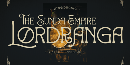 Lordranga is a distinct and vintage styled serif font, with a unique style & modern look. This typeface is perfect for an elegant & luxury logo, book or movie title design, fashion brand, magazine, clothes, lettering, quotes, and so much more.
 - Megistica Dreams by Letterena Studios,
$9.00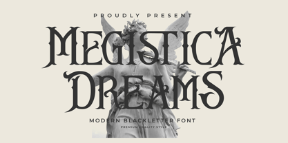 Megistica Dreams is a serif modern blackletter typeface that has its unique style & modern look. This typeface is perfect for an elegant & luxury logo, book or movie title design, fashion brand, magazine, clothes, lettering, quotes, and so much more.
 - Midnight Terror by Invasi Studio,
$19.00 Midnight Terror Font has powerful and solid stroke brush styles that speak to the instant nightmare sensations when you place them into your horror design project. It was inspired by horror and thriller movie posters from the ancient age.
 - Mackenzin by Letterena Studios,
$17.00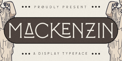 Mackenzin is a modern and classic serif font with a unique style and fancy look! This typeface is perfect for an elegant & luxury logo, book or movie title design, fashion brand, magazine, clothes, lettering, quotes, and so much more.
 - Gorthe by Letterena Studios,
$17.00 A serif modern and classic typeface that has its own unique style & modern look. This typeface is perfect for an elegant & luxury logo, book or movie title design, fashion brand, magazine, clothes, lettering, quotes, and so much more. **Uppercase
 - Megila by Letterena Studios,
$17.00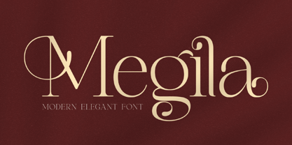 Megila is a modern and classy serif font with a unique style and modern look. This typeface is perfect for an elegant & luxury logo, book or movie title design, fashion brand, magazine, clothes, lettering, quotes, and so much more.
 - Chilling Atmosphere by PizzaDude.dk,
$20.00 Chilling Atmosphere is inspired by classic horror movies and is super useful to for your creepy postcards, flyers, clothing or perhaps packaging. I've added 6 different versions of each letter, to make your creepy text stand even more out!
 - Gods Must by Letterena Studios,
$17.00 A serif modern and classic typeface that has its own unique style & modern look. This typeface is perfect for an elegant & luxury logo, book or movie title design, fashion brand, magazine, clothes, lettering, quotes, and so much more. **Uppercase
 - Mariana by Letterena Studios,
$9.00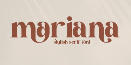 Mariana is a modern and classic serif font with a unique style and beautiful characters. This typeface is perfect for an elegant & luxury logo, book or movie title design, fashion brand, magazine, clothes, lettering, quotes, and so much more.
 - Lawbreaker JNL by Jeff Levine,
$29.00 The December, 1935 movie poster for James Cagney in “Public Enemy” has its title hand lettered in a bold, squared, slab serif type style. Now digitally recreated as Lawbreaker JNL, it is available in both regular and oblique versions.
 - Death Demon by Yoga Letter,
$15.00 "Death Demon" is a horror font that is very scary and full of mystery. This font is perfect for Halloween moments, movie titles, book titles, Halloween party invitations, and more. Equipped with uppercase, lowercase, numerals, punctuation, and multilingual support.
 - Halloween Devil by Yoga Letter,
$15.00 "Halloween Devil" is a unique and spooky display font. This font is perfect for Halloween moments, Halloween invitations, metal concerts, horror movie titles, and more. Equipped with uppercase, lowercase, ligatures, uppercase alternates, lowercase alternates, multilingual support, numerals, and punctuation.
 - Bagias by Letterena Studios,
$9.00 Bagias is a modern and classic sans serif font that features its own unique look. This typeface is perfect for elegant & luxurious logos, book or movie title designs, fashion brands, magazine covers, clothes, lettering, quotes, and so much more.
 - Occidental Tourist JNL by Jeff Levine,
$29.00Occidental Tourist JNL is based on a set of die-cut cardboard letters used by teachers. They were primarily found on classroom bulletin boards or felt boards. The font's name is a pun on the movie The Accidental Tourist. - Trade Gothic Inline by Linotype,
$29.00 Trade Gothic inline is a quirky display companion for Trade Gothic Next, offering five different voices, and a whole lot of personality. The lighter weights are graceful and elegant, embracing negative space to give the sense that the letters are halfway to disappearing. Designer Lynne Yun has incised the darker weights with a super thin inline that emphasises the heaviness of the letters, and creates a reassuring chunkiness. “If I kept the inlines the same, it created a lot of visual noise,” explains Yun. “I wanted each weight to be different enough, so in the end the weight and width of the letters was increasing and decreasing in size, and the inlines were too. The black is almost like an extra black, because the inline is smaller. It's about trying to have different voices for each weight.” Trade Gothic Inline is available in five weights, from light to black.
 - ITC Scram Gravy by ITC,
$29.99The 1928 logotype for Sertal Toiletries consisted of a stylized woman's head, a very snaky S, and five fine, fat deco caps spelling out the rest of the brand name. From these five clues, designer Nick Curtis divined the rules" of the typeface and drew a complete alphabet, including a lower case. The result: ITC Scram Gravy. The finished product could be described as Bodoni on steroids. Tight curls in characters like the 'm,' 'r' and 'y' soften the lower case and give the design a light-hearted flavor. ITC Scram Gravy takes its name from one of many running gags in the screwball comic strip "Smokey Stover," which had folks alternately splitting their sides and scratching their heads from 1935 to 1973. Those familiar with Bill Holman's strip will recall Smokey's car, the Foomobile, and one of his famous nonsense declarations: "No foo-ling, that scram gravy ain't wavy."" - Doris by Fontsphere,
$16.00 Introducing DORIS: A Sweet Handwritten Font Family. DORIS is a stunning new font designed to add a touch of sweetness and charm to your designs. It was originally created for a series of children's books, then it was expanded with additional glyphs and additional thicknesses were added.. --- Key Features:. Handwritten Charm: DORIS captures the beauty and warmth of handwritten lettering, bringing a personal and intimate feel to your designs. Its imperfect lines and organic shapes radiate authenticity and evoke a sense of genuine connection. . Versatile Usage: Whether you're designing coloring books, creating beautiful illustrations, making invitations, or crafting nicely-made quotes, DORIS adapts beautifully to various applications, providing endless creative possibilities. . Feminine and Playful: With its soft curves and whimsical strokes, DORIS exudes a feminine and playful essence. It is a font that effortlessly brings a touch of joy to any design, making it perfect for creating illustrations, invitations, and other projects aimed at capturing a sense of happiness. . Multiple Thickness Options: The availability of five different thicknesses in the DORIS font family allows you to choose the perfect stroke weight for each project. Whether you need a delicate touch or a bold statement, DORIS has you covered. . --- Usage Recommendations:. Children's Books and Illustrations: DORIS is an excellent choice for children's books, illustrations, or any other project targeting a young audience. Its playful and friendly aesthetics will capture the hearts of kids and adults alike. . Invitations and Greeting Cards: Create stunning invitations and charming greeting cards with DORIS. Its sweet and friendly style sets the right tone for special events, celebrations, or heartfelt messages. . Nicely-Made Quotes: Give your quotes a personal and endearing touch with DORIS. Whether it's motivational quotes, lovely sayings, or inspiring messages, DORIS will add warmth and authenticity to every word. . Personal Branding: Incorporate DORIS into your personal branding materials, such as business cards, logos, or website headers, to showcase your unique personality and create a lasting impression. . --- Let DORIS bring a touch of sweetness and handwritten charm to your designs. With its delightful handwritten style, multiple thickness options, and endless usage possibilities, DORIS is the perfect companion for creating projects that are full of happiness and joy.
 - Crescendo by Canada Type,
$29.95 A year after the tremendous success of Memoriam in the "Lives They Lived" issue of the New York Times magazine at the end of 2008, Patrick Griffin and Nancy Harris Rouemy teamed up once more to tackle the same project for the 2009 issue. This time the magazine's design concept revolved around a typeface they created specifically for custom vertical malleability, and that can play just as well in single- or multi-color environments. The result was another iconic commemorative issue that shows exotic tri-line letters merging, swashing, extending and flourishing in stunning gold, silver and blue on black on the cover, and in black on white on the inside pages. Just like in the previous year, the issue won multiple publication design and typography awards. Crescendo is that typeface, finally issued for retail by public demand. Just turn your setting into outlines in your favorite vector program, grab single strands and extend away, and do your best alternating colours between strands. Crescendo comes with a limited punctuation set, but accented characters for Western Latin languages are included, and there many, many alternates and ligatures in there as well. This typeface is best used in large display sizes.
 - Streetscript Redux by Eclectotype,
$40.00 Streetscript Redux is an update to the now discontinued Streetscript. In the original version, it seems a lot of users didn't like the s’s in the font, and after seeing them redrawn (not always with the best results!) a few times, I decided to make a new version of the font with less idiosyncratic s’s, and this is the result, Streetscript Redux. (I should have listened to my other half - “those s’s look like fives,” she said) All other features of the original Streetscript are intact (barring a couple of s-ligatures no longer necessary). There’s been a little tweaking of some outlines, and slight changes with spacing too, but for the most part, all I've done is redraw those pesky five-like s’s, so that you don't have to.
 - Boho by Latinotype,
$39.00 Boho is inspired by a bohemian girl who is a free soul and creative spirit. She is a city girl, but she loves spending a lot of time outdoors and being close to nature. She loves art and going to the antiques and organic food markets. She is a wild and free spirit who knows no bounds. Boho is Coto Mendoza’s first Script font family, which is based on gestual calligraphy with Cola pen. A first exposure to gestual strokes applied to font design can be seen in her previous work, Macarons. Boho consists of 4 subfamilies: Script, Line, Sans and Serif. Each subfamily comes in 4 weights: Regular, Bold, Italic and Bold Italic. Script and Line versions include a teardrop terminal variant. Dingbats and ornaments are also included. Boho. Love and creative spirit!
 - Gosent by NamelaType,
$19.00 Gosent is a Modern Sans serif typeface that has larger x-height size, it will give great performance in small text sizes. Features moderate contrast and lots of special details like the unusual ink trap, giving a modern feel. Gosent is great your various design, both serious and fun projects. Consists of 9 Weight variants from Thin to Black and comes with Oblique version