10,000 search results
(0.037 seconds)
- Innie Outtie - Unknown license

- Dickwhipped - Unknown license

- Jangly Bounce - Unknown license

- FiftiesHollow - Unknown license

- Relieftechnik - Unknown license

- Cheap Pizza - Unknown license

- Texas LED - Unknown license

- Warren - Unknown license

- Tape Loop - Unknown license

- Hebrew Yiddish Std by Samtype,
$49.00 This is a classic early 20th century Yiddish font. This has all the new modern Nikud like: Qamats Katan, ShevaNa, Dagesh Hazak and Holam Chaser.
 - RM Imber by Ray Meadows,
$19.00 A great new display face. The slight serif gives extra character to this solid looking design, whilst the outline version has an open, clean look.
 - Capitol Pro by RMU,
$30.00 Like a phoenix from the ashes - here comes Capitol Pro, a complete redesign of Schriftguss' 1931 Capitol font of which just a few letters existed.
 - Nuclear Standard by Zang-O-Fonts,
$25.00Strong, hard lines inspired the name of this font, based on the "nuclear standard" set by the U.S. and the Soviets during the cold war. - Psyche by Haiku Monkey,
$10.00Psyche is a swash font, hand drawn and tweaked and kerned to within an inch of its life. Perfect for fancy, funky initials and phrases. - Hebrew Yiddish II by Samtype,
$59.00 This is a classic early 20th century Yiddish font. This has all the new modern Nikud like: Qamats Katan, ShevaNa, Dagesh Hazak and Holam Chaser.
 - Hebrew Yiddish III by Samtype,
$39.00 This is a classic early 20th century Yiddish font. This has all the new modern Nikud like: Qamats Katan, ShevaNa, Dagesh Hazak and Holam Chaser.
 - Hello Arsenio by Figuree Studio,
$18.00 Say hello to Hello Arsenio font. Made with love and joy. Kids look, so it will make your design more beautiful, cute, fun, and colorful.
 - Barbed Wire by Monotype,
$29.99Andrew Smith played with his pencil and scetched an alphabet with several strokes. and as he made come cross strokes it lokes like barbed wire. - Macaron by Akufadhl,
$15.00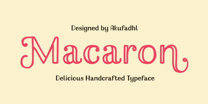 Macaron is a lovely, playful handcrafted typeface with inconsistency. It's designed to suit your homemade products and crafts and is also best for display purposes.
 - Clairdelune by Maulana Creative,
$14.00 Give your designs an authentic handcrafted feel. Clairdelune is perfectly suited to stationery, logos and much more. File includes: - Ligatures - Multilingual Support MaulanaCreative Many Thanks!
 - My Recipes by Pixel Colours,
$15.00 My Recipes is a sweet font duo designed with an authentic hand drawn flavour. Combine it with it's lovely graphics and get the perfect recipe!
 - Utica JNL by Jeff Levine,
$29.00Utica JNL takes the basic components of Boat Decals JNL and reworks the characters into a bold, block font with thick-and-thin line variations. - Wishtime by Sakha Design,
$14.00 Use it for all of your hand-lettering projects like invitations, greeting cards, promotional materials, websites, and branding that need that hand-brushed lettering vibe.
 - Take Chances by Seemly Fonts,
$12.00 Take Chances is a simple and natural handwritten font. This font will greatly complement each of the design ideas you wish to bring to life!
 - Winery by Gleb Guralnyk,
$13.00 Hi! Introducing vintage Winery typeface. Tall condenced font, that is very compact, but has its own style – perfect for label design, or whatever you like :)
 - Zenith by Glyphobet,
$9.99 Chinese characters have simplifed and more complex, "traditional" variants. Zenith imagines what an un-simplified, traditional version of the Latin alphabet might have looked like.
 - Sport Shaded JNL by Jeff Levine,
$29.00Sport Shaded JNL is a classic block font with a cast shadow, perfect for any project for sports teams, college life or high school activities. - Altero by Stefano Giliberti,
$15.00 Altero is a font family for larger-than-life words. It supports 112 languages, features a total of 334 glyphs and includes an italicized version.
 - Minnie by Lebbad Design,
$24.95 Minnie is a clean monoline upright script. This fun-loving font is great for headline display and text use. It comes with numerous alternate characters.
 - ALT Deville by ALT,
$- DEVILE is a gothic medieval font; its something new for me I never tried to create a font like this before so check it out –
 - Henri Modeste by JBFoundry,
$16.00 Henri Modeste is a mix of capital and lowercase forms. It has an high contrast and many ligatures to give your documents an eccentric look.
 - Ravioli by Arendxstudio,
$12.00 Ravioli combines fun fonts that will easily turn any design idea into a stand out! Fall in love with this adorable and versatile font family!
 - Agenor by Graphite,
$17.00 Agenor is an all caps display typeface family. It comes in five weights and is suitable for headlines, headings, branding, posters, packaging, titles and logos.
 - Morgain by Umbra95,
$32.00 Morgain is a decorative vintage font with "celtic spirit". Morgain Is an experimental font, specific shapes and forms gives it a little hand-painted effect.
 - Grandma by HVD Fonts,
$19.00 Grandma is a lovely hand-drawn serif font. It is perfect for greeting cards, children's books and everything that should have a handmade, kind feeling.
 - Tasmik by NamelaType,
$22.00 Tasmik literally means thickening, this font is thick like extrabold in wight, impressed firm but flexible, suitable for display text and the center of interest.
 - Van Dingbats by Vanarchiv,
$30.00 This Dingbat font is designed to work well with the Van Condensed family. The dingbats in it have the same round treatment like the typeface.
 - Phollick by Typotheticals,
$8.00A basic handdrawn and scanned text that could be used for scrapbooks and the like. This font is a cross between Italican Oblique and Czaristane. - Compendium by Sudtipos,
$99.00 Compendium is a sequel to my Burgues font from 2007. Actually it is more like a prequel to Burgues. Before Louis Madarasz awed the American Southeast with his disciplined corners and wild hairlines, Platt Rogers Spencer, up in Ohio, had laid down a style all his own, a style that would eventually become the groundwork for the veering calligraphic method that was later defined and developed by Madarasz. After I wrote the above paragraph, I was so surprised by it, particularly by the first two sentences, that I stopped and had to think about it for a week. Why a sequel/prequel? Am I subconsciously joining the ranks of typeface-as-brand designers? Are the tools I build finally taking control of me? Am I having to resort to “milking it” now? Not exactly. Even though the current trend of extending older popular typefaces can play tricks with a type designer’s mind, and maybe even send him into strange directions of planning, my purpose is not the extension of something popular. My purpose is presenting a more comprehensive picture as I keep coming to terms with my obsession with 19th century American penmanship. Those who already know my work probably have an idea about how obsessive I can be about presenting a complete and detailed image of the past through today’s eyes. So it is not hard to understand my need to expand on the Burgues concept in order to reach a fuller picture of how American calligraphy evolved in the 19th century. Burgues was really all about Madarasz, so much so that it bypasses the genius of those who came before him. Compendium seeks to put Madarasz’s work in a better chronological perspective, to show the rounds that led to the sharps, so to speak. And it is nearly criminal to ignore Spencer’s work, simply because it had a much wider influence on the scope of calligraphy in general. While Madarasz’s work managed to survive only through a handful of his students, Spencer’s work was disseminated throughout America by his children after he died in 1867. The Spencer sons were taught by their father and were great calligraphers themselves. They would pass the elegant Spencerian method on to thousands of American penmen and sign painters. Though Compendium has a naturally more normalized, Spencerian flow, its elegance, expressiveness, movement and precision are no less adventurous than Burgues. Nearing 700 glyphs, its character set contains plenty of variation in each letter, and many ornaments for letter beginnings, endings, and some that can even serve to envelope entire words with swashy calligraphic wonder. Those who love to explore typefaces in detail will be rewarded, thanks to OpenType. I am so in love with the technology now that it’s becoming harder for me to let go of a typeface and call it finished. You probably have noticed by now that my fascination with old calligraphy has not excluded my being influenced by modern design trends. This booklet is an example of this fusion of influences. I am living 150 years after the Spencers, so different contextualization and usage perspectives are inevitable. Here the photography of Gonzalo Aguilar join the digital branchings of Compendium to form visuals that dance and wave like the arms of humanity have been doing since time eternal. I hope you like Compendium and find it useful. I'm all Spencered out for now, but at one point, for history’s sake, I will make this a trilogy. When the hairline-and-swash bug visits me again, you will be the first to know. The PDF specimen was designed with the wonderful photography of Gonzalo Aguilar from Mexico. Please download it here http://new.myfonts.com/artwork?id=47049&subdir=original
 - Duende by Aerotype,
$49.00 Created with headline, logo and other short display work in mind, Duende comes in two weights with alternates for the upper and lowercase, consecutive characters are controlled with the OpenType Ligature feature. Display bigger lowercase crossbars as the surrounding characters allow with OpenType Contextual Alternates on, or create your own custom lowercase f or t with a non-crossbar character and one of the included crossbar options Other features include case-sensitive quotes and smart apostrophes. Duende has an alternate for every capital letter and multiple alternate options for the lowercase including swashy terminal characters and non-connecting alternates. Also included are a few clip-on swash elements that can be used to create initial and terminal forms. Duende uses smart crossbars for common situations, unifying Af, Aft, At, Att, Aff, tt and ff with a single crossbar when the OpenType Ligature feature in on. The Ligature feature also ensures subtle baseline variation when two lowercase characters are keyed twice in a row. Enable Contextual Alternates in your OpenType menu and Duende uses bigger f and t crossbars as the surrounding characters allow. Enable Discretionary Ligatures for lowercase o connections. You can also make your own lowercase f and t to fit any situation combining one of the included crossbars and non-crossbar f or t characters (available as ‘Alternates for Current Selection’ when f or t is selected). Just select the crossbar you want from the glyph table as a separate text element and move it anywhere. Also included are ten tt ligatures with crossbars and one without. Duende also has a few other swashy things that can be used to cross the lowercase f and t. Customize alternate capitals U, V, W, X and Y with any one of the swash options available in the glyph table for those characters.


