10,000 search results
(0.045 seconds)
- Bad Girl by Scholtz Fonts,
$21.00Bad Girl was designed to appeal to the young consumer and the young-at-heart. While clearly feminine, it manages to combine a charming naïveté with in-your-face rebelliousness. The awkward, rather self-involved character shapes have a definite gauche appeal. Bad Girl has a gamine-like insouciance with a touch of wickedness. In contrast to its naive appearance, Bad Girl has been carefully crafted, letterspaced and kerned and contains a full character set of 237 characters. The font comes in two styles, regular and light. - Tosca by Wiescher Design,
$39.50 Tosca is a very elegant and decorative typeface with 730 glyphs. I put a second set of capital letters in the places of the smallcaps. So just type the word in lowercase, then select the first letter and convert it to smallcap in the OpenType menu. I also give you a ton of ligatures that can be accessed via OpenType. I am slowly learning to use these OpenType features, it is fun, but it is a lot of work. Your forever learning type-designer Gert Wiescher
 - Woody by Wiescher Design,
$39.50 Frans Masereel wrote or should I rather say cut some "novels in pictures" around 1927. They are written in powerful black and white woodcuts and were apparently printed from the original cuttings, at least that what it looks like. On the cover he cut the titles in rough wooden letters. Those letters inspired me to produce Woody. Maybe some day I will add a second weight, wich will be an extended cut. But for the time being this is enough woodwork. Your woodcutter Gert Wiescher
 - Riveta by JCFonts,
$30.00 Riveta is a sharp type family available in 18 styles, designed in 2021 by Joël Carrouché. Medium and medium italic styles are 100% free to use. The typeface features a simple and solid geometric construction, with straight terminals and a very discrete triangular serif that gives the font some extra spice in big size. Riveta is equipped for advanced typography, with features such as ligatures, tabular and proportional figures, arrows and icons, stylistic alternates, case-sensitive forms, fractions, scientific inferiors and superiors, and circled figures.
 - ITC Franklin Gothic LT by ITC,
$43.99 Franklin Gothic was designed between 1903 and 1912 by Morris Fuller Benton for the American Type Founders Company. The font serves as the American Grotesk prototype. It was named after Benjamin Franklin. Even today, Franklin Gothic remains one of the most widely used sans serif typefaces. The robust character of the font gives text a modern feel. It is widely used in newspapers and advertising and is frequently seen in posters, placards and other material where space is restricted. Featured in: Best Fonts for Tattoos
 - Gemsbuck Pro by Studio Fat Cat,
$14.00 Gemsbuck Pro is a typeface that was designed by Atok Khoirudin in 2022. It is a sans-serif font known for its bold and geometric design. Gemsbuck Pro features clean lines and a modern, industrial aesthetic, making it popular for various applications, including posters, headlines, and logos. The font family includes several weights and styles, ranging from light to bold, allowing for versatile use in different design contexts. Gemsbuck Pro has been widely used in print, advertising, and digital media due to its distinctive and impactful appearance.
 - Moyt by Outerend,
$20.00 "Moyt" is a display slab font that has an art deco retro feel in a slanted modern design. This family is perfect not only for TV and film titles and credits but also for holiday season materials such as greeting cards, Christmas cards and many other purposes. Individual fonts - light, regular, medium and bold - are available in addition to a variable version which can be perfect if you would like to adjust its weights in detail. Hope you’ll have fun using this typeface for your projects.
 - Bazar by Linotype,
$29.99German Designer Klaus Sutter digitized Bazar, a brush script typeface from the 1950s originally drawn by Imre Reiner (1900-1987) and published in 1956 by D. Stempel AG. Bazar is a calligraphic brush type free from accurate horizontal and vertical strokes and a contrast to the objective body type. It has a more static character and could be perfectly applied in headlines or as a figurative word mark. Like tradional chinese calligraphers, Imre Reiner was also a painter; this is reflected in the glyphs of Bazar. - ITC Fontoon by ITC,
$40.99ITC Fontoon was designed by Steve Zafarana of the Galápagos Design Group in 1995. Along with ITC Fontoonies and ITC Gargoonies from the same designers, it is the perfect text font for cartoons and comics. Slight irregularities in stroke contrast and basic forms distinguish ITC Fontoon and make it look like printed handwriting. It has an individual and consciously naive character and its high x-height makes it legible even in smaller point sizes. ITC Fontoon is best used for short texts and headlines. - Gildersleeve by Greater Albion Typefounders,
$7.95 Gildersleeve evokes the spirit of the Arts and Crafts movement of the 1920s. Think of a hand-cut Roman display face, with loving care lavished over each serif and letterform. Gildersleeve is offerered in the classic combination of a regular face, a bold face, an italic and an italic bold. Any of them are ideal for poster or cover work, as well as for chapter and section headings in a longer document, in combination with a text face such as Vertrina or Clementhorpe Text.
 - Gemsbuck 01 by Studio Fat Cat,
$14.00 Gemsbuck 01 is a typeface that was designed by Atok Khoiruding in 2022. It is a sans-serif font known for its bold and geometric design. Gemsbuck 01 features clean lines and a modern, industrial aesthetic, making it popular for various applications, including posters, headlines, and logos. The font family includes several weights and styles, ranging from light to bold, allowing for versatile use in different design contexts. Gemsbuck 01 has been widely used in print, advertising, and digital media due to its distinctive and impactful appearance.
 - Jasmin by Vincenzo Crisafulli,
$29.00 Jasmin is a tribute to the ancient stories of The Thousand and One Nights, in which a main story serves as a connection for a series of other stories, just like all the other glyphs are derived from one of Jasmin's letters or from a sign. A graphic path in which we tried to combine the calligraphy designed with a quill with geometric research. Among the glyphs there is one referring to a letter from a famous font by Paul Renner, made by Fonderia Bauer in 1927.
 - TXT HunkaSpunk by Illustration Ink,
$3.00The name says it all. HunkaSpunk is whimsical, eye-catching, and fun. Download and use this cool TrueType font for lively scrapbook journaling and paper crafting. - Steagal by insigne,
$24.75 I love geometric sans serifs, their crispness and rationality. Le Havre taps into this style, but for a while, I've wanted to create a font recalling the printed Futura of the 1940s, which seems to have an elusive quality all its own. After seeing an old manual on a World War II ship, I developed a plan for "Le Havre Metal" but chose to shelve the project due to Le Havre's small x-height. That's where Steagal comes in. When Robbie de Villiers and I began the Chatype project in early 2012 (a project which led one publication to label me the Edward Johnston of Chattanooga!), we started closely studying the vernacular lettering of Chattanooga. During that time, I also visited Switzerland, where I saw how designers were using a new, handmade aesthetic with a geometric base. I was motivated to make a new face combining some of these same influences. The primary inspiration for the new design came from the hand-lettering of sign painters in the United States, circa 1930s through 1950s. My Chatype research turned up a poster from the Tennessee Valley Authority in Chattanooga, Tennessee, which exhibited a number of quirks from the unique hand and style of one of these sign artists. Completing the first draft of Steagal, however, I found that the face appeared somewhat European in character. I turned then to the work of Morris Fuller Benton for a distinctly American take and discovered a number of features that would help define Steagal as a "1930s American" vernacular typeface--features I later learned also inspired Morris Fuller Benton's Eagle. The overall development of Steagal was surprisingly difficult, knowing when to deliberately distort optical artifacts and when to keep them in place. Part of type design is correcting optical illusions, and I found myself absentmindedly adjusting the optical effects. In the end, though, I was able to draw inspiration from period signs, inscriptions, period posters, and architecture while retaining just enough of the naive sensibility. Steagal has softened edges, which simulate brush strokes and retain the feeling of the human hand. The standard version has unique quirks that are not too intrusive. Overshoots have almost been eliminated, and joins have minimal corrections. The rounded forms are mathematically perfect, geometric figures without optical corrections. As a variation to the standard, the “Rough” version stands as the "bad signpainter" version with plenty of character. Steagal Regular comes in five weights and is packed with OpenType features. Steagal includes three Art Deco Alternate sets, optically compensated rounded forms, a monospaced variant, and numerous other features. In all, there are over 200 alternate characters. To see these features in action, please see the informative .pdf brochure. OpenType capable applications such as Quark or the Adobe Creative suite can take full advantage of the automatically replacing ligatures and alternates. Steagal also includes support for all Western European languages. Steagal is a great way to subtly draw attention to your work. Its unique quirks grab the eye with a authority that few typefaces possess. Embrace its vernacular, hand-brushed look, and see what this geometric sans serif can do for you.
 - Journeyman by Cafe.no,
$12.00 Journeyman is an all caps layered display typeface in the sign painter tradition. It has normal width caps in lowercase position and a wider caps in uppercase position. Letters in lowercase position are slightly more rounded than those in uppercase position thus providing two styles. Journeyman supports languages with latin characters and ligatures as well as Greek and Cyrillic. The normal front layer is Line while Silhouette is usually put at the back for a three dimensional effect. Other layer arrangements are possible. The type works well for shop displays, poster work, menus, signage and other purposes where you want the type to have impact.
 - Challenger by Linotype,
$29.99German-born, veteran graphic designer and calligrapher Mandred Kloppert, has designed everything from book covers and packaging to logos and fonts. In fact, in 1977, one of his poster designs was voted best poster of the year. Challenger, his first digital typeface draws on his more than 40 years of experience as a freelance graphic designer and calligrapher. Challenger is a versatile font and is particularly effective in contexts in which the purpose is to put across a message very directly and assertively, while retaining a dignified style - in advertisement texts, on packaging, invitations and greetings cards and the like. It is dynamic without being overbearing, individual without being quirky. - Wistar Type by Ana's Fonts,
$15.00 Wistar Typewriter is a monospaced typewriter font in two styles: Regular and Faded, in both vector and SVG versions, with dashed line and underline alternatives and a bonus caps font, for a total of 14 fonts. This font family is versatile and ready to use in modern and retro designs alike. With its soft realistic texture, Wistar looks great in both long or short texts, in digital collages, branding and packaging, social media posts, logotypes, etc. Software requirements for the SVG font: Photoshop CC2017+ // Illustrator CC2018+ No SVG support? No problem! The font includes a vector version of the font that keeps its textured goodness.
 - Trade Convention JNL by Jeff Levine,
$29.00 An ad for the annual Variety Club Convention appeared in the March 18, 1940 issue of "The Film Daily. The main headline was hand lettered in a classic Art Deco "solid" style of sans serif - ultra bold and with no counters - but had one additional feature: 'engraved' lines to the left of each character. This has now been expanded into the digital typeface Trade Convention JNL, which is available in both regular and oblique versions. Variety Clubs (now know as Variety - The Children's Charity) was founded in Pittsburgh, Pennsylvania in 1928 by entertainers specifically to aid children. Their history can be found at https://variety.org/who-we-are/history
 - Superba Pro by Red Rooster Collection,
$60.00 Superba Pro is a condensed Egyptian font family with short ascenders and descenders. The dots on the lowercase ‘i’ and the German umlaut-vowels are square. Haas Type Foundry created the original Superba in 1928-1930. Steve Jackaman (ITF) designed and produced a digital version of the bold weight in 1992. In 2017, Jackaman completely redrew the bold weight, added an accompanying wide weight, and expanded the glyph set to support Central and Eastern European languages. Like other slab serif faces, Superba excels at display sizes and is comfortable at subhead sizes. It is robust, and has “superb” legibility, allowing it to dominate attention in any project it is utilized in.
 - Apéro by Resistenza,
$39.00 A cheerful handwritten font family composed by 8 fonts. 5 slab weights, 2 slab effects and a sans serif. Handmade, friendly and classy, this family is inspired in one of our favorite traditions in Torino, “ L'Aperitivo ”. The social event every afternoon! Before dinner friends meet in the local bar and spend the time together eating, drinking, talking, laughing and eating and drinking again. Handwritten to get a friendly and human feeling. Letterforms specially designed to take the charming mood of this event. The sans serif has been inspired in some letterings found in old local liquor labels. Check out also ‘Modern Love Slanted’ Turquoise Nautica
 - ITC Roswell by ITC,
$40.99Roswell was designed by Jim Parkinson, who acknowledges the 'spacey' ancestry of its name. Yes, Roswell, New Mexico. There was a big anniversary of 'the incident' in the news while I was designing in Roswell. "The incident" is of course the alleged UFO crash in Roswell. "I thought the name was acceptable as a serious font name, while, on another level, having a strangely humorous edge," says Parkinson. Roswell looks great in large sizes on a poster or in a magazine layout. It started out as "a variation on American gothic forms like Railroad Gothic", says the designer, but Roswell is an original design with eccentricities of its own." - Mediator Serif by ParaType,
$30.00Mediator Serif is a balanced contemporary serif typeface that performs well both in display sizes (like in packaging or branding) and body text (books or periodicals where narrow styles will be extremely useful). Mediator Serif is a complementary serif face for Mediator Sans. The family contains 32 fonts in 2 widths: 8 romans with matching italics, of slightly extended proportions, from Thin to Black; and 8 narrow styles with matching italics too. The character set in all faces was expanded to include small caps and old style figures. The typeface was designed by Manvel Shmavonyan with the participation of Alexander Lubovenko and released by ParaType in 2017. - Geller Sans by Ludka Biniek,
$29.00 Geller Sans typeface have been developed based on his serif predecessor’s proportions. He’s quite handsome, quite organised. Looking at thin–extraheavy styles he has enough of charm to stand out in advertisement. In text styles you can relay on him. He’s able to meet demand of complex design tasks. Geller Sans has been fitted with wide range of OpenType features. As Geller Serif, he has bullets & dingbats, for easier entry-point making. Entire font family comes in 4 width (Regular, Narrow, Condensed, Compressed). Each width finds its best application in different typographic fractions what makes Geller Sans easy to apply in editorial graphic design. Who’d like to challenge him?
 - FS Rome by Fontsmith,
$50.00 Trajan The original template for this one-weight, all-caps font was the inscription on Trajan’s Column, carved in AD 113 to celebrate the emperor Trajan’s victory in the Dacian Wars. College student Jason Smith copied the stone lettering from the cast on display in London’s Victoria & Albert Museum. In Roman times, the signmaker would paint letters onto stone with a wide brush for the stone mason to chisel out later. The signwriter would end each stroke with a flick of his brush, which the mason would also carve into the stone. Ecce (as they would have said in Rome): the serif was born. Hand-crafted “I first drew this typeface when I was 17,” says Jason. “I drew it with a very sharp 9H pencil on polydraw film. “Then, using a Rotring pen, I inked the letters in and scraped back the serifs so they were perfectly sharp. These letters were then reduced on a PMT camera. I’d designed my first typeface, although it wasn’t digitised till much later.” Digitised Years after Jason had drawn the original typeface, its transfer into digital form made further refinements necessary. The serifs and weights needed thickening slightly, creating a crisp, new version whose delicate elegance is best appreciated in larger sizes. A classically-inspired font, timeless and perfectly-proportioned, to reflect the refinement of premium brands.
 - Wachinanga - Personal use only

- DHF Quinta's Diary - Personal use only

- Creatify by Fikryal,
$18.00 Creatify – Font is a bold script font. It’s perfect for logo, branding, title, social media posts, advertisements, product packaging, product designs, label, photography, watermark, special event, magazine, web design, etc. Features : Creatify ( Uppercase, Lowercase ) Contextual alternates Stylistic alternate Ligatures Multilingual Support If you have any questions please don’t hesitate to contact me. follow my Instagram: fkryall Thank you Fikryal Studio
 - Delvon Family by madeDeduk,
$15.00 Delvon is a modern sans serif font family. It is suitable to create text for branding, product packaging, invitations, quotes, t-shirts, labels, poster, logos and more. Features: Uppercase Lowercase Numbers & Symbols International Glyphs Ligatures If you need anything else just shoot me on email at: dedukvic@gmail.com or find more previews on my Instagram here : https://www.instagram.com/acekelgondolayu/ Hope you enjoy it.
 - Hello Hollis by Zane Studio,
$15.00 Introducing the Halo Hollis Font Duo.. hello nice people this is my new font, the Hello Hollis Font Duo sits somewhere between a modern serif and signature, Hello Hollis is great for logo branding, wedding invitations, typography, text quotes, magazines, or anything else you want. Hello Hollis Serif includes, numbers, punctuation, alternatives, ligatures and also supports other languages :) Thank You :)
 - Hosrein Gomer by madeDeduk,
$16.00 Hosrein Gomer is a Modern Ligature Font, use this font for any branding, product packaging, headline, invitation, fashion, label, poster, logo etc. Feature Uppercase & Lowercase Number & Symbol International Glyphs Multilingual support Alternative Ligature Feel free to drop us a message any time and follow my shop for upcoming updates Shoot me on email at: dedukvic@gmail.com Hope you enjoy it.
 - Boris Brush by Hanoded,
$20.00 Boris is my son: he was born on January 7th and he is as cute as can be. Boris Brush font is a very loud, very useful brush typeface, which I created using some fine-haired brushes and black paint. It is all caps, but lower and upper case are different and can be freely interchanged. Comes with all the diacritics you need.
 - Chicken Feet by BA Graphics,
$45.00An irresistible design by my (11 year old) Granddaughter; it brings that child innocence to font design. When she first showed it to me I was so impressed I could not resist I had to make it into her very own font. Alexandra is also the designer of the font flag and says she is working on new font ideas. - Royal Blossom by Wiescher Design,
$39.50 Royal Blossom belongs to my extended family of blackletter fonts that are derived from the famous Royal Bavarian Fraktur. Ayres Royal and Monkeytails also belong to this elaborate set of blackletter fonts; that's why I now offer the lot for an exceptional price. All fonts can be mixed and used together. Your type designer with a crunch for history, Gert Wiescher.
 - Nagissta by madeDeduk,
$11.00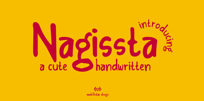 Introducing Nagissta is a cute handwritten font with a matching script and regular will be perfect for book, title branding, product packaging, invitation, quotes, t-shirt, label, poster, logo etc. Feature Uppercase & Lowercase Number & Symbol International Glyphs Multilingual support Ligature Feel free to drop us a message any time and follow my shop for upcoming updates Hope you enjoy it.
 - Barrowboy by Studio K,
$45.00 Barrowboy was inspired by the handwritten sales tickets that are still to be found on market stalls and fruit barrows, and are as familiar as the street cries that accompany them. The signage is mostly confined to numerals, so translating it into a font is pretty much a work of imagination. See also my other fun fonts Bebopalula, Calypso and Pier Arcade.
 - Communiqué by Studio K,
$45.00 Communiqué is a variation on my Export Drive font family. It is a bold condensed stencil font of the kind traditionally used to mark tea chests, packing cases etc. Nowadays its applications are universal, although it is particularly well suited to branding or publishing projects which strive for a sense of freshness, urgency and immediacy, or a rugged, rough-and-ready feel.
 - Midnight Chalker by Hanoded,
$15.00 Midnight Chalker is, well, a chalk(ish) font and it was (fro the greater part) created around the midnight hour. That’s usually when I get my inspiration. Midnight Chalker is a tall, eroded font - all caps, but the upper and lower case differ and can be mixed. Of course it comes with more diacritics than you can throw a chalkboard at.
 - Cool Crayon by Hanoded,
$15.00 Cool Crayon is a nice typeface I created with the black crayola from my 3 year old son's crayola box. It was broken (because he tends to throw them around), but I managed to get the glyphs onto a sheet of paper. Cool Crayon is similar to Crayon Crumble, but is rounder and thicker. Cool Crayon comes with extensive language support.
 - Rockets Battle by Rochart,
$10.00 Rockets Battle is my hand drawn brush font, and makes with original brush paint, by using high resolution brush stroke images with incredible definition. Its look natural. It will be great for Logotypes, Posters, Digital Lettering Arts, Clean Design, Branding Design, Sign, Merchandise and Social Media Posts. This font contain of Uppercase, Lowercase, Number, Symbol, Punctuation, also support multilingual and already PUA encoded.
 - Wangi by Ergibi Studio,
$20.00 Wangi - Display Font, a stencil style typeface perfect for any type of logo, packaging, fashion, magazine, etc. Mantovans is cleanly designed. This is the best choice with more than 130+ alternative characters, so you can show more variations for the completion of your design If there is a problem, question, or anything about my fonts, don't hesitate to ask! Big Thanks Ergibi Studio

