10,000 search results
(0.127 seconds)
- Kidzhood Arabic by NamelaType,
$34.00 Kidzhood Arabic is sibling of Kidzhood with the addition of Arabic glyphs, for Arabic, Urdu, and Farsi. The font represent the characters as funny and flexible, just like childish characters can be. Kidzhood equipped with cute letter form and some attractive ligatures, giving it a playful feeling.
 - Dayana by Stefani Letter,
$14.00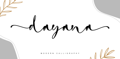 dayana is a lovely and delicate handwritten font. It looks gorgeous on wedding invitations, thank you cards, quotes, greeting cards, logos, business cards, and every other design which needs a handwritten touch, and much more! It features a varying baseline, smooth lines, gorgeous glyphs, and stunning alternates.
 - Bella Notes by Attype Studio,
$14.00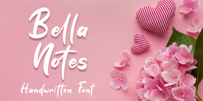 Bella Notes is lovely Handwritten font, including ligatures that perfect for any combination for your design. Bella Notes perfectly macth for design with valentine theme, any product like book cover, t-shirt, branding, promotion, social media post, quotes, wedding, photography and more. What's included: - Ligatures - Multilingual Support
 - Hawker Display by Webhance,
$4.00 Hawker is a beautiful modern display font family. Hawker carries a powerful, unique, cute, artistic, and social character line with a premium finish, giving a new impression. Hawker is perfectly crafted for logos, magazines, advertisements, websites, headlines, titles, captions, UIs, games, apps, films, apparel and more.
 - Lincoln Electric by Canada Type,
$30.00 Lincoln Electric started its life as an in-house experimental film type Thomas Lincoln drew shortly after concluding his work as part of Herb Lubalin’s famed crew in the late 1960s,. The master alphabet was drawn on illustration boards using pen and ink and press-type lines. The typeface was initially made for use in the branding and promotional material of Lincoln’s new design outfit. This alphabet’s forms are a spin on Bifur, the all-cap deco face designed by Adolphe Mouron (known as Cassandre) in 1929, and published by the Deberny & Peignot foundry in France. Lincoln Electric evolves Cassandre’s idea further by constructing new shapes more in line with minimalist principles rather than art deco geometry — something clearly evident in Lincoln’s minuscules, which exhibit a clear connection to Bauhaus ideas More than 50 years after the typeface’s design, Thomas Lincoln found the original film alphabet tucked away in his archives and brought it over to Canada Type for digital retooling. The result is a modern and thoroughly elaborate set of fonts that belonging prominently in a 21st century designer’s toolbox. The following features are included in Lincoln Electric: • Three fonts for chromatic layering. • More than 1900 glyphs in each font. • Expanded Latin and Cyrillic character sets. • Small caps and Caps-to-small-caps. • Six different sets of stylistic alternates. • Ordinals and case-sensitive forms. For a showing of the stylistic set variations and a sample of demonstration of chromatic layering, please consult this PDF.
 - Sixta by Hoftype,
$39.00 Sixta, a new monoline face with a classical background, has comfortable proportions and a puissant appearance. Although it has plenty of movement and is eventful, its discreet stroke ductus makes it excellent both for text and display. Sixta comes in eight weights, in OpenType format and with extended language support for more than 40 languages. All weights contain proportional lining figures, tabular lining figures, proportional old style figures, lining old style figures, matching currency symbols, fraction- and scientific numerals.
 - Orgon Plan by Hoftype,
$49.00 Orgon Plan is the square-cut sister of the Orgon. It represents the crispy counterpart to the sucsessfull Orgon family and was published in 2020. Orgon Plan consists of 20 styles and is well equipped for advanced typography. It comes in OpenType format with extended language support. All weights contain small caps, ligatures, superior characters, proportional lining figures, tabular lining figures, proportional old style figures, lining old style figures, matching currency symbols, fraction- and scientific numerals and matching arrows.
 - Fox by profonts,
$41.99 Fox was originally designed by W. Rebhuhn for the former German Genzsch & Heyse foundry. In reminiscence of the good old times, Ralph M. Unger redrew and digitally remastered this font in 2007. His work is based on artwork taken from old font catalogues. Fox is a very lively script, quite typical for the 50s
 - Hazel Script by Eclectotype,
$40.00 The design process of this font was rudely interrupted on August 11th, 2015, when my first child, Hazel, was born. Thinking up names for fonts can be tricky, as can thinking up names for babies, so when the font was finally finished, it seemed like a good idea to kill two birds with one stone, and here it is: Hazel Script. Hazel Script is a finely crafted, elegant, connecting script. I wanted to make something unique, and to this end, the contrast in the face is not based on any ductal logic, or the writing of some imagined tool. The thick parts of glyphs are purely aesthetic devices, placed to give the otherwise monoline font an interesting rhythm. The over-sized upper case letters follow a mid-century lettering skeleton, and swash forms can be used judiciously to add spice to the text. Hazel Script works "out of the box" but to really get the best out of it, use OpenType-savvy programs to unlock a world of swashes, alternates, ligatures and the like. In detail, the features are as follows: Swash - alternate forms for many glyphs Stylistic Sets - 1: script r, 2: alternate s, 3: script z, 4 and 5: more swash options, 4,5,6 and 7: access to alternate ampersands (the font boasts six to choose from!), 8: connecting forms for K, L, R, X and Z. Localised forms - ij digraphs for Dutch, and a script lslash for Polish. Standard ligatures - a mixture of ligatures, including the 'percent off' (just type "% off") and a heart that connects to the ends of words (type "<3") Automatic fractions Ordinals - a and o for Spanish etc. but also s,t,r,d,h and n for English 1st 2nd and 3rd etc. Contextual alternates - automatically places special start and end glyphs where necessary. Hazel Script would look great in glossy magazines set large, or would make a slightly unorthodox choice for wedding stationery, birth announcements, letterheads...
 - DIY Fantasy Stamp by TypoGraphicDesign,
$19.00 The typeface DIY Fantasy Stamp is designed in 2020 for the font foundry Typo Graphic Design by Manuel Viergutz. The display typeface is inspired by the crafts of 20s and 40s. The basis for this authentic stamp font was a letter case with a rubber stamp from Simplex. This analog character set of 85 stamps, was digitally extended to 500+ glyphs. 5 font-styles (Sharp, Dirty, Rough, Invert, Heavy) with 546 glyphs (Adobe Latin 3) incl. decorative extras like icons, arrows, dingbats, emojis, symbols, geometric shapes, catchwords, decorative ligatures (type the word #LOVE for ❤ or #SMILE for ☺ as OpenType-Feature dlig) and stylistic alternates (4 stylistic sets). For use in logos, magazines, posters, advertisement plus as webfont for decorative headlines. The font works best for display size. Have fun with this font & use the DEMO-FONT (with reduced glyph-set) FOR FREE! Font Specifications ■ Font Name: DIY Fantasy Stamp ■ Font Weights: Sharp, Dirty, Rough, Invert, Heavy + DEMO (with reduced glyph-set) ■ Font Category: Display for headline size ■ Glyph Set: 546 glyphs (Adobe Latin 3) ■ Specials: Decorative extras like arrows, emojis, ornaments, geometric shapes, catchwords, decorative ligatures (type the word #LOVE for ❤ or #SMILE for ☺ as OpenType Feature. dlig) and stylistic alternates (4 stylistic sets) ■ Design Date: 2020 ■ Type Designer: Manuel Viergutz
 - Planet Express by Estudio Calderon,
$29.99 Family type designed by Felipe Calderón. This type is a display with a modern style and a different and innovative concept. The development of this type was a challenge because it was set out from the begining as a script font with ornaments and complements, where the round shapes do not have prominence in the result. Planet Express is an interesting job from the aesthetic point of view, it works for big scale texts and contains little shadow-cuts in each character to give it more personality and stand out among other fonts from this gender. I hope this new project works to solve issues in design. Planet Express is composed of Regular & Italics, it has 250 intelligent ligatures to produce the best signs in big scale, it is perfect for branding and works very well with the geometric complements. It is designed with programming in opentype: Ligatures, Discretionary ligatures, Stylistic Alternates, Stylistic set 01, Stylistic set 02, Stylistic set 03, Stylistic set 04, Stylistic set 05, Stylistic set 06, Stylistic set 07, Stylistic set 08 & Stylistic set 09, multiple language support and a complete set of extras like arrows, catchwords, flags, emblems, hands, fleurons & crossed elements. Planet Express can be used in different ways, each character pretends to cover the needs in any circumstance where it is used. It is funny to write words and play with the complements. It also works with current concepts in graphic design like sports, cars, hip hop, music, social network, skateboarding and more. Everybody can use this font, it works with different languages like italian, french, portuguese, danish, german and so forth. See specimen and samples here. Enjoy it!
 - Eulogia by Majestype,
$14.00 Eulogia is a cute, lovely and fun handwritten font. Made with love from scratch using markers. This font brings love, fun and a unique feel to your designs. With 300+ glyphs, it can provide many possibilities for creating great looking designs. Perfect for comics, displays, titles, children's designs with illustrations like our poster displays. Language Support: Catalan, Danish, German, English, Spanish, Estonian, Finnish, French, Irish, Icelandic, Italian, Norwegian, Portuguese, Slovenian, Albanian, Swedish Illustrations using our fonts Kayto Doodles https://www.myfonts.com/collections/kayto-font-majestype We hope you enjoy this font as much as we made it. Cheers and thank you so much!
 - Stencil Box JNL by Jeff Levine,
$29.00 The lettering for Stencil Box JNL was found on the packaging of a children's toy stencil set circa the 1940s. Popular for years, Pencil Stencils were a series of "connect the line" stencils where a series of dashed lines were traced from the cutouts and the lines connected to complete pictures of animals or other subjects. Although the packaging itself was often updated to reflect the current times during the life of the product, it was this hand-lettered example of stencil-meets-Art Deco from the 40s that proved worthy of saving as a digital typeface.
 - Kinder Stone by Letterhend,
$17.00 Let Kinder Stone add a pop of personality to your designs! This fun and whimsical font is like a playful friend. Its rounded, bubbly letters give it a friendly and approachable feel, while its cartoon-like appearance adds a touch of humor and playfulness. Use Kinder Stone to create logos, posters, and other designs that need a dash of personality and fun. Features : Uppercase & lowercase Numbers and punctuation Alternates & Ligatures Multilingual PUA encoded We highly recommend using a program that supports OpenType features and Glyphs panels like many of Adobe apps and Corel Draw, so you can see and access all Glyph variations.
 - Cooper Nouveau by House Industries,
$33.00 Few fonts reach cult status. Despite its ubiquity—and perhaps because of its lack of subtlety—for a hundred years Cooper continues to draw the faithful. It’s even come to define an entire typographic genre and recently starred in its own documentary. Cooper Nouveau is Dave West’s imaginative contribution to the Cooper oeuvre. Drawn in 1966, Nouveau refreshes Oswald Cooper’s original italic with an energetic pitch, simplified contours, and a plump friendly figure. Uniform strokes and generous curves push the font’s playful personality and springy silhouette even further. A selection of swashed characters and ligatures offers options for lively logos and strong captions. While Cooper Nouveau looks laid-back and easy-going, it’s more than capable of pulling it’s own typographic weight. Put it to work where relaxed needs to project confident. Set Nouveau large for eye-magnet posters, packaging, and advertisements. Maximize its youthful energy for kids’ themes, craft action, and apparel bounce. Or set it alongside a master like Benguiat Buffalo or Chalet to show how Cooper Nouveau can communicate on paper and screens with an inherent ability to speak the language of style in many tongues. But like any cult icon: beware! Cooper has a way of setting the needle, and Nouveau just may become your go-to design fix. FEATURES ALTERNATES: Cooper Nouveau contains several alternate characters, which add flair to your designs and can help solve spacing issues LIGATURES: Many letter combinations in Cooper Nouveau form a ligature to solve spacing issues and produce more pleasing designs. COOPER NOUVEAU CREDITS Typeface Design: Dave West Digitization: Dave Foster Typeface Direction: Ben Kiel, with Ken Barber Like all good subversives, House Industries hides in plain sight while amplifying the look, feel and style of the world’s most interesting brands, products and people. Based in Delaware, visually influencing the world.
 - Pumkinpie by Balpirick,
$15.00 Pumkinpie is a cute and lovely handwritten font. Fall in love with its simple and neat style and use it to create gorgeous wedding invitations, beautiful stationary art, eye-catching social media posts, and much more!
 - Merc by Canada Type,
$24.95 Merc is a four-letter word that stops just one y short of Mercy. Merc is also the standard street abbreviation for mercenary, or a soldier for hire. Now that the global security business has become a two hundred billion dollar industry, we thought you would like to have your very own affordable merc. Knew you'd be pleased. Merc is based on an all-cap metal face called Agitator, designed by Wolfgang Eickhoff and published by Typoart in 1960. The rough brush letters look like they were made by someone who is capable of elegance but has no time for it. These are letters that live to catch the eyes and warn them loudly: Doom is here, and if you want it screamed out, this Merc is at your service. This font contains more than 460 glyphs, which means quite a few stylistic alternates and support for the majority of Latin languages.
 - Bayshore by Set Sail Studios,
$18.00 Perm your hair, squeeze into your lycra, and retro-fy your text with Bayshore! A totally tubular mono-line script font straight out of the 80's. This hand-drawn font is perfect for creating slick & stylish lettering. Whether it’s for logos, product packaging or merchandise, Bayshore is guaranteed to give your text an unmistakeable retro quality. Bayshore comes as a single font file with added features allowing you to customise your text; End Swashes • Each lower-case character has a separate ‘end-swash’ version, use this for the last letter in a word to give it a custom-feel styling. These end-swashes are accessible via any software with Opentype capabilities, simply by turning on ‘Stylistic Alternates’. Underline Swashes • Four swashes of varying lengths are also available, simply by typing any of the square brackets [ ] { }. These can be used to underline your text and give it a real eye-catching quality.
 - NewLibris by Hubert Jocham Type,
$39.00 The first version of Libris I designed in London in 1997 when I worked for Frank Magazine. Later Libris was used in the magazine for text and display. In 1999 Libris was chosen as the corporate typeface of Bally Switzerland. I also was involved in the design of the entire branding. NewLibris is the version that was published in my own shop. - What was the inspiration for designing the font? NewLibris is an elegant contemporary easy to read sans serif. It has a wide variety of weights and proportions that are easy to use in corporate branding and magazines. - What are its main characteristics and features? contemporary humanist legible sans serif - Usage recommendations: corporate branding and magazines and other publications
 - Gilam by Fontfabric,
$39.00 Gilam is a sans serif font with semi-condensed proportions. The typeface was based on the famous DIN but combines its popular neo-grotesque look with characteristics, such as the pointed edges in the “W” and “M” as well as the outward cut terminals, which gives a distinctive look to the modern geometric typeface. The complete set of 9 weights plus italics gives to designers the absolute freedom to create anything. Perfect layouts with blocks of text, headlines, motion graphics, logos, apps, and websites are just part of the intended usage of this versatile typeface. Features: • 765 glyphs in 18 styles; • Extended Latin, Cyrillic and Greek; • Geometric forms and low contrast; • Prominent x-height which makes it legible in a text; • Perfect for headlines and logos; • Suitable for web, print, motion graphics etc. • Semi-condensed proportion; • Advanced typographical support and OpenType features including case-sensitive forms, fractions, superscript and subscript characters, and stylistic alternates; • Complete set of figures - old style and lining figures, which come with proportional and tabular variation; Gilam means “joy of people” so that you can enjoy it!
 - Odisseia by Plau,
$20.00 Odisseia: Monospaced Typeface Made on Earth by Plau. Plau presents Odisseia, a monospace type family in 8 styles designed with simplicity of shapes and a humanist touch. We’ve ventured into monospace territory, where all letters must occupy the same amount of space. This style is usually associated with typewriters and computer terminal fonts. Like all monospaced fonts, every letter align vertically in a multi-line setting. The rhythm created is peculiar, since large letters such as m and w occupy the same space as narrow ones like i. Because we have 4 different weights: light, regular, bold and black the design of some characters have to be adapted to fit the same width and achieve a constant light/dark value throughout. These features make Odisseia suitable for a specific yet considerable range of uses, from computer coding to systemized communication such as brand identities. This style has been used from high-end brand identity to cutting edge digital applications. Odisseia sets a little shorter in comparison with other monospaced fonts, and bears a large x-height.
 - Broadside by Device,
$39.00 Broadside is a versatile, authoritative and functional family inspired by the sans serifs seen on ’40s and ’50s patriotic posters and period advertising. It is available in seven weights across condensed, normal and extended widths, each with reweighed italics. The type from this period was very often hand-drawn, and so differs considerably from poster to poster. Many American examples of this period use a Photo-Lettering style called Murray Hill and its derivatives, although their UK counterparts, designed by such luminaries as Abram Games or Tom Eckersley, are more stylistically diverse. Even though no single model is available to base a digitisation on, there are certain recurring stylistic quirks that give the type its unique flavour, and so the most interesting examples from several sources were be combined for the final family. Alternate short descenders, allowing for tighter line spacing, can be toggled on or off in the Opentype panel of Indesign or Illustrator. Tabular and lining numerals and a single-story ‘a’ are also available in all weights and styles.
 - Protrakt Variable by Arkitype,
$10.00 Protrakt is inspired by city life and sport. It has been designed as a variable font and is best to use as a variable font to get the full enjoyment of using this typeface. However, if you do not have access to variable technology through your software, there are nine widths in the font family so this will give you just as much access to the creativity this font can provide. By using the variable sliders in your design software you have a range of weight and width options. Play around with individual letters to give your type a unique look. Included in this family are alternate characters to add even more styling options. *Unfortunately there is no option to test out the variable capabilities on MyFonts as yet. Please have a look at the poster images to get a great idea of how I have used this font. By using the variable version you only need to install one font file instead of the entire family, this saves space and time to manually select individual styles.
 - Emoli by Arttype7,
$10.00 Emoli is a strong font family with a laid-back style. Inspired by the strong bending of iron, a unique character can be felt through controlled letterforms and blunt finishes. Each font in this family is standalone, and strong and cute. Emoli consists of ten fonts Emoli-Thin & Emoli-Thin Italic, with the thinnest complexion looks luxurious in high appearance. Emoli-Light and Emoli-Light Italic looks elegant combined with the weight of the Emoli Font family. Regular and italic emojis, the basis of emollient fonts, balance shapes, and letter uniqueness are found in this weight. Emoli Bold and Emoly Bold Italic will gently emphasize a strong character. Emoli Extra Bold and Emoli Extra Bold Italic, the thickest weights that will facilitate legibility and strong attitude. FEATURES 10 weights / Italics / Lines / Numbers & Signs Font family Emoli works well on applications, brands, logos, magazines, films. Different weights give you the full range to explore a variety of applications, while illustrated fonts give a modern, relaxed and powerful feel to any project.
 - Rusty Cage by Hanoded,
$15.00 I named this font after one of my favorite songs by Soundgarden: "Rusty Cage". The font is a mishmash of letters, which were hand-drawn and given a photoshop overhaul to make them look grungy and grotesque. I mixed upper and lower case letters, added a whole bunch of alternate letters, spooned in some Salt and Calt and added a pinch of Liga as well. The result is a weird concoction, which looks good on posters, in ads and possibly even tattoos. I dare you!
 - Absolem by Anastasia Kuznetsova,
$21.00 Tasty and sweet, Absolem is a sleek high contrast serif type with. Absolem is excellent for headlines, packaging, posters and any other display use conveying an elegant impression. I invite you to familiarize yourself with the preliminary images and hope that you will be imbued with my vision of this creative font, which, I am sure, will be suitable for all the interesting projects you are working on. Fonts can be opened and used in any software that can read standard fonts, even in MS Word.
 - Stereotype by studiocharlie,
$17.00 Stereotype is a geometrical font in five weights based on the same square. It's a gradient!
 - KnewFont by Ingrimayne Type,
$9.95 KnewFont simulates neat and meticulous hand printing. Its letters slant left and come in five weights.
 - Hey Beauty by Subectype,
$15.00 Hey Beauty is a Chic and Lovely Calligraphy font, described by a Love touch with natural handwritten style, perfect for your favorite projects. Fall in love with its incredibly distinct and timeless style and use it to create spectacular designs! What's Include : Hey Beauty OTF, TTF, WOFF Multilingual Support Thank You, Subectype
 - BigNoodleTitling - 100% free

- Laquittea by Slex Studio,
$18.00 new modern calligraphy font - Laquittea. This beautiful script is for those who need elegance and style for their designs and is perfect for wedding invitations, logos, save the date cards and branding. The Laquittea script has 2 regular and bold styles covering the full set of Uppercase and Lowercase Characters, Numbers and Punctuation. Also contains ligatures and many alternative styles to perfectly recreate natural calligraphy (check the preview to see them all). All fonts are available for West European, Central European and Southeast European Languages. You can check your language typing characters in the text box below. If you have any questions about my products, feel free to write me a message or contact me by email slexs515@gmail.com. Thank you so much for checking out my shop!
 - Buddy by Hackberry Font Foundry,
$24.95 Buddy is the new companion sans for Contenu, the book font family designed for my book on font design design. Originally, I called it Compagnon, but that seemed to pompous. Then I called it Aide, but that was too formal and dry. It's a loose, free, easy to read sans, so when my wife suggested Buddy, it clicked. This is the 4-font Buddy family of Regular, Italic, Bold, & Bold Italic. I made a new, more limited feature set for these fonts due to their designed usage, but there are still small caps, small cap figures, oldstyle figures, numerators, and denominators. The bold is closer to a black, and the italics are only slightly slanted obliques. If you need a strong black in caps, use the small caps of the bold.
 - Cargan by Hoftype,
$49.00 Cargan merges the strength of the slab serif with a gentle line flow. The result is a versatile typeface family with a distinct personality that performs superbly in headlines as well as subheads and shorter text applications. The Cargan family consists of 16 styles and is well suited for ambitious typography. It comes in OpenType format with extended language support. All weights contain ligatures, superior characters, proportional lining figures, tabular lining figures, proportional old style figures, lining old style figures, matching currency symbols, fraction- and scientific numerals and matching arrows. The roman styles offer alternative versions for the ”a” and ”g” characters.
 - Zenit by Cuchi, qué tipo,
$9.95 As "Zenith" means, in an astronomical context, the highest point reached by a celestial body, my new typeface raises its drawing for carry it to the highest expression. In an effort to design a singular graphic and visual letters system, the contrasts and proportions of “Zenit” boosts up and are squeezed as much as possible, resulting in a very particular aesthetic, while still maintaining a certain grotesque reminiscence. Given its dynamic, postmodern, daring and futuristic style, “Zenit” is an ideal typeface for use in designs that want to discover new space worlds full of color and speed, still unexplored. “Zenit, the typeface that rockets you!.”
 - Maxly by Kaer,
$19.00 Hey, friends! I’m here for you with my new colored font Maxly. All the letters in this font are colored brightly and vividly with colors overlay. You can use it in your corporate identity, in magazines, posters, clothes design, and others. --- *You can use color fonts in PS since CC 2017, AI since CC 2018, ID since CC 2019, QuarkXPress since 2018, Pixelmator, Sketch, Affinity Designer Since macOS 10.14 Mojave, Paint.NET Windows only.* *Please note that the Canva & Corel doesn't support color fonts!* --- What's included? * Colored and regular B&W styles * Numbers * Symbols * Multilanguage support If you have any questions or issues, please contact me: kaer.pro@gmail.com Best, Roman.
 - Tola by Agnieszka Ewa Olszewska,
$18.00 Tola is a modern, reversed-weight, experimental display font with a spirit of the 70s. Looks better in large sizes but in smaller thanks to the thick bottom makes also interesting effect. It’s based on my letter shape experiment. I was drawing one single letter in the hope to find interesting results. I started Tola font with the letter “G” and based on that shape I created the rest of the alphabet. Tola looks good in modern graphics. It contains uppercase, numbers, and some punctuation signs, and is multilingual. Perfect for logos, posters, and social media graphics that need a super superhero with a sentimental touch.
 - Boogie by Linotype,
$40.99German graphic designer Ralf Weissmantel created Boogie in 2003. Boogie is an ironic reference to pop art, and to disco lettering from the 1960s and 70s. Its round forms and outlines evoke the flashing, pulsating lights and music of that era. Shipping with five different, width-compatible fonts, the Boogie typeface has four different components: an outlined letterform is the base element, and forms the first font. Three additional fonts may be layered over top of this base, surrounding the first font with up to three bubble-outlines. In graphics applications like Adobe PhotoShop or Illustrator, these elements can each be assigned different colors. There is also a fifth font, which contains the base outlined letterform pre-surrounded by three additional outlines of the same color. Boogie works best in large headline, display and signage applications, where its forms can be clearly seen and enjoyed. When different colored layers are applied, text set in Boogie will gyrate and jive across the page! Weissmantel has worked as an art director for various international advertising agencies, and has led Corporate Design projects for firms such as Grey and MetaDesign. His design work, honored internationally, has been included in the typography collection of the Museum for Art and Trade in Hamburg. He is currently teaching graphic design at the Düsseldorf University of Applied Sciences. Weissmantel has been an associate of the United Designers Network since August 2002. Boogie received an Honorable Mention in the 2003 International Type Design Contest, sponsored by Linotype GmbH. - Agency FB by Font Bureau,
$40.00 ATF Agency Gothic was designed by Morris Fuller Benton in 1932 as a lone titling typeface. In 1990, David Berlow saw potential in the squared forms of the narrow, monotone capitals. He designed a lowercase and added a bold to produce Font Bureau Agency, an immediately popular hit. Sensing its potential to be than just a useful condensed face, Font Bureau developed Agency into a major series offering five weights in five widths; FB 1990-95
 - Mythical Christmas by Allouse Studio,
$16.00 Mythical Christmas Script bring you the joyfull feel with bouncy calligraphy styles with Beginning and Ending swash to play around, these also come with Multi-Lingual Support. Mythical Quirky give you an a handwriting serif styles and just including Uppercase Lowercase Number and Multi-Lingual Support. Enjoy these Lovely Couple Font! We highly recommend using a program that supports OpenType features and Glyphs panels like many of Adobe apps and Corel Draw, so you can see and access all Glyph variations. Mythical Christmas is perfect for any tittle, logo, invitation, product packaging, branding project, megazine, social media, wedding, or just used to express words above the background. Enjoy the font, feel free to comment or feedback, send me PM or email. Thankyou!
 - Jawbox by Chank,
$49.00In 1995, when indie rock hipness was just reaching its pique, Chank was really into Jawbox, a post-punk band from DC. It was their music he was listening to when he made this font for the Space Ghost web site. The band broke up in 1997, but the font named in their honor lives on. This font family includes Jawbox, Jawbox Chanky, and Jawbreaker.
