10,000 search results
(0.209 seconds)
- Mineraline by Formation Type Foundry,
$25.00 Mineraline is inspired by the crystalline, faceted forms of minerals. This unique display typeface is made of a complex linear structure, giving the letterforms a dynamic, intricate and dimensional feel – especially suited to display use in very large sizes. The unique linear structure allows the line-weight of the character framework to be varied, to give the family a varying ‘visual’ weight, rather than altering the traditional stroke width. Used at smaller sizes, the type is incredibly detailed, almost woven looking. At larger display sizes the framework and bevelled joints become more obvious and striking. From the delicate Light through to the solid and angular Ultra, Mineraline is perfect to give your work a distinctive, modern and creative edge. Its multiple weights are ideally suited to work across Branding, Logo & Identity, Retail, Point of Sale, Packaging, Advertising, Fashion, Digital and Film, or any other experimental graphic and typography tasks.
 - Linotype Atlantis by Linotype,
$29.99Lutz Baar was born in Berlin, now living in Gothenburg, Sweden. He is an art director at his own advertising and Web design studio Miraculus. Among his typeface designs you find the award winning Linotype Pisa, the hand tooled looking Linotype Atlantis, and the strictly Linotype Ordinar, designed for Web usage. - JAF Zalamander by Just Another Foundry,
$42.00 Blackletter, sans serif, graffiti, constructivism: all these influences are combined into a lively and dynamic – and somehow “disobedient” – typeface. Since blackletter fonts typically don’t look great when used in all-caps, Zalamander comes with a special Caps version that contains letter variants that combine nicely in uppercase. All fonts support Cyrillic.
 - Lindraki by Twinletter,
$18.00 The Lindraki Groovy font is a very geometric and crooked font with high contrast between thin and bold lines and shapes. This font has an elegant and distinct style that makes it visually different from many other fonts. It makes your design stand out from the rest. This font will give a unique touch to your design. Never put off using this cool font, as it will help you give extra zest to all kinds of work. This fun font has precisely defined Curves and the subtle strokes of the typeface make this font very pleasing to the eye. So what are you waiting for? Stop procrastinating and incorporate it into your designs right away! What’s Included : Standard glyphs Iso Latin 1 Simple installations We highly recommend using a program that supports OpenType features and Glyphs panels like many Adobe apps and Corel Draw, so you can see and access all Glyph variations. PUA Encoded Characters – Fully accessible without additional design software. Fonts include Multilingual support
 - Granny Smith by BA Graphics,
$45.00Angular serifs give this font a unique look. Works well in all applications. - Hayride JNL by Jeff Levine,
$29.00 Based in part on the hand-lettered title for a piece of vintage sheet music, Hayride JNL gets both its inspiration and name from Michael Todd's 1948 production "Mexican Hayride". The original design was in outline form, and the letters with straight-lined shapes had slight curves to them. For Hayride JNL, those lines were straightened and the letters made solid in appearance.
 - Arlette by TypeTogether,
$49.00 Pilar and Ferran based Arlette on the fast stroke of one letter from a Roger Excoffon family, but along the way they abandoned that starting point in favour of experimentation. Many sans serifs are like a svelte black dress: functional, beautiful, and the unfussy outfit for a nice evening get together. The Arlette family isn’t like this. It’s a stunner — an incandescent reimagining of what defines a sans and how it can look. Arlette explores the boundaries of the sans serif landscape and returns with forms developed from gestural vigour. Thinking of it as “painterly” may at first seem to fit, but it underestimates Arlette’s ability to master an unseen world of countless emotions and physical applications: magazines, branding, editorial, teen and young adult works, book covers, and a host of products and packaging whose content will be amplified with Arlette’s voice. Not only does Arlette use its eight weights plus italics to speak in Latin-based scripts, it is also fluent in Thai and has six weights (hairline through bold) with which it meets that challenge, whether in text or display. Arlette Thai’s modern nature is seen in two features for the script. One is the decorative Thai characters that are based on original palm leaf manuscripts. Another is a version of the Latin numerals adapted to the height of the script due to their wide use in Thailand. Arlette Thai has been meticulously developed, including contextual kerning to avoid mark clashes. Arlette’s OpenType capabilities include mathematic and scientific figures, positional forms, pointers, arrows, and oldstyle, lining, and tabular lining numerals. In addition to all this, it’s packed with swashes and swash ligatures in both scripts for enthusiastic typesetting. Because it pushes experimentation without compromising readability, both Arlette Thai and Latin are surprisingly legible in small sizes and arrestingly beautiful when their details can be seen.
 - Hey Baby Script by Bosstypestudio,
$13.00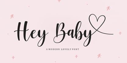 Hey Baby Script is a Chic and Lovely Calligraphy font, described by a Love touch with natural handwritten style, perfect for your favorite projects. Fall in love with its incredibly distinct and timeless style and use it to create spectacular designs! What's Include : Multilingual Support Thank You,
 - Madelisa Script by Bosstypestudio,
$14.00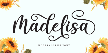 Madelisa Script is a Chic and Lovely Calligraphy font, described by a Love touch with natural handwritten style, perfect for your favorite projects. Fall in love with its incredibly distinct and timeless style and use it to create spectacular designs! What's Include : Multilingual Support Thank You,
 - Wildflower by Calamar,
$15.00 Introducing my new handwriting font - Wildflower. It's perfect for creating quotes, logos, or just adding a handmade touch to any project.
 - Boink Dropshadow by Robert Petrick,
$19.95 Boink Dropshadow is a variation on my ITC Boink font. This is a great font for headlines & fun to design with.
 - Doughnut by AType,
$24.95This font thicker than my Fatman. It so thick and round, that looks as a doughnut. Yes, it is a doughnut! - Changing by PintassilgoPrints,
$24.90 Changing is a lively font, loaded with many automatic interlock pairs that do their magic in OpenType aware applications. Its peculiar design and such choices for letter combinations make this a very dynamic, spirited and useful typeface.
 - Once by Atlantic Fonts,
$26.00 Once upon a time there was a really adorable font. Expressive, hand-lettered, and storybook sweet in any language, Once has charm to spare. Enjoy the new set of double letter ligatures, and live happily ever after.
 - Xcetera by Typogama,
$19.00 Work for the Xcetera typeface started with the desire to create a classical serif design but using the less contrasted stroke thickness found in a host of sans serif designs. My aim was to retain some of the clarity found in modern strokes yet use the serifs to aid in letter recognition and legibility. The result is a form of hybrid design that is surprising clear in small point sizes yet offer a lot of personality in larger formats. Suited for both display and text settings, Xcetera aims to be both functional and fun while looking to explore new possibilities for the classical typeface style.
 - Tokoloshe by Scholtz Fonts,
$17.95Tokoloshe is a name in African mythology for a mischievous leprechaun-like figure that loves practical jokes and tricking people. There are many books of such African stories, for example Tales of the Tokoloshe by Pieter Scholtz. The letter shapes that I used in the Tokoloshe font have inspiration from two sources: -- the spiky character of the font was derived from the wonderfully imaginative, wooden carvings of the Makonde people of beings called "shetani". The word "tokoloshe" is used by other tribes, but from his behaviour, he is certainly a type of shetani. -- some of the letter shapes were informed by Art Deco styles of fonts, for example: Kunjani, Black Tie SF, Selznick Normal, Zaire SF, Binner Gothic and ITC Anna. But the Tokoloshe font, like its namesake, is much more freespirited. Use this font whenever you want to suggest the rich artistic, cultural and spiritual heritage of Africa. The font is fully professional in terms of its character set. It contains over 235 characters - (upper and lower case characters, punctuation, numerals, symbols and accented characters are present). In fact, it has all the accented characters used in the major European languages. - Whimsies by Typephases,
$25.00The Whimsies series goes further in our fixation with invented little people: the three dingbats of this series contain mostly imaginary situations, drawn first with ink on paper. All but a tiny fraction of the illustrations (a total of 114) have been drawn from one's imagination, with no previous models. The themes depicted here are varied and often humorous, though the humour is on the darker side, you are warned. The themes have a definite retro - victorian feel, with top hats, moustaches, long coats, walking canes and the like. Together with their close relatives, our Illustries, Bizarries, Ombres, Absurdies and Genteta dingbats (we give this bizarre collective the common name of Whimbats) you can use the Whimsies in an endless variety of projects, ranging from small spot illustration to whole pages, page spreads or posters applications. You can use them as they come in the digital font, or customize them easily in your favourite graphics program. A touch of texture or color will give them a completely new look. The vectorial nature of digital fonts means you can enlarge them to any size, with no loss of crispness in their outlines. - ITC Japanese Garden Ornaments by ITC,
$29.99ITC Japanese Garden Ornaments is a symbol font designed by Akira Kobayashi (before Kobayashi became Linotype's Type Director in 2001, he worked as an independent typeface designer in Tokyo). The images in Japanese Garden are, as the name suggests, mostly floral or herbaceous, derived from designs used in Japanese indigo stencil dyeing. In Japanese Garden," Kobayashi says, "I tried to create a set of type fleurons that are very familiar to a Japanese eye, but not too exotic to people in other countries." Several of the designs fit together seamlessly in repeating patterns; others work either together or as isolated ornaments, a flexibility that also characterizes traditional Western type fleurons. "The original illustrations," notes Kobayashi, "were mostly cut from white paper squares, about two by two inches in size, and were simply scanned and traced. That is why there are few smooth curves and perfectly straight lines in the illustrations. I simply liked the ragged textures of them."" - Neuland by Linotype,
$29.99 A rough sanserif titling cut by Rudolf Koch for Klingspor in 1923. The letters give the appearance of being crudely cut in wood.
 - 112 Hours by Device,
$9.00 Rian Hughes’ 15th collection of fonts, “112 Hours”, is entirely dedicated to numbers. Culled from a myriad of sources – clock faces, tickets, watches house numbers – it is an eclectic and wide-ranging set. Each font contains only numerals and related punctuation – no letters. A new book has been designed by Hughes to show the collection, and includes sample settings, complete character sets, source material and an introduction. This is available print-to-order on Blurb in paperback and hardback: http://www.blurb.com/b/5539073-112-hours-hardback http://www.blurb.com/b/5539045-112-hours-paperback From the introduction: The idea for this, the fifteenth Device Fonts collection, began when I came across an online auction site dedicated to antique clocks. I was mesmerized by the inventive and bizarre numerals on their faces. Shorn of the need to extend the internal logic of a typeface through the entire alphabet, the designers of these treasures were free to explore interesting forms and shapes that would otherwise be denied them. Given this horological starting point, I decided to produce 12 fonts, each featuring just the numbers from 1 to 12 and, where appropriate, a small set of supporting characters — in most cases, the international currency symbols, a colon, full stop, hyphen, slash and the number sign. 10, 11 and 12 I opted to place in the capital A, B and C slots. Each font is shown in its entirety here. I soon passed 12, so the next logical finish line was 24. Like a typographic Jack Bauer, I soon passed that too -— the more I researched, the more I came across interesting and unique examples that insisted on digitization, or that inspired me to explore some new design direction. The sources broadened to include tickets, numbering machines, ecclesiastical brass plates and more. Though not derived from clock faces, I opted to keep the 1-12 conceit for consistency, which allowed me to design what are effectively numerical ligatures. I finally concluded one hundred fonts over my original estimate at 112. Even though it’s not strictly divisible by 12, the number has a certain symmetry, I reasoned, and was as good a place as any to round off the project. An overview reveals a broad range that nonetheless fall into several loose categories. There are fairly faithful revivals, only diverging from their source material to even out inconsistencies and regularize weighting or shape to make them more functional in a modern context; designs taken directly from the source material, preserving all the inky grit and character of the original; designs that are loosely based on a couple of numbers from the source material but diverge dramatically for reasons of improved aesthetics or mere whim; and entirely new designs with no historical precedent. As projects like this evolve (and, to be frank, get out of hand), they can take you in directions and to places you didn’t envisage when you first set out. Along the way, I corresponded with experts in railway livery, and now know about the history of cab side and smokebox plates; I travelled to the Musée de l’imprimerie in Nantes, France, to examine their numbering machines; I photographed house numbers in Paris, Florence, Venice, Amsterdam and here in the UK; I delved into my collection of tickets, passes and printed ephemera; I visited the Science Museum in London, the Royal Signals Museum in Dorset, and the Museum of London to source early adding machines, war-time telegraphs and post-war ration books. I photographed watches at Worthing Museum, weighing scales large enough to stand on in a Brick Lane pub, and digital station clocks at Baker Street tube station. I went to the London Under-ground archive at Acton Depot, where you can see all manner of vintage enamel signs and woodblock type; I photographed grocer’s stalls in East End street markets; I dug out old clocks I recalled from childhood at my parents’ place, examined old manual typewriters and cash tills, and crouched down with a torch to look at my electricity meter. I found out that Jane Fonda kicked a policeman, and unusually for someone with a lifelong aversion to sport, picked up some horse-racing jargon. I share some of that research here. In many cases I have not been slavish about staying close to the source material if I didn’t think it warranted it, so a close comparison will reveal differences. These changes could be made for aesthetic reasons, functional reasons (the originals didn’t need to be set in any combination, for example), or just reasons of personal taste. Where reference for the additional characters were not available — which was always the case with fonts derived from clock faces — I have endeavored to design them in a sympathetic style. I may even extend some of these to the full alphabet in the future. If I do, these number-only fonts could be considered as experimental design exercises: forays into form to probe interesting new graphic possibilities.
 - Quota by Ryan Williamson,
$- Quota is an investigation into the modularity of the Cyrillic alphabet. Unlike Latin and Greek, the Cyrillic alphabet owes much of its form to its development in early industrious printing and movable type. This lead the Cyrillic alphabet to be dominated by hard edge and straight lines, giving it a much more modular overall construction. The forms within the Cyrillic alphabet therefor allow for all the characters themselves to have somewhat unified side bearings without compromising ease of reading. Within Quota the default character set has only unified side bearing, giving a more relaxed mono-spaced appearance. While the first stylistic set unifies the entire character set with the same character width, creating a true mono-spaced typeface. Quota was initially designed in Cyrillic, catering to all languages using the alphabet. While the Latin was designed after, and is loosely based of the forms present within the Cyrillic alphabet.
 - 1592 GLC Garamond by GLC,
$38.00 This family was inspired by the pure Garamond pattern set of fonts used by Egenolff and Berner, German printers in Frankfurt, at the end of the sixteenth century. All the experts said it was the best and most complete set of the time. The italic style used with it was Granjon’s, as in 1543 Humane Jenson. A few fleurons from the same printers have been added. It can be used variously for web-site titles, posters and flyers design, publishing texts looking like ancient ones, or greeting cards, various sorts of presentations, as a very elegant and legible font... This font supports very large sizes as easily as small sizes, remaining very smart, elegant and fine. Its original cap height is about five millimeters. Decorated letters like 1512 Initials, 1550 Arabesques, 1565 Venetian, 1584 Rinceau from GLC Foundry, can be used with this family without anachronism.
 - Quatie by insigne,
$24.00 Originally a conceptual approach from the Chatype project of Jeremy Dooley and Robbie de Villiers, Quatie has been restructured to add a new industrial element to Insigne’s offerings. Like the Official Font of Chattanooga, Tennessee, Quatie definitely carries a contemporary, hipster feel. Quatie similarly draws much of its inspiration from the industrial brawn of the railroad and the unique characteristics of Cherokee letterforms, giving it an atypical form not usually found in an industrial slab. While the Quatie concept was originally set aside for the more technological look of Chatype’s final image, Jeremy revived this face from its dormant state and refined it for its commercial release in 2013. This bracketed slab with its slightly rounded, soft edges adds a warm, retro, industrial element to Insigne’s offerings. The resulting quirky, ‘hipster’ vibe of Quatie lends its voice to give an unparalleled edge to your designs.
 - VLNL Jelly Donuts by VetteLetters,
$30.00 VLNL Jelly Donuts’ Jelly Donuts is the round sibling of VLNL Donuts. Equally funky, just round. Like its counterpart Jelly Donuts is heavily infused by hip 1970s geometric fonts like Blippo, Pump and ITC Bauhaus. It nonetheless has both feet in this modern day and age. Meticulously designed and tightly spaced, VLNL Jelly Donuts is very suitable for logos, headlines and music artwork. We especially recommend using it on big 12" album covers. VLNL Jelly Donuts is deep fried, filled with cream, custard or jam, and ometimes glazed or covered in a variety of sweetness: sprinkles, cinnamon, coconut, chopped peanuts, powdered sugar or maple syrup. As a very sweet and saturated snack should, VLNL Jelly Donuts is fitted with a full set of alternate swoosh caps that can be deployed to liven up your already ‘out there’ designs. You can’t get any more funky than this.
 - Gothiks Round by Blackletra,
$50.00 Gothiks Round is the rounded version of Gothiks. It is a narrow 6-weight display sans-serif influenced by Texturas. The rhythm and verticality of Texturas can be easily identified on the letters with diagonal strokes like A N M K k V v W w X x Y y Z z: here they are all vertical. This kind of morphology was chosen because it accepts condensation in a very natural way, giving to this sans-serif a very unique personality. The intermediate weights can be used for short texts while extreme weights are excellent for big sizes. It has an extensive character set—with extensive language support—and many OpenType features like fractions, small capitals and different figure sets. Default figures align with lowercase. The typeface’s name refers to the plural of the word Gothic, which in turn can refer to both sans-serifs or Blackletter, depending on geographic location.
 - Pauline Didone Variable by insigne,
$99.99 Introducing Pauline Didone Variable, a flawless blend of Art Deco elegance and contemporary script. Inheriting a splash of femininity from its lineage, Pauline, it’s the perfect choice for eye-catching logos, standout headings, and memorable snippets of copy. Dive into a 10-font family arsenal, complete with 5 distinct weights, italics, and a treasure trove of OpenType alternates. Reflecting the allure of retro scripts, its geometric silhouette, paired with bold brush contrasts, commands attention. Pauline Didone’s contemporary high-contrast design ensures your artwork isn’t just in Kansas anymore but in the vibrant world of modern design. Enhance your projects with over 150 alternate characters, including a set of whimsical ball terminals reminiscent of Toto's playful spirit. Access these Oz-inspired elements with advanced software like the Adobe Suite or Quark. Step into a realm of enchantment with Pauline Didone and let your designs shine like the Emerald City.
 - Scientist Castle by DLetters Studio,
$13.00 Scientist Castle Family Slab Serif Font Is A Great Font For any project! Available in 4 styles that you can use for various purposes, as a combination or separation according to the design style. Complete with OpenType features, which allow you to give a more calligraphic look! There are regular, Italic, Outline, and Outline Italic styles and very easy to use. Scientist Castle Family Slab Serif Font is a great choice for Projects you like branding, design, wedding, photography, Magazine, logo designs, album, covers Book, business cards, quotes, and projects other designs. What’s Included : – S-Alt – Works on Win, Mac – Simple installations – Accessible in Adobe Illustrator, Adobe Photoshop, Adobe InDesign, even work on Microsoft Word. – PUA Encoded Characters – Fully accessible without additional design software. Thanks for your support, please kindly send us a message for any question about our product. Hope you like it.
 - Delizius Script Latin Pro by Saffatin.co,
$27.00 Delizious! A combination of retro, vintage and modern calligraphy styles to find exotic nuances in the characters. Vintage-style swashes, it's simple and still looks elegant. Consistent thickness is a characteristic of retro fonts. The position of letters that look up and down makes them look like they are dancing, a characteristic of modern calligraphy letters that are trending today. Basically this is a simple font, you can see it. Specific OpenType features include Contextual Alternates, Stylistic Alternates, Swashes, Standard Ligatures, also Multilingual accent support. With Opentype features, You can access glyphs very easily. An advantage of Opentype and I like it very much. In Adobe software, You ca turn off your “opentype” feature to accesses random/selected letters. This font support Multilingual Latin Pro accent letters of Central Europa, Western (À Â Æ È Ë ã ä æ è...) Hope you all love it. Thank you!
 - Marmellata Jar 02 by Fontscafe,
$39.00 So you just designed a night club brochure, and now need to change gears to help you make a design that oozes with love and togetherness? Let our Marmellata fonts help you get into the mood! A part of our Marmellata package and also available individually, the Jar 02 is something to be tried to be believed. This font takes you to that special place in your heart, reserved for your most cherished memories... It is great because of its simplicity, very much like all things from childhood! Don’t get us wrong though, this is not just a ‘childish’ font. While it would work great for children’s designs, we believe it would also be very fitting in designs that call for a touch of nostalgia, love, comfort, well-being and happiness. And yes, we agree that all children remind us of all of the above!
 - 1557 Civilité Granjon by GLC,
$42.00 Living from 1545 in Lyon, France, the famous punchcutter Robert Granjon created a typeface that looked like his own handwriting. The first book printed with this font, in 1557, was probably Dialogues de la vie et de la mort by Innocent Ringhier. We offer the complete typeface. It is a charming font with historical forms (long s, final s and others) and many ligatures, enriched with accented letters and other characters that did not exist in the original (thorn, eth, lslash and others), and a lot of alternates that permit rich and varying typography. Warning: all characters appear with the 1500s manual blackletter old style, especially letters “e” “r” or “h” alternate and some ending forms, and may be difficult to read at first, but it quickly becomes very easy. The font contains all characters for Baltic, Western European (Including Celtic), Eastern European, Northern European, and Turkish languages.
 - French Bulldog by Sudtipos,
$49.00 Day after day we are running from here to there, living in a society that does not allow us to slow down for a minute. Having so many things on our minds, we often unnecessarily complicate our problems, and our stress is so great that we forget what happiness is. French Bulldog was made to celebrate the unnoticed precious little moments. A hot coffee in the morning, the sea breeze on your face, the sweet smell of a flower, a nap with your dog, a meeting with friends, the tenderness of a maternal caress, traveling, walking, crying, sharing, feeling, being onesself. French Bulldog creates spontaneity from chaos with different shapes working randomly to form finesse or coarseness, just like a casual hand works a brush and tries to follow the rules with unpredictable results. It is versatile and fresh, friendly and relaxed. Flow in the moment.
 - Ugroh Black by Saffatin.co,
$12.00 Get ready to jazz up your design game with the brave Ugroh Display Black font include Italic! Armed with a whopping 260 glyphs, it's got all the languages covered and comes with a bonus of ligatures and alternative glyphs. So, whether you want to add a fancy twist or a subtle tweak, it's got you covered and will make your designs shine like a star! With its bold and modern look, Ugroh Display Black font is a perfect choice for any design project that requires a touch of elegance. Its clean lines and sharp edges will give your designs a professional look that will impress any audience. Whether you're creating a logo, a poster, or a website layout, Ugroh display black font will give your project a unique and stylish look. Its versatile character set makes it a great choice for a variety of design styles, from minimalistic to ornate. And with its extensive language support, you can be sure that your message will be heard loud and clear, no matter where your audience is located. So, why settle for a dull and uninspired design when you can jazz it up with Ugroh display black font? Try it out today and see your designs shine like never before!
 - Monterey Pop by K-Type,
$20.00 Monterey Pop oozes 1960s freedom and optimism, and is based on Tom Wilkes’s poster lettering for the Monterey International Pop Festival in June 1967, the event which heralded the legendary Summer of Love. The fonts include a newly-designed lowercase and a full complement of Latin Extended-A characters. In addition to the normal font, Outline and Thinline versions with matching spacing and kerning are supplied for use separately or overlapped with the regular font for bicolor effects. The Outline font is best for darker lines, and the Thinline font is designed for white and tinted outlines which can tend to halo and appear slightly bolder.
 - Rondawe by Luhop Creative,
$18.00 If you've got style and love all the luxuries in life, you're Rondawe! Add a touch of luxury and style to your projects too, with the new Rondawe Font Collection. It's highly recommended to turn your Opentype features on while using the Rondawe font, to make use of it's best features - the multitude of OpenType ligatures and alternates. This font is designed to pair harmoniously, and lend themselves to high end branding, logo designs, product packaging & invitation designs.Creates a perfect pairing contrast with combining Rondawe Serif and all Script font. and one more font recommendation that you should apply in your work,(Kelimajaroe Display) Get Discont 45% Use Code [ KLMJR45 ]
 - Motownphilly by IKIIKOWRK,
$19.00 Introducing Motownphilly - Classic Handdrawn Type, created by ikiiko. Motownphilly is a handwritten script typeface inspired by the typography styles of Movie titles and the American Classic Show & Orchestra in 1950s. This typeface is designed to give the appearance of an expressive style. Motownphilly has bold, raw lettering lines, with wild strokes. A style commonly used in print ads, magazine, and sign advertisements of the era. This typeface is perfect for an poster, newspaper, magazine ads, and also good for vintage product, food & beverages, quotes, or simply as a stylish text overlay to any background image. What's included? Uppercase & Lowercase Number & Punctuation Alternates Multilingual Support Works on PC & Mac
 - Summer Cherry by Letterara,
$13.00 Introducing a new beautiful calligraphy font, Summer Cherry! Created for the Summer season Summer Cherry is perfect for elegant logos, upscale packaging, wedding stationery, websites, and any other projects requiring a handwritten and luxurious touch. A wide range of swashes (a-z) and alternates (A-Z, a-z) are included so that you can give your logo or name a custom, hand-calligraphy look. Moreover, Summer Cherry was created to look as close to a natural handwritten script as possible by including 64 ligatures. With built in OpenType features, this script comes to life as if you are writing it yourself. You can see it in the picture shown.
 - ALS Zwoelf by Art. Lebedev Studio,
$63.00 The design of Zwoelf stems from a letter created by Oleg Pashchenko for the poetry book called “They Talk.” Modified in several ways, the lettering gained readability and a more neutral look. This typeface combines Modern and Gothic styles, ugliness and beauty, the horrifying and the funny. Typographers may highlight any of this. Zwoelf features elements that can be found in both Roman and Gothic styles, but has no real historical prototype. It creates coarse body copy that feels like blackletters. The type is well-suited for use with rough line graphics. Zwoelf is a good choice for short texts, headings, witchcraft potion recipes, madrigals, spells and treasure map naming.
 - FF Advert Rough by FontFont,
$49.99 Dutch type designer Just van Rossum created this display and sans FontFont in 1992. The family has 5 weights, ranging from One to Five and is ideally suited for advertising and packaging, film and tv, music and nightlife as well as poster and billboard projects. FF Advert Rough provides advanced typographical support with features such as ligatures, alternate characters, case-sensitive forms, fractions, super- and subscript characters, and stylistic alternates. It comes with a complete range of figure set options – oldstyle and lining figures, each in tabular and proportional widths. This FontFont is a member of the FF Advert super family, which also includes FF Advert.
 - Tierra Script by Corradine Fonts,
$15.00 Tierra Script is a connected script typeface with a simple structure and organic contour. Its naivety and fluency makes it easy to read and close to everyone. The system has two main styles, one more formal than the other, then could be used in a wide diversity of designs applying the appropriate look. Also has other features, like swashes, alternative characters and contextual replacements. All that features are supported by a careful Open Type programmation, then is just needed to play a little with the font to obtain lovely words and phrases. Some features are present in all the fonts but the "Plus" version contains all of them.
 - Octopuss by ITC,
$29.99Octopuss is an energetic titling typeface designed in 1970 by Colin Brignall for Letraset dry transfer sheets. Brignall expanded the basic alphabet with an outline variation with a shadow, which makes the typeface look three dimensional, almost like it is floating. Octopuss font displays the unmistakable signs of the typefaces of the 1970s, as do Countdown and Harlow, also designed by Brignall. The circular strokes of the capitals that drop well under the base line are striking and unique. Because of the small white spaces of its lower case letters, the rounded, robust Octopuss is meant exclusively as a headline font and should be set in large point sizes.