7,357 search results
(0.229 seconds)
- Baudi by MKGD,
$13.00 Bauhaus is a style of art that was born in Weimar Germany in the early part of the 20th century. The font that bears the bauhaus name was constructed in accordance with this style by making use of spheres and squares with little or no added flourishes. Since this typeface was already minimalistic in appearance, it was difficult to produce a similarly styled font. So I went back to bauhaus’ architectural roots for inspiration. The result contains a more detailed composition, but is still focused on the basic aesthetics that continue to make bauhaus a popular art form. Baudi has a glyph count of 388 and supports the following languages Afrikaans, Albanian, Asu, Basque, Bemba, Bena, Bosnian, Catalan, Chiga, Colognian, Cornish, Croatian, Czech, Danish, Embu, English, Esperanto, Estonian, Faroese, Filipino, Finnish, French, Friulian, Galician, German, Gusii, Hungarian, Icelandic, Indonesian, Irish, Italian, Kabuverdianu, Kalaallisut, Kalenjin, Kamba, Kikuyu, Kinyarwanda, Latvian, Lithuanian, Low German, Lower Sorbian, Luo, Luxembourgish, Luyia, Machame, Makhuwa-Meetto, Makonde, Malagasy, Malay, Maltese, Manx, Meru, Morisyen, North Ndebele, Norwegian Bokmål, Norwegian Nynorsk, Nyankole, Oromo, Polish, Portuguese, Romanian, Romansh, Rombo, Rundi, Rwa, Samburu, Sango, Sangu, Scottish Gaelic, Sena, Shambala, Shona, Slovak, Slovenian, Soga, Somali, Spanish, Swahili, Swedish, Swiss German, Taita, Teso, Turkmen, Upper Sorbian, Vunjo, Walser, Zulu
 - Promenade by Jen Wagner Co.,
$17.00 Introducing Promenade – a calligraphic serif that started on paper with a flat nib pen (see the 6th image), and blossomed into a full serif with italics. At its core, this font is just... beautiful. It's elegant, it's crisp, it's delicate, but can still hold its own. As I was creating the graphics, I just couldn't get over the flow of the letters – especially the italic. It's got class, but also isn't afraid to rock a pair of Doc Marten's. Funny enough, Jen from Tonic (they make beautiful websites) saw a preview of this font and said, "I'd take that font to prom." Which of course spurred a conversation about how this font would take a Mercedes G-Series instead of a limo, and wear Doc Marten's instead of heels, but still wear the most gorgeous dress, and that is 100% Promenade (and inspo for the name – thanks, Jen!). I've also been loving combining the regular and italic, especially for logos (see the "Friendfolk" logo) One thing to note about Promenade is the letter spacing. It was spaced for clean reading and intentional balance, so I recommend setting the spacing a little tighter if you want to create the display look found in many of the logo mockups(around -20 to -40 should do!).
 - Fazeta Sans by Adtypo,
$32.00 Fazeta Sans is a perfect companion to serif typeface Fazeta. Two light weights were added, so the complete typeface consist of 14 fonts (7 weights + matching italics). The fine gradation lets you choose perfect weight for any type of project. Every font have 1140 glyphs – just like the serif version and contains the same features, so use and combining of whole typeface is very comfortable. Also fixed kerning allows better comfort for eyes by reading and shortens the length of the text. I tried to preserve sharp and cold impression from serif version, but some straight lines had to be curved due to the natural limitation of sans typefaces (for example the upper arch of “f” is shaped more smooth). However it keeps extremely open form. A little playfulness was left at the end of letters “k, K, and R”, but if you want, this can be eliminated by using a rigorous SS01 feature. Serifs were here transformed into a small yaw from main stroke and so enlive the monotony of sans kind of types. Also slight cutting the top of the letters helping to surprisingly vivid final impression. Fazeta Sans is therefore suitable for wide range of type sizes – from small marginalies to huge poster sizes. To see more please check the PDF specimen.
 - Leo by Canada Type,
$29.95 Leo is an economic magazine and book face meant for use in sizes suitable for immersive reading, with different cuts optimized for different body copy size ranges, like footnotes and legal text. Designed with the explicit intent of relaying information without calling attention to itself, this typeface places itself squarely on the "function" side of the eternal debate about form versus content. The roman Leo fonts were built with as little ornamentation as possible, with wedge serifs, a high x-height and a skeleton somehwat rooted in the designers' reflections on the modern, post-war Dutch archetype. Rather than follow traditional models with entirely different forms, contracted widths and steep slants, the Leo italics deliver naturally subtle emphasis in reading by closely relating to the forms, stance and rhythm of their roman counterparts. The 12 Leo fonts contain over 700 glyphs each, and include support for the vast majority of Latin languages. Included OpenType features are built-in small caps, lining and oldstyle figures in both proportional and tabular sets, superiors, numerators, denominators inferiors, ordinals, automatic fractions, ligatures, and optional long descenders for optimal counterspace management in book and magazine text layout. For more information on Leo's character set, features and some print tests, please consult the PDF in the gallery section of this page.
 - Neacademia by Rosetta,
$70.00 Neacademia is a Latin and Cyrillic type family inspired by the types cut by 15th century punchcutter Francesco Griffo for Venetian printer Aldus Manutius. Beyond the letterforms themselves, however, the digital fonts themselves are based on the techniques and methods Griffo employed. The family comprises four distinct variants optimised for specific point sizes, as was traditional in metal type. While the display sizes maintain a visual link to calligraphic roots, text sizes exhibit more typographic qualities, following the hand of the carver. Likewise, Neacademia maintains its even colour on the page by carefully employing alternative letterforms, rather than leaning on a multitude of kerning pairs. A geeky little detail you’ll likely need to point out with a magnifying glass to your type friends, but creating a neat texture that works in readers favour nonetheless. Neacademia’s historically sensitive eye is put to work for modern typographers’ needs. It incorporates Griffo’s italic capitals and harmonizes them with the lowercase and the romans — where the original Aldine italics had no capitals of their own and simply re-used the uprights. It was designed with specific allowances for letterpress photopolymer printing. Printed digitally, it can tolerate – and even benefit from – low resolution, rough paper, and low-grade presswork. In many ways, it feels like using metal type again!
 - Boogie Nights NF Pro by CheapProFonts,
$10.00 A typical Art Deco font. I have redesigned the uppercase “S” to mach the lowercase, tweaked a little here and there - and completely redesigned all the diacritics (which didn't really match the letter designs). Nick Curtis says: "The inspiration for this font came from a poster for an Austrian trade show from the 1920s, credited simply to Wasserman." ALL fonts from CheapProFonts have very extensive language support: They contain some unusual diacritic letters (some of which are contained in the Latin Extended-B Unicode block) supporting: Cornish, Filipino (Tagalog), Guarani, Luxembourgian, Malagasy, Romanian, Ulithian and Welsh. They also contain all glyphs in the Latin Extended-A Unicode block (which among others cover the Central European and Baltic areas) supporting: Afrikaans, Belarusian (Lacinka), Bosnian, Catalan, Chichewa, Croatian, Czech, Dutch, Esperanto, Greenlandic, Hungarian, Kashubian, Kurdish (Kurmanji), Latvian, Lithuanian, Maltese, Maori, Polish, Saami (Inari), Saami (North), Serbian (latin), Slovak(ian), Slovene, Sorbian (Lower), Sorbian (Upper), Turkish and Turkmen. And they of course contain all the usual “western” glyphs supporting: Albanian, Basque, Breton, Chamorro, Danish, Estonian, Faroese, Finnish, French, Frisian, Galican, German, Icelandic, Indonesian, Irish (Gaelic), Italian, Northern Sotho, Norwegian, Occitan, Portuguese, Rhaeto-Romance, Sami (Lule), Sami (South), Scots (Gaelic), Spanish, Swedish, Tswana, Walloon and Yapese.
 - Grapple BRK Pro by CheapProFonts,
$10.00 Another very squarish and futuristic font from Brian Kent. This time I've kept the very thin style of the diacritics, but I have redesigned the A and H (and a couple of other letters and glyphs ;) - mostly to give them a little more "meat". And then added the usual plethora of accented letters for our unique language support, of course. Result! ALL fonts from CheapProFonts have very extensive language support: They contain some unusual diacritic letters (some of which are contained in the Latin Extended-B Unicode block) supporting: Cornish, Filipino (Tagalog), Guarani, Luxembourgian, Malagasy, Romanian, Ulithian and Welsh. They also contain all glyphs in the Latin Extended-A Unicode block (which among others cover the Central European and Baltic areas) supporting: Afrikaans, Belarusian (Lacinka), Bosnian, Catalan, Chichewa, Croatian, Czech, Dutch, Esperanto, Greenlandic, Hungarian, Kashubian, Kurdish (Kurmanji), Latvian, Lithuanian, Maltese, Maori, Polish, Saami (Inari), Saami (North), Serbian (latin), Slovak(ian), Slovene, Sorbian (Lower), Sorbian (Upper), Turkish and Turkmen. And they of course contain all the usual "western" glyphs supporting: Albanian, Basque, Breton, Chamorro, Danish, Estonian, Faroese, Finnish, French, Frisian, Galican, German, Icelandic, Indonesian, Irish (Gaelic), Italian, Northern Sotho, Norwegian, Occitan, Portuguese, Rhaeto-Romance, Sami (Lule), Sami (South), Scots (Gaelic), Spanish, Swedish, Tswana, Walloon and Yapese.
 - Knock Type by sugargliderz,
$20.00 KnockType is based on the concept of braille notation in Japanese. It does not support braille notation in other languages. KnockType is not necessarily aimed at facilitating “braille transcription”. It is designed so that someone who understands the grammar of “braille transcription” can instantly transliterate into braille text that was previously transcribed to kana characters, etc. In addition, it allows ink characters to be converted to braille using OpenType features. It is recommended for use in applications that are compatible with OpenType features. If they are not compatible, KnockType is “simply a kana font”. To be a little more specific, it is assumed that KnockType will be used in Adobe’s InDesign and Illustrator applications. If you don't have them, you will not get satisfactory results. Four types of font are available. There are “hasBox&Line”, “hasnotBox&Line”, and the reversed font of each. When displayed on a convex surface, the assumption is that they will be used mainly for printing applications. When displayed on a concave surface, the assumption is that they will be used mainly for writing on braille boards, etc. By printing, you can get a rough idea of the dot positions. It is more effective to match them to the grid size of the braille board.
 - Yolk by Monotype,
$31.99 Yolk is an Eggcentric Sans Serif Typeface consisting of nine weights in both roman and italic. Essentially, this is a geometric sans typeface that has been inspired by the shape and proportions of an egg. With its bottom-heavy glyphs, Yolk has an unusual personality – it’s not too awkward to be off-putting, and it’s not too uniform to be associated with the myriad of generic geometric sans fonts that are available. Yolk has a distinctive presence in its upright form, while the italics exude a more flamboyant nature. When combined, your typographic results will be pleasing and perhaps a little quirky too. This 18-font type family achieves a good balance of personality, versatility, and usability. Small Caps are available at the click of a button, then add Stylistic Set 1 to achieve Petite Caps. The petite caps harmonise with the regular lowercase forms, so that you can create unicase-style typography too. All Latin-based languages are covered within the 1000+ glyphs of each Yolk font. Key Features: • 18 font family – 9 weights in Roman and Italic • Small Caps, Petite Caps, with Proportional, Old Style, and Small Cap figures, plus Fractions, Numerators, Denominators, Superiors, and Inferiors • Full European character set (Latin Extended) • 1,000+ glyphs per font.
 - Sleeve Notes by Wing's Art Studio,
$12.00 Sleeve Notes: A font from the analogue age. Inspired by album covers and hand-written song lyrics. Sleeve Notes is an experimental script font and all-caps pair with a loose hand-written style that explores the golden-age of record stores, vinyl albums, cassettes and CDs. It imagines our teenage selves kicking back with a coke (oversized headphones on) discovering a new band and studying the notes on their latest album. Besides production credits, the best sleeves (otherwise known as liner notes) included photos, cool artwork and hand-written song lyrics that gave the listener a human connection to the mind of the artist. This font embraces it's subtle ink blotches and rough edges; all imperfections that build to create a sense of a hastily written lyric, set-list or just a fun little scribble. The package includes six fonts in total; the regular script with two complete sets of alternatives, then two sets of all-caps, and finally the special characters font that features a decorative alphabet plus symbols and underlines. For authentically retro, hand-made looking lettering, it's a great choice and offers the flexibility few other fonts can match. Check out all the visuals to see it action!
 - Kaat by ChrisNuijen.com,
$29.00 Kaat is a new type (2013). It was designed by Chris Nuijen and named after his daughter Kaat. It represents the period in which everyone has their face behind the latest mobile phone screen or interactive games console. "Kaat"is slick, modern and progressive, to reflect our busy immediate life style, whilst providing the essentials in a period where people can be judged on television. Kaat is here to stay and to evolve. Everyone wants to try to be that little bit different, but essentially we are all the same, with the same inherent needs, just like babies or children. We need to be fed, watered, nurtured and loved, the only difference is in today's world you can do all that from behind a screen. "Kaat" bridges that gap, transcending the basic needs of type, with the sophistication and fast paced sharpness of today, everyone wants to be different but we all stay the same, this is a reflection in the thickness and shape of each glyph. The font represents how we are molded and cast differently in yet we still stay the same, because we need the repetition! Everything needs to be done quicker, simpler and cheaper. We eat we sleep we communicate.
 - Tupelo by Canada Type,
$39.95 Philip Bouwsma’s offbeat mind, always working in mysterious ways, brings us one of the unlikeliest syntheses of historical influences in a perfectly fluid, organic, and highly expressive connected script. Tupelo takes its inspirational roots from the handwritings of two of the most influential men in world history: Elvis Presley and Abraham Lincoln. It took a little research and analysis on Bouwsma’s part to reveal that The King’s and Honest Abe’s methods of writing shared a common ancestor: a writing system they had both learned as youths during their early school years. While Tupelo’s lowercase maintains the slant, color, texture, and flourish of Elvis’s handwriting, its uppercase is the embodiment of Lincoln’s well-versed originality. This is the closest a typeface has ever come, in its timeliness and historic relevance, to making a statement about these modern days' fusion of politics and popular culture. Tupelo comes in two main fonts, plus a set of beginning lowercase, a set of ending lowercase, and plenty of alternates and extras. The non-Pro set consists of five fonts, while Tupelo Pro combines the lot in a single font of over 840 characters, which includes programming for push-button swash caps, stylistic alternates, oldstyle figures, beginning and ending letters. Elvis and Abe would be proud!
 - Arlen by Groteskly Yours,
$45.00 Meet Arlen, a funky, variable type family in 36 styles. Inspired by 20th century hand-painted signs and the visual culture of the 1980's, Arlen adds a little extra to this already charismatic mix. Arlen is a display sans serif that can be freely used for larger bodies of text. Among its most prominent visual features are high contrast, flaring stems and dynamic letterforms. With 860 characters in each font, Arlen supports most Latin-based languages and offers a large number of extra characters, dingbats, alternate glyphs, ligatures, and punctuation marks. Some of the most useful OpenType features are included too, such as Case-Sensitive Punctuation, Stylistic Alternates, Tabular Figures, Fractions, Localization, and a lot more. Some letters and characters come in two versions: thin and bold, and you can easily alternate between the two using a corresponding stylistic set. Arlen is a cheerful typeface that conveys kindness, good cheer, and only good vibes. It would feel at home both in digital and print mediums; it can be used in advertising, editorial design, social media, web design, packaging, or personal design projects. With versatility at its heart, Arlen would be a perfect typeface for large design systems that require multiple styles for typesetting.
 - Nova Horst by PintassilgoPrints,
$35.00 Nova Horst is an amplified version of Horst, a highly original font (MyFonts Rising Star) based on etchings by the extraordinary artist and printmaker Horst Janssen. Nova Horst keeps all the amazing wilderness of the original font, while enriched with sharp OpenType programming, plus a whole new set of alternates, a handy set of ornaments and loads of cool unpredictable overlapping glyphs. Language support was also expanded. Now there are 5 sets of letters, 2 sets of numerals and a robust set of discretionary ligatures. OpenType functionalities now include an extremely playful Contextual Alternates feature and also Discretionary Ligatures and Stylistic Alternates. Nova Horst is an energizing blend of eccentric characters, cool OpenType features, loads of alternates and a meticulous kerning table. But be warned: as the original font, this one is quite addictive! A quick roadmap: • All features turned off: you can choose the different letterforms stored on upper- and lowercase sets. There are no overlapping letters. • Contextual Alternates turned on: you get alternating characters from 4 sets of glyphs, with loads of overlapping letters, all managed by a carefully handcrafted kerning table. The result is a very cool random effect on glyphs distribution. • Discretionary Ligatures turned on: now some additional glyphs enter the scene. There are more than 60 ligatures glyphs which substitute pairs of letters for some extra-coolness • Stylistic Alternates turned on: access the counterless glyphs from the Stylistic Alternates set. Use each feature alone or mix them up for added boldness. Gorgeous extravaganza guaranteed!
 - Hernández Niu by Latinotype,
$29.00 In the typedesign industry the terms ‘nova’, ‘neue’, ‘next’, ‘new’ are often used to refer to a typeface that has been modified in different ways: redesign, technical readjustments, greater number of characters, etc. At Latinotype we are now starting to use the word ‘niu’ to refer to these kinds of typefaces. Niu is an adaptation of the original word ‘new’, i.e., we have adapted this English word to the phonology and spelling of our own language but keeping the original meaning. Race mixing, diversity, change and adaptation are part of the essence of Latin American culture and, at Latinotype, we are all constantly expressing these elements in everything we do. Latin Power! Hernández Niu was designed by César Araya and Daniel Hernández. The font is based on the design of Hernández Bold: the thickest weight has been adapted to fit small text better. Five new styles have been added, ranging from neutral to more expressive fonts. Hernández Niu is a display slab serif font of thickened serifs, functional expressive ink-traps and true italics. Detailed forms and counterforms allow this typeface to be used in very large sizes. Hernández Niu is well-suited for publishing, small text and headlines. A wide variety of weights make the font a perfect choice for hierarchical type-setting, branding, logotypes, magazines, etc. This font consists of 6 weights, ranging from Extra Light to Heavy, each with matching true italics. Hernández Niu comes with a set of 397 characters, making it possible to use the font in 212 different languages.
 - A Truly Hook by Javanice Studio,
$16.00 Introducing Truly Hook by Javanice Studio a Truly Hook is A Handwritting Font a Truly Hook is perfect for branding project, apparel, labels, magazines, books, greeting / wedding cards, packaging, fashion, make up, stationery, and any type of advertising purpose or just used to express words above the background. This font includes a Truly Hook also multilingual support. Enjoy the font, feel free to comment or feedback, send me PM or email.
 - Quite Something by Hanoded,
$15.00 I have always liked the word ‘quite’ - you can stick it in a sentence and all of a sudden that sentence looks quite sophisticated! Quite Something may not be all that sophisticated; in fact, it is a rather messy font. But that’s where the fun begins! Use it for your children’s book covers, toy packaging and posters. I am sure people will say that your designs are Quite Something!
 - Joe Mad by Comicraft,
$39.00 When Joe Madureira saw the custom font we'd created for Jim Lee, he called us up immediately and uttered the immortal words... "I Want One!" We were, of course, only too happy to oblige. Now, this very font, based upon Joe's own handwriting, is available. Think about it, where else can you get a World Famous Comic Book Artist like Joe Madureira to work for you for under a hundred bucks?
 - Mister Mustard by AdultHumanMale,
$12.00 MisterMustard is a chubby art deco style font, not thin or elegant, but plump and jolly. The font is available in two styles regular and italic. While it was designed to be playful, this font has both an uppercase and a lower case, so it works for practically everything (maybe not a headstone or obituary). It’s loaded with extra foreign glyphs so it gives you plenty of options. Buy. Install. Enjoy.
 - De Arloy by Storictype,
$16.00 De Arloy Typeface was inspired by art nouveau style from 1890-1910 which combining classic typography with awesome features bring classic touch on this decade :), it works well with normal size text but it works even better for large displays or short words. this is suit for : wine packaging, labeling, logo, classic shop, coffee shop, movie title, etc De Arloy Features Uppercase Lowercase Numerals & Punctuations Open Type featuring Ligatures
 - PAG Industria by Prop-a-ganda,
$19.99Prop-a-ganda offers retro-flavored fonts inspired by lettering on retro propaganda posters, retro advertising posters, retro packages all the world over. This is perfect font for your retrospective project. PAG Industria is one of the simplest font in Prop-a-ganda series. In spite of its simple letter form, the bold stroke is very powerful and sophisticated. This font leaves an impact even just a few words. - Heikudo Freedom by Hanzel Space,
$25.00 A typeface that proves its usefulness over time. Letter strokes that produce unique characters on each glyph so that they display a natural impression. This font is very suitable for branding, film titles, book titles, quotes, product names and the business you want to create. What's Included : Heikudo Freedom Standard glyphs Works on PC / Mac Simple installations Accessible in the Adobe Illustrator, Adobe Photoshop, Adobe InDesign, even work on Microsoft Word.
 - Rheson by Twinletter,
$15.00 RHESON is the ideal font for any project that requires a small amount of gothic flair. Its various lovely and harmonious shapes let you select the perfect word for your project. The best part is that this font is of a high caliber, so you can be sure that your logo, label, badge, the newest music or movie videos, old-fashioned posters, and other items will all look their best.
 - Cerkiymo by Hishand Studio,
$15.00 The strokes of the Cerkiymo font dance gracefully across the page, exuding an air of elegance and freshness. With its delicate curves and refined lines, the Cerkiymo font lends an elegant touch to any design, breathing a fresh sense of sophistication into each word. Perfect for logos, branding, invitations, stationery, wedding designs, social media posts, and much more. Complete with ligatures alternates regular italic hollow icon kerning multilingual support
 - Ansichtkaart by PizzaDude.dk,
$20.00 Ansichtkaart is dutch for postcard. People rarely send postcards these days, they send emails. But, if you really, really, really want to send a postcard, then write it by hand. Otherwise, send a greeting via email using cute graphics and a cute font. Use Ansichtkaart! The receiver will love it! Comes with astonoshing 8 different versions of each letter, using contextual alternates. Besides that, the font is loaded with foreign characters!
 - Incus by VladB,
$20.00 Incus is a modern sans serif geometric font, includes upper and lower case characters, Latin, Cyrillic, Latin Eastern Europe, Turkish, Baltic and other. The Incus family consists of 6 fonts, divided into 2 subgroups (according to the type of style - St, Cut), and have the 3 types of thickness in each subgroup. Incus fonts will be useful in developing a brand, creating posters and other graphic products, and for word processing
 - Wendling by Good Java Studio,
$20.00 Wendling - with Sweet Swashes is romantic script font make with many swashes in start and ending character. Make a beautiful style heart with swash. This font includes full set of swash heart lowercase letters, numerals, and punctuation. Also it includes: - short lowercase beginning and ending swashes - lowercase ending heart swashes, which serve to connect two words or letters. This is so perfect for invitations, monograms, wedding, fashion, branding, label. or logotype.
 - Natalie Caydence by Grezline Studio,
$12.00 Natalie Caydence is an incredibly distinct, delicate and timeless script font. It looks stunning on wedding invitations, thank you cards, quotes, greeting cards, logos, business cards and every other design which needs a handwritten touch. Feature : - A lot of Alternates ( With a Total of 620+ Glyphs ) - Multilingual Language - Works on PC & Mac - Simple installations - Accessible in the Adobe Illustrator, Adobe Photoshop, Adobe InDesign, even works on Microsoft Word.
 - Floyal Rush by PizzaDude.dk,
$18.00 Floyal Rush is 100% handmade, it’s organic looking and super friendly in a funky wobbly way! Although inspired by grafitti, Floyal Rush has got this cartoon and whimsical vibe to it. I don’t know about using Flyal Rush for massive text, but I would suggest short words and shout-outs - but I dare you! Go ahead and challenge me! I have added 3 versions, which fit together: Solid, Shine and Regular.
 - Bravely by Craft Supply Co,
$20.00 Bravely- Handwritten Font is an handwritten script font based on the expression of real handwriting, lets you transform type into an exciting and beautiful piece of work. The irregular, hand-lettered look adds a real human touch to things and comes along with a lot of loving details. Combine all font-styles the way you want, add some ornamental swashes or banners and even a single word becomes magnificent.
 - Jorell Lieven by Javanice Studio,
$16.00 Introducing Jorell Lieven by Javanice Studio Jorell Lieven is A Playful Handwritten Font Jorell Lieven is perfect for branding project, apparel, labels, magazines, books, greeting / wedding cards, packaging, fashion, make up, stationery, and any type of advertising purpose or just used to express words above the background. This font includes, Jorell Lieven also multilingual support. Enjoy the font, feel free to comment or feedback, send me PM or email.
 - Gingerline by Hanoded,
$15.00 I love learning new words. I stumbled upon the term Gingerline after I named an older font Gamboge. Like Gamboge, Gingerline is a name for a shade of orange - the color of ripe kumquats to be precise. Didn’t know that! Gingerline font is a handmade calligraphy font; nice and even, thick and thin and quite elegant if I may say so. Comes with an abundance of diacritics as well.
 - Lazycat by VladB,
$28.00 Lazycat is a modern sans serif geometric font, includes upper and lower case characters, Latin, Cyrillic, Latin Eastern Europe, Turkish, Baltic and other. The Lazycat family consists of 8 fonts, divided into 2 subgroups (according to the type of style - St, Rg), and have the 4 types of thickness in each subgroup. Lazycat fonts will be useful in developing a brand, creating posters and other graphic products, and for word processing.
 - Migelia by Romie Creative,
$12.00 Migelia is a beautiful script font with perfect alternatives. This font will add a romantic and elegant feeling to your design. Migelia can be used for various applications, such as wedding designs, logos, invitations, posters, social media posts, and others. Additional characters are coded by PUA with a love accent Can be used in any software, such as Adobe Photoshop, Illustrator, Microsoft Word, PowerPoint, and others. Multilingual glyphs.
 - Buckey Petty by Javanice Studio,
$16.00 Introducing Buckey Petty by Javanice Studio Buckey Petty is A Handwritten Script Font Buckey Petty is perfect for branding project, apparel, labels, magazines, books, greeting / wedding cards, packaging, fashion, make up, stationery, and any type of advertising purpose or just used to express words above the background. This font includes Buckey Petty also multilingual support. Enjoy the font, feel free to comment or feedback, send me PM or email.
 - Organon Serif by G-Type,
$60.00 The six weight Organon Serif typeface is a stylish and feature-laden OpenType family which complements its sister Organon Sans, both components working in tandem to create an elegant, legible and thoughtfully designed suite of fonts which share similar cap & x heights, stem widths and ascender/descender values. Organon Serif mixes slab and calligraphic traits to create a truly impressive modern serif face fully loaded with typographic options.
 - Valibuk by Juraj Chrastina,
$39.00 Valibuk is a compact clean typeface for headlines and short text. No details are small and it’s a bunch of details that make Valibuk as it is. It’s a heavy, condensed face with a high x-height and tight spacing and that’s why Valibuk can write loud. The quality of the spacing and kerning is ensured by Igino Marini. Lomidrevo is a grunge stencil family derived from Valibuk.
 - Ramadan Elegant by Marmara,
$23.00 If you are a graphic designer, magazine editor, fashion stylist, industrial designer, publisher, printer or have a creative business, this font is for you, I believe it is a font that should be in your font folder for all your work.. Make awesome logotypes; When you write any word, it almost gives a logotype effect, I enjoyed working on it very much, I'm sure you will like it too...
 - Monisha by Rotterlab Studio,
$12.00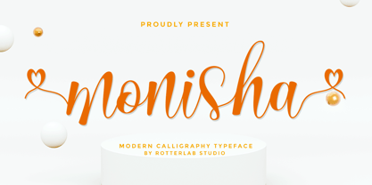 Monisha is a beautiful script font with perfectly perfect alternates. This font will exude a romantic and elegant feeling of your design. Monisha can be used for various applications, such as wedding designs, logos, invitations, posters, social media posts, and others. Features: - Additional characters encoded by PUA with a love accent - Can be used in any software, such as Adobe Photoshop, Illustrator, even Microsoft Word, PowerPoint, and others. - multilingual glyphs
 - NorB Comic by NorFonts,
$28.00 NorB Comic fonts are handwritten text fonts inspired from my childhood comic comic-books, they can be used with any word processing program for text and display use, print and web projects, apps and ePub, Comic Books, graphic identities, branding, editorial, advertising, scrapbooking, cards and invitations … or even just for fun! NorB Comic fonts come with 6 weights each with their matching italics and in a Normal and Condensed version.