7,357 search results
(0.024 seconds)
- Kremlin Pro by ParaType,
$30.00 The first version of Kremlin was designed at ParaType (ParaGraph) in 1995 by Tagir Safayev. Based on an informal handwriting. Kremlin is a Russian word for a fortress or a citadel. The reason why the author selected this word for the font name is not quite clear even for him. Probably the appearance of the text line set in this font resembled a tight fence. Later the font was expanded in character set and got two style variations with extended proportions. The suffix "Pro" in the name was added to distinguish the new version from the previous one. The derivative work was done by Dmitry Kirsanov and Gennady Fridman in 2010. The font is recommended for advertising and display typography.
 - Bechamel Roman by Andinistas,
$39.00 BECHAMEL ROMAN was born interpreting unicase letterings of the movie "Willy Wonka and the chocolate factory". Later these ideas matured with flexible tip nib and paper mixing their naive proportions with some classic ingredients of Baskerville, Bodoni, Didot, Round Hand Script, Graffiti and labels found in Venezuela and Colombia. BECHAMEL ROMAN designed to be combined with Bechamel. BECHAMEL Script, Vein, Words & Ornaments were hand drawn to design words and phrases in logos, packaging, posters, envelopes and greeting cards. BECHAMEL ROMAN 1,2,3 & 4 is an experimental font family designed by #carlosfabiancg. It includes an irregular look to communicate craftsmanship. Its multiple upper cases with condensed width and naive lines are notable for their expressive drawing with a high amount of contrast between thick and thin strokes.
 - Wittenberger Fraktur by Monotype,
$29.99One of the earliest Monotype faces, issued about 1906 in two weights, normal and semibold. Based on Schelter & Giesecke's School Fraktur which was in turn based on type favored by early 16th century printers in Wittenberg. It was the door of the Schlosskirche in Wittenberg on which Luther nailed his 95 theses. For this reason, types similar to Wittenberger Fraktur are particularly associated with Lutheran theology. There are two s versions in the DFR-layout. They enable you to typeset the old way, where the long s with the form like an f is used in the beginning and middle of a syllable or word and the typical round s, also called final s, is used at the end of syllable and end of words. - Champagne & Limousines - Personal use only

- Swollen - Unknown license

- Austin Pen by Three Islands Press,
$29.00 Empresario Stephen F. Austin (1793-1836) is considered by many the “Father of Texas” for leading the first Anglo-American colony into the then-Mexican territory back in the 1820s. A few years later, while on a diplomatic mission to Mexico City, Austin was arrested on suspicion of plotting Texas independence and imprisoned for virtually all of 1834. During this time he kept a secret diary of his thoughts and musings—much of it written in Spanish. Austin Pen is my interpretation of Austin’s scribblings in this miniature prison journal (now in the collection of the wonderful Dolph Briscoe Center for American History, in the Texas city that bears his name). The little leather-bound book is filled with notes in ink and pencil—some of the faded penciled pages traced in ink years later by Austin’s nephew Moses Bryan. A genuine replication of 19th century cursive, Austin Pen has two styles: a fine regular weight, along with a bold style that replicates passages written with an over-inked pen. Each is legible and evocative of commonplace American penmanship of two centuries ago.
 - MFC Viper Monogram by Monogram Fonts Co.,
$19.95 The inspiration source for Viper Monogram is the 1934 Book of American Types by American Type Founders. Found in that specimen book, was a sophisticated two-color monogram design called Hollywood Combination Initials, which was available in limited size metal castings. This wonderful monogram style is now digitally recreated, revived, and updated for modern use! Viper Monogram supports one and two letter monograms, but due to its super condensed style works best for three letter monograms. The default typing style for Viper Monogram is an all horizontal all caps setup which can be used for headlines and titling. Type in Capitals for an outline effect, lowercase for a solid effect. By enabling OpenType Contextual Alternates, you can type diagonal top-aligned monograms up to three letters. By typing in all lowercase, and layer a copy of the lowercase with Stylistic Alternates enabled, you can create a two-color effect. Viper Monogram is available in Pro format Opentype fonts only due its unique setup. Download and view the MFC Viper Monogram Guidebook if you would like to learn a little more.
 - Rifton by Halbfett,
$30.00 Rifton is a heavy display typeface designed for use in large sizes. It is available as a regular and italic font or as one Variable Font with an italic axis. Installing the Variable Font offers users additional benefits because, in addition to the pre-defined “upright” and “italic” instances, the interpolations between them can be used. That allows you to have slanted text – but just a little less slanted than in the italic. Rifton is an all-caps design, but the letters mapped to the lowercase keyboard do not always have the same forms as the uppercase. That is most visible when it comes to the “s”, which takes a Star-Wars-style form (think of the Star Wars logo). The Rifton fonts also include OpenType features like ligatures – including some exciting discretionary ligatures – and super-wide alternate glyphs for several letters, including “B”, “E”, “F”, “H”, “L”, “N”, “P”, “R”, “T” and “Z”. Rifton is ideal for making a bold statement in headlines, poster designs, or logos. -
 - Nudista by Suitcase Type Foundry,
$39.00 Nudista is a monolinear, geometric sans-serif based on the proportions of the Purista typeface, released in 2007. The forms are not based strictly on square shape, but rather on a pleasant oval, round shape. The letter outlines are smooth, even technicist, the geometric precision is however compensated in places where it would get in the way of legibility and compromise the desired visual impact. Nudista was originally conceived as a display type, but it is sufficiently legible even in text sizes. Thus, it suits short texts in corporate prints. Carefully chiselled letter curves are sturdy and well suited for the harsh conditions of low-resolution printing devices, they work well on computer screens and mobile phone displays. However, Nudista works best in corporate systems, navigation and orientation systems, where it may be, also thanks to the sufficient range of weights, a good alternative to the well-known and thus a little overused DIN. Naked typeface with no needless decorations humbly serves in all places where too expressive types could be disturbing.
 - Odisseia by Plau,
$20.00 Odisseia: Monospaced Typeface Made on Earth by Plau. Plau presents Odisseia, a monospace type family in 8 styles designed with simplicity of shapes and a humanist touch. We’ve ventured into monospace territory, where all letters must occupy the same amount of space. This style is usually associated with typewriters and computer terminal fonts. Like all monospaced fonts, every letter align vertically in a multi-line setting. The rhythm created is peculiar, since large letters such as m and w occupy the same space as narrow ones like i. Because we have 4 different weights: light, regular, bold and black the design of some characters have to be adapted to fit the same width and achieve a constant light/dark value throughout. These features make Odisseia suitable for a specific yet considerable range of uses, from computer coding to systemized communication such as brand identities. This style has been used from high-end brand identity to cutting edge digital applications. Odisseia sets a little shorter in comparison with other monospaced fonts, and bears a large x-height.
 - Magneta by Positype,
$25.00 To describe what inspired Magneta would be to add a little Dwiggins, throw in some Benton with a hint of Austin, wrap it up in a crisp, contemporary package and serve. The skeleton of the family is a Garalde (like my earlier Epic) but with a desire to produce something much more transitional and contemporary, I sought to simplify, simplify, simplify. Cap and ascenders share the same height, the x-height is slightly larger than expected which should make a functional typeface for editorial, headlines or where more visually complex systems are needed. The modulation is much more intentional than historical and creates some interesting interactions between the various weights. There are both Normal and Condensed widths available with 6 different weights and matching italics, small caps, oldstyle figures, swashes, stylistic and discretionary ligatures (that includes some fun majuscule ligatures in the roman styles), there is no lack of typographic goodness for the designer. To add some spice, a set of Decorative Ornaments have been created that include geometric, floral, curvilinear patterns and much more.
 - Mela by Resistenza,
$39.00 Mela was created with a pointed brush and walnut ink using thick brushstrokes. The original idea was to make a kind of urban graffitti with a fat brush, but the final result is more refined and elegant. Something new - light and bold together. The letters are a little bit slanted using sharp strokes, the brush gives the illusion of a fat-tipped marker. This handmade typeface has a lot of contrast, it brings together the beauty of the calligraphic shapes and strokes with the esthetics of a modern urban style. It creates a carefree feeling, contemporary, adding a perfect modern touch to your work. The possibilities for customized layouts are limitless, using the opentype ligatures and alternates to you make Mela your own. Mela Pro contains 473 glyphs: alternates, ligatures, icons, ornaments, and much more. Mela regular is limited to letters, figures and punctuation. Mela & Mela Pro are perfect for headlines and short texts. Use it for magazines, packaging, advertising, branding, posters, editorials, TV, movies and websites to give to your projects the unmistakable human touch of beautiful handwritten letters.
 - Mullingar by Fontdation,
$18.00 Introducing Mullingar, our latest submission to the display typeface’s world library. Heavily inspired by the letters that are used in old/classic advertisements and signpainting culture, with a little magic touch of modern twist to keep this family relevant. Mullingar letterforms were built from bold and blocky base, unique serif combinations, clean plus smooth curves, and sharp edges. Available in six styles (Regular, Bold, Light, plus Slanted in each version), that guaranteed to give you joy in designing. Mullingar family is a reminiscent of retro sign painting, featuring a rustic architecture that makes it quite at home in a wide variety of design themes. Its blocky characters are best used in bold signage, headlines, advertising, logo designs, product packaging, merchandise, apparel, posters, album artwork, book covers, titling, etc. This typeface also provides additional versatility through OpenType feature, offering discretionary ligatures, standard ligatures, and stylistic alternates. It extends multilingual support to Basic Latin, Western European, Euro, and Pan African Latin languages for design projects intended for an international audience.
 - Contenu by Hackberry Font Foundry,
$24.95 Because Contenu is designed for text use, it is spaced for body copy in the 9-12 point range. That is far too much spacing for heads, subheads, and the like. So I made the display version of Contenu Book to use for headers. In the process of tightening the spacing at the very large sizes, I also made some minor modifications to the glyph shapes to make this version a little more elegant. Contenu Opentype has two Opentype families for print design. Contenu Book has five fonts: Regular, Italic, Bold, Bold Italic, and Display. Contenu has Medium, Medium Italic, Black, and Black Italic. The name is French for content and this is what the family is designed for: text, body copy, and book layout. If it has a style, it is a modern take on oldstyle serif font using Jenson as a mask. There are no plans for display versions of the bolder weights or the italics. If you want them, use Contenu Medium, Book Bold, Contenu Black, or any of the four italics and tighten the tracking.
 - Genteta by Typephases,
$25.00 In the tradition of the stock cuts that printing type foundries offered as metal, these spot illustrations remind you —for their look and technique— of vintage publications like victorian age newspapers and magazines. Similar to their counterparts in the Whimsies, Absurdies, Ombres, Bizarries and Whimsies series, the Genteta is another collection of little people in funny and absurd situations, recreated in black ink, from imagination and with no reference or models, and then carefully digitized. The Genteta trio of dingbats includes more than 150 new images. Their vectorial file format means you can use them at any size with no loss of quality. Every Genteta dingbat offers ready-made images for a variety of creative projects. They can be used as they come or easily customized in any graphics program. At small sizes they are ideal spot illustrations with a whimsical touch; at large sizes they can bring a whole page, a spread or even a big poster to life. Use them in creative projects including, but not limited to, flyers, brochures, book jackets and editorial illustration.
 - AmpleNuSoft by Soneri Type,
$50.00 AmpleNuSoft is a display type family derived from the AmpleNutypeface by softening the edges. It has optical mono-linear stroke and a bit squarish form in nature. It has a seamless stroke movement instead of sharp angles formed by the junction of two strokes, which is a prominent feature of its design. It is designed to be a little eye-catching yet legible. It has clear and distinguishable letterforms, which help to elaborate and emphasize the message. It is graphically strong and commands the viewer's attention. The overall appearance of type is suitable for setting and using it as heading, title, headline, logotype, etc. The type family consists of twelve styles which include six upright weights and their italics. AmpleNuSoft has a bit more squarish counters and angles than Ample typeface, it even has straight terminals while Ample has a slight curve. In addition to this, few characters have some major or minor changes and the letter ‘g’ plus ‘y’ and their respective diacritics have alternate style variations. AmpleNuSoft is designed by Aakash Soneri during the period between 2020-2021.
 - Cinema Script by Eclectotype,
$40.00 The early Twentieth Century was a golden age for cinema, and for the artists who lettered the iconic title sequences. Cinema Script is inspired by this lettering style, but has departed substantially from the source material in an effort to be less retro and more in tune with today’s designers' needs. The font will work admirably ‘out of the box’ but to really shine use the advanced OpenType features. Contextual alternates and ligatures should be on by default for the best results. Discretionary ligatures are a little more out there, so use them, ahem, at your discretion. Cinema Script also boasts swash characters, optional oldstyle numerals, plenty of stylistic sets and a nice ordinal feature for 1st, 2nd, 3rd etc. For greater detail, check out the user guide in the gallery section. This is a versatile brush script style font. It seems familiar, with a similar vibe to other brush fonts but without the staid ubiquity. Cinema Script will look great on the big screen, or on your screen, on food packaging, t-shirts, blogs, photobooks, wedding stationery... You get the idea!
 - Magneta Condensed by Positype,
$25.00 To describe what inspired Magneta would be to add a little Dwiggins, throw in some Benton with a hint of Austin, wrap it up in a crisp, contemporary package and serve. The skeleton of the family is a Garalde (like my earlier Epic) but with a desire to produce something much more transitional and contemporary, I sought to simplify, simplify, simplify. Cap and ascenders share the same height, the x-height is slightly larger than expected which should make a functional typeface for editorial, headlines or where more visually complex systems are needed. The modulation is much more intentional than historical and creates some interesting interactions between the various weights. There are both Normal and Condensed widths available with 6 different weights and matching italics, small caps, oldstyle figures, swashes, stylistic and discretionary ligatures (that includes some fun majuscule ligatures in the roman styles), there is no lack of typographic goodness for the designer. To add some spice, a set of Decorative Ornaments have been created that include geometric, floral, curvilinear patterns and much more.
 - Treatise by Zephyris,
$- Treatise was born in a notebook at the back of a boring lecture on immunology with the simple thought of “How can I make a serif more fun?” When writing a scientific treatise, there are not many options for making it enjoyable. However, some little quirks and fun features in the font can take the serious edge off the writing.... Treatise is a light and open serif with some design quirks, which give it a slightly calligraphic feel; a single -storey “a” and “g,” a visible stroke mark on the “o,” and a curved arm on the “k.” These features are subtle enough to fit into a paragraph of text but bold enough to give a title some character. The Treatise family includes a true italic and a heavy-struck style bold, and several OpenType features; standard and discretional ligatures, contextual alternatives, and different figure styles. The character coverage includes Basic Latin, Latin-1 Supplement, and Latin Extended-A and will support most Latin-alphabet languages, including languages with more exotic characters such as Icelandic and Maltese.
 - Fielding by AVP,
$25.00 Characterized by generous unstressed curves, subtley waisted stems and asymmetric serifs, Fielding is a great choice for sure-footed stylish text and elegant headlines. Its warm classical forms resolve into highly readable text at any size both on paper and on screen. Six weights and corresponding italics provide a choice of styles while small capitals, superscript, subscript, fractions, a range of ligatures and cameo capitals will add refinement to the most demanding of layouts. Default numerals are of uniform height, a little smaller than capitals and are proportional: not 'old style' in the traditional sense, they nevertheless sit comfortably in general text. Tabular numerals and lining numerals are also available. Italic styles are lighter in weight and freer in form, skipping alongside their upright counterparts to provide pleasing emphasis or variation. The comprehensive latin character set includes eastern European, Baltic and Turkish languages. First designed for a quarterly magazine, Fielding can be used wherever a modern interpretation of tradition is required including branding and packaging, websites, news media, books, general publicity and smart documentation.
 - Parabrite by Okaycat,
$19.50Parabrite arrives as a vision of the future. The future is brite - Parabrite - this is unavoidable now. The composition of Parabrite is found to be based on a set of technical behaviors defined from a set of four sub-glyphs and their interactions, similar to the make up of our D.N.A. (A,C,G,T). Likewise, Parabrite's block matrix is composed of four units (S,L,I,C). These units are only allowed to group together according to predefined set of mathematical rules, and affect each other symbiotically. The smallcase letters stand five feathers high, while the capitals add an extra two feathers width. Parabrite is extended, containing the full West European diacritics & a full set of ligatures, making it suitable for multilingual environments & publications. Use Parabrite when you dream of a future world. Since Parabrite is adapted to be quickly read by a wide assortment of electronic scanners, legibility to humans suffers a little, although robots report it is much easier on the eyes. They are happy to read it for you too, if you are having trouble. - Absurdies by Typephases,
$25.00 Absurdies is a trilogy of pictorial typefaces with lots of mischief, fun, weirdness, black humour and amusement. It includes 143 digitized illustrations. You will find many inexplicable behaviours, madmen, strange occupations, absurd and chaos-loving characters, and general whimsy. This little crowd can be used in many ways, from spot illustration to big illustration work or graphic designs, taking advantage of the vectorial format of the font file. The characters in Absurdies (together with their kin, the Illustries, Whimsies, Ombres, Bizarries and Genteta dingbats) are drawings from the sketchpad of Joan M. Mas, drawn from imagination and with no reference, except in a handful of cases pulled from historical photography. He wanted an easy-to-use format to collect his hundreds of imaginary ink drawings and he realized a digital typeface was an ideal solution. Having the illustrations gathered in a font file means you can use them instantly in any program you like. You may choose to use the images out of the box, or further customize them with colours and textures. The possibilities are endless.
 - Gradl Highstep by HiH,
$8.00 Gradl Highstep is an archetypical Art Nouveau face by the prolific and mysterious Max Joseph Gradl. It epitomizes the visual language of elegance and sophistication. It seems strange that so little information is available today about Max Gradl: He seems to have been well known in his day. In addition to his jewelry design, he did advertising work for customers in Naples, London and New York in addition to customers in cities all over Germany. Gradl Highstep is an all-cap font with a wide range of ligatures: 094=SA, 123=CH, 125=CK, 126=TS, 167=FA, 172=PA, 177=TA, 188=WA and 190=YA. In addtion, 137=Gradl’s dated monogram “MJG 1903,” 175=LLC abbreviation, 181=alternate S. This is a subtle font with thin, variable strokes. It is best used at 28 points and larger to give it the presence it needs to be be appreciated. Gradl Highstep Initials is a companion font, incorporating a deft line drawing of a fashionable woman of the period who is every bit as elegant as the underlying font.
 - P22 Folkwang Pro by IHOF,
$29.95 Folkwang is an unusual roman type with a lowercase that resembles an upright italic. Unusual top serifs are contrasted by almost no foot serifs. Originally released by the Klingspor foundry in 1955, this face originated from Hermann Schardt while he was the director of the Folkwang Werkkunstschule in Essen Germany circa 1949. According to British book designer and printing historian John Dreyfus in the 1955 Penrose Annual: Folkwang “…is a lovingly made piece of work which could have easily have been little more than an act of awe-struck reverence for the calligraphic techniques rediscovered by Edward Johnston and spread abroad in Germany by Anna Simons. Of special interest is the serif treatment of the lower-case letters: at the feet the terminals are mostly left bare, but the ascenders and the cross-strokes of the f and t are given elaborate curving serifs which in the mass create an effect unusual in a page of letters made as movable types, resembling rather more a piece of intaglio engraving. The ligatures ch and ck are original and successful.”
 - Fearlessly Authentic by Ahmad Jamaludin,
$19.00 Say hello to the new classic nineties retro font, Fearlessly Authentic! The trend is to make thin serif fonts that made the 80s and 90s style, so we wanted to make them too but with a different touch. Make it slightly rounded for a retro look and make your design look great! Fearlessly Authentic - A classic nineties retro with a complementary italic version. In the italic family, we make it different from the regular and make a shape with a unique uppercase so it looks more classic, retro but a little modern We've also been loving combining the regular and italic, especially for logos (see the "Symphatize logo, image #3) Included : Regular and Italic Letters, numbers, symbols, and punctuation Use in many programs even in Canva Multilingual Support Language Support: Danish, English, Estonian, Filipino, Finnish, French, Friulian, Galician, German, Gusii, Indonesian, Irish, Italian, Luxembourgish, Norwegian Bokmål, Norwegian Nynorsk, Nyankole, Oromo, Portuguese, Romansh, Rombo, Spanish, Swedish, Swiss-German, Uzbek (Latin) Come and say hello over on Instagram! https://www.instagram.com/dharmas.studio/ Dharmas Studio
 - Ansage by Sudtipos,
$49.00 Ansage does not claim to be neutral; it escapes from the rationalist sans of closed strokes and regular forms. Meaning Announcement in German, Ansage is versatile and communicates effectively across a broad range of media and formats such as branding, posters, websites, apps, titles and compositions with little spacing). Ansage is a sans serif font with a strong personality that emerges from an interest in and the study of a wide variety of typographic specimens of Gothic fonts from the nineteenth century. The design process behind Ansage brought about constant transformations in form; the result is a compact and robust font, with a large x-height, small ascenders and descenders, and open terminals that grow in expressiveness as it increases in weight. It is available in 10 weights, ranging from Hairline to Black, and 3 widths – Condensed, Regular and Expanded – plus italics, which make a total of 60 perfect variables to combine and contrast with each other. In addition, it also includes multiple open-type functions such as alternative styles, Old Style Figures, Tabular Forms, fractions, case sensitive, ligatures and more.
 - Contenu Book by Hackberry Font Foundry,
$24.95Because Contenu is designed for text use, it is spaced for body copy in the 9-12 point range. That is far too much spacing for heads, subheads, and the like. So I made the display version of Contenu Book to use for headers. In the process of tightening the spacing at the very large sizes, I also made some minor modifications to the glyph shapes to make this version a little more elegant. Contenu Opentype has two Opentype families for print design. Contenu Book has five fonts: Regular, Italic, Bold, Bold Italic, and Display. Contenu has Medium, Medium Italic, Black, and Black Italic. The name is French for content and this is what the family is designed for: text, body copy, and book layout. If it has a style, it is a modern take on oldstyle serif font using Jenson as a mask. There are no plans for display versions of the bolder weights or the italics. If you want them, use Contenu Medium, Book Bold, Contenu Black, or any of the four italics and tighten the tracking. - Guilloche A by Wiescher Design,
$80.00 Guilloches were – in the old days – used to make the falsification of banknotes more difficult. The engraving of these intricate lines was done by a highly specialized mechanical machine, which was operated by an equally highly specialized engraving artist. Once the settings for a specific curve were changed back to zero it was very difficult, if not impossible to set them back to the old design. I have designed a useful set of Guilloches that join to form ribbons that create a kind of op-art 3d effect. Under the keys A-U and a-u you find joining pieces. Under the keys V-Z and v-z I placed start- and endpieces. 0-4 are different lenght straight extensions and 5-9 are not quite so straight extensions. All other keys are corner pieces that can be used as stand-alones or put in rows to make for superb decoration. With a little bit of experimentation and maybe colored overlays you can achieve super-phantastic designs. Your elegant type designer Gert Wiescher.
 - Bushing by Hackberry Font Foundry,
$13.95 Bushing is a quick serif experiment going for open light display type. For years I have always stopped and really liked what I saw with fonts like the original Cushing from the turn of the 20th century. This time the desire for a font was stirred by Felici's article in CreativePro on fonts from the beginning of the 20th century, especially his captures of Cushing No. 2 and the version commissioned for Norwood press from ATF. I'm not interested in historically accurate reconstructions. My desire is for the general feel I get when I see a font. As a result, Bushing has little to do with Cushing (other than the last six letters). But it is a Serif font with small serifs and a huge x-height with a very open feel. I like it. I hope you do also. I made it into a limited display version of OpenType Pro. I added small caps and oldstyle figures, as I can hardly work without them. But ligatures seemed silly for this one.
 - Mairy by Typesketchbook,
$39.00 Mairy font family is a modern sans serif font family. Featuring 9 separate weights each followed by own true italics Mairy is positioned somewhere between rounded sans with humanist touch. In fact the humanist presence in Mairy is a little bit more than the usual doze adding more calligraphic elements mostly noticeable in italic weights but also very important in regulars. This symbiosis of Grotesk geometry with handwriting is well balanced regarding contrast and legibility so that at the end we have a highly usable font family. Light weights are very tender and elegant while the old and blacks are soft, friendly and full of vitality. The mid weights are just perfect with their medium contrast and excellent legibility. Mairy is very fresh font family and is surprisingly flexible when it comes to screen or print use – it is optimized for both even if the conditions are poor. Use it with OpenType compatible software and explore its true potential by accessing additional set of ligatures, alternates and multilingual support.
 - 1066 Hastings by GLC,
$38.00 In 1066, William, duke of Normandy, was invading England. He was demanding the crown for himself, against King Harold the Saxon. He killed Harold and reached the crown at Hastings, the well-known battlefield. A few years later, in Bayeux (Normandy, French)was displayed a large tapestry (almost 70 m long) who was telling the story of the conquest. Along the tapestry was written a comment in Latin, using Roman capitals influenced a little by English or Scandinavian style (as it is visible in the Eth character). We have created the font, inspired from this design, adapted for contemporary users, making difference between U and V, I and J, which has not any relevance for ancient Latin scribes, and naturally with Thorn, Oslash, Lslash... and usual accented characters did not exist at the time. We also have reconstructed the K, German double s and Z, always using patterns of the time. We have scrupulously respected the poetic irregular and distressed original forms with two or three alternate for each characters, including reconstructed numerals.
 - Seuchter Experimental by HiH,
$10.00 Seuchter Experimental is a product of the fertile Jugendstil period in Austria. Drawn by Bruno Seuchter, about whom little biographical information is available, the design first appeared in Seuchter’s publication, Die Fläche, in 1902. Die Fläche means “surface or expanse,” presumably a reference to a “tabula rasa” or clean slate. The implication is one of starting anew, rejecting the past and searching for fresh, different modes of visual expression — which is exactly what Art Nouveau attempted to do. Seuchter Experimental is a quirky and light-hearted font. Ligatures include AT, AV, CH, CK, FJ, LO and ST. Although basically an all-cap font, several of the accented letters in the lower case position represent the oft-seen desire to keep the accents below cap-height. The a-umlaut at 228 and u-umlaut at 252 reflect Seuchter’s original design. For a discussion of the difference between a diaresis and an umlaut, see Appendix B of Bringhurst’s The Elements of Typographical Style. In the meantime, give this font room to breathe.
 - Stars Stripes RH by Enrich Design,
$-The recent tragedies in America have resulted in a tremendous need for donations. This new font was created to benefit the victims in New York. This font is a great opportunity for artists, designers and computer users to show their support. The font needs to be big, 36 points or higher is recommended. It can be used at smaller point sizes, but there is little detail at smaller sizes. I felt a need to do something, ever since I saw those two beautiful buildings collapse in New York. You see, I went to school in New York, and I learned so much there. I truly love New York, and this is a way for me to show my support to the Big Apple. A $20.00 donation to the Twin Towers Fund is requested for those who download this font. Please send the donation to: Twin Towers Fund General Post Office P.O. Box 26999 New York, NY 10087-6999 Special thanks to those who reviewed my font and offered advice on what needed to be done to complete the font. - Scratch SCF by Scholtz Fonts,
$15.00Scratch SCF is a grunge font with a difference. It has an irregular, almost random outline that suggests an old-fashioned quill pen that is leaking and scratching its way across the page. There are also connotations of simplicity, of a writer that is unsophisticated, possibly learning to write for the first time. This is a font that avoids all the associations of slick, worldly-wise urbanity, of cynicism and of "the medium being more important than the message". Instead the simplicity of Scratch SCF conveys a sincerity and integrity of design that bespeaks simplicity and old-fashioned honesty. All these associations are conveyed with a contemporary look, without resorting to rehashing the past with yet another retro font. Scratch SCF has a full character set: all upper and lower case characters, all special and accented characters and all punctuation, numerical and mathematical characters. All have been carefully spaced and kerned. Scratch SCF Staggered is a little more "grungy" than the regular style because the individual letters do not rest on the same baseline and thus have more vitality. - AmpleNu by Soneri Type,
$50.00 AmpleNu is a display type family derived from the Ample typeface. It has optical mono-linear stroke and a bit squarish form in nature. It has a seamless stroke movement instead of sharp angles formed by the junction of two strokes, which is a prominent feature of its design. It is designed to be a little eye-catching yet legible. It has clear and distinguishable letterforms, which helps to elaborate and emphasize the message. It is graphically strong and commands the viewer's attention. The overall appearance of type is suitable for setting and using it as heading, title, headline, logotype, etc. The type family consists of sixteen styles which include eight upright weights and their italics. AmpleNu has a bit more squarish counters and angles than Ample typeface, it even has straight terminals while Ample typeface has a slight curve. In addition to this, few characters have some major or minor changes and the letter ‘g’ plus ‘y’ and their respective diacritics have alternate style variations. AmpleNu is designed by Aakash Soneri during the period between 2018-2020.
 - Chercán by PampaType,
$28.00 Chercán is a spirited typeface created with a delicate sense of how readability doesn't need to be dull. Chercán wears a uniquely friendly voice, and its mature design makes it highly legible in small bodies as well as in the distance. Its balanced rhythm is the result of a slow pairing of qualities found in old classics admired by Gálvez, such as Copperplate by Frederic Goudy (1905) and Antique Olive by Roger Excoffon (1962). Chercán occupies a unique place in the contemporary type design shelf, by exquisitely combining versatility and elegance. Due to the delicate grey colors it gains within long texts, Chercán is good for immersive reading, where one wants to avoid readers’ eyes fatigue. It can be a great choice for setting texts that require a slightly informal atmosphere without losing authority. Chercán is the Chilean name for the melodious little bird Troglodytes aedon usually found all across the Americas. Available in Std and Pro versions with all the usual OT features, Chercán addresses all modern needs of the demanding typographer.
 - Lila Pro by Eurotypo,
$42.00 Lila Pro has all the advantages of OpenType technology that allows a variety of combinations: standard ligatures, contextual alternates, discretional ligatures, word ending and tails. Specially designed for creating logos for products and packaging, this font can also be used as body text for its good legibility and accurate kerning.
 - Foxtale by Gabe Silverstein,
$29.00 Foxtale was inspired by an ancient Hebraic scriptural style, boasting flared seraphs, classic structures and dramatic shapes. Foxtale is perfectly suited for impactful word marks or subtext. A fully featured typeface with upper and lowercase, Latin characters, numbers, symbols, currency and alternatives - Foxtale will surely excite your next design adventure!
 - Norseman 2 by Alphabet Agency,
$21.00 Forged to be as imposing as a Norse horde ready to stampede into battle, Works great in all caps which it was initially designed to. I designed the lowercase characters to match really well with each other and the uppercase, so it works well in title case. Designed by Jon Swinn.
 - Mariogalo by Balpirick,
$15.00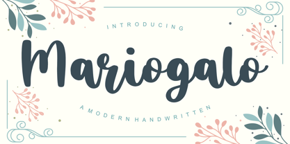 Proudly Present, Mariogalo Font. Mariogalo is a Modern Handwritten font. Mariogalo is perfect for product packaging, branding project, megazine, social media, wedding, or just used to express words above the background. Mariogalo also multilingual support. Enjoy the font, feel free to comment or feedback, send me PM or email. Thank you!

