5,845 search results
(0.012 seconds)
- Apres by Font Bureau,
$40.00 David Berlow and staff drew Apres as part of a series designed originally for the Palm Pre smart phone, for use both on the device and in print marketing. Simple, open letterforms and generous proportions provide a clear, comfortable, and inviting experience for navigation and readability. The plain-spoken geometry is regular and balanced, without being static or mechanical, for a friendly and forthright familiarity; FB 2008
 - Malebu by Macrotipo,
$39.00 Malebu is a sans serif font that was created based on grotesque and humanist models with certain geometric features. It is clear, simple, gentle and friendly, and can be used in text sizes. It is easy to read in long texts, magazines, books and the like. The rounded shape makes it friendly and fluent. A short x-height is functional and adds economy without losing consistency.
 - Heran by Gassstype,
$23.00 Hello Everyone, introduce our new product Font HERAN This Is All Caps Display Font.This is a Textured Natural Style and classy style with a clear style and dramatic movement. This font HERAN is great for your next creative project such as logos, printed quotes, invitations, cards, product packaging, headers, Logotype, Letterhead, Poster. That is has charming, authentic and relaxed characteristic more natural look to your text.
 - Rollinkland by Almarkha Type,
$29.00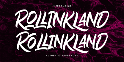 Rollinkland is a Authentic brush font with a clear style and dramatic movement this font is great for your next creative project such as logos, printed quotes, invitations, cards, product packaging, headers, Logotype, Letterhead, Poster, Apparel Design, Label, and etc. Rollinkland comes with uppercase, lowercase, numerals, accents (Multilingual characters), punctuations and so many variations on each character include OpenType alternates, swash to let you customize your design
 - Commuters Sans by Dharma Type,
$19.99 Commuters Sans is a daily type. Classic but Modern. Very simple geometry and wide type with warm clearness. Useful for both body-text and titling by their minimal glyph shapes and slightly wide and eye-catching proportion. Consists of eight weights and their matching italics. Supporting almost all latin languages. All-caps text for one line or a few is as wonderful as normal mixed-case typesetting.
 - Teeny Boppin NF by Nick's Fonts,
$10.00Propaganda in a poodle skirt? Another gem gleaned from Schrifti Alphabeti, a book of Cyrillic alphabets published in Kiev (now Ukraine, then USSR) in 1979. Flouncy, bouncy, perky and quirky, this typeface will add sass and charm to any project it graces. Both versions of this font contain the Unicode 1252 Latin and Unicode 1250 Central European character sets, with localization for Romanian and Moldovan. - Wesal Arabic by Zaza type,
$29.00 Wesal is an Arabic typeface with an elegant and modern feeling. It’s luxurious, strong, legible, Clear, Simple, and contemporary. The design is inspired by the Kufic calligraphic style and influenced by the Naskh style. Wesal has a wide range of use possibilities headlines, logotypes, branding, books, magazines, motion graphics, and use on the web and Tv. Orleen consists of 9-weight versions from thin to Black.
 - Archivio by Resistenza,
$39.00 Archivio is a neutral font family based on the sans-serif typefaces of the early 20th century. Geometric letter forms are combined with some humanist touches creating a clear and legible typeface. Archivio family includes Sans, Slab, Italic, Back-slant and other experimental versions. Manually edited kerning and Opentype features with amazing swashes, alternates and beautiful ornaments, It was designed for display and text usage.
 - Malebu by Muykyta,
$10.00 Malebu is a new sans serif font that was created based on grotesque and humanist models with certain geometric features. It’s clear, simple, gentle and friendly, can be used in text sizes. Its easy to read in long texts, magazines, books and the like. The rounded shape makes it friendly and fluent. A short x-height is functional and adds economy without losing consistency.
 - Satin Blues by PizzaDude.dk,
$18.00 Satin Blues is my easy going and very legible sans. Actually I drew this by hand and then traced each letter digitally, leaving a super steady, yet funky, comic font. I've made two versions: the Regular and Soft. The Soft version has rounded edges, which gives a smoother look. The font is very suitable for anything that needs a clear but wild comic look.
 - Rosalina by Supfonts,
$15.00 Hello, friends. Here's my new experiment. This font breaks the boundaries even more. Rosalina combines all these qualities: simple and clear, looks at ease. It is perfect for signatures or design, wedding invites and cards, where you do not need a strict style :) Test it out below to see how it could look for your next project! Check out my blog: https://www.instagram.com/zloillev pinterest.com/dmitriychirkov7 Enjoy
 - Mint Dayz by Four Lines Std,
$15.00 Unleash a wave of nostalgia with Mint Dayz, the font that seamlessly blends retro charm with modern legibility. This font captures the essence of yesteryears, infusing a sense of vintage elegance into your designs. Also Mint Dayz places a premium on readability and legibility. Each character is carefully crafted to ensure your message is crystal clear, making it suitable for a wide range of design projects.
 - The font named "Set Fire to the Rain" by Kimberly Geswein is an embodiment of expressive creativity and a palpable emotional resonance. Designed by Kimberly Geswein, a designer known for her diverse ...
- YT Big Latin by Yangtype,
$9.00 The concept of this letter is a young alligator. Young crocodiles have lean bodies and are agile. It has uncontrollable power, and the angular leather vinyl and teeth feel vivid. This font was created to convey the most compressed energy possible through a collection of compressed squares. Although it doesn't attack, it is quite an aggressive letter.
 - Artist Colony JNL by Jeff Levine,
$29.00Artist Colony JNL is the third type design inspired by some online examples from an early 20th Century French book of decorative hand lettering. While Arte Critique JNL and French Art Initials JNL embrace the Art Noveau style, Artist Colony JNL leans more toward the emerging Art Deco Movement of the late 1920s and early 1930s. - Moki by FaceType,
$25.00 The seven ways of Moki. Moki comes in seven different styles: Base, Cut, Dust, Lean, Mono, Soft and Uni. Moki is a display expert – with a wide range of languages covered, the family offers a style for every purpose. You are a SciFi movie director and are looking for an alternative to the inevitable Eurostile? Now you have!
 - Ongunkan Borama Somali Script by Runic World Tamgacı,
$100.00 The Gadabuursi alphabet, also known as the Borama alphabet Borama is an alphabetic script for the Somali language. It was devised around 1933 by Sheikh Abdurahman Sheikh Nuur of the Gadabuursi clan. Though not as widely known as Osmanya, the other major orthography for transcribing Somali, Borama has produced a notable body of literature mainly consisting of qasidas.
 - Ebdus by AdultHumanMale,
$12.00 Ebdus is a thin, modern, lightweight font, occasionally a little gawky and tall, sometimes a little plump and rounded. The font is available in 5 weights from Thin to Heavy but they all lean towards all things anorexia. It looks as good in copy as it does in headlines, it’s perfect for an angry letter to an uppity android.
 - skeemat - Unknown license

- Abrect by Hackberry Font Foundry,
$24.95 My first font for the summer of 2009, Abrect is a new sans serif font where I try to maximize the x-height and keep the design fresh and personal. It fits in with my continuing objective of designing book fonts that I can really use. Abrect is a tangent for me just taking an idea out to its end. In particular, it is a radical modification of my first font in 1993, Nuevo Litho. The hand-drawn shapes vary a lot, many pushing the boundaries of the normal character. With many of the new releases I see, the digital perfection is getting pretty extreme. It’s looking like a Rococo stage of development for many with decoration taking over from function. I'm consciously trying to head a different direction. This is not a normal font for me in that it has caps, lowercase, with the appropriate figures for each case, no small caps. This is the first time I have skipped small caps in over a decade. This font has all the OpenType features in the display set for 2009 except for the small caps. There are several ligatures for your fun and enjoyment: bb gg ff fi fl ffi ffl ffy fj ft tt ty Wh Th and more and many of them are experimental in form. Enjoy!
 - Corton by Greater Albion Typefounders,
$14.00 Corton was inspired by the traditional lettering on a gravestone in an English village. While that might sound a rather solemn beginning, Corton has wonderfully lively air, with distinctive lively serifs and beautifully swashed downstrokes. Eight faces are offered: regular and titular each in three weights plus regular condensed. Between them they are ideal signage and display faces, merging 'olde-worlde' charm and fun character, but remaining clear and legible.
 - Didot LP by LetterPerfect,
$39.00 Didot LP is a very elegant rendition of the 18th-century French typeface -- Didot. This design took the earlier Italian neo-classical model (Bodoni) to a new level of refinement, with fully rationalized shapes and delicate hairlines. Didot LP accentuates these qualities, providing a classical text face with a clear and modern voice. The companion face -- Didot LP Display -- optimizes the proportions, spacing and hairlines for use at very large sizes.
 - Quache by Mans Greback,
$29.00 Quache is a flexible sans-serif, created by Måns Grebäck between 2018 and 2020. It has unique, stylish curvatures and is clear, legible and sharp with open letter forms. The font family consists of six weights and four widths, totaling in 28 main styles: Thin, Light, Regular, Bold, Black, Heavy and Condensed, Normal, Expanded, ExtraExpanded It supports Latin-based languages, and contains numbers and all symbols you'll ever need.
 - Santini by Canada Type,
$25.00Santini began as an experiment in mixing historical art deco, art nouveau, arts and crafts, and to a lesser extent Bauhaus sources. Surprised at the pleasant outcome of the experiment, we expanded it to become three weights, and included some alternates within the fonts themselves. Santini is an excellent choice for art- and architecture-related design, where the message needs to be conveyed in a clear yet sturdy and modern fashion. - Ambivert by Gassstype,
$23.00 Hello Everyone, introduce our new product Font Ambivert is a Rough Display Font.This is a Textured Natural Style and classy style with a clear style and dramatic movement. This font Ambivert is great for your next creative project such as logos, printed quotes, invitations, cards, product packaging, headers, Logotype, Letterhead, Poster, Design this font is great for your creative projects such as watermark on photography, and perfect for logos & branding.
 - Crossfit by TypeThis!Studio,
$54.00 Crossfit is a new headline font family, designed by Anita Jürgeleit at TypeThis!Studio. It’s suitable for big sizes and titles, such as big movie posters, advertising or editorial headlines. Matching topics might be adventures, sports, strong nature and all kind of challenging life events. Its bold stability transformes your creation into a non questionable design. It is bold, clear and also friendly thanks to its rounded corners. www.typethis.studio
 - ITC Odyssée by ITC,
$29.99ITC Odyssée is the work of French designers Roselyne and Michel Besnard, who were inspired by the digital imagine of type which opened up possibilities for new visual illusions. The serifs of this font recreate the virtual lines formed by optical residue" on TV screens, looking like horizontal serifs trailing off to the right. ITC Odyssée is a clear and legible typeface which features a simplicity and grace in its forms." - TD Neuth by Tribox Design,
$9.00 TD Neuth is inspired by Millennial and Gen Z qualities; it is modern, direct, and clear. It has excellent legibility and is ideal for usage in displays, headlines, labels, packaging design, and even long paragraphs on digital collaterals. Each glyph is meant to be balanced: not too light, not too bold, and not too regular. Use TD Neuth if you want your layout and designs to look modern and fresh.
 - Multihalf by Luxfont,
$21.00 Introducing Neotype. Abstract font family with colored halves. An interesting and unusual fonts in the glitch style. Combination of clear shapes with soft gradients. Geometric color stylization of letters. Features: - Uppercase and lowercase the same size but different colors. - Transparency in letters. - Kerning. IMPORTANT: - Check the glyphs in the font before buying! - SVG fonts contain raster letters. - Check it www.colorfonts.wtf - Try a FREE DEMO version before buying. ld.luxfont@gmail.com
 - Extra Crunchy by Bogstav,
$18.00 Extra Crunchy is my handwriting when I am eating cookies while drawing! No, it's true! I did eat a whole box of cookies while drawing this font! :) The letters are a bit jumpy, and have no steady x-height, however, your text may look a bit off, but it is clear and legible. Fits perfect for a children's book, a postcard/poster design or something else that needs that extra crunch :)
 - Neuville by Poetic Poetical,
$29.00 Neuville is a geometric and low-contrast sans serif for everyday use related to typography. The shapes of the characters are clear, simple and balanced to allow for legibility and help the typeface deliver the contents with a neutral and objective voice. The Neuville family includes three weights and has a wide range of OpenType features such as tabular figures, numerators and denominators, superscript and subscript numbers, and case-sensitive forms.
 - Mantra Rimba by Four Lines Std,
$15.00 Introducing Mantra Rimba Font: Where Nature's Magic Meets Readability, inspired by the beauty that surrounds us. While it's inspired by nature's whimsy, we haven't forgotten the basics. This font ensures your message is clear, making it perfect for a wide range of creative projects. Whether you're designing invitations, logos, social media graphics, posters, or stickers, let "Mantra Rimba Font" be your creative muse. It adapts flawlessly to any canvas.
 - Paget by Greater Albion Typefounders,
$8.50 Paget is a modern exploration of Tuscan design. Here you'll find simple geometric outlines with an 'Arts and Craft' charm about them. Paget is beautifully clear and easy to read, but offers a distinctive charm that conventional sans serif and serif faces don't. Paget is offered in regular and oblique forms and is an ideal way to merge tradition and all that is new and fresh in your designs.
 - Uplink by Sudtipos,
$59.00 Uplink is decorative upright lettering with heavy calligraphic influences and clear friendly forms. Alternate forms with artificial "tail" connections, swashing their way from one letter across the vertical stroke of the next, add an unusual yet distinctly human detail to the forms that shape the words. Uplink's reserved humor can be a little tolerant of mechanical abuses like shearing or stretching, which makes it ideal for food product packaging design.
 - Siggy by Typogama,
$19.00 The Siggy typeface family has all the traits of a serious serif typeface, but with a little wobble. Originally created as a display typeface, this family of fonts contains 4 styles that allow varied and clear compositions in both text or display settings. For an added twist, play with the Opentype features and watch how various letter combinations allow surprising substitutions through the use of alternate letters or ligatures.
 - Landsdowne Commercial by Greater Albion Typefounders,
$18.00 ‘Landsdowne Commercial’ is a development of one of our designer’s earlier public domain releases, ‘Landsdowne’. All glyphs have been completely redrawn and refined. An extensive range of stylistic alternates and ligatures have been added, as well as a completely new bold face and several forms of numerals. Landsdowne commercial is ideal for period-inspired design work, such as posters and book covers as well for clear elegant communications.
 - Comenia Serif Pro by Storm Type Foundry,
$69.00Comenia was developed as typographic system for use on all levels of schools and universities. It introduces new aesthetic standards aimed at improving reading and writing skills and the perception of texts for pupils, students, teachers, office and IT staff at schools. It offers a clear, intelligible and universal graphic tool for layout of primers, textbooks, educational texts and materials, for electronic typography and for the information systems. - Tamword by Prioritype,
$18.00 Introducing a new script font with a bold and clear style. Yes you can use this font in your projects and make it even more classy. It can be applied to logos, video previews, crafts, apparel products, packaging, photographer watermarks, and any of your other awesome projects. for an overview you can see some of the previews above. Features: -Uppercase -Lowercase -Numeral -Punctuation -Multilingual -Alternate -Ligature -Swash Thanks.
 - Honest Punch by Sarid Ezra,
$15.00 Honest Punch is a bold and strong quotable font that you can use for any purposes. This font is very suitable for tagline and branding. With readability and clear looks, this font is perfect for quote. Honest Punch contains unique lowercase and uppercase that you can use at the same times in a word that will make your design more attractive. This font also contains ligature, underline, and support multilingual.
 - Portada by TypeTogether,
$35.00 For everyone wishing for a modern serif that’s as clear and readable as a sans in restrictive digital environments, meet Portada by Veronika Burian and José Scaglione. Sans serifs are commonly used on small screens to save space and carry a modern tone. Serifs may appear fickle and unsteady, pixel grids change from one product to another, and space is at a premium. Portada now provides a serif option for these restrictive digital environments, putting that old trope to rest. The screen has met its serif match. Portada was created from and for the digital world — from e-ink or harsh grids to Retina capability — making it one of the few serifs of its kind. Portada’s text and titling styles were engineered for superlative performance, making great use of sturdy serifs, wide proportions, ample x-height, clear interior negative space, and its subservient personality. After all, words always take priority in text. It’s not all business, though. Portada’s italics contain an artefact of calligraphy in which the directionality of the instrokes and the returning curves of the outstrokes give the family a little unexpected brio. Yet even the terminals are stopped short of flourished self-absorption to retain their digital clarity. When printed these details are downright comforting. Portada’s titling styles enact slight changes while reducing the individual width of each character and keeping the internal space clear. Titling italics have increased expressiveness across a few characters rather than maxing out the personality in each individual glyph. Digital magazines, newspapers, your favourite novel, and all forms of continuous screen reading benefit from Portada’s features. This family can also cover many of the needs developers have: user interface, showing data intensive apps on screen, even one-word directives and dialogs. And, as a free download, an exhaustive set of dark and light icons is included to maintain Portada’s consistent presence, whether as a word or an image. The complete Portada family (eight text styles, ten titling styles, and one icon set) is designed for extensive, clear screen use — a rare serif on equal footing with a sans.
