997 search results
(0.034 seconds)
- Toxica - Unknown license

- FT Weapon Of Choice by Fenotype,
$19.00
- Wisdom Teeth by DM Founts,
$20.00
- Neisya by Phoenix Group,
$13.00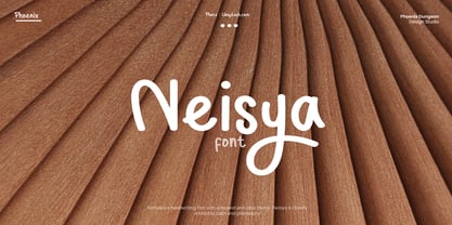
- Qoronfull Arabic by Boharat Cairo,
$20.00
- PR Ex Cathedra by PR Fonts,
$10.00
- Gridder - Unknown license

- Gridder - Unknown license

- Gridder - Unknown license

- Levy by Lithographe,
$36.00
- Angro by Linotype,
$29.99
- Peerless 131 Bold by Wooden Type Fonts,
$15.00
- Peerless by Wooden Type Fonts,
$15.00
- Buratino by ParaType,
$25.00
- PaperCutAlmondDark by PineStreet,
$25.00
- Solo Print by PizzaDude.dk,
$11.00
- North Blue by Aldedesign,
$18.00
- Duonor JNL by Jeff Levine,
$29.00 - Absinthe by Device,
$39.00
- VideoTech by The Northern Block,
$12.80
- Fountain Pen by Jonahfonts,
$20.00
- Fucked Olympia J - Unknown license

- QueueBrick by The Northern Block,
$16.70
- Turntable Stencil JNL by Jeff Levine,
$29.00
- Primitive Tuscan JNL by Jeff Levine,
$29.00
- Interum by Jonahfonts,
$25.00
- Hyang Soo by Phoenix Group,
$9.00
- Three Day Pass JNL by Jeff Levine,
$29.00 - Alvairo Brilliante by Wildan Type,
$15.00
- P22 Broadwindsor by IHOF,
$24.95
- Potter Alaska by Aldedesign,
$18.00
- Buggy Ride by Jonahfonts,
$35.00
- Hieroglyph Informal by Grummedia,
$20.00 - Core Magic Rough by S-Core,
$20.00
- HallowHell Dingbats by Just in Type,
$20.00
- Jashel by Typebae,
$15.00
- KG Chasing Pavements by Kimberly Geswein,
$5.00
- Breakfast by PizzaDude.dk,
$15.00
- ArTarumianGrigNor by Tarumian,
$40.00
- Sango by Katatrad,
$29.00


