10,000 search results
(0.029 seconds)
- ITC Goudy Sans by ITC,
$29.99 Frederic W. Goudy designed three weights of this friendly-looking sans serif font from 1922-1929 for Lanston Monotype in the United States. Goudy was attempting to impart freedom and personality to the sans serif form at a time when geometric sans serifs, such as Futura, were gaining rapid world-wide popularity. To achieve this challenging goal, he looked to lapidary inscriptions and manuscript writing for inspiration. He included elements such as slight swellings of terminal strokes, slab serifs on a few of the caps, alternate uncial forms, and a few swash strokes. The result is uniquely Goudy: charming, instinctive, and just right for adding warmth to magazine or advertising layouts. The design staff at ITC updated and filled out the family for a total of eight styles in ITC Goudy Sans. ITC Goudy Sans® font field guide including best practices, font pairings and alternatives.
 - CG Symphony by Monotype,
$29.99CG Symphony was among the first one hundred PostScript faces released by Compugraphic in 1988. The original version of CG Symphony font is the Linotype Original font family Syntax. - Sistina by URW Type Foundry,
$35.00 Sistina is a trademark of Heidelberger Druckmaschinen AG, which may be registered in certain jurisdictions, exclusively licensed through Linotype Library GmbH, a wholly owned subsidiary of Heidelberger Druckmaschinen AG.
 - Eckmann by URW Type Foundry,
$35.99 Eckmann is a trademark of Heidelberger Druckmaschinen AG, which may be registered in certain jurisdictions, exclusively licensed through Linotype Library GmbH, a wholly owned subsidiary of Heidelberger Druckmaschinen AG.
 - Alcuin by URW Type Foundry,
$99.99 Alcuin is a trademark of Heidelberger Druckmaschinen AG, which may be registered in certain jurisdictions, exclusively licensed through Linotype Library GmbH, a wholly owned subsidiary of Heidelberger Druckmaschinen AG.
 - Al Blue Cashews by Aluyeah Studio,
$125.00 Hello Aluyeaholics! Blue Cashews' alternates are inspired by the curved shape of a cashew with a blunt tip. Blue Cashews give the impression that we often see in the packaging of snacks, cereals, milk, and so on. So warm, sweet, fresh, crunchy and full of love!Coming with 220+ stunning and super easy to use alternates and ligatures. To get results like the preview just type B.2l.3ue.2 C.2ash.2ew.2s.3
 - Geogrotesque Expanded Series by Emtype Foundry,
$69.00 Geogrotesque Expanded Series comes in three widths: Wide, Extended and Expanded, that go between 120% and 200% of the normal width. Since the original Geogrotesque is slightly condensed, the Wide family becomes a good option for texts. Whereas the Extended and Expanded are ideal for display sizes. With the inclusion of the Expanded Series and the preceding Condensed ones, the Geogrotesque super family is now a complete widths system. For more details see the PDF.
 - Phyton by Subqi Studio,
$21.99 Phyton is a beautiful font combination between script and serif. With alternative character in both serif and script style with over 380+ glyphs for the script and 320+ glyphs for the serif. Phyton will be great for your creative project such as wedding invitation, logo, header, card, packaging, label, badge, flyer and more. Phyton comes with uppercase, lowercase, numeral, punctuation and support western multilingual accent as well. With many additional alternative characters to play.
 - FP København by Fontpartners,
$35.00 Copenhagen has been in need of a typeface that unites the city’s many visual expressions. The three designers Morten Rostgaard Olsen, Henrik Birkvig and Ole Søndergaard have designed and developed the typeface FP København. Now available from MyFonts in 20 styles: Uprights & Italics, small caps, pictos-characters, stencils, sprayed style, OT-features, ligatures, contextual alternates etc. The shapes of the letters are inspired by the city’s culture and the visual environment and design in Denmark in the 20th century. It is relatively low and wide as the city itself and with rounded corners that give it a warm visual mood. “You can find examples of the use of a typeface with the same purpose in other parts of the world, for example, to identify local areas or urban tourism materials. FP København is our take on that kind of typeface” the designers add.
 - Old Man Eloquent by Three Islands Press,
$29.00 John Quincy Adams, sixth President of the United States, didn't hit his stride until he'd left that lofty office. It was during his many years in Congress that he assured his legacy, not least because of his long, masterful oratory opposing slavery. His speeches, in fact, won him the nickname "Old Man Eloquent." So when I decided to simulate Adams's penmanship in his legendary diary (which he kept for nearly 70 years), it seemed fitting to call the font by that name. I focused on his handwriting from about 1810, when he was Ambassador to Russia, but also consulted pages from later years. Old Man Eloquent has both regular and bold weights. The OpenType version has more than 450 glyphs, including alternate uppercase characters, old-style and lining figures, and numerous ligatures; all formats contain several common (English) words.
 - GAU_font_modern - Unknown license

- Lens Grotesk by Typedepot,
$39.99 Lens Grotesk is a Neo-grotesque type family of 16 fonts born as a result of a very conscious research in the field of the neutral Swiss aesthetic. There's a reason for all the prominent examples of this design like Helvetica and Univers to be used on a daily basis for more than 70 years and it's a simple one - they just work. The closed terminals, the low contrast, uniform widths and proportions makes the Neo-grotesques feel just right. Although very often branded as stiff, the neutral Neo grotesques are here to stay and Lens Grotesk is our own reading of the popular style. Lens Grotesk takes the Neo-grotesk model one step further adding a pinch of Geometric sans-serif to the mix thus creating a way more modern and contemporary looking design. Characterized with more generous oval proportions and slightly more open terminals, Lens Grotesk keeps the modulation and rhythm needed for a slightly longer texts while visibly keeping everything in order. Zooming in you'll find traces of the Geometric aesthetic - the robust almost right angled approach of the arches and tails (look t, f, j, y) and the way more circular rounded shapes. Like all our fonts, Lens Grotesk is equipped with a range of OpenType features, stylistic alternatives and of course Cyrillic support. It comes in a pack of 16 fonts with 8 styles and their matching italics or one variable font file available with all full family purchases. Live Tester | Download Demo Fonts | Subscribe
 - Body by Zetafonts,
$39.00 Body graphic project at Behance Body is a type family designed for Zetafonts by Cosimo Lorenzo Pancini with Andrea Tartarelli. Conceived as a contemporary alternative to modernist superfamilies like Univers or Helvetica, Body tries to maximize text readability while providing a wide range of options for the designer. It comes in two variants (Body Text and Body Grotesque), each in four widths and four weights: regular and bold for basic typesetting, light and extrabold for display use. Body Grotesque applies to the sans serif modernist skeleton little imperfections and quirks inspired by our research in early 20th century type specimens. Curves are slightly more calligraphic and a light inverse contrast is applied to bold weights, giving the typeface a slight vintage appearance in display use. Body Text, on the contrary, challenges the modernist aesthetics maximizing horizontal lines and using open terminals for letters like “s” and “a” that appear normally dark in modernist grotesques. For both variants, the normal width family is slightly condensed in an effort to maximize space usage; the Slim width is provided for extremely dense texts or side notes while the Fit width is optimized for display usage as in logos, headings or titles. The Large width manages to look elegant in its light weight while becoming a valid heading or subtitle font in its extrabold weights. All the 64 fonts in the Body superfamily include a complete latin extended character set with small caps for over 70 languages, Russian cyrillic, open type positional numbers, stylist sets and alternate forms.
 - Blast Beat - Personal use only

- ITC Einhorn by ITC,
$29.99Einhorn is a peculiar typeface. Difficult to classify, this upright, bold, script-like semi serif typeface was designed in 1980 by Alan Meeks. Meeks was inspired by the art nouveau period, and may have been trying to liven up the design scene. In 1980, typefaces like Helvetica and Univers were ubiquitous, and the digital revolution was still years away. Experimental faces like Einhorn helped fill the gap for creative designers looking for untraditional choices in which to set headlines and advertising work. The merit of pioneer display faces like Einhorn have never lessened; Einhorn still sets a mean display text, and works great in logos and other corporate ID solutions. - Stoutface SC - Personal use only

- Propagate by Graptail,
$15.00 Propagate is a font display is made by hand, inspired by classic posters. Propagate comes with uppercase, lowercase, numerals, punctuations and so many variations on each characters include opentype alternates, common ligatures and also additional swash to let you customise your designs. Perfect to use for Logotype, Letterhead, Poster, Apparel Design, Label and etc.
 - Berose by Surotype,
$21.00 Berose is a luxurious typeface with high contrast. Comes in two styles regular and oblique with some alternative characters. With its elegant and dynamic character, Berose is perfect for romantic nuances such as wedding invitations, Covers, Movie title, Logotype, Poster, Quotes, Signage or something else. To Access Alternate Characters, Software that Supports Opentype is required.
 - Philomena Script by Letterhend,
$16.00 Philomena is a signature script that brings the classy and luxury look. The natural feel of the signature works perfect for those who needs a typeface for headline, logotype, apparel, invitations, branding, packaging, advertising etc. This font is comes in uppercase, lowercase, punctuation, symbols, numerals, stylistic set alternate, ligatures, etc., as well as multilingual support.
 - Chadlershire by Uncurve,
$20.00 Chadlershire is font duo a perfectly blended type for any art work. Comes with emboss, inline and shadow layering styles, including alternates and some extra ornaments. Chadlershire is inspired by typografic design, sign painters, lettering, vintage art, tattoo art, and ephemera label. Perfect for labels, posters, branding, logotypes, headers, titles, packaging, display, and more.
 - Homrich by Eotype,
$9.00 Homrich is font designed by Fajar Ramadan, with design combination between urban street wear themes. Homrich comes with stylistic, alternates, ligatures and supports multilingual languages. Create unique & beautiful logotype, use it as an elegant solution for your next magazine layout, or choose Homrich for any graphics that require a sleek look with a elegant.
 - Rhinegold by Graptail,
$15.00 Rhinegold is a font display is made by hand, inspired by classic posters. Rhinegold comes with uppercase, lowercase, numerals, punctuations and so many variations on each characters include opentype alternates, common ligatures and also additional swash to let you customise your designs. Perfect to use for Logotype, Letterhead, Poster, Apparel Design, Label and etc.
 - Signate Grotesk by Sign Studio,
$18.00 Signate Grotesk comes in 9 weights. The dimensions are synchronous from Thin to Black and are also equipped with an Italic style of 12 degrees. Equipped with Cyrillic characters will provide good language support. Can stand alone or as a support for other typography. Very versatile for writing official documents, logotypes, product branding, website design.
 - Block Space by Putracetol,
$24.00 Introducing Block Space, a negative space font. This font is perfect for your projects related branding design, logo, posters, apparel, logotype, header, quote, invitation, greeting card, cover, poster, fashion design and any more. Come with lot of ligatures character, it's make this font more unique and stand out . This font is also support multi language.
 - Sarkastic by Graptail,
$15.00 Sarkastic is a font display is made by hand, inspired by classic posters. Sarkastic comes with uppercase, lowercase, numerals, punctuations and so many variations on each characters include opentype alternates, common ligatures and also additional swash to let you customise your designs. Perfect to use for Logotype, Letterhead, Poster, Apparel Design, Label and etc.
 - Hestrial by Graptail,
$15.00 Hestrial is a font display is made by hand, inspired by classic posters. Hestrial comes with uppercase, lowercase, numerals, punctuations and so many variations on each characters include opentype alternates, common ligatures and also additional swash to let you customise your designs. Perfect to use for Logotype, Letterhead, Poster, Apparel Design, Label and etc.
 - Atyp Kido by Suitcase Type Foundry,
$80.99 Atyp Kido with softened stem ends is a great alternative if you are creating branding or logotype with a feeling of warmth, love and playfulness. Atyp Kido comes in six weights with a rich language palette of expanded Latin, Cyrillic and Greek. The available variable format is a clear benefit for creating quality responsive design.
 - NS Emhericans Vintage by Novi Souldado,
$15.00 A design revelation inspirited by perpetual classics—establishing a graceful, aesthetic, and dynamic font. Introducing a vintage galvanized look typeface named Emherican. Comes with three font pairing combinations, extras ornaments, ligatures, and +60 stylistic alternates—makes it ideal and perfect for creating a design piece inspired by letterheads, posters, signage, charters, labels, packaging, logotypes, etc.
 - Roline by HansCo,
$17.00 INTRODUCING ROLINE – Modern Display typeface! ROLINE is a modern lined font with unique style that will make your design looks modern and sophisticated. You can use this font for any purpose, especially to make logotype like a technology logo brand. This typeface is comes in ALL CAPS also support multilingual in ALL CAPS only. Enjoy!
 - Brolink by Sarid Ezra,
$13.00 Brolink is a wide bold sans based font with unique lowercase that will make your design looks sci-fi and modern. You can use this font for any purpose, especially to make logotype. You can mix and match the uppercase and lowercase to make your logo more readable. This font also comes with outline style!
 - Nucleo by HansCo,
$17.00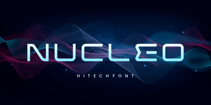 INTRODUCING NUCLEO – Modern Display typeface! NUCLEO is a modern monoline font with unique style that will make your design looks modern and futuristic. You can use this font for any purpose, especially to make logotype like a technology logo brand. This typeface is comes in uppercase, lowercase, punctuation, symbols, numerals, etc also support multilingual. Enjoy!
 - Leafstar by Letterhend,
$12.00 Leafstar is a vintage styled font duo. It comes with a unique sans and script with the retro feel. The are perfect to use in logotype, badges, sign boards, posters, headline text, apparel, wedding invitations and more. This font has many OpenType features like ligature, stylistic alternates, contextual alternates, swashes and has multi-language support.
 - Mongoose by Kostic,
$40.00 Mongoose is a condensed sans serif, made for posters, headlines and logotypes. Caps and x-height were made to match the ultra wide Briller, so it could be fun to combine these two highly contrasting type families. Thanks to the OpenType features, figures come in both tabular and proportional widths, fractions and superior/inferior positions.
 - Sylfaen by Microsoft Corporation,
$49.00Sylfaen was designed for Microsoft in 1998 by John Hudson and W. Ross Mills of Tiro Typeworks, and Geraldine Wade of Monotype Typography. Sylfaen is a Welsh word meaning foundation"; an apt name since the font stemmed from research into the typographic requirements of many different scripts and languages. This version of Sylfaen supports the WGL4.0 character set, for Pan-European language coverage. In addition to Latin, Greek and Cyrillic letterforms, the font contains the characters necessary for support of the Armenian and Georgian languages. Font Designer: John Hudson, W. Ross Mills, Geraldine Wade. The Sylfaen font contains 729 glyphs including Latin 1, WGL Pan-European, Armenian and Georgian." - HollaBear by Designova,
$9.00 A cute and funny kid-friendly typeface inspired from bears and handmade with passion and joy. Will you believe if we say, HollaBear is made by bear cubs. The typeface is essentially simple but very uniquely expressive when it comes to the design of posters, flyers, cartoons graphics, logotype, web and display usage. Please see the examples shown above to get an idea about the capability of this typeface. HollaBear comes with Extended Latin character sets including Western European, Central European and South Eastern European character sets. The typeface comes in 6 variants (Regular, Italic, Outline, Outline Italic, 3D and 3D Italic).
 - bunker - Unknown license

- Mumos by Muykyta,
$9.00 Mumos is a block type font. Is a font of thirteen units of height with straight terminations in which there is complete absence of curves. Although very basic is a dynamic typography with many possibilities thanks to its three styles, including open space, which facilitates the work with fillers without having to vectorize the glyphs.
 - LT Novelty - 100% free

- LT Diploma - 100% free

- Origins Smooth by Laura Worthington,
$39.00 Origins is based on letters hand-drawn with a crow quill on parchment paper, a testament to calligraphic grace and antique ambiance. Its tight, energetic angularity can be complemented with swooping swash capitals, alternate ascending and descending letterforms, and graceful ending characters. Origins sings in settings related to food and wine, celebrations, travel, and history. Origins features 120 alternates and swashes, 8 ligatures and 20 ornaments. See what’s included! http://bit.ly/2hsRQ15 This font has been specially coded for access of all the swashes, alternates and ornaments without the need for professional design software! Info and instructions here: http://lauraworthingtontype.com/faqs/


