10,000 search results
(0.03 seconds)
- Gogobig by Bogusky 2,
$25.00I have always been frustrated when looking for a bold condensed face. The choices were the usual? Helvetica Bold Condensed, Univers Bold Condensed or Alternate Gothic #2... all rather dated. I was looking for a really unique, clean, uncluttered sans serif face, so I decided to design one. I have since adapted it to many logo designs. So, in my terms and conditions, I decided to permit the modification of the letter forms for logos and monograms, but logos and monograms only, not the typeface in normal usage. - Chedros by Surotype,
$15.00 Chedros is a display typeface with playful taste. It comes in two different weight, regular and bold so you can use them to your heart's content. Chedros very suitable to use for headlines, wordmark, prints, logotype, young and playful design or anything else.
 - Rocket Chicken by Letteralle,
$18.00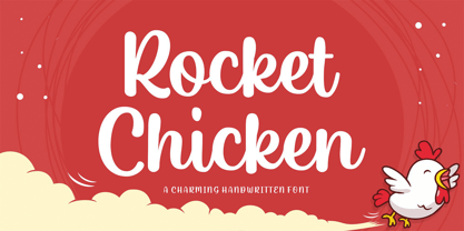 A smooth handwritten font with a personal charm and modern twist. Rocket Chicken come with multilingual support. This font is suitable for your design needs such as product packaging, merchandise, social media design, T-shirts, Logotype, and more. Enjoy Designing, Thank you.
 - Pottery by Nurf Designs,
$16.00 Pottery is a beatiful script font. This font is great for your next creative project such as logos, printed quotes, invitations, cards, product packaging, headers, Logotype, Letterhead, Poster, Apparel Design, Label, and etc. Pottery comes with uppercase, lowercase, numerals, punctuations, multilingual support .
 - Moister by Ilham Herry,
$35.00 Introducing Moister, inspired by beer labels in the old days. This collection comes with several styles: script, block, and expanded. It is possible to combine and options to create label designs, headlines, logotypes, signage, posters, greeting cards, letterheads, t-shirts and much more.
 - Grandmaid by Martype co,
$19.00 Grandmaid is a family Sans Serif font designed with carefully handcrafted. Also suitable for branding, T-shirt, Classic Design, Logotype, and any project. Comes with a tons of ligature and alternates make your life more than comofortable, easier to design and free stress.
 - Wolf Fangs Graffiti by Sipanji21,
$15.00 Wolf Fangs is an incredibly unique and chunky lettered display font with graffiti basic feel, its suitable for logotype, design grafics, e-sport, apparel, wall art, etc. Add this font to your favorite creative ideas and notice how it makes them come alive!
 - Ovalie by Typefactory,
$14.00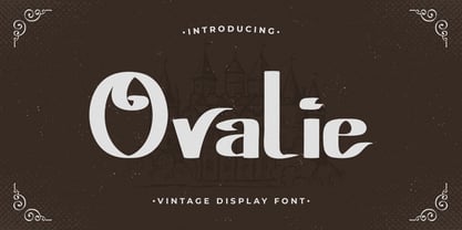 Ovalie is a vintage display font that was made by hand and inspired by classic posters. Ovalie comes with uppercase, lowercase, numerals, symbols & punctuations, alternate, ligature and multilingual support. Perfect to use for Logotype, Letterhead, Poster, Apparel Design, Labels, and many more designs.
 - Fokers by Letterhend,
$14.00 Fokers, a new display typeface with classy and luxury look! Fokers' different styles works perfectly for headline, logotype, apparel, invitation, branding, packaging, advertising, and more. Fokers comes in uppercase, lowercase, with punctuation, symbols, numerals, stylistic set alternate, ligatures and also multi-lingual support.
 - Shilia by Linotype,
$103.99 SHILIA – AN ARABIC FONT THAT LIVES HAND IN HAND WITH LATIN TEXT CHARACTERS A special design principle underlies the Arabic font Shilia created by Mamoun Sakkal: the form of the characters means that they harmonise happily with sans serif Latin fonts, such as Univers. Because of this, Shilia is the ideal choice for any bilingual project and for use in international corporate branding. Shilia™ had its beginnings in the 1970s. Taking one of the oldest variants of Arabic script, the minimalist Kufic, as his inspiration, Mamoun Sakkal fashioned simple stroke shapes that are combined according to a geometric grid. Shilia is at home in both worlds, that of the East and that of the West. And although Shilia has been primarily designed to be used as a display font, it is also ideal for setting shorter texts. Before being published by Linotype, Shilia underwent major adaptation and updating, and is now available in the modern OpenType format. Mamoun Sakkal increased the characters available per individual typeface variant to over 1,800, and his daughter, Aida Sakkal, worked on programming the extensive OpenType features for the font. There are numerous ligatures that can be used to provide suitable variation and avoid repetition within a given context, and many special features such as the dots under the initial and final segments of words being automatically centralised. Shilia not only supports Arabic, but also Persian and Urdu. Special character combinations for setting texts in these languages, particularly Urdu, are provided through OpenType. And there are a total of 19 stylistic sets with additional character variants available to the user. An example of Urdu text Shilia is available in eight weights, from UltraLight to Black. The corresponding condensed versions are in the course of preparation. Along with the Arabic characters, all of the typeface versions include matching Latin alphabet letters of Adrian Frutiger’s Linotype Univers® family, making Shilia intrinsically suitable for setting bilingual texts. A set of ornaments carefully designed to allow for numerous compositions of bands and decorative patterns rounds off the range of characters on offer. With its 21 weights, Shilia is one of the most extensive of Arabic typeface families that is currently on the market. Its clear and well-balanced forms emphasise the linear nature of the font without allowing it to appear sterile or artificial. Shilia not only cuts a good figure as a display font for signage or in artistic projects, thanks to its substantial range of features, the font family can also be used to set texts, such as corporate and administrative documents. In addition, but the full compatibility between the Arabic and Latin characters makes Shilia the perfect choice for international and multilingual design projects.
 - Seminary by Solotype,
$19.95This began life as a European font that was copied in the United States by Bruce's Type Foundry in 1885. It was caps only and had a fine line "three-D" shadow. We scrapped the shadow, added a lower case, and voila! - Conners Corners NF by Nick's Fonts,
$10.00 Here's another collection of ornate border elements gleaned from the 1888 specimen books of James Conner's Sons United States Type Foundry in New York City. Refer to the PDF guide for detailed, yet simple, instructions for constructing nine delightfully different border patterns.
 - Herbal Medicine by Wildan Type,
$12.00 Introducing Herbal Medicine Font !! Herbal Medicine is a fun and quirky handwritten font with a unique style, playful look & feel! embodies fun. Use this gorgeous and unique font to bring any DIY. you also can enjoy many unic alternate style each character.
 - Eco Hand Kid by TypoGraphicDesign,
$19.00 The typeface Eco Hand Kid is designed from 2022 for the font foundry Typo Graphic Design by Manuel Viergutz as a political statement #climatejustice 4 font-styles (Cond, Bold, Outline, Icons) with 948 glyphs (Adobe Latin 3) incl. 100+ decorative extras like icons, arrows, dingbats, emojis, symbols, geometric shapes, catchwords, German Capital Sharp S, zodiac signs, ligatures (type the word #LOVE for ♥︎ or #SMILE for ☺ as OpenType-Feature dlig) and stylistic alternates (8 stylistic sets). For use in logos, magazines, posters, advertisement plus as webfont for decorative headlines. The font works best for display size. Have fun with this font & use the DEMO-FONT (with reduced glyph-set) FOR FREE! Font Specifications ■ Font Name: Eco Hand Kid ■ Font Styles: 4 (Cond, Bold, Outline, Icons) + DEMO (with reduced glyph-set) ■ Font Category: Sans Serif Display for headline size ■ Glyph Set: 948 glyphs (Adobe Latin 3) incl. 100+ icons (decorative extras like arrows, dingbats, emojis, symbols) ■ 93 languages: Afrikaans Albanian Asturian Asu Basque Bemba Bena Breton Catalan Chiga Colognian Cornish Croatian Czech Danish Dutch Embu English Esperanto Estonian Faroese Filipino Finnish French Friulian Galician German Gusii Hungarian Igbo Indonesian Irish Italian Kabuverdianu Kalaallisut Kalenjin Kamba Kikuyu Kinyarwanda Latvian Lithuanian Lower Sorbian Luo Luxembourgish Luyia Machame Makhuwa-Meetto Makonde Malagasy Maltese Manx Meru Morisyen North Ndebele Norwegian Bokmål Norwegian Nynorsk Nyankole Oromo Polish Portuguese Quechua Romanian Romansh Rombo Rundi Rwa Samburu Sango Sangu Scottish Gaelic Sena Serbian Shambala Shona Slovak Soga Somali Spanish Swahili Swedish Swiss German Taita Teso Turkish Upper Sorbian Uzbek (Latin) Volapük Vunjo Walser Welsh Western Frisian Yoruba Zulu ■ Design Date: 2022 ■ Type Designer: Manuel Viergutz
 - Billy Sham by Putracetol,
$15.00 Introducing a new retro font called “Billy Sham“. Inspired from retro typography and lettering in the 70’s and 80’s combine with bold typography style. With a total of 534 glyphs with 359 alternate, you can make letter combinations for lettering with a lot of options. Come with open type feature ( a lot of alternates and end swash), its help you to make great lettering. Billy Sham best uses for Logotype, heading,cover, poster, logos, quotes, product packaging, header, merchandise, social media & greeting cards and many more. This font is also support multi language. To access the alternate glyphs, you need a program that supports OpenType features such as Adobe Illustrator CS, Adobe Photoshop CC, Adobe Indesign and Corel Draw.
 - Curly Keken by Putracetol,
$15.00 Introducing a new retro font called “Curly Keken“. Inspired from retro typography and lettering in the 70’s and 80’s combine with bold typography style. With a total of 534 glyphs with 359 alternate, you can make letter combinations for lettering with a lot of options. Come with open type feature ( a lot of alternates and end swash), its help you to make great lettering. Curly Keken best uses for Logotype, heading,cover, poster, logos, quotes, product packaging, header, merchandise, social media & greeting cards and many more. This font is also support multi language. To access the alternate glyphs, you need a program that supports OpenType features such as Adobe Illustrator CS, Adobe Photoshop CC, Adobe Indesign and Corel Draw.
 - Fuel by VersusTwin,
$39.00 The Fuel typefaces are a modern update on the techno sans, complete with soft rounded corners as well as decorative inktraps. Stylistic Alternates included within all styles are alternates for the capital B, E, G, and R characters, as well as all of their accented siblings. The Fuel Complete package bundles all of the dynamic styles of the Fuel, Fuel Extended, Fuel Uni, Fuel Uni Extended, and Fuel Script typefaces into one powerhouse of a collection.
 - Maille by The Paper Town,
$23.00 Maille is a bold display font powered by OpenType, featuring contextual alternates, beautiful ligatures and stylistic sets with just a hint of retro feel. Maille comes with a set of 720+ glyphs and can cover a wide range of projects from branding to advertising, stationery, headers, quotes and so much more. OpenType features include stylistic alternates with lovely swashes, initial and terminal forms and contextual alternates to enhance your text and create beautiful designs. It also includes 139+ standard and discretionary ligatures with multilingual support. The OpenType features can be easily accessed by using an OpenType capable software such as Adobe Illustrator, Photoshop or InDesign. Maille supports multilingual characters for western, central and south-east European languages.
 - 1776 Independence by GLC,
$38.00 1776 Independence was designed inspired mainly from the Caslon typeface used by John Dunlap in the night of 1776 July 4th in Philadelphia to print the first 200 sheets of the Congress' Declaration of Independence establishing the United States of America. I just added accented letters and a few others, with respect for the original design. A render sheet,enclosed with font file, help to identify them on keyboard. It can be used as web-site titles, posters and fliers, editing ancient texts, menus or greeting cards as a very decorative font... This font supports as easily enlargement or small size, remaining clear and easy to read from 8 or 9 points to 72 and over. It gives a smart look especially to prints.
 - PROG.BOT - 100% free

- This Boring Party - Unknown license

- Meritorious Script by Wacaksara co,
$15.00 meritorious is a script font with a bold vintage style. come with two versions (regular and extruded). This font is inspired by the manual lettering style that is suitable for your design needs such as book cover, logotype, branding, letterhead, poster, product packaging, label, invitation, and more. meritorious comes with uppercase, lowercase, numbers, punctuation and there are variations on each character including OpenType alternatives, common ligatures. Thanks
 - Maya Day Names by Deniart Systems,
$15.00 Contains the 20 day names of the Maya calendar as well as (in outline and silhouette mode) as well as the 19 Maya numerals. NOTE: this font comes with an interpretation guide in pdf format.
 - Times New Roman PS Cyrillic by Monotype,
$67.99In 1931, The Times of London commissioned a new text type design from Stanley Morison and the Monotype Corporation, after Morison had written an article criticizing The Times for being badly printed and typographically behind the times. The new design was supervised by Stanley Morison and drawn by Victor Lardent, an artist from the advertising department of The Times. Morison used an older typeface, Plantin, as the basis for his design, but made revisions for legibility and economy of space (always important concerns for newspapers). As the old type used by the newspaper had been called Times Old Roman," Morison's revision became "Times New Roman." The Times of London debuted the new typeface in October 1932, and after one year the design was released for commercial sale. The Linotype version, called simply "Times," was optimized for line-casting technology, though the differences in the basic design are subtle. The typeface was very successful for the Times of London, which used a higher grade of newsprint than most newspapers. The better, whiter paper enhanced the new typeface's high degree of contrast and sharp serifs, and created a sparkling, modern look. In 1972, Walter Tracy designed Times Europa for The Times of London. This was a sturdier version, and it was needed to hold up to the newest demands of newspaper printing: faster presses and cheaper paper. In the United States, the Times font family has enjoyed popularity as a magazine and book type since the 1940s. Times continues to be very popular around the world because of its versatility and readability. And because it is a standard font on most computers and digital printers, it has become universally familiar as the office workhorse. Times?, Times? Europa, and Times New Roman? are sure bets for proposals, annual reports, office correspondence, magazines, and newspapers. Linotype offers many versions of this font: Times? is the universal version of Times, used formerly as the matrices for the Linotype hot metal line-casting machines. The basic four weights of roman, italic, bold and bold italic are standard fonts on most printers. There are also small caps, Old style Figures, phonetic characters, and Central European characters. Times? Ten is the version specially designed for smaller text (12 point and below); its characters are wider and the hairlines are a little stronger. Times Ten has many weights for Latin typography, as well as several weights for Central European, Cyrillic, and Greek typesetting. Times? Eighteen is the headline version, ideal for point sizes of 18 and larger. The characters are subtly condensed and the hairlines are finer." - Times New Roman Seven by Monotype,
$67.99In 1931, The Times of London commissioned a new text type design from Stanley Morison and the Monotype Corporation, after Morison had written an article criticizing The Times for being badly printed and typographically behind the times. The new design was supervised by Stanley Morison and drawn by Victor Lardent, an artist from the advertising department of The Times. Morison used an older typeface, Plantin, as the basis for his design, but made revisions for legibility and economy of space (always important concerns for newspapers). As the old type used by the newspaper had been called Times Old Roman," Morison's revision became "Times New Roman." The Times of London debuted the new typeface in October 1932, and after one year the design was released for commercial sale. The Linotype version, called simply "Times," was optimized for line-casting technology, though the differences in the basic design are subtle. The typeface was very successful for the Times of London, which used a higher grade of newsprint than most newspapers. The better, whiter paper enhanced the new typeface's high degree of contrast and sharp serifs, and created a sparkling, modern look. In 1972, Walter Tracy designed Times Europa for The Times of London. This was a sturdier version, and it was needed to hold up to the newest demands of newspaper printing: faster presses and cheaper paper. In the United States, the Times font family has enjoyed popularity as a magazine and book type since the 1940s. Times continues to be very popular around the world because of its versatility and readability. And because it is a standard font on most computers and digital printers, it has become universally familiar as the office workhorse. Times?, Times? Europa, and Times New Roman? are sure bets for proposals, annual reports, office correspondence, magazines, and newspapers. Linotype offers many versions of this font: Times? is the universal version of Times, used formerly as the matrices for the Linotype hot metal line-casting machines. The basic four weights of roman, italic, bold and bold italic are standard fonts on most printers. There are also small caps, Old style Figures, phonetic characters, and Central European characters. Times? Ten is the version specially designed for smaller text (12 point and below); its characters are wider and the hairlines are a little stronger. Times Ten has many weights for Latin typography, as well as several weights for Central European, Cyrillic, and Greek typesetting. Times? Eighteen is the headline version, ideal for point sizes of 18 and larger. The characters are subtly condensed and the hairlines are finer." - Times New Roman WGL by Monotype,
$67.99 In 1931, The Times of London commissioned a new text type design from Stanley Morison and the Monotype Corporation, after Morison had written an article criticizing The Times for being badly printed and typographically behind the times. The new design was supervised by Stanley Morison and drawn by Victor Lardent, an artist from the advertising department of The Times. Morison used an older typeface, Plantin, as the basis for his design, but made revisions for legibility and economy of space (always important concerns for newspapers). As the old type used by the newspaper had been called Times Old Roman," Morison's revision became "Times New Roman." The Times of London debuted the new typeface in October 1932, and after one year the design was released for commercial sale. The Linotype version, called simply "Times," was optimized for line-casting technology, though the differences in the basic design are subtle. The typeface was very successful for the Times of London, which used a higher grade of newsprint than most newspapers. The better, whiter paper enhanced the new typeface's high degree of contrast and sharp serifs, and created a sparkling, modern look. In 1972, Walter Tracy designed Times Europa for The Times of London. This was a sturdier version, and it was needed to hold up to the newest demands of newspaper printing: faster presses and cheaper paper. In the United States, the Times font family has enjoyed popularity as a magazine and book type since the 1940s. Times continues to be very popular around the world because of its versatility and readability. And because it is a standard font on most computers and digital printers, it has become universally familiar as the office workhorse. Times?, Times? Europa, and Times New Roman? are sure bets for proposals, annual reports, office correspondence, magazines, and newspapers. Linotype offers many versions of this font: Times? is the universal version of Times, used formerly as the matrices for the Linotype hot metal line-casting machines. The basic four weights of roman, italic, bold and bold italic are standard fonts on most printers. There are also small caps, Old style Figures, phonetic characters, and Central European characters. Times? Ten is the version specially designed for smaller text (12 point and below); its characters are wider and the hairlines are a little stronger. Times Ten has many weights for Latin typography, as well as several weights for Central European, Cyrillic, and Greek typesetting. Times? Eighteen is the headline version, ideal for point sizes of 18 and larger. The characters are subtly condensed and the hairlines are finer."
 - Times New Roman by Monotype,
$67.99 In 1931, The Times of London commissioned a new text type design from Stanley Morison and the Monotype Corporation, after Morison had written an article criticizing The Times for being badly printed and typographically behind the times. The new design was supervised by Stanley Morison and drawn by Victor Lardent, an artist from the advertising department of The Times. Morison used an older typeface, Plantin, as the basis for his design, but made revisions for legibility and economy of space (always important concerns for newspapers). As the old type used by the newspaper had been called Times Old Roman," Morison's revision became "Times New Roman." The Times of London debuted the new typeface in October 1932, and after one year the design was released for commercial sale. The Linotype version, called simply "Times," was optimized for line-casting technology, though the differences in the basic design are subtle. The typeface was very successful for the Times of London, which used a higher grade of newsprint than most newspapers. The better, whiter paper enhanced the new typeface's high degree of contrast and sharp serifs, and created a sparkling, modern look. In 1972, Walter Tracy designed Times Europa for The Times of London. This was a sturdier version, and it was needed to hold up to the newest demands of newspaper printing: faster presses and cheaper paper. In the United States, the Times font family has enjoyed popularity as a magazine and book type since the 1940s. Times continues to be very popular around the world because of its versatility and readability. And because it is a standard font on most computers and digital printers, it has become universally familiar as the office workhorse. Times?, Times? Europa, and Times New Roman? are sure bets for proposals, annual reports, office correspondence, magazines, and newspapers. Linotype offers many versions of this font: Times? is the universal version of Times, used formerly as the matrices for the Linotype hot metal line-casting machines. The basic four weights of roman, italic, bold and bold italic are standard fonts on most printers. There are also small caps, Old style Figures, phonetic characters, and Central European characters. Times? Ten is the version specially designed for smaller text (12 point and below); its characters are wider and the hairlines are a little stronger. Times Ten has many weights for Latin typography, as well as several weights for Central European, Cyrillic, and Greek typesetting. Times? Eighteen is the headline version, ideal for point sizes of 18 and larger. The characters are subtly condensed and the hairlines are finer."
 - Times New Roman Small Text by Monotype,
$67.99In 1931, The Times of London commissioned a new text type design from Stanley Morison and the Monotype Corporation, after Morison had written an article criticizing The Times for being badly printed and typographically behind the times. The new design was supervised by Stanley Morison and drawn by Victor Lardent, an artist from the advertising department of The Times. Morison used an older typeface, Plantin, as the basis for his design, but made revisions for legibility and economy of space (always important concerns for newspapers). As the old type used by the newspaper had been called Times Old Roman," Morison's revision became "Times New Roman." The Times of London debuted the new typeface in October 1932, and after one year the design was released for commercial sale. The Linotype version, called simply "Times," was optimized for line-casting technology, though the differences in the basic design are subtle. The typeface was very successful for the Times of London, which used a higher grade of newsprint than most newspapers. The better, whiter paper enhanced the new typeface's high degree of contrast and sharp serifs, and created a sparkling, modern look. In 1972, Walter Tracy designed Times Europa for The Times of London. This was a sturdier version, and it was needed to hold up to the newest demands of newspaper printing: faster presses and cheaper paper. In the United States, the Times font family has enjoyed popularity as a magazine and book type since the 1940s. Times continues to be very popular around the world because of its versatility and readability. And because it is a standard font on most computers and digital printers, it has become universally familiar as the office workhorse. Times?, Times? Europa, and Times New Roman? are sure bets for proposals, annual reports, office correspondence, magazines, and newspapers. Linotype offers many versions of this font: Times? is the universal version of Times, used formerly as the matrices for the Linotype hot metal line-casting machines. The basic four weights of roman, italic, bold and bold italic are standard fonts on most printers. There are also small caps, Old style Figures, phonetic characters, and Central European characters. Times? Ten is the version specially designed for smaller text (12 point and below); its characters are wider and the hairlines are a little stronger. Times Ten has many weights for Latin typography, as well as several weights for Central European, Cyrillic, and Greek typesetting. Times? Eighteen is the headline version, ideal for point sizes of 18 and larger. The characters are subtly condensed and the hairlines are finer." - Times New Roman PS Greek by Monotype,
$67.99In 1931, The Times of London commissioned a new text type design from Stanley Morison and the Monotype Corporation, after Morison had written an article criticizing The Times for being badly printed and typographically behind the times. The new design was supervised by Stanley Morison and drawn by Victor Lardent, an artist from the advertising department of The Times. Morison used an older typeface, Plantin, as the basis for his design, but made revisions for legibility and economy of space (always important concerns for newspapers). As the old type used by the newspaper had been called Times Old Roman," Morison's revision became "Times New Roman." The Times of London debuted the new typeface in October 1932, and after one year the design was released for commercial sale. The Linotype version, called simply "Times," was optimized for line-casting technology, though the differences in the basic design are subtle. The typeface was very successful for the Times of London, which used a higher grade of newsprint than most newspapers. The better, whiter paper enhanced the new typeface's high degree of contrast and sharp serifs, and created a sparkling, modern look. In 1972, Walter Tracy designed Times Europa for The Times of London. This was a sturdier version, and it was needed to hold up to the newest demands of newspaper printing: faster presses and cheaper paper. In the United States, the Times font family has enjoyed popularity as a magazine and book type since the 1940s. Times continues to be very popular around the world because of its versatility and readability. And because it is a standard font on most computers and digital printers, it has become universally familiar as the office workhorse. Times?, Times? Europa, and Times New Roman? are sure bets for proposals, annual reports, office correspondence, magazines, and newspapers. Linotype offers many versions of this font: Times? is the universal version of Times, used formerly as the matrices for the Linotype hot metal line-casting machines. The basic four weights of roman, italic, bold and bold italic are standard fonts on most printers. There are also small caps, Old style Figures, phonetic characters, and Central European characters. Times? Ten is the version specially designed for smaller text (12 point and below); its characters are wider and the hairlines are a little stronger. Times Ten has many weights for Latin typography, as well as several weights for Central European, Cyrillic, and Greek typesetting. Times? Eighteen is the headline version, ideal for point sizes of 18 and larger. The characters are subtly condensed and the hairlines are finer." - Times New Roman PS by Monotype,
$67.99In 1931, The Times of London commissioned a new text type design from Stanley Morison and the Monotype Corporation, after Morison had written an article criticizing The Times for being badly printed and typographically behind the times. The new design was supervised by Stanley Morison and drawn by Victor Lardent, an artist from the advertising department of The Times. Morison used an older typeface, Plantin, as the basis for his design, but made revisions for legibility and economy of space (always important concerns for newspapers). As the old type used by the newspaper had been called Times Old Roman," Morison's revision became "Times New Roman." The Times of London debuted the new typeface in October 1932, and after one year the design was released for commercial sale. The Linotype version, called simply "Times," was optimized for line-casting technology, though the differences in the basic design are subtle. The typeface was very successful for the Times of London, which used a higher grade of newsprint than most newspapers. The better, whiter paper enhanced the new typeface's high degree of contrast and sharp serifs, and created a sparkling, modern look. In 1972, Walter Tracy designed Times Europa for The Times of London. This was a sturdier version, and it was needed to hold up to the newest demands of newspaper printing: faster presses and cheaper paper. In the United States, the Times font family has enjoyed popularity as a magazine and book type since the 1940s. Times continues to be very popular around the world because of its versatility and readability. And because it is a standard font on most computers and digital printers, it has become universally familiar as the office workhorse. Times?, Times? Europa, and Times New Roman? are sure bets for proposals, annual reports, office correspondence, magazines, and newspapers. Linotype offers many versions of this font: Times? is the universal version of Times, used formerly as the matrices for the Linotype hot metal line-casting machines. The basic four weights of roman, italic, bold and bold italic are standard fonts on most printers. There are also small caps, Old style Figures, phonetic characters, and Central European characters. Times? Ten is the version specially designed for smaller text (12 point and below); its characters are wider and the hairlines are a little stronger. Times Ten has many weights for Latin typography, as well as several weights for Central European, Cyrillic, and Greek typesetting. Times? Eighteen is the headline version, ideal for point sizes of 18 and larger. The characters are subtly condensed and the hairlines are finer." - Metalsoup by Alit Design,
$20.00 "Metal Soup" is a captivating blackletter font that exudes a unique blend of boldness and a dynamic, distressed aesthetic. With its robust design, this font is perfect for making a striking statement in your design projects. "Metal Soup" boasts 720 characters and offers comprehensive multilingual support, making it versatile and adaptable for a wide range of creative applications.
 - Ranira by Differentialtype,
$10.00 Ranira is a modern serif typeface. It is suitable for typing on documents and can also be used for display fonts, suitable for logotypes, titles, captions, and more. Ranira comes with 7 weights and 14 styles. Ranira is also equipped with alternates and ligatures.
 - Muge by Linecreative,
$18.00 Muge is awesome for branding and logotype, Muge has a modern, trendy and elegant impression. Muge Comes with Ligatures and lots of alternate characters & unlock types featured so you can mix and match like a you want. Muge also supports multi-language (Western Europe Latin)
 - Zamon by Java Pep,
$17.00 Proudly present the newest modern serif font called Zamon. This font is elegant and perfect for the headline, title, logotype, fashion, quote text, publishing, etc. Zamon also comes in an oblique style so you can pair it to make contrast and to highlight purpose.
 - Bugheds by Letterhend,
$19.00 Introducing Bugheds. A blackletter font that i've made with a personality touch. They works perfect for you who needs for headline, logotype, apparel, branding, packaging, advertising etc. This font is comes in uppercase, lowercase, punctuation, symbols, numerals, stylistic set alternate, ligatures, etc also support multilingual.
 - Gamarasa by Differentialtype,
$10.00 Gamarasa is a sports font with a modern design. Gamarasa comes with 4 styles, and 6 weights. Makes it easy for you to combine various styles according to your design needs. Gamarasa is perfect for logotypes, sport branding, posters, apparel designs, labels, and much more.
 - Hastag Vintage by Typefactory,
$14.00 Hastag is a vintage display font that was made by hand and inspired by classic posters. Hastag comes with uppercase, small caps, numerals, symbols & punctuations, alternate, ligature and multilingual support. Perfect to use for Logotype, Letterhead, Poster, Apparel Design, Labels, and many more designs.
 - Once upon a time in the digital kingdom, there was a font named Tempora LGC Uni, crafted by the master hands of Alexey Kryukov. This intrepid typeface embarked on a journey to unite the realms of let...
- Heimat Display by Atlas Font Foundry,
$50.00 Heimat Display is the high contrast sans serif typeface family within the Heimat Collection, also containing Heimat Didone, Heimat Sans, Heimat Mono and Heimat Stencil. Heimat Display is a typeface family designed for contemporary typography, especially for use in headlines and on posters, but also for reading purposes. It combines an idiosyncratic appearance with the feeling of a grid-based letter construction of the late 20s. Since the design might be too extreme for some applications, Heimat Display’s character set provides different alphabets, the regular one plus alternate designs that comes across as less suspenseful. Heimat Display [873 glyphs] comes in 72 styles and contains extra sets of alternate glyphs, many ligatures, lining figures [proportionally spaced and monospaced], hanging figures [proportionally spaced and monospaced], positive and negative circled figures for upper and lower case, superior and inferior, fractions, extensive language support and many more OpenType features.
 - Heimat Didone by Atlas Font Foundry,
$50.00 Heimat Didone is the high contrast serif typeface family within the Heimat Collection, also containing Heimat Display, Heimat Sans, Heimat Mono and Heimat Stencil. Heimat Didone is a neo-classical typeface family designed for contemporary typography, especially for use in headlines and on posters, but also for reading purposes. It combines an idiosyncratic appearance with the feeling of a grid-based letter construction of the late 20s. Since the design might be too extreme for some applications, Heimat Didone’s character set provides two alphabets, the regular one plus an alternate design that comes across as less suspenseful. Heimat Didone [872 glyphs] comes in 72 styles and contains 6 optical weights, extra sets of alternate glyphs, many ligatures, lining figures [proportionally spaced and monospaced], hanging figures [proportionally spaced and monospaced], positive and negative circled figures for upper and lower case, superior and inferior, fractions, extensive language support and many more OpenType features.

