10,000 search results
(0.041 seconds)
- Gerush by ZetDesign,
$15.00 Gerush is a font in the form of a fingerprint. This font is neatly crafted to present a formal yet memorable and unique feel. very suitable for brand identity and other uses. This font is made in a regular and light style with an italic style in each.
 - UppenArmsNF - 100% free

- Frutiger by Linotype,
$42.99 In 1968, Adrian Frutiger was commissioned to develop a sign and directional system for the new Charles de Gaulle Airport in Paris. Though everyone thought he would want to use his successful Univers font family, Frutiger decided instead to make a new sans serif typeface that would be suitable for the specific legibility requirements of airport signage: easy recognition from the distances and angles of driving and walking. The resulting font was in accord with the modern architecture of the airport. In 1976, he expanded and completed the family for D. Stempel AG in conjunction with Linotype, and it was named Frutiger. The Frutiger™ family is neither strictly geometric nor humanistic in construction; its forms are designed so that each individual character is quickly and easily recognized. Such distinctness makes it good for signage and display work. Although it was originally intended for the large scale of an airport, the full family has a warmth and subtlety that have, in recent years, made it popular for the smaller scale of body text in magazines and booklets. The family has 14 weights and 14 companion fonts with Central European characters and accents. Another 14 Cyrillic companion fonts are available as well. See also the new revised version Frutiger Next from the Linotype Platinum Collection. Featured in: Best Fonts for Logos
 - Medicine Drops by Multype Studio,
$99.00 Medicine Drops is a font with a death metal theme. Be an alternative to make logos, merch, or anything with the nuances of death metal music. This font perfect for logotype death metal band, logotype death metal brand, product, merchandise death metal band, death metal band covers, rock events, rock posters, rock magazine covers, branding, product design, labels and other creative project. What’s Included : Standard glyphs Works on PC / Mac Simple installations Accessible in the Adobe Illustrator, Adobe Photoshop, Adobe InDesign, even work on Microsoft Word PUA Encoded Characters, Fully accessible without additional design software. Multilingual support Thank you for your purchase! Hope you enjoy with our font!
 - Murder Brack by Multype Studio,
$99.00 Murder Brack is a font with a death metal theme. Be an alternative to make logos, merch, or anything with the nuances of death metal music. This font perfect for logotype death metal band, logotype death metal brand, product, merchandise death metal band, death metal band covers, rock events, rock posters, rock magazine covers, branding, product design, labels and other creative project. What’s Included : Standard glyphs Works on PC / Mac Simple installations Accessible in the Adobe Illustrator, Adobe Photoshop, Adobe InDesign, even work on Microsoft Word PUA Encoded Characters, Fully accessible without additional design software. Multilingual support Thank you for your purchase! Hope you enjoy with our font!
 - 1610 Cancellaresca by GLC,
$38.00 This font was inspired by the “Cancellaresca moderna ” type, which was calligraphed by Francesco Periccioli (published in 1610 in Siena, Italy). It was entirely handwritten by the designer for each circumstance, using quill pen and medieval ink on a rough paper, with added characters as accented ones and a lot of ligatures with respect for the original design. This font includes “long s” and also a lot of ligatures as “ff”, “ffi” “fij” “pp”... It can be used for web-site titles, posters and flier designs, editing ancient texts or greeting cards, or as a very decorative and elegant font. This font retains its qualities and beauty over a wide range of sizes.
 - Ysobel by Monotype,
$29.99 The Ysobel™ typeface family is not only elegant; it is also exceptionally legible and space economical. A collaborative design effort between Robin Nicholas, as lead designer and project director, Delve Withrington and Alice Savoie of Monotype Imaging, the project had the primary design goal of creating a typeface family for setting text in newspapers and periodicals. The result, however, is also ideal for any application that requires quick and easy assimilation of text. According to Nicholas, “The idea for the design started when I was asked to develop a custom version of Century Schoolbook. I wanted to give the design a more contemporary feel, although the client ultimately decided to keep their typeface closer to the original. The project nevertheless gave me ideas for a new design. Since designing Nimrod, some 30 years ago, I had wanted to make a more modern typeface family for newspapers and magazines – this seemed the ideal candidate.” Ysobel (pronounced “Isabel”) has the soft, inviting letter shapes of Century Schoolbook but contrasts these with more incised serifs and terminals. Its capitals are also narrower than those of Century Schoolbook, and care was taken to ensure that they harmonize perfectly with the lowercase. Ysobel’s x-height is full-bodied without disrupting lowercase proportions. In addition, curved terminals, such as those in the “C,” “c” and “e,” were drawn more open as an aid to legibility and readability in text copy. Weight stress is near vertical, and hairlines are robust to ensure character fidelity in small point sizes. Development began with the text version of the family, which has four weights, each with an italic companion. All weights feature lining and old style numerals, fractions, superiors and extended Latin language coverage. Small caps are also available in the Roman Regular design. Ysobel Display is a completely redrawn version of the typeface; it is narrower, and has a slightly smaller x-height, thinner hairlines and subtle design changes to improve its appearance when set at large sizes. The Display Italic received particular attention to make it ideal for setting headlines, subheads and short blocks of copy. Changes include a slightly greater italic angle and more cursive treatment of some letter shapes. Alternative styles of capital “J” and “Q,” to provide variation, are available in all weights.
 - Rotis II Sans by Monotype,
$50.99 Developed over several years by the late Otl Aicher and first released in the late 1980s, the Rotis® typeface has become a timeless classic. ROTIS II SANS HISTORY Aicher was a renowned German designer and corporate image consultant. He created the four basic designs of Rotis – sans serif, semi sans, semi seif and serif – within an extended typeface family concept, wherein all designs share a common cap height, lowercase x-height, basic stem weight and general proportions. While each version is part of the large, integrated family, each was also designed to function on its own as a distinctive typestyle. The result is that all members of the Rotis family combine smoothly with each other. Aicher, however, did not design the Rotis family with the weights and proportions normal for more contemporary releases. Rotis Sans Serif, for example, was drawn with just six weights and only two italics. Starting in 2010, Robin Nicholas, senior designer for Monotype Imaging in the UK, and freelance designer Alice Savoie collaborated to bring Rotis Sans Serif up to current standards. The result is Rotis II Sans, a completely new addition to the Rotis family. “We devised our approach together,” recalls Savoie, “deciding which weights to start with, what kind of alterations to make to the original Rotis, etc. I went to work on the typefaces, regularly submitting proofs to Robin. We would then decide in tandem on the next steps to take.” Nicholas elaborates, “We revisited the range of weights and added matching italics so that the new additions to the family offer increased versatility. We optimized the outlines, corrected the weight of several letters and re-examined overall spacing and kerning. In addition to a new set of numerals, with a height similar to the capitals, we also drew case-sensitive punctuation.” ROTIS II SANS USAGE The new Rotis II Sans suite comprises 14 typefaces: seven weights, ranging from extra light to black, each with a companion italic. The designs are available as OpenType® Pro fonts, allowing for automatic insertion of ligatures and fractions. Pro fonts also offer an extended character set supporting most Central European and many Eastern European languages. Aicher’s original Rotis designs were widely used for branding and advertising. With the addition of Rotis II Sans, the family is again poised to become a powerful communicator.
 - Inbadge by Blankids,
$30.00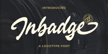 Hello, Are you looking for a modern trandy script font? Do you want of creating Something that stand out and inspire creativity, imagination, and endless fun? Wait no more, we will give you the best choice. Inbadge a Branding Logotype Font Inbadge a Branding Logotype Font, Inspiring from brush lettering style typography. This font is perfect for a design that makes it more attractive and playful. made with a very good level of aesthetics making this font suitable for book cover, poster, packging, merchandise, logotype and much more. Inbadge font includes Multilingual Support, among others : Afrikaans, Albanian, Asu, Basque, Bemba, Bena, Breton, Catalan, Chiga, Cornish, Danish, Dutch, English, Estonian, Faroese, Filipino, Finnish, French, Friulian, Galician, German, Gusii, Indonesian, Irish, Italian, Kabuverdianu, Kalenjin, Kinyarwanda, Luo, Luxembourgish, Luyia, Machame, Makhuwa, Meetto, Makonde, Malagasy, Manx, Morisyen, North Ndebele, Norwegian Bokmål, Norwegian Nynorsk, Nyankole, Oromo, Portuguese, Quechua, Romansh, Rombo, Rundi, Rwa, Samburu, Sango, Sangu, Scottish Gaelic, Sena, Shambala, Shona, Soga, Somali, Spanish, Swahili, Swedish, Swiss German, Taita, Teso, Uzbek (Latin), Volapük, Vunjo, Zulu FEATURES : Uppercase Lowercase Number Punctuation Multilingual PUA Encode Opentype
 - PowerUp by Grype,
$19.00 The gaming world is loaded with so many cool logotypes that never see the full font light of day. The PowerUp family finds its origins of inspiration in the Super Mario Bros. logotype, and been expanded upon to create its two unique styles and extruded shadow typefaces. PowerUp celebrates the geometric sans serif stylings of the original logotype, both in its condensed and heavyweight forms, and gives them the full character set they deserve. It's fun and functional. Each font includes a full standard character set with expansive international support of latin based languages, and 2 weight/width styles and three shadow styles. This highly stylized family is ready to electrify design urges, both digital and beyond. Here's what's included with the PowerUp Family: 480 glyphs per style - including Capitals, Lowercase, Numerals, Punctuation and an extensive character set that covers multilingual support of latin based languages. 5 styles: Regular, Black, Shadow, Black Shadow One, & Black Shadow Two. Layered Black & Black Shadow Two can be scaled down to 62% to match inspiration logotype. Here's why the PowerUp Family is for you: You're in need of a dynamic geometric font with extruded shadow layerable fonts You're a huge Super Mario Brothers fan You're a gamer, obsessed with all gaming related things You are looking for a techno style font family with Condensed AND Uber Black styles You just like to collect quality fonts to add to your design arsenal
 - ATTACK OS by OS CORP,
$25.00 ATTACK OS font version: 1.0 is the first version, including 340 characters, there are 4 types of handwriting that are: Regular; Italic; Bold; Bold Italic. We work with agencies and brands on visual identities and custom type design. Do you need a new font? Or an adjustment of the existing one? We can handle it on a best technological and creative level. New font design We create a concept and drawing of a completely new font to emphasise the character of your brand or project. Modifications to our fonts We adjust one of our retail fonts to your needs. It usually means a small change in design, an extension of the language set or icons. Let’s discuss how we can work together
 - Elen Sans by Hurufatfont,
$19.00 The first design of Elensans consisted of 4 styles that are including two weights and their italics which I designed in my student years in 2002. It was designed with a little Art Nouveau style touch with inspired by classical geometric based fonts such as Friz Quadrata and Eras. It was updated with according to the orientations of the day in 2012 and eventually it took its final form with actual touches in 2020. The family has 18 weights, ranging from Thin to Black in normal styles and including their italics. It is ideally suited for advertising and packaging, editorial and publishing, logo, branding and creative industries, poster and billboards, small text, wayfinding and signage as well as web and screen design.
 - ITC Garamond by ITC,
$34.99 Drawn by Tony Stan, ITC Garamond was first released in 1975 in Book and Ultra weights only. These were intended as display faces to complement existing text designs from other foundries. (In fact, many of ITC’s interpretations of traditional typefaces began as display counterparts for existing text designs.) These first weights of ITC Garamond became so popular, however, that ITC released the Light and Bold weights and a suite of condensed faces in 1977. Now, the complete ITC Garamond family features sixteen members: four weights of roman and italic in normal width and four weights of roman and italic in companion condensed versions. The family resemblance is there, but ITC Garamond’s unique provenance gives it an unmistakable, one-of-a-kind appeal.
 - Xyngia by ROHH,
$40.00 Xyngia is a professional modern sans serif typeface. Thanks to its excellent legibility it is a great choice both for on-screen use as well as print purposes. Xyngia is designed for use in long and short paragraphs of text, headlines and user interfaces. Its design nuances gives it distinctive character making it an interesting option for brand identification and logo design. Xyngia consists of 22 fonts - 11 weights and their corresponding italics. It has extended language support (over 1000 glyphs) and true italics, as well as broad number of OpenType features, such as small caps, case sensitive forms, standard and discretionary ligatures, stylistic sets, contextual alternates, lining, oldstyle, tabular and small cap figures, slashed zero, fractions, superscript and subscript, ordinals, currencies and symbols.
 - Libertad by TipoType,
$24.00 Design can do without images, but not without typefaces. Libertad is a sans-serif typeface that mixes humanist and grotesk models. It’s most interesting feature is the combination of balanced regulars with dynamic italics, which makes it a very versatile font for different uses. This typeface follows the Luc(as) de Groot’s Interpolation Theory, that’s why it has seven specially-calculated weights plus their matching italics, from thin to extra-bold. This allows it to be useful in big headlines and also small texts. It has more than 800 characters per weight and support for more than 70 languages. WARNING: This does not work with most Office suites; you only have access to R/I/B/BI. Credits: Photos by Lu-Lee.com - Web template by EleganThemes.com
 - Forked Tongue by Comicraft,
$19.00 Are you Troubled by Ghostly Voices in the night? Do you hear the Terrifying Tones of Demons and Ghouls in your Attic or Cellar? Have you or any of your family spoken with "Forked Tongue? Well, talk of the devil, Forked Tongue happens to be the latest offering brought to you buy our courteous and efficient staff this month (now on call twenty-four hours a day to serve all your supernatural lettering needs). If it Sounds Spooky, it most probably speaks with Forked Tongue. Oh, but if you really have got ghosts or poltergeists, well, um, we don't know who you gonna call. Features: Four weights (Regular, Italic, Bold & Bold Italic) with upper and lower case alphabets. Includes Western and Central European international characters.
 - Gasco by Joelmaker,
$30.00 GASCO is a collection of natural handwritten letters inspired by the retro style of the 70s and 80s, the style seems to take us a little back to the manual era, this type of letter is very unique, you can change from modern to retro or vintage style with a combination of a collection of alternates so it is ready to help To make your design look elegant, in the image shown you can see what this letter can do. There is a condensed version and an italic version of the font included 9 Upright and 9 Italic weights, ranging from Sheer to Black, all coming in 1 Outline style. This font also comes with 1 more elegant display style.
 - Bumble OS by OS CORP,
$3.00 BUMBLE OS font version: 1.0 is the first version, including 340 characters, there are 3 types of handwriting that are: Regular (Regular); Italic (Italic); Bold (Bold). We work with agencies and brands on visual identities and custom type design. Do you need a new font? Or an adjustment of the existing one? We can handle it on a best technological and creative level. New font design We create a concept and drawing of a completely new font to emphasise the character of your brand or project. Modifications to our fonts We adjust one of our retail fonts to your needs. It usually means a small change in design, an extension of the language set or icons. Let’s discuss how we can work together
 - Akwe Pro by ROHH,
$40.00 Akwe Pro™ is a professional, ultra versatile sans serif typeface characterized by excellent legibility and modern design perfect for all design purposes. It is designed for use in long and short paragraphs of text, headlines and user interfaces. Its distinctive character and carefully crafted proportions make it a great option for brand identification and logo design. Akwe Pro™ mega family consists of 164 fonts - each weight in uprights, italics and small caps versions. It has extended language support and true italics, as well as broad number of OpenType features, such as small caps, case sensitive forms, standard and discretionary ligatures, stylistic sets, contextual alternates, lining, old style, tabular and small cap figures, slashed zero, fractions, superscript and subscript, ordinals, currencies and symbols.
 - FF Signa Correspondence by FontFont,
$68.99 Danish type designer Ole Søndergaard created this sans FontFont in 2002. The family contains 4 weights: Regular, Italic, Bold, and Bold Italic and is ideally suited for logo, branding and creative industries and small text. FF Signa Correspondence provides advanced typographical support with features such as ligatures, alternate characters, case-sensitive forms, fractions, super- and subscript characters, and stylistic alternates. It comes with a complete range of figure set options – oldstyle and lining figures, each in tabular and proportional widths. As well as Latin-based languages, the typeface family also supports the Cyrillic writing system. This FontFont is a member of the FF Signa super family, which also includes FF Signa, FF Signa Serif, FF Signa Serif Stencil, and FF Signa Stencil.
 - Cream by Monotype,
$30.00 Cream is a retro soft serif typeface comprising 12 fonts. It can handle most typographic applications from branding to body copy with its range of weights and inherent legibility. Whatever you type will have a friendly message, but it really comes into its own when you start applying some of the additional ligatures and alternates that are built into this type family. You’ll soon be creating distinctive typographic compositions that are pleasing to the eye. There are 12 fonts altogether, ranging from Light to Black weights in both roman and italic. It has an extensive character set that covers all Latin European languages. Key features: 6 weights in Roman and Italic 75 Alternates 37 Ligatures Full European character set (Latin only) 730 glyphs per font.
 - Gaultier by Borutta Group,
$39.00 Gaultier is the result of over 5 years of work on a typeface inspired by my favourite creators in European typography – Claude Garamond, Robert Granjon and Eric Gill. The main idea of the project was to create a sans-serif antiqua with all features reserved for serif typefaces. In addition to the rich set of characters, Neuropa includes: Small Caps, Superscript, Subscript, Ligatures, Discretionary Ligatures, Contextual Alternates, Swash Variants and 5 different styles of digits. Upright styles with delicate contrast corresponds with the expressive form of italics inspired by Granjon italic construction. Gaultier will work wherever we want to emphasize modernity without forgetting tradition. The sharp character of the whole family is perfect for longer texts, visual communications and branding purposes.
 - Gyst Variable by phospho,
$90.00 Gyst is a neo-humanist sans-serif typeface that artfully blends the principles of Grotesque and Antiqua. With its classic uprights and the serifs in its true italics, Gyst spans the arc from a modern humanistic sans serif to a captivating calligraphic serif. Contrasting strokes and luscious, on the other hand razor-edged terminals reflect a sense of grace, thriving at the intersection of geometric precision and flourishing sophistication. Made for body text as well a s display use. In any situation, you will find the autonomous cursive posture to be a perfect playmate for the upright. Gyst Variable is a TTF Variable Font with a weight axis and a whole lot Alternates and Ligatures. Gyst is also available in four static upright and italic weights.
 - Scoundrel by Comicraft,
$19.00 Leathery and Loopy Letterer of Legend, Richard Starkings has pointed his Apple Pencil at Procreate on his iPad and proceeded to raise the bar on lower case for this scandalous series of squiggles we had to call Rendered in the style of ShoutOut, this jaunty new Comicraft offering features both upper and lower case and recreates a pen lettering style of which we honestly thought Old Man Starkings was no longer capable! Suitable for jolly journal entries, hand-written notes to loved ones and sundry laundry lists, SCOUNDREL does more than Shout, and it does it quite quietly too! Scoundrel includes four weights (Regular, Italic, Bold & Bold Italic) with upper and lower case alphabets plus Western and Central European international characters.
 - Le Monde Livre Std by Typofonderie,
$59.00 A text face in 4 styles Before the arrival of Phototypesetting, each font size had a specific design. Le Monde Livre, designed by Jean François Porchez, along with Le Monde Journal re-establishes this practice. When Le Monde Journal was developed specifically for use at small point sizes (below 10 points.) Le Monde Livre works beautifully for book typography, magazine settings. In comparison to the italics in Le Monde Journal, Le Monde Livre’s italics are of a totally different design, closer to the models of the Renaissance. The families match well together on the same page, Le Monde Journal for small sizes settings, Le Monde Livre for large settings. The verticals metrics and proportions of Le Monde Livre are calibrated to match perfectly others Typofonderie families.
 - Argumentum by Kostic,
$40.00 In December 2013 two new weights - Thin & Ultra (with Italics) were added to the set, Small Caps included! The intention was to make a technical-looking sans with a warmer feel to it, balanced between hard geometric shapes and friendly curves with slightly narrower endings. It should be useful in a wide range of tasks, whether combining the eight weights with distinct italics for editorial design, setting multiple pages of text, making financial reports, or using the highly contrasted lights and blacks for display and packaging design. Argumentum has a character set to support Western and Central European languages, and an extended set for monetary symbols. Each weight includes small caps, ligatures, proportional lining and oldstyle numbers, tabular figures, fractions and scientific superior/inferior figures.
 - Guilin by Sensatype Studio,
$15.00 A Modern Luxury Font that we created special for elegant branding needs, with extra ligature and alternates in unique shape will be ready to add value of your brand. It so nice to leverage designer or product owner that need solutions to make their design look more classy and modern. And specially for Calista font, We prepared any ligatures, and any alternate characters to help you create unlimited variations for your creative needs. Guilin Modern Luxury Font Family ready with: Any options to get creative variations (combination of Alternate and Ligatures) Ready 4 Weights (Thin, Regular, Thin Italic, Italic) Preview as a inspirations that you can do with Guilin font Ready with Lowercase and Uppercase characters Wish you enjoy our font. :)
 - Brosse by Greater Albion Typefounders,
$12.95 Brosse is a family of slabserif faces which emphasise clarity and geometric cleanliness of line, in a 'Brave New World' sprit that harks back to the 1930s and possibly also to postwar rebuilding in the 1950s. Its clear legibility makes it ideal for poster work and titles, as well as for signage of any kind. Eight faces are offered, regular and italic, bold and bold italic, as well as a condensed face and a bold weight thereof. There are also two decorative forms- outline and embossed faces. All faces include a large character set and extensive Opentype features. A Demonstrater version of the regular face is also offered free of charge-this is fully licensed but has a signnificantly reduced character set.
 - Tracy Queen by Mans Greback,
$59.00 Tracy Queen is a velvety display typeface. Drawn and created between 2020 to 2022, this modern lettering has a soft personality while maintaining a strong expression. Tracy Queen gives any project a flowing appearance with its wavy shapes and smooth edges. The Tracy Queen family consist of 4 fonts: Regular, Alt, Italic and Alt Italic The font is built with advanced OpenType functionality and has a guaranteed top-notch quality, containing stylistic and contextual alternates, ligatures and more features; all to give you full control and customizability. It has extensive lingual support, covering all Latin-based languages, from Northern Europe to South Africa, from America to South-East Asia. It contains all characters and symbols you'll ever need, including all punctuation and numbers.
 - Isla by Sudtipos,
$39.00 Eugene Grasset, the popular 19th-century Swiss graphic designer, dabbled in a multitude of disciplines such as ceramics, furniture, tapestry, jewelry and stamp design. Known mostly for his commercial posters and illustrations, he left a legacy of design that still fascinates scholars and professionals alike. One of the rarely mentioned Grasset treasures is the italic he designed in 1898 for use in two of his posters. Grasset's italic has an irregular quality that makes it seem much older than it is. It can be a very meaningful face in many contexts, such as map-related design or historical publications. Isla was digitized by Alfredo Graziani and completed by Alejandro Paul, maintaining the utmost respect for its historical flavor. The typeface includes a wealth of ligatures and alternates.
 - Blink Twice by Sarid Ezra,
$15.00 Introducing, Blink Twice, a unique sans with styled lowercase! Blink Twice is a modern and stylish font based sans that have unique looks. This font contains uppercase and lowercase that have different form. You can use the lowercase and uppercase in the same word that will make your text more stand out! And the best of this font is the italic version as the alternates which mean you can combine it all without worrying about the kerning! You can use this font for the magazine, poster, and suitable for headline. This font also support multi language. What you will get: All Caps Font with different uppercase and lowercase Italic version as the alternates (E H I N M e h i n m). Well Kerned.
 - Makozin by Hashtag Type,
$31.06 Makozin is a humanist typeface with a stylish appearance. Designed with a more fluid approach, makozin has more movement and curvature within stems, an angled stress and visible modulation. Together these features give a strong presence of the hand providing a comfortable read. Makozin's aesthetic dimensions both serve and enhance the design, making it the perfect tool for communicating in magazines; both in their print and online form, with attention grabbing headlines and easy to read body copy that follows. The true italics of this typeface are a real show stealer, they instantly create a sense of atmosphere, style and authority, complementing the uprights perfectly. Full details include 10 weights including italics, manually edited kerning and a range of OpenType features.
 - Sinkin Sans Narrow by K-Type,
$20.00 Sinkin Sans Narrow is a simple, pleasantly proportioned and easy to read sans-serif, available in all 9 standard web weights, 100 to 900, plus italics, so the face is a comprehensive illustration of the CSS web font numerical scale. Sinkin Sans fonts are designed with tiny, inconspicuous notches that sink into verticals at the intersections of strokes, adding highlights to congested corners. The incisions make right angles appear sharper and improve definition in more intricate characters. Sinkin Sans Narrow inherits the enviable clarity and readability of the luxuriously wide original family. The Narrow typeface, however, is designed to economise on space within busy web pages and has been sensitively condensed for maximum legibility. Each weight of Sinkin Sans Narrow is supplied with a free Italic.
 - Shelf by SzymonType,
$- Shelf is a humanistic sans-serif font of cool and solid character. Its frugal, clean and organic drawing as well as its name were inspired by the ice shelf landscape. Shelf was designed as a universal tool for creating a coherent information and navigation systems with accompanying publications, such as visual identity of exhibitions including catalogues. It is suggested to set long texts in Roman and Italic, while the best combination for a wayfinding system is Roman and Oblique. Every weight, therefore, contains Roman, Italic and Oblique versions. The variety of over 1500 glyphs constitutes a rich set of Latin script characters. Shelf includes small caps, a broad set of figures, a wide set of alternative style variants, arrows and a number of OpenType features.
 - Face Front by Comicraft,
$49.00 FACE FRONT, True Believers, This is The Issue You’ve Been Waiting For! In response to requests from our Hawkeyed customers, we’re making this Super Team of fonts -- which our fontmeister Assembled for the pages of THE AVENGERS -- available for the first time! A handsome collection of characters that would put a Norse God to shame, FACE FRONT is composed of Earth’s Mightiest regular, italic, bold and bold italic faces -- in UPPER and lower case. And now, these Living Legends can now be yours! Rick Jones not included! Remastered Face Front includes improved spacing and kerning, an upright Bold weight, Central European & Cyrillic characters,Crossbar I Technology™ to place it in exactly the right spots, plus hearts, stars & music notes for Manga lettering.
 - Tribunus SG by Spiece Graphics,
$39.00 Warren Chappell was the original designer of this handsome pen-formed roman typeface introduced by the Stempel Foundry in 1939. It was cast in Germany as Trajanus and named after the Roman emperor whose accomplishments are preserved on the Trajan Column in Rome. This version, Tribunus, retains the same rugged but handsome quality of the oldstyle original. A set of italic oldstyle figures are included with the italic roman. Tribunus is also available in the OpenType Std format. Some new characters have been added to this OpenType version. Advanced features currently work in Adobe Creative Suite InDesign, Creative Suite Illustrator, and Quark XPress 7. Check for OpenType advanced feature support in other applications as it gradually becomes available with upgrades.
 - Mondish by Tour De Force,
$25.00 Mondish is an elegant sans serif family that comes in five weights with matching Italics. Commonly recognized as fashionable font by its design and main purpose, Mondish is actually much more than that. Characteristic by high contrasted stems, gentle calligraphic endings of lowercase letters, slightly condensed Italics and slanted letter axis through the entire family, it leaves an impression as a designer's charming partner for a wide variety of projects. Mondish is equipped with OpenType features such as Stylistic and Contextual Alternates, Oldstyle Figures, Ordinals, Subscript and Superscript, Initial Forms, Denominator, Numerator and Fractions with Standard and Discretionary Ligatures followed with Small Caps. Beside basic and extended Latin character set, Mondish comes with Cyrillic support. Exactly 700 glyphs in total.
 - Omertino by OKSHUtypeCO,
$9.00 Omerta Font Family - is a classic style sans serif typeface making it one of the most memorable caps fonts on the market. This versatile font can be used for logos, mastheads, pull quotes & monograms showing both feminine and masculine qualities.Very suitable for greeting cards, branding materials, business cards, quotes, posters, and more!This font are perfect for wedding postcard. Or you can create perfect and unique design of your logo, blog, stationery, marketing, magazines and more :) FONT FAMILY: regular style italic style stripes style stripes italic style Stripes style is not outline!!! This is a developed style of the letter that goes from contour to line, which gives a certain rare style that makes you pay attention to yourself. Features : UpperCase & Lowercase Numerals & Punctuations Multilingualcharacters(AÀÁÂÃÄÅCÇDÐEÈÉÊËIÌÍÎÏNÑOØÒÓÔÕÖUÙÜÚÛWYÝŸŸ ÆŒßÞàáâãäåæçèéêëìíîïðñòóôõöøùúûüýÿ)
 - Weiss by Linotype,
$29.99The German poet, painter, calligrapher and type designer Emil Rudolf Weiß originally created this eponymous typeface for the Bauer Foundry of Frankfurt. Long known and loved by metal type enthusiasts under the name "Weiss Antiqua," this design was inspired by typefaces from the Italian Renaissance while still distinctly reflecting the artistic and poetic personality of its twentieth-century designer. Weiss has tall ascenders, sharp apex points, and a low-slung midsection on the caps. The italic moves like a classical ballerina. Weiss is one of the earliest contemporary serif types to have italics based on the chancery style of writing. The Weiss family works well for warmly legible text typography; and it's also an original choice for refined headline and display graphics." - Gardner Sans by Lewis McGuffie Type,
$35.00 Gardner Sans is a humanist sans serif with a range of weights, italics, small caps stylistics alternates and a set of decorative ornaments. The light and regular faces work at smaller sizes and the heavier weights are good for display lettering. It is inspired by a few historical sources including Stephenson Blakes' Granby, Gill Sans, as well as some old hand-done lettering for sales tickets. The name (and the basis for the small caps) derives in-particular from the Roy Gardner collection of sales tickets from early 20th century that can be found on spitalfieldslife.com The heavier weights were particularly influenced by a later cut of Gill Sans, Extra Bold 321. The italic is more of a contemporary mix of humanist styles.
