4,760 search results
(0.026 seconds)
- Coronet by Red Rooster Collection,
$45.00Designed by R.H. Middleton for Ludlow, circa 1937. Digitally engineered by Steve Jackaman. - Coronette by Chank,
$99.00 The exciting new typewriter font, Coronette, combines old-fashioned charm with modern typographic sensibilities. Originally commissioned as a custom font for Magnetic Poetry, this clean, medium-weight typewriter font is now available to the general font-lovin' public. Enjoy a new, multi-purpose workhorse font for all your labeling and page layout needs.
 - Coronet I by URW Type Foundry,
$35.99 Coronet is a non-joining script font first issued by Ludlow. The capitals have been drawn with a degree of freedom whereas the lowercase are more formal in structure. The ascending lowercase letters of the Coronet font are quite tall, descenders are short. Coronet is a useful script for informal occasions, such as invitations, flyers and greetings cards.
 - Coronet MT by Monotype,
$29.99
- Gorodets by Alexandra Korolkova,
$25.00 Gorodets is a symbol font based on traditional wood-painting style from the town Gorodets on Volga river, Russia. The main motifs of it are decorative flowers, birds, horses and even people, drawn in special way and painted in black, red, blue and green. The Gorodets typeface consists of 60 manually traced images divided into two parts: filled and empty ones. The typeface can be suitable in greeting cards and other printed materials to make them look decorative in a traditional Russian way.
 - Corrente by d[esign],
$17.38 Corrente, named aptly for its “electric” letter shading (“corrente” is Italian for “current” (electrical)) will add a little spark to your works. Corrente’s “Dagger” glyphs are lightning bolts!
 - Corynette by Maulana Creative,
$13.00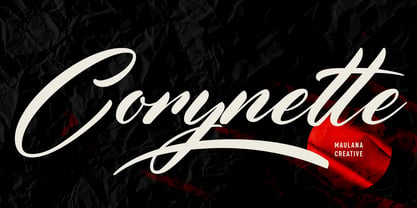 Corynette is a fancy handwritten script font. With medium contrast stroke, fun character with a bit of ligatures and alternates. To give you an extra creative work. Corynette font support multilingual more than 100+ language. This font is good for logo design, Social media, Movie Titles, Books Titles, a short text even a long text letter and good for your secondary text font with sans or serif. Make a stunning work with Corynette font. Cheers, MaulanaCreative
 - Linotype Automat by Linotype,
$29.99Distinguishing characteristics of Frank Marciulano’s Linotype Automat™ are its strictly constructed basis and its uniquely placed stroke contrasts. The emphasized vertical strokes are reminiscent of bars and give text a static feel. The forms of the letters are distinctly modern, an interpretation of a typeface meant for machines. Automat is not recommended for text but is particularly good for headlines in large point sizes, which allow its unusual forms to really stand out. - Linotype BlackWhite by Linotype,
$29.99BlackWhite is a titling typeface created by Ferdinay Duman in 1989 styled after the designs of the late 1980s. Like the name says, the figures emphasizes the play between dark and light. To this end, most inner spaces have been deleted. The constructed outlines of the robust figures draw the attention. In some weights, Duman split the figures horizontally, giving them a unique look. The technical and mechanical BlackWhite is perfect for generous headlines on fliers or in trendy magazines. - Linotype Venezia by Linotype,
$29.99Linotype Venezia Initiale is part of the Take Type Library, selected from the contestants of Linotype’s International Digital Type Design Contests of 1994 and 1997. Designed by German artist Robert Kolben, the font is based on the classic forms of Roman writing in the 1st and 2nd centuries found chiseled on countless buildings and monuments. Linotype Venezia Initiale is a timeless, elegant font particularly well-suited to headlines or as initials in combination with other fonts, working especiall well with sans serif alphabets. - Linotype Traco by Linotype,
$29.99 - Linotype Hieroglyphes by Linotype,
$29.00 - Linotype Scrap by Linotype,
$29.00Linotype Scrap is part of the Take Type Library, chosen from the entries of the Linotype-sponsored International Digital Type Design Contests of 1994 and 1997. The font is available in two weights and was designed by German artist Ingo Preuss. It is as though the forms of the basic weight were cut with scissors out of pieces of paper. There are no inner contours, only the outer silhouettes. The capital letters which make up Scrap Bonus are set on black rectangular backgrounds and are white and framed with a white contour. This weight includes a number of different pictograms which were also not spared the scissors. The decorative Linotype Scrap embodies the comic style of the 1990s and is meant exclusively for headlines of points sizes 18 and larger. - Linotype MMistel by Linotype,
$29.99 - Linotype Traffity by Linotype,
$29.99 - Linotype Modulo by Linotype,
$29.99 - Linotype Tetria by Linotype,
$29.99Tetria was designed by Martin Jagodzinski, who says that the font came from the need for a compact, constructivist typeface. Tetria combines the expression of simplicity of the 'norm' typefaces like DIN Mittelschrift with elements of Old Face typefaces which optimize legibility. It therefore contains old style figures and a larger stroke contrast, which makes the font legible even in smaller point sizes." Sources of inspiration for Tetria were the designs of Joost Schmidt and Herbert Bayer as well as the norm typefaces. The name comes from the Greek word for 'four', tetra. "Four is the number of many simple and useful objects, four wheels on a car, four corners of a book. Also, the basic forms of Tetria come from the simple geometric form of the square." The space-saving Tetria is well-suited to a variety of uses, from corporate typeface to text to display on posters, flyers or onscreen." - Linotype Puritas by Linotype,
$29.99The German designers Gerd Sebastian Jakob and Jörg Ewald Meißner developed the Linotype Puritas family in 1999. The family, which has six text styles as well as a ornament set, displays a very geometric design, which harks back to the German modernist experiments with typography and lettering from the 1920s. The letters in Linotype Puritas Light, Linotype Puritas Medium, and Linotype Puritas Bold all have a slight slant to them. Not to be confused with an italic-grade slant, which may be found in the Light, Medium, and Bold Italic styles, these acute slants add a dynamic quality to text. The Linotype Puritas Ornaments font contains several dingbats and border elements, all drawn in the same line style as the companion letters. The entire Linotype Puritas family is included in the Take Type 4 collection from Linotype GmbH." - Linotype Afrika by Linotype,
$29.99Linotype Afrika, from German type designer Jörg Herz, is part of the TakeType Library, chosen from the entries of the Linotype-sponsored International Digital Type Design Contest 1999 for inclusion on the TakeType 3 CD. Dancing, jumping, and playing, the lively beings of this symbol font exude joy. Ornaments and a few frolicking animals complete the font. Combining the single figures, whether as decoration or border, creates a pattern which will surprise you with its lightness and dynamism. - Linotype Salamander by Linotype,
$29.99Linotype Salamander is a part of the Take Type Library, selected from the contestants of Linotype’s International Digital Type Design Contests of 1994 and 1997. Designed by German artist Michael Struller, the font seems to be composed of strokes and curves jointed together to form characters. Yet Salamander also looks like a handwriting font, in part because of its slight lean to the right. The font contains four basic weights, from regular to demibold, and two particularly heavy double-weights. Linotype Salamander is a light and lively font, particularly good for short texts of point size 10 and up or, in its heavier weights, for headlines and displays. - Linotype Agogo by Linotype,
$40.99Linotype Agogo is part of the Take Type Library, chosen from the contestants of Linotype’s International Digital Type Design Contests of 1994 and 1997. Designed by British artist Ed Bugg, the font is reminiscent of the elegant 1920s and 1930s. It is a calligraphy font with five weights, one regular and four swash. The regular weight alone is clear and legible enough even for longer texts, although when used with swash characters, the texts should be shorter or headlines. - Linotype Method by Linotype,
$29.99 - Linotype MhaiThaipe by Linotype,
$29.99Linotype Mhai Thaipe is part of the Take Type Library, chosen from the entries of the Linotype-sponsored International Digital Type Design Contests of 1994 and 1997. The work of German designer Markus Remscheid, the name is not hard to recognize as an English-Asian play on my type and describes its general character. The small circles which ornament the alphabet and the unusual flowing forms which look like a mixture of Arabic and Sanskrit combine to give the typeface an ornamental, exotic look. Linotype Mhai Thaipe is best used for headlines with point sizes of 12 or larger. - Linotype Aspect by Linotype,
$29.99The letters in the Linotype Aspect Family fonts seem to be experiments in the handcrafting of letters with just a few basic geometric forms. For instance, the bowls of the letters C, D, and G in Linotype Aspect Intro are all made up of narrow half circles. Features like this make Linotype Aspect Intro perfectly suited for headlines and short passages of text. Its quirkiness is sure to lend a smile to the faces of your readers. For shorter headlines with larger point sizes, try setting your text in Linotype Aspect Regular, the second member of the Linotype Aspect family. Linotype Aspect Regular uses the same basic letterforms as Linotype Aspect Intro, but reverses them out in white, and places them over bulbous black shapes. The Linotype Aspect family was developed by German designs Hans-Jürgen Ellenberger in 1999. - Linotype Rowena by Linotype,
$29.99Linotype Rowena is part of the Take Type Library, selected from the contestants of Linotype’s International Digital Type Design Contests of 1994 and 1997. This text font was designed by the Latvian artist Gustavs A. Grinbergs and is available in six weights, from light to black. The font has a light stroke contrast and its basic forms are the circle, rectangle and triangle, making it a constructed face. The impression of the font on the reader is elegant and cool, very like poster fonts of the 1930s. Linotype Rowena is suitable for headlines and shorter texts with point sizes 12 and larger. - Linotype Kaliber by Linotype,
$29.99 - Linotype Brewery by Linotype,
$29.99Linotype Brewery is part of the Take Type Library, chosen from the contestants in the International Digital Type Design Contests of 1994 and 1997. This text font is available in six weights from light to black and was designed by Gustav A. Grinberg. An outstanding characteristic of the font is its light stroke contrast and its constructed forms. Its tiny, triangular serifs first become noticeable in very large typesizes, much like the Dutch fonts of the 17th century, Copperplate, for example. Linotype Brewery is cool and elegant and well-suited to middle-length texts and headlines. - Linotype Belle by Linotype,
$29.99Linotype Belle is a casual script face. Created in 1999 by the Swiss designer Isabelle Stutz, the letters in this design have a light, informal nature, and appear as if they were written out quickly, using a writing instrument similar to a ballpoint pen. Linotype Belle has two fonts to offer: Linotype Belle Plain and Linotype Belle Bonus. Linotype Belle Bonus contains more extravagant, swash-like capitals than Linotype Belle Plain's characters; when used together, these two fonts can create a varied, lively impression. Linotype Belle was a prizewinner in Linotype's Third International Type Design Contest. Additionally, the design is part of the innovative Take Type Library, and can be purchased as part of the Take Type 3.1 CD collection. The typeface works excellently when used to set magazine or newsletter headlines, and as text for greeting cards." - Linotype Dala by Linotype,
$40.99Created by Swedish designer Bo Berndal in 1999, Linotype Dala Text can best be described as a softer, friendlier blackletter. Blackletter refers to typefaces that evolve out of Northern Europe's medieval manuscript tradition. Often called gothic, or Old English, these letters are identified by the traces of the wide-nibbed pen stroke within their forms. Linotype Dala Text most resembles the fraktur type of blackletter. Fraktur types were popular text faces in Northern Europe until the 20th century. Inspired by Swedish folklore, this fraktur is much softer and rounder than most examples. Its connection to the Scandinavian folkloric tradition makes Linotype Dala perfectly suited for such texts as fairy tales, medieval stories, and other things that might appeal to a child's sense of adventure. To strengthen the medieval fairy tale look, use Linotype Dala Text together with other elements of the Linotype Dala family: Library's Linotype Dala Pict and Linotype Dala Border. The characters in these two supplementary fonts were inspired by medieval and renaissance folk art, and were also drawn by Bo Berndal, making them a perfect match. All three styles of the Linotype Dala Family are part of the Take Type 4 collection from Linotype GmbH." - Linotype Submerge by Linotype,
$29.99 - Linotype Zensur by Linotype,
$29.99Linotype Zensur is part of the Take Type Library, chosen from the entries of the Linotype-sponsored International Digital Type Design Contests of 1994 and 1997. This fun font was created by French designer Gérarld Alexandre and contains one weight. The characters look as though parts of each of them were censored or removed, leaving just enough left over to know what was meant. The basic forms of this font are sans serif and the rounded corners give it an almost soft character. Linotype Zensur is a distinctive typeface which is especially good for headlines in larger point sizes. - Linotype Improfil by Linotype,
$29.99 - Linotype Albafire by Linotype,
$29.99With Albafire, Jürgen Ellenberger has played with flames that come out of the exhausts from Michael Schumachers Ferrari, or the hot rod cars in America or at the tractor pulling contests. This gives this sans serif face a speedy and wavy flavour. It fits ideally for speedy headlines like for bikers couriers. - Linotype CreativeArrows by Linotype,
$29.99 - Linotype Festtagsfont by Linotype,
$29.99 - Linotype Centennial by Linotype,
$29.99 Centennial appeared in 1986 in honor of Linotype’s 100th birthday. The roman and light cuts of the font are reminiscent of the Century typeface, particularly on that of Linn B. Benton and Morris F. Benton, designed around the turn of the 19th century for the American Type Founders. Like Century, Centennial too embodies a cool, reserved neutrality.
 - Linotype Bariton by Linotype,
$29.00Linotype Bariton is part of the Take Type Library, chosen from contestants of Linotype’s International Digital Type Design Contests of 1994 and 1997. Designer Alexej Chekoulaev designed his font in one weight to mirror the Zeitgeist of the early 1930s. The characters of this extremely bold font are based on the form of a rectangle though its rounded edges soften its look a bit. Linotype Bariton should be used only in larger point sizes in headlines which should really catch the eye. - Linotype Freytag by Linotype,
$29.99Linotype Freytag is a condensed display face with simple, geometric shapes. With its highly readable and trendy letterforms, it is perfect for flyers, advertising, packaging, posters and magazine headlines. - Linotype GlassFlag by Linotype,
$29.99 - Linotype Mega by Linotype,
$29.00Linotype Mega is part of the Take Type Library, chosen from the entries of the Linotype-sponsored International Digital Type Design Contests of 1994 and 1997. The fun schrift of German designer Till F. Teenck is available in three weights whose names are word plays in themselves. Mega in (which we hope the font will be) contains relatively light, somewhat irregularly-drawn characters which look as though they were printed by hand and the characters are set rather far apart from each other. This weight is good for short and middle length texts in point sizes of 10 and larger. Mega normal is anything but. The characters are the outline forms of Mega in and their larger width reduces the distance between them. This weight is generally a headline font. Mega out is a very heavy weight and is the filled-in version of Mega normal. The characters flow into each other and look almost like silhouettes. The reduced legibility makes this font suitable exclusively for headlines in larger point sizes.
Page 1 of 119Next page