4,868 search results
(0.026 seconds)
- Pinel Pro by URW Type Foundry,
$39.99 The characteristic ‘French face’ was originally made in 1899 under the supervision of Joseph Pinel. Thus, what was originally French 10 pt. Nº 2, got its present name. The Frenchman Joseph Pinel called himself a "typographical engineer", but was at the time employed as a type draughtsman at the Linotype Works in Altrincham. It appears that this and some other faces that he supervised, were, except for use on the Linotype, also meant for manufacturing matrices for the Dyotype. This composing machine was an invention of Pinel. The Dyotype was a rather complicated machine and consisted, like the Monotype, of two separate contraptions, a keyboard which produced a perforated paper ribbon and a casting machine which produced justified lines of movable type. Unlike the Monotype which has a square matrix carrier, the Dyotype had the matrices on a drum (in fact two drums, hence the name of the machine). A Pinel Diotype company was founded in Paris and a machine was built with the help of the printing press manufacturer Jules Derriey. As is often the case, a lack of sufficient capital prevented the commercializing of this ingenious composing machine. Coen Hofmann digitized the font from a batch of very incomplete, damaged and musty drawings, which he dug up in Altrincham. He redrew all characters, bringing up the hairstrokes somewhat in the process. The result is a roman and italic, while the roman font also includes Small Caps
 - Schwennel by Linotype,
$29.00Linotype Schwennel is part of the Take Type Library, selected from the contestants of Linotype’s International Digital Type Design Contests of 1994 and 1997. This prize-winning font was designed by the German artist Svenja Voss. The figures seem to have been somehow eroded, parts of some strokes are completely missing, contours seem washed away. The eye works to put the pieces together to form a meaningful series of figures. The second weight, lila+negro, completes the letter fragments of the lila weight. Missing pieces are filled in and contours completed, making the resulting text stronger and a bit more legible. Linotype Schnwennel is intended exclusively for headlines in larger point sizes. - Aster Script by Fenotype,
$25.00 Aster Script is a modern calligraphy script with high contrast. Aster Script is a hand drawn font and it’s great for any display use from packaging to poster and logotype to headline. Aster Script is equipped with contextual alternates and ligatures that are automatically on. The feature is set under Standard Ligature function. In addition Aster Script has Swash alternates for every standard character. Aster Script has wide language support and special characters are PUA encoded.
 - Cheq by Adobe,
$35.00A set of chessmen and related symbols. Another version from Linotype can be found at Linotype Game Pi. " - Impacta by Linotype,
$29.99Linotype Impacta is part of the Take Type Library, which features the winners of Linotype’s International Digital Type Design Contest from 1994 to 1997. Dutch artist Marc Lubbers designed Impacta with little contrast between strokes, rather, he depended on the slope of the strokes to give his font character. Impacta can be used in small or large point sizes and its constructed forms bring a modern feel to graphic design. - Escript by Linotype,
$29.99Linotype Escript is a part of the Take Type Library, which features winners of Linotype’s International Digital Type Design Contest. Hans-Jürgen Ellenberger designed this handwriting font with fresh, lively forms. Each letter has a slightly different character, yet all fit well together and this lack of concrete rules gives the font a spontaneous feel. Escript is well-suited to headlines, smaller texts, and initials when combined with constructed typefaces. - Indus by Linotype,
$29.99Linotype Indus is part of the Take Type Library, which features winners of Linotype’s International Digital Type Design Contest from 1994 to 1997. Designed by P.H. Hashin from India, Indus finds its historical roots in inscriptions found on ancient Indian graves. Thus Indus has a unique look and is versatile in point sizes from middle to headline. The font combines well with sans serif and slab serif typefaces. - Frenda by Blankids,
$17.00 Introducing a new monoline layered font family called Frenda font. Frenda inspired by 80's music poster, automotive poster, funk music poster. Frenda came with opentype features you can mix and match with as you like and many choices of alternative character. Frenda good for logotype, poster, badge, book cover, tshirt design, packaging and any more.
 - Astronimus by Patria Ari,
$15.00 Astronomus, a cutting-edge sci-fi tech font characterized by its bold box-shaped letters. This modern typeface is meticulously designed, offering a distinctive aesthetic that makes it the ideal choice for various logotype applications. Whether you're in the technology sector, the construction industry, automotive design, or any other heavyweight domain, Astronomus delivers a powerful and futuristic visual impact.
 - Bruno Ace Pro by Stiggy & Sands,
$29.00 Our Bruno Ace Pro draws its inspiration from modern automotive logotypes. This geometric sans-serif has a wide stance with a tall x-height for a strong look and appeal, as well as ease of legibility. The SmallCaps and extensive figure sets offer a more extensive range of use as well as a more intense vibe.
 - Hard Race by Multype Studio,
$16.00 Hard Race is a racing theme font with sharp and consistent angles combined with a hard and strong style. So it looks very fast and powerful. Hard Race it's perfect for logotype racing product, racing game covers, sports events, automotive posters, automotive magazine covers, branding, product design, labels and other creative project. What’s Included : Standard glyphs Works on PC / Mac Simple installations Accessible in the Adobe Illustrator, Adobe Photoshop, Adobe InDesign, even work on Microsoft Word PUA Encoded Characters, Fully accessible without additional design software. Multilingual support Thank you for your purchase! Hope you enjoy with our font!
 - Mercurial by Grype,
$16.00 Geometric/Technical style logotypes have been developed for car chrome labels since the early 1980’s, but automobile companies don't monopolize the style by any means. During the 80’s and 90’s, a lot of these logos leaned towards the geometric sans styles and the swiss styling of fonts like Handel Gothic, while playing with varying degrees of squared rounds and varying expanded widths per logotype. Mercurial has this flavor, but it wasn’t derived from logotypes. Instead, it began as a digitization of a film typeface from LetterGraphics in the early 70's known as "Sam". It visual ties to this genre of automotive logotypes and fonts like Handel Gothic lend a familiarity to it, yet it has an identity all its own. As with so many automotive logotypes, this singular style film typeface, lacked an expansive family which shows off all potential the logotypes have and what they "could" be and do. And that's where we come in. What originally began as this family’s Regular Width - Bold Style has been expanded into a collection of 3 Width Families, each containing 5 Weights. Here’s what’s included with the Mercurial Complete bundle: 396 glyphs per style - including Capitals, Lowercase, Numerals, Punctuation and an extensive character set that covers multilingual support of latin based languages. (see the final poster graphics for a preview of the characters included) 3 widths in the collection: Narrow, Regular, & Wide 5 weights in each width family: Light, Book, Regular, Medium & Bold. Here’s why the Mercurial Family is for you: - You’re in need of stylish sans font family with a range of widths and weights. - You’re love those 80’s automotive logos, but want more range of use. - You’re looking for an alternative to Handel Gothic. - You’re looking for a clean techno typeface for your rave poster designs. - You just like to collect quality fonts to add to your design arsenal.
 - Shelda by Locomotype,
$15.00 Shelda is a modern brush script font made with unique style. It has several beautiful alternative characters that you can use as style choices. Also has OpenType features such as ligatures, stylistic alternates and final swashes to enhance your font combinations. Shelda is suitable for those of you who like casual style. You can add swash automatically under the letters by typing underscores twice to five times. This font can be used for the purposes of branding design, logotype, apparel, fashion, wedding events, packaging etc.
 - Motel Xenia by Fenotype,
$19.95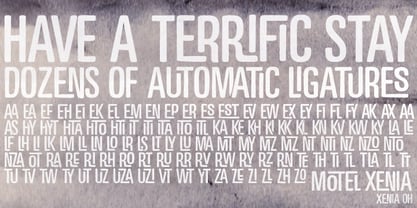 Motel Xenia is an OpenType font with dozens of automatic ligature pairs.
 - Kiosk by Fenotype,
$19.00 Kiosk is a prominent display typeface pair. It is a sturdy condensed sans serif and an eloquent brush script. In addition there are textured “print” versions of them both. Kiosk fonts work as a pair or as themselves. Sans is great for sturdy headlines, menu titles, packaging or any such, the bigger the better. Script is great as a logotype, used for quotes, magazines, packaging and branding. Textured versions are the same fonts with a rugged outline and with a “stamp” texture inside the letters. Kiosk Script is equipped with several OpenType features. It has Contextual Alternates and Standard Ligatures that are automatically help to keep the connections smooth. They’re both automatically on. In addition it has Swash, Stylistic and Titling Alternates and even more alternates for some characters. The font is PUA encoded and you can access alternate characters from OpenType controls or manually from Character or Glyphs window.
 - ReadMyHand by Linotype,
$29.99Linotype Read My Hand is part of the Take Type Library, selected from contestants in Linotype’s International Digital Type Design Contests of 1994 and 1997. It is the digitalized handwriting of its Dutch designer, Leon Hulst. As is common of handwriting fonts, the forms of the letters seem spontaneous and individual. Read My Hand is a dynamic font suitable for texts with point sizes larger than 12 and particularly good for documents which should have a personal touch. - Bring Race by Multype Studio,
$19.00 Bring Race is a font with a race theme. With a strong style, consistent at sharp corners, but it will look good because it maximizes the shape to make it look strong, fast, and powerful. Bring Race it's perfect for logotype racing product, racing game covers, sports events, automotive posters, automotive magazine covers, branding, product design, labels and other creative project. What’s Included : Standard glyphs Works on PC / Mac Simple installations Accessible in the Adobe Illustrator, Adobe Photoshop, Adobe InDesign, even work on Microsoft Word PUA Encoded Characters, Fully accessible without additional design software. Multilingual support Thank you for your purchase! Hope you enjoy with our font!
 - Racing Games by Mevstory Studio,
$20.00 Racing Games is a font with a race theme. With a strong style, consistent at sharp corners, but it will look good because it maximizes the shape to make it look strong, fast, and powerful. Racing Games it's perfect for logotype racing product, racing game covers, sports events, automotive posters, automotive magazine covers, branding, product design, labels and other creative project. What’s Included : Standard glyphs Works on PC / Mac Simple installations Accessible in the Adobe Illustrator, Adobe Photoshop, Adobe InDesign, even work on Microsoft Word PUA Encoded Characters, Fully accessible without additional design software. Multilingual support Thank you for your purchase! Hope you enjoy with our font!
 - LHF Chicago Script by Letterhead Fonts,
$46.00 This Charles Borges' script takes full advantage of the Open Type format with several automatic ligatures that occur as you type for a nicer fit. Plus, the manual stylistic alternates allow you to choose the letters you prefer. Alternates occur automatically as you type in supported programs when you have "Ligatures" or "Stylistic Alternates" turned on. If your program does not support automatic ligatures and substitutions, you may still access the alternates manually using the printable keyguide or using Character Map (Windows) or Font Book (Mac).
 - Sabon by Linotype,
$45.99 In the early 1960s, the German Master Printers’ Association requested that a new typeface be designed and produced in identical form on both Linotype and Monotype machines so that text and technical composition would match. Walter Cunz at Stempel responded by commissioning Jan Tschichold to design a new version of Claude Garamond’s serene and classical Roman. Its bold, and particularly its italic styles are limited by the requirements of Linotype casting machines, forcing the character widths of a given letter to match between styles, giving the italic its characteristic narrow f. The family’s name is taken from Jacques Sabon, who introduced Garamond’s Romans to Frankfurt. Sabon has long been a favorite of typographers for setting book text, due to its smooth texture, and in large part because Tschichold’s book typography remains world famous.
 - Ginger John by Fenotype,
$25.00 Ginger John is a strong and expressive sign painting style brush script family with three weights. Ginger John is equipped with automatic Contextual Alternates and Standard Ligatures that add variety in the flow and keep connections smooth. If that isn’t enough, there’s Swash, Stylististic and Titling Alternates for every standard uppercase and lowercase character. Ginger John Extras is a pack of strokes and swashes that can be used as underlining endings for words. Ginger John is an outstanding display font that works great for any display use, from branding to packaging to logotype.
 - Cookery by Los Andes,
$29.00 Cookery is a contemporary, friendly and authentic hand-drawn brush pen typeface with irregular baseline. It is well-suited to display use for book covers, logotypes, packaging, restaurant menus, invitation cards and advertising, among other uses. Get the most out of Cookery's 613-character set by activating OpenType features including letters having the capability to automatically adjust between connected and disconnected forms, alternates, swashes, initial/terminal forms, old style figures, etc. All these alternatives provide a wide range of possibilities to give your compositions a natural, playful and unique look.
 - New Century Schoolbook LT by Linotype,
$29.99Under the commission of the American Century Magazine"", Linn Boyd Benton designed a new text typeface in 1894 with a design typical of the Neorenaissance movement in typography. Morris Fuller Benton produced various interpretations of this font for American Typefounders and the companies Linotype, Intertype and Monotype quickly took up the typeface. New Century Schoolbook font is a very legible font, fairly narrow and with relatively little stroke contrast. This font is from Morris F. Benton and appeared in 1915. - Matthia by Linotype,
$29.99Linotype Matthia is part of the Take Type Library, which features the winners of Linotype’s International Digital Type Design Contest from 1994 to 1997. Dieter Kurz designed Matthia as a slender, flowing brush font. Its characters are in a handwritten style yet stand almost straight, making Matthia a mixture of reserved and lively, of static and dynamic. The font is reminiscent of advertisement typefaces popular in the 1950s and extremely versatile, suitable for short texts in small point size or headlines on posters. - Balder by Linotype,
$29.99Linotype Balder is a part of the Take Type Library, winners of Linotype’s International Digital Type Design Contest. Designed by Lutz Baar, Balder is reminiscent of advertisement and poster typefaces of the 1950s and 1960s. It is composed of only capital letters, making it perfect for initials and headlines. Balder looks as though it were written with a broad tipped pen. Its light serifs at the tops of the characters and the slant of some of the strokes give Balder a dynamic feel. - Grafilone by Linotype,
$29.99Linotype Grafilone is part of the Take Type Library, which features winners of Linotype’s International Digital Type Design Contest. In creating his font, Bo Berndal combined elements of the constructed and Art Deco styles. Slender and angular, Grafilone is mechanically exact and coolly resesrved. A distinguishing characteristic is the combination of angular and sloping strokes, which give the font a dynamic feel. Grafilone is particular good as a headline font and for initials when combined with constructed sans serif fonts. - Delphin No2 by URW Type Foundry,
$35.99 Delphin is a calligraphic font with upright capitals and slightly inclined lowercase. Delphins ascenders are tall and a number of letters have tails which descend below the baseline. Delphin is a useful face in advertising for short texts and display. Delphin is a trademark of Linotype Corp. and may be registered in certain jurisdictions in the name of Linotype Corp. or its licensee Linotype GmbH.
 - Facsimile by Linotype,
$29.99Linotype Facsimile is part of the Take Type Library, which features the winners of Linotype’s International Digital Type Design Contest. Designed by J. Luigs and S. Wicker, the forms were constructed for electronic readers, just as the OCR fonts were. The increasing use of computers accompanied the growing number of fonts suitable for electronic reading. The standard has long been set, but designers are always creating new interpretations and new symbols. Typefaces like Facsimile are here to stay and personify the Zeitgeist of the late 20th century. - Contacta by Linotype,
$29.00Linotype Contacta is part of the Take Type Library, which features winners of Linotype’s International Digital Type Design Contest. Ralf Weissmantel designed this font to display no stroke contrast at all. Instead of using conventional letter forms, Contacta is a more designed-oriented font, with some characters recognizable only in context, not necessarily at first glance. The technical, unconventional forms look almost like a maze, especially when set together. This font is not suitable for text but makes a unique impression in logos and headlines. - Boberia by Linotype,
$29.99Linotype Boberia is part of the Take Type Library, which features winners of Linotype’s International Digital Type Design Contest. Designed by Bo Berndal, its historical roots lie in the neoclassicism of the turn of the 20th century. The slender letters with a large x-height and marked stroke contrast give the font an elegant character. The nostalgic, flowing forms are typical of Art Deco fonts and allow designers a number of possibilities for the font’s use. Boberia includes regular, italic and bold type styles. - HoTom by Linotype,
$29.99Linotype Ho Tom is part of the Take Type Library, which features winners of Linotype’s International Digital Type Design Contest from 1994 to 1997. Designed by Thomas Hoffman, this font’s historical roots are easily traced to the slab serif style. Ho Tom was originally intended as a lettering system for a project in the center of the old East Berlin. This explains the stable, angular characters and the consistent rectangular base forms, which also makes Ho Tom a very legible font, suitable for longer texts. - The "Etaoin Shrdlu" font, crafted by the designer known as SpideRaY, is a compelling tribute to the history and legacy of typographic design and typesetting. The name itself, "Etaoin Shrdlu," origina...
- Bouncer by Fenotype,
$9.95 Bouncer is an all-caps font family with automatic interlocks. With soft and rounded look and over 150 automatic ligatures and three weights Bouncer is a flexible and easy to use font. It's very suitable for anything from a Jazz poster to a restaurant menu. To access the ligatures you only need to write in CAPS in any OpenType-supporting application.
 - Monticello by Linotype,
$40.99 Linotype Monticello was designed by C.H. Griffith in 1946. Its design is based on James Ronaldsons Roman No.1 and Oxford Typefaces from American Type Founders and was revised by Matthew Carter while he was working at Linotype between 1965 -1981.
 - Finnegan by Linotype,
$40.99German designer Jürgen Weltin designed Linotype Finnegan, a modern text design with roots in the humanist letterforms of the Renaissance. As the recognizable direction of movement in writing runs from upper left to lower right, Weltin mimicked this in his design: Linotype Finnegan's up and down strokes end in residual serifs. All of the thick strokes have a taper; horizontal strokes and curves are noticeably thinner than the verticals. This dynamic nature lends a combination of individualness and energy, along with a high degree of variety, to Linotype Finnegan. Linotype Finnegan is a wholly new and unique typeface. It distinguishes itself through its extreme legibility, originality, and formal excellence. Linotype Finnegan makes fun to read longer texts non-stop. However, the typeface never distracts the attention from the text's content by forcing itself too much into the foreground. - Titular by Latinotype,
$26.00 Titular is a condensed Sans Serif typeface that works well with headings, subheadings, newspapers, magazines as well as with logotypes, brands and posters. This typeface revives the spirit of old Woodtypes, but adding a contemporary flavour and Latin American seasoning. The family comes with 2 subfamilies: one regular and one alternative. Just like many of our faces, every subfamily includes 7 weights plus italics. Titular is a Latinotype’s typeface designed by Bruno Jara, and produced and supervised by Latinotype Team. Latinotype Team comprises: Luciano Vergara, Daniel Hernández, Bruno Jara, César Araya and Rodrigo Fuenzalida.
 - Humanist 970 by Bitstream,
$29.99Bitstream's version of Adsans originally released by Linotype & Machinery. - Imperial by Bitstream,
$29.99Ed Shaar’s Intertype alternative to the Linotype legibility group. - Knofedt by PizzaDude.dk,
$15.00 Comicbook letters with a laid back slightly wobbly look! 4 different lowercase letters, which automatically cycle as you type! Wow!
 - CG Gothic by Monotype,
$29.99This is a family of "Gothic" types from the Monotype Design Studio. The faces named "Gothic No. 1 through 4" were produced by Compugraphic. Gothic No. 1 is a condensed, late 19th century American-style sans serif typeface. Gothic No. 2 and Gothic No. 3 are based on the Metro #2 series, designed by W.A. Dwiggins for Mergenthaler Linotype during the 1920s and 30s. Gothic No. 4 looks vaguely like Gothic number one, but is heavier and smaller on the body. Gothic Extra Light Extended is a very light and wide design.