10,000 search results
(0.034 seconds)
- Ohitashi by Typodermic,
$11.95 Attention all design enthusiasts! Are you tired of the same dull typefaces dominating the design world? Look no further than Ohitashi, the daring and unconventional creation by Typodermic principal Raymond Larabie. In a world where twentieth-century sans-serif typefaces reign supreme, Ohitashi breaks the mold and blazes its own trail. Larabie has masterfully infused this typeface with a unique blend of humanistic stroke contrast, spontaneous licks and curls, and incised detail, resulting in a one-of-a-kind design that defies convention. But don’t let the unconventional nature of Ohitashi fool you. This typeface offers a practical range of three weights—standard, semi-bold, and bold—making it an incredibly versatile option for any design project. Whether you’re looking to add a touch of personality to a marketing campaign, or looking to revamp your brand identity with something fresh and new, Ohitashi has got you covered. So why settle for the same boring old typefaces when you can break free from the rut favored by reductive competitors? Embrace the unconventional with Ohitashi and see your designs come to life like never before. Trust us, your audience will thank you. Most Latin-based European writing systems are supported, including the following languages. Afaan Oromo, Afar, Afrikaans, Albanian, Alsatian, Aromanian, Aymara, Bashkir (Latin), Basque, Belarusian (Latin), Bemba, Bikol, Bosnian, Breton, Cape Verdean, Creole, Catalan, Cebuano, Chamorro, Chavacano, Chichewa, Crimean Tatar (Latin), Croatian, Czech, Danish, Dawan, Dholuo, Dutch, English, Estonian, Faroese, Fijian, Filipino, Finnish, French, Frisian, Friulian, Gagauz (Latin), Galician, Ganda, Genoese, German, Greenlandic, Guadeloupean Creole, Haitian Creole, Hawaiian, Hiligaynon, Hungarian, Icelandic, Ilocano, Indonesian, Irish, Italian, Jamaican, Kaqchikel, Karakalpak (Latin), Kashubian, Kikongo, Kinyarwanda, Kirundi, Kurdish (Latin), Latvian, Lithuanian, Lombard, Low Saxon, Luxembourgish, Maasai, Makhuwa, Malay, Maltese, Māori, Moldovan, Montenegrin, Ndebele, Neapolitan, Norwegian, Novial, Occitan, Ossetian (Latin), Papiamento, Piedmontese, Polish, Portuguese, Quechua, Rarotongan, Romanian, Romansh, Sami, Sango, Saramaccan, Sardinian, Scottish Gaelic, Serbian (Latin), Shona, Sicilian, Silesian, Slovak, Slovenian, Somali, Sorbian, Sotho, Spanish, Swahili, Swazi, Swedish, Tagalog, Tahitian, Tetum, Tongan, Tshiluba, Tsonga, Tswana, Tumbuka, Turkish, Turkmen (Latin), Tuvaluan, Uzbek (Latin), Venetian, Vepsian, Võro, Walloon, Waray-Waray, Wayuu, Welsh, Wolof, Xhosa, Yapese, Zapotec Zulu and Zuni.
 - MVB Verdigris Pro by MVB,
$79.00 Garalde: the word itself sounds antique and arcane to anyone who isn’t fresh out of design school, but the sort of typeface it describes is actually quite familiar to all of us. Despite its age—born fairly early in printing’s history—the style has fared well; Garaldes are still the typefaces of choice for books and other long reading. And so we continue to see text set in old favorites—Garamond, Sabon®, and their Venetian predecessor, Bembo®. Yet many new books don’t feel as handsome and readable as older books printed in the original, metal type. The problem is that digital type revivals are typically facsimiles of their metal predecessors, merely duplicating the letterforms rather than capturing the impression—both physical and emotional—that the typefaces once left on the page. MVB Verdigris is a Garalde text face for the digital age. Inspired by the work of 16th-century punchcutters Robert Granjon (roman) and Pierre Haultin (italic), Verdigris celebrates tradition but is not beholden to it. Created specifically to deliver good typographic color as text, Mark van Bronkhorst’s design meets the needs of today’s designer using today’s paper and press. And now, as a full-featured OpenType release, it’s optimized for the latest typesetting technologies too. With MVB Verdigris Pro Text, Van Bronkhorst has revisited the family, adding small caps to all weights and styles, extensive language support, and other typographic refinements. Among the features: • Support for most Latin-based languages, including those of Central and Eastern Europe. • Precision spacing and kerning by type editor Linnea Lundquist. The fonts practically set beautiful text by themselves. • Proportional and tabular figure sets, each with oldstyle and lining forms with currency symbols to match. • Ligatures to maintain even spacing while accommodating Verdigris’ elegant, sweeping glyphs. • Numerators and denominators for automatic fractions of any denomination. • Useful, straightforward dingbats including arrows, checkboxes, and square and round bullets in three sizes. • Alternative ‘zero’ and ‘one’ oldstyle figures for those who prefer more contemporary versions over the traditional forms. • An alternative uppercase Q with a more reserved tail. • An optional, roman “Caps” font providing mid-caps, useful for titling settings, and for those situations when caps seem too big and small caps seem too small. __________ Sabon is a trademark of Linotype Corp. Bembo is a trademark of the Monotype Corporation.
 - Oo-la-la by Emboss,
$26.95 Inspired by old French poster art. This typeface was cut from an old rubylith.
 - Tazugane Gothic by Monotype,
$187.99 The Tazugane Gothic typeface family is the first original Japanese typeface created by Monotype. Designed by Akira Kobayashi, Kazuhiro Yamada and Ryota Doi of the Monotype Studio, the Tazugane Gothic typeface offers ten weights and was developed to complement the classic Latin typeface, Neue Frutiger. The design of the Tazugane Gothic typeface balances an original, humanistic style with elements of traditional Japanese handwriting. The two typefaces work together in a natural, seamless and adaptable manner so that Japanese and Latin texts can be used side-by-side for a wide range of applications, including in magazines, books and other print media; on digital devices; in branding and corporate identity systems; and in signage for buildings, highways and mass transit. Tazugane Gothic was updated to support the “Reiwa” new era symbol. Reiwa can be written as two kanji: 令和. This update to Tazugane Gothic includes Reiwa designed as a single ligature and is encoded as U+32FF. The inspiration for the Tazugane Gothic typeface is as elegant as its design. Since antiquity, cranes have been regarded in East Asia as auspicious birds for their noble appearance and elegance in flight. The typeface is named Tazugane Gothic in honor of the longevity of the crane, with the goal that it will be used for many years to come. The combination of the Tazugane Gothic typefaces’ traditional and humanistic elements, along with its intended ability to complement popular Latin typefaces, makes it one of the most uniquely flexible designs for applications where Japanese and Latin texts can be used together. The typeface family was created to have wide appeal, with a pleasing and consistent experience for readers, for use on screen, in print, in signage, packaging and advertising. Tazugane Gothic has 10 weights. The Light, Book, Regular, Medium and Bold weights are considered best for text sizes. The Ultra Light, Thin, Heavy, Black and Extra Black weights are recommended for headline sizes.
 - Sunblock Pro by Grype,
$19.00 Clean and geometric deco sans typefaces have been used in a range of scientific publications, corporate logotypes, and beauty products over the years. However, a typeface of this style has yet to have an expansive range of widths and weights to become a design workhorse, until now. The Sunblock family finds its origin of inspiration in the Coppertone sunscreen company logo, and from there expands to type megafamily. Sunblock celebrates the rounded geometric forms of deco and bauhaus lettering through a compressed lens, transcending its brand inspired origin to give birth to a font family that pulls on modern and historical styles. It inherited its soothing tone from the limited character logotype that inspired it, and goes on to include a lowercase, small caps, and a comprehensive range of widths and weights, creating a straightforward, uncompromising collection of typefaces that lend a solid foundation and a broad range of expression for designers. Here's what's included with the Sunblock Collection bundle: 643 glyphs per style - including Capitals, Lowercase, Numerals, Punctuation and an extensive character set that covers multilingual support of latin based languages. (see the 7th graphic for a preview of the characters included) 21 fonts in 5 width subfamilies: Ultra Condensed, Extra Condensed, Condensed, Semi Condensed, & Standard. 5 weights per subfamily (except Ultra Condensed): Thin, Light, Regular, Bold, & Black. Fonts are provided in both TTF & OTF formats. The TTF format is the standard go to for most users, although the OTF and TTF function exactly the same. Here's why the Sunblock Collection is for you: You're in need of a deco geometric font family with a big range of weights and widths You're love that Coppertone letter styling, and want to design anything within that genre You're looking for an alternative to Chalet Comprime with a more versatile range of styles You're looking to start up your own derivative Sunscreen product line You just like to collect quality fonts to add to your design arsenal
 - Robur by Canada Type,
$24.95 It shouldn't be a surprise to anyone that these letter shapes are familiar. They have the unmistakable color and weight of Cooper Black, Oswald Cooper's most famous typeface from 1921. What should be a surprise is that these letters are actually from George Auriol's Robur Noir (or Robur Black), published in France circa 1909 by the Peignot foundry as a bolder, solid counterpart to its popular Auriol typeface (1901). This face precedes Cooper Black by a dozen of years and a whole Great War. Cooper Black has always been a bit of a strange typographical apparition to anyone who tried to explain its original purpose, instant popularity in the 1920s, and major revival in the late 1960s. BB&S and Oswald Cooper PR aside, it is quite evident that the majority of Cooper Black's forms did not evolve from Cooper Old Style, as its originators claimed. And the claim that it collected various Art Nouveau elements is of course too ambiguous to be questioned. But when compared with Robur Noir, the "elements" in question can hardly be debated. The chronology of this "machine age" ad face in metal is amusing and stands as somewhat of a general index of post-Great War global industrial competition: - 1901: Peignot releases Auriol, based on the handwriting of George Auriol (the "quintessential Art Nouveau designer," according to Steven Heller and Louise Fili), and it becomes very popular. - 1909-1912: Peignot releases the Robur family of faces. The eight styles released are Robur Noir and its italic, a condensed version called Robur Noir Allongée (Elongated) and its italic, an outline version called Clair De Lune and its condensed/elongated, a lined/striped version called Robur Tigre, and its condensed/elongated counterpart. - 1914 to 1918: World War One uses up economies on both sides of the Atlantic, claims Georges Peignot with a bullet to the forehead, and non-war industry stalls for 4 years. - 1921: BB&S releases Cooper Black with a lot of hype to hungry publishing, manufacturing and advertising industries. - 1924: Robert Middleton releases Ludlow Black. - 1924: The Stevens Shanks foundry, the British successor to the Figgins legacy, releases its own exact copies of Robur Noir and Robur Noir Allongée, alongside a lined version called Royal Lining. - 1925: Oswald Cooper releases his Cooper Black Condensed, with similar math to Robur Noir Allongée (20% reduction in width and vectical stroke). - 1925: Monotype releases Frederick Goudy's Goudy Heavy, an "answer to Cooper Black". Type historians gravely note it as the "teacher steals from his student" scandal. Goudy Heavy Condensed follows a few years later. - 1928: Linotype releases Chauncey Griffith's Pabst Extra Bold. The condensed counterpart is released in 1931. When type production technologies changed and it was time to retool the old faces for the Typositor age, Cooper Black was a frontrunning candidate, while Robur Noir was all but erased from history. This was mostly due to its commercial revival by flourishing and media-driven music and advertising industries. By the late 1960s variations and spinoffs of Cooper Black were in every typesetting catalog. In the early- to mid-1970s, VGC, wanting to capitalize on the Art Nouveau onslaught, published an uncredited exact copy of Robur Black under the name Skylark. But that also went with the dust of history and PR when digital tech came around, and Cooper Black was once again a prime retooling candidate. The "old fellows stole all of our best ideas" indeed. So almost a hundred years after its initial fizz, Robur is here in digital form, to reclaim its rightful position as the inspiration for, and the best alternative to, Cooper Black. Given that its forms date back to the turn of the century, a time when foundry output had a closer relationship to calligraphic and humanist craft, its shapes are truer to brush strokes and much more idiosyncratic than Cooper Black in their totality's construct. Robur and Robur Italic come in all popular font formats. Language support includes Western, Central and Eastern European character sets, as well as Baltic, Esperanto, Maltese, Turkish, and Celtic/Welsh languages. A range of complementary f-ligatures and a few alternates letters are included within the fonts.
 - Riggle is a font that dances across the page with a playful yet robust energy. Imagine each letter crafted not merely to form words, but to invoke a feeling of joy and creativity. Its design leans in...
- Christmas Snowflake by Stefani Letter,
$12.00 Christmas Snowflake is a friendly, fresh, rich, and beautiful handwritten font. It is ideal for holiday-themed greeting cards, invitations, logotype, branding, stationery, poster, and any project that requires a beautiful touch. Fall in love with its incredibly distinct and timeless style and use it to create spectacular designs! This font is PUA encoded which means you can access all of the glyphs.
 - Blackfire by Fype Co,
$13.00 Blackfire is a classic sans serif font that features beautiful alternates and ligatures, with regular and rounded edges in favor of a smooth and clean look. Blackfire features beautiful alternates and ligatures, allowing you to experiment with and create a multitude of stunning results. You can also use Blackfire for design projects like logotype, poster, promotional design, header, and many more.
 - Aiger by HansCo,
$15.00 Aiger is a slab type font with rounded characters on each side. Use this display slab font to add that special retro vintage touch to any design idea you can think of! Very suitable for logotype, Stickers, Packaging design, Cricut Project, headlines, brand identity, t shirt or apparel industry, posters, magazines, books, YouTube, Instagram, websites, or any of your creative design projects. Enjoy!
 - Kaindra by Sipanji21,
$15.00 Kaindra is a Theme display font that has a Japanese Ninja Looks. Kaindra is a good font to use for various graphic designs, such as poster titles, banners, advertisements, logotypes, and is good for combining various types of icons. This font is also good for packaging, crafting, children's and adult clothing. apply this font for your various designs to make it more powerful
 - Aquascape by Goodigital13,
$20.00 It will make your design project more beautiful. The font is suitable for any design like branding, fashion, print template, quotes, wedding and etc. Perfect to use for Logotype, Letterhead, Poster, Apparel Design, Label and etc. perfect for cards, prints, logos, invitations, arrange illustration and decoration. It has upper and lower case letters, numbers, special characters, accents. Perfect for Children!
 - Balian by Alit Design,
$24.00 The BALIAN font is inspired by Balinese style carvings, because it is made in Bali and the Balinese also make it. The unique and beautiful engraving forms create a display font with character. The Balian font is perfect for classic and unique themed designs, besides that this font is perfect for t-shirt designs, poster titles, text headers or logotype designs.
 - Kuranji by Mevstory Studio,
$20.00 Kuranji, a brand new display font. It’s quirky letterforms make this font perfect for branding, headlines, logotype, stickers, editorial design, and more. Features : Regular Italic We highly recommend using a program that supports OpenType features and Glyphs panels like many of Adobe apps and Corel Draw, so you can see and access all Glyph variations. Contact us if you need something! Happy Designing!
 - Blue On Blue by Gerald Gallo,
$20.00 Blue On Blue is a display font not intended for text use. It was designed specifically for display, headline, logotype, branding, and similar applications. Blue On Blue has an uppercase alphabet, numbers, and punctuation. For convenience, the uppercase alphabet is repeated under the lowercase keys. Only the portions of the characters that are outlined by the 3D-simulated depth are visible.
 - Arial by Monotype,
$45.99 Arial is one of the most widely used designs of the last 30 years. Drawn in 1982 by Robin Nicholas and Patricia Saunders for use in an early IBM® laser printer, Arial has become a staple for textual content. While it is widely believed that Arial's design was based on Helvetica, it is more accurate to consider Monotype Grotesque as its ancestor.
 - Sleepless by Gassstype,
$27.00 Introducing of our new product Sleepless is a hand drawn Horror Brush font and dramatic movement. This font is great for your next creative project such as logos, printed quotes, invitations, cards, product packaging, headers, Logotype, Letterhead, Poster, Label, and etc. Best for project that need horror vibes , horror poster, childrenbook, cartoon, comic . You can activate Ligature OpenType panel design more interesting.
 - Vince by Sign Studio,
$15.00 Vince was created to be a display font. Each side of the character is carefully crafted so that this font has a premium quality. The curve that has an extrema point will be kept geometric and smooth. Ligatures and Stylistic Alternate work well to provide design variations. Versatile for building branding, invitations, logotypes, magazine headings and posters. Supporting font in preview : Hexi
 - Tilda Script by Roman Polishchuk,
$25.00 Tilda Script Family is a clean and lining script with regular and non-connect versions in four weights. With this family you can craft solid logotypes with a unique look, set posters and ads, and even run longer lines of copy on packaging. Tilda Script is a versatile family with extensive language support and advanced typographic features including:Ligatures, Stylistic Alternates, Stylistic Sets.
 - Restless Heart by Bhubbiberry Studio,
$16.00 Restless Heart is serif font features a mixed modern-classic design inspired by the Art Nouveau era. Restless Heart support multilingual languages, numbers, punctuation and alternative-ligatures. Create gorgeous & beautiful logotype, use it as an elegant solution for your next magazine layout, or choose Restless Heart for any graphics that require a catchy look with a elegant flair. Warm regards.
 - Eastgood by Wacaksara co,
$12.00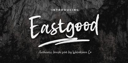 Eastgood Font is a hand brush script font and dramatic movement. This font is great for your next creative project such as Logotype, printed quotes, invitations, cards, product packaging, headers, Letterhead, Poster, Apparel Design, Label, and etc. Eastgood comes with uppercase, lowercase, numerals, punctuations and so many variations on each character include OpenType alternates, and common ligatures to let you customize your designs.
 - Christmas Soul by Stefani Letter,
$12.00 Christmas Soul is a friendly, fresh, rich, and beautiful handwritten font. It is ideal for holiday-themed greeting cards, invitations, logotype, branding, stationery, poster, and any project that requires a beautiful touch. Fall in love with its incredibly distinct and timeless style and use it to create spectacular designs! This font is PUA encoded which means you can access all of the glyphs.
 - Tabela by aspect type,
$25.00 Tabela is a family of typefaces inspired by the aesthetics of monospaced fonts. Its design, based on the monospaced font, preserves its characteristic elements. Perfect for headlines, titles and logotypes, it also has an alternative, more neutral stylistic variant for projects that do not require such distinctive lettering. Its wide array of diacritics allows it to be used in most European languages.
 - Flowess by Gassstype,
$29.00 Hello Everyone, introduce our new product Font Flowess This Is Brush Font.This is a Textured Natural Style and classy style with a clear style and dramatic movement. This font Flowess is great for your next creative project such as logos, printed quotes, invitations, cards, product packaging, headers, Logotype, Letterhead, Poster. You can activate 23 Ligatures and 34 Alternate glyphs OpenType panel.
 - Macrosty by Putracetol,
$19.00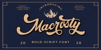 Macrosty is a vintage script font. The classic feel is really perfect for you who needs a typeface for retro / vintage theme. This font is comes in uppercase, lowercase, punctuations, symbols & numerals, alternate, etc. Also support multilingual and already PUA encoded. Macrosty is perfect for logotype, apparel, invitation, magazines, branding, packaging, advertising, fashion, make up, stationery, novels, labels or anything.
 - Shootout by Arendxstudio,
$14.00 Shootout - Street Typeface with sharp and beautiful letters that create fonts that are modern, trendy and elegant. Came with opentype features such stylistic alternates, stylistic sets & ligatures good for logotype, poster, badge, book cover, tshirt design, packaging and any more. Features : • Character Set A-Z • Numerals & Punctuations (OpenType Standard) • Accents (Multilingual characters) • Ligature • Alternate There it is! I really hope you enjoy it
 - Moonsilver by HIRO.std,
$16.00 MOONSILVER is a Display font. This font describes about taft, funny, square, brave, vintage, retro FEATURES - Support Opentype Features - Uppercase - Numbering and Punctuations - PUA Encoded Characters - Multilingual Support - Works on PC or Mac USE MOONSILVER works great in any branding, logotype, magazines, poster, social media posts, clothing, advertisements, film title and any projects that need funny, strong, retro and vintage taste.
 - Bloxhall by Ana's Fonts,
$16.00 Bloxhall is a sans serif display font with an art deco inspired style. This font family includes outline, faded and layered versions, with an extra offset variation to make layering super easy. Bloxhall's different variations and solid retro look, make it a perfect set for poster design, logotypes & branding, editorial design, titles, short phrases & slogans. Your creativity is the limit!
 - Pristine Light by Gerald Gallo,
$20.00 Some words from the foundry: The Pristine Light fonts are clean and crisp, sans serif, uppercase only. They were designed specifically for those applications where uppercase text is appropriate, such as display, headline, logotype, branding, and similar applications. There are numbers, punctuation, accented characters, symbols, and miscellaneous characters. For convenience the uppercase alphabet is repeated under their respective lowercase keys.
 - Ephemera Fascia by Ephemera Fonts,
$20.00 Ephemera Fascia is a typeface inspired from facade sign of historical building. 5 layer styles available from outline, inset, base, shadow 01, shadow 02. Opentype features support such as Stylistic set 01, Stylistic set 02, Stylistic set 03, and Discretionary Ligature. This typeface was created for Display needs, such as headlines, menu board, signage, logotype, badges design, packaging, etc. Caps only fonts.
 - Gio by Fenotype,
$20.00 Gio is a wedge serif with robust geometric features and subtle details. Available in two widths and seven styles each, Gio boasts a generous x-height and straight endings, maintaining generally consistent proportions. This creates an elegant ensemble, ideal for captivating display purposes. Gio excels in magazine layouts, headlines, as a logotype, or in any display use, imparting a sophisticated modern feel.
 - Brightlast by FallenGraphic,
$17.00 Introducing Brightlast Brightlast font under inspiration of vintage bar signage, hotel signage, barbershop signage ect. Brightlast has a classic impression but still elegant suitable for modern and classic designs project. Brightlast are perfect for badge, label, tshirt design, branding, logotype, poster, book cover, packaging and more. FEATURES : Character Set A-Z Numberal Accents (Multilingual characters) PUA encode Alternates Ligature MULTiLINGUAL ACCENT žŠŒšŸÀÁÂÃÄÅÆÇÈÉÊËÌÍÎÏÐÑÒÓÔÕÖØÙÚÛÜÝßàáâãäåæçèéêëìíîïðñòóôõöøùúûüýÿ
 - Segina by Creativemedialab,
$22.00 Segina combines a high-contrast serif with a modern psychedelic font that is slightly wavy unique, and attractive. Segina consists of two Regular and Display options, each containing six weights from thin to Black. And also variable format with two axes, weight, and optical size. Segina has alternative characters that can be combined to create a beautiful heading, title or logotype.
 - Chantila by Tropical Sunlight Co.,
$20.00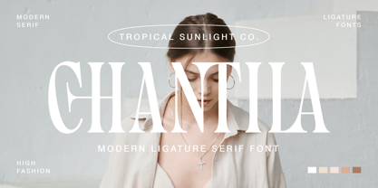 Chantila - Modern Serif Font The font is called "Chantila", it is modern serif with fashionable themes. The font comes with many beautiful ligature features. This collection matches apply in some designs such as the logotype, quotes, wedding invitation, business card, packaging, branding, and more custom design. Chantila font includes : Uppercase, lowercase, numeral, symbol and punctuation Alternate and Ligature Multilingual PUA Encoded
 - Rockets Battle by Rochart,
$10.00 Rockets Battle is my hand drawn brush font, and makes with original brush paint, by using high resolution brush stroke images with incredible definition. Its look natural. It will be great for Logotypes, Posters, Digital Lettering Arts, Clean Design, Branding Design, Sign, Merchandise and Social Media Posts. This font contain of Uppercase, Lowercase, Number, Symbol, Punctuation, also support multilingual and already PUA encoded.
 - Aldin by Open Window,
$- Aldin is a stylish and modern typeface based on geometric forms. It is best suited for headlines and subheads but can also work in short paragraphs. Its character makes it a good choice for magazines, advertisements, packaging or logotypes for the fashion or tech industries—particularly the thinner weights. Thicker weights also allow the option for more contrast among elements.
 - Green On Green by Gerald Gallo,
$20.00 Green On Green is a display font not intended for text use. It was designed specifically for display, headline, logotype, branding, and similar applications. Green On Green has an uppercase alphabet, numbers, and punctuation. For convenience, the uppercase alphabet is repeated under the lowercase keys. Only the portions of the characters that are outlined by the 3D-simulated depth are visible.
 - Onitsha by Arendxstudio,
$14.00 Introducing a new font called Onitsha - Handwritten Font inspired by urban fonts with sharp and beautiful letters that create fonts that are modern, trendy and elegant. Onitsha came with opentype features such stylistic alternates, stylistic sets & ligatures good for logotype, poster, badge, book cover, tshirt design, packaging and any more. Features : • Character Set A-Z • Numerals & Punctuations (OpenType Standard) • Accents (Multilingual characters) • Ligature
 - Carrinady by madeDeduk,
$14.00 I'm really excited to introduce Carrinady. Carrinady is a modern logotype font style, suitable to create any branding, product packaging, invitation, quotes, t-shirt, label, poster, logo etc. Features: - UPPERCASE - lowercase - Number & Symbol - International Glyphs - Symbol If you need anything else just shoot me an email at: dedukvic@gmail.com Find more previews on my Instagram here : https://www.instagram.com/acekelgondolayu/?hl=en
 - Sensor by Tour De Force,
$25.00 Square "robocap" typeface containing some little bit of experimental letters such as "t" or "f". Designed by Dusan Jelesijevic who wanted to make a font that would look heavy as building construction printed on your shirts. Even if it looks strong and stable, it is surprisingly very readable at small sizes which make it perfect for titles, posters or logotypes.