2,907 search results
(0.042 seconds)
- PF Libera Pro by Parachute,
$79.00 PF Libera was designed at a time of leisure with no particular intention for commercial use. In fact it was offered in the beginning as a freeware. In 2001, designer Charis Tsevis was convinced that it may have some commercial value, so Parachute obtained the rights to sell this typeface. At that time, we did not even imagine what would follow. Since then, PF Libera is one of our most successful typefaces. We have seen it being used in very diverse applications. From publishing to advertising to banking, to transportation, to retail applications. Food, beverages, fashion, automobiles, tourism, the list goes on and on. In any way, this typeface is very personal, modern and provocative. It stays with you and definitely it brings along the message. PF Libera comes in 3 styles. One of them, 'Liberissima', was added later and is more loose than the other two. The new 'Pro' version is powered with 7 OpenType features and is carefully designed to include all languages that are based on Latin, Greek and Cyrillic.
 - MC Sattel Hintar by Maulana Creative,
$14.00 Sattel Hintar Brush Script Font Sattel Hintar is a brush script font. With rough brush stroke, fun character with a bit of ligatures and has a two files lowercase alternates. To give you an extra creative work. Sattel Hintar font support multilingual more than 100+ language. This font is good for logo design, Social media, Movie Titles, Books Titles, a short text even a long text letter and good for your secondary text font with sans or serif. Make a stunning work with Sattel Hintar font. Cheers, MaulanaCreative
 - Bernhard Antique SB by Scangraphic Digital Type Collection,
$26.00Since the release of these fonts most typefaces in the Scangraphic Type Collection appear in two versions. One is designed specifically for headline typesetting (SH: Scangraphic Headline Types) and one specifically for text typesetting (SB Scangraphic Bodytypes). The most obvious differentiation can be found in the spacing. That of the Bodytypes is adjusted for readability. That of the Headline Types is decidedly more narrow in order to do justice to the requirements of headline typesetting. The kerning tables, as well, have been individualized for each of these type varieties. In addition to the adjustment of spacing, there are also adjustments in the design. For the Bodytypes, fine spaces were created which prevented the smear effect on acute angles in small typesizes. For a number of Bodytypes, hairlines and serifs were thickened or the whole typeface was adjusted to meet the optical requirements for setting type in small sizes. For the German lower-case diacritical marks, all Headline Types complements contain alternative integrated accents which allow the compact setting of lower-case headlines. - Antique Unique JNL by Jeff Levine,
$29.00 A page from an 1880s type specimen book presented a unique "Barnum"-like design with top horizontal lines much thinner than the bottom ones. Titled "Ten Line Antique Compressed No. 7", the design transcends the years; for it's not only an antique wood type font, but is also reminiscent of the 1960s hippie counterculture movement. Antique Unique JNL is available in both regular and oblique versions.
 - Antique Tuscan Condensed by Wooden Type Fonts,
$20.00A revival of one of the popular wooden type fonts of the 19th century, condensed, bold, curved serifs, a very useful design for display. - Antique Ornaments JNL by Jeff Levine,
$29.00Antique Ornaments JNL collects twenty-six vintage printers' ornaments from the 1800s into one convenient digital font file. - Kenosha Antique NF by Nick's Fonts,
$10.00 The inspiration for this elegant, willowy typeface was found in the 1903 type specimen catalog of Barnhard Brothers & Spindler. The original version was named "Racine"; this version takes its name from another town in Wisconsin. The Postscript and Truetype versions contain a complete Latin language character set (Unicode 1252); in addition, the Opentype version supports Unicode 1250 (Central European) languages as well.
 - Alabaster Antique FJ by Frncojonastype,
$39.00 fj Alabaster Antique™ is a hybrid typefamily with a 10 styles inspired of the develop and exploration of “serif” since the first half in XIX century, envolves a special influence of the slab humanist typefaces, —with a calligraphy flavor in his Italic— with the goal to generate a contrast in to texts sheets. Has a three display versions based in the universe of “woodtypes” to deliver a “unity” in all typeset, like his versions fj Alabaster Antique™ Display, Engraved & Shaded. Include Small Caps, Swashes, Modern and OldStyles figures to decimal notation that envolve to fj Alabaster Antique™ in a ideal typeface for first and second lecture in the most of the visual communication pieces. • To exclusive licenses and to follow the develop of this project please visit frncojonas.com Learn about upcoming releases, work in progress and get to know us better! WB: frncojonas.com BE: beh.net/frncojonas TW: @frncojonas ING: @frnco.jonas
 - Antique Decorations JNL by Jeff Levine,
$29.00 Antique Decorations JNL collects more images of vintage letterpress embellishments [primarily from wood type sources]; redrawn in digital format and made available in one convenient font file.
 - Antique Embellishments JNL by Jeff Levine,
$29.00Antique Embellishments JNL collects more vintage wood type ornaments and embellishments from the late 1800s and is a perfect companion to Antique Ornaments JNL. - Antique Packaging JNL by Jeff Levine,
$29.00 The box cover of “Drawing Stencils No. 3 for Use on Slate or Paper” [a children’s drawing set produced by Montgomery, Ward & Company of Chicago circa the 1890s] had its title in an elegant spurred Roman type face. Working from the few letters available, a complete character set was created that resulted in Antique Packaging JNL, which is available in both regular and oblique versions. To note, this is the 1500th font release from Jeff Levine Fonts since its inception in January of 2006.
 - Antique Wells Extra by Wooden Type Fonts,
$15.00A revival of one of the popular wooden type fonts of the 19th century, extra bold, slab Antique. - Astoria Antique SG by Spiece Graphics,
$39.00 The ornamented and magnificent type design used with the color plates of Owen Jones' “The Grammar of Ornament” has served as a model for this nineteenth century typeface. Astoria Antique possesses an intricate and spidery-like quality. Its v-shaped wedge endings make it look like something straight out of an old curiosity shop. In addition, lowercase letters have been added for design convenience. Astoria Antique will make a great choice whenever a period or Victorian look is desired. Astoria Antique is also available in the OpenType Std format. Some new characters have been added to this OpenType version. Advanced features currently work in Adobe Creative Suite InDesign, Creative Suite Illustrator, and Quark XPress 7. Check for OpenType advanced feature support in other applications as it gradually becomes available with upgrades.
 - LHF Grants Antique by Letterhead Fonts,
$33.00 Nice for an authentic old fashioned flavor without being over-bearing.
 - Bellwether Antique NF by Nick's Fonts,
$10.00This quaint charmer is based on the original, 1913 antique version of Georg Belwe's eponymous classic. Equally suitable for headlines and text, this face is welcome in any setting. All versions of this font include the Unicode 1250 Central European character set in addition to the standard Unicode 1252 Latin set. - Bernhard Antique SH by Scangraphic Digital Type Collection,
$26.00Since the release of these fonts most typefaces in the Scangraphic Type Collection appear in two versions. One is designed specifically for headline typesetting (SH: Scangraphic Headline Types) and one specifically for text typesetting (SB Scangraphic Bodytypes). The most obvious differentiation can be found in the spacing. That of the Bodytypes is adjusted for readability. That of the Headline Types is decidedly more narrow in order to do justice to the requirements of headline typesetting. The kerning tables, as well, have been individualized for each of these type varieties. In addition to the adjustment of spacing, there are also adjustments in the design. For the Bodytypes, fine spaces were created which prevented the smear effect on acute angles in small typesizes. For a number of Bodytypes, hairlines and serifs were thickened or the whole typeface was adjusted to meet the optical requirements for setting type in small sizes. For the German lower-case diacritical marks, all Headline Types complements contain alternative integrated accents which allow the compact setting of lower-case headlines. - Antique Macabre Ornaments by Aerotype,
$28.00 A set of authentic 18th century Belgian printers ornaments provided the reference for this creepy group of glyphs.
 - Souvenir Gothic Antique by URW Type Foundry,
$35.99Original design by Phil Martin - Caslon Antique EF by Elsner+Flake,
$35.00 - Antique Typewriter JNL by Jeff Levine,
$29.00 “Victoria Underwood” was found within the pages of the 1923 American Type Founders specimen book. It was one of many printing fonts faithfully replicating those used on various makes and models of actual typewriters. The purpose of such type was to allow mass production of letters or notices that could appear personalized rather than shop printed. Antique Typewriter JNL is the digital version of this design, and is available in both regular and oblique versions.
 - Antique Border Ornaments by Scriptorium,
$12.00 - Antique Wells Expanded by Wooden Type Fonts,
$15.00 A revival of one of the popular wooden type fonts of the 19th century, suitable for text, expanded, unusual Antique, with unique features in lower case design, g, k, y, a.
 - Archive Antique Extended by Archive Type,
$19.95Extended display typeface. - Bernhard Antique EF by Elsner+Flake,
$35.00 - Antique X Condensed by Intellecta Design,
$13.90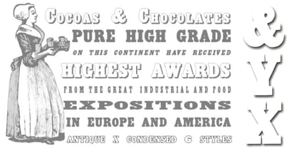
- MPI French Antique by mpressInteractive,
$5.00 French Antique was first shown in the specimen books of William H. Page & Company in 1869. The font is extremely tall and thin, with serifs taller than many character's widths. Lines are straight and clean with no fuss. French Antique can fit a lot of headline into a small space.
 - TXT Antique Italic by Illustration Ink,
$3.00Bring your scrapbook page to life with unique journaling and titles made possible with this cool italic font. It'll add instant flavor to posters, signs, bulletin boards, and word art that call for an old-fashioned, antiqued flair. - Caslon Antique Pro by SoftMaker,
$9.99 Caslon Antique Pro is one of the fonts of the SoftMaker font library.
 - Antique Slabserif JNL by Jeff Levine,
$29.00 Antique Slabserif JNL is a reinterpretation of Monotype's Modern Antique 26, released in 1909. The name of the typeface is an oxymoron because Modern conflicts with Antique. Despite many critics of the "mechanical" look of the font's design, it has developed a bit of charm with age and the passing of time. Available in both regular and oblique versions, Antique Slabserif JNL can be used as both a text and headline font.
 - Antique Stencils JNL by Jeff Levine,
$29.00 A butterfly, plants, animals, borders, embellishments, a center piece and corner pieces make up this assortment of charming stencil designs re-drawn from vintage sources for Antique Stencils JNL.
 - Antique Tuscan 8 by Wooden Type Fonts,
$15.00 A display style font, upper case only, very typical of wooden type of the 19th century, ideal for circus posters or posters of any kind which might feature antique material and so on
 - Fancy Antique Display by The Infamous Foundry,
$49.00 Fancy Antique Display is a uppercase display font inspired by French decorative alphabets from the 1940's and 1950's. Perfect for headlines, logos and everything above the body.
 - Antisa Brush by Stripes Studio,
$20.00 Antisa Brush is a super casual hand brushed script with detailed brush stroke texture, and a quirky, Can be used for various purposes. such as the title, signature, letterhead, signage, labels, newsletters, posters, logos, correspondence, wedding invitations, badges, etc.
 - Linem Up JNL by Jeff Levine,
$29.00Linem Up JNL is based on one of Alf R. Becker's alphabets for Signs of the Times magazine. With A-Z only and basic punctuation, it is best used in very limited text at larger point sizes. Thanks to Tod Swormstedt of ST Publications (and the curator of the American Sign Museum in Cincinnati, Ohio) for providing the reference material. - Roadside Diner JNL by Jeff Levine,
$29.00 The hand painted signage from a 1950s era photo of the Miami Diner Restaurant in Miami, Florida inspired the digital version of its 1940s-influenced lettering. Roadside Diner JNL is available in both regular and oblique versions.
 - HF American Diner by Monotype,
$29.00 - Hand of Linda by Lunas Type,
$19.00 Introducing, Hand of Linda! Hand of Linda is a signature notes and handwritten font. Hand of Linda have a chic and natural curves to add charm impression for your design. Hand of Linda is perfect for many design needs such as merch, T-shirts, signature logo, wedding, book covers, social media posts, websites, events, and many more. What's you get : - Numeral & Punctuation. - ligatures. - Multilingual Support. Enjoy Designing! Thanks! Lunas Type
 - Kis Antiqua Now TB Pro by Elsner+Flake,
$99.00 In the course of the re-vitalization of its Typoart typeface inventory, Elsner+Flake decided in 2006 to offer the “Kis Antiqua” by Hildegard Korger, in a re-worked form and with an extended sortiment, as an OpenType Pro-version. After consultation with Hildegard Korger, Elsner+Flake tasked the Leipzig type designer Erhard Kaiser with the execution of the re-design and expansion of the sortiment. Detlef Schäfer writes in “Fotosatzschriften Type-Design+Schrifthersteller”, VEB Fachbuchverlag Leipzig, 1989: No other printing type has ever generated as far-reaching a controversy as this typeface which Jan Tschichold called the most beautiful of all the old Antiqua types. For a long time, it was thought to have been designed by Anton Janson. In 1720 a large number of the original types were displayed in the catalog of the „Ehrhardische Gycery“ (Ehrhardt Typefoundry) in Leipzig. Recently, thanks to the research performed by Beatrice Warde and especially György Haimann, it has been proven unambiguously that the originator of this typeface was Miklós (Nicholas) Tótfalusi Kis (pronounced „Kisch“) who was born in 1650 in the Hungarian town of Tótfal. His calvinistic church had sent him to the Netherlands to oversee the printing of a Hungarian language bible. He studied printing and punch cutting and earned special recognition for his Armenian and Hebrew types. Upon his return to Hungary, an emergency situation forced him to sell several of his matrice sets to the Ehrhardt Typefoundry in Leipzig. In Hungary he printed from his own typefaces, but religious tensions arose between him and one of his church elders. He died at an early age in 1702. The significant characteristics of the “Dutch Antiqua” by Kis are the larger body size, relatively small lower case letters and strong upper case letters, which show clearly defined contrasts in the stroke widths. The “Kis Antiqua” is less elegant than the Garamond, rather somewhat austere in a calvinistic way, but its expression is unique and full of tension. The upper and lower case serifs are only slightly concave, and the upper case O as well as the lower case o have, for the first time, a vertical axis. In the replica, sensitively and respectfully (responsibly) drawn by Hildegard Korger, these characteristics of this pleasantly readable and beautiful face have been well met. For Typoart it was clear that this typeface has to appear under its only true name “Kis Antiqua.” It will be used primarily in book design. Elsner+Flake added two headline weights, which are available as a separate font family Kis Antiqua Now TH Pro Designer: Miklós (Nicholas) Tótfalusi Kis, 1686 Hildegard Korger, 1986-1988 Erhard Kaiser, 2008
 - Kis Antiqua Now TH Pro by Elsner+Flake,
$99.00 In the course of the re-vitalization of its Typoart typeface inventory, Elsner+Flake decided in 2006 to offer the “Kis Antiqua” by Hildegard Korger, in a re-worked form and with an extended sortiment, as an OpenType Pro-version. After consultation with Hildegard Korger, Elsner+Flake tasked the Leipzig type designer Erhard Kaiser with the execution of the re-design and expansion of the sortiment. Detlef Schäfer writes in “Fotosatzschriften Type-Design+Schrifthersteller”, VEB Fachbuchverlag Leipzig, 1989: No other printing type has ever generated as far-reaching a controversy as this typeface which Jan Tschichold called the most beautiful of all the old Antiqua types. For a long time, it was thought to have been designed by Anton Janson. In 1720 a large number of the original types were displayed in the catalog of the „Ehrhardische Gycery“ (Ehrhardt Typefoundry) in Leipzig. Recently, thanks to the research performed by Beatrice Warde and especially György Haimann, it has been proven unambiguously that the originator of this typeface was Miklós (Nicholas) Tótfalusi Kis (pronounced Kisch) who was born in 1650 in the Hungarian town of Tótfal. His calvinistic church had sent him to the Netherlands to oversee the printing of a Hungarian language bible. He studied printing and punch cutting and earned special recognition for his Armenian and Hebrew types. Upon his return to Hungary, an emergency situation forced him to sell several of his matrice sets to the Ehrhardt Typefoundry in Leipzig. In Hungary he printed from his own typefaces, but religious tensions arose between him and one of his church elders. He died at an early age in 1702. The significant characteristics of the “Dutch Antiqua” by Kis are the larger body size, relatively small lower case letters and strong upper case letters, which show clearly defined contrasts in the stroke widths. The “Kis Antiqua” is less elegant than the Garamond, rather somewhat austere in a calvinistic way, but its expression is unique and full of tension. The upper and lower case serifs are only slightly concave, and the upper case O as well as the lower case o have, for the first time, a vertical axis. In the replica, sensitively and respectfully (responsibly) drawn by Hildegard Korger, these characteristics of this pleasantly readable and beautiful face have been well met. For Typoart it was clear that this typeface has to appear under its only true name “Kis Antiqua.” It will be used primarily in book design. Elsner+Flake added these two headline weights, which are available besides a separate font family Kis Antiqua Now TB Pro. Designer: Miklós (Nicholas) Tótfalusi Kis, 1686 Hildegard Korger, 1986-1988 Erhard Kaiser, 2008
 - Antia Notario by Putracetol,
$16.00 Antia Notario is a modern vintage serif font with beautiful ligatures, tons of alternative glyphs and multilingual support. It’s bold, groovy, clean and unique with vintage fell. Antia Notario is very versatile font that works great in large and small sizes. Helps to create layout design in 60s or 70s design projects. Come with open type feature with a lot of alternates, its help you to make great lettering. Antia Notario best uses for heading headlines, cover, poster, logos, quotes, product packaging, merchandise, social media & greeting cards and many more.