2,907 search results
(0.053 seconds)
- Linear by URW Type Foundry,
$89.99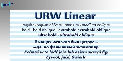
- Linear by Type Associates,
$24.95
- Lineare by Tipo,
$35.00 Lineare Serif is an attempt at solving the difficult problem of creating readable text type, seeking new ways to provide readers with some pleasure and rest as they walk along each line, creating a space where there is harmony between man and the printed form. Asymmetric serifs both in their height and width, medium contrast in the stroke, and balanced upward and downward movements make “Lineare Serif” a typeface featuring both attitude and aptitude for editorial purposes.
 - LineDrive by Ingrimayne Type,
$12.95 LineDrive was inspired by an obscure 19th century type design. It has no curved lines and what are normally circular elements in the lower-case letters are diamond-shaped. It might work best with only upper-case letters, which have a Victorian feel to them. In addition to the two weights of plain and bold, the family includes a shadowed version and an inline (or outlined) version.
 - Lineam by Richarts,
$9.00 In old Latin language Lineam mean line and that what Lineam is: a line based Sans Serif Display font. Lineam is a simple and clean looking font family and can be used for a range of cases. It is a modern sans serif font with geometric feeling and comes with 8 weights and matching italics.
 - Lonear by Liartgraphic,
$22.00 Introducing our latest product, we call this product the Lonear serif font Lonear is a modern type font With a unique and firm touch Lonear hight font is great to use on: fashion magazines, logos, photography, landing pages, flyers, social media and so on What's included - Lonear font - multilingual support - alternatives - ligatures Thank you, best regards Liarttyype
 - Lineart by Atom,
$22.00 With the concept of a slightly bold monoline and a touch of fast strokes to produce a very unique modern typography. Lineart , a modern font that really stands out, will add dynamism to your design needs. It will be very dynamic when combined with serif and sans serif fonts. With Lineart, make your design look different than others! Many thanks Eko Kurniawan | Letteratom
 - Linea - Unknown license

- Linea by Page Studio Graphics,
$25.00 - Linear Beam - Personal use only

- Linear Curve - Unknown license

- Linear Gothic by BA Graphics,
$45.00A great headline face very bold and graphic. Not recommended for small sizes! - Linear Tektu by TeGeType,
$19.00 The basic idea of this type family was to keep the "ductus" of the fraktur calligraphy only. And to adapt it to draw a sans serif typography which still keep the magic rhythm and colour of the original letters.
 - Linear Fraktu by TeGeType,
$19.00 The basic idea of this type family was to keep the "ductus" of the fraktur calligraphy only. And to adapt it to draw a sans serif typography which still keep the magic rhythm and colour of the original letters.
 - Linear EF by Elsner+Flake,
$35.00 - Poster Linear by Jehansyah,
$9.00 Poster Linear Natural sans serif font is simple but looks very futuristic and very stylish, it adds to your confidence to make your designs look bolder and modern. Perfect for stickers, media posts, social media statuses, magazines, books, covers, game covers, banners, wall magazines, sports shades, and more, plus a few families you can incorporate into your designs.
 - Antigua by Corradine Fonts,
$19.95 - Antiqva by Ultramarin,
$40.00 An alphabet based on classic Roman letterforms. As a model for our typography since ancient times, Roman stone inscription remains the starting point for all Latin letterforms. Working with these classical letters is an eternal dance for the graphic artist. The constant drawing and refinement of detail. A typographical relationship for ever.
 - Lindau - Unknown license

- Kinera by Zamjump,
$17.00 Kinera is a display elegant serif . It seduces your eyes with its curves yet still looks serene and classy. Perfect for any kind of creativity you are about to start :). with a binder in it will add a very memorable impression to the writing you want. Note : Ligature can be active in CAPSLOCK File Included : - All Caps - Ligature
 - Lindau by SIAS,
$39.90 Lindau is a new take on the Jensonian Roman typeface genre. The idea was to combine the Venetian proportions with a conical shaping of the vertical parts. Lindau may be considered an alternative to fonts like Jenson, Centaur, Trump Medieval or Deepdene. Suitable for ads, stationary, branding and label design, headlines and short to medium-length text bodies. Lindau is layed out with comprehensive character support for every Euro-Latin language.
 - Anlinear by Linotype,
$29.99Anlinear is part of a series of constructed typographic experiments from the young Swiss designer Michael Parson. In the Anlinear family, which contains three separate weights, Parson has successfully created a fabulous display of alphabets out of the sole arrangement of lines at right angles to each other. The letters in this face virtually groove with the beat as you set them in text. Like a musical score, they provide a fantastic look just right for your next flyer. This family of fonts looks best when set in larger point sizes, in headlines or other display settings. - Lindore by Irina Vascovet,
$16.00 Lindore is a handwritten pointed pen calligraphy script that has a fun and whimsical personality. Perfect for posters, wedding invitations, and all of your favorite quotes! We would love to see how you use the font! Use #lindorefont to tag us on Instagram!
 - Qindars by Twinletter,
$15.00 Qindars is a display font with a unique and fun theme, created by paying close attention to the uniqueness of each letter character, as well as the level of precision so that when used in words or sentences, it can produce a truly beautiful combination of letters, all of which we carefully designed for ourselves. Show you what makes us unique, and notice how beautiful, harmonious, and smooth each graphic treat is. This typeface is ideal for usage in a variety of unusual graphic projects, including games, book titles, outdoor activities, posters, banners, quotes, branding, and other unique projects. So, what are you waiting for? Get this font now!
 - Litera by ITC,
$29.99Litera was designed in 1983 by Michael Neugebauer, who used the same strict constructed design found in his typeface Circulus. In its figures are the clear geometric forms of the circle, triangle and rectangle, which were also the main forms of Bauhaus designs. The overall look of Litera is modern, clear and light. Distinguishing characteristics are the openness and the e and P and the particularly long cross stroke of the G. The cool Litera is best for middle length texts and headlines. Similar typefaces include Futura from Paul Renner and Avenir from Adrian Frutiger. - Gliners by Dumadi,
$25.00 Gliners is a simple stylized font that overlies the center of the glyphs bar in the font. Glyphs font doesn’t have too many, it only offers Uppercase and Multilingual, but don’t worry because its simple shape will make your project look interesting. The Gliners font is very suitable for use as movie titles, movie title poster covers like the review image I shared above. how? are you interested in trying it? Thank You, stay the center of attention and classy!
 - Gingar by Melli Diete,
$42.00 Gingar – a headline face, playful and classic – a proper font. Gingar includes swash-characters and ligatures in a wide range of weights from UltraLight to ExtraBlack, plus Italics. Typeface for life, fashion, food, wellness, magazines, corporate design projects and more. Rock with Gingar!
 - Litera by URW Type Foundry,
$35.99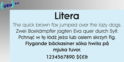
- Line44 by URW Type Foundry,
$39.99 Remembering us of the early graffiti on the New York subways. And similar to creating and producing a graffiti, a "Piece", also the styles of Line44 are superposed in layers.
 - Linefeed by Typodermic,
$11.95 Introducing Linefeed, the retro-inspired monospaced typeface that transports you back to the 1960s and 1970s era of computer band printers. Drawing inspiration from the revolutionary technology of the time, Linefeed captures the essence of the clunky yet iconic machines that were responsible for producing some of the most important documents of the time. Imagine a row of hammers, one for each column, smacking the paper against the ribbon and raised characters embossed on a constantly revolving steel band. This is the heart of the Linefeed font, paying homage to the technology that paved the way for the digital age. Most band printers of the time were restricted to uppercase, digits, and a little punctuation to ensure maximum efficiency, but Linefeed brings this beloved typeface to life with added lowercase letters, extra punctuation, and accents. Linefeed was once one of the most widely used computer fonts during the 1960s and 1970s. It could be found on a plethora of documents, including driver’s licenses, magazine subscription labels, report cards, invoices, and auto dealership window stickers, among other things. In a world where sleek and modern designs dominate, Linefeed offers a refreshing throwback to the golden age of computing. Its technical design, inspired by the machines of yesteryear, is a testament to the ingenuity and creativity of early computer designers. With its monospaced layout and vintage charm, Linefeed is sure to bring a touch of nostalgia to any design project. Most Latin-based European writing systems are supported, including the following languages. Afaan Oromo, Afar, Afrikaans, Albanian, Alsatian, Aromanian, Aymara, Bashkir (Latin), Basque, Belarusian (Latin), Bemba, Bikol, Bosnian, Breton, Cape Verdean, Creole, Catalan, Cebuano, Chamorro, Chavacano, Chichewa, Crimean Tatar (Latin), Croatian, Czech, Danish, Dawan, Dholuo, Dutch, English, Estonian, Faroese, Fijian, Filipino, Finnish, French, Frisian, Friulian, Gagauz (Latin), Galician, Ganda, Genoese, German, Greenlandic, Guadeloupean Creole, Haitian Creole, Hawaiian, Hiligaynon, Hungarian, Icelandic, Ilocano, Indonesian, Irish, Italian, Jamaican, Kaqchikel, Karakalpak (Latin), Kashubian, Kikongo, Kinyarwanda, Kirundi, Kurdish (Latin), Latvian, Lithuanian, Lombard, Low Saxon, Luxembourgish, Maasai, Makhuwa, Malay, Maltese, Māori, Moldovan, Montenegrin, Ndebele, Neapolitan, Norwegian, Novial, Occitan, Ossetian (Latin), Papiamento, Piedmontese, Polish, Portuguese, Quechua, Rarotongan, Romanian, Romansh, Sami, Sango, Saramaccan, Sardinian, Scottish Gaelic, Serbian (Latin), Shona, Sicilian, Silesian, Slovak, Slovenian, Somali, Sorbian, Sotho, Spanish, Swahili, Swazi, Swedish, Tagalog, Tahitian, Tetum, Tongan, Tshiluba, Tsonga, Tswana, Tumbuka, Turkish, Turkmen (Latin), Tuvaluan, Uzbek (Latin), Venetian, Vepsian, Võro, Walloon, Waray-Waray, Wayuu, Welsh, Wolof, Xhosa, Yapese, Zapotec Zulu and Zuni.
 - LineWire by The Northern Block,
$16.70 A modern geometric typeface influenced by the work of Dutch designer Wim Crouwel . The angular nature of the design lends itself strongly towards large display applications but because each character is formed from a consistent grid, stylish body copy can also be achieved. Details include 6 weights, a complete character set, manually edited kerning and Euro symbol.
 - Lancar by Twinletter,
$12.00 Lancar is a sans serif font family with lovely curving forms ideal for headings and text. The curves provide your project an exquisite and harmonious design, great for making your project look gorgeous. This font also comes with four families to help you with your job. With this typeface, you can make your project stand out. of course, your various design projects will be perfect and extraordinary if you use this font because this font is equipped with a font family, both for titles and subtitles and sentence text, start using our fonts for your extraordinary projects.
 - Lontare by RGB Studio,
$17.00 Lontare script typeface works really well for Logos and Apparel Design. It's also great for creating Prints or Merchandise, as you can use the illustrative qualities of the shapes to create an art piece. Lontare script typeface includes many different alternates for each lowercase letter. It's extremely fun to use as each word can be transformed to your liking. Files Include : Basic Latin A-Z and a-z Numbers Symbols PUA Encode Multilanguage Support Thanks and have a wonderful day, If you have any questions, please get in touch with us Don't forget to check out our other products.
 - Antiques by Fantasy Inspirations,
$9.75With my dingbats and your favorite software, you can create elegant web graphics in minutes! All these fonts were created with the web designer in mind. Each font consists on 26 original shapes with endless possibilities: virtual jewelry, buttons, framing, interfaces, etc. For examples of what you can do with these fonts: Click Now! - Antique by Storm Type Foundry,
$26.00The concept of the Baroque Roman type face is something which is remote from us. Ungrateful theorists gave Baroque type faces the ill-sounding attribute "Transitional", as if the Baroque Roman type face wilfully diverted from the tradition and at the same time did not manage to mature. This "transition" was originally meant as an intermediate stage between the Aldine/Garamond Roman face of the Renaissance, and its modern counterpart, as represented by Bodoni or Didot. Otherwise there was also a "transition" from a slanted axis of the shadow to a perpendicular one. What a petty detail led to the pejorative designation of Baroque type faces! If a bookseller were to tell his customers that they are about to choose a book which is set in some sort of transitional type face, he would probably go bust. After all, a reader, for his money, would not put up with some typographical experimentation. He wants to read a book without losing his eyesight while doing so. Nevertheless, it was Baroque typography which gave the world the most legible type faces. In those days the craft of punch-cutting was gradually separating itself from that of book-printing, but also from publishing and bookselling. Previously all these activities could be performed by a single person. The punch-cutter, who at that time was already fully occupied with the production of letters, achieved better results than he would have achieved if his creative talents were to be diffused in a printing office or a bookseller's shop. Thus it was possible that for example the printer John Baskerville did not cut a single letter in his entire lifetime, for he used the services of the accomplished punch-cutter John Handy. It became the custom that one type founder supplied type to multiple printing offices, so that the same type faces appeared in various parts of the world. The type face was losing its national character. In the Renaissance period it is still quite easy to distinguish for example a French Roman type face from a Venetian one; in the Baroque period this could be achieved only with great difficulties. Imagination and variety of shapes, which so far have been reserved only to the fine arts, now come into play. Thanks to technological progress, book printers are now able to reproduce hairstrokes and imitate calligraphic type faces. Scripts and elaborate ornaments are no longer the privilege of copper-engravers. Also the appearance of the basic, body design is slowly undergoing a change. The Renaissance canonical stiffness is now replaced with colour and contrast. The page of the book is suddenly darker, its lay-out more varied and its lines more compact. For Baroque type designers made a simple, yet ingenious discovery - they enlarged the x-height and reduced the ascenders to the cap-height. The type face thus became seemingly larger, and hence more legible, but at the same time more economical in composition; the type area was increasing to the detriment of the margins. Paper was expensive, and the aim of all the publishers was, therefore, to sell as many ideas in as small a book block as possible. A narrowed, bold majuscule, designed for use on the title page, appeared for the first time in the Late Baroque period. Also the title page was laid out with the highest possible economy. It comprised as a rule the brief contents of the book and the address of the bookseller, i.e. roughly that which is now placed on the flaps and in the imprint lines. Bold upper-case letters in the first line dramatically give way to the more subtle italics, the third line is highlighted with vermilion; a few words set in lower-case letters are scattered in-between, and then vermilion appears again. Somewhere in the middle there is an ornament, a monogram or an engraving as a kind of climax of the drama, while at the foot of the title-page all this din is quietened by a line with the name of the printer and the year expressed in Roman numerals, set in 8-point body size. Every Baroque title-page could well pass muster as a striking poster. The pride of every book printer was the publication of a type specimen book - a typographical manual. Among these manuals the one published by Fournier stands out - also as regards the selection of the texts for the specimen type matter. It reveals the scope of knowledge and education of the master typographers of that period. The same Fournier established a system of typographical measurement which, revised by Didot, is still used today. Baskerville introduced the smoothing of paper by a hot steel roller, in order that he could print astonishingly sharp letters, etc. ... In other words - Baroque typography deserves anything else but the attribute "transitional". In the first half of the 18th century, besides persons whose names are prominent and well-known up to the present, as was Caslon, there were many type founders who did not manage to publish their manuals or forgot to become famous in some other way. They often imitated the type faces of their more experienced contemporaries, but many of them arrived at a quite strange, even weird originality, which ran completely outside the mainstream of typographical art. The prints from which we have drawn inspiration for these six digital designs come from Paris, Vienna and Prague, from the period around 1750. The transcription of letters in their intact form is our firm principle. Does it mean, therefore, that the task of the digital restorer is to copy meticulously the outline of the letter with all inadequacies of the particular imprint? No. The type face should not to evoke the rustic atmosphere of letterpress after printing, but to analyze the appearance of the punches before they are imprinted. It is also necessary to take account of the size of the type face and to avoid excessive enlargement or reduction. Let us keep in mind that every size requires its own design. The longer we work on the computer where a change in size is child's play, the more we are convinced that the appearance of a letter is tied to its proportions, and therefore, to a fixed size. We are also aware of the fact that the computer is a straightjacket of the type face and that the dictate of mathematical vectors effectively kills any hint of naturalness. That is why we strive to preserve in these six alphabets the numerous anomalies to which later no type designer ever returned due to their obvious eccentricity. Please accept this PostScript study as an attempt (possibly futile, possibly inspirational) to brush up the warm magic of Baroque prints. Hopefully it will give pleasure in today's modern type designer's nihilism. - DR Lineart by Dmitry Rastvortsev,
$29.98 Display type-family in op-art style with Latin, Greek and Cyrillic scripts support. Award: The Best Of Ukrainian Design in Typestyle and typography 2016.
 - Linear Curve Fatty - Unknown license

- Lyneous Linear BRK - Unknown license

- New Millennium Linear by Three Islands Press,
$24.00New Millennium Linear is one of three font families that share a common name, a common design philosophy, a common x-height, and basic character shapes. (The others are New Millennium and New Millennium Sans; all three work well together.) New Millennium Linear is a "monotone" newer version of the Sans face whose smooth, geometric, "Gothic" look gives it a completely different personality. The typeface comes with regular, bold, italic, and bold italic styles, each with a complete character set. New Millennium Linear might best be used in captions, callouts, labels, titles, and similar display situations. - ideoma LINER - Personal use only


Page 1 of 73Next page