2,259 search results
(0.114 seconds)
- Earline by Cooldesignlab,
$15.00 Meet the new slick calligraphy font - Earline. This gorgeous script is for those who need some elegance and style for their designs and is perfect for wedding invitations, save date cards, feminine branding, and other necessities. This font is modern, simple, but still authentic. Earline includes the complete set of Basic Uppercase and Lowercase Characters, Numbers, and Punctuation Marks. It also contains binders and many stylistic alternatives to perfectly recreate natural calligraphy (check the preview to see all of them).
 - Cheliya by Cooldesignlab,
$15.00 Meet the new slick calligraphy font - Chelya. This gorgeous script is for those who need some elegance and style for their designs and is perfect for wedding invitations, save date cards, feminine branding, and other necessities. This font is modern, simple, but still authentic. Chelya includes the complete set of Basic Uppercase and Lowercase Characters, Numbers, and Punctuation Marks. It also contains binders and many stylistic alternatives to perfectly recreate natural calligraphy (check the preview to see all of them).
 - Athaar by MysticalType,
$12.00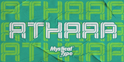 Athaar is a bold, modern sports font with dramatic movements and a strong feel for your latest project that requires a modern sports look. It is perfect for branding projects, logos, wedding designs, social media posts, advertisements, product packaging, product design, labels, photography, watermarks, invitations, stationery, and any project that requires a modern sport style. Athaar comes with uppercase, lowercase letters, numbers, punctuation, and many variations of each character, including OpenType alternatives and general binders to allow you to customize your design.
 - Bohate by Sulthan Studio,
$12.00 Introduce Bohate - is a font from handwriting on paper then made it come alive and I removed some of the smudges to make it look neat with an alternative for each letter that goes up and down differently like the letters b,d,f,g, h, j, k, l, p, t, y etc has a total of 713 glips featuring uppercase, lowercase, numbers, punctuation, language support, swash, alternatives and binders. very natural you can try it and enjoy your work with this handwriting
 - Khanza Script by Suamzu Art,
$12.00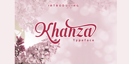 Khanza is a script font that is connected with clear style and dramatic movements. Khanza comes with uppercase, lowercase letters, numbers, punctuation, and so many variations on each character including alternative opentypes, common binders, and also additional cuts to allow you to customize your design. Perfect for use for Logotype, Letterhead, Posters, Clothing Designs, Labels and others. khanza font will help all the design projects that you are working on Khaza script features: Uppercase & lowercase Alternates & swashes Ligatures Standart international characters Punctuation & symbols
 - Foline by Gatype,
$14.00 Foline , stylish modern calligraphic script with lots of personality. Beautiful Opentype features with beautiful standard ligatures that replicate natural handwriting. Easily personalize her look with its many alternative glyphs, binders, and swashes. She's a natural for logo, stationery, and product design projects looking for a dynamic, personal vibe. If you don't have a program that supports OpenType features such as Adobe Illustrator and CorelDraw X Versions, you can access all of the alternative glyphs using Font Book (Mac) or Character Map (Windows):
 - Cover Up by Hanoded,
$15.00 Cover Up is a roughish font with a lot of character. Its edges are slightly jagged, there is no real baseline and it looks like the whole thing has been sand blasted. When you get to know Cover Up, you’ll find that it comes with a hidden agenda, because underneath the rough exterior lives an oh-so sweet heart. Use it for your product packaging, book covers and posters - it won’t disappoint you. Comes with an illegal amount of diacritics.
 - Mishega by Mega Type,
$12.00 Mishega Script is modern calligraphy font, including Regular. This font is casual and pretty with swashes. Can used for various purposes. such as logo, product packaging, wedding invitations, branding, headlines, signage, labels, signature, book covers, posters, quotes and more. Feature: · All Uppercase and Lowercase · Alternates and Ligatures · Numbers & Symbols · Supported Languages · Substitutes and Binders · PUA Encoded Have fun using Mishega!!! I really hope you enjoy it! Feel free to follow, like and share. Thank you so much for checking out my shop!
 - Spiraling Down by Hanoded,
$15.00 I was listening to an Opeth album called Blackwater Park. By the time I had decided that this font needed some swirls, the band was playing a song called The Drapery Falls - which has the word ‘spiraling’ in it (see poster 2) - and the name was born. Spiraling down is a surprisingly elegant font (given its roughness). I probably wouldn’t set a whole text in it, but it will really stand out as a titling font for packaging or book covers.
 - Lovetina by Cooldesignlab,
$12.00 Meet the new slick calligraphy font - Lovetina. This gorgeous script is for those who need some elegance and style for their designs and is perfect for wedding invitations, saving date cards, feminine branding, and other necessities. This font is modern with a love style, but still authentic. Lovetina includes the complete set of Basic Uppercase and Lowercase Characters, Numbers, and Punctuation. It also contains binders and many stylistic alternatives to perfectly recreate natural calligraphy (check the preview to see all of them).
 - Shocka by Skinny Type,
$16.00 Shocka - a serif look with simple, clean and visual elegance with smooth curves and beautiful ligatures, A very versatile font that works in both large and small sizes. This font is suitable for a wide variety of projects such as: headlines, logos, labels, branding projects, magazines, homeware designs, product packaging, mugs, quotes, posters, and more. It can also be more expressive and fun, thanks to the many alternatives and binders that combine harmoniously in this font and make it more interesting and versatile. Try to change alternatives, binders and you will get many options for your project which will make it bold & beautiful. Features: Section • Full set of uppercase, lowercase • Ligatures • Alternative • A wide variety of numbers, symbols & punctuation • Characters with accents • Support Multiple Languages • PUA encoded WHAT IS INCLUDED: • Shocka – Regular • Shocka– Outline This type of family has become the work of true love, making it as easy and fun as possible. I really hope you enjoy it! I can't wait to see what you do with Stanger Display! Feel free to use the #Skinny_Type and #Shocka Serif font tags to show what you've done visit my Instagram : https://www.instagram.com/skinny.type/ Thank you!
 - Brigent Display by Masa Type,
$19.00 Brigent Display - a Retro Font look with simple, clean and visual elegance with smooth curves and beautiful ligatures, A very versatile font that works in both large and small sizes. This font is suitable for a wide variety of projects such as: headlines, logos, labels, branding projects, magazines, homeware designs, product packaging, mugs, quotes, posters, and more. It can also be more expressive and fun, thanks to the many alternatives and binders that combine harmoniously in this font and make it more interesting and versatile. Try to change alternatives, binders and you will get many options for your project which will make it bold & beautiful. Features: • Full set of uppercase, lowercase • Ligatures • Alternative • A wide variety of numbers, symbols & punctuation • Characters with accents • Support Multiple Languages • PUA encoded WHAT IS INCLUDED: • Brigent Display – Regular This type of family has become the work of true love, making it as easy and fun as possible. I really hope you enjoy it! I can't wait to see what you do with Brigent Display! Feel free to use the #Masa Type and #Brigent Display font tags to show what you've done Thank You.
 - Gutenberg B by Alter Littera,
$25.00 A clean, smooth rendition of the magnificent B42-type used by Johann Gutenberg in his famous 42-line Bible. In addition to the usual standard characters for typesetting modern texts, the font includes a comprehensive set of special characters, alternates and ligatures, plus Opentype features, that can be used for typesetting (almost) exactly as in Gutenberg’s Bible and later incunabula. Also available as The Oldtype “Gutenberg C” Font in a slightly roughened style simulating irregularities and ink spreads associated with old metal types, papers and parchments. The main historical sources used during the font design process were high-resolution scans from several printings of Gutenberg’s Bible. Other sources were as follows: Kapr, A. (1996), Johann Gutenberg - The Man and his Invention, Aldershot: Scolar Press (ch. 7); De Hamel, C. (2001), The Book - A History of The Bible, London: Phaidon Press (ch. 8); Füssel, S. (2005), Gutenberg and the impact of printing, Burlington: Ashgate (ch. 1); and Man, J. (2009), The Gutenberg Revolution, London: Bantam (ch. 7). Specimen, detailed character map, OpenType features, and font samples available at Alter Littera’s The Oldtype “Gutenberg B” Font Page.
 - Bugisha Display by Masa Type,
$20.00 Bugisha Display - a sans serif look with simple, clean and visual elegance with smooth curves and beautiful ligatures, A very versatile font that works in both large and small sizes. This font is suitable for a wide variety of projects such as: headlines, logos, labels, branding projects, magazines, homeware designs, product packaging, mugs, quotes, posters, and more. It can also be more expressive and fun, thanks to the many alternatives and binders that combine harmoniously in this font and make it more interesting and versatile. Try to change alternatives, binders and you will get many options for your project which will make it bold & beautiful. Features: • Full set of uppercase, lowercase • Ligatures • Alternative • A wide variety of numbers, symbols & punctuation • Characters with accents • Support Multiple Languages • PUA encoded WHAT IS INCLUDED: • Bugisha Display– Regular This type of family has become the work of true love, making it as easy and fun as possible. I really hope you enjoy it! I can't wait to see what you do with Bugisha Display! Feel free to use the #Masa Type and #Bugisha Display font tags to show what you've done Thank You.
 - Stanger by Dora Typefoundry,
$20.00 Stanger - a sans serif look with simple, clean and visual elegance with smooth curves and beautiful ligatures, A very versatile font that works in both large and small sizes. This font is suitable for a wide variety of projects such as: headlines, logos, labels, branding projects, magazines, homeware designs, product packaging, mugs, quotes, posters, and more. It can also be more expressive and fun, thanks to the many alternatives and binders that combine harmoniously in this font and make it more interesting and versatile. Try to change alternatives, binders and you will get many options for your project which will make it bold & beautiful. Features: • Full set of uppercase, lowercase • Ligatures • Alternative • A wide variety of numbers, symbols & punctuation • Characters with accents • Support Multiple Languages • PUA encoded WHAT IS INCLUDED: • Stanger – Regular • Stanger – Italic This type of family has become the work of true love, making it as easy and fun as possible. I really hope you enjoy it! I can't wait to see what you do with Stanger Display! Feel free to use the #Dora Typefoundry and #Stanger Display font tags to show what you've done visit my Instagram : https://www.instagram.com/doratypefoundry/ Thank you!
 - Lattolatoo by Zamjump,
$17.00 Lattolatoo is a unique modern display font with a fun and trendy kind of street style twist. From poster designs to t-shirts and packaging, Lattolatoo will give your designs an alternative to the minimal look and supercharge your creative work. Lattolatoo is hand-drawn, having an almost handwritten appearance; the characters skip the baseline giving it a charming yet modern look and feel. Alternative All characters A to Z one alternative. To make your text look less repetitive, you can substitute the letters for something else—this makes your design look more like handwriting. Ligature Lattolatoo has standard ligatures, 7 of them in total. You can activate it through the glyph panel in Adobe applications. The binder makes a huge difference in the look of Beautiful Freak. It switches the order of two popular letters making your design look more individual. opentype Please note: Alternatives and Binders use OpenType features. Therefore, you'll need a design application to access these options—an application such as Adobe Photoshop, Illustrator, or InDesign. Included : - Uppercase glyphs only (This font is unicase) - Punctuation, Symbols, and Numbers - Alternate A-Z characters (1 character) - 7 Ligatures - Support for Central, Western, and Southeast European characters
 - Murrx - 100% free

- Silo Slab by TypeUnion,
$25.00 Designed and built in London by TypeUnion, Silo Slab is a fluid slab serif typeface embodying energetic curves and a clean, functional structure. The Silo Slab Family is made up of 6 weights, which range from a delicate Extra-Light, all the way through to a punchy, loud Extra-bold and each carry a versatility for multiple applications and uses. Each weight has a matching italic. Silo Slab features open type alternate characters, and extensive language support to provide a flexible, substantial user experience.
 - Traveller by Holland Fonts,
$30.00A geometric design, published in Rick Poynor’s Typography Now 1 (Booth-Clibborn Editions, London UK,1991). Discussing these kinds of angular styles, the critic Rick Poynor noted that "fate has overtaken the angular post-constructivist type design of Neville Brody, Zuzana Licko and Max Kisman". Poynor described a process by which typefaces, once “fresh, unexpected, precisely attuned to the moment”, get used increasingly often in less and less appropriate contexts and end up looking "irredeemably passé". (Poynor, Rick, ‘American Gothic’ in Eye Magazine, 6/1992) - Noise Maker by Bogstav,
$15.00 Can noise be a beautiful sound? Well, I guess...because the other day when I was playing the good old Bleach album by Nirvana (which I consider lovely grunge music!) my wife yelled "Could you stop that noise?!" - and I answered "What noise?!" - ha-ha-ha! Anyway, I finished this font while listening to that particular lovely noise, and I knew that this crunchy, grungy, handmade and full of contextual alternates and multilingual font had to be named something with the word "noise" in it!
 - The Razels by ijemrockart,
$15.00 The Razels Font is a bold calligraphy script with dramatic moves and strong styles for your latest project that requires the look of a hand bulletin. This is perfect for branding projects, logos, wedding designs, social media posts, advertisements, product packaging, product design, labels, photography, watermarks, invitations, stationery, and any project that requires a handwriting style. The Razels Font comes with uppercase letters, lowercase letters, numbers, punctuation, and many variations of each character, including OpenType alternatives and general binders to allow you to customize the design.
 - Gretania by Gatype,
$12.00 Gretania includes a full set of upper and lower case letters, multilingual symbols, numbers, punctuation, alternatives and ligatures.This font has a Modern Elegant Style, perfect for branding, logos, invitations, masterheads and more. Gretania features OpenType style alternatives, International binders and support for most Western Languages included. To enable the OpenType Stylistic alternative, you need a program that supports OpenType features such as Adobe Illustrator CS, Adobe Indesign & CorelDraw X6-X7, Microsoft Word 2010 or later. Thank you so much for viewing and Enjoying it.
 - Times New Roman PS Cyrillic by Monotype,
$67.99In 1931, The Times of London commissioned a new text type design from Stanley Morison and the Monotype Corporation, after Morison had written an article criticizing The Times for being badly printed and typographically behind the times. The new design was supervised by Stanley Morison and drawn by Victor Lardent, an artist from the advertising department of The Times. Morison used an older typeface, Plantin, as the basis for his design, but made revisions for legibility and economy of space (always important concerns for newspapers). As the old type used by the newspaper had been called Times Old Roman," Morison's revision became "Times New Roman." The Times of London debuted the new typeface in October 1932, and after one year the design was released for commercial sale. The Linotype version, called simply "Times," was optimized for line-casting technology, though the differences in the basic design are subtle. The typeface was very successful for the Times of London, which used a higher grade of newsprint than most newspapers. The better, whiter paper enhanced the new typeface's high degree of contrast and sharp serifs, and created a sparkling, modern look. In 1972, Walter Tracy designed Times Europa for The Times of London. This was a sturdier version, and it was needed to hold up to the newest demands of newspaper printing: faster presses and cheaper paper. In the United States, the Times font family has enjoyed popularity as a magazine and book type since the 1940s. Times continues to be very popular around the world because of its versatility and readability. And because it is a standard font on most computers and digital printers, it has become universally familiar as the office workhorse. Times?, Times? Europa, and Times New Roman? are sure bets for proposals, annual reports, office correspondence, magazines, and newspapers. Linotype offers many versions of this font: Times? is the universal version of Times, used formerly as the matrices for the Linotype hot metal line-casting machines. The basic four weights of roman, italic, bold and bold italic are standard fonts on most printers. There are also small caps, Old style Figures, phonetic characters, and Central European characters. Times? Ten is the version specially designed for smaller text (12 point and below); its characters are wider and the hairlines are a little stronger. Times Ten has many weights for Latin typography, as well as several weights for Central European, Cyrillic, and Greek typesetting. Times? Eighteen is the headline version, ideal for point sizes of 18 and larger. The characters are subtly condensed and the hairlines are finer." - Times New Roman Seven by Monotype,
$67.99In 1931, The Times of London commissioned a new text type design from Stanley Morison and the Monotype Corporation, after Morison had written an article criticizing The Times for being badly printed and typographically behind the times. The new design was supervised by Stanley Morison and drawn by Victor Lardent, an artist from the advertising department of The Times. Morison used an older typeface, Plantin, as the basis for his design, but made revisions for legibility and economy of space (always important concerns for newspapers). As the old type used by the newspaper had been called Times Old Roman," Morison's revision became "Times New Roman." The Times of London debuted the new typeface in October 1932, and after one year the design was released for commercial sale. The Linotype version, called simply "Times," was optimized for line-casting technology, though the differences in the basic design are subtle. The typeface was very successful for the Times of London, which used a higher grade of newsprint than most newspapers. The better, whiter paper enhanced the new typeface's high degree of contrast and sharp serifs, and created a sparkling, modern look. In 1972, Walter Tracy designed Times Europa for The Times of London. This was a sturdier version, and it was needed to hold up to the newest demands of newspaper printing: faster presses and cheaper paper. In the United States, the Times font family has enjoyed popularity as a magazine and book type since the 1940s. Times continues to be very popular around the world because of its versatility and readability. And because it is a standard font on most computers and digital printers, it has become universally familiar as the office workhorse. Times?, Times? Europa, and Times New Roman? are sure bets for proposals, annual reports, office correspondence, magazines, and newspapers. Linotype offers many versions of this font: Times? is the universal version of Times, used formerly as the matrices for the Linotype hot metal line-casting machines. The basic four weights of roman, italic, bold and bold italic are standard fonts on most printers. There are also small caps, Old style Figures, phonetic characters, and Central European characters. Times? Ten is the version specially designed for smaller text (12 point and below); its characters are wider and the hairlines are a little stronger. Times Ten has many weights for Latin typography, as well as several weights for Central European, Cyrillic, and Greek typesetting. Times? Eighteen is the headline version, ideal for point sizes of 18 and larger. The characters are subtly condensed and the hairlines are finer." - Times New Roman WGL by Monotype,
$67.99 In 1931, The Times of London commissioned a new text type design from Stanley Morison and the Monotype Corporation, after Morison had written an article criticizing The Times for being badly printed and typographically behind the times. The new design was supervised by Stanley Morison and drawn by Victor Lardent, an artist from the advertising department of The Times. Morison used an older typeface, Plantin, as the basis for his design, but made revisions for legibility and economy of space (always important concerns for newspapers). As the old type used by the newspaper had been called Times Old Roman," Morison's revision became "Times New Roman." The Times of London debuted the new typeface in October 1932, and after one year the design was released for commercial sale. The Linotype version, called simply "Times," was optimized for line-casting technology, though the differences in the basic design are subtle. The typeface was very successful for the Times of London, which used a higher grade of newsprint than most newspapers. The better, whiter paper enhanced the new typeface's high degree of contrast and sharp serifs, and created a sparkling, modern look. In 1972, Walter Tracy designed Times Europa for The Times of London. This was a sturdier version, and it was needed to hold up to the newest demands of newspaper printing: faster presses and cheaper paper. In the United States, the Times font family has enjoyed popularity as a magazine and book type since the 1940s. Times continues to be very popular around the world because of its versatility and readability. And because it is a standard font on most computers and digital printers, it has become universally familiar as the office workhorse. Times?, Times? Europa, and Times New Roman? are sure bets for proposals, annual reports, office correspondence, magazines, and newspapers. Linotype offers many versions of this font: Times? is the universal version of Times, used formerly as the matrices for the Linotype hot metal line-casting machines. The basic four weights of roman, italic, bold and bold italic are standard fonts on most printers. There are also small caps, Old style Figures, phonetic characters, and Central European characters. Times? Ten is the version specially designed for smaller text (12 point and below); its characters are wider and the hairlines are a little stronger. Times Ten has many weights for Latin typography, as well as several weights for Central European, Cyrillic, and Greek typesetting. Times? Eighteen is the headline version, ideal for point sizes of 18 and larger. The characters are subtly condensed and the hairlines are finer."
 - Times New Roman by Monotype,
$67.99 In 1931, The Times of London commissioned a new text type design from Stanley Morison and the Monotype Corporation, after Morison had written an article criticizing The Times for being badly printed and typographically behind the times. The new design was supervised by Stanley Morison and drawn by Victor Lardent, an artist from the advertising department of The Times. Morison used an older typeface, Plantin, as the basis for his design, but made revisions for legibility and economy of space (always important concerns for newspapers). As the old type used by the newspaper had been called Times Old Roman," Morison's revision became "Times New Roman." The Times of London debuted the new typeface in October 1932, and after one year the design was released for commercial sale. The Linotype version, called simply "Times," was optimized for line-casting technology, though the differences in the basic design are subtle. The typeface was very successful for the Times of London, which used a higher grade of newsprint than most newspapers. The better, whiter paper enhanced the new typeface's high degree of contrast and sharp serifs, and created a sparkling, modern look. In 1972, Walter Tracy designed Times Europa for The Times of London. This was a sturdier version, and it was needed to hold up to the newest demands of newspaper printing: faster presses and cheaper paper. In the United States, the Times font family has enjoyed popularity as a magazine and book type since the 1940s. Times continues to be very popular around the world because of its versatility and readability. And because it is a standard font on most computers and digital printers, it has become universally familiar as the office workhorse. Times?, Times? Europa, and Times New Roman? are sure bets for proposals, annual reports, office correspondence, magazines, and newspapers. Linotype offers many versions of this font: Times? is the universal version of Times, used formerly as the matrices for the Linotype hot metal line-casting machines. The basic four weights of roman, italic, bold and bold italic are standard fonts on most printers. There are also small caps, Old style Figures, phonetic characters, and Central European characters. Times? Ten is the version specially designed for smaller text (12 point and below); its characters are wider and the hairlines are a little stronger. Times Ten has many weights for Latin typography, as well as several weights for Central European, Cyrillic, and Greek typesetting. Times? Eighteen is the headline version, ideal for point sizes of 18 and larger. The characters are subtly condensed and the hairlines are finer."
 - Times New Roman Small Text by Monotype,
$67.99In 1931, The Times of London commissioned a new text type design from Stanley Morison and the Monotype Corporation, after Morison had written an article criticizing The Times for being badly printed and typographically behind the times. The new design was supervised by Stanley Morison and drawn by Victor Lardent, an artist from the advertising department of The Times. Morison used an older typeface, Plantin, as the basis for his design, but made revisions for legibility and economy of space (always important concerns for newspapers). As the old type used by the newspaper had been called Times Old Roman," Morison's revision became "Times New Roman." The Times of London debuted the new typeface in October 1932, and after one year the design was released for commercial sale. The Linotype version, called simply "Times," was optimized for line-casting technology, though the differences in the basic design are subtle. The typeface was very successful for the Times of London, which used a higher grade of newsprint than most newspapers. The better, whiter paper enhanced the new typeface's high degree of contrast and sharp serifs, and created a sparkling, modern look. In 1972, Walter Tracy designed Times Europa for The Times of London. This was a sturdier version, and it was needed to hold up to the newest demands of newspaper printing: faster presses and cheaper paper. In the United States, the Times font family has enjoyed popularity as a magazine and book type since the 1940s. Times continues to be very popular around the world because of its versatility and readability. And because it is a standard font on most computers and digital printers, it has become universally familiar as the office workhorse. Times?, Times? Europa, and Times New Roman? are sure bets for proposals, annual reports, office correspondence, magazines, and newspapers. Linotype offers many versions of this font: Times? is the universal version of Times, used formerly as the matrices for the Linotype hot metal line-casting machines. The basic four weights of roman, italic, bold and bold italic are standard fonts on most printers. There are also small caps, Old style Figures, phonetic characters, and Central European characters. Times? Ten is the version specially designed for smaller text (12 point and below); its characters are wider and the hairlines are a little stronger. Times Ten has many weights for Latin typography, as well as several weights for Central European, Cyrillic, and Greek typesetting. Times? Eighteen is the headline version, ideal for point sizes of 18 and larger. The characters are subtly condensed and the hairlines are finer." - Times New Roman PS Greek by Monotype,
$67.99In 1931, The Times of London commissioned a new text type design from Stanley Morison and the Monotype Corporation, after Morison had written an article criticizing The Times for being badly printed and typographically behind the times. The new design was supervised by Stanley Morison and drawn by Victor Lardent, an artist from the advertising department of The Times. Morison used an older typeface, Plantin, as the basis for his design, but made revisions for legibility and economy of space (always important concerns for newspapers). As the old type used by the newspaper had been called Times Old Roman," Morison's revision became "Times New Roman." The Times of London debuted the new typeface in October 1932, and after one year the design was released for commercial sale. The Linotype version, called simply "Times," was optimized for line-casting technology, though the differences in the basic design are subtle. The typeface was very successful for the Times of London, which used a higher grade of newsprint than most newspapers. The better, whiter paper enhanced the new typeface's high degree of contrast and sharp serifs, and created a sparkling, modern look. In 1972, Walter Tracy designed Times Europa for The Times of London. This was a sturdier version, and it was needed to hold up to the newest demands of newspaper printing: faster presses and cheaper paper. In the United States, the Times font family has enjoyed popularity as a magazine and book type since the 1940s. Times continues to be very popular around the world because of its versatility and readability. And because it is a standard font on most computers and digital printers, it has become universally familiar as the office workhorse. Times?, Times? Europa, and Times New Roman? are sure bets for proposals, annual reports, office correspondence, magazines, and newspapers. Linotype offers many versions of this font: Times? is the universal version of Times, used formerly as the matrices for the Linotype hot metal line-casting machines. The basic four weights of roman, italic, bold and bold italic are standard fonts on most printers. There are also small caps, Old style Figures, phonetic characters, and Central European characters. Times? Ten is the version specially designed for smaller text (12 point and below); its characters are wider and the hairlines are a little stronger. Times Ten has many weights for Latin typography, as well as several weights for Central European, Cyrillic, and Greek typesetting. Times? Eighteen is the headline version, ideal for point sizes of 18 and larger. The characters are subtly condensed and the hairlines are finer." - Times New Roman PS by Monotype,
$67.99In 1931, The Times of London commissioned a new text type design from Stanley Morison and the Monotype Corporation, after Morison had written an article criticizing The Times for being badly printed and typographically behind the times. The new design was supervised by Stanley Morison and drawn by Victor Lardent, an artist from the advertising department of The Times. Morison used an older typeface, Plantin, as the basis for his design, but made revisions for legibility and economy of space (always important concerns for newspapers). As the old type used by the newspaper had been called Times Old Roman," Morison's revision became "Times New Roman." The Times of London debuted the new typeface in October 1932, and after one year the design was released for commercial sale. The Linotype version, called simply "Times," was optimized for line-casting technology, though the differences in the basic design are subtle. The typeface was very successful for the Times of London, which used a higher grade of newsprint than most newspapers. The better, whiter paper enhanced the new typeface's high degree of contrast and sharp serifs, and created a sparkling, modern look. In 1972, Walter Tracy designed Times Europa for The Times of London. This was a sturdier version, and it was needed to hold up to the newest demands of newspaper printing: faster presses and cheaper paper. In the United States, the Times font family has enjoyed popularity as a magazine and book type since the 1940s. Times continues to be very popular around the world because of its versatility and readability. And because it is a standard font on most computers and digital printers, it has become universally familiar as the office workhorse. Times?, Times? Europa, and Times New Roman? are sure bets for proposals, annual reports, office correspondence, magazines, and newspapers. Linotype offers many versions of this font: Times? is the universal version of Times, used formerly as the matrices for the Linotype hot metal line-casting machines. The basic four weights of roman, italic, bold and bold italic are standard fonts on most printers. There are also small caps, Old style Figures, phonetic characters, and Central European characters. Times? Ten is the version specially designed for smaller text (12 point and below); its characters are wider and the hairlines are a little stronger. Times Ten has many weights for Latin typography, as well as several weights for Central European, Cyrillic, and Greek typesetting. Times? Eighteen is the headline version, ideal for point sizes of 18 and larger. The characters are subtly condensed and the hairlines are finer." - Kotadaila by Gatype,
$17.00 Kotadaila is a script font that includes a complete set of uppercase and lowercase letters, multilingual symbols, numbers, punctuation, alternatives and ligatures. This font has a Modern Elegant Style, perfect for branding, logos, invitations, masterheads and more. Kotadaila features OpenType style alternatives, International binders and support for most Western Languages included. To enable the OpenType Stylistic alternative, you need a program that supports OpenType features such as Adobe Illustrator CS, Adobe Indesign & CorelDraw X6-X7, Microsoft Word 2010 or later. Thank you very much for viewing and Enjoying it.
 - Rekix Black by Twinletter,
$18.00 Create a fresh and fun design with the Rekix Black font. This elegant font can be used in any project from fashion to editorial work. Add some whimsy and spice to your next design project with this font. This font takes inspiration from the most popular vintage and retro fonts while bringing its own unique character. The letterforms have been carefully crafted to offer an elegant, yet playful feel. With a wide variety of binders and alternatives, Rekix Black brings a bit of vintage charm to any design project.
 - Gotten Say by Rhd Studio,
$20.00 Gotlen Say, I hope you are interested in this font, if you want to use it for your work This font can be used easily and simply because there are many features in it it contains a complete set of lowercase and uppercase letters, various types punctuation, numbers, and multilingual support. Fonts also contain several Binder and Device Style Style for those of you who have software it can work. Any question? Send me a message! I'm ready to answer any pre-sale or post-purchase questions you may have about this product!
 - Elbflorenz by RMU,
$35.00 Another jewel of the vast treasure of historical font designs was digged out and brought to life again. Due to the courtesy of the Quay Brothers, London, who yielded to me an age-old brochure of Albert Auspurg’s ‚Miami‘, released by Schriftguss in 1934, I was able to redesign this elegant font. This font which I called ‚Elbflorenz‘, a cognomen for Dresden, contains West and Central European type faces as well as those for Romanian and Turkish. To get access to the historical number sign please use either the OT feature additional ligatures or ordinals.
 - Demagogue by Hanoded,
$15.00 I was listening to the radio and a song caught my attention. It was ‘Demagogue’ by a band called the Urban Dance Squad. That song brought back memories from when I was a student, so I decided to name this font after it. Demagogue was made using a Sharpie pen and a piece of expensive paper. The result is a very legible, very neat and very bold font. Demagogue is ideal for when you want to get your message across, but hopefully not in a demagogue-ish way! ;-)
 - Honey Dolista by Mega Type,
$19.00 Honey Dolista is an elegant serif look with lots of ligatures and alternative bindings that will make your presentation or logo stand out! Bring your brand to life and add a touch of elegance and style with the Honey Dolista font. customize it for your titles, logos, business cards, printed quotes, all kinds of invitations, cards, packaging and your website or social media branding. Features Include: -Uppercase & Lowercase -Swash, Ligature -Alternates Binders -Numbers & Symbols -Multi language Please contact us if you have any questions, we are happy to help you! Enjoy!
 - Watford by madjack.font,
$15.00 Watford is a textured brush font, a contemporary approach to design, handmade with irregular base lines. Suitable for use in title designs such as clothing, invitations, booklets, stationery designs, quotes, branding, logos, greeting cards, t-shirts, packaging designs, posters and more. Watford includes a complete set of upper and lower case letters, as well as multi-language support, numbers, punctuation, binders, alternatives and additional swash. If you have questions, feel free to contact me via email: madjack.font@gmail, com Thank you very much for finding and enjoying it! Muhammad Zaki
 - Lyonette NB by No Bodoni,
$39.00 These four typefaces, Berlinette NB, Lyonette NB, Marseillette NB and Parisette NB, were designed from the same basic shape, a geometric form that avoids strict horizontals and uses more offbeat triangular shapes. Lyonette is a fanciful type, gentle and precocious. It seems aloof at times but isn�t really. The frivolity and quirkiness of the narrow width is offset by the fey, finger-like horizontals, vaguely reminiscent of strange encounters and dark closets. It�s great for fashion advertising with literary pretensions. Or maybe a kinder, gentler sci-fi movie.
 - Ballard by Proportional Lime,
$5.95 This typeface was inspired by a font used by Henrie Ballard. Ballard operated on Fleet Street at the Signe of the Bear in London, England. He was active in the industry from 1597-1608. The font is meant to capture the feel of the original typeface with the capability of reproducing the many ligatures that are part of what make that era's printing interesting. The Italic version has a dramatic feel that is almost handwritten in appearance. Every Proportional Lime font comes with a complete guide to its Unicode extended character set.
 - Drowsy Lunch by PizzaDude.dk,
$15.00 The inspiration for this font (as well as the name!) comes from a London cafe I visited years ago. I was fascinated with the handwritten menu - irregular and awkward, yet refreshingly charming. I did my best to recall that particular look by adding 4 slightly different versions of each lowercase letter. The name of the font comes from the speed of the waiter...or the lack of it! But luckily he took his time, otherwise I wouldn't have had the time to really look at the handwritten menu! :)
 - Bridget by Anaya Studio,
$18.00 Bridget I hope you are interested in this font, if you want to use it for your work. This font can be used easily and simply because there are many features in it contains a complete set of lowercase and uppercase letters, various types punctuation, numbers, and multilingual support. Fonts also contain several Binder and Device Style Style for those of you who have software it can work. Any question? Send me a message! I'm ready to answer any pre-sale or post-purchase questions you may have about this product! Enjoy! Regards,
