10,000 search results
(0.047 seconds)
- Wizard Illusion by Hatftype,
$17.00 Wizard Illusion is a halloween display font that is inspired by gothic and horror style because its shape is very unique and is perfect for any project that you will use with this theme. Features : 1.Uppercase & Lowercase 2.Multilingual support 3.Number 4.Symbol 5.Punctuation 6.Support in Mac and Windows OS -Support in design application (photoshop, illustrator, and more). I really hope you enjoy it.
 - Tarweed by Matteson Typographics,
$19.99 Tarweed is based on a Gothic Tuscan style wood type. Its floral decorative stem endings are similar to the buds of the pungent Tarweed flower found at elevation in the Rockies. Useful for any 19th century-looking typographic design Tarweed’s style can be useful for flower shops, billiard halls, music venues, restaurants and more. Expertly crafted to be used at large sizes these fonts also work well in digital applications.
 - Backbone by 38-lineart,
$17.00 Backbone is a unique blackletter font. It’s suitable for use in various projects such as gothic letters, tattoos, headlines, posters, magazines, newspapers, t-shirts, labels, and any other designs that you wish to create. Get inspired by Black metal and It will add an edgy feel to any crafting project! Bold and spooky, Ideal for any October project or Halloween party, this font will become your top choice in no time!
 - Painting Stencil JNL by Jeff Levine,
$29.00 Painting Stencil JNL was modeled in part from a vintage set of 8 inch Gothic stencils. Alphabets of this size were generally referred to as painting stencils because each letter could be painted individually in marking signs, streets or buildings, where the classic 'lettering guide' type of stencils were used for smaller projects and had alignment holes for accurate letter spacing as well as multiples letters per page.
 - Flanker Ruano by Flanker,
$18.00 The typeface Ruano was inspired from “Lettera cancelleresca formata” by the Vatican calligrapher Ferdinando Ruano, carved and cast in 1926 by Nebiolo of Turin on the advice of Raffaello Bertieri who designed the capital letters and numbers, missing in the original. The difficulty of the design of this chancery font lies in its original vertical layout, bending the calligraphic harmonies to the Gothic style, thus distinguishing it from contemporary cursive alphabets.
 - Waxen by Twinletter,
$15.00 Introducing our newest gothic font called WAXEN, presenting a vintage and elegant style. With a classic Roman typeface, this font evokes confident elegance with striking details on each side of the lettering. This font can be used in a variety of projects to create a vintage and elegant style. Use it to enhance visual projects, titles, or banners, packaging with a bold classic look that exudes style, elegance, and strong personality.
 - Tisk by Gittype,
$20.00 Tisk is a superb blackletter font. The Blackletter typeface (also sometimes referred to as Gothic, Fraktur or Old English) was used in the Guthenburg Bible, one of the first books printed in Europe. This style of typeface is recognizable by its dramatic thin and thick strokes, and in some fonts, the elaborate swirls on the serifs. Use this font for any crafting project that requires a personalized look!
 - Drafting Class JNL by Jeff Levine,
$29.00 Within the pages of “The Essentials of Lettering” by Thomas E. French and Robert Meiklejohn (circa 1912) is an example for creating a sans serif alphabet and numerals. The lesson plate is entitled “Upright Single-Stroke Gothic”; a basic monoline font most useful for architectural and drafting plans because of its easy-to-read properties. This type design is now available as Drafting Class JNL, in both regular and oblique versions.
 - Wilhelm Klingspor Gotisch by Linotype,
$40.99Wilhelm Klingspor Gotisch appeared in 1925 with the Klingspor font foundry in Offenbach, Germany. Designer Rudolf Koch based his work on the Gothic forms of the 14th century and his broken letter font is often seen in advertisements. However, the ornamental letters do not match today’s legibility standards and Wilhelm Klingspor Gotisch is therefore recommended for use in headlines and short texts with a point size of 12 or larger. - University Roman by ITC,
$40.99University Roman font is based on Speedball hand-lettering. Designed at the Letraset Type Studio in 1983. University Roman is notable for its narrow capitals with crossbars that sit well above the median line. This unique roman design evokes a romantic air in display work such as packaging and advertising. - Pax by Linotype,
$29.99Pax is clearly a didone, using Vox classification. The contrast between the thin lines and the thicker ones is noticeable, as you would expect from a didone. The basic form is relatively narrow, therefore I designed another Pax, slightly wider and darker, and called it Pax #2. Otherwise they are more or less identical. Pax is Latin for peace, on everyone's want list in 1995 - as well as every single year before and after that. Pax was released in 1995. - Pax 2 by Linotype,
$29.99Pax is clearly a didone, using Vox classification. The contrast between the thin lines and the thicker ones is noticeable, as you would expect from a didone. The basic form is relatively narrow, therefore I designed another Pax, slightly wider and darker, and called it Pax #2. Otherwise they are more or less identical. Pax is Latin for peace, on everyone's want list in 1995 - as well as every single year before and after that. Pax was released in 1995. - Helvetica Hebrew by Linotype,
$65.00Helvetica is one of the most famous and popular typefaces in the world. It lends an air of lucid efficiency to any typographic message with its clean, no-nonsense shapes. The original typeface was called Neue Haas Grotesk, and was designed in 1957 by Max Miedinger for the Haas'sche Schriftgiesserei (Haas Type Foundry) in Switzerland. In 1960 the name was changed to Helvetica (an adaptation of Helvetia", the Latin name for Switzerland). Over the years, the Helvetica family was expanded to include many different weights, but these were not as well coordinated with each other as they might have been. In 1983, D. Stempel AG and Linotype re-designed and digitized Neue Helvetica and updated it into a cohesive font family. At the beginning of the 21st Century, Linotype again released an updated design of Helvetica, the Helvetica World typeface family. This family is much smaller in terms of its number of fonts, but each font makes up for this in terms of language support. Helvetica World supports a number of languages and writing systems from all over the globe. Today, the original Helvetica family consists of 34 different font weights. 20 weights are available in Central European versions, supporting the languages of Central and Eastern Europe. 20 weights are also available in Cyrillic versions, and four are available in Greek versions. Many customers ask us what good non-Latin typefaces can be mixed with Helvetica. Fortunately, Helvetica already has Greek and Cyrillic versions, and Helvetica World includes a specially-designed Hebrew Helvetica in its OpenType character set. Helvetica has also been extende to Georgian and a special "eText" version has been designed with larger xheight and opened counters for the use in small point sizes and on E-reader devices. But Linotype also offers a number of CJK fonts that can be matched with Helvetica. Chinese fonts that pair well with Helvetica: DF Hei (Simplified Chinese) DF Hei (Traditional Chinese) DF Li Hei (Traditional Chinese) DFP Hei (Simplified Chinese) Japanese fonts that pair well with Helvetica: DF Gothic DF Gothic P DFHS Gothic Korean fonts that pair well with Helvetica: DFK Gothic" - Helvetica Thai by Linotype,
$149.00Helvetica is one of the most famous and popular typefaces in the world. It lends an air of lucid efficiency to any typographic message with its clean, no-nonsense shapes. The original typeface was called Neue Haas Grotesk, and was designed in 1957 by Max Miedinger for the Haas'sche Schriftgiesserei (Haas Type Foundry) in Switzerland. In 1960 the name was changed to Helvetica (an adaptation of Helvetia", the Latin name for Switzerland). Over the years, the Helvetica family was expanded to include many different weights, but these were not as well coordinated with each other as they might have been. In 1983, D. Stempel AG and Linotype re-designed and digitized Neue Helvetica and updated it into a cohesive font family. At the beginning of the 21st Century, Linotype again released an updated design of Helvetica, the Helvetica World typeface family. This family is much smaller in terms of its number of fonts, but each font makes up for this in terms of language support. Helvetica World supports a number of languages and writing systems from all over the globe. Today, the original Helvetica family consists of 34 different font weights. 20 weights are available in Central European versions, supporting the languages of Central and Eastern Europe. 20 weights are also available in Cyrillic versions, and four are available in Greek versions. Many customers ask us what good non-Latin typefaces can be mixed with Helvetica. Fortunately, Helvetica already has Greek and Cyrillic versions, and Helvetica World includes a specially-designed Hebrew Helvetica in its OpenType character set. Helvetica has also been extende to Georgian and a special "eText" version has been designed with larger xheight and opened counters for the use in small point sizes and on E-reader devices. But Linotype also offers a number of CJK fonts that can be matched with Helvetica. Chinese fonts that pair well with Helvetica: DF Hei (Simplified Chinese) DF Hei (Traditional Chinese) DF Li Hei (Traditional Chinese) DFP Hei (Simplified Chinese) Japanese fonts that pair well with Helvetica: DF Gothic DF Gothic P DFHS Gothic Korean fonts that pair well with Helvetica: DFK Gothic" - Helvetica Monospaced Paneuropean by Linotype,
$89.00Helvetica is one of the most famous and popular typefaces in the world. It lends an air of lucid efficiency to any typographic message with its clean, no-nonsense shapes. The original typeface was called Neue Haas Grotesk, and was designed in 1957 by Max Miedinger for the Haas'sche Schriftgiesserei (Haas Type Foundry) in Switzerland. In 1960 the name was changed to Helvetica (an adaptation of Helvetia", the Latin name for Switzerland). Over the years, the Helvetica family was expanded to include many different weights, but these were not as well coordinated with each other as they might have been. In 1983, D. Stempel AG and Linotype re-designed and digitized Neue Helvetica and updated it into a cohesive font family. At the beginning of the 21st Century, Linotype again released an updated design of Helvetica, the Helvetica World typeface family. This family is much smaller in terms of its number of fonts, but each font makes up for this in terms of language support. Helvetica World supports a number of languages and writing systems from all over the globe. Today, the original Helvetica family consists of 34 different font weights. 20 weights are available in Central European versions, supporting the languages of Central and Eastern Europe. 20 weights are also available in Cyrillic versions, and four are available in Greek versions. Many customers ask us what good non-Latin typefaces can be mixed with Helvetica. Fortunately, Helvetica already has Greek and Cyrillic versions, and Helvetica World includes a specially-designed Hebrew Helvetica in its OpenType character set. Helvetica has also been extende to Georgian and a special "eText" version has been designed with larger xheight and opened counters for the use in small point sizes and on E-reader devices. But Linotype also offers a number of CJK fonts that can be matched with Helvetica. Chinese fonts that pair well with Helvetica: DF Hei (Simplified Chinese) DF Hei (Traditional Chinese) DF Li Hei (Traditional Chinese) DFP Hei (Simplified Chinese) Japanese fonts that pair well with Helvetica: DF Gothic DF Gothic P DFHS Gothic Korean fonts that pair well with Helvetica: DFK Gothic" - Botija by Tipo,
$69.00With a gentle, modulating effect and very neat from a formal point of view, Botija is ideal for medium sized texts: it is a font family with a unique style. Created initially as a reinterpretation of Bodoni, it maintains a sharp vertical axis and a medium level of contrast, suitable to function in smaller bodies and featuring subtle details which stand out in medium-sized bodies of text. - Morris by HiH,
$10.00 Morris is a four-font family produced by HiH Retrofonts and based on the work of the very English William Morris. William Morris wanted a gothic type drawn from the 14th century blackletter tradition that he admired both stylistically and philosophically. He drew from several sources. His principal inspiration for his lower case was the 1462 Bible by Peter Schoeffer of Mainz; particularly notable for the first appearance of the ‘ear’ on the g. The upper case was Morris’s amalgam of the Italian cursive closed caps popular throughout the 12th through 15th centuries, a modern example of which is Goudy’s Lombardic Capitals. The gothic that Morris designed was first used by his Kelmscott Press for the publication of the Historyes Of Troye in 1892. It was called “Troy Type” and was cut at 18 points by Edward Prince. It was also used for The Tale of Beowulf. The typeface was re-cut in at 12 points and called “Chaucer Type” for use in The Order of Chivalry and The Works of Geoffrey Chaucer. Morris' objective is designing his gothic was not only to preserve the color and presence of his sources, but to create letters that were more readable to the English eye. ATF copied Troy and called it Satanick. Not only was the ATF version popular in the United States; but, interestingly, sold very well in Germany. There was great interest in that country in finding a middle ground between blackletter and roman styles -- one that was comfortable for a wider readership. The Morris design was considered one of the more successful solutions. Our interpretation, which we call Morris Gothic, substantially follows the Petzendorfer model used by other versions we have seen, with the following exceptions: 1) a larger fillet radius on the upper arm of the H, 2) a more typically broadpen stroke in place of the foxtail on the Q, which I do not like, 3) inclusion of the aforementioned ear on the g and 4) a slightly shorter descender on the y. We have included five ornaments, at positions 0135, 0137, 0167, 0172 and 0177. The German ligatures ‘ch’ & ‘ck’ can be accessed using the left and right brace keys (0123 & 0125). Morris Initials One and Morris Initials Two are two of several different styles of decorative initial letters that Morris designed for use with his type. He drew from a variety of 15th century sources, among which were Peter Schoeffer’s 1462 Mainz Bible and the lily-of-the-valley alphabet by Gunther Zainer of Augsburg. Each of the two initial fonts is paired with the Morris Gothic lower case. Morris Ornaments is a collection of both text ornaments and forms from the surrounding page-border decorations.
 - Boscha by Maulana Creative,
$17.00 Boscha is a condensed sans serif font. With medium tall stroke, fun character with a bit of ligatures. To give you an extra creative work. Boscha font support multilingual more than 100+ language. This font is good for logo design, Social media, Movie Titles, Books Titles, a short text even a long text letter and good for your secondary text font with sans or serif. Make a stunning work with Boscha font. Cheers, Maulana Creative
 - Coopslight by Maulana Creative,
$15.00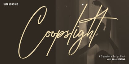 Coopslight is a tall expressive signature font. With medium stroke, fun character with a bit of ligatures and alternates. To give you an extra creative work. Coopslight font support multilingual more than 100+ language. This font is good for logo design, Social media, Movie Titles, Books Titles, a short text even a long text letter and good for your secondary text font with sans or serif. Make a stunning work with Coopslight font. Cheers, MaulanaCreative
 - Mistoms by Maulana Creative,
$14.00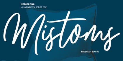 Mistoms is a casual script font. With medium contrast stroke, fun character with a bit of ligatures and alternates. To give you an extra creative work. Mistoms font support multilingual more than 100+ language. This font is good for logo design, Social media, Movie Titles, Books Titles, a short text even a long text letter and good for your secondary text font with sans or serif. Make a stunning work with Mistoms font. Cheers, MaulanaCreative
 - Rotarry Semi Geometric Font by Maulana Creative,
$15.00 Rotarry is a modern sans display font. Medium stroke, fun character with a bit of ligatures and alternates. To give you an extra creative work. Rotarry font support multilingual more than 100+ language. This font is good for logo design, Social media, Movie Titles, Books Titles, a short text even a long text letter and good for your secondary text font with script or serif. Make a stunning work with Rotarry font. Cheers, Maulana Creative
 - MC Raktor by Maulana Creative,
$18.00 Raktor is a modern Display serif font with medium-low stroke contrast, fun characters with a few ligatures and alternates to let you unlock extra creative work. Raktor supports more than 100+ languages. This font is good for logo design, social media, movie titles, books titles, short and even long text, lettering. Raktor also works great when combined with other script or serif fonts as a secondary text font. Create stunning work with Raktor!
 - Bigteeth by Maulana Creative,
$13.00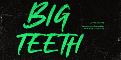 Bigteeth is a horror vibes handwritten font. With slanted medium rough brush stroke, fun character. To give you an extra creative work. Bigteeth font support multilingual more than 100+ language. This font is good for logo design, Social media, Movie Titles, Books Titles, a short text even a long text letter and good for your secondary text font with sans or serif. Make a stunning work with Bigteeth font. Cheers, Maulana Creative
 - Servat by Maulana Creative,
$14.00 Servat is a retro semi slab serif font. With medium stroke, fun character with a bit of ligatures and alternates. To give you an extra creative work. Servat font support multilingual more than 100+ language. This font is good for logo design, Social media, Movie Titles, Books Titles, a short text even a long text letter and good for your secondary text font with sans or script. Make a stunning work with Servat font.
 - Chillin Notez by Four Lines Std,
$15.00 With its flowing lines and cool, contemporary vibe, Chillin Notez adds an air of refinement to any project. Whether you're crafting captivating advertisements, designing eye-catching poster, or creating stunning social media graphics, this font is your ultimate companion for conveying a message that resonates.
 - Max Stitch by Aboutype,
$24.99Similar to Erasurehead. Redrawn as in line, outline font for embroidery application. Works well with layers, colors, gradients and filters. Max was designed for all media and can be used in a wide range of point sizes. Max requires subjective display kerning and compensation. - Sometype Mono by Dharma Type,
$- Sometype Mono is a free monospaced font family for coding and tabular layout which can be used for commercial purpose for free. So far, Sometype Mono consists of 6 style. Regular, Italic, Medium, Medium Italic, Bold and Bold Italic.
 - BB Petie Boy - Unknown license

- Tempo by Red Rooster Collection,
$45.00Based on the Medium weight of Ludlow Tempo. - Casthago by BustanType,
$24.00 Casthago is a transitional, humanist serif typeface family, comes with some contrast in the stroke and medium curve braketed serif that creates a very classic and traditional feel. Casthago designed for body text, creating a steady and readable rhythm, made for immersive reading. Some Character comes with alternate style 'a,h,m,n' that inspirated by Carolingian manuscript that was popular in medieval European period. Casthago consists of 16 styles from Extralight to black including italic styles and 2 variable fonts addition.
 - Simplo by Durotype,
$49.00 Simplo: the ‘Italian Futura’. Simplo is a geometric sans serif typeface, built in sixteen styles. It is a tribute to the 1930s typeface Semplicità, designed by Nebiolo’s Alessandro Butti. Although many details of Simplo differ from Semplicità, it preserves the spirit of the original. Simplo is ideal for use in display sizes. It is also quite legible in text, and is well suited for graphic design and corporate identity design. Simplo has sixteen styles, extensive language support, eight different kinds of figures, sophisticated OpenType features — so it’s ready for advanced typographic projects. The most notable characteristics of this typeface are the ‘t’ and the ‘f’. The ‘t’ is the culmination of simplicity: a vertical line with just a simple right-side crossbar. The ‘f’ also has just a right-side crossbar, and is really tall: it reaches both the highest and lowest vertical position of the typeface. The top of the distinctive ‘s’, is much narrower than its bottom. The ‘a’, ‘b’, ‘d’, ‘g’, ‘p’, ‘q’, and ‘u’ are spurless, and show a family resemblance with Hans Reichel’s 1990s typeface Dax. However, these letters are rounder and more geometric than Dax’s counterparts, because of Dax’s higher x-height and narrower design. In Paul Shaw’s Imprint article about typefaces that have been overlooked and/or underappreciated, “Overlooked Typefaces”, he concluded his discussion of Semplicità as follows: “These idiosyncrasies suggest that Semplicità might find a warm reception today, given the current love affair with Gotham, Neutraface and Proxima—and the resurgence of ITC Avant-Garde Gothic.” Free demo font available. For more information about Simplo, download the PDF Specimen Manual.
 - FF Videtur by FontFont,
$62.99 German type designers Axel Bertram and Andreas Frohloff created this serif FontFont in 2012. The family contains 4 weights: Light, Regular, Medium, and Bold and is ideally suited for film and tv, editorial and publishing, small text as well as web and screen design. FF Videtur provides advanced typographical support with features such as ligatures, alternate characters, case-sensitive forms, fractions, super- and subscript characters, and stylistic alternates. It comes with a complete range of figure set options – oldstyle and lining figures, each in tabular and proportional widths.
 - FF Eureka Mono by FontFont,
$62.99 Slovakian type designer Peter Bil'ak created this sans FontFont in 2001. The family has 20 weights, ranging from Light to Black in Condensed and Medium (including italics) and is ideally suited for book text and editorial and publishing. FF Eureka Mono provides advanced typographical support with features such as ligatures, alternate characters, case-sensitive forms, super- and subscript characters, and stylistic alternates. It comes with tabular lining figures. This FontFont is a member of the FF Eureka super family, which also includes FF Eureka and FF Eureka Sans.
 - Mercusuar by Fauzistudio,
$12.00 Mercusuar font FAMILY – an expansion on Mercusuar that includes 16 fonts, regular and italic, from Thin weight to Bold, and still has all the clean lines and trendy minimalist vibes! Mercusuar is a stunningly crisp upper and lowercase typeface that looks incredible in both large settings as a display text. Includes: Mercusuar Thin (Regular & Italic) Mercusuar Extralight (Regular & Italic) Mercusuar Light (Regular & Italic) Mercusuar Regular (Regular & Italic) Mercusuar Medium (Regular & Italic) Mercusuar Semibold (Regular & Italic) Mercusuar Bold (Regular & Italic) Numbers & punctuation Foreign language support Hope you enjoy. Intuisi Creative
 - Adriane Text by Typefolio,
$49.00 Adriane Text was designed between 2006 and 2007 with additional production completed by Silas Dilworth for this 2008 release [v1.002]. Focusing on text composition and unique typographic characteristics, details within the characters provide both personality and excellent legibility at small sizes. With a medium contrast, a predominantly vertical axis, and a generous x-height, it can be classified as a transitional typeface. This package of advanced OpenType fonts consists of the style-linked quartet of Regular and Bold weights accompanied by corresponding Italics, each of which include small caps and full support for Extended Latin character sets - now including Central European diacritics. Old style and lining figures are provided in both proportional and tabular spacing, and an extensive set of ligatures, ornaments, dingbats, and alternate ampersands are available across the family. The Italics possess a fluidity that contrasts with the staid posture of the Roman styles. The degree of inclination for the uppercase and lowercase characters are slightly different, offering an enhanced visual rhythm in the text settings.
 - Miyagi by Thinkdust,
$10.00 Miyagi brings the classic Yagi Link Double to the digital world, a modern form for a timeless typeface. Miyagi pays tribute to the decade it was created while pushing it into the boundaries of the future as well, a double image to match its double lines. Complex in design but easy to read, Miyagi embodies the stylistic ideas inherent in typeface design.
 - Rochaline by Lemon Studio Type,
$15.00 Rochaline a fashion chic display font. This font was inspired by and for fashion brands in the world. In general, it creates a luxurious and elegant look in design. Add this font to your favorite creative ideas and notice how it makes them stand out! Use this font for your fashion brand, resort, cosmetics, invitations, wedding, branding, packaging, magazines, boutique, social media, restaurant, spa, greeting cards, headers, headline, and many more...
 - Fox Cupid by Fox7,
$16.00 Fox Cupid is a cute and fun color display font. Fall in love with its authentic feel and use it to create gorgeous invitations, beautiful stationary art, eye-catching social media posts, and cute greeting cards. Add this beautiful font to each of your creative ideas, and notice how it makes them stand out. 🌺🌺 Please note that the Canva do not support color fonts! 🌺🌺
 - 1462 Bamberg by GLC,
$38.00 Font designed from that used in Bamberg by Albrecht Pfister, in early years of printing, exactly for a book titled "Ackermann Von Böhmen" writen in old German by Johannes Von Tepl, and decorated by a lot of splendid colored carved woods. This font include "long s", naturelly, as typically medieval, but any abbreviated characters, and, curiously no german "ß", no more than "W". (The only one I did found where a hand drawn one.) In addition, the "k" have not a German gothic form. Added, the accented characters, no longer existing on this time, and capitals when was a lack. A render sheet, in the font file, makes all easy to identify on a keyboard. This font is used as variously as web-site titles, posters and fliers design, editing ancient texts... This font supports as easily enlargement as small size, remaining readable, original and beautiful, especially in capitals.
 - Neuborn by HIRO.std,
$10.00 Introducing Neuborn Font Family Neuborn is a Sans Serif Font Family (Light, Light Italic, Regular, Regular Italic, Regular Hollow, Regular Italic Hollow, Medium, Medium Italic, Medium Hollow, Medium Italic Hollow, Bold, Bold Italic, Bold Hollow, Bold Italic Hollow). This Font Template contains Modern, Formal or Non Formal, Classy, Elegant, Strong, Readable, Stylish, Cool, Bold, Minimalist and easy to use. FEATURES - Uppercase and Lowercase letters - Numbering and Punctuations - Multilingual Support - Works on PC or Mac - Simple Installation USE Neuborn works great in any branding, name card, logos, apparel, produk pagaking, flyers, magazines, label, films, stationary, posters, etc. and any design project that requires a formal or informal touch.
